Search Results for: design ideas

My Nice Home Gallery Showflats

It’s been a while, and we are stoked to have you back at the revamped My Nice Home Gallery!

The gallery has undergone a makeover, so expect all-new interior themes for the 2-room Flexi, 3-room, 4-room and 5-room flat types, as well as a new MyNiceHome concept space. In addition to refreshed interior themes, the showflats also showcase the latest fittings and finishes that we provide in our new flats.

Read on to find out more about the showflats for each flat type:

Showflats

  • 2-Room Flexi (36 sqm): Blush
  • 2-Room Flexi (46 sqm): Mid-Century Modern
  • 3-Room: Retro Fun
  • 4-Room: Nordic Silhouette
  • 5-Room: Tropical Luxe

2-Room Flexi (36 sqm): Blush

If you’re a fan of the soft ‘blush’ interior look, this 2-room Flexi showflat at the My Nice Home Gallery is perfect for you.
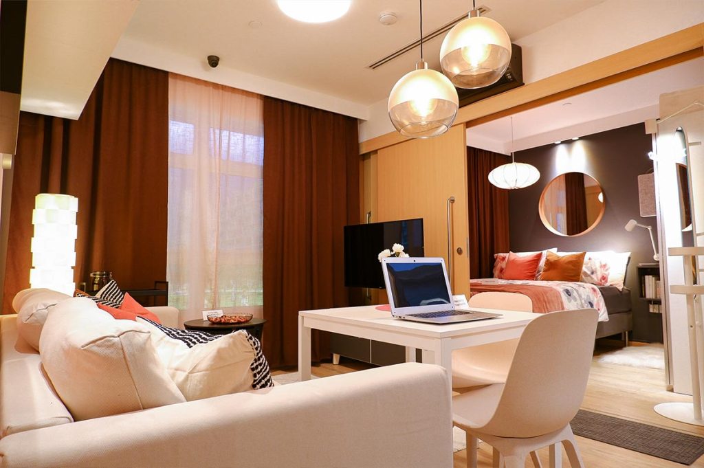
The living room features pink, white and grey shades – the primary colours of the showflat’s interior theme

The main colour palette comprises a soft pink hue, as well as shades of white and greys. White is used to create an airy and light feel while the darker grey tones help to create depth. Grey and pink tones are used strategically in the showflat – such as on the feature walls in the living room and bedroom. A variety of patterns and textures also tastefully jazz up the interior.
MNHG-2-1024x683.jpg

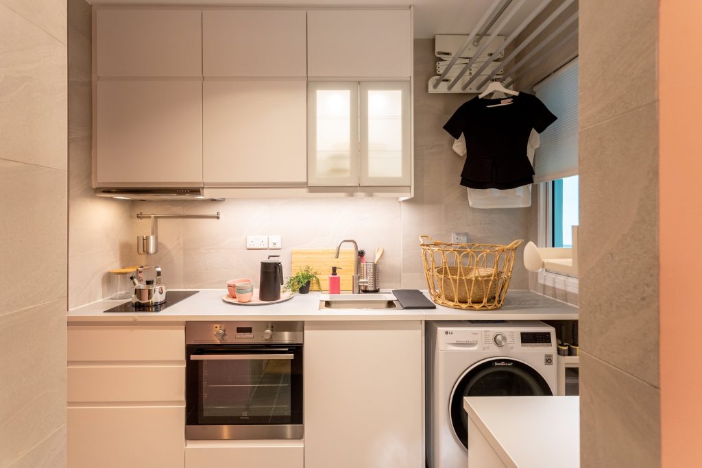
The kitchen comprise mainly the colour white that brightens up the space

The showflat shows how to maximise space using modular and multi-functional furniture. The extendable dining table is a perfect example – when not in use, it can be shortened to free up floor space, and doubles up as a work desk. Additionally, the sofa and bed frame both have storage compartments to keep items that you rarely use.
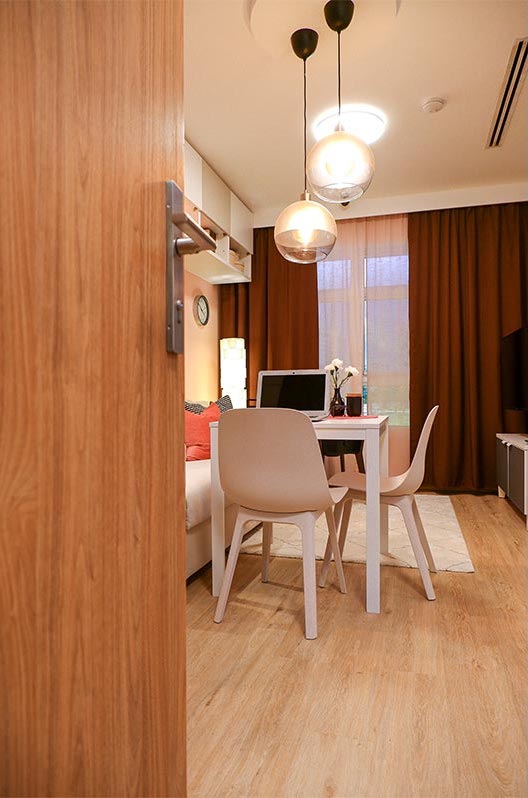
Create a work nook in the living/ dining area

As the living room is adjacent to the bedroom, consider incorporating a television which can be rotated 180°. That way, you can choose to watch your shows from either room!
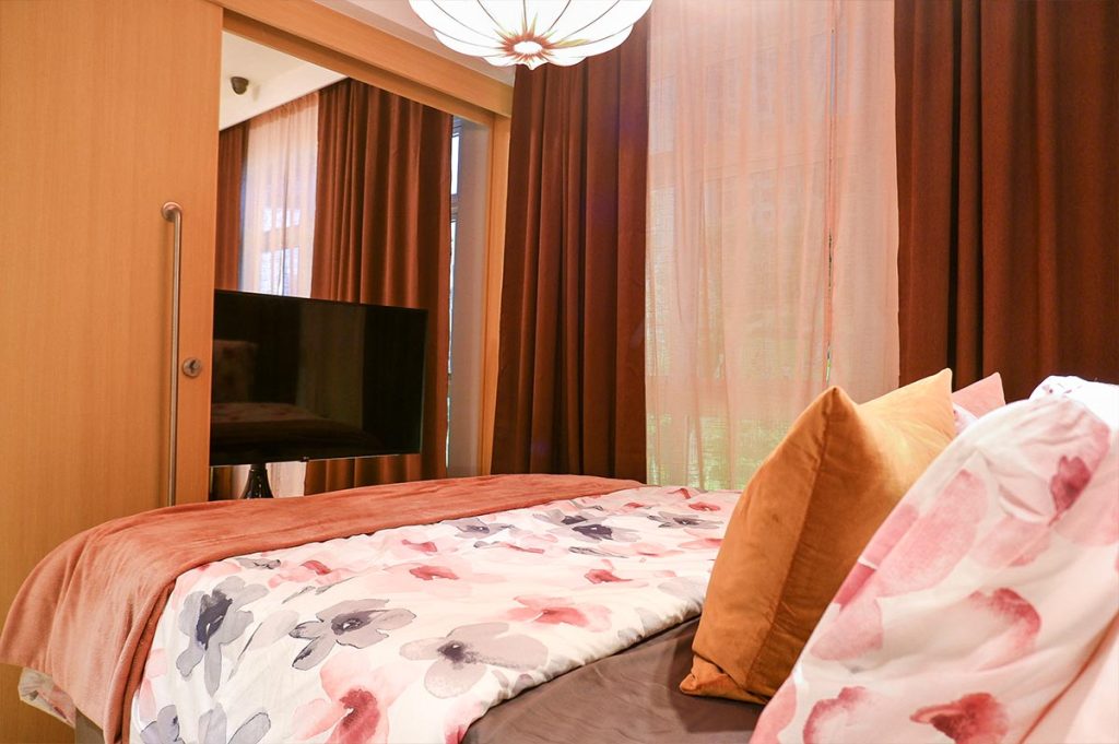
Incorporate a rotating TV to maximize space

2-Room Flexi (46 sqm): Mid-Century Modern

The mid-century modern aesthetic is characterised by simplicity and functionality. What sets this style apart is its focus on sleek lines with geometric forms, and the use of contrasting materials.
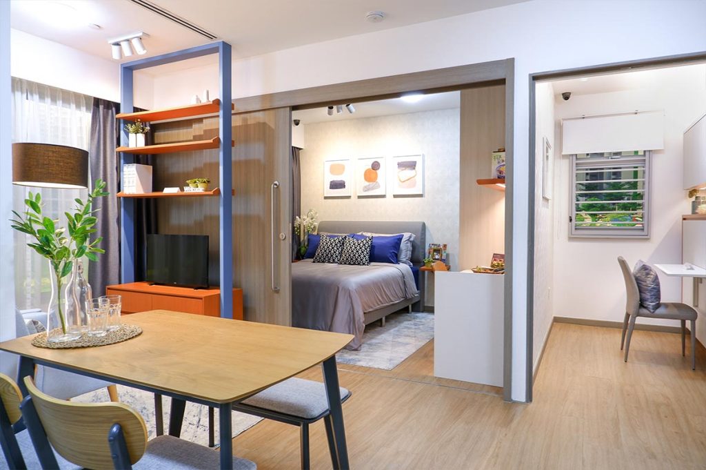
View from the living area

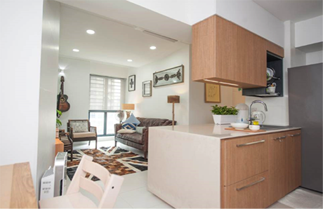
The earthy colours and wooden furniture in this showflat make the entire space cosy and intimate. The most striking element is the geometric-patterned feature wall in the living room that complements the mid-century modern look.
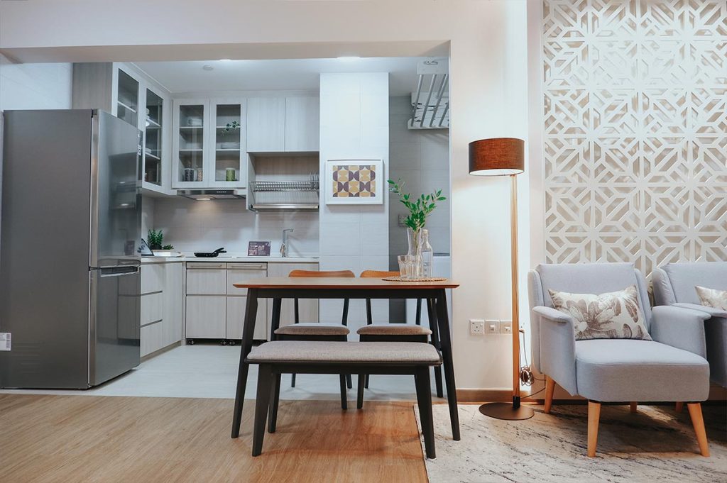
The geometric feature wall adds a different dimension to the space
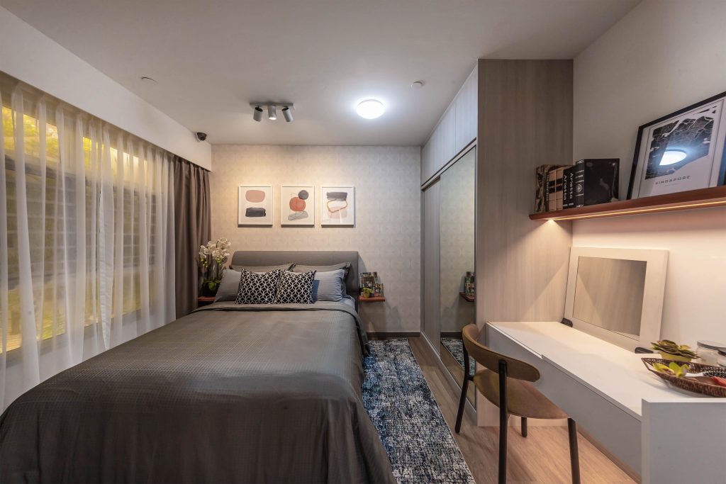
MNHG-7-1024x683.jpg

Pull-out drawers in the vanity area in the master bedroom can maximise storage space

This 2-room Flexi showflat features a layout that includes a space for caregivers, and an open kitchen which allows for greater mobility. It is an ideal home for active seniors to live in comfortably and safely.
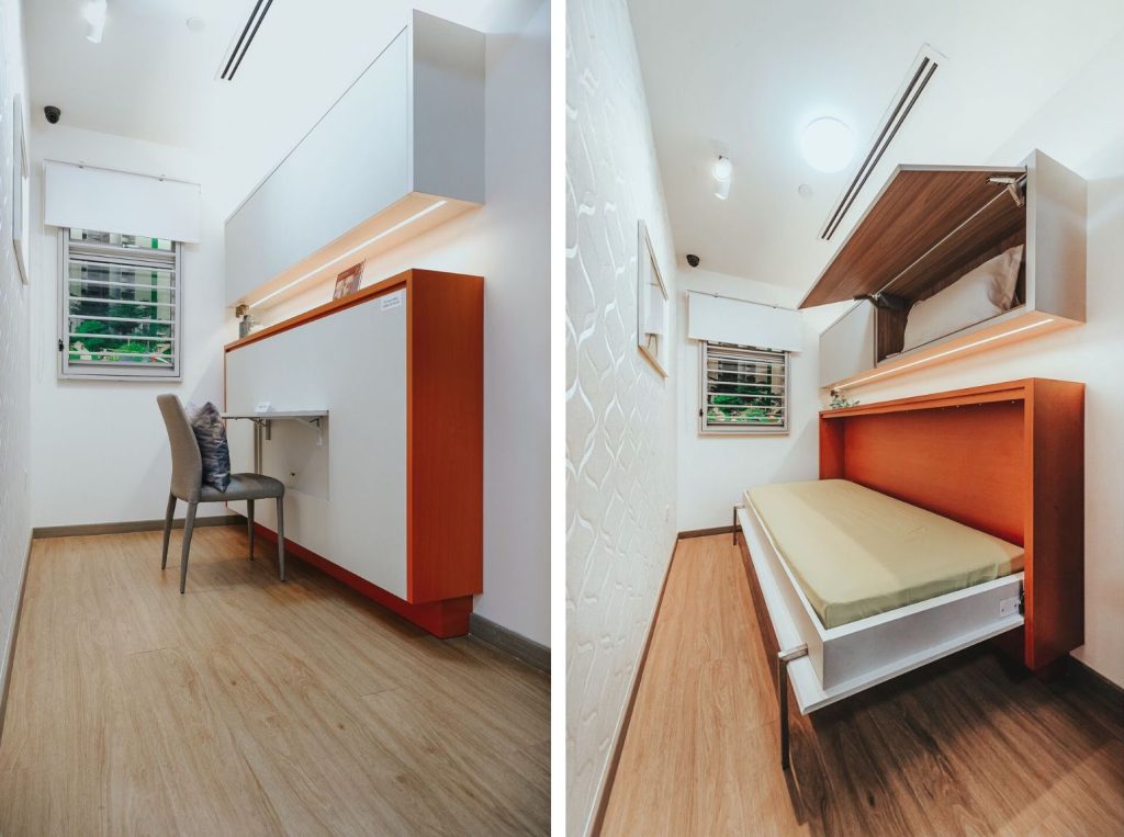
Flexible space for a caregiver, which can double up as a workspace
MNHG-9-1024x683.jpg

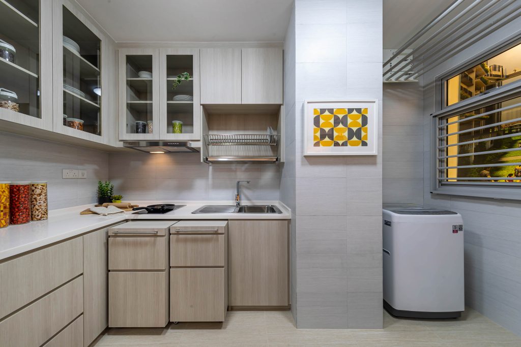
The kitchen features pull-out drawers that double up as additional countertop space

3-Room: Retro Fun

Step into this showflat and be greeted by a refreshing mix of fun colours and prints that effortlessly serve up retro vibes and add visual interest. The 3-room showflat provides inspiration for fun-loving young families looking to liven up their space.
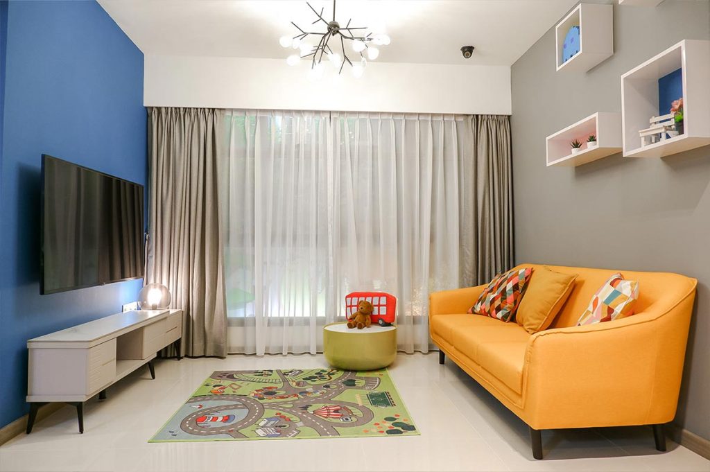
The living area is decked out in pops of colour that add vibrancy to the space

Colours such as turquoise, mustard and pink were iconic a few decades ago, when they found their way into everything from fashion to furniture. In this living room, a pink lounge chair is a striking statement piece.
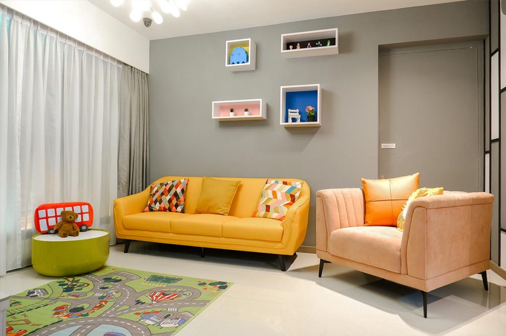
Statement furniture such as the lounge chair can be used for visual interest

Beyond the colours and prints, home owners who are space-conscious will also find some inspiration. Storage furniture, such as a bed with compartments, is used to reduce visual clutter.

A notable feature of the showflat lies in the kitchen, which has been combined with the utility area to form an enlarged area that will please any cooking enthusiast. The kitchen adopts an open concept that flows seamlessly into the living room, giving a sense of spaciousness to the living area.
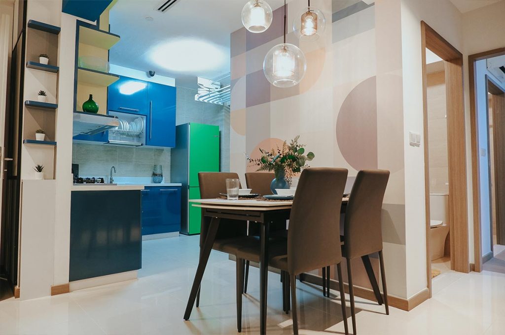
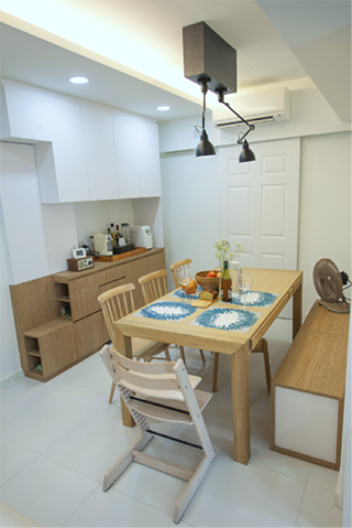
The open kitchen is seamlessly connected with the dining area. Versatile furnishings such as the extendable dining table and stackable dining chairs help to maximise space and can be neatly stowed away when not in use, to reduce visual clutter

The child’s bedroom features more storage solutions such as underbed boxes and wall niches. These wall niches also visually break up vertical spaces while adding a touch of modernity and vibrancy to the rooms.
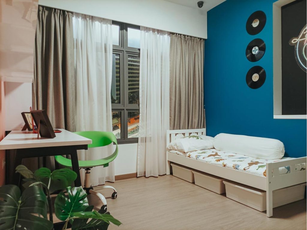
Underbed boxes and wall niches are used to provide additional storage space in the child’s bedroom

4 Room: Nordic Silhouette

With their timeless yet contemporary aesthetic, it’s little wonder why Scandinavian homes are a popular source of inspiration. Love the idea of a Nordic-inspired nest for yourself? The 4-room showflat at the My Nice Home Gallery offers wallet-friendly design ideas for both young couples and families.

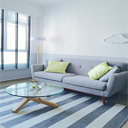
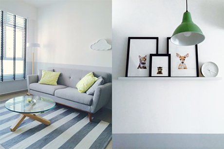
Decked out in the Nordic theme, the 4-room showflat features harmonious shades of mustard, white and grey.
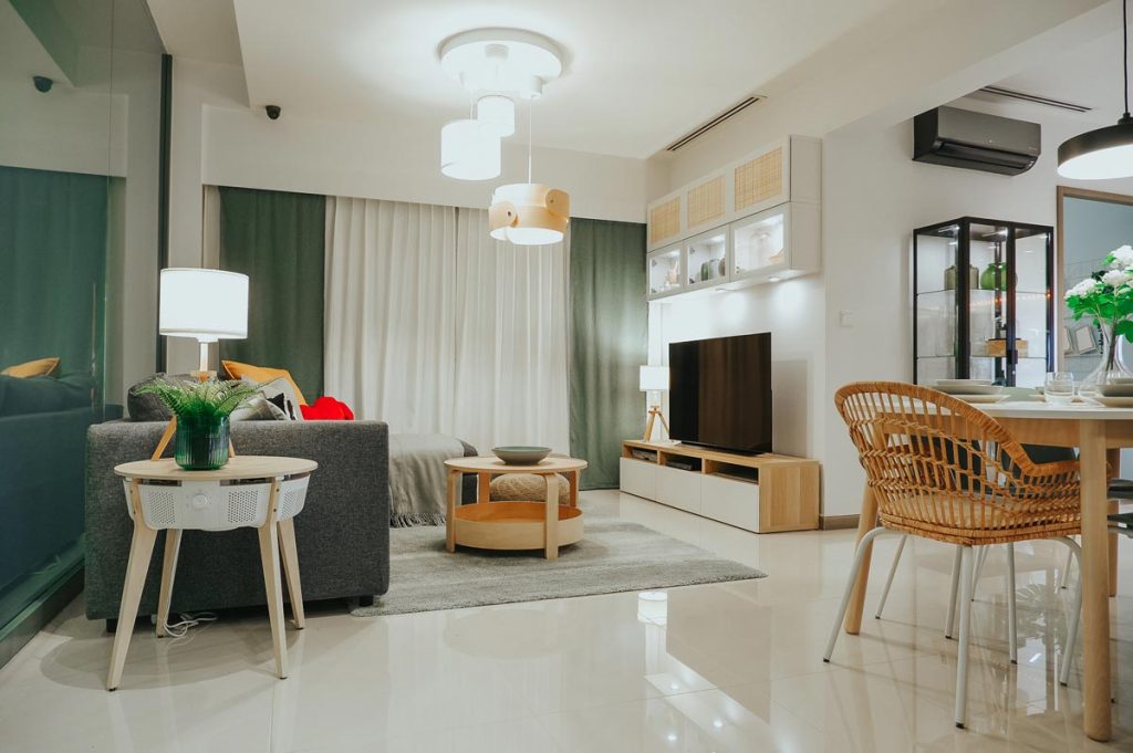
The 4-room showflat adopts an open floor plan that sees a seamless transition from the living to dining area

The use of white and light-coloured carpentry and furnishings complement the neutral palette. In the combined living and dining space, yellow chairs and cushions add a pop of colour. Striped textiles emphasise the clean lines typical of Scandinavian interiors.

With a spacious common area as the heart of the home, a family can gather comfortably on the plush sofa or around the dining table to spend quality time together.
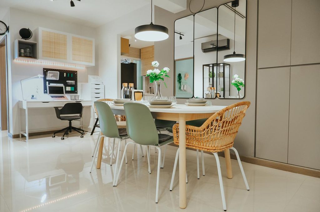
The yellow dining chairs help to add a pop of colour to the area

A study nook in the living area is also a great spot for children to indulge in their creative hobbies, or for adults who need to get some work done at home.
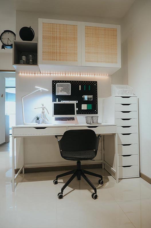
A workspace carved out from a corner

While Scandinavian design might be minimalist in nature, the master bedroom shows how to achieve a cosy personal sanctuary. Details matter – add curves through an oval mirror or rounded lampshade for a gentle touch, and put soft furnishings like luxe bedclothes and rugs on your shopping list!
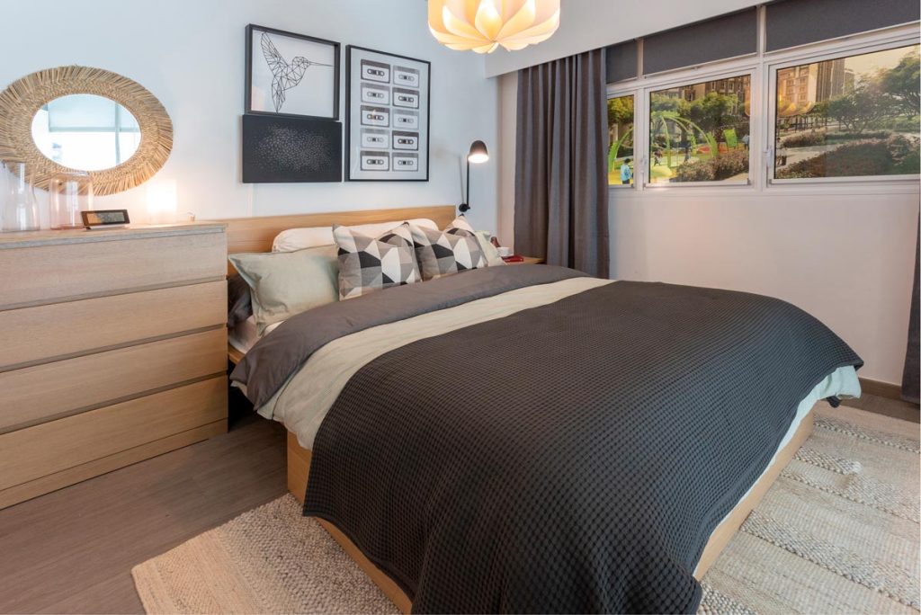
Soft furnishings rugs and bed throws can be used to add a cosy touch to the bedroom

If you have always wanted a smart home, you will enjoy the master bedroom in the 4-room showflat. Be sure to check out how you can control smart appliances such as lights and blinds through a tablet, to create your ideal environment.

When designing your children’s bedrooms, it’s possible to achieve both style and function. For instance, a bunk bed instantly carves out space for a study right beneath, providing ample space for favourite books and toys.
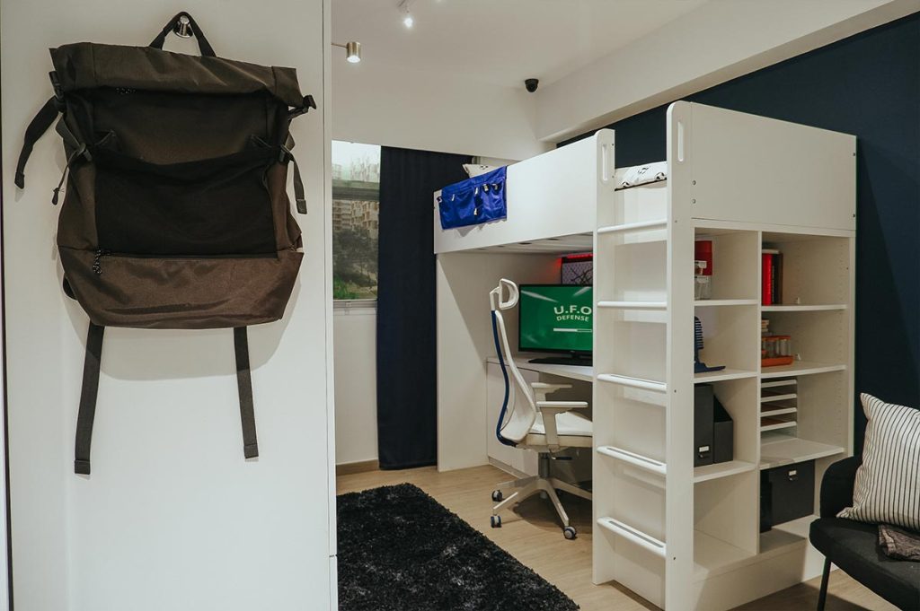
Bunk bed with a study nook

A bed with storage beneath is practical and will serve your child well throughout their growing years. Instead of built-ins, movable furniture can be replaced as and when needed to meet the child’s changing needs.
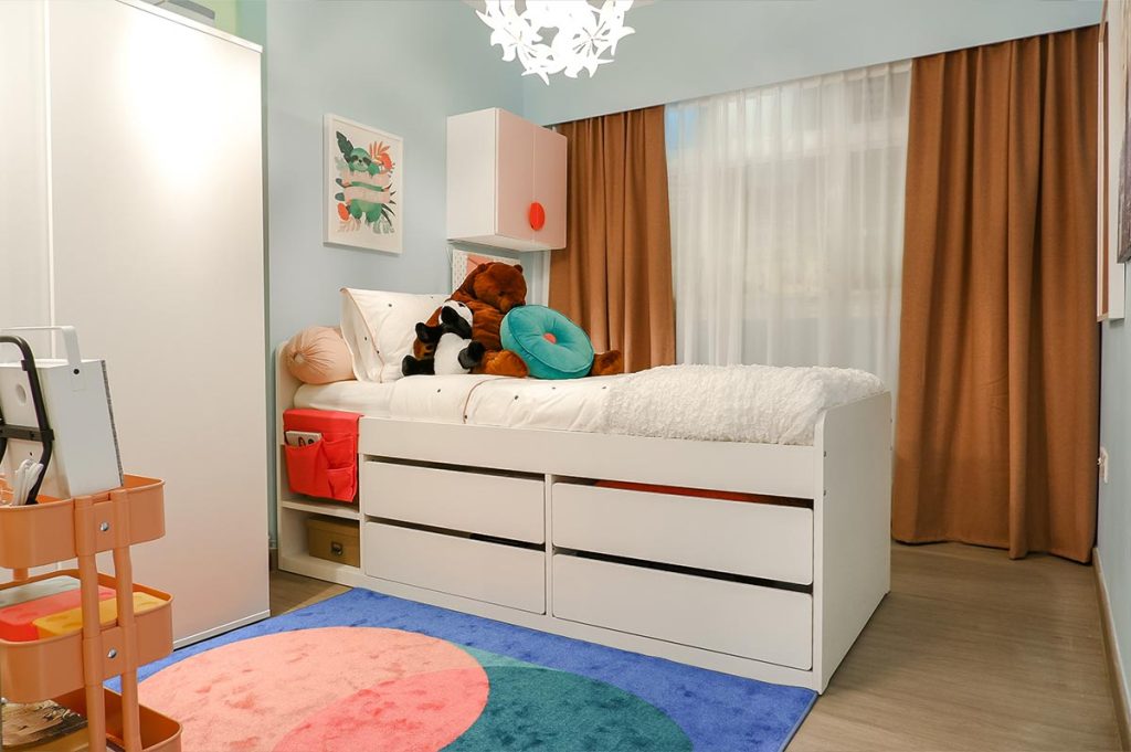
Maximize storage space with underbed pull-out drawers or boxes

Keep things simple but not plain, with unique design elements such as floral light fixtures and surface decals.

5-Room: Tropical Luxe

Decked out in a tropical theme, the 5-room showflat features a colour palette of turquoise and white, with splashes of greenery, as well as black and wood accents. At the same time, a hint of gold fittings as well as geometric lines and textures add to its luxurious vibes.
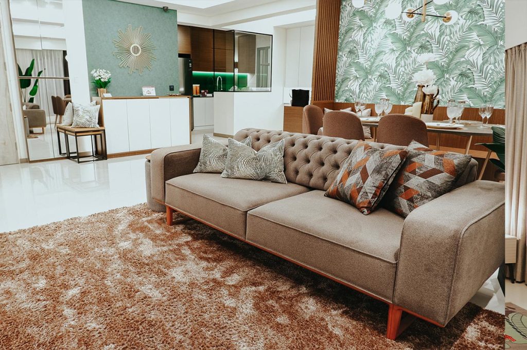
The living room is decorated with splashes of greenery, wood accents and gold fittings to bring out the interior theme

In creating a larger common area, the dining area is designed to be within the living room. Instead of conventional dining chairs, a long, built-in bench is used for seats. Not only does it add to the aesthetic, a bench offers more seating space while doubling up as storage.
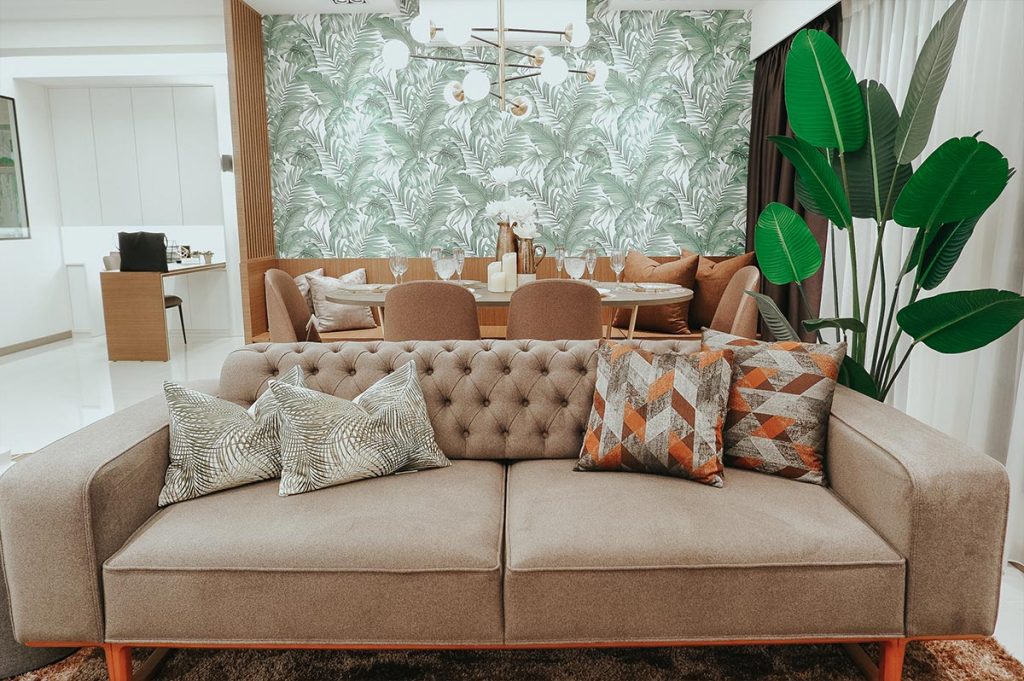
The dining room is designed as an extension of the living area
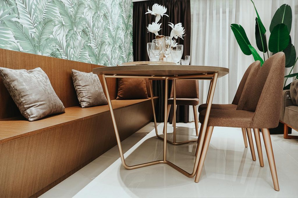
The built-in bench doubles up as a storage area

This showflat also features a small workspace near the kitchen. For more flexibility, the worktable is designed to be easily stowed away when not in use and can be converted into an exercise space or children’s play area.
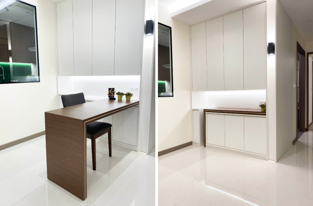
MNHG-24-2-1024x675.png


The versatile worktable can be easily stowed away

To demarcate the spaces, a  half-wall partition topped with a black-framed glass panel is used.
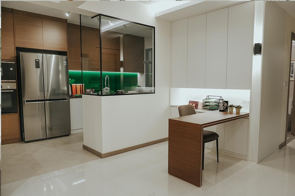
The half-wall and half-glass kitchen partition has become increasingly popular amongst home owners

For families who indulge in heavy cooking, this type of kitchen partition also come in handy as it helps with keeping the fumes within the kitchen while allowing a full view of the living area—useful for supervising the little ones!

Inspired by hotel suites, the master bedroom is designed to be luxurious yet cosy. Cove lights are used to create a welcoming atmosphere, while lines and textures on the wardrobe and feature wall create a subtle statement.
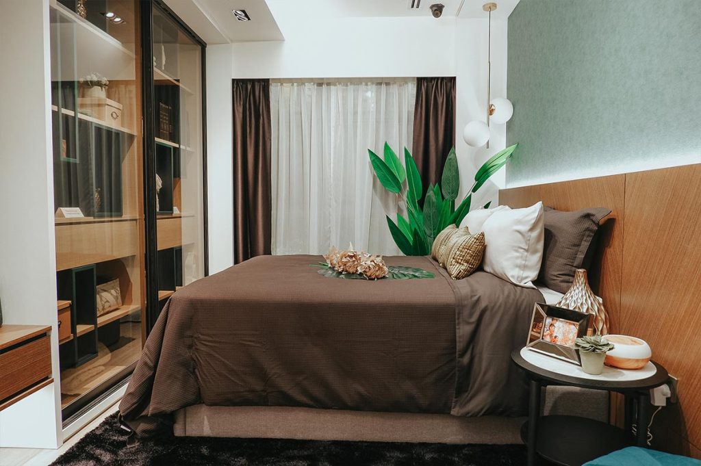
The design of the master bedroom is inspired by that of a hotel

More space-saving solutions can be found in the bedrooms. For instance, the common bedroom features a flip-up dresser that doubles up as a writing desk, while the kids room has a pull-out study table that can be easily stowed away to create a bigger play area.
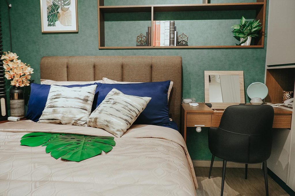
The dressing table features a flip-up mirror that can be easily kept away to double up as a writing desk
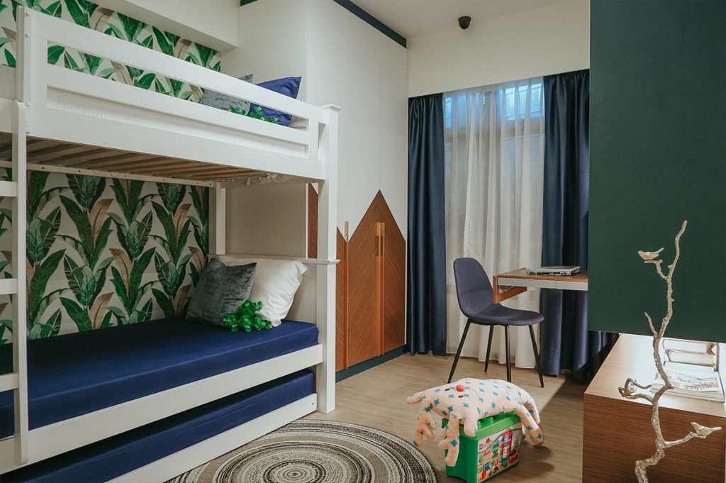
Similarly, the pull-out study table in the children’s room enables the area to be used more flexibly

The showflat also showcases the smart home features that can be incorporated into your new home to make it more comfortable and convenient. These include temperature and humidity sensors, as well as smart lighting, air conditioners and voice activated smart controls.
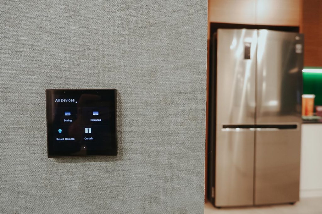
Features such as light and air conditioning can be remotely controlled via a smart system
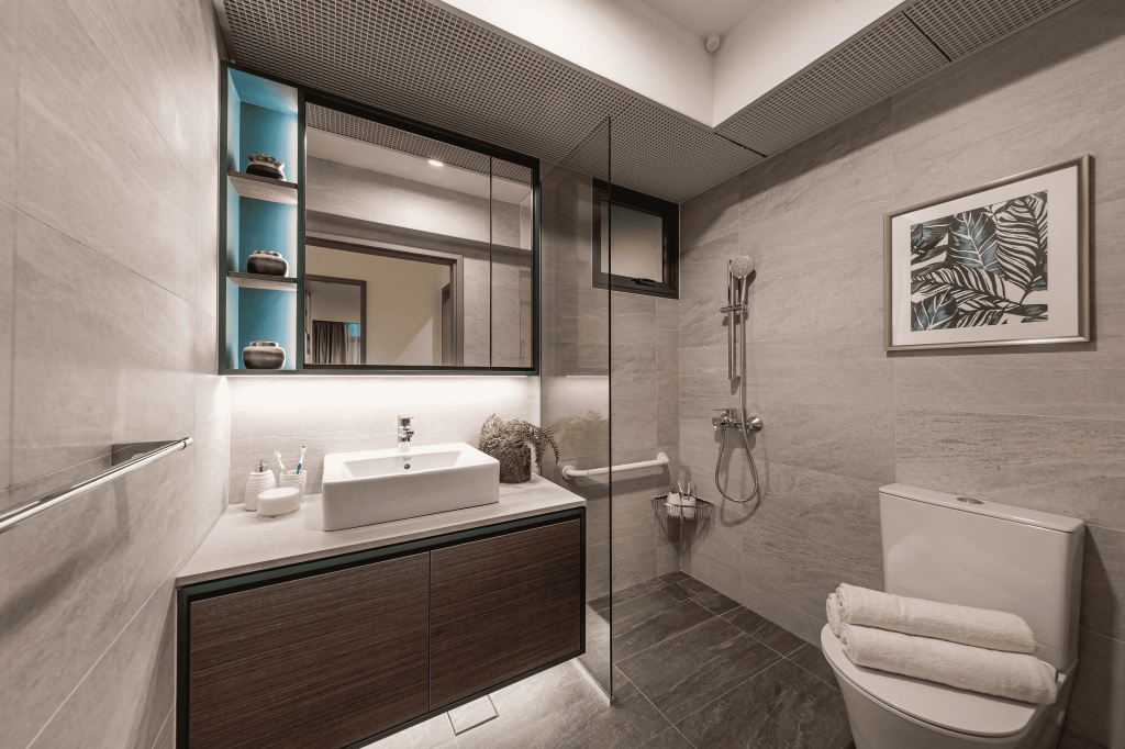
MNHG-28-1024x682.png

One example of smart lighting is the motion-sensor activated lights in the bathroom

In the showflat, you can also find assistive items such as pull-down wardrobe racks, motion sensor bins and telephones with larger displays. A smart elderly monitoring and alert system comprising a panic alert button, digital security camera, smart smoke and sensors will also be on display.


Source: mynicehome.gov.sg

Luxe Look for Less

Luxe Look for Less

The luxe look exudes elegance, glamour, and sophistication. But it may be tricky to buy budget-friendly items for this theme. Here is where styling accents can achieve the same marvellous vibe, at a fraction of the cost.

1. Faux marble

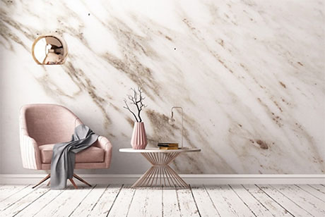
Marble has always been a material that adds a luxurious touch to home decor. For those on a budget, marble contact papers are excellent replacements to the real (and expensive) deal.

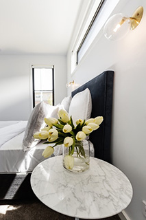
Try adding marble accents in your home by using marble contact papers over your current household items, such as trays or your bedroom bedside table. Up for some DIY? Check out how to use marble contact paper to create a minimalist terrarium.

2. Power lighting

If done right, lighting can be a powerful way to create the right atmosphere without spending much money. Ditch the outdated lighting fixtures, and swap them for fancier ones such as pendant lighting, chandeliers, or table lamps.

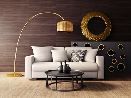
If you have the space, floor lamps can also add a stylish touch to your home interior. For dramatic effect, try including metallic or modern arc lamps for that classic and timeless designer look.

3. Glamour gold

Nothing says luxe more than gold. These days, you can easily use gold spray to instantly add glam to anything in your home. Focus on finding accent pieces that will stand out, such as the legs of a side table or upcycled glass jars, and add a simple coat of spray paint to for an extravagant touch.

Other metallic shades, such as silver and bronze, can also add a pop of sparkle and shine. A quick tip – exercise restraint when using metallic shades in your home decor. It may look tacky when overused, but using them sparingly can instantly elevate your living space.

4. Wall wow

If you are just starting to incorporate the luxe look in your home and do not wish to commit to expensive art pieces, try hanging abstract pieces or short quotes on your wall instead. There are lots of free prints online, or scour craft websites for good bargains. Now all you have to do is print and frame it up yourself!

Have more tips on how to create a luxe look for less? Share your ideas with us at our social!

Source: mynicehome.gov.sg

Maximising Space at Home

Maximising Space at Home

Too much stuff and not enough space – sounds familiar? Well, there are many tips and tricks to creating more storage space while giving your home a spacious and welcoming feel. Here are some ideas.

Use vertical space

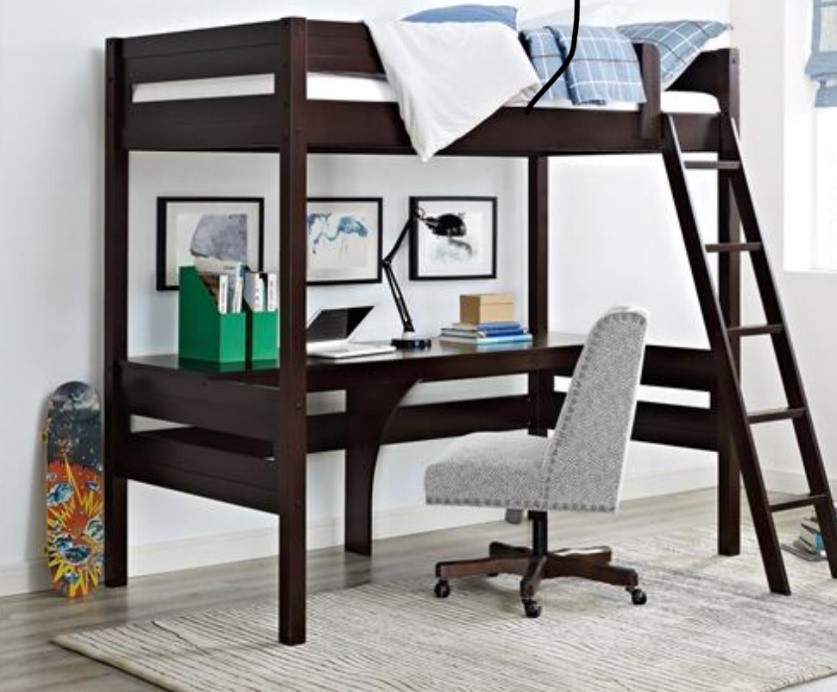
The vertical space in HDB flats is commonly untapped. By taking advantage of the unused space, you can gain practical floor area at home. For example, the bed is a large furniture that takes up significant space. By elevating the bed, you can transform the space below into a useful study or seating area – voila, you have created dual use for the same space.

Photo credit: Dorel Living

Build platform beds

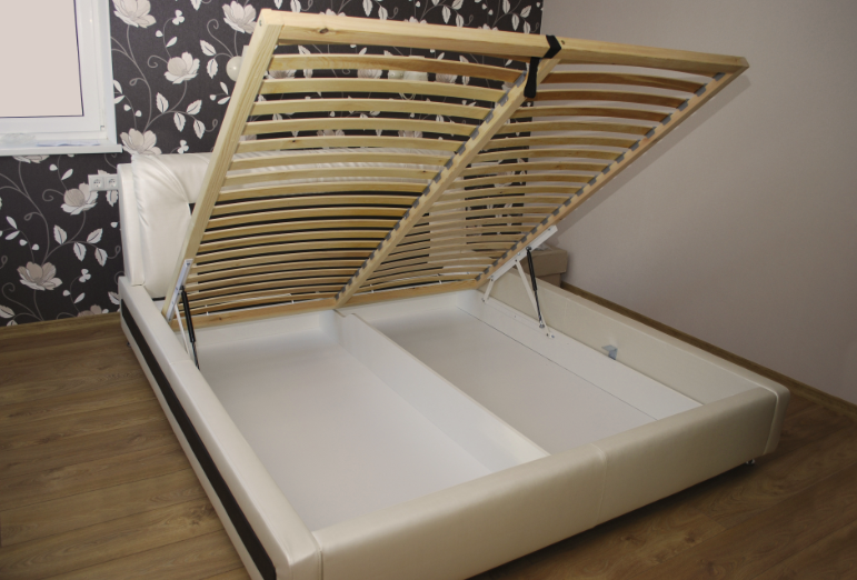
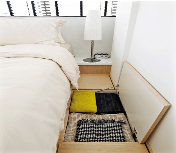
Keeping belongings under the bed is one of the oldest and most economical storage methods that effectively maximises the space in the bedroom. It also helps to keep the room looking clean and neat. In fact, you could double the storage space if you place the bed on a raised platform with storage compartments. Hiding clutter, this discreet storage space is perfect for seldom used items such as holiday decorations, winter clothing etc.

Photo credit: Home and Decor

Float your furniture

A great tip to make your home look bigger is to get the furniture off the floor. ‘Floating’ furniture gives the room a contemporary and minimalist look. In addition, it also maximises every inch of space in the room and makes cleaning easier. Without furniture ‘legs’, wall-mounted furniture opens up the room visually, giving it an airy feel. Try wall-mounting your desks, cabinets or shelves, and see precious space being freed up!

Use the walls

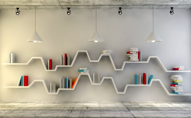
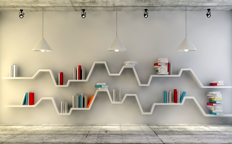
Walls offer excellent storage options. The creative use of wall space, whether through shelving or a small gallery wall, adds ample storage and character to your home. For greater visual impact, vary the height of the shelves to create interesting designs.

Multi-purpose furniture

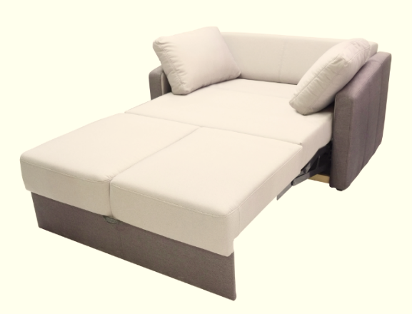
Opt for multi-purpose, convertible or expandable furniture for more efficient use of space. Multifunctional furniture is practical as they serve dual or more purposes. A common example is the sofa bed which serves as a sofa by day, and a bed by night. Or you can consider a slot sofa with hidden footrests and coffee table to be set up only when needed.

Photo credit: BonjourLife.com

Do you have interesting tips to maximise space at home? Tell us via our Leposh Design Facebook page.

Source: mynicehome.gov.sg

Mid-Century Modern Style

Mid-Century Modern Style

Get the Mad Men look with this interior design trend.

If you’ve watched old American movies (or you’re a Mad Men fan), you would notice that their homes have a distinctive look. Chances are, they are done up in the mid-century modern style that encompasses smooth lines, earthy materials, and quirky accessories.

What is Mid-century Modern Style?

This style is based on earlier European design influences such as Bauhaus and the International style.

After World War II, many European designers and artists migrated to America, bringing with them their eye for design that places equal focus on form and functionality. As technology improved rapidly after the war, these artists were able to turn their ideas into mass-produced pieces – many of which soon ended up in homes across American suburbs.

Clean Lines, Functional Shapes

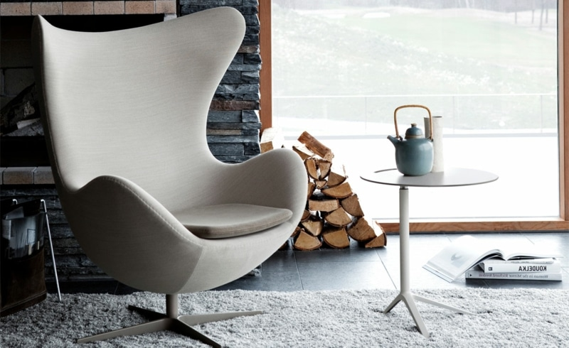
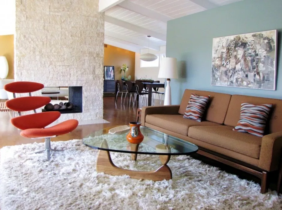
Geometric shapes and smooth lines are mid-century modern essentials. Furniture are simple and clean, not ornate and heavily-embellished. To help get the look, consider buying pieces that are decidedly vintage – like an egg chair!

The egg chair is an iconic mid-century modern piece.

(Image Credit: Inspiration Design Books)

Mix Materials and Textures

Wood is a staple of the style, but you can also have furniture made from materials like glass, vinyl and acrylic. Mix these materials within the room to get the classic mid-century modern look.

Pro-tip: Up your mid-century modern style game by getting furniture that mix materials. Check out that wooden coffee table with its glass top!

(Image source: Better Living Socal)

Play with Colours

Feel free to combine white and pastel tones with bold and colourful accents – these could come in the form of furniture pieces, textiles, or even a bold graphic print on the wall.

Why not make the best use of your wall space add some bold prints to it?

(Image Credit: Recently The Blog)

Open and Airy

Mid-century modern homes should have an open and airy feel, so go for an open-plan layout where possible. Do also make sure to have blinds or drapes that you can easily pull aside to let in natural light.

Let in some natural light to complete your mid-century modern home!

(Image Credit: Nonagon Style)

You don’t have to travel back in time to get a vintage look in your home. Already have the style? Send us a photo at our socials – we’d love to take a look!

Source: mynicehome.gov.sg

10 Unique and Stylish HDB Common Bathrooms

10 Unique and Stylish HDB Common Bathrooms

Running out of ideas on how to renovate your bathroom? Here are 10 stylish HDB bathroom projects to give you some inspiration!

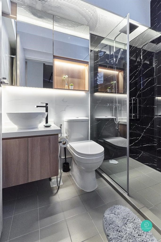
1. With the right fittings (clean and sleek) and ideal lighting (subtle yet modern), you can easily achieve the luxe hotel look for your own bathroom. This HDB bathroom is actual proof — the all-white interior lends a touch of sophistication, while the dark marble wall serves as a beautiful standout contrast.

Interior Firm: ELPIS Interior Design

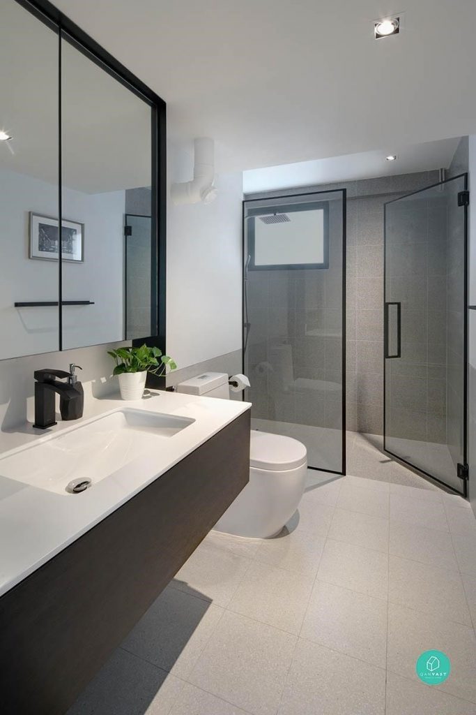
2. Incorporating a floating vanity provides the illusion of a bigger space.

Interior Firm: Versaform

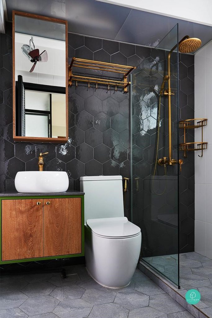
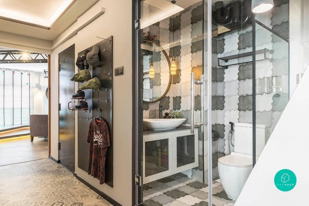
3. Quirky tiles are the key design feature in this bathroom as they help to add a ‘wow’ factor. To avoid a clash of patterns, everything else is kept clean and simple.

Interior Firm: Chapter One Interior Design

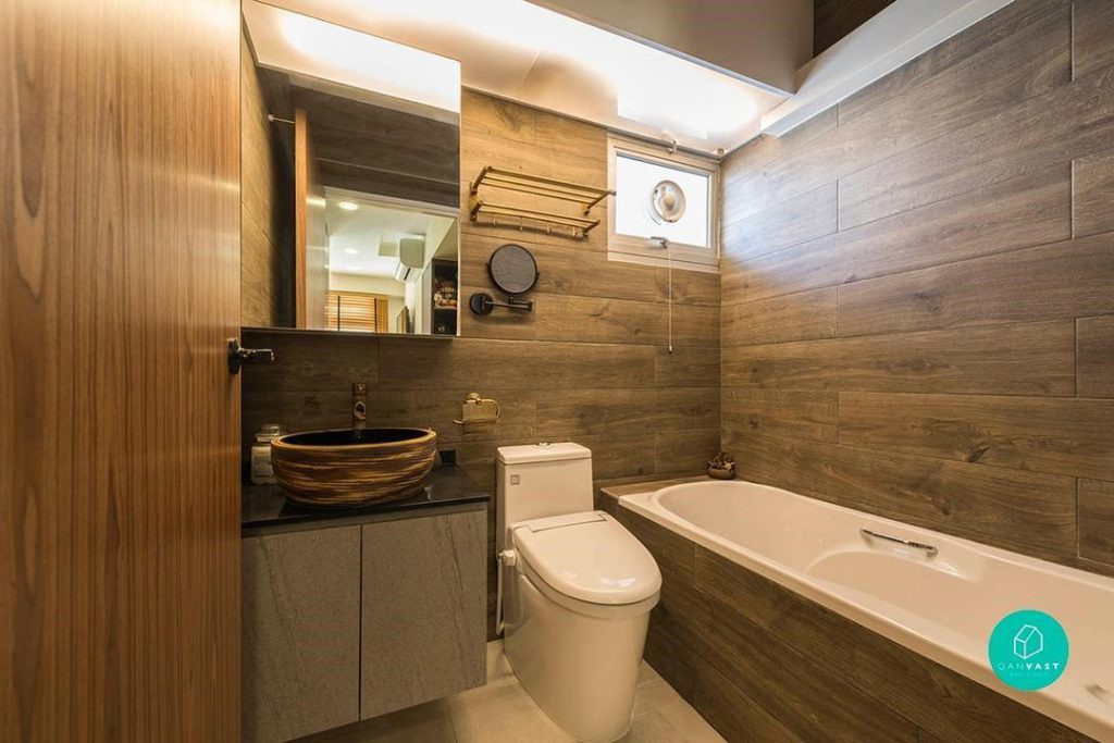
4. Natural wood adds warmth to this bathroom, which even comes with a full-sized bathtub. The wooden basin is a welcome change from the typical white porcelain sink. The use of wood panels for the walls creates a traditional Japanese bathhouse vibe.

Interior Firm: Control Space Design Studio

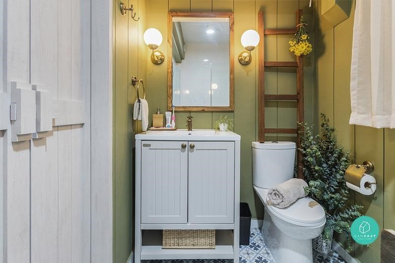
5. This cosy bathroom emulates the classic English-cottage bath concept perfectly — with its wooden walls and vanity, and potted plants in all the right places. The green-meets-white palette exudes a calming vibe, while floral tiles add a retro twist.

Interior Firm: Hall Interiors

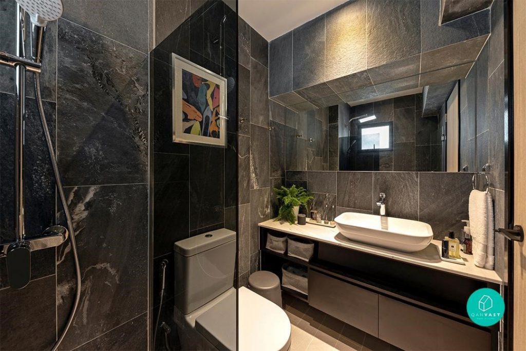
6. This bathroom definitely makes a statement with its black and grey colour palette. The black marble shower area is ultra-luxe, while the sleek, long vanity makes for a perfect centrepiece (it’s also a great way to maximise all the space).

Interior Firm: Bowerman

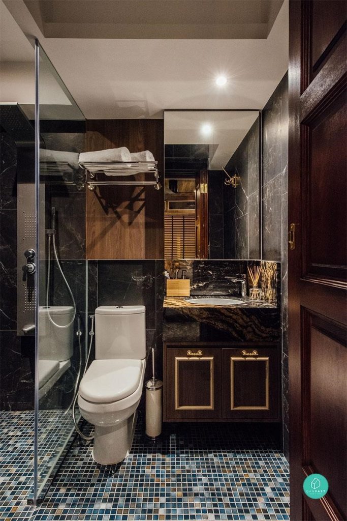
7. Coloured mosaic tiles are subtle, but pack a punch! The black marble and gold detailing on the vanity also add a touch of class.

Interior Firm: Fatema Design Studio

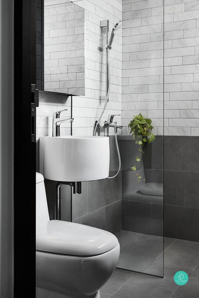
8. The kind of bathroom we like – sleek, simple, minimalist and industrial. Grey bathrooms are so on-trend now. Chrome accessories provide a striking contrast against white fittings and fixtures. And that small potted fern nestled in the corner? The perfect finishing touch.

Interior Firm: Dan’s Workshop

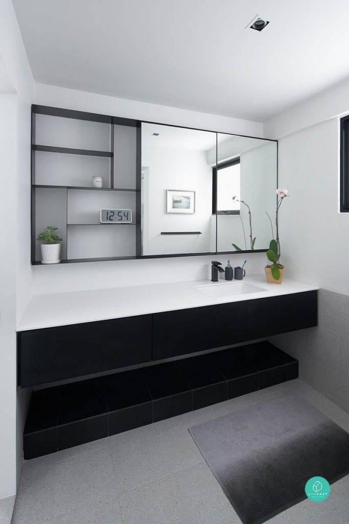
9. Less is more in this monochrome bathroom. A streamlined design is the key to achieving a sophisticated look.

Architect: PROVOLK

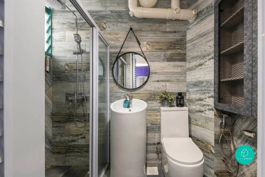
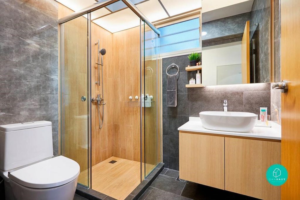
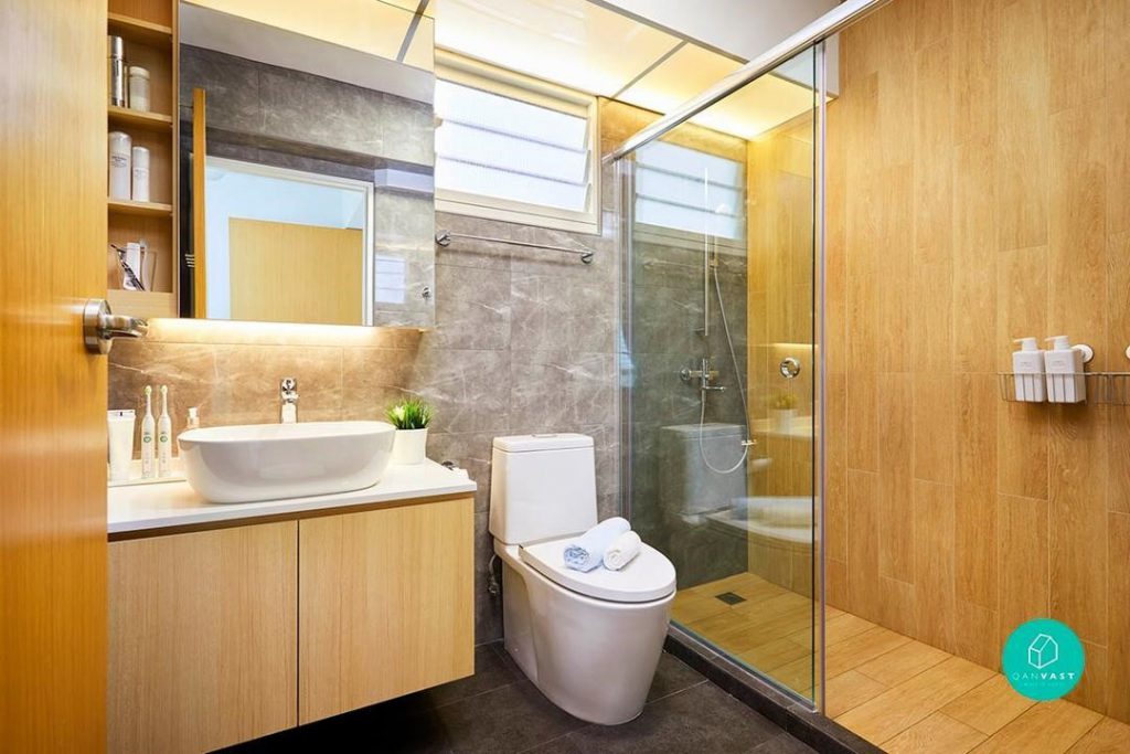
10. We love wooden concept bathrooms, but this homeowner took it one notch up by matching it with trending grey hues. It pulls off the Muji-meets-industrial look so effortlessly!

Interior Firm: The Local INN.terior

This article was contributed by Qanvast, Singapore’s go-to renovation platform. Whether you’re embarking on a major overhaul or a simple refresh, Qanvast can connect you to the right professionals for the job.

Source: mynicehome.gov.sg

A Slice of Australia in Queenstown

A Slice of Australia in Queenstown

Lester and Lydia live in a 4-room flat at SkyTerrace@Dawson with their 2-year-old son. Their cosy space is an eco-lover’s dream, inspired by the homes and cafes in Australia where the couple lived during their university years.

They embraced organic materials in a big way, from the oak table in the dining area to the vintage leather sofa, rattan seats, and driftwood lamps in the living room. Old mirrors were given a new lease of life, lining the living room wall to reflect light into the area.

The family’s television is tucked away in a specially designed cabinet, safely out of their son’s reach – like most of the other electronic appliances such as tablets and mobile phones.

The living room oozes casual charm

A Home for Family

A family that eats together, stays together. This explains why Lester and Lydia love their kitchen and dining area the most. They opted for an island counter top in the open concept kitchen, deep enough to prepare dough for pastries and bread. Twice a month, it doubles up as a buffet table when family and friends come over for dinner parties and get-togethers.

To recreate the experience of dining at communal tables which are commonplace in Melbournian cafes, the couple paired a large 8-seater oak table with wooden chairs and a custom-designed storage bench.

“We do lots of things around this table, besides having meals together. We play the guitar, draw, do jigsaw puzzles, and host imaginary tea parties with our son. The subtle scent of natural oak from the table also lifts our mood”, Lester and Lydia said.

A view of the kitchen and living room from the dining area

Inspired by Australian cafes

Luxe for Less

For a touch of luxury at home, the couple cleverly used materials which looked far more expensive than they actually were, like the solid surface kitchen counter top which easily passes off as stone.

To mimic the appearance of marble for their kitchen backsplash, they opted for large slabs of homogenous tiles with a vein finish similar to the real deal. Not only was it more affordable, it is also easier to maintain – two thumbs up in my book!

In the master bedroom bath/ toilet, a ‘mother of pearl’ mosaic on the vanity countertop completes the look, a space which will not look out of place in an upscale hotel.

Small but impactful touches which add to the overall look

Organic Home, Organic Process

The couple, who designed the flat themselves, said that the entire design process was fairly organic. They started out with the intention of making the kitchen and dining area the heart of their home, and with good ideas and planning, the other aspects fell into place

.“Our completed flat turned out 90% of the way we envisioned. But what mattered more was that we designed a home which could promote family unity”, they said.

Know of other well-designed HDB homes that we can feature?

Source: mynicehome.gov.sg

Soothing Shades of Grey

Soothing Shades of Grey

At Home with Julian and Dawn

You can often tell a couple’s personality by the way their home looks. And for Julian and Dawn, their tastefully-decorated space speaks volumes about their chic and minimalist style.

Soothing grey tones dominate the 4-room Costa Ris flat, accentuated by pops of colours from their accessories. The home is cosy, comfortable, and functional – just as the couple had envisioned it to be.

Cool grey tones that soothe and relax

A Home Takes Shape

After hours of poring through Pinterest and online resources, Julian and Dawn found themselves gravitating towards a Scandinavian decor style for their home. With some ideas in mind, they engaged an interior designer whom they credited for bringing their concept to life.

Julian and Dawn stressed on the importance of chemistry when choosing an interior designer to partner as that may just be the key to making a potentially stressful experience, enjoyable. They said their designer was invaluable throughout the whole process – from crystallising their vision through mood boards, to picking out paint swatches and navigating the extensive tile warehouse with them.

It was about four months before the couple moved into their home, but not before having to clean up the onslaught of dust that inevitably comes with renovations.

“We rounded up some friends to help us clean up, and hosted a pizza party on the newly-cleaned floors to thank them afterwards”, they said. “But the dust was everywhere, and it took many rounds of cleaning over several weekends before it finally went away.”

Pretty details for a cohesive look

Scandinavian with a Twist

Although Julian and Dawn’s home was predominantly inspired by the clean Scandinavian style, they avoided it looking clinical by incorporating different patterns and textures. A look around the flat revealed hexagonal toilet floor tiles, cement screed walls in the kitchen and toilets, and retro-patterned flooring in the rooms.

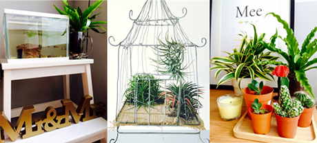
They consciously infused their living space with personal touches like favourite artworks, books, photographs, and memorabilia. Indoor plants, the couple’s new hobby, also dot the flat for added colour to rooms and counter tops.

To ensure a cohesive look for their home, Julian and Dawn were very disciplined when it came to selecting furniture. Anything that did not match the overall theme was a no-go, even if it looked great.

The use of wood and patterned tiles lend warmth to the study

New home, new hobby – indoor plants!

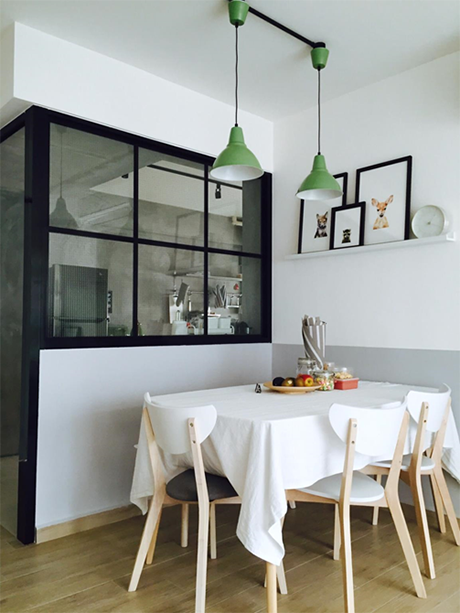
Since moving in in April 2015, the dining nook remains the couple’s favourite part of the home. With its hanging lights, photo frames, and light wood table set against black-framed kitchen doors, they have had friends and family remark that the area looks like part of a hipster café. They also let on that they have invested in a coffee machine, with the aroma of a freshly brewed cup adding to the café-like setting. Good food, good coffee, and good company – what is there not to love?

Hipster café right at home

Home Sweet Home

Julian and Dawn said that the journey from bare flat to home sweet home had been a challenging but fulfilling one. Besides sticking to a clear décor theme and choosing the right interior designer, they said a sense of humour is essential to keep the stress of home-building at bay.

Source: mynicehome.gov.sg
Sleek and Classic

Sleek and Classic

Jiamei and Winston had a clear idea of what their first home should look like – clean and modern, yet have a timeless appeal. So this young couple chose a mix of Scandinavian and Industrial themes to create a fusion look for their 4-room flat.

After collecting their keys to their home at Waterway Terraces I in Punggol, they engaged an ID to bring to life their ideas. As Winston works for a tile supplier, he was up to date with the design trends as well, and this helped them plan their interior design. In total, they spent about $40,000 on renovations.

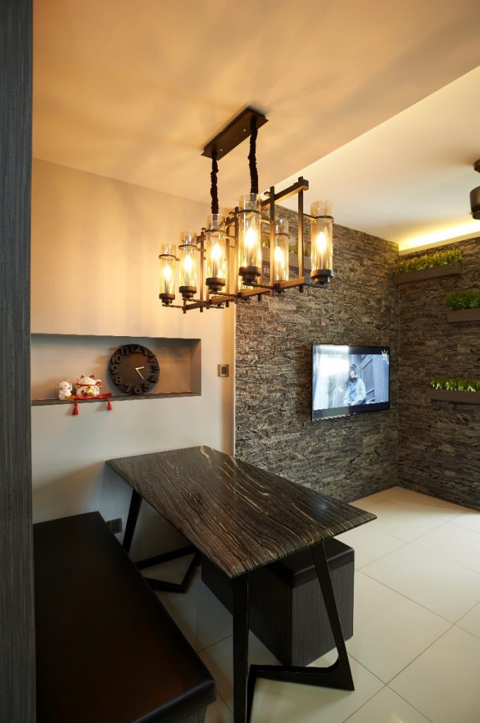
For their living room, the couple created a unique marble feature wall to give the area a classy finish. To soften the strong look, the couple added some ‘planter boxes’ and plants next to their TV console. The living room is also Winston’s favourite place in their home and where they unwind after a long day at work. Their dining area is a cosy space tucked in the living room and also doubles up as a family bonding space. The use of lights that look straight out of some medieval castle lends an interesting dimension to the place.

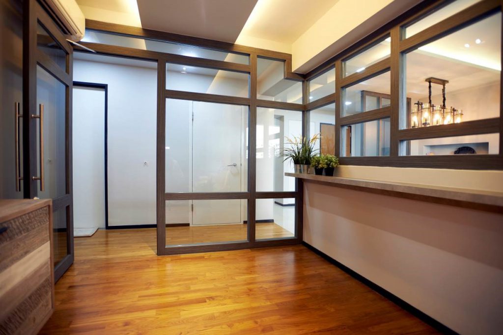
The couple removed a portion of their living room wall to create a study area that doubles up as play area for their bubbly daughter, Zerlinda. The dark wood frames in the study area complement the home’s overall colour palette.

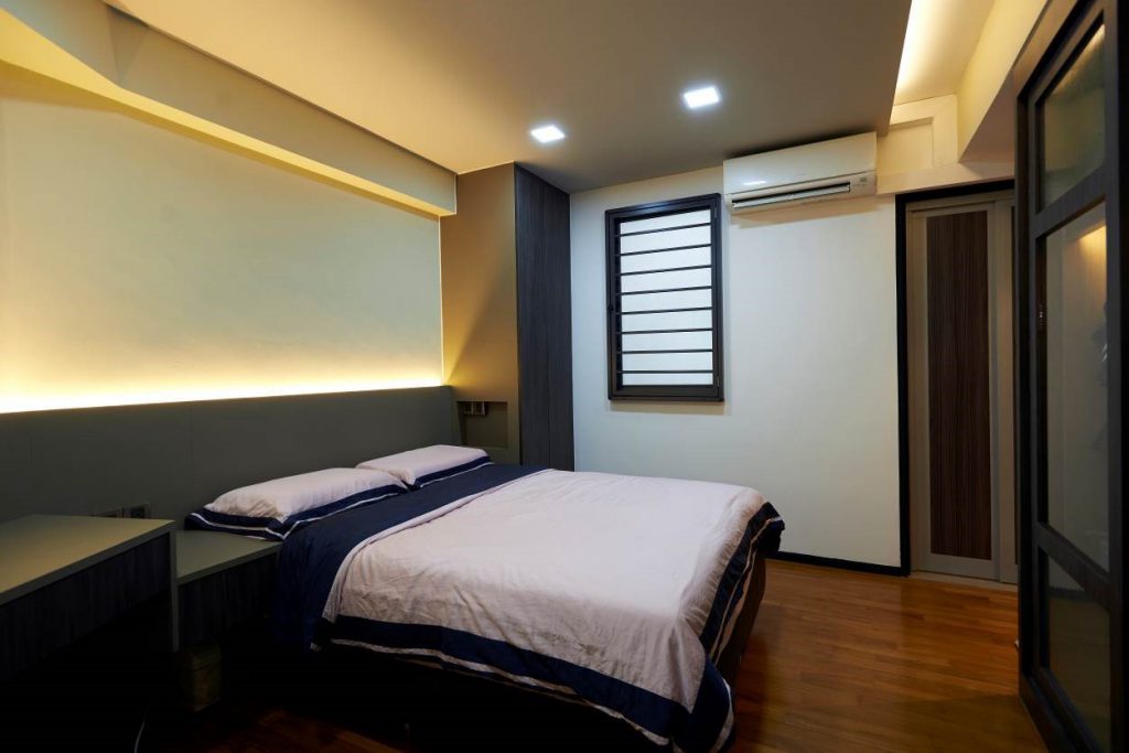
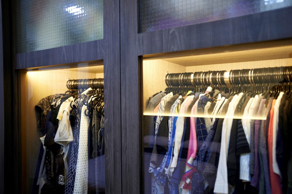
The wood theme continues in the master bedroom. The sleek wardrobe spans the length of the room with unique detailing. The frosted glass portion looks like the window panels of older HDB flats.

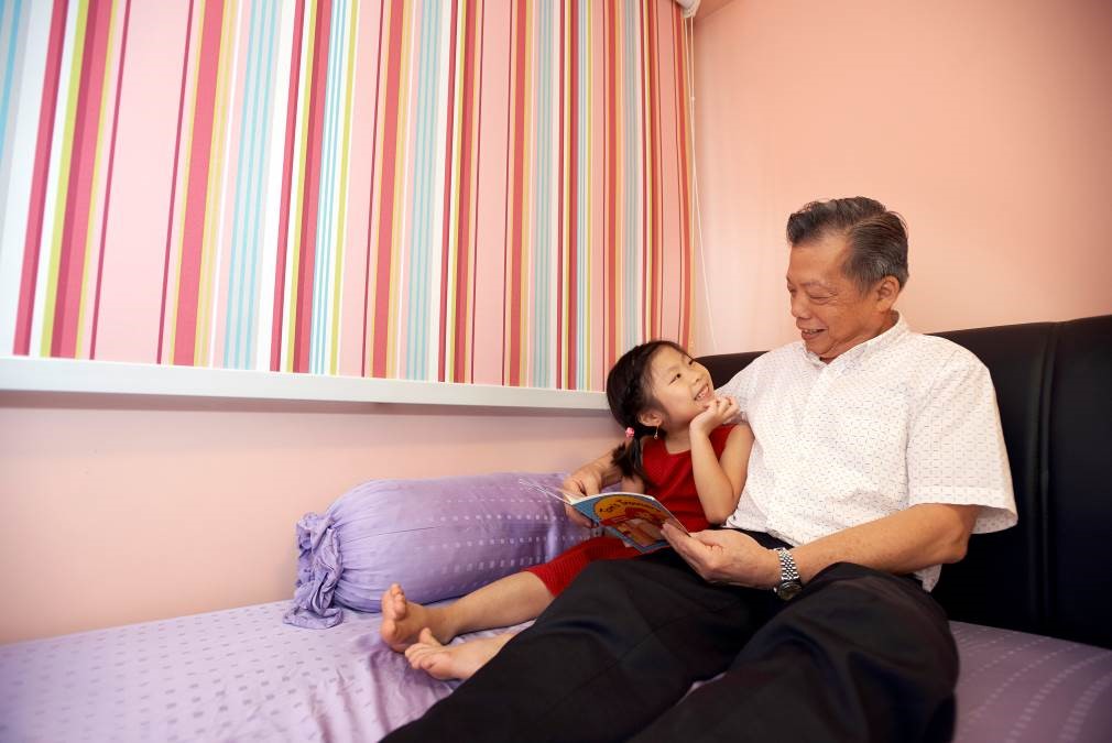
Zerlinda’s room is a fun mix of pink and purple, something which she picked out herself, shared Jiamei. The little one also loves to spend time playing with her grandfather in her room.

Jiamei and Winston added that they are happy that they made their home at Waterway Terraces I as their neighbours are great folks. It started with chats in a Whatsapp group, and now the friendship and bonds have grown stronger and, they have become close friends. Their neighbours even threw Jiamei a surprise on her birthday – almost 20 of them gathered at her home to celebrate the occasion. Their community of neighbours is always giving a helping hand to tend to sick neighbours even at 2am, buy breakfast at the market, and run simple errands for each other. Their children too, hang out to play or go swimming together.

“Before we got to know each other better, some of us planned to move out after satisfying the Minimum Occupation Period (MOP), but now no one is keen to do so as we have all become such good friends!” said Jiamei with a laugh.

Source: mynicehome.gov.sg
Doing It Right in Wood and White

Doing It Right in Wood and White

Step through the entryway of Yan Liang and Annabelle’s 4-room flat in Shunfu, and a spacious living and dining area comes right into view.

Inspired by simple Scandi aesthetics, the couple chose a cohesive mix of medium-tone wood finishes and white detailing across their furnishings. The result is an airy and welcoming abode that anyone would love to come home to.

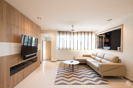
A chevron printed rug is a bold and stylish statement piece in the living room

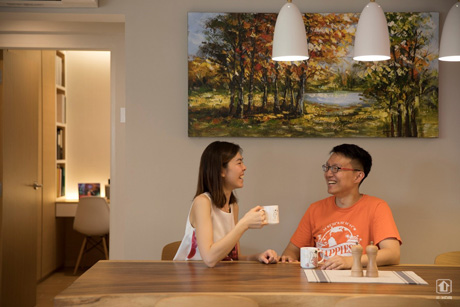
Their 6-seater dining table is perfect for small gatherings

“We plan to host friends and family often, so we made sure to have ample seating,” Yan Liang said. In addition, the couple designed a large and fully equipped kitchen within their home, as Annabelle loves to cook.

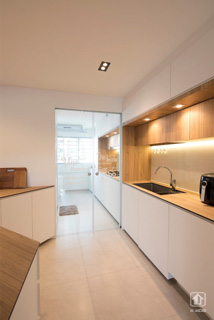
The kitchen is cleverly divided by glass sliding doors, which help to contain the smell of oil and grease from permeating the rest of the flat. Doing so creates a semi-open concept kitchen, and enables Yan Liang and Annabelle to entertain their guests while preparing drinks and snacks.

Glass sliding doors divide the stove and wash areas

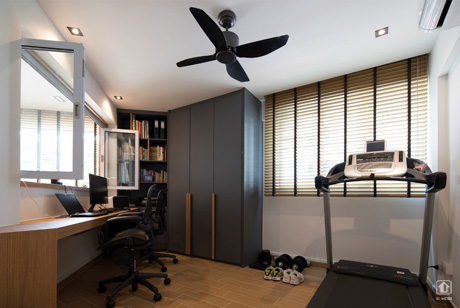
The living room features a wood-framed interior window that opens up into the study room and home gym. This design element ensures that the couple can interact constantly, even if Yan Liang is working in the study while Annabelle is busy in the kitchen.

Functional interior windows (on the left) let more light through

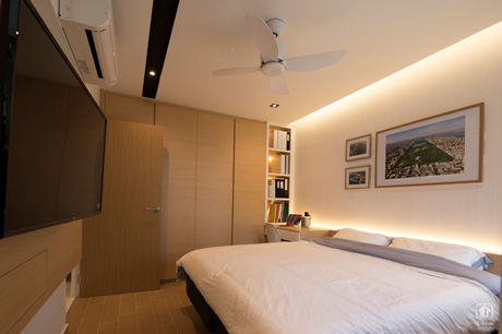
Framed photographs from Yan Liang and Annabelle’s travels adorn the master bedroom

Subtle details such as the white panelled wall in the master bedroom add texture and interest to the overall decor. The couple also opted for wood-look tiles for their flooring. “Compared to laminate wood flooring, these tiles are easier to clean and maintain over time,” Annabelle explained.

Like many home owners, Yan Liang and Annabelle did their research and checked out several interior design companies before picking one who had the best ideas for how to maximise their flat’s unique U-shaped layout. They spent around $80,000 for the entire renovation.

The couple shared that they enjoy living in the Shunfu estate, which is within walking distance to Marymount MRT station and Bishan-Ang Mo Kio Park. Residents have access to plenty of amenities nearby, including a hawker centre and supermarket.

Source: mynicehome.gov.sg
Scandinavian Simplicity

Scandinavian Simplicity

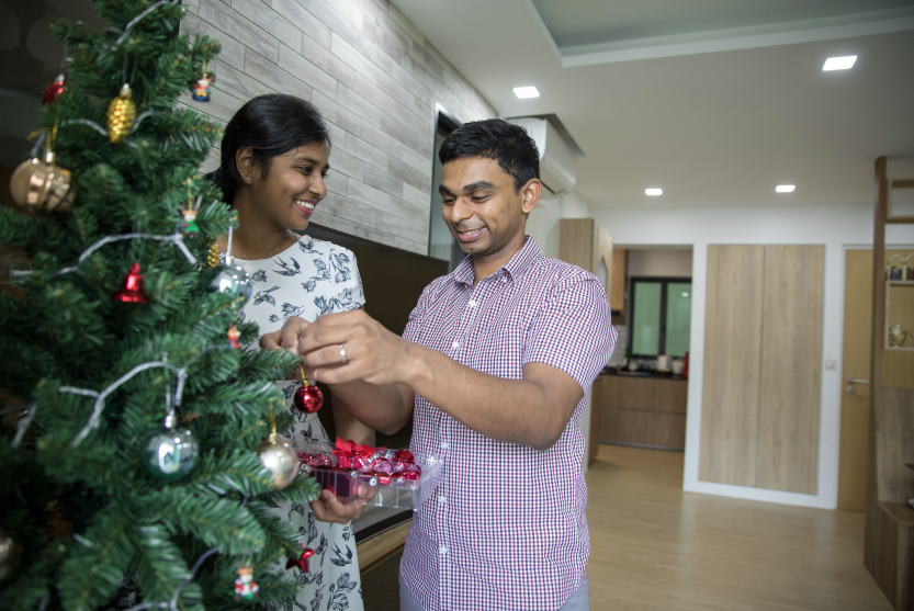
This 4-room flat at SkyVille @ Dawson checks all the right boxes when it comes to having an awesome, fuss-free home. And it was all done within a mere 2.5 months, making it possible for the happy couple to move in in December 2017, just in time for Christmas!
Physiotherapists with a busy schedule, they had the help of an Interior Designer (ID) to renovate their home. Knowing what they wanted made the work easier. “We both knew that we were going for a Scandinavian, natural, wood-elements-kind-of-look for the home – so that made things a lot easier,” said Rethinam.

Ingenious storage ideas

Since the couple wanted to ensure that they maximise the space as much as possible, their ID helped to point out which of their ideas might work better.

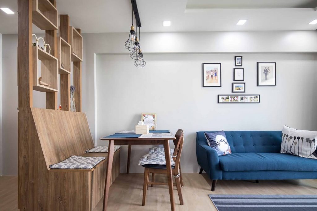
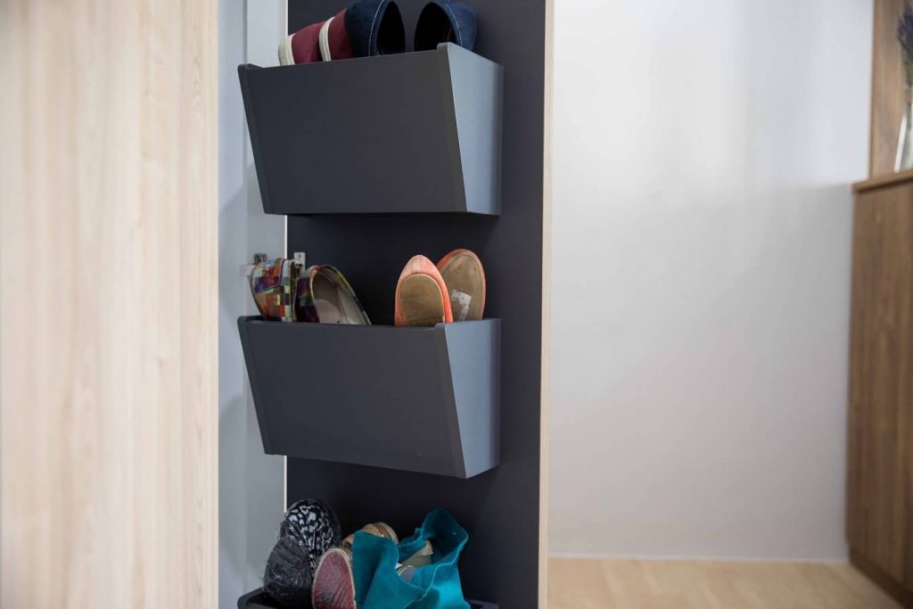
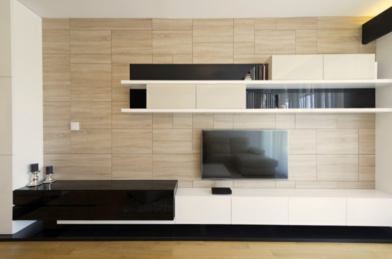
Putting their heads together, they succeeded in creating ingenious storage spaces, such as building shelves behind cupboard doors to store shoes, having the TV console share common wall space between 2 rooms, and replacing dining chairs with bench seats that double up as storage solutions.

Dining seats with storage to keep clutter away

Stow away the shoes neatly in shelves behind cupboard doors

Hiding the TV console by cutting it over to the next room is ingenious!

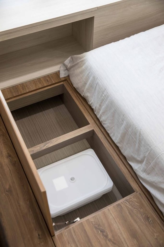
Storage solutions under the platform bed

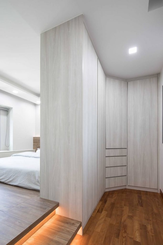
Walk-in wardrobe that acts as a partition to the bedroom

Personal touch

While Scandinavian is a preferred interior design theme these days, each home can look quite different with the personalised touch of their owners. For Rethinam and Alyssa, they have chosen to accessorise their home with keepsakes and photos of their holidays and their wedding too.

Cute keepsakes lending their personal touch to the decor

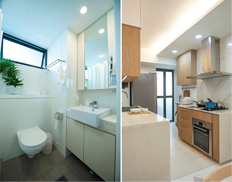
Neutrals in the bathroom to complement the rest of the home decor

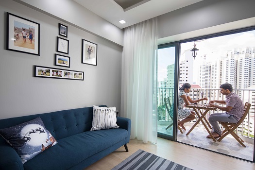
The balcony is a lovely place too, overlooking the rooftop of the car park and the precinct greenery below their block. “We love how we are surrounded by greenery in this neighbourhood,” said Alyssa.

Reno tips

The couple spent about $40,000 on the home renovations but their flat looks like a million bucks!

Unwinding and checking out the lush green views from their quaint balcony

If you are a new home owner planning on your renovations, why not check out these tips shared by Rethinam and Alyssa:

  1. Go through a few IDs’ portfolio and see whose style best meets your vision for your home.
  2. Take the time to meet some IDs and talk to them to see if you get along well.
  3. Let them know your requirements but discuss to see what is feasible.
  4. Have a budget for your renovations (which you can let your ID know) plus some buffer amount, as you might require the latter for some unplanned renovation works later.

Source: mynicehome.gov.sg