Search Results for: design ideas

A ‘Scandustrial’ Revolution

A ‘Scandustrial’ Revolution

With a theme inspired by a mix of Scandinavian and industrial styles (or ‘Scandustrial’, as it is increasingly being known as), Joshua and Giselle’s 5-room BTO flat in Punggol Emerald feels so much like a café that I would gladly hang out in!

The recently-married couple generously shared their design journey with me, and some insightful tips too.
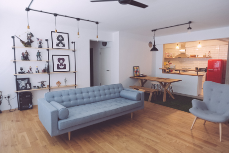
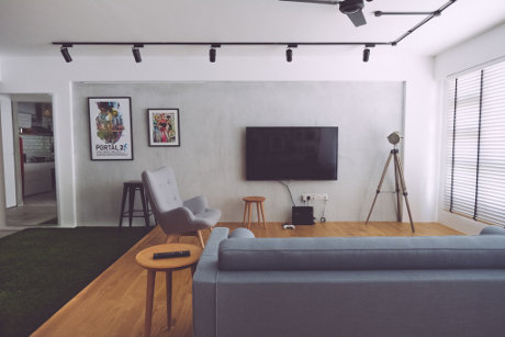
Different views of the ‘Scandustrial’ living room

Design with a Purpose

The couple had three guiding principles which helped to streamline their design choices:

1. Use natural materials whenever possible

2. Adopt an open concept

3. Create a unique yet practical living space

They designed the entire flat on their own, and engaged an interior designer to coordinate the renovation works, obtain the necessary renovation permits, and translate their ideas into the final design.

During the six months that Joshua and Giselle were drawing up the design plans, their inspiration stemmed from everywhere – furniture stores, magazines, online references, and especially eateries that had similar interiors to the couple’s chosen themes. Even Joshua’s mother chipped in with design ideas and practical suggestions!

Going Au Naturel

To recreate an outdoorsy dining experience, the couple got a dining table and bench which had been fashioned from the cross section of a tree trunk. An artificial grass carpet below the table helped to complete the alfresco setting.

They picked solid oak flooring over vinyl and laminate, which made a difference in creating the right aesthetics. The couple also creatively embraced the use of wood by creating shelves out of planks, and exposing plywood edges in the carpentry.
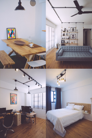
The wooden textures throughout the house add to the clean, Scandinavian look

Attention to Detail

Although the home is fitted out with energy-saving LED light bulbs, Joshua installed some incandescent lamps for decorative purposes. Gorgeous hand-painted tiles line the passageway to the bedrooms, evoking a slightly vintage vibe.
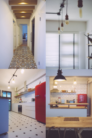
Delicious details around the home that add up to the big picture

Food for Thought

Joshua revealed that choosing the furniture was probably the hardest part of the design journey. Factors like the material, size, and colour of each piece had to be carefully considered before making a purchase. As he considered the couch to be the centrepiece of his home, it took the couple several trips to various furniture shops before they settled on the current one.

The couple also learnt some things the hard way. For example, some furniture pieces were delivered before the renovation was finished, and the workers had to keep moving them around the house in order not to damage them. So, here’s a note of advice – complete the bulk of your renovations before bringing in your furniture!

Home Sweet Home

Meet Giselle and Joshua, the awesome couple behind this ‘Scandustrial’ home

I’m truly inspired by Joshua and Giselle’s hands-on approach in designing their own home, cleverly combining the use of space, materials, and details to transform their HDB flat into such a beautiful home, and creating a unique space they can truly call their own.

Source: mynicehome.gov.sg

Back to Basics

Back to Basics

At Home with Jane and Davier

Stepping into this 5-room flat located in Tampines, gives you a sense of calmness – maybe it’s the white walls, or the earthy tones. This Scandinavian and minimalistic decor makes Jane and Davier’s home a cosy haven tucked away in the eastern part of the island.

Love for All Things Simple

“We were quite clear from the start on how our dream home should look like,” said Jane. “It definitely helped that both of us had similar tastes in furnishing our new flat,” added Davier. Having collected their keys in 2015, the couple shared their quick and interesting transformation of their BTO flat. “We started renovations in October last year and we were quitekiasu– checking the progress of our renovations almost daily. It was rather cool to witness the bare flat morph into our ideal home in just a few months!”

Making plaster look like a brick wall feature can save some money

Neutral tones never go out of fashion

Bomb shelter door cum photo wall

Getting Into the Design

Even before getting their keys, the design-savvy couple started planning the look of their new home by Pinterest-ing minimalistic interior design ideas. They also used Google SketchUp (it’s free!) to make their dream home come to live in 3D format so that they could play around with the space and plan the furniture.

Jane added that they did not want to have too many decor elements in their house, just simple evergreen ones that can be shifted around to instantly refresh the design.

Shelves with fuss-free and easily changeable decor pieces

The duo, who confess to being TV addicts, also put in a lot of time and effort to ensure that their living room turned out to be exactly as they envisioned it to be.So their dining table is just behind the sofa, and they hacked a wall off their kitchen so that they can interact or catch up on their favourite drama series while whipping up a meal.

Window seats let more guests lounge around the living room while multi-tasking as a storage option too

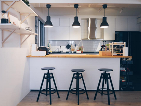
Open-kitchen concept – breakfast bar also doubles up as additional cooking or baking space

No Renovation Blues

Though the couple enjoyed shopping for the furniture (from picking out a wooden ceiling fan to complement theirau naturelhome, to finding the right dining table), they were happy to pass the bulk of the renovation planning to their trusted Interior Designer (ID).

Davier said that amidst their busy work schedules, they were thankful to have someone coordinate all the renovation works. The key is to do a lot of research and speak to IDs and contractors so that you can engage someone whom you are comfortable with, he shared.

Here are more shots for you to feast on Jane and Davier’s design ideas ?

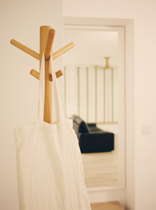
Creative use for a coat stand

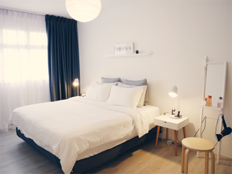
Small white side tables paired with a mirror stand for that minimalistic vibe

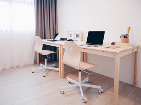
Wood, and more wood everywhere!

Adding a pop of colour and a local flavour to the home decor

Source: mynicehome.gov.sg

A Flat with Flexible Layout

A Flat with Flexible Layout

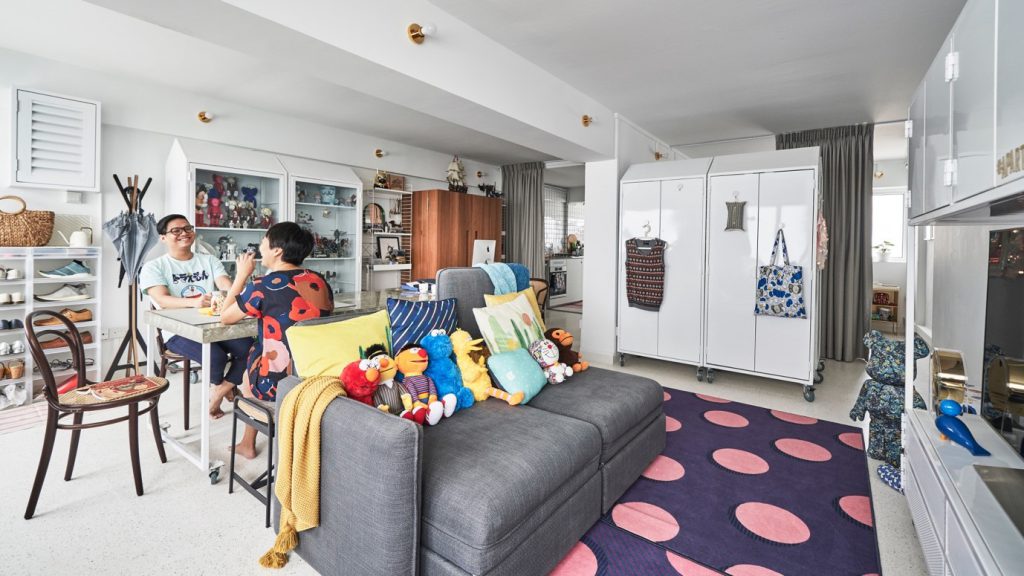
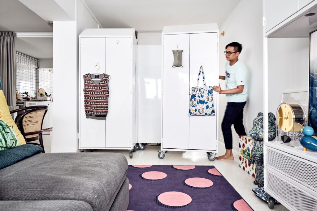
Betty and Marcus used mobile storage units so that they can reconfigure their 3-room flat layout easily!

Art directors Betty and Marcus purchased their 3-room resale flat after house-hunting for over a year. The couple wanted a location that offered a shorter commute to their workplaces, and were patient until they found the ideal flat that met their budget and needs.

Flexible Spaces

Betty was inspired by the design of retail spaces, where layout is often dynamic. “I wanted our home to have flexible space, which we can reconfigure as needed,” she shared.

The creative couple had many ideas for their home, and chose to engage an interior design studio to refine the concept for their home. “We wanted a neutral party who could mediate between us, if and when we had different design ideas!” Betty recalled with a laugh. Three-D Conceptwerke was their eventual choice, as they found the studio’s portfolio to be original and unconventional.

Having expected the interior designer to propose partitions and sliding doors, which will offer some degree of layout flexibility, Betty and Marcus were pleasantly surprised when he suggested customised mobile storage units instead.

These storage units took the place of all walls which were hacked. Made of lightweight steel, they are easily movable and enable the home owners to move and alter the layout at whim. “It’s effortless to switch them around when we feel like transforming our flat occasionally. It’s also convenient when we wish to make room for visiting friends who want to stay over for a couple of nights,” Betty said.

Customisation of the storage units, however, was an intricate process, involving detailed calculations to ensure that the units fit under the beams and even the block’s elevators when moving in.

Putting a Personal Touch

Another unique feature of Betty and Marcus’ flat is the extensive use of terrazzo tiles, which were sourced from Vietnam. They chose to use terrazzo for their flooring as it is a timeless material, while its subtle pattern of speckled colours add visual interest to the home.

“We spent around $80,000 on the renovation, but saved where we can, such as by buying our lighting fixtures online,” they shared.

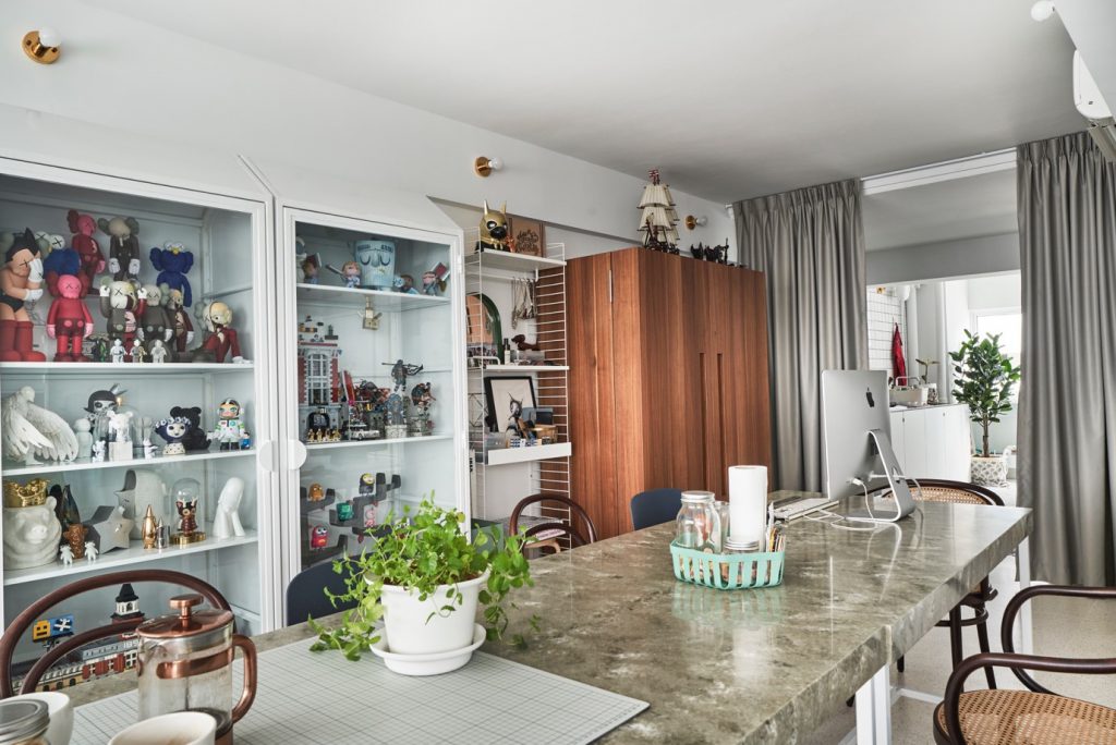
The couple also took time to furnish their home with pieces they love, and were not afraid to mix and match different materials and colours. The marble-look dining table doubles up as a workspace, and is complemented by Made & Make rattan chairs and a metal dining bench from JotterGoods.

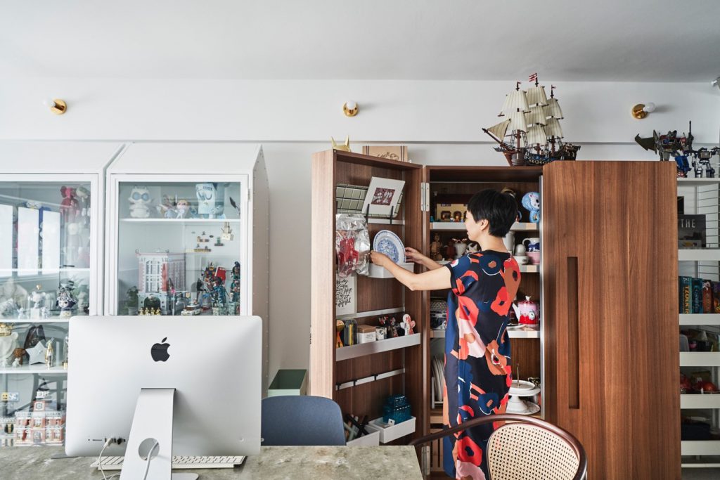
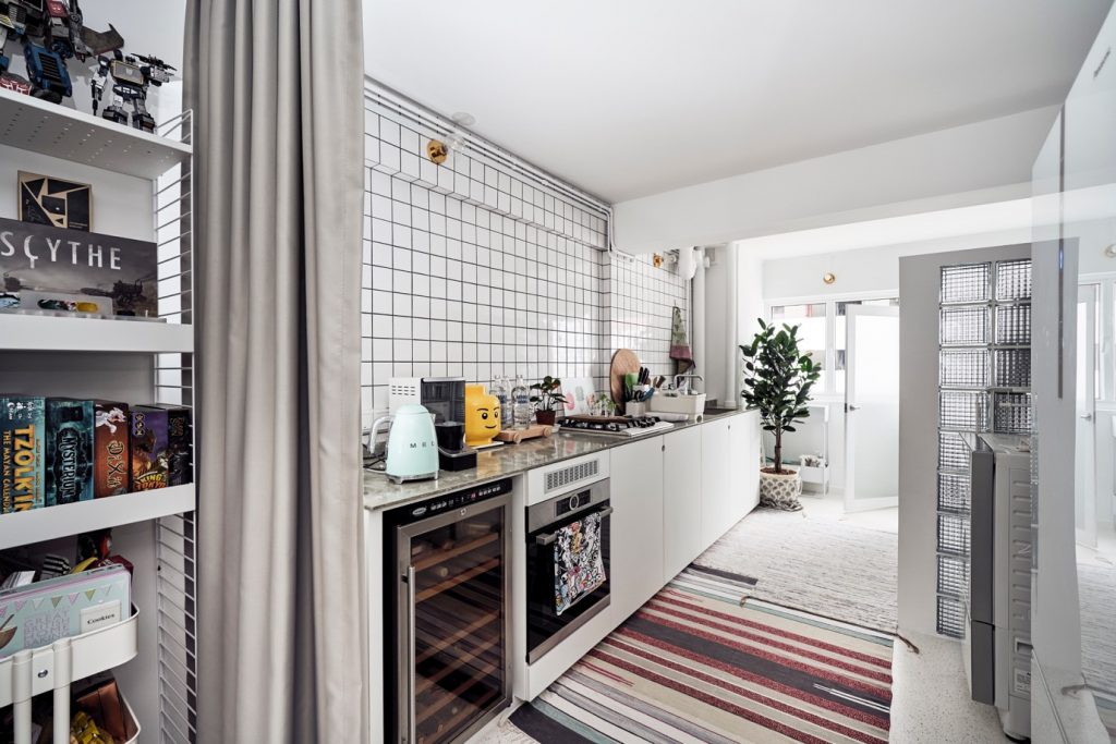
Leading into the kitchen is Betty’s prized possession, a Bulthaup cabinet crafted from wood. With doors that can fully open up to show all the contents in clear view, the well-designed piece offers maximum storage capacity while taking up minimal space. The rich colour of the wood also goes well with the white painted frames of the steel storage units.

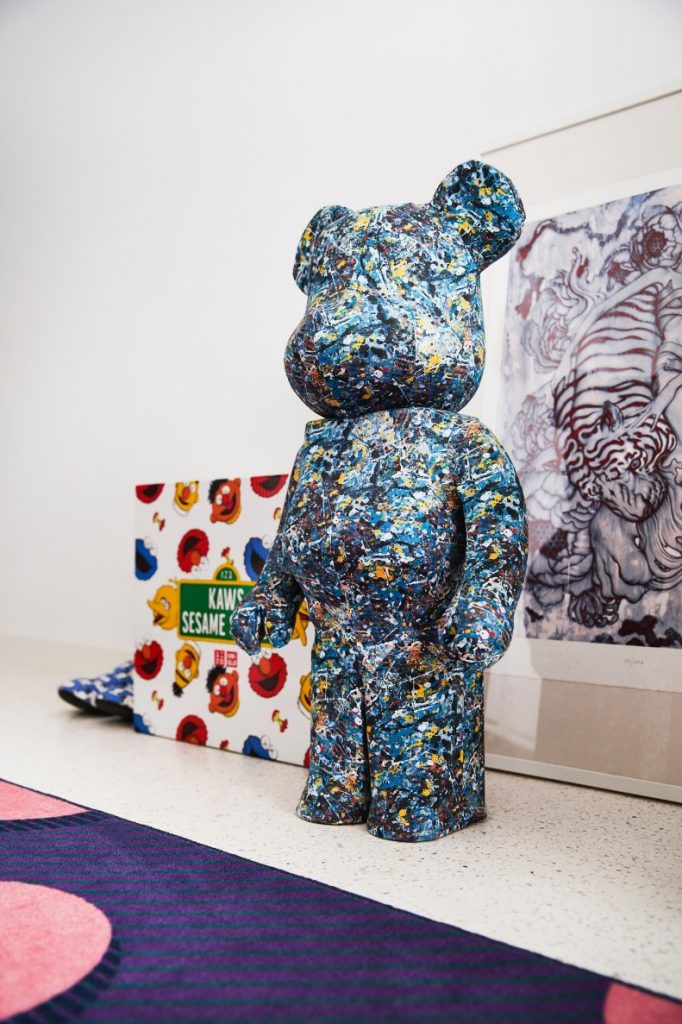
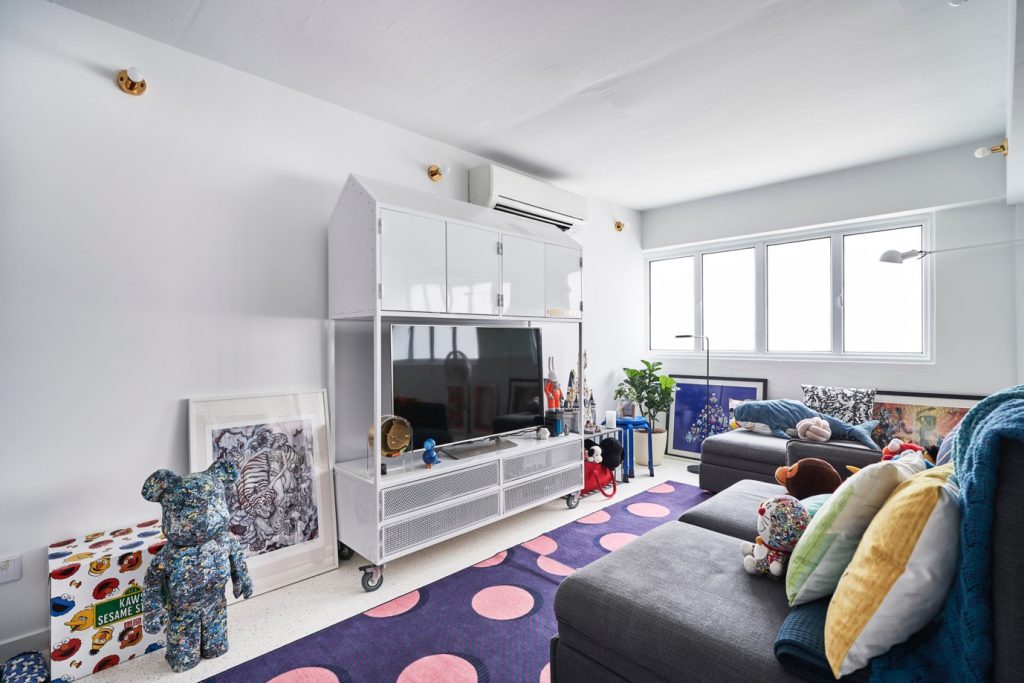
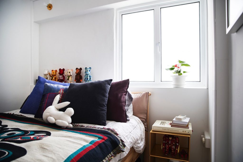
Completing the personal touch are displays of Betty’s homeware collection, Marcus’ KAWS toys, and souvenirs from their travels.


Source: mynicehome.gov.sg
A Touch of Peranakan

A Touch of Peranakan

Christopher knew that the 5-room resale flat in Pasir Ris was The One, the moment he saw it. “My mother and I had viewed 10 properties before falling in love with this unit,” he said.

Having grown up and lived in the east side of Singaporefor allhis life, Pasir Ris was an ideal town for Christopher with its laidback vibes and peaceful surroundings. On top of the lovely view, the flat offered him the chance to design his home the way he wanted.

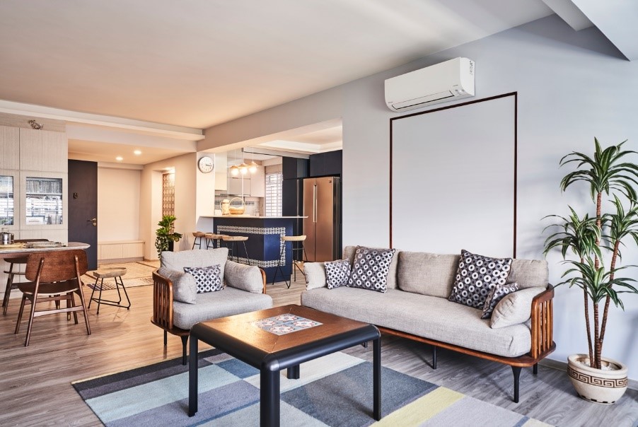
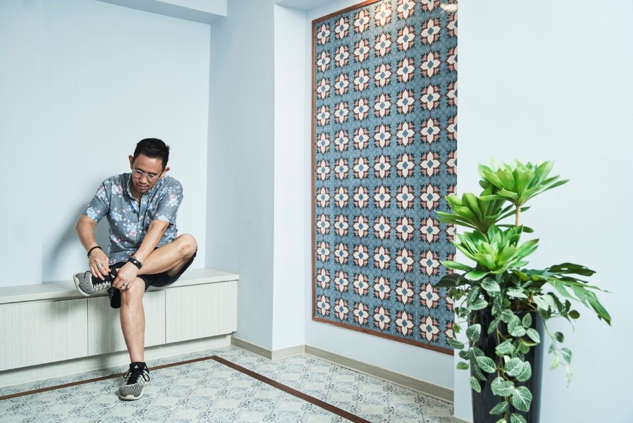
Christopher worked closely with his interior designer, Dan,to develop the design ideas and carry out the renovation works. To complement a soothing palette of greys and blues,subtle patterns were incorporatedin the décor for visual interest. One example is thestunning feature wall of Peranakan tiles at the entryway, as a nod to Christopher’sheritage.

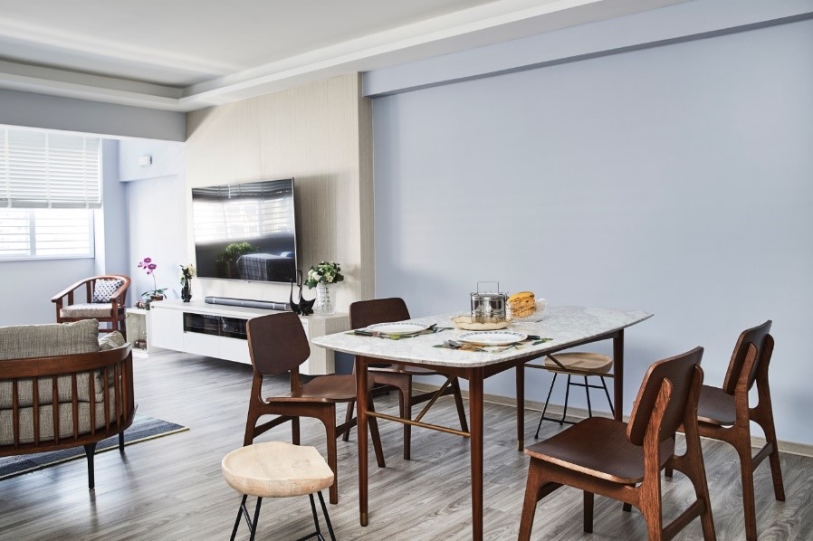
In planning the layout of the flat, Christopher considered how the space could meet his lifestyle needs. “As I had little use for a balcony, I chose to expand the living room instead,” he explained. The change made room for ample seating and dining space, which is especially useful when he has friends over.

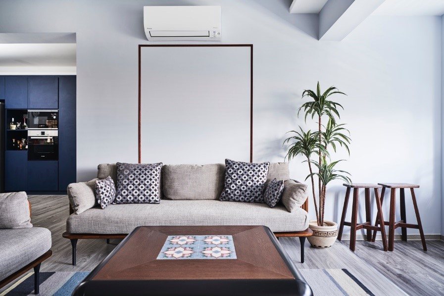
While Christopher purchased most of his furniture from Castlery and IKEA, he also has unusual pieces in his home, such as a customised coffee table with a Peranakan tile pattern that complements the overall interior design concept.

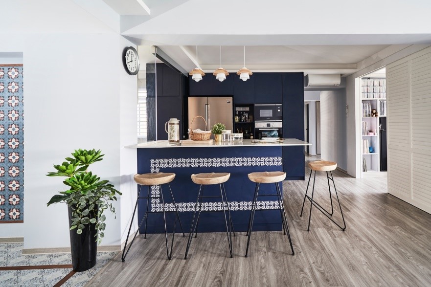
Christopher and his mother do a lot of cooking at home, so he remodelled the kitchen into one with both wet and dry areas that are separated by glass doors to keep the cooking fumes out. The open concept kitchen features a dark blue island with a unique motif, which also doubles up as a casual breakfast bar.

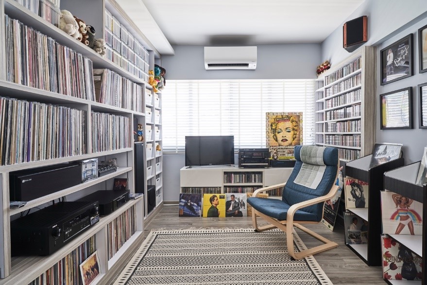
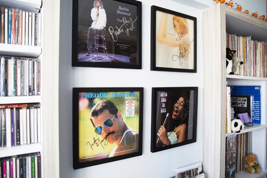
An avid vinyl record collector, Christopher transformed one of the bedrooms into a music room. Besides full-height shelves to display his extensive, prized collection, the room is decked out in framed signed vinyls and other toy memorabilia. “It is a favourite spot for me to sit back and unwind while listening to music,” Christopher said.


Source: mynicehome.gov.sg

Living the Artist’s Dream

Living the Artist’s Dream

Stepping inside the five-room flat, one can’t help but marvel at the amalgamation of colours and textures. “I didn’t have a specific theme when I was designing the house because I couldn’t choose between them,” Grace laughed. “But I do know that I love to be stimulated by visual elements, so my home is really colourful.”

From deciding on the colour palette to picking out the furniture to painting the walls, Grace had put the house together from scratch. “My husband is really easy-going, so he leaves the décor to me,” she grinned.

Located in Bukit Batok, the flat is a stone throw’s away from the MRT station and amenities such as hawker centres and polyclinics –  one of the primary reasons why she fell in love with the neighbourhood. “We got pretty lucky when purchasing our flat,” Grace shared and continued, “We opted for the Sale of Balance flats in Bukit Batok and had only two units in our block to choose from – one unit was booked on the flat selection day but we’re still very pleased with our unit.”

In addition to using more than 10 colours on the walls of her home, a variety of textures are found throughout the flat. “When browsing for home decor ideas, my main goal was to have an aesthetic space. This resulted in a carefully curated party of colours and textures that include glass, coarse stones, leather, metal and more!”

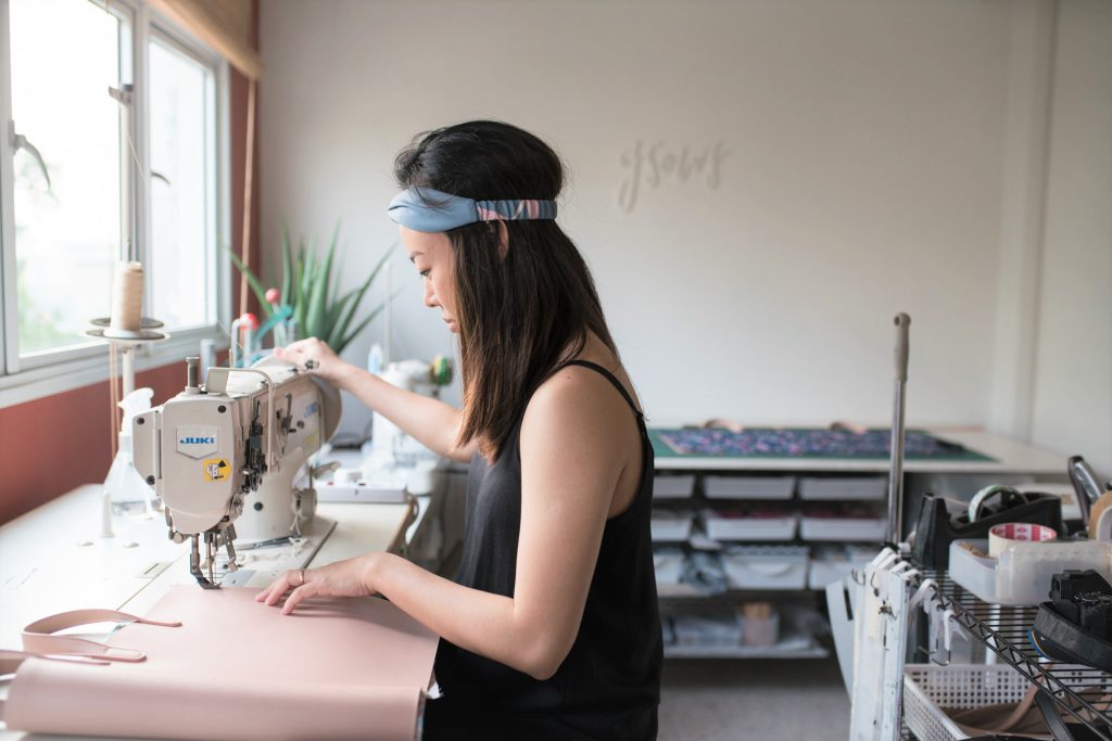
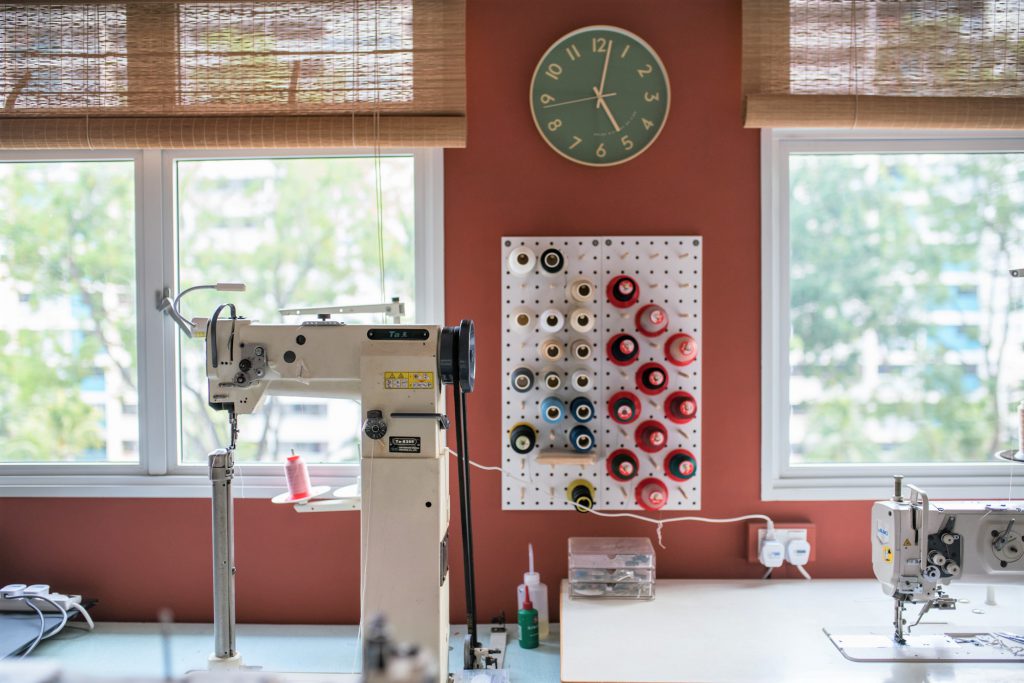
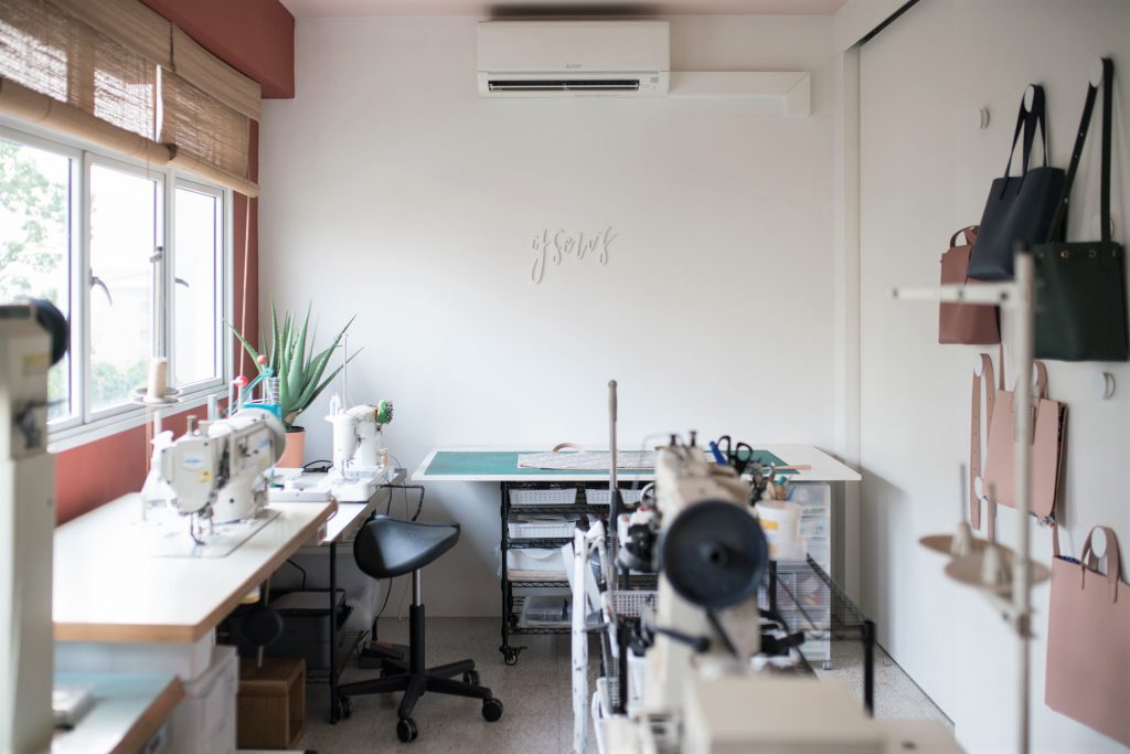
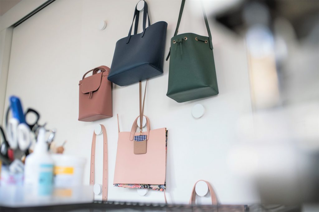
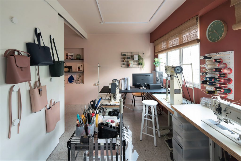
With sewing machines, materials and bags hanging off nearby racks, one can easily guess Grace’s line of work. The founder of GSEWS, a venture that specialises in customised bags, Grace was an architecture student at the National University of Singapore (NUS) when she uncovered her passion for sewing and in particular, bag making. 2 ½ years into the course, she made the life-changing decision of dropping her degree to pursue her passion.

“Honestly, the further I was into the course, the more I thought I was not suited to be an architect,” Grace said. “I was making and selling bags while in school, and it dawned on me that I am more of a craft maker than building designer. That was when I decided to make the switch.”

Considering the importance of her home workstation, Grace was extra meticulous when designing the space. “Having the option to hack the partition walls was very helpful as it resulted in a wide rectangular area that gave us ample layout possibilities,” Grace smiles.

“The workspace also features the only white walls in the house as I use them as the backdrop for product photoshoots.”

Putting the Pinterest-worthy home together however, did come with its fair share of challenges. Every piece of furniture complemented the overall aesthetic, something Grace was particularly mindful of. “Our renovation budget was tight and my design ideas such as the fluted glass sliding toilet door and marble kitchen wall were not easy to execute.”

“I had to look for cost-friendly alternatives like marble-printed tiles for the kitchen countertop that was more affordable than the regular quartz material, but with the same durability,” Grace explains.

“But I have to say that this made the renovation process more fulfilling. Take the glass sliding door for example – we had to source for the different components of the door (hinges, sliding track, rollers, glass, door handle, door lock) before assembling it ourselves. The process was rewarding as it helped widen my knowledge of materials and construction methods tremendously.” From the customised high table in the living room to the doorknobs, Grace’s home is a careful curation of both overseas and local furniture.

So what are some renovation tips Grace has for homeowners? “I find visualisation aids very useful, especially for those not intending to engage their interior designers or consultants. Personally, I recommend Home Design, an interior design mobile app that allowed me to visualise the furniture layout, wall colours and more to see what works and what doesn’t”, quips the homeowner.

She also shared that how, even after one and a half years, she’s still making tweaks to her home workspace. “The main objective is to keep it simple, neat and efficient for work,” Grace says. “I’d put a lot of thought into the placement of the sewing machines, tables and tools but I’m still constantly making changes in order to improve the workflow. For instance, in order to save on space, I’ve replaced a stand-alone clothes rack with knobs to hang my bags on.”

For aspiring home business owners looking to design their workspace, Grace highlights the importance of workflow visualisation. “Think about the space utilisation (especially if you’re working with many tools or constantly need to move around) before planning permanent fixtures such as storage spaces and doors. It’s helpful to keep your layout flexible with mobile shelves and tables as you’ll tend to move them around as you make adjustments to your workspace.”

Know of a gorgeous HDB home we should feature? Drop us an email at mynicehome@mailbox.hdb.gov.sg!

By Adeline Ang

Source: mynicehome.gov.sg
Home Tours: A Little Slice of Morocco

Home Tours: A Little Slice of Morocco

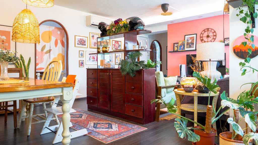
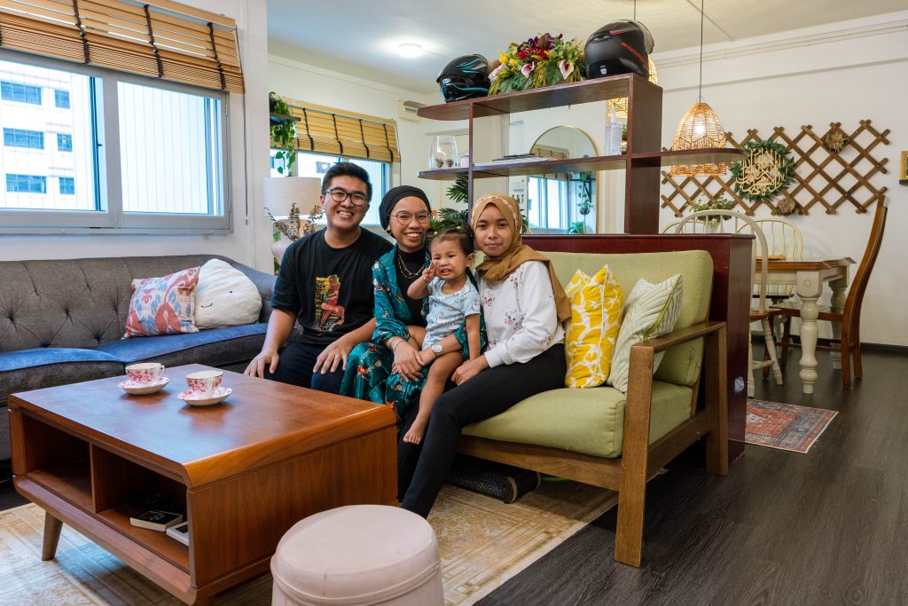
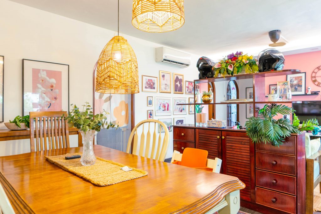
Decked in rich prints and patterns, the home of Syazana, Izat and their daughter Inaya is reminiscent of a Moroccan café.

The 4-room HDB flat is located in Woodlands, where both Syazana and Izat grew up. “We first met in secondary school– in fact, some of our dating spots are a few minutes walk away from our current home,” the couple laughs while reminiscing. “We are very familiar with the area, and also wanted to remain close to our family and friends. So when we saw this flat being offered during a Sales of Balance exercise, we decided to go for it!”

From left: Izat, Syazana, Inaya and Wati, their helper

Minimal Renovation Works

The couple engaged a contractor to only carry out basic works such as re-flooring, painting and tiling. Most of the flat’s carpentry works were also limited to the kitchen where only the cabinets and worktop are built-ins.

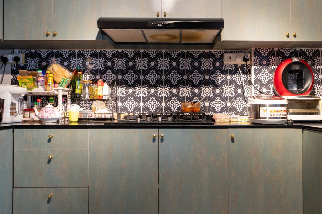
Instead of hacking and replacing the original backsplash tiles, Syazana used DIY tile stickers to give the kitchen a fresh look.

To add a dash of personality to the space, Syazana used DIY tile stickers for the kitchen backsplash

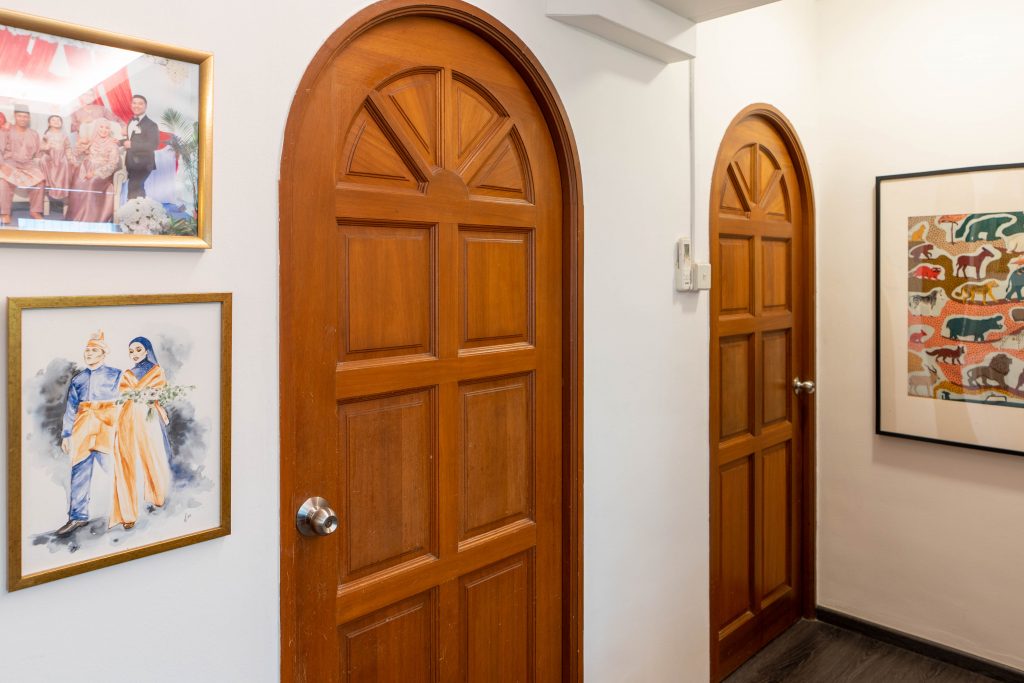
The unique wooden arc doors were also part of the original features of the flat

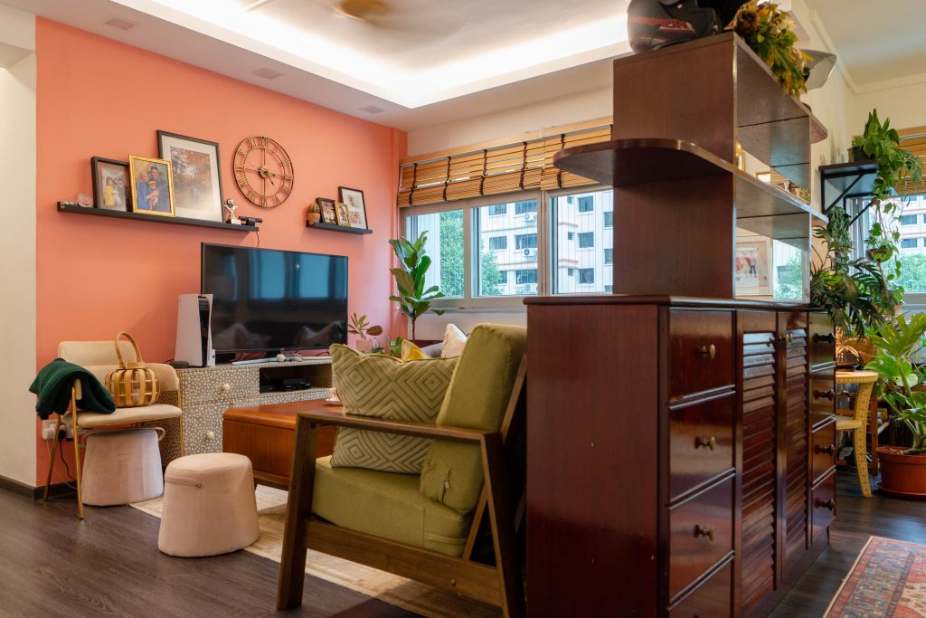
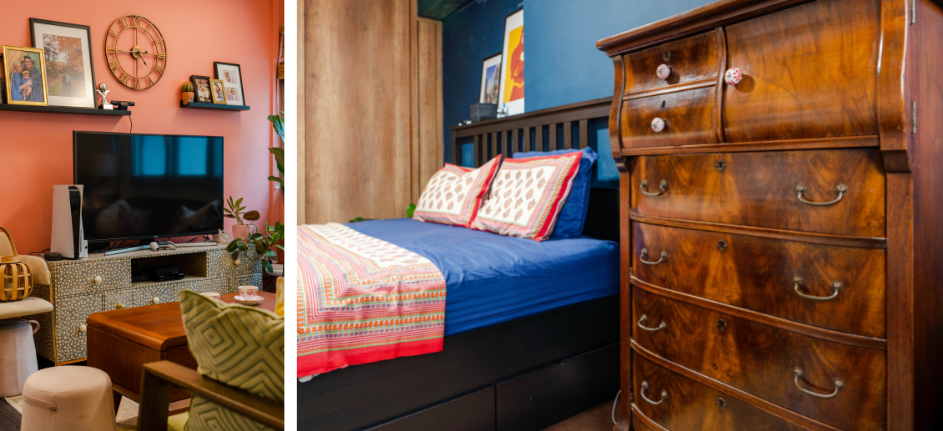
While the renovation works may be minimal, the results are anything but. For instance, when deciding on the paint colours, Izat shares how he wanted something unique. “I love pink and have always wanted to incorporate the colour in my home,” he grins. “What better way to do so than a centrepiece in the living room?”

Contrasting colours: the dark vinyl flooring further brings out the vibrancy of the strawberry-pink feature wall

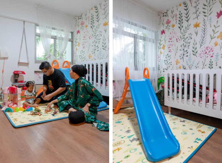
Inaya’s playroom, where a feature wallpaper brightens up the space.
 

Sustainable Home Styling

For Syazana and Izat, home styling is an ongoing process which explains why the look of their home only came together two years after moving in. Doing away with an interior theme also gave them the flexibility to include whatever caught their eye. The result is a synthesis of vibrant prints and textures, that complements the black, gold and wood accents.

While most home living centrepieces tend to be in the form of a sofa or TV console, Syazana and Izat’s home was designed around the dining table.

Starting from the dining table (left), the home owners began to incorporate more wood furnishings such as the sideboard, also a vintage piece (right)

“The dining table is from my childhood home,” Syazana shares. “We really like the texture and shade of the wood and decided to build the space around the table – the table also marked the beginning of our wood furnishing collection!”

From left: The bone in-lay TV console was previously displayed at the Peranakan Museum while the dressing table in the master bedroom is a vintage piece

Most of the furnishings and décor pieces are also sourced online. Not only are they more affordable, the couple says, purchasing items from different platforms provides them with greater choices. One of the home owners’ go-to platform is Carousell, an online marketplace for users to buy or sell new and pre-loved items. Some of the couple’s Carousell finds are the sofa and coffee table.

For home owners looking to purchase pre-loved items online, Syazana advises, “It’s important to ask questions – some of the mandatory ones include the existing condition and material of the item. For wood furniture, I’ll ask about the specific type of wood, to make sure I’m comfortable with the material.”

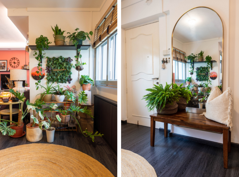
A Passion for Plants

As plant enthusiasts, it’s no surprise that Syazana and Izat’s home is decorated with a wide variety of plants. This includes the home owners first plant, the fiddle-leaf plant, snake plant and the more exotic venus flytrap.

The entryway has been partially repurposed into a plant corner

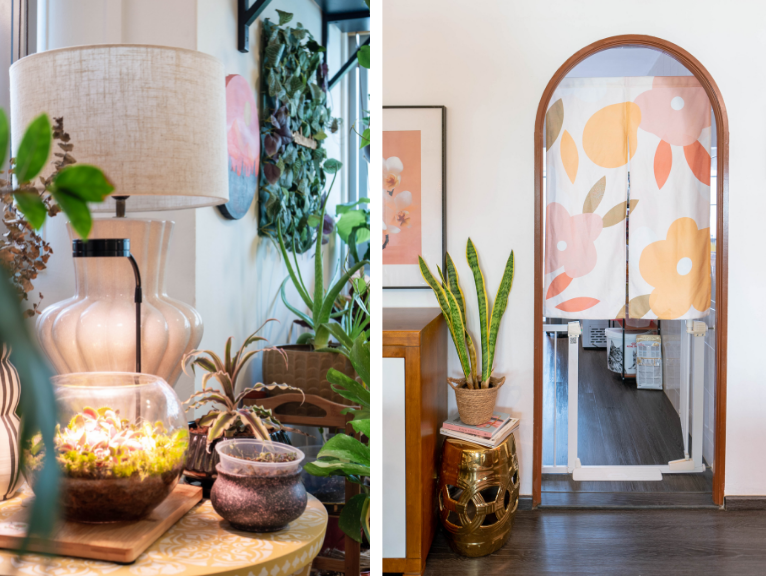
“Plants are great for adding colour and brightening the space. Home owners who are first-time plant parents can consider the snake plant – a hardy, low-maintenance variety that is also aesthetic,” the couple advises.

From left: Venus flytrap and snake plant

“But once you introduce a plant into your home, it can be difficult to stop at just one,” they laugh.

Uncover more design inspirations from Home Tours and Design Ideas.

Source: mynicehome.gov.sg
Home Tours: A Modern, Idyllic Paradise

Home Tours: A Modern, Idyllic Paradise

From the earthy colour palette to the breezy, sheer curtains that bathe the flat in natural light, it’s almost hard to believe that Joey and Huang Peng’s flat is located in Toa Payoh, and not in a more exotic locale by the beach.

Channeling Resort Vibes

It was love at first sight for the first-time home owners, who were drawn to the resale flat’s spacious and squarish layout. “When we were viewing the flat, we could already envision what our home would look like,” they recall.

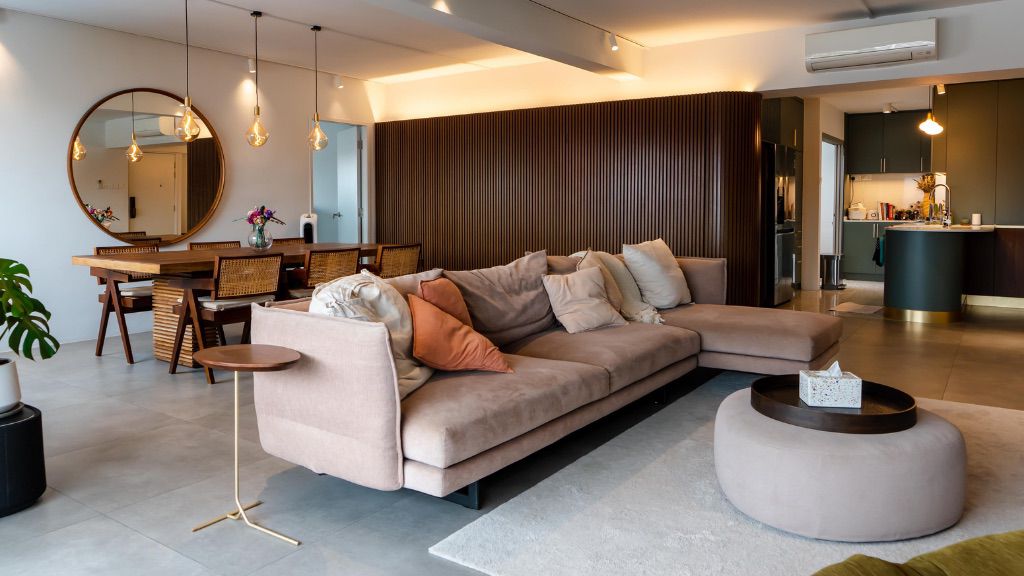
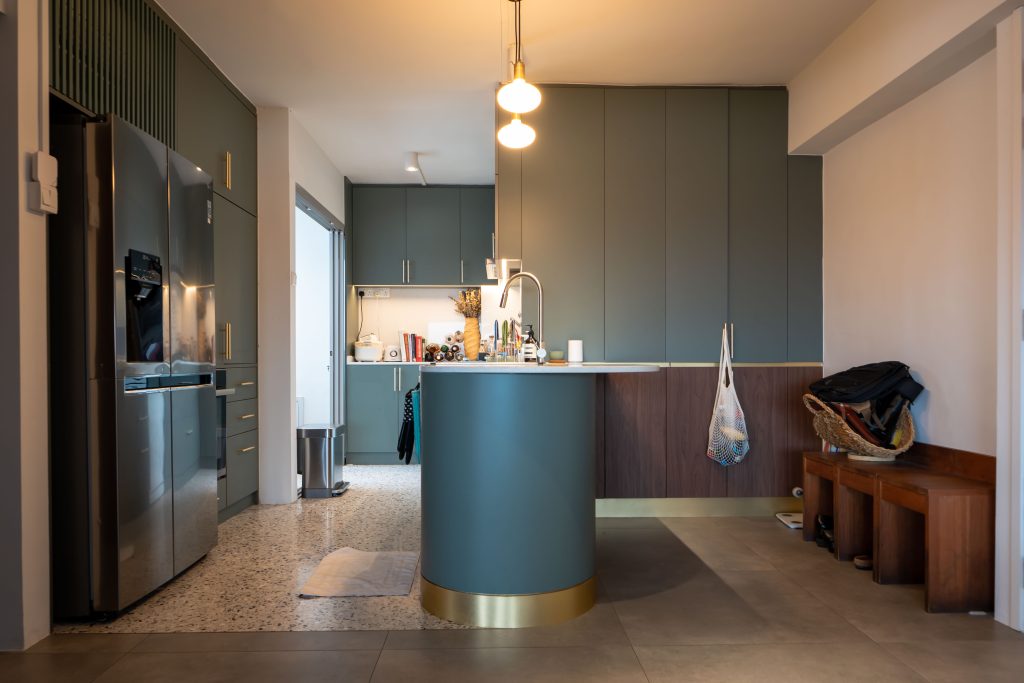
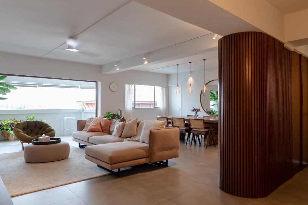
They combined the living and dining rooms, creating a villa-like open plan, and connected the open-concept kitchen seamlessly to this communal space. “The countertop is prep space and hangout spot all in one,” Joey says.

The rounded countertop offers a contemporary look

This layout creates a larger common space for hosting family and friends, and helps to keep the area cool through cross-ventilation, especially when the bi-fold balcony doors are open.

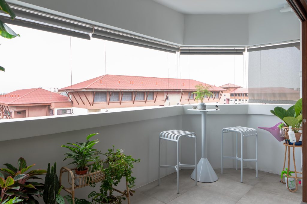
The balcony features a row of house plants, including an oversized banana tree that channels serious resort vibes. This cosy space is also furnished with a bar table and stools, where Joey and Huang Peng would occasionally spend their time unwinding after a long day.

The balcony is also designed as a green sanctuary

Blending Old and New

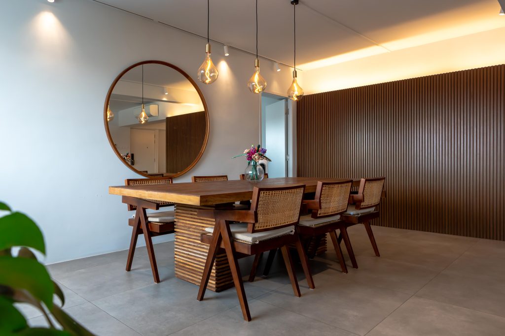
The balcony isn’t the only place to have a meal. Indoors, a dining set featuring rattan—a classic material enjoying a revival— adds a laidback charm to the home.

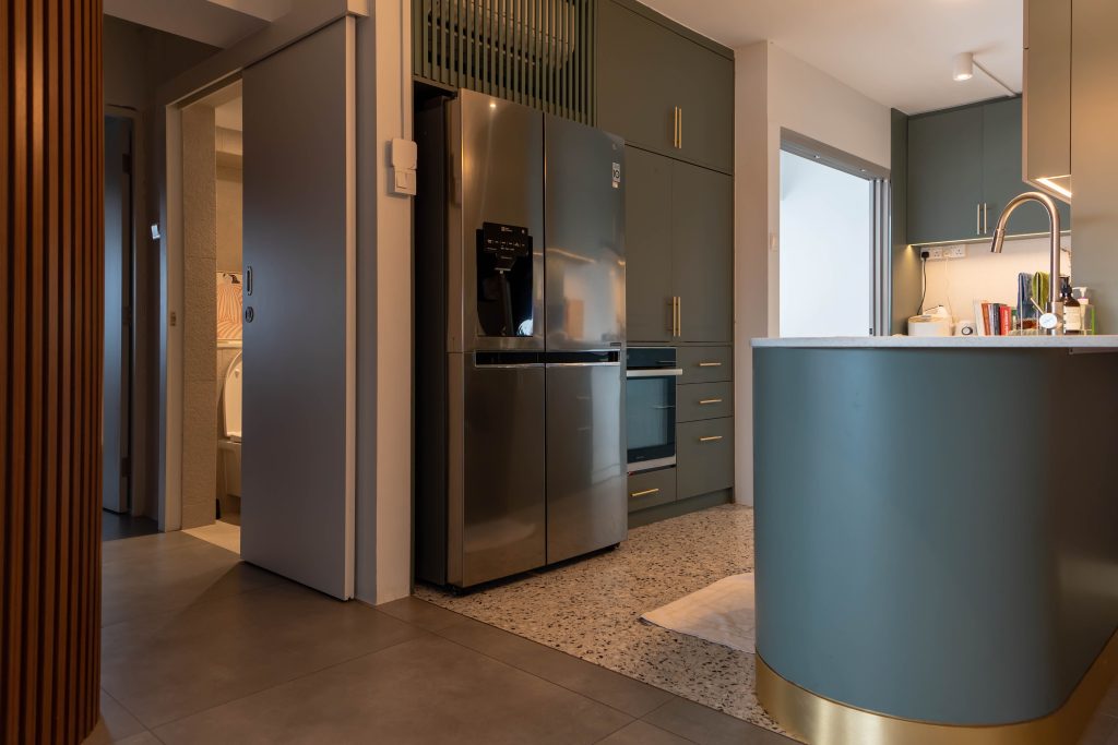
In the kitchen, terrazzo—another material making a comeback— feature in the floor tiles. Considering that the Huangs’ flat is 37-years-old, the heritage elements are a fitting nod to the ‘retro-ness’ of the flat.

The terrazzo tiles in the kitchen also serves as a space demarcation

“We embarked on our flat-buying journey knowing that we wanted a home for life, one that could accommodate our current lifestyle and grow with our needs,” they say. “Since we’re planning to make this flat our forever home, we made sure that the lease could cover us up to the age of 95.”

Place for Privacy and Rest

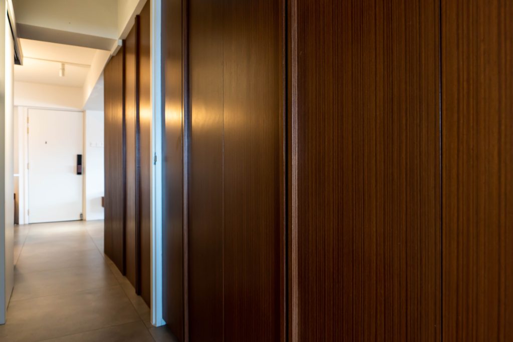
Their forever home is as aesthetically pleasing as it is functional. To carve out a little privacy in an open plan home, Joey and Huang Peng incorporated a partition wall, to demarcate the space between the bedrooms and common living area.


Beyond adding to the home’s aesthetics, the partition doubles up as a storage space

A combination of function and form, the partition doubles up as a storage space too. It is a statement piece – one of the interior design ideas suggested by the couple’s architect consultant.

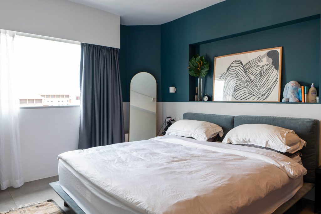
The private quarters of the home feel like a sanctuary. A darker shade of teal is used in the master bedroom to create a restful ambience, with the chic white sheets reminiscent of those in a resort. The bathroom sports a minimalist look, with grey subway tiles as its primary feature.

Soothing colours such as dark teal and greys are used to make the master bedroom a more conducive space for rest

When recalling the renovation process, the couple emphasises, “It’s important to invest in quality materials, especially for built-ins and fixtures that are going to last you a long time. We always believe in putting functionality first – an important consideration we think home owners should take into account.”

Embark on more Home Tours or discover more interior design ideas here.


Source: mynicehome.gov.sg
Home Tours: A Playful, Bohemian Home

Home Tours: A Playful, Bohemian Home

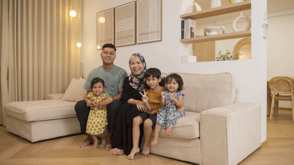
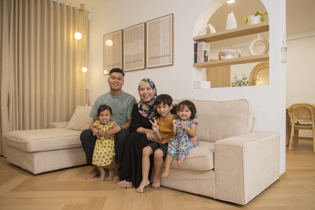
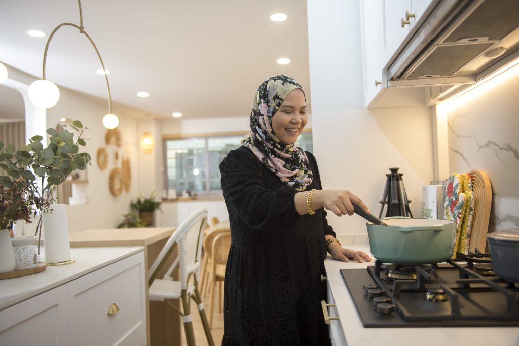
Full of colour, but with a hint of minimalism, Rina Raihana and Muhammed Fauzan’s home in Bukit Panjang is a representation of their individual styles.

“I wanted a colourful, playful space while Fauzan leans towards the Scandinavian aesthetic. So, we decided on a mainly white-and-wood theme that’s decorated with splashes of colours and playful elements,” Rina smiles. The 5-room flat is also adorned with wall paintings and rattan décor that add to its Bohemian charm.

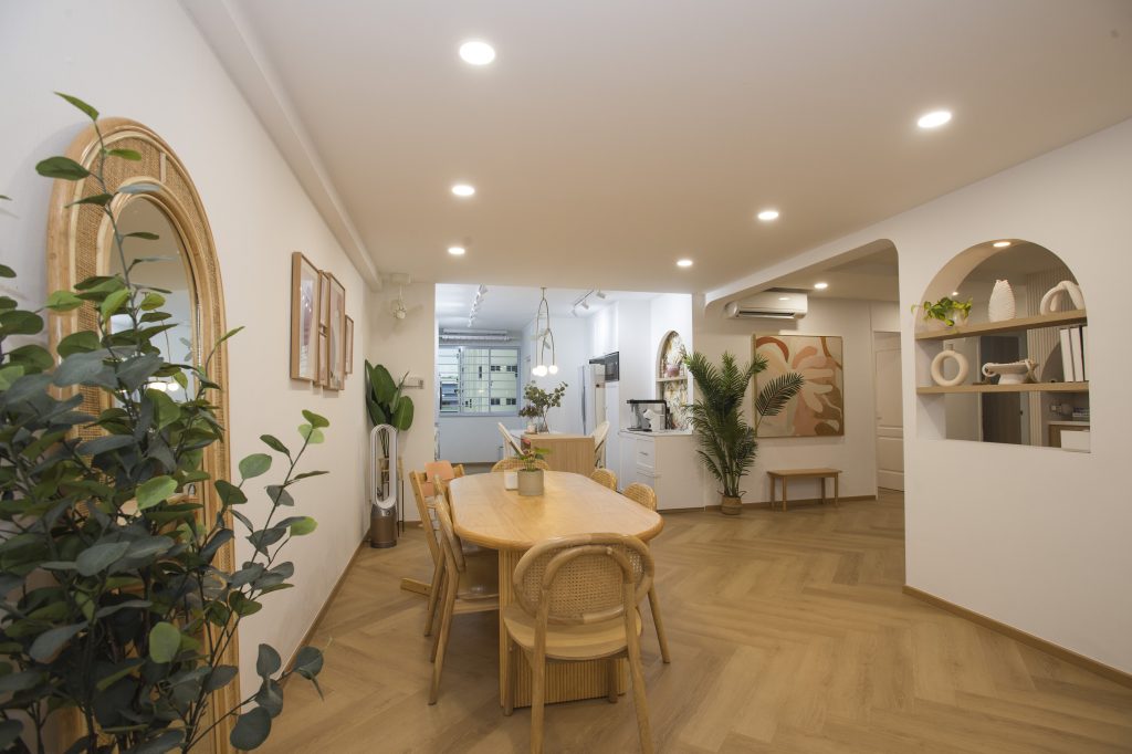
The dining room overlooks the kitchen in the open concept communal area

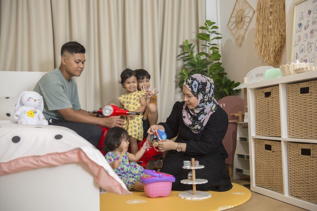
Fauzan, Rina and their three children

Mixing Shapes and Patterns

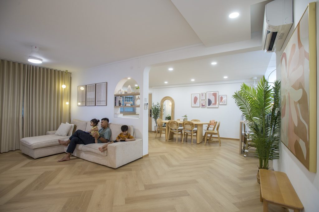
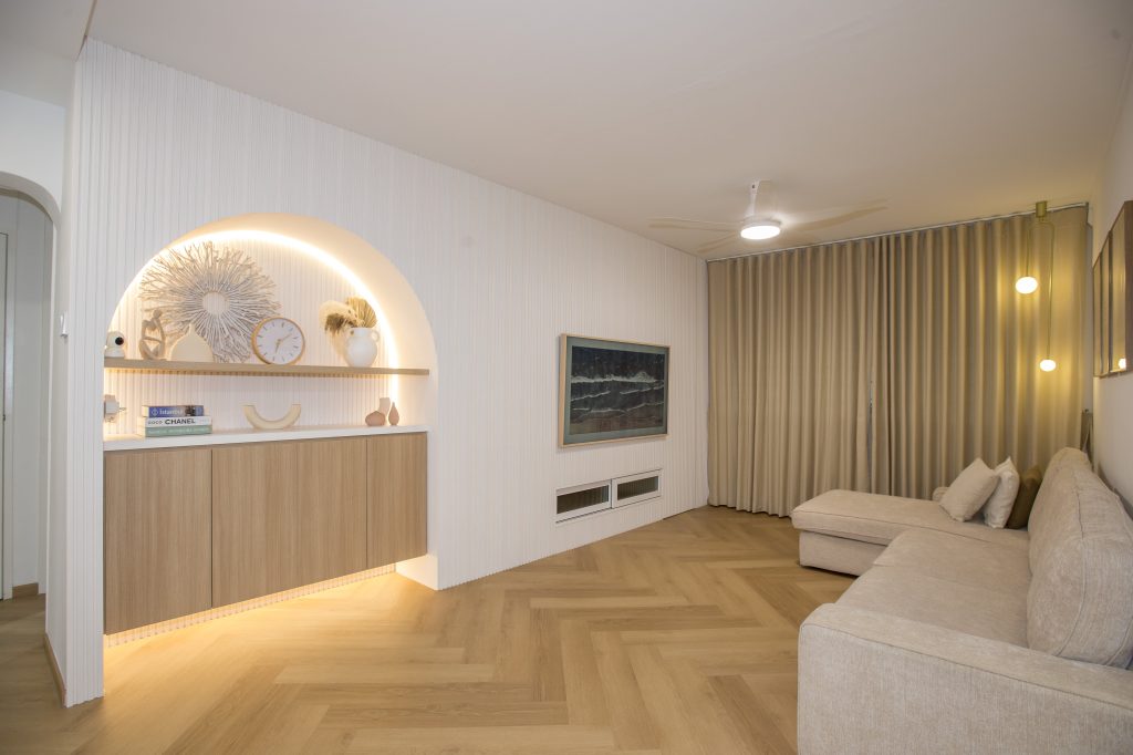
Rina and Fauzan, who are second-time home owners, worked together to achieve the shared vision for their home. In the open plan communal area, the walls and most of the décor items, are primarily white. The herringbone pattern is weaved into the flooring, creating a seamless flow between the living, dining and kitchen areas. These aspects of the design are attributed to Fauzan, who explains, “I’m a minimalist who prefers consistency and continuity.”

The herringbone floor that carries throughout the space ensures continuity and flow

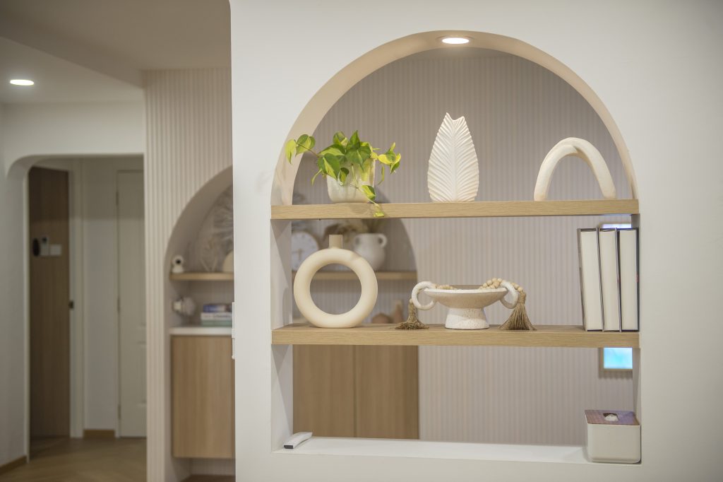
The home is far from monotonous, however, as the couple incorporated arches and colourful wall paintings for a playful touch – a result of Rina’s bubbly personality. “With their round edges, the arches also help to soften the overall look,” she says.

Colourful wall paintings and elements such as arches add a touch of playfulness

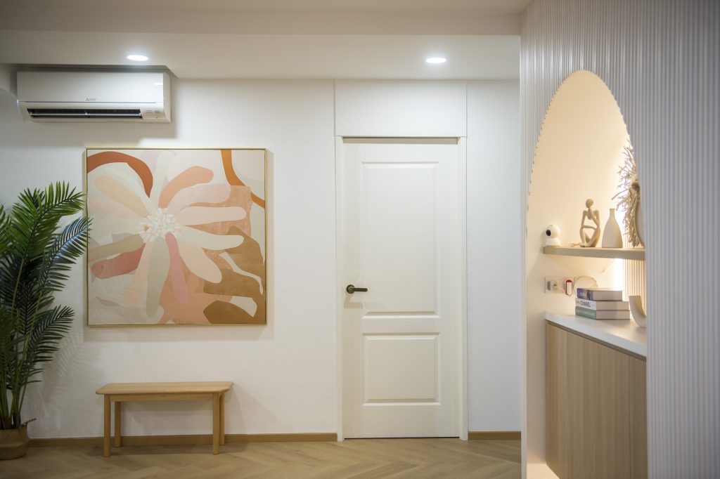
The decorative arch-in-the-wall located near the entryway is designed to make an impression

The main arch, designed as part of the feature wall, doubles up as a décor corner. Built-in cabinets maximise storage space.

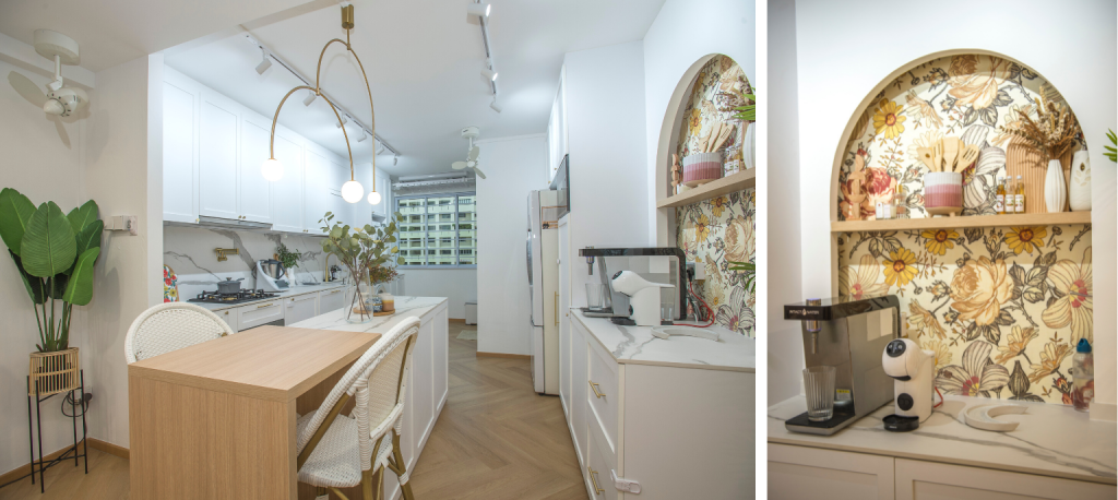
The arch is also present in the kitchen pantry, albeit in a different style. A vintage-inspired wallpaper is used as the backdrop, to add a pop of colour in the area. This complements the white rattan chairs at the kitchen island, where Rina does most of her cooking preparations.

“The extra countertop space comes in handy, especially because I cook often. The kitchen island is also perfect for us, as it doubles up as a hosting area whenever we have friends and family over,” Rina shares.

Rina’s favourite space in the house is the kitchen, where she spends time refining her culinary skills

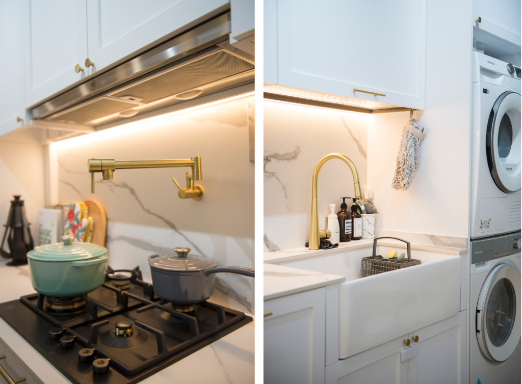
The kitchen sports a minimalist look with its matching marble backsplash and countertop. The rustic look of the shaker-style cabinets and farmhouse sink further ties the kitchen’s aesthetic back the rest of the communal area.

Bohemian with a touch of luxe: the kitchen features a marble backsplash, shaker-style cabinets and a farmhouse sink 

Playing with Colours

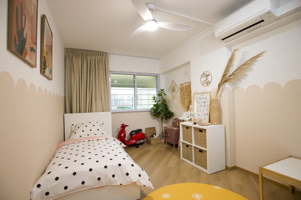
In the children’s bedrooms, colours are used to liven up the space. “We didn’t plan to use vibrant colours in the bedrooms initially. However, after receiving a yellow playmat as a gift, we thought the décor for the children’s bedrooms could be brighter, especially since the rooms are also their play area,” Rina says.

The scalloped walls, an alternative to conventional half walls, were hand-painted by Rina and Fauzan

The bedroom is also where the family spends quality time together

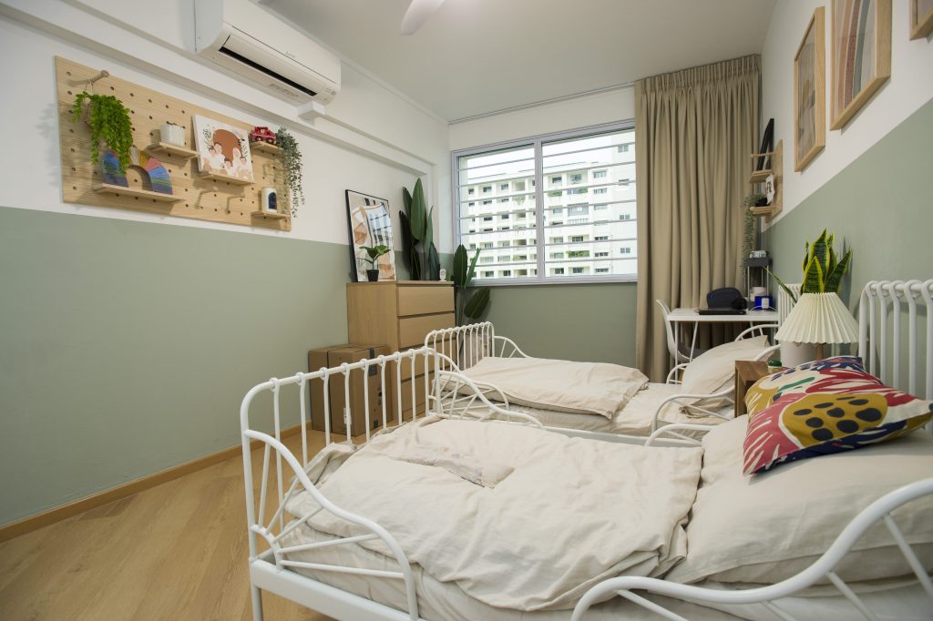
In the adjacent bedroom, the couple chose a refreshing sage colour for the walls. White, rustic-inspired bedframes add a cosy vibe to the bedroom.

The second  bedroom also sports a half-wall feature

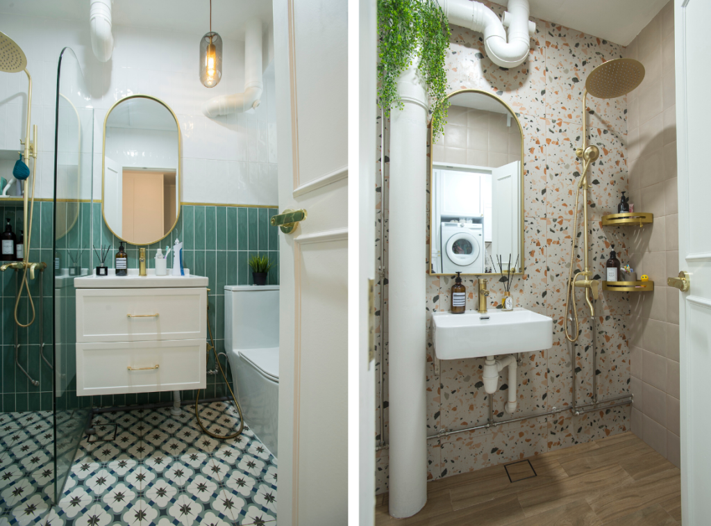
It is however, in the bathrooms where Rina’s vision for colourful spaces truly come to life. The common bathroom features a half-wall designed with green subway tiles paired with a mosaic-tile floor, while the ensuite bathroom stands out with a terrazzo wall and wood-inspired floor tiles. Both bathrooms are also adorned with gold fittings that further brighten up and add luxe to the intimate spaces.

It’s colours and patterns galore in both the common bathroom and ensuite

“I really unleashed my creativity in the bathrooms,” Rina laughs. “Since the bathrooms are more ‘hidden’, I could add more colours without them looking too contrasting to the rest of the flat.”

Get inspired with more Home Tours or check out Design Ideas for more interior reads.


Source: mynicehome.gov.sg
Home Tours: A Monochrome Greenhouse with Retro Influences

Home Tours: A Monochrome Greenhouse with Retro Influences

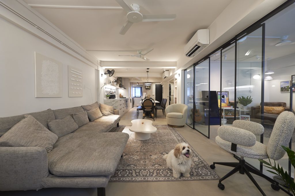
Drawn to the minimal and consistent look of a monochrome palette, Joanne Teo and Samuel Tan did up their home in shades of white, black and grey. The aesthetic is also inspired by the industrialist look, as seen from the concrete flooring and metal black accents that carry throughout the 3-room flat.

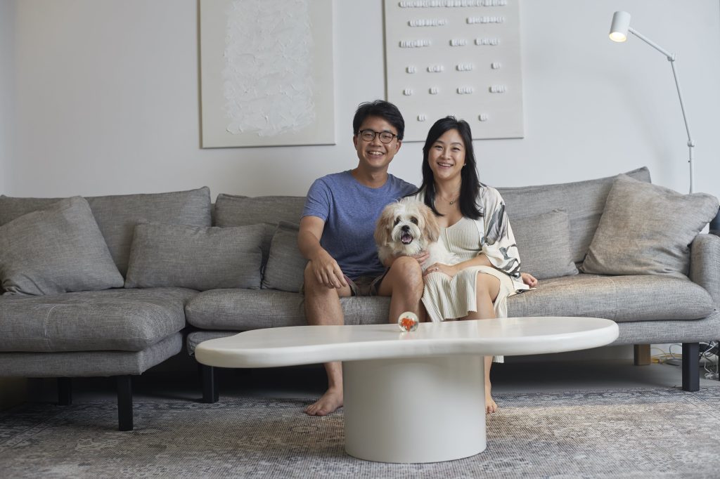
Home owners Samuel and Joanne, and their furkid Bam Bam

“We thought a monochromatic approach is the best way to achieve the modernist look we wanted,” the couple shares. “We also chose the colours for their versatility, as they can be complemented by most furnishings.”

Green and Sustainable Home Décor

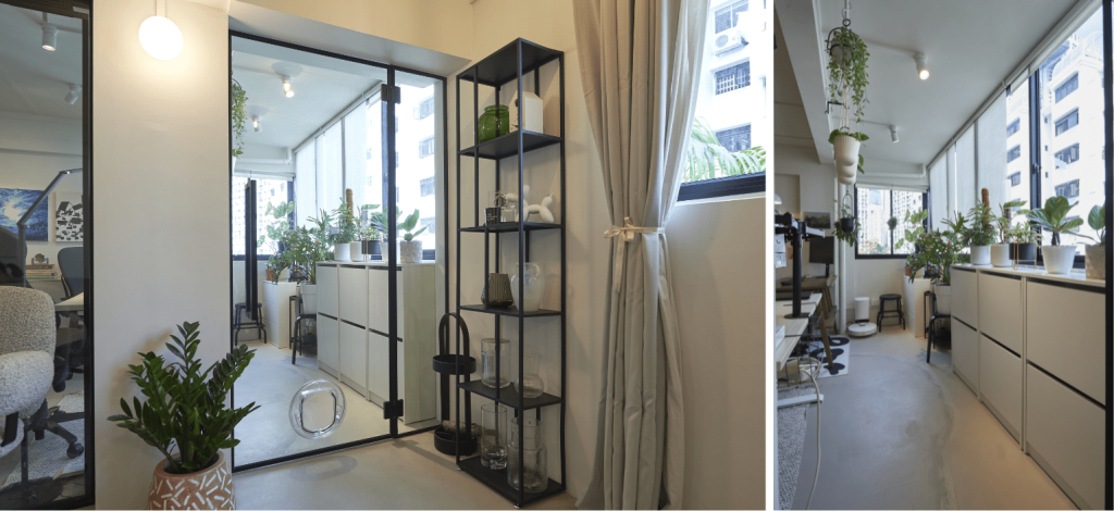
Amidst the sea of grey, pops of colours are incorporated through decor such as plants and paintings, to liven up the space. What stands out most is the balcony garden, a result of Joanne’s passion for plants.

The balcony has been transformed into a gardening space

Housing a variety of decorative potted and hanging plants, the balcony has been turned into a mini greenhouse. “The natural light makes the space very conducive for gardening,” Joanne smiles as she shares more on the transformation of the balcony. “It started with a few plants and before we knew it, our balcony is filled with greenery.”

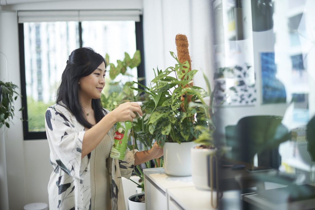
Joanne finds gardening a therapeutic activity

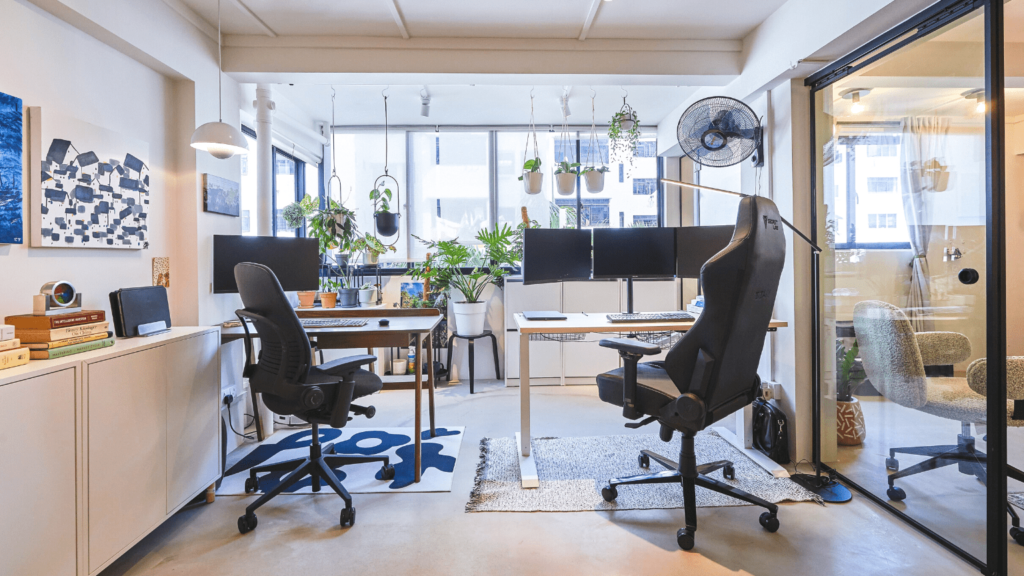
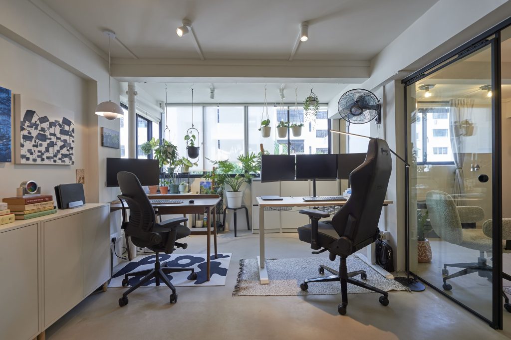
To facilitate the flow of natural light, the wall partition between the balcony and the adjoining home office, was removed. “Our workspace is now brighter. And with the balcony garden, we get to enjoy the sight of greenery, along with fresh air, whilst working.”

The home office opens up to greenery

The home office also doubles up as a recreation room, where Samuel spends most of his time in the reading corner. “I love lounging in the leather armchair – whether it’s taking a break or reading my favourite book. It’s where I spend my me time,” he explains.

The lounge corner is also Samuel’s favourite space

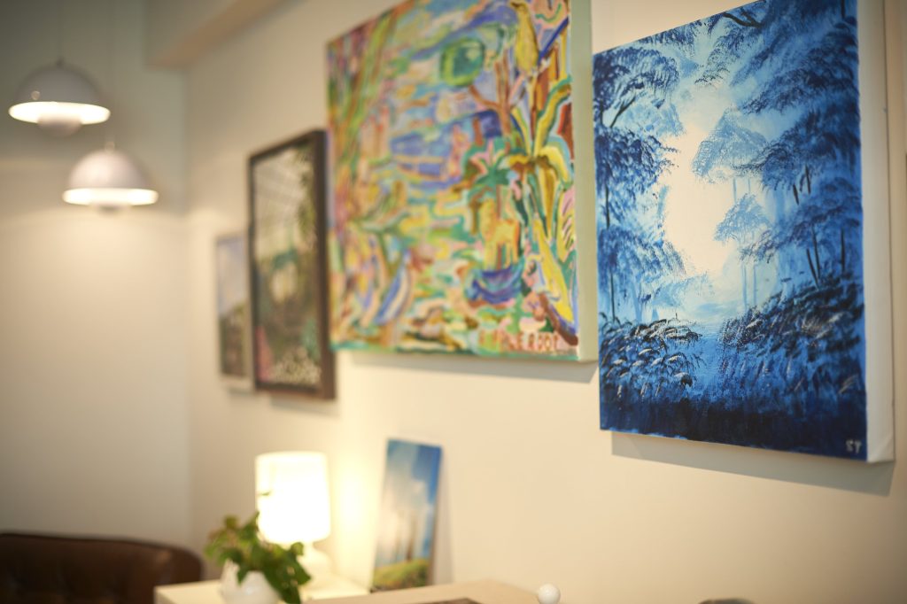
Beyond spots of greenery, the room is also decorated with paintings that span across the wall – some of which are painted by Joanne and Samuel, who love experimenting with art. This room, with its colours, is a departure from the rest of the house.

Paintings add colour to the space

In one of their creations, the home owners had upcycled leftover packing foam peanuts. “We thought it was a waste to throw them out, so we tried to incorporate them into our décor. It turned out surprisingly well and adds some personality to the overall aesthetic,” Joanne chuckles.

The DIY art in the living room (right) is created from upcycled packing peanuts

Minimalist Design with Retro Influences

Separated by a sliding glass door, the home office flows into the open concept communal area that comprise the living room, dining room and kitchen.

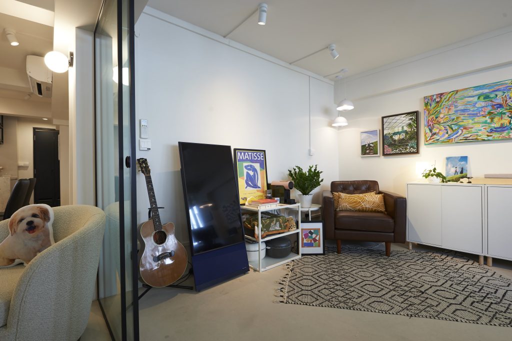
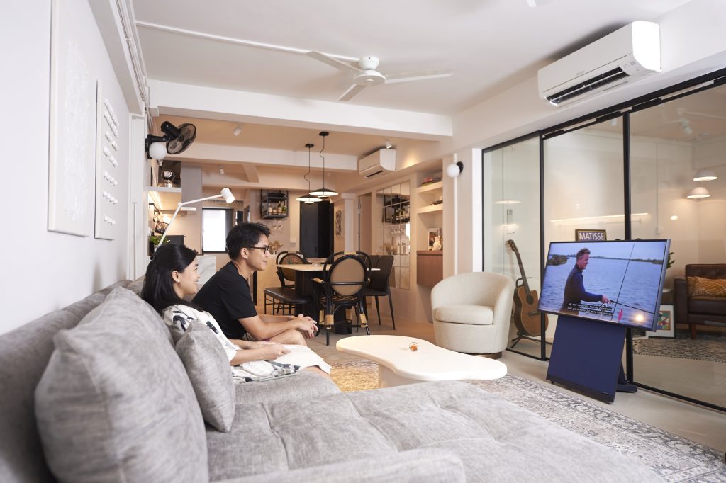
Instead of designating a space for a television, the home owners took the unconventional route of having a mobile screen that can be conveniently stowed away when not in use

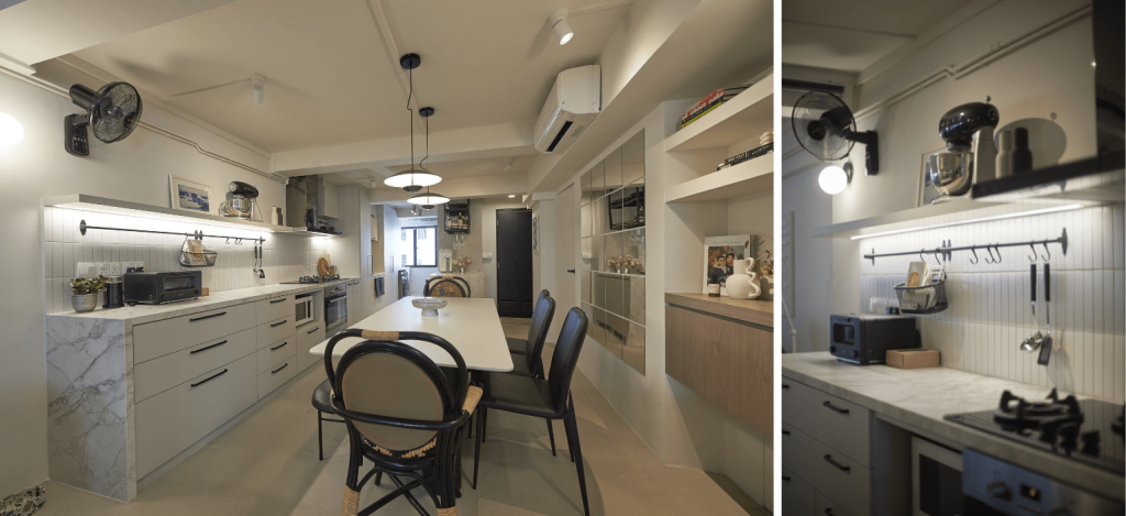
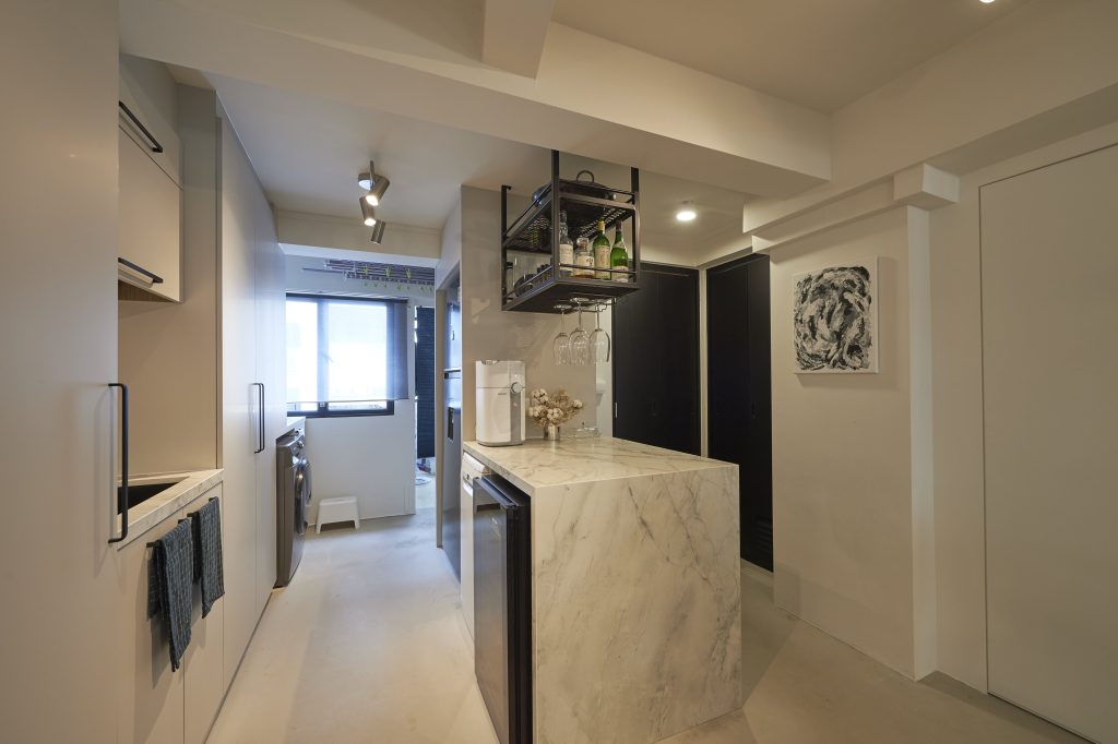
In keeping to the monochromatic theme, the open kitchen is also dressed in white and grey tones, including the marble countertop.

A minimalist kitchen: Top shelves, instead of cabinets, are used to create openness in the space

The kitchen island/ bar serves as additional countertop space for cooking preparation and hosting

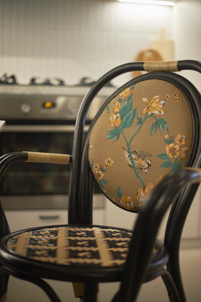
Retro influences are used to give the space its unique look. Take for instance, the old-school wall fans and nostalgic rattan dining chairs.

The floral embroidery adds a nostalgic charm to the rattan dining chairs

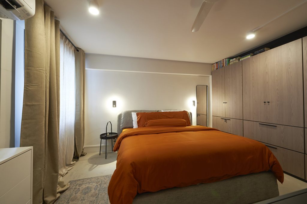
In the bedroom, the orange hue of the sheets gives off cosy retro vibes. Like the rest of the flat, the design is also kept to the minimum, with a wardrobe being the only carpentry item.

The intended space between the wardrobe and ceiling serves as a book storage

When asked about their favourite spaces in their home, Joanne laughs and says, “It’s a no-brainer for Samuel, it’s definitely the home office. For me, I prefer the living room as it’s my lounge spot and it provides the best view of the greenery at the balcony.”

For more interior inspiration, check out more Home Tours and Design Ideas


Source: mynicehome.gov.sg
A Guide to Having a Walk-In Wardrobe
A Guide to Having a Walk-In Wardrobe
You don’t have to have a million to dress like a million!

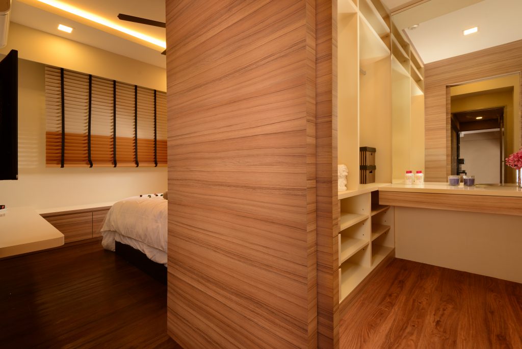
They say size matters and for walk-in wardrobes, it is definitely the case of the bigger, the better! While turning an entire bedroom space into a walk-in wardrobe is very, very tempting, it is important to consider whether it is worthwhile to do so – especially if you’re thinking of welcoming a little one soon!

However, it is still possible to achieve your dream wardrobe. The best part? You don’t have to sacrifice an entire room or carry out major hacking works!

Credit: Nitty Gritty Interior

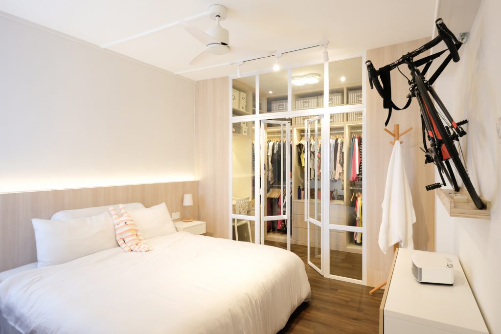
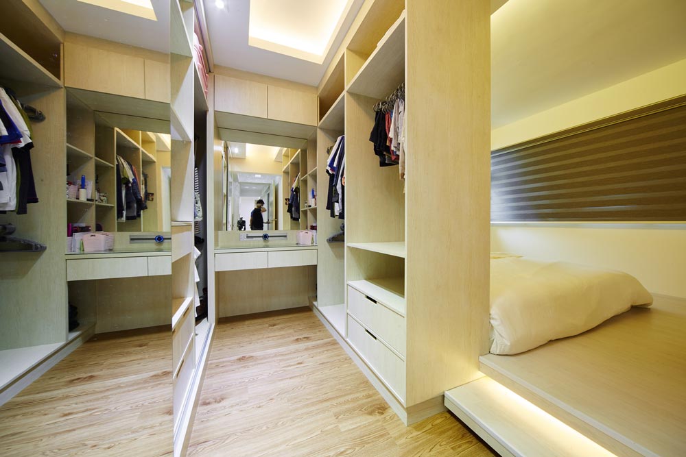
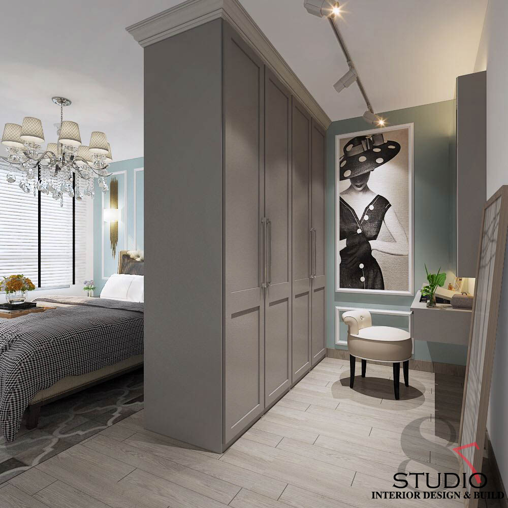
Check out these 3 design ideas on how you can transform your bedroom space to fit a walk-in wardrobe:

Lay It Out

Photo Credit: CAD Associates ID

Before you go wild with designing your walk-in wardrobe, think about how much space you wish to dedicate to the space. This helps you decide on the layout of your walk-in wardrobe. Some ideas include a galley style with an aisle in between two closets, an L-shape configuration with ample (standing) space, or even a little boxed-up enclave for that exclusive feel.

All About That Space

Photo Credit: Design 4 Space

Fitting a walk-in wardrobe in your bedroom means having to maximise space with the help of an efficient design. Regardless of the layout you’re going for, it’s helpful to swap out the hinged doors for sliding frames or even ceiling-to-ground curtains – not only do they help to save space, but they also create an illusion of a wider aisle.

Accessorise

Photo Credit: Eighty Seven

Yes, it’s possible to accessorise your walk-in wardrobe! A full-length mirror is a must-have; be it on the wall, the wardrobe door, or sliding frame. Spruce it up with statement lighting that brightens up the space, and then add pops of colour such as a feature wall, painting, or plant.

Excited about these ideas and can’t wait to start on your renovation journey? Read up and be familiar with the HDB renovation guidelines first, and check out some of our handy renovation tips!

Source: mynicehome.gov.sg