Home Tour

Home Tours: Pinterest-Worthy Farmhouse with Chic, Rustic Vibes

Home Tours: Pinterest-Worthy Farmhouse with Chic, Rustic Vibes

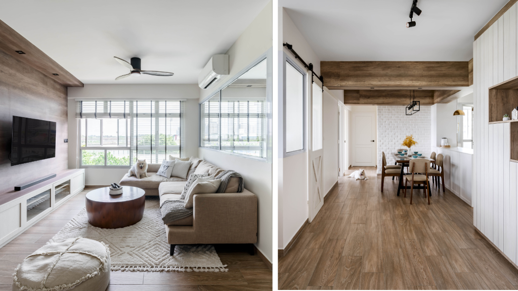
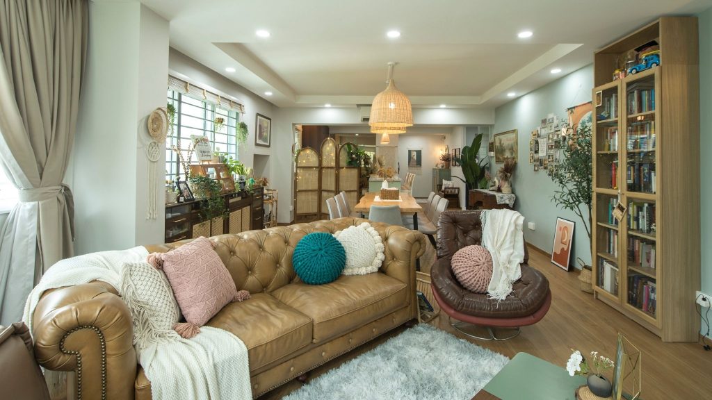
Inspired by the look of a contemporary farmhouse, home owners Cherylene and Vincent gave their Anchorvale flat an interior design makeover that is chic yet rustic.
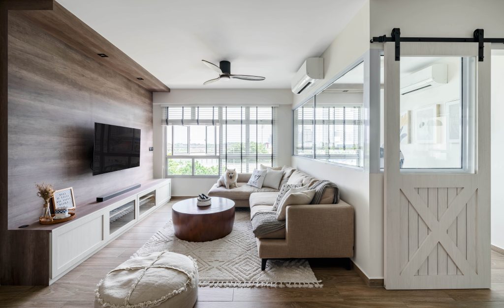
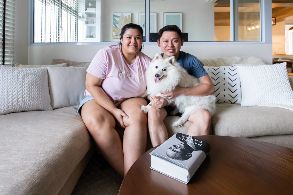
Photo: Ethereall

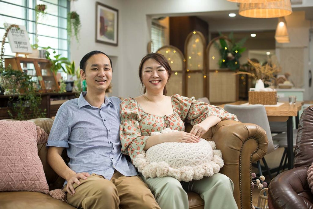
Home owners Cherylene and Vincent, with Sugar, their furkid

Wood and White

The couple incorporated clever carpentry built-ins that helped bring the interior design farmhouse theme to life while still keeping the home functional. For example, white wall panels in the entryway not only  complement the overall aesthetics, they actually lead to hidden cabinets that keep the flat’s distribution box and wireless router hidden.
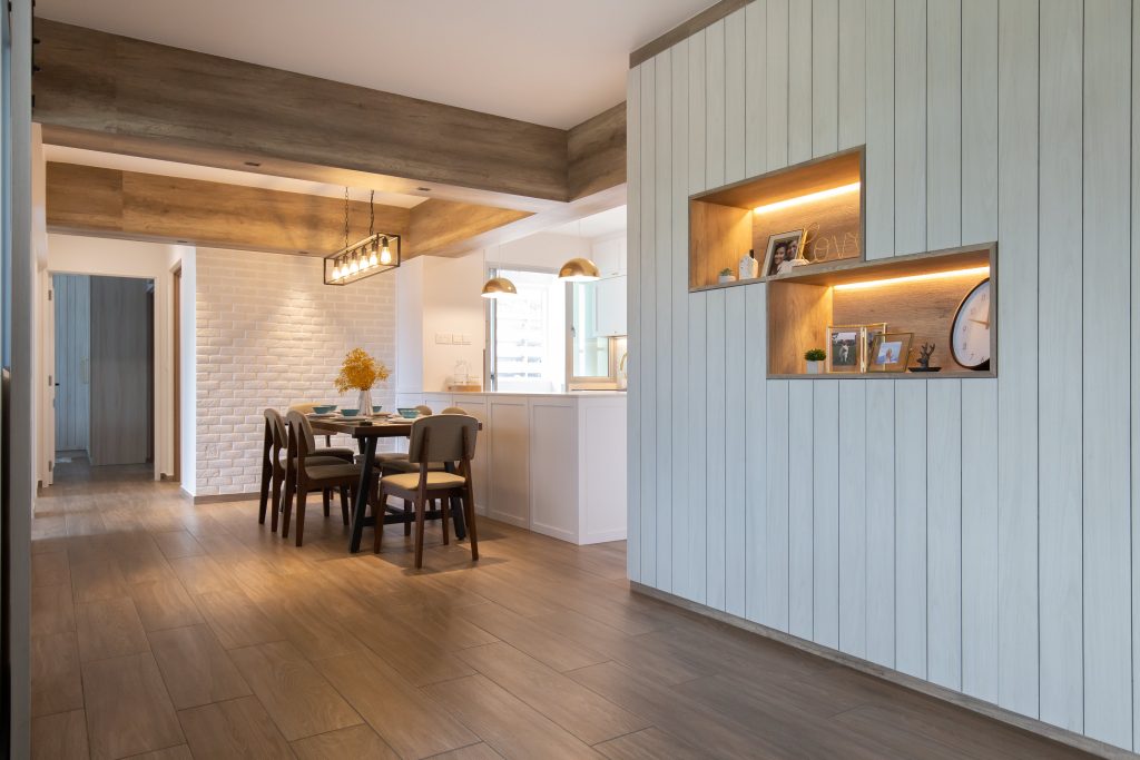
At the entryway, the panels conceal hidden storage space
Photo: Ethereall

“Our home is mainly white as we wanted to brighten the space. We have some dark surfaces, mostly wood accents. Our flooring is porcelain tiles with wood prints. We also have a couple of overhead ‘wood’ beams to mimic the look of an actual barn,” Cherylene explains.

On the ‘wood beams’, Vincent shares: “One of the beams is actually a box that holds our lighting wires!”
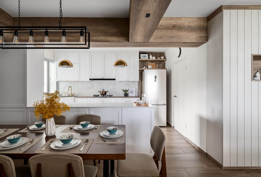
Beams on the ceiling complete the farmhouse look
Photo: Ethereall

Interior design tip: wooden flooring and a variety of neutral-coloured home décor items add an element of cosiness.

Photo: Ethereall

Keeping Things Light and Bright

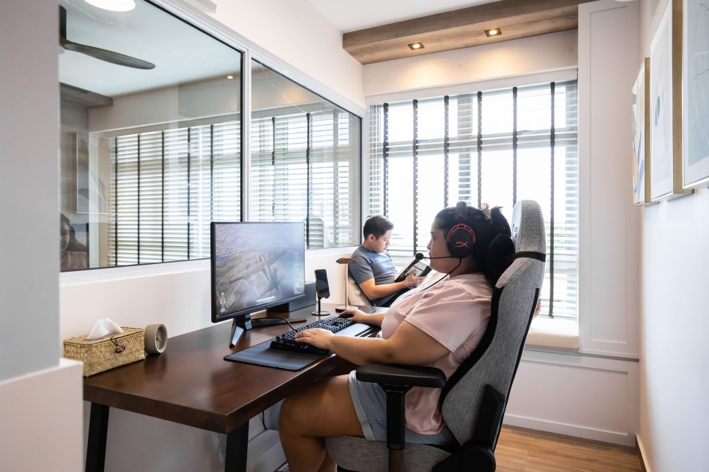
A half partition wall with indoor windows is used to demarcate the living room and home office. “Vincent wanted indoor windows to create the illusion of a bigger space. With these windows, we’re also able to ‘communicate’ despite being in different rooms,” Cherylene laughs.
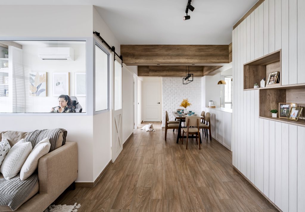
A half wall with indoor windows demarcates the home office from the communal area
Photo: Ethereall

The home office is Cherylene’s favourite space, as it also doubles up as a gaming sanctuary

Right outside the home office is the kitchen and dining area. “We opted for an open kitchen to accommodate a kitchen island. We also requested for open shelves, which are a common feature in American homes, to emulate the farmhouse look,” the couple say.

Panelling is done on the front of the island as well as the cabinets, with clean-lined Shaker-style doors. Shaker-style is a classic American design look which features a centre panel with an overlay around the edge.
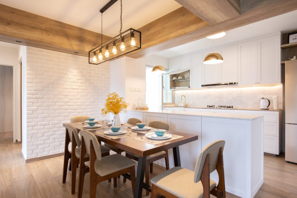
Shaker-style cabinetry and panelling lend a minimalist, timeless look
Photo: Ethereall

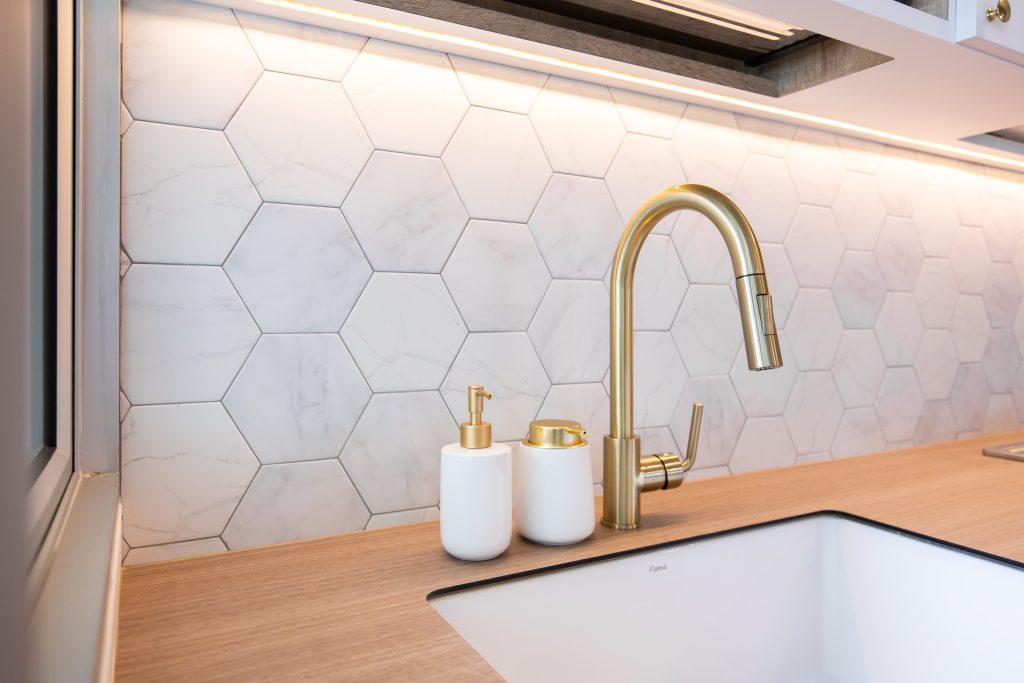
Gold accents add a touch of chic to this urban farmhouse
Photo: Ethereall
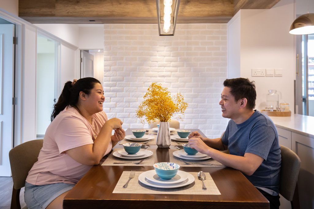
The dining area features a white brick wall

Place for Rest

In contrast to the rest of the space, the master bedroom incorporates darker tones to create a more relaxing ambience. The couple also customised the headboard in the shiplap style – a prominent feature of the farmhouse theme. While shiplap is more commonly white, Cherylene and Vincent chose a darker, off-white colour to better blend with the grey wall.
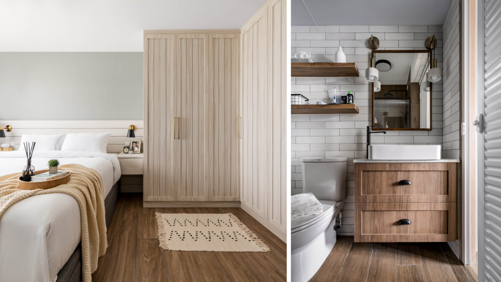
Like the master bedroom, the bathroom features dark tones such as greys and blacks
Photo: Ethereall

Other carpentry works include the L-shaped wardrobe, that enables full utilisation of the corner space. An extendable table installed inside the wardrobe doubles up as a separate vanity area for Cherylene.

Advice to New Home Owners

On renovation costs, Vincent says, “Some have asked why we’d chosen to undergo such extensive renovation works, and my answer is always this – our home is our sanctuary, hence the effort is worthwhile.”

“It’s important to embark on some research before meeting with interior designers. This way, the discussions will be more productive. Do speak with different designers. You may have an idea of the interior design, but as you discuss more, these ideas may change or improve. Exploring your options is important,” he says.

Renovating your home? Embark on more Home Tours for interior design inspirations!

The article was adapted from a version first published on Qanvast.


Source: mynicehome.gov.sg

Home Tours: Heritage Home with a Contemporary Twist

Home Tours: Heritage Home with a Contemporary Twist

With its local-inspired décor, Peranakan accents and mid-century modern furnishings, Ridzwan and Nadiah’s BTO flat in Kallang is reminiscent of a shophouse – but with a contemporary touch.

Purchasing Their First Home

“We opted for a 3-room flat as we wanted to be comfortable in terms of the space and budget,” Nadiah explains. “We applied for housing grants and made the downpayment with our CPF. This freed up our cash savings for other home-related costs such as renovation works and furnishings.”

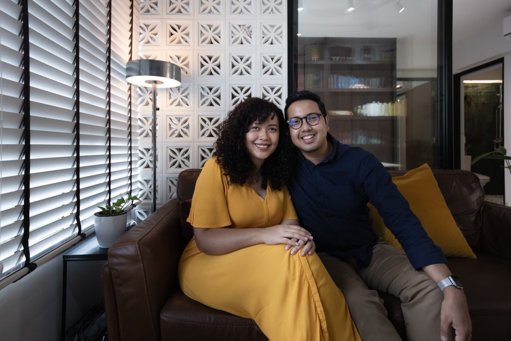
Home owners Nadiah and Ridzwan

“Our home reflects our modern take on a heritage shophouse – perfect for old souls,” laughs Ridzwan.

A Personality-Driven Home

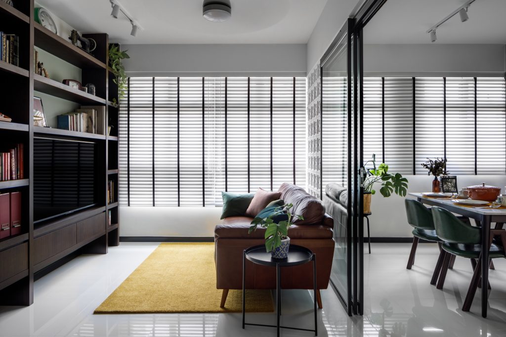
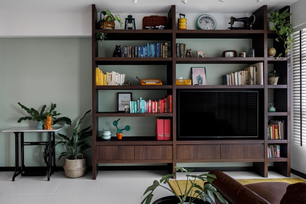
Ridzwan and Nadiah wanted the space to incorporate their lifestyles and personalities. In the living room for instance, the couple demarcated a space for their book collection. “Both Nadiah and I love reading – one of the first things we talked about when we met was our shared love for Enid Blyton books when we were children,” Ridzwan smiles.

In addition to their book collection, the feature shelf also houses the couple’s collection of trinkets, including a vintage clock and tingkats. Family heirlooms such as a typewriter and sewing machine also double as home décor, adding to the nostalgic vibes that carry throughout the space.

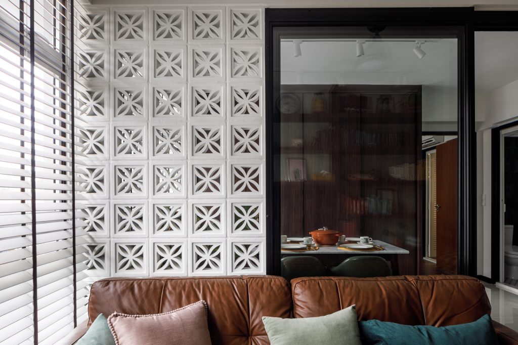
The patterns of the semi partition are reminiscent of Peranakan-inspired prints

When asked to describe the overall look and feel of their home, Ridzwan says, “It’s a combination of mid-century modern and influences from local heritage – in a way, our home design is our classy take on a traditional Singapore shophouse.”

Space Planning

One of the home owners’ priorities is to have a flexible space that can adapt to their changing lifestyle needs.

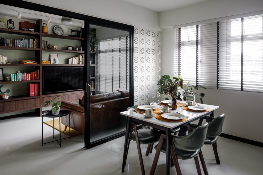
For example, a sliding glass door replaces the wall between one of the bedrooms and the living room, resulting in a semi-open space. While the space is currently being used as the dining area and (?) Ridzwan’s home office, the room can be converted into a nursery once the couple starts a family.

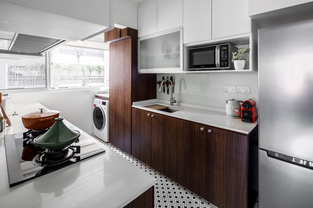
The kitchen and service yard were combined to accommodate an extended kitchen counter.

“We enjoy cooking together, so we wanted a spacious layout that allows us to move about freely as we do so,” says Nadiah. “We love how we could also fit a full-sized pantry while allowing sufficient space for our laundry area.”

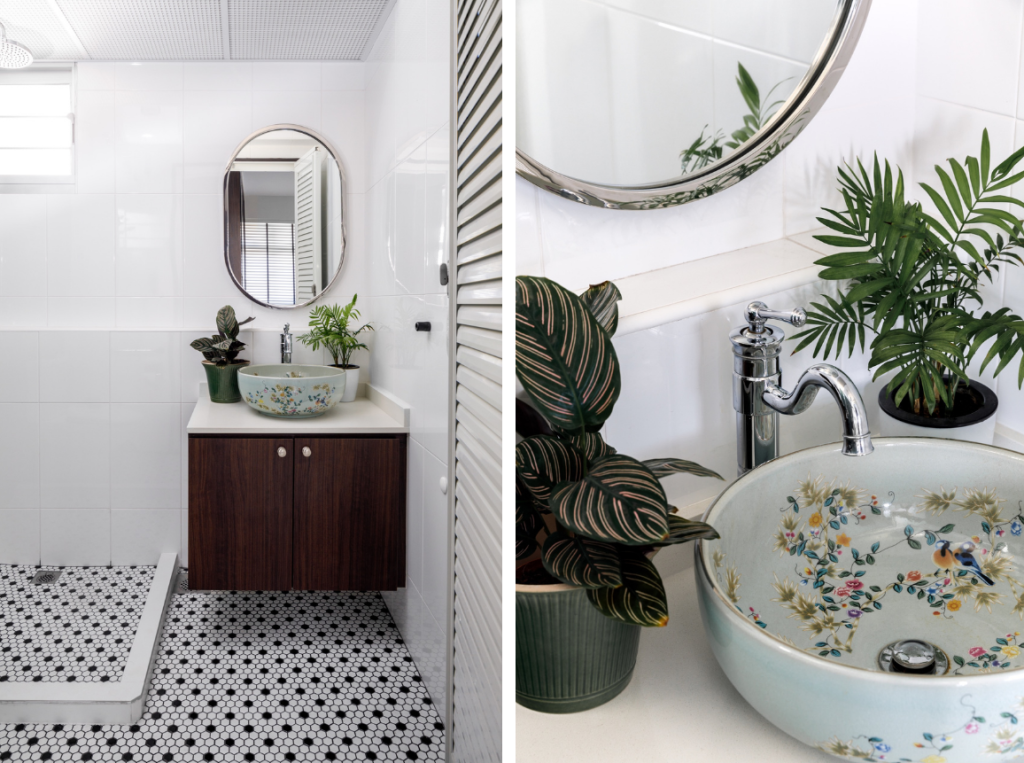
The black and white mosaic floor tiles in the kitchen are also found in the common bathroom

The porcelain sink is a statement piece that the couple chanced upon online

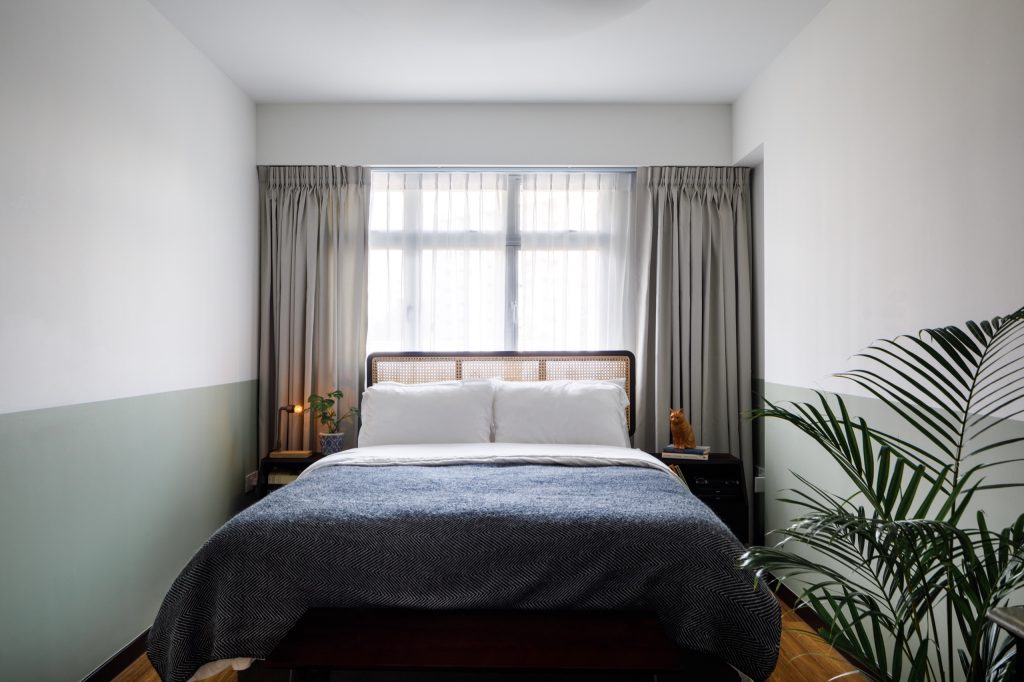
One uncommon feature is that the couple did away with a wardrobe in the bedroom. On this decision, Nadia explains, “We wanted to place a vanity table, which is a family heirloom, in the bedroom instead. We figured that having a storage bed and large cabinets in the common areas will meet our storage needs.”

The retro look of the customised rattan headboard perfectly complements the overall aesthetics of the flat

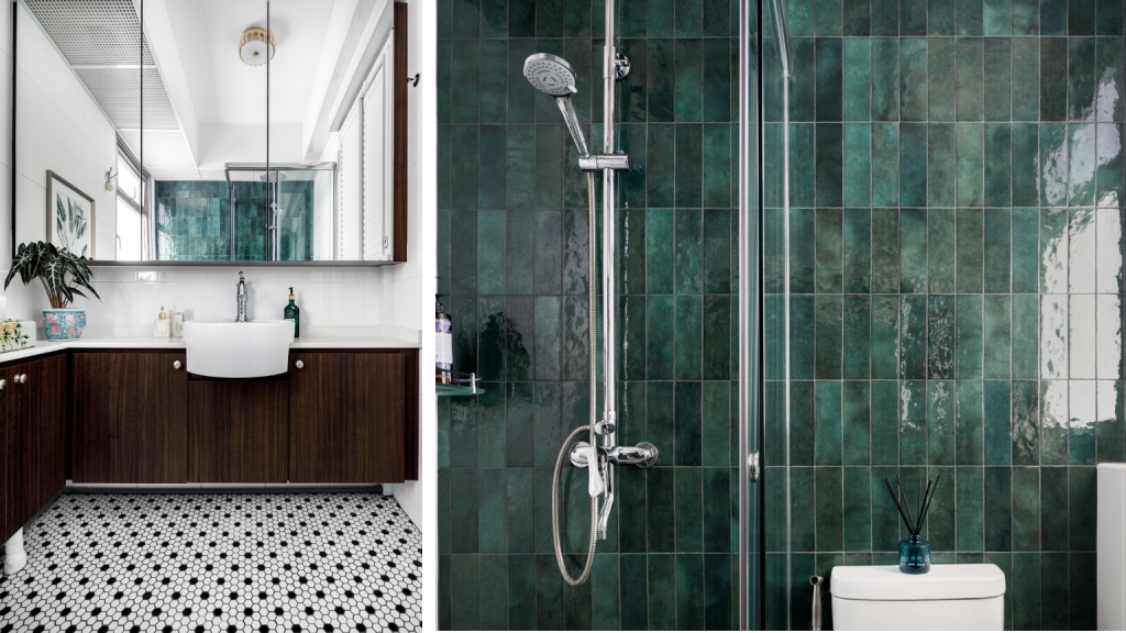
In the en suite, the sink was relocated to the right side of the bathroom, to accommodate an L-shaped counter. “With the fixtures and fittings flushed to the right, the space feels bigger.”

Similar to the common bathroom, black and white mosaic tiles were chosen for the en suite while jade green subway wall tiles are used to add a pop of colour

“With the current work-from-home arrangement, we have come to appreciate our home a lot more,” the couple laughs. “We usually work in the dining area, so during lunch time, we’d prepare and have our meals and get back to work. In the evenings, the communal area will be transformed to an exercise area for our workouts. We’re really happy with how our home is perfect for both work and play.”

The article was adapted from a version first published on Qanvast.


Source: mynicehome.gov.sg
Home Tours: A Bright and Airy Abode

Home Tours: A Bright and Airy Abode

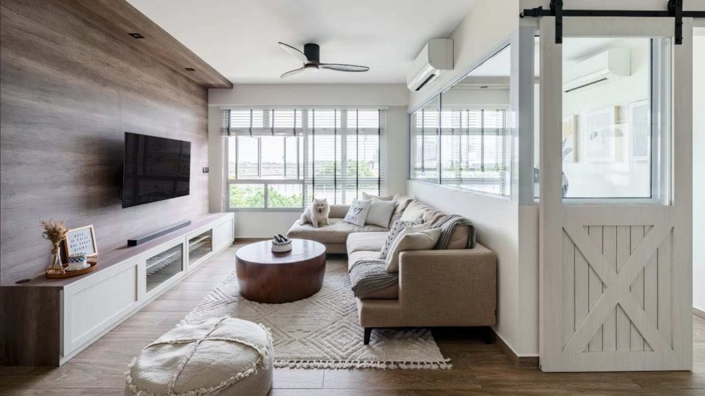
For Peter and Gene, all they wanted was to transform their 5-room resale flat in Punggol into a comfortable abode to call their own. “This is our first HDB flat, our first renovation, and the first home that our son would be growing up in, so we were excited to embark on our home ownership journey,” shares Peter, a freelance hairstylist.

Gene and Peter, with their son Yang Zhe

Purchasing Their First Home

A key consideration for the couple when hunting for their first home was space. “Our flat is a good match for our needs,” Peter says. “It was love at first sight– we immediately took a liking to the flat’s spaciousness, the floor-to-ceiling windows in the living room that open up to the view, and the generous spacing between blocks which allows us ample privacy.”

Accessibility to amenities was also a priority for Gene. “Discovering the nearby facilities became a highlight in our flat-hunting journey, because that’s when it became clear to us that HDB towns are built to meet the daily needs of residents.”

Residing in Punggol

The couple’s home is a stone’s throw away from green spaces such as Punggol Waterway Park and Coney Island. The flat is also located near the Punggol Park Connector, which conveniently links to other surrounding parks such as Sengkang Riverside Park – a perfect complement to Peter’s active lifestyle.

“Before moving to Punggol, I was training for a marathon in this area, and thought it was an excellent neighbourhood for exercising,” Peter recalls. “I enjoy being able to run or cycle in the surrounding parks. For longer exercise sessions, I just have to get on the park connector, and I’ll be able to explore other green spaces.”

Gwen, on the other hand, enjoys taking leisurely walks around the neighbourhood. “Punggol truly is an eco-town – there’s plenty of greenery everywhere and I feel closer to nature whenever I go on walks,” she smiles. “I like taking my son, Yang Zhe, on strolls to visit the nearby gardens.”

“We love how the amenities cater to young families such as ours – this includes the childcare centre located at the ground floor of our block, wet markets and supermarkets,” Gene shares. “Getting around is convenient as well, as our flat is within walking distance from Punggol MRT station, which is on the North-East line that we’re familiar with.”

A Timeless, Blue and White Interior

When deciding on the overall look and feel of the flat, Peter shared that he sought a clean-cut look. “I wanted our home to look sleek, but not necessarily minimalist. We also wanted a pop of colour, and eventually decided on the blue and white shades which our interior designer suggested.”

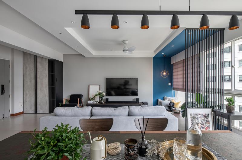
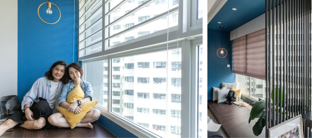
Another suggestion the couple adopted from their interior designer was the transformation of the existing cosy corner in the living room. “Instead of demolishing it, we decided to give it a refreshed look by painting it in my favourite shade of blue. We also added a divider, to further demarcate the space.”

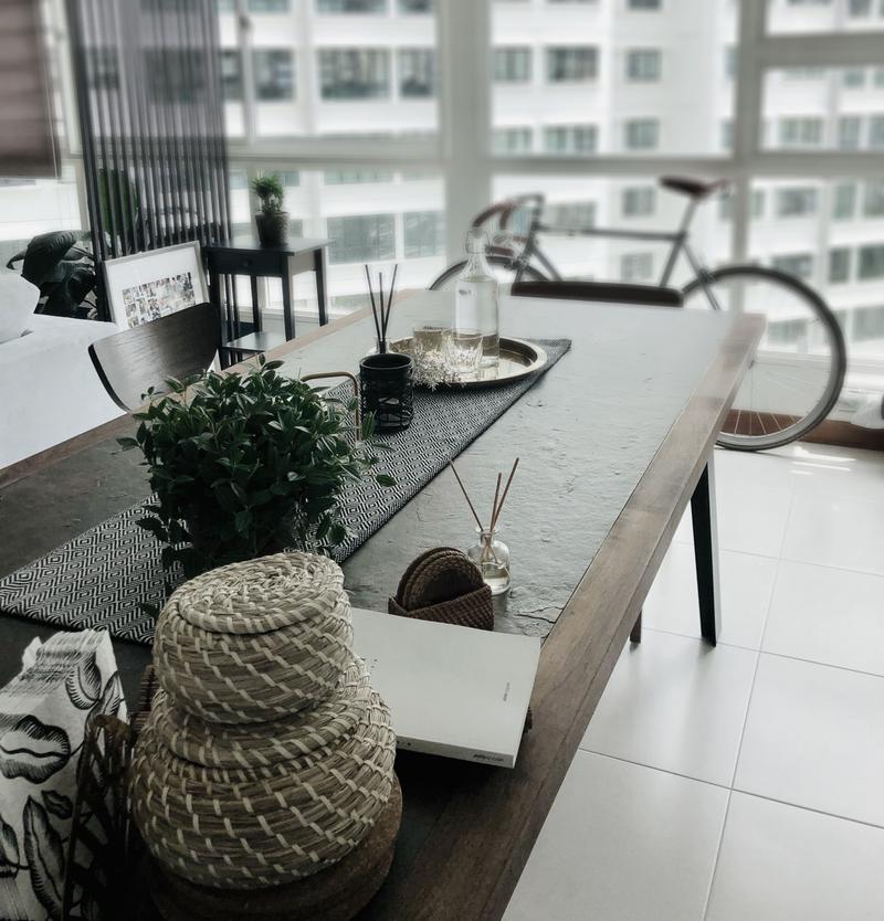
In the dining room, the couple incorporated a large dining table that could double as a work desk. “We’re used to working in the dining area, and wanted the same for our new home,” Peter smiles.

A statement piece, the dining table is made of a limestone tabletop and walnut wood frame

The open concept living space is extended into the kitchen, as the home owners wanted a more seamless look throughout their home. “We decided to do away with the kitchen door, for a seamless and spacious feel. While we cook regularly, we don’t usually indulge in heavy cooking, so the design works for us,” Gwen says.

The glass pendant lamp over the countertop adds a dash of character to the kitchen

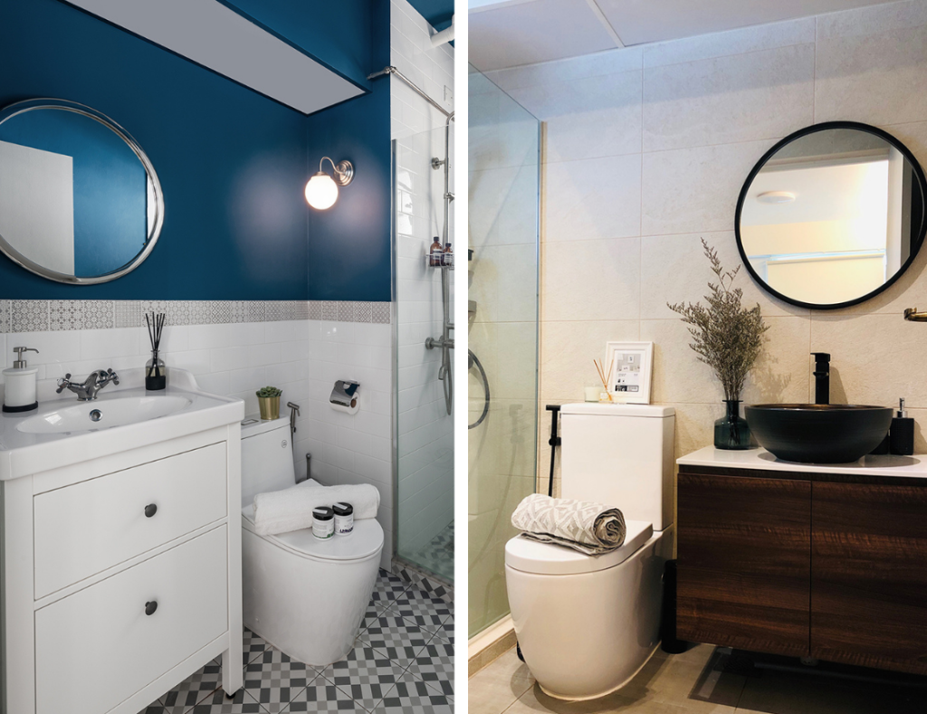
For the en suite and common bathroom, the couple chose a different design for each of them. While the common bathroom features the same colour accents as the common living area, the en suite was designed to give off a more relaxing vibe. “We were inspired by spas, and deliberately chose wall tiles of a more rustic, stone-like finishing to replicate the look.”

The common bathroom (left) and en suite (right)

“I think even if we were to move elsewhere in future, this flat will be the one that I’ll remember the most. After all, it’s where our first child is growing up in, and also where I’m learning how to be a full-time stay-at-home mother for the very first time. This space will always hold a special place in my heart,” Gwen smiles.

This article was adapted from a version first published on Qanvast.


Source: mynicehome.gov.sg
Home Tours: A Playful, Bohemian Home

Home Tours: A Playful, Bohemian Home

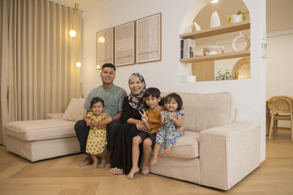
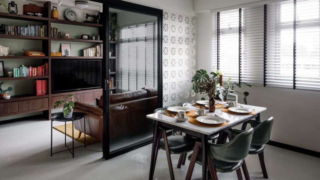
Full of colour, but with a hint of minimalism, Rina Raihana and Muhammed Fauzan’s home in Bukit Panjang is a representation of their individual styles.

“I wanted a colourful, playful space while Fauzan leans towards the Scandinavian aesthetic. So, we decided on a mainly white-and-wood theme that’s decorated with splashes of colours and playful elements,” Rina smiles. The 5-room flat is also adorned with wall paintings and rattan décor that add to its Bohemian charm.

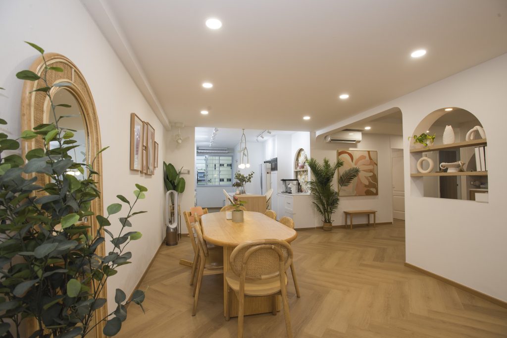
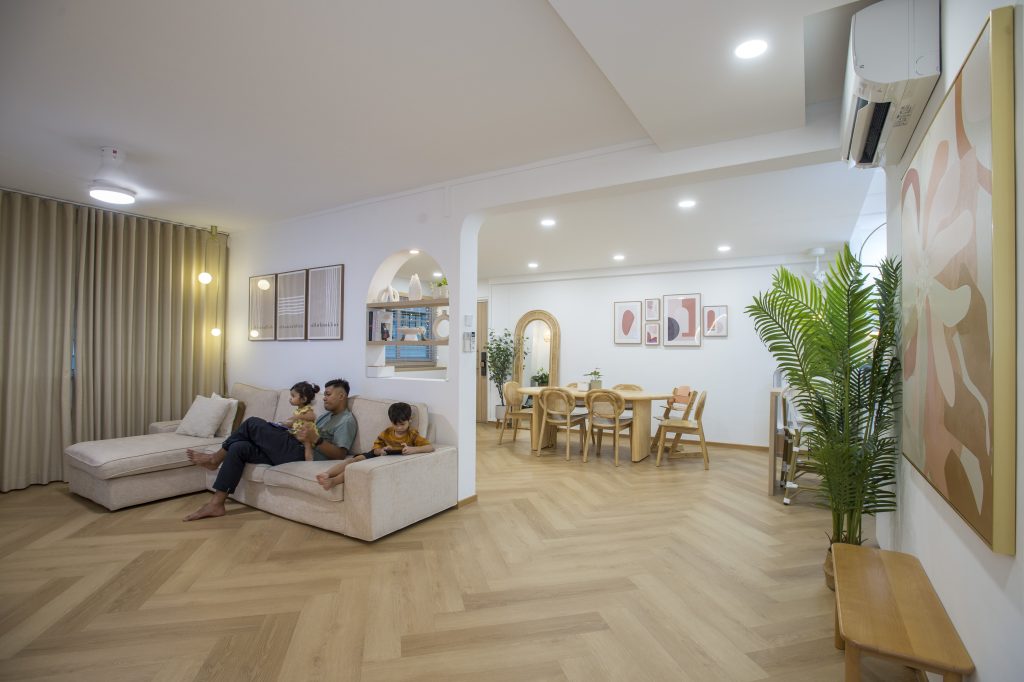
The dining room overlooks the kitchen in the open concept communal area

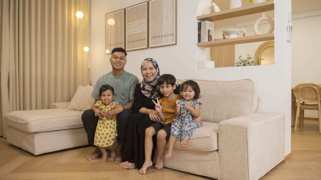
Fauzan, Rina and their three children

Mixing Shapes and Patterns

Rina and Fauzan, who are second-time home owners, worked together to achieve the shared vision for their home. In the open plan communal area, the walls and most of the décor items, are primarily white. The herringbone pattern is weaved into the flooring, creating a seamless flow between the living, dining and kitchen areas. These aspects of the design are attributed to Fauzan, who explains, “I’m a minimalist who prefers consistency and continuity.”

The herringbone floor that carries throughout the space ensures continuity and flow

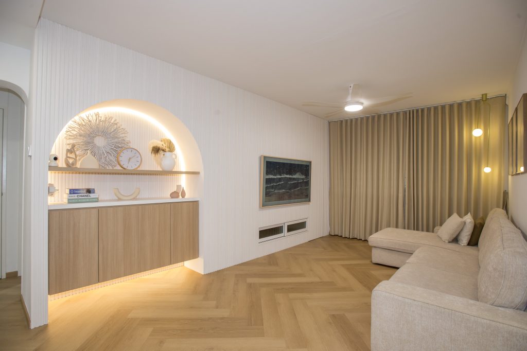
The home is far from monotonous, however, as the couple incorporated arches and colourful wall paintings for a playful touch – a result of Rina’s bubbly personality. “With their round edges, the arches also help to soften the overall look,” she says.

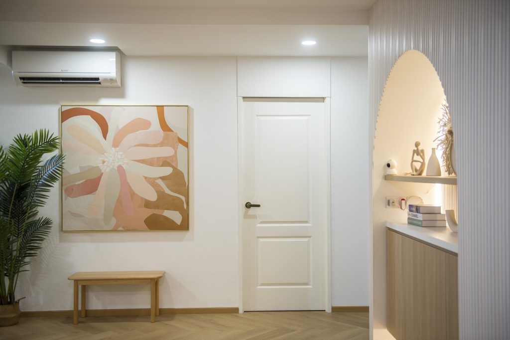
Colourful wall paintings and elements such as arches add a touch of playfulness

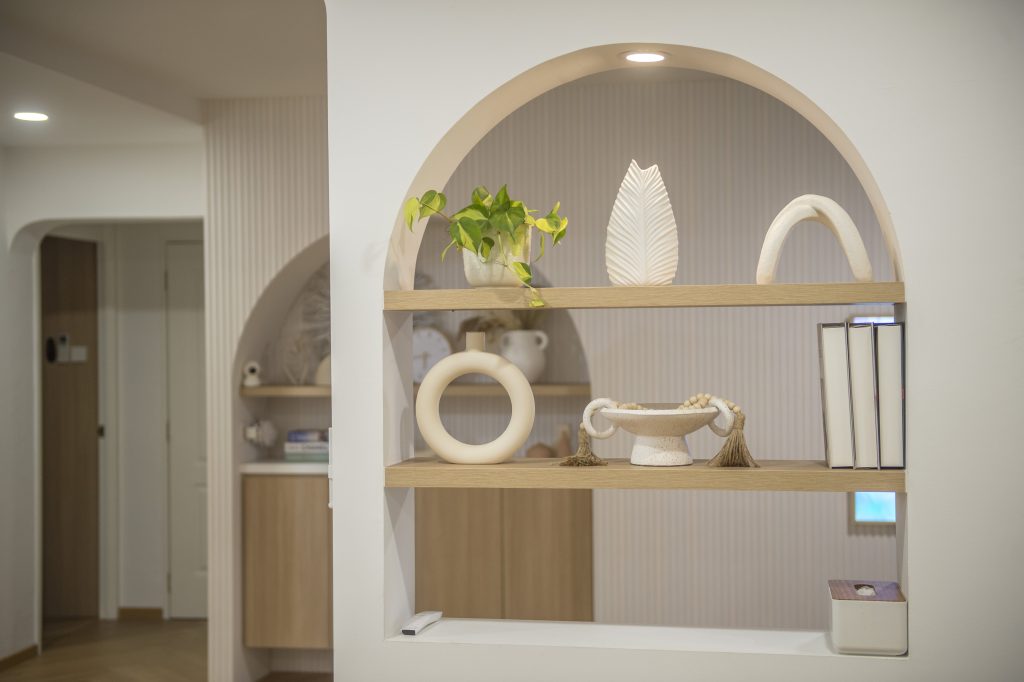
The decorative arch-in-the-wall located near the entryway is designed to make an impression

The main arch, designed as part of the feature wall, doubles up as a décor corner. Built-in cabinets maximise storage space.

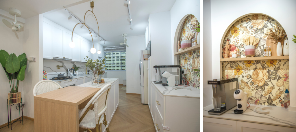
The arch is also present in the kitchen pantry, albeit in a different style. A vintage-inspired wallpaper is used as the backdrop, to add a pop of colour in the area. This complements the white rattan chairs at the kitchen island, where Rina does most of her cooking preparations.

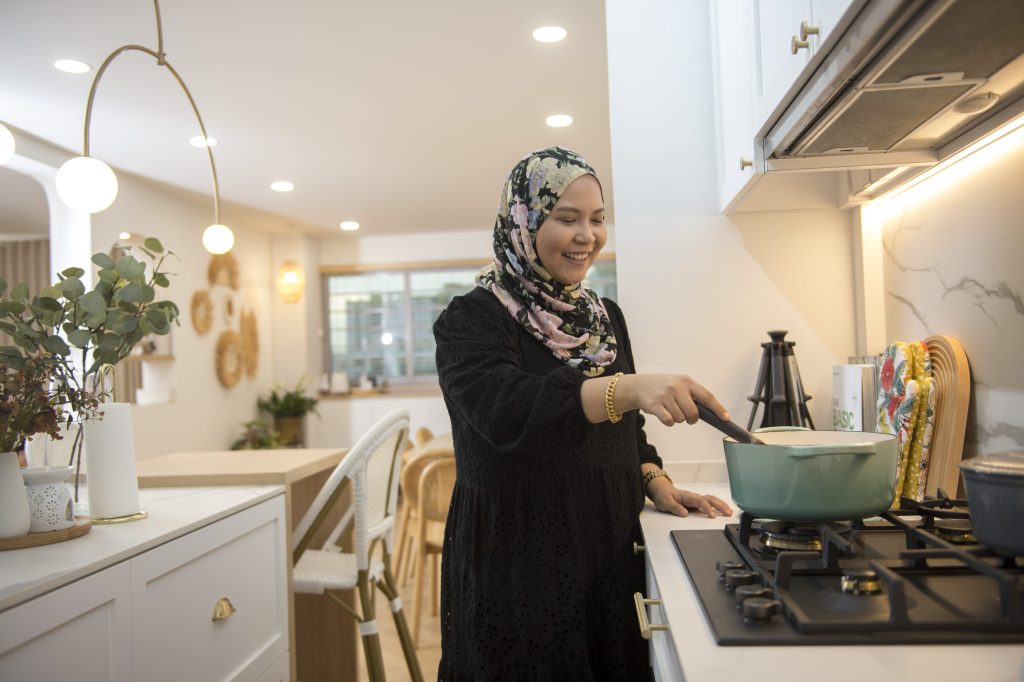
“The extra countertop space comes in handy, especially because I cook often. The kitchen island is also perfect for us, as it doubles up as a hosting area whenever we have friends and family over,” Rina shares.

Rina’s favourite space in the house is the kitchen, where she spends time refining her culinary skills

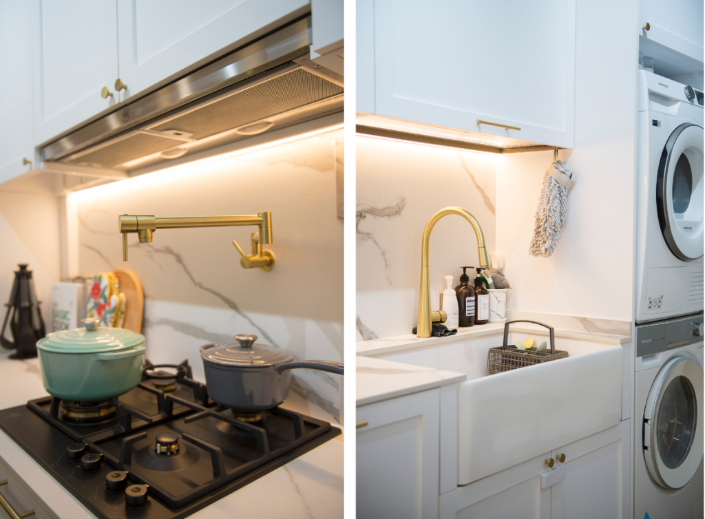
The kitchen sports a minimalist look with its matching marble backsplash and countertop. The rustic look of the shaker-style cabinets and farmhouse sink further ties the kitchen’s aesthetic back the rest of the communal area.

Bohemian with a touch of luxe: the kitchen features a marble backsplash, shaker-style cabinets and a farmhouse sink 

Playing with Colours

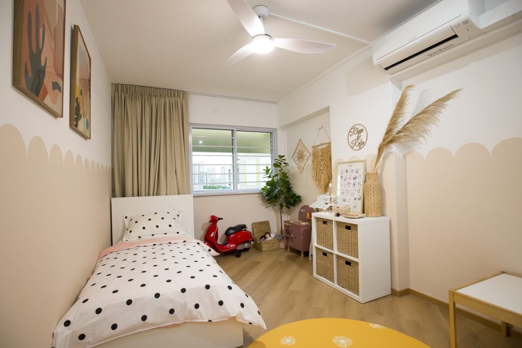
In the children’s bedrooms, colours are used to liven up the space. “We didn’t plan to use vibrant colours in the bedrooms initially. However, after receiving a yellow playmat as a gift, we thought the décor for the children’s bedrooms could be brighter, especially since the rooms are also their play area,” Rina says.

The scalloped walls, an alternative to conventional half walls, were hand-painted by Rina and Fauzan

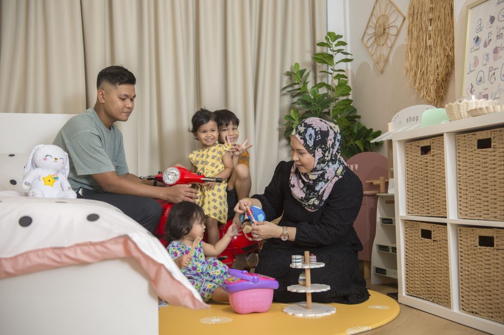
The bedroom is also where the family spends quality time together

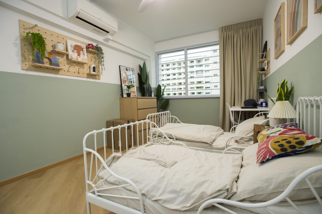
In the adjacent bedroom, the couple chose a refreshing sage colour for the walls. White, rustic-inspired bedframes add a cosy vibe to the bedroom.

The second  bedroom also sports a half-wall feature

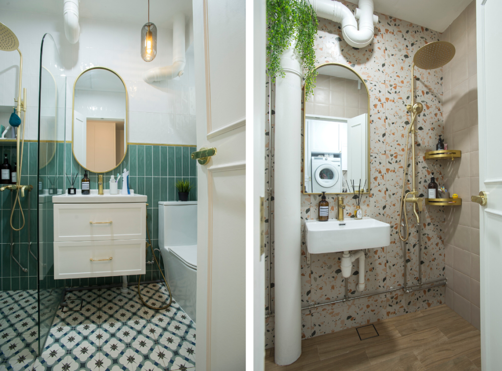
It is however, in the bathrooms where Rina’s vision for colourful spaces truly come to life. The common bathroom features a half-wall designed with green subway tiles paired with a mosaic-tile floor, while the ensuite bathroom stands out with a terrazzo wall and wood-inspired floor tiles. Both bathrooms are also adorned with gold fittings that further brighten up and add luxe to the intimate spaces.

It’s colours and patterns galore in both the common bathroom and ensuite

“I really unleashed my creativity in the bathrooms,” Rina laughs. “Since the bathrooms are more ‘hidden’, I could add more colours without them looking too contrasting to the rest of the flat.”

Get inspired with more Home Tours or check out Design Ideas for more interior reads.


Source: mynicehome.gov.sg
Home Tours: A Monochrome Greenhouse with Retro Influences

Home Tours: A Monochrome Greenhouse with Retro Influences

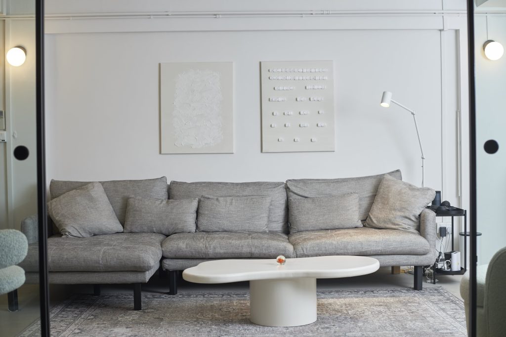
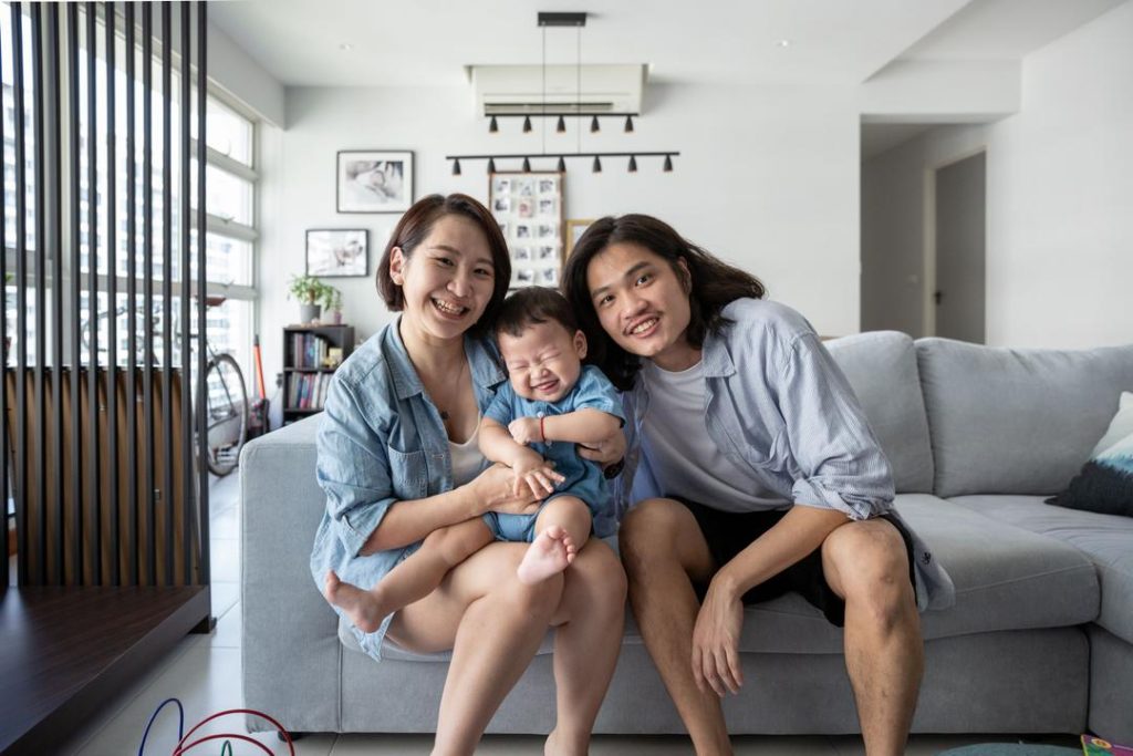
Drawn to the minimal and consistent look of a monochrome palette, Joanne Teo and Samuel Tan did up their home in shades of white, black and grey. The aesthetic is also inspired by the industrialist look, as seen from the concrete flooring and metal black accents that carry throughout the 3-room flat.

Home owners Samuel and Joanne, and their furkid Bam Bam

“We thought a monochromatic approach is the best way to achieve the modernist look we wanted,” the couple shares. “We also chose the colours for their versatility, as they can be complemented by most furnishings.”

Green and Sustainable Home Décor

Amidst the sea of grey, pops of colours are incorporated through decor such as plants and paintings, to liven up the space. What stands out most is the balcony garden, a result of Joanne’s passion for plants.

The balcony has been transformed into a gardening space

Housing a variety of decorative potted and hanging plants, the balcony has been turned into a mini greenhouse. “The natural light makes the space very conducive for gardening,” Joanne smiles as she shares more on the transformation of the balcony. “It started with a few plants and before we knew it, our balcony is filled with greenery.”

Joanne finds gardening a therapeutic activity

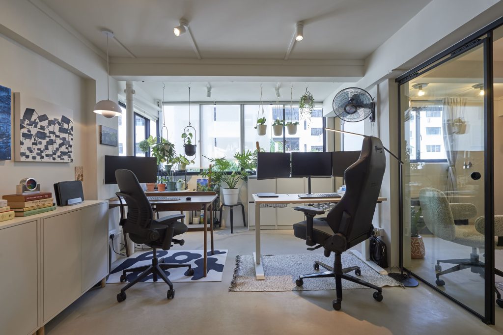
To facilitate the flow of natural light, the wall partition between the balcony and the adjoining home office, was removed. “Our workspace is now brighter. And with the balcony garden, we get to enjoy the sight of greenery, along with fresh air, whilst working.”

The home office opens up to greenery

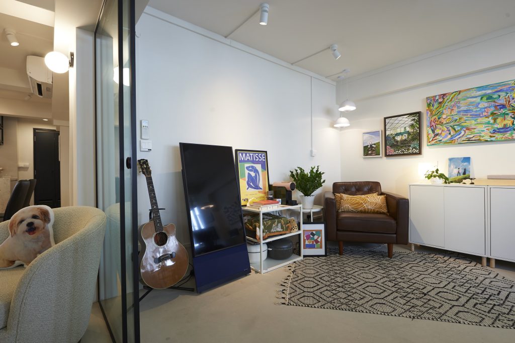
The home office also doubles up as a recreation room, where Samuel spends most of his time in the reading corner. “I love lounging in the leather armchair – whether it’s taking a break or reading my favourite book. It’s where I spend my me time,” he explains.

The lounge corner is also Samuel’s favourite space

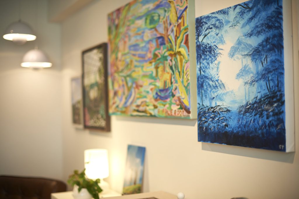
Beyond spots of greenery, the room is also decorated with paintings that span across the wall – some of which are painted by Joanne and Samuel, who love experimenting with art. This room, with its colours, is a departure from the rest of the house.

Paintings add colour to the space

In one of their creations, the home owners had upcycled leftover packing foam peanuts. “We thought it was a waste to throw them out, so we tried to incorporate them into our décor. It turned out surprisingly well and adds some personality to the overall aesthetic,” Joanne chuckles.

The DIY art in the living room (right) is created from upcycled packing peanuts

Minimalist Design with Retro Influences

Separated by a sliding glass door, the home office flows into the open concept communal area that comprise the living room, dining room and kitchen.

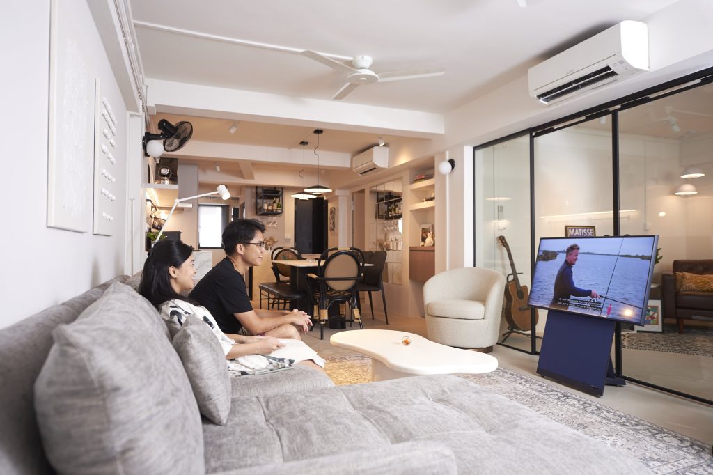
Instead of designating a space for a television, the home owners took the unconventional route of having a mobile screen that can be conveniently stowed away when not in use

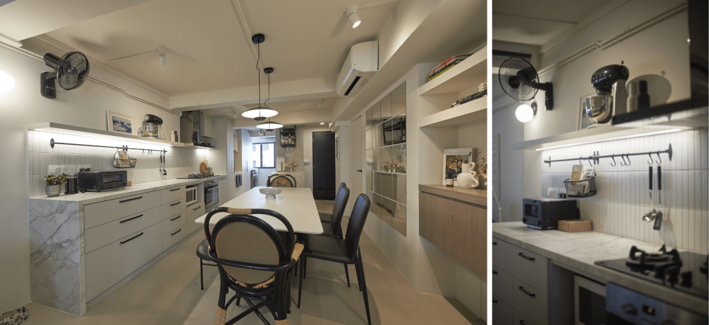
In keeping to the monochromatic theme, the open kitchen is also dressed in white and grey tones, including the marble countertop.

A minimalist kitchen: Top shelves, instead of cabinets, are used to create openness in the space

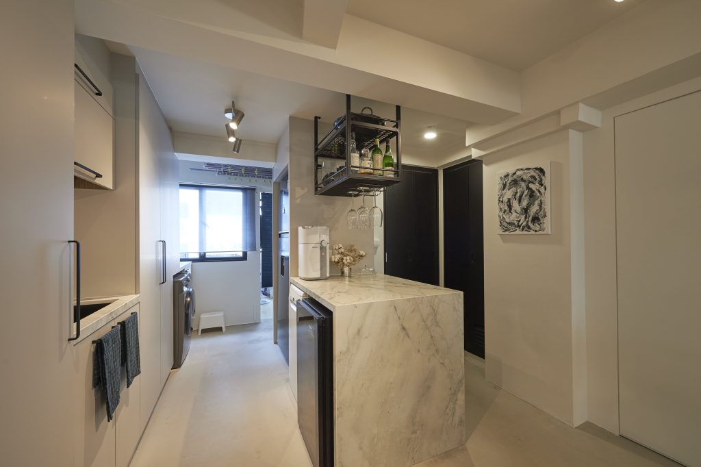
The kitchen island/ bar serves as additional countertop space for cooking preparation and hosting

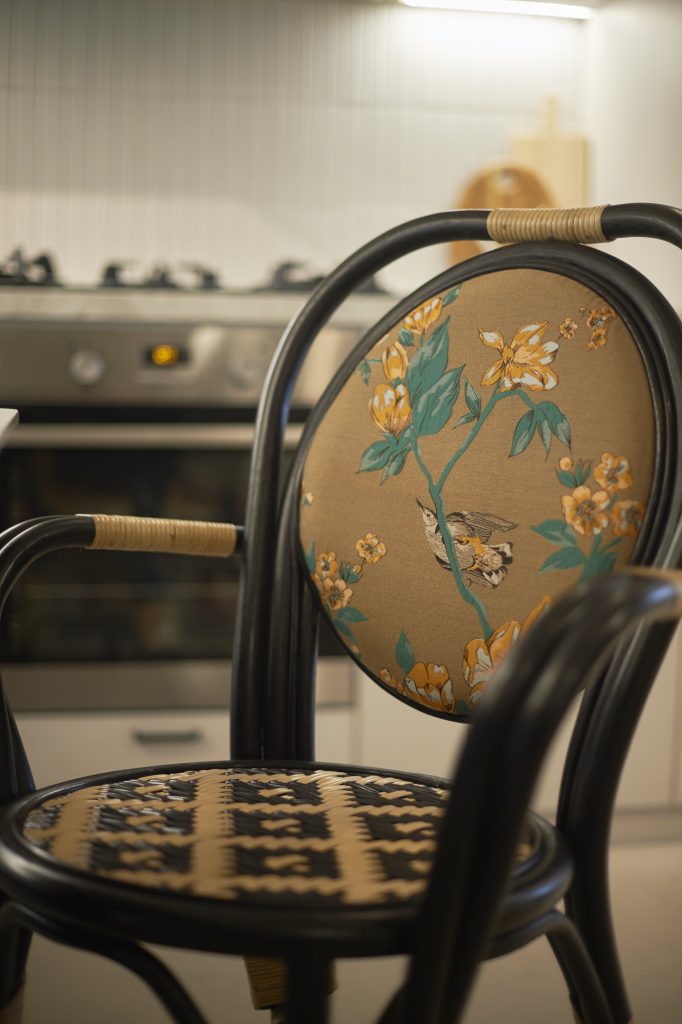
Retro influences are used to give the space its unique look. Take for instance, the old-school wall fans and nostalgic rattan dining chairs.

The floral embroidery adds a nostalgic charm to the rattan dining chairs

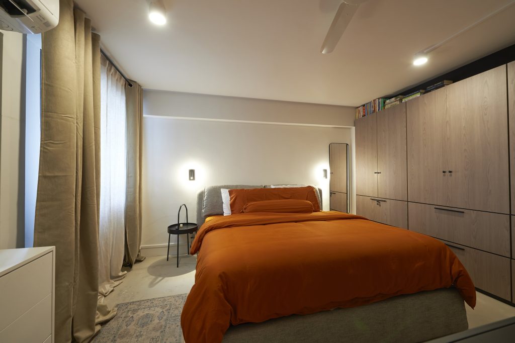
In the bedroom, the orange hue of the sheets gives off cosy retro vibes. Like the rest of the flat, the design is also kept to the minimum, with a wardrobe being the only carpentry item.

The intended space between the wardrobe and ceiling serves as a book storage

When asked about their favourite spaces in their home, Joanne laughs and says, “It’s a no-brainer for Samuel, it’s definitely the home office. For me, I prefer the living room as it’s my lounge spot and it provides the best view of the greenery at the balcony.”

For more interior inspiration, check out more Home Tours and Design Ideas


Source: mynicehome.gov.sg
Home Tours: Wood Vibes Only

Home Tours: Wood Vibes Only

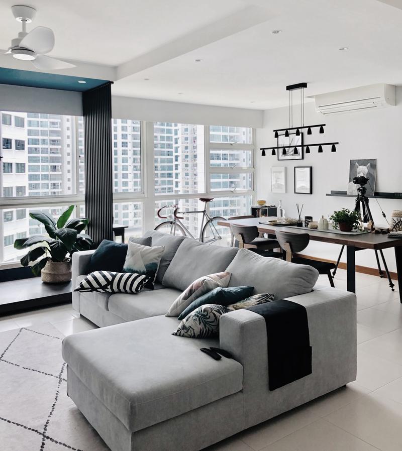
Levon and Jasper’s abode exudes calm and soothing vibes reminiscent of a Ryokan – a traditional Japanese inn

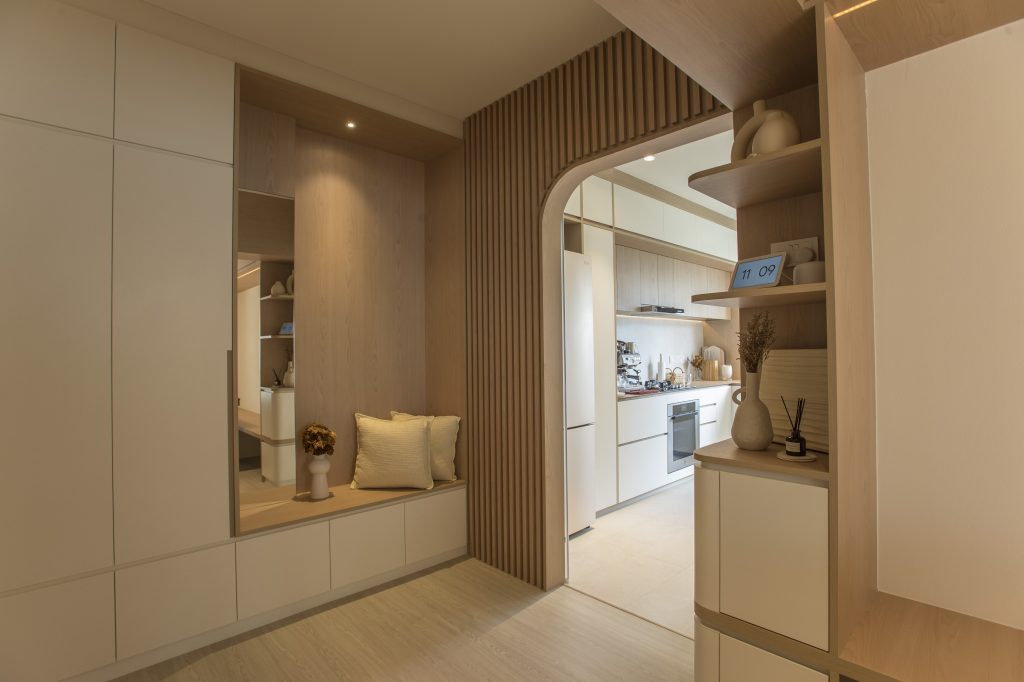
There’s a lot to love about Levon and Jasper’s flat in Bukit Merah, particularly the wood-splashed interior and wooden walkway arches. There, the interplay of light and honey-toned wood exudes calm and soothing vibes reminiscent of a Ryokan – a traditional Japanese inn.

“We like the warm and cosy vibe of wood,” the home owners explain. “We took inspiration from the Japandi (Japanese and Scandinavian) style, as its fusion of simplicity and nature is closest to what we envisioned for our home.”

First-time home owners Jasper and Levon

Warm, Wood Vibes

Just like one would expect in a Ryokan, hospitality plays a big part in the couple’s home. “One of our key considerations when flat-hunting was that our home needed to have a large common area to host our friends and family,” Jasper explains.

They found what they were looking for in their current home and worked to turn their ideas to reality. Instead of consulting with an interior designer, Levon and Jasper took on the task of planning for the space themselves.

On one side, they placed a large, plush sofa that seats many; and on the other side, a dining nook where friends and family would gather. In the nook, wood laminates stretch from the floor to across the ceiling, making the spot feel extra cosy. The wood on the ceiling also visually demarcates the dining nook from the rest of the communal area. Strip lighting along the top frame of the nook gives it a modern touch, while a customised wooden bench replaces conventional dining chairs on one side of the table.

Wood-paneled walls, floor, and even ceiling, lend warmth to the space 
Wooden arches, such as the one above, softens the interior 

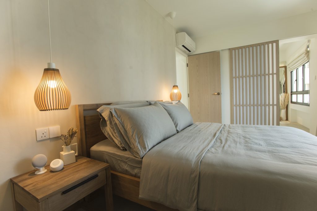
Wooden touches extend to the bedroom as well. Like those in traditional Japanese inns, a wooden sliding screen door with vertical rectangular panels is used to define and separate the bedroom from the adjoining space.

Warm lighting is used to create a restful ambience in the bedroom

Balancing the Look

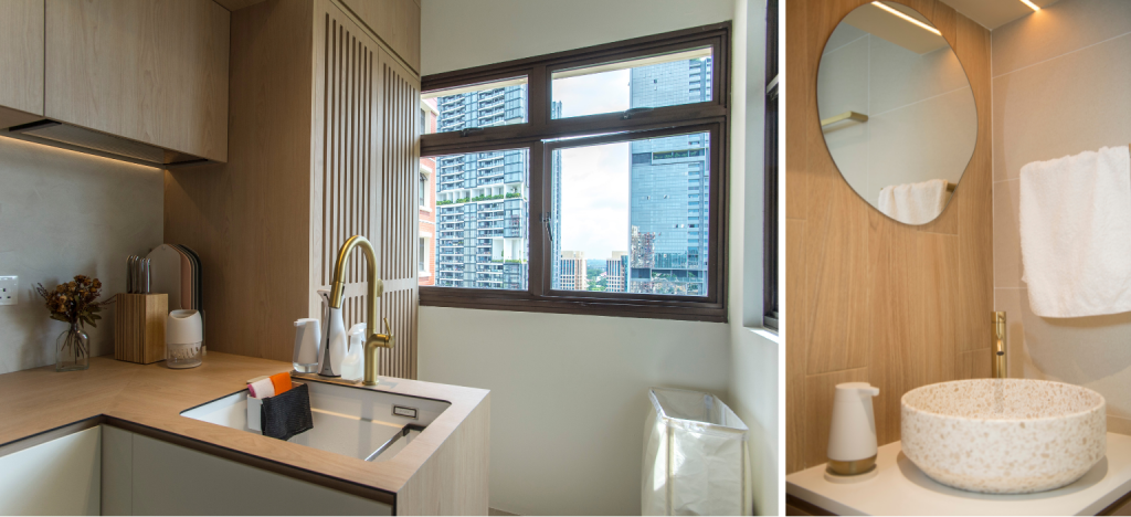
While the colour palette of the home comprises mostly neutral shades, gold accents are used consistently throughout to liven up the space. In the kitchen, with most of the cabinets decked out in wooden laminates, a gold tap injects modernity to the look. Similarly, the gold tap stands out—in a good way—against the wood-tiled bathroom wall.

Gold accents liven up the space
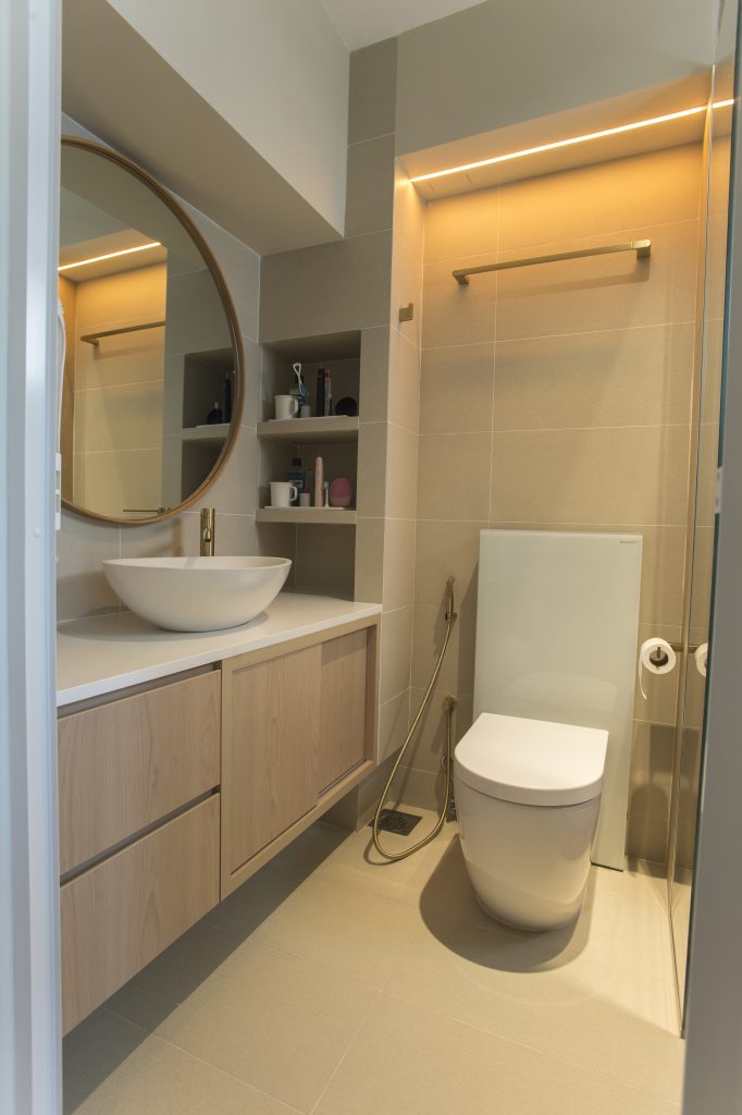
No onsen here, though wooden tiles and ambient lighting create a relaxing space

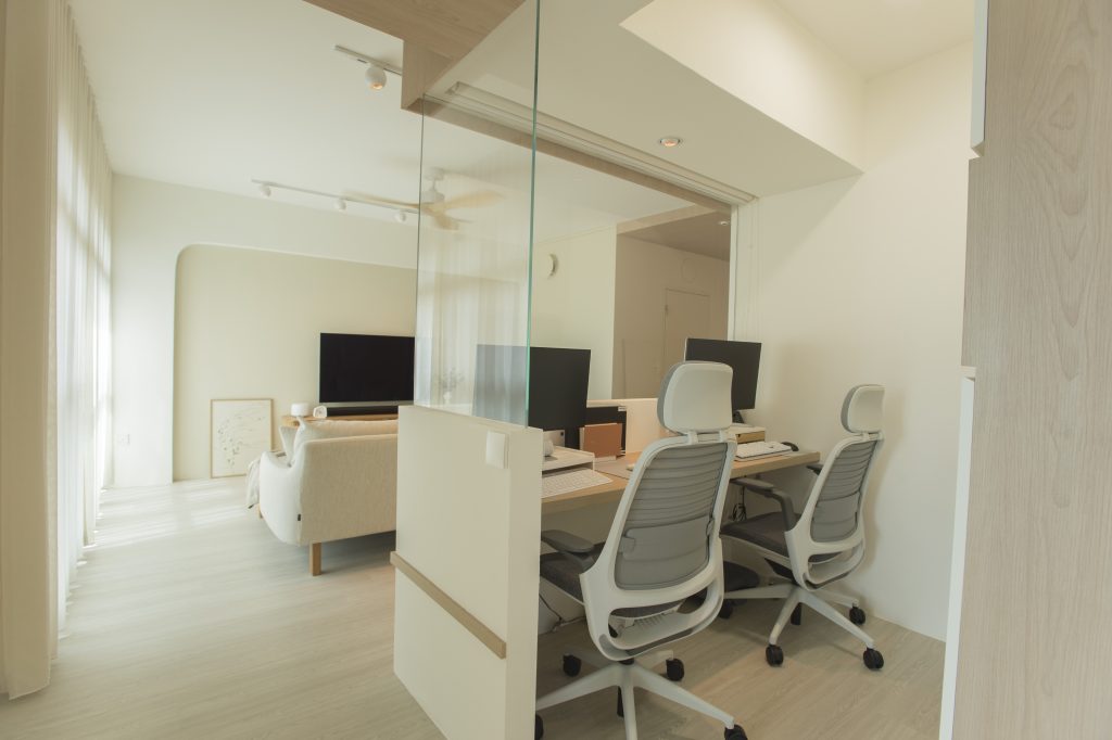
Glass was also cleverly used in the home design to break up the use of all that wood, in the form of a half wall partition between the workspace and living room.

A section of the master bedroom was carved out for a workspace

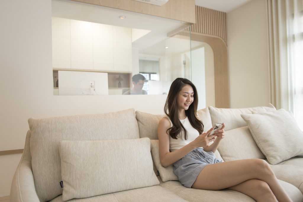
“We like how the glass wall lets in more natural light into our home,” Levon explains. “It also lets us feel like we’re in the same space, even if we are not.”

Jasper adds: “For instance, when I’m working and Levon is watching TV, I’d pop my head up for a break and watch whatever she’s watching – sometimes, she’d even catch me up on the plot!”

The half glass wall partition between the workspace and living room lets the couple feel like they are in the same space

A Home Designed for Individual Needs

While aesthetics played a big role in the design of their home, the couple emphasises the importance of functionality.

“It’s helpful to think about how the design can cater to your way of living, and not the other way round,” they say. “We knew we wanted a walk-in wardrobe and a workspace, so we prioritised those and designed the space accordingly.”

The result is a gorgeous home that caters to their lifestyle and individual needs.


Source: mynicehome.gov.sg
Home Tours: A Boho-Chic Home Full of Thrifted Treasures

Home Tours: A Boho-Chic Home Full of Thrifted Treasures

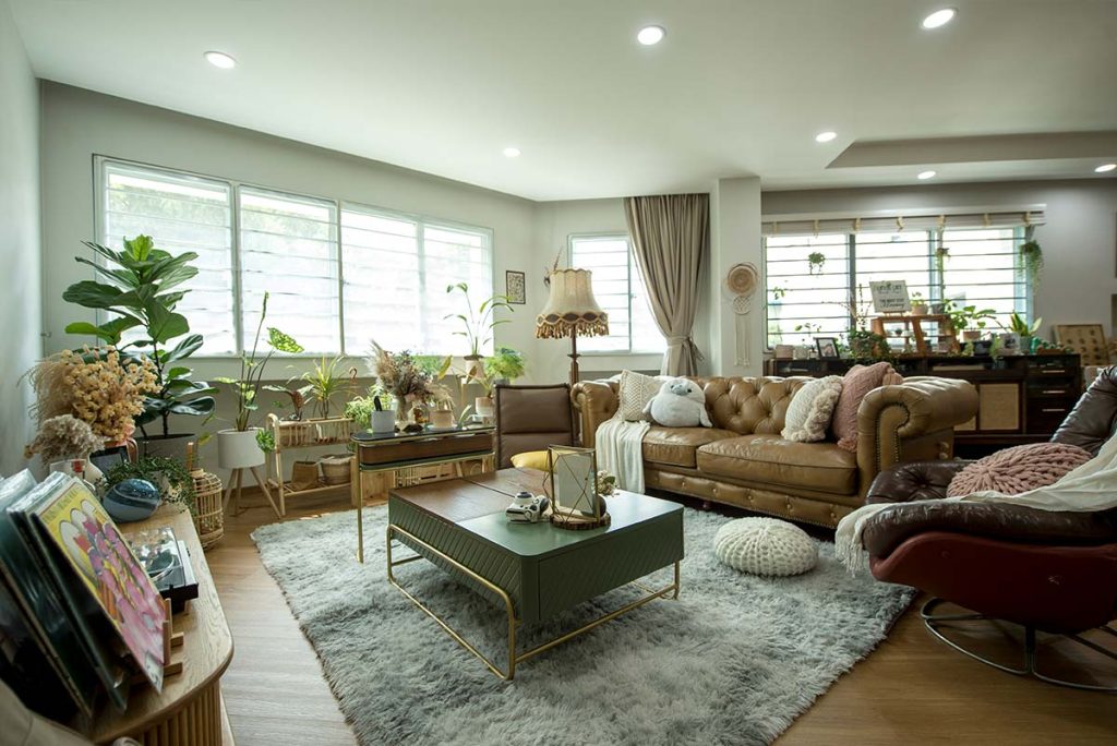
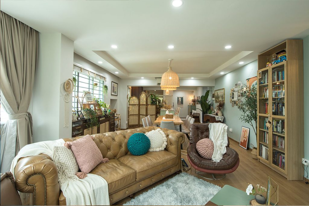
As avid antique lovers, most of the furnishing and home décor pieces in Jocelyn and Samuel’s flat have vintage origins

For vintage hunters Jocelyn Lim and Samuel Ng, their 5-room flat in Pasir Ris is a proud display of their thrifted treasures collection.

Home owners and vintage lovers, Samuel and Jocelyn

“Every piece tells a story,” Jocelyn explains. “The 19th century lampshade in the living room was passed down for generations in an Australian family. It looks so unique because of the way it’s crafted. It was the first item that we picked out for our new home,” she adds.

The 19th century lampshade in the living room was the first item Jocelyn and Samuel purchased for their home

Pre-loved Furniture with Character

As avid antique lovers, most of the furnishing and home décor pieces in the flat have vintage origins. For Samuel, the appeal of those thrifted pieces lies in their craftsmanship, uniqueness, and intricate detailing. “I love the different colours and textures that they add to our home.”

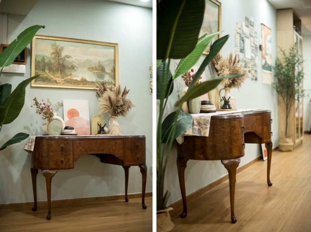
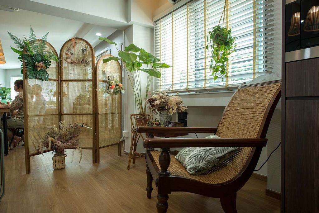
One of his favourite pieces is the sideboard with distinctively curved legs (also known as Queen Anne legs or cabriole legs) and padded feet. Another vintage statement piece is the planter’s chair, which comprises long teakwood planks with a rounded end. The planter’s chair was commonly used during the colonial era, where the extended planks were used as leg rests.

“I like that we’re able to learn about the art and design from a particular period through the furniture and items that we have collected over time,” Samuel says.

The Queen Anne style furniture comprises distinctively curved legs and padded feet
The planter’s chair, picked up from Carousell, was a great find for the couple

While Jocelyn and Samuel look out for good deals in retail shops and on online platforms, the items don’t always come in optimal condition. That’s when the couple would dabble in some DIY works, such as painting over pottery and fixing the frame of a leather side chair.

Repairing a leather side chair (right) was one of the couple’s DIY projects

Laidback Boho-Chic Vibes

The pre-loved furniture which they have chosen, complement the flat’s earthy tones, rattan accents and greenery that reflect the couple’s love for nature. Together with the tapestry and paintings on the walls, the flat exudes casual boho-chic vibes.

The open living concept provides the illusion of a larger space, and the natural light filtering in through the windows lends the flat its soft, natural look. The windows also offer ample views of the surrounding greenery, something the couple was drawn to right from the start.

“This flat checked all the right boxes for us. We even got to enjoy proximity grants, on top of CPF housing grants, because we live near our parents. That helped us save quite a bit on the cost of the flat,” they say.

The open layout of the communal area is another feature that the home owners love, especially since they frequently host family and friends.

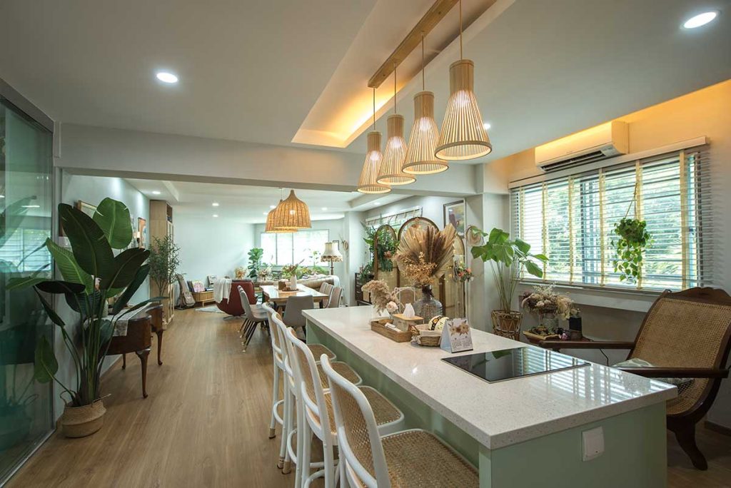
A kitchen island is incorporated into the common living area as an additional gathering space for the couple’s family and friends.

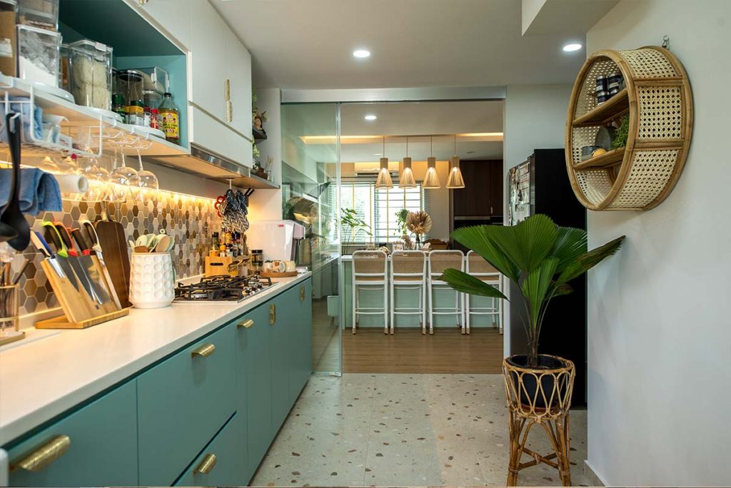
Different floor treatments help to demarcate the different spaces while also serving a functional purpose. “As we spend a considerable amount of time (or money?) in the kitchen, we decided on terrazzo tiles for the space as they are relatively easy to upkeep. They also complement the boho aesthetic,” Jocelyn explains. A glass sliding glass door keeps fumes and smells contained in the kitchen, whenever the couple whips up a meal.

Rattan accents in the form of a shelf and plant pot tie the look together in the kitchen.

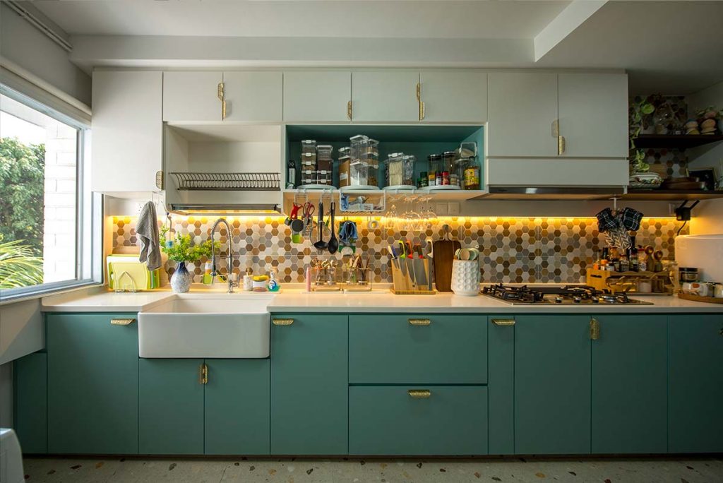
The green and white kitchen complements the earthy tones of the house

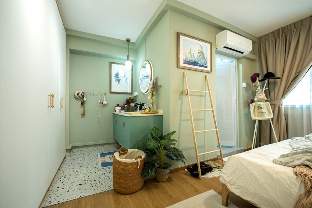
In a house full of unique finds, another unexpected touch is the creation of a sink and bathroom vanity in the bedroom instead of having it within the ensuite itself. The couple did so as they wanted a bigger sink and vanity area.

The terrazzo-tiled vanity area is a unique feature of the master bedroom

As with the rest of the flat, the bedroom is designed in a neutral palette that adds to the room’s relaxing environment

When asked about their favourite thing to do at home, Jocelyn laughs. “We love lounging! When designing our home, we made sure to include a variety of side chairs and settees.”

The home owners take their love for lounging so seriously that they carved out a space for that very purpose. Leading up to the master bedroom is a cosy corner furnished with a daybed and soft cushions.

The lounge corner

For Samuel, the lounge corner is his favourite space because the cosy and relaxing vibes make it perfect for reading and spending some me-time.

Samuel often spends his free time reading in the lounge corner

When asked about her favourite space within their abode, Jocelyn, without missing a beat, quips, “The living room, because it offers me the best views of our home.”

“I love the planter’s chair in the living room too!” Samuel adds. “I can just sit there and admire the greenery surrounding our home, which is a definite plus.”

From finding a flat that ticked all their boxes, to designing a home that meets their exact tastes and lifestyle needs, Samuel and Jocelyn created a home that was perfect for themselves.

Source: mynicehome.gov.sg
Home Tours: A Self-Designed, Studio-Inspired Home

Home Tours: A Self-Designed, Studio-Inspired Home

A fan of open layouts? Find out how Yi Ting and Wenxiang turned their flat into a bright and airy studio-like space.

Seated by the bay window that overlooks the rest of their home, couple Ong Yi Ting and Poh Wenxiang laugh when naming their favourite space at home. “Since our flat is one connected space, can our answer be ‘our home’?” they say cheekily.

Home owners Yi Ting and Wenxiang

A Completely Open Layout

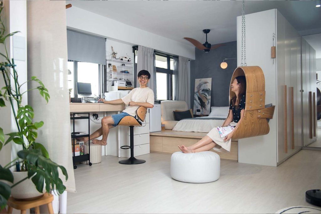
While the concept of open layout is relatively common, what makes Wenxiang and Yi Ting’s 3-room BTO flat stand out is their decision to completely do away with bedrooms. The result is a bright and airy studio-like space designed to suit the couple’s lifestyle needs.

“We started brainstorming for layout ideas as soon as we selected our flat,” Yi Ting recalls. “Our priority was to have maximum space with minimal maintenance, so that helped guide our design process.” With a background in design, the couple experimented with a variety of layouts—with and without bedrooms— before deciding on the current iteration.

On why they did not opt for a bigger flat type, Yi Ting laughs and says, “The bigger the space, the higher the level of maintenance required. We didn’t see the need for a bigger flat, plus, with the current open layout, the space is more than sufficient for our needs.”

From the From the living room, one can get an overall view of Yi Ting and Wenxiang’s 3-room flat.

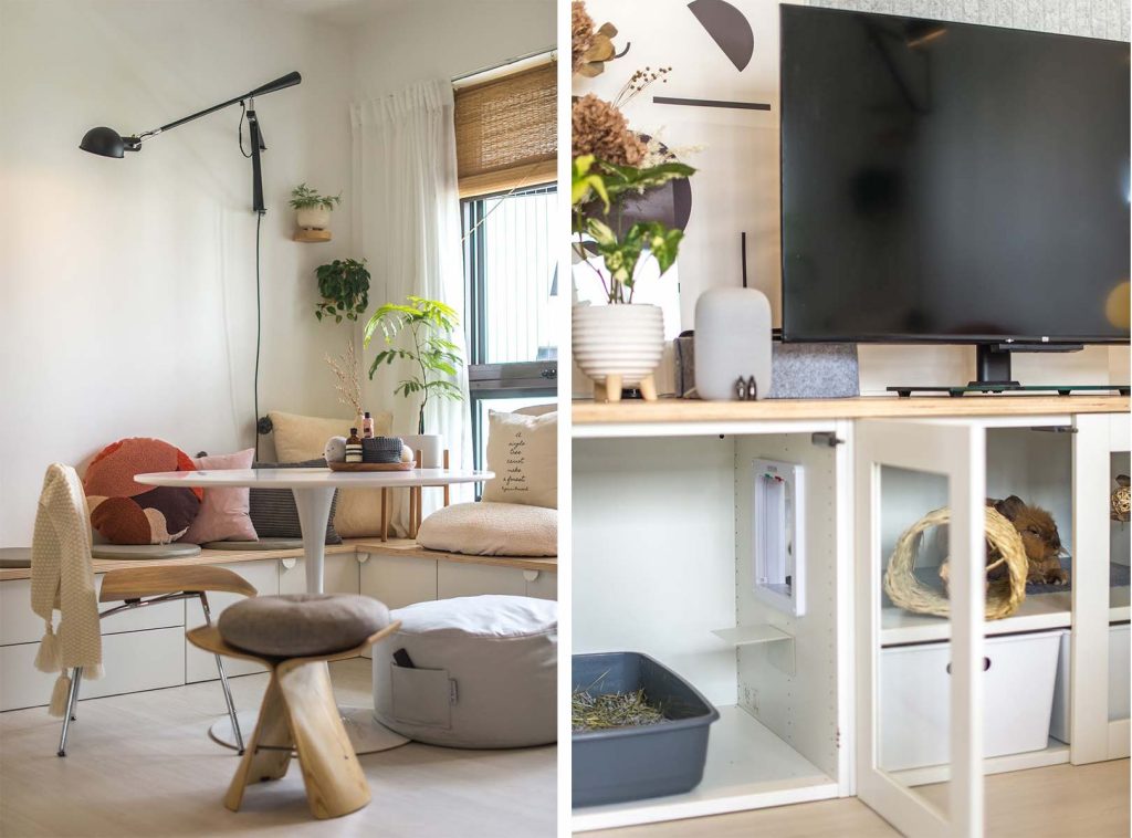
The couple considered each other’s living habits and needs, to help them better plan the flow of their home whilst still fully utilising the space. For instance, they wanted to combine the living and dining area, so having a sofa in the room wasn’t ideal. Instead, they designed an L-shaped seat that extends to the window for this purpose.

An L-shaped seat that borders the room is one of the couple’s many designs that integrates form and function.

Creating Different Spaces

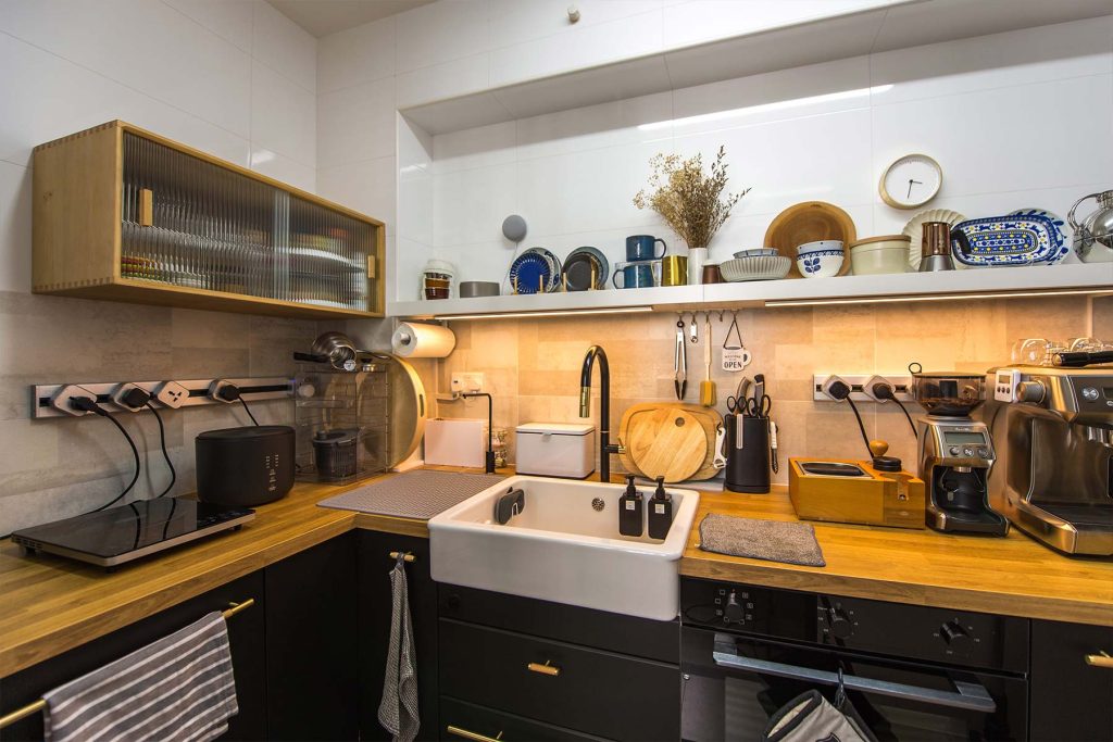
Wenxiang and Yi Ting were careful to remove only the non-structural walls in their flat to facilitate a seamless flow within the flat. They then used design elements to differentiate the various spaces. The kitchen for instance, is set apart by its tiled flooring as opposed to the vinyl overlay in the rest of the flat.

To further differentiate the kitchen from the rest of the flat, darker tones such as black and grey are used.

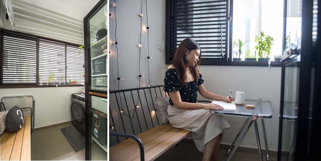
The home owners also made full use of the service yard, transforming it into a dual-use space comprising a laundry area and lounge corner.

The service yard also has a cosy breakfast nook

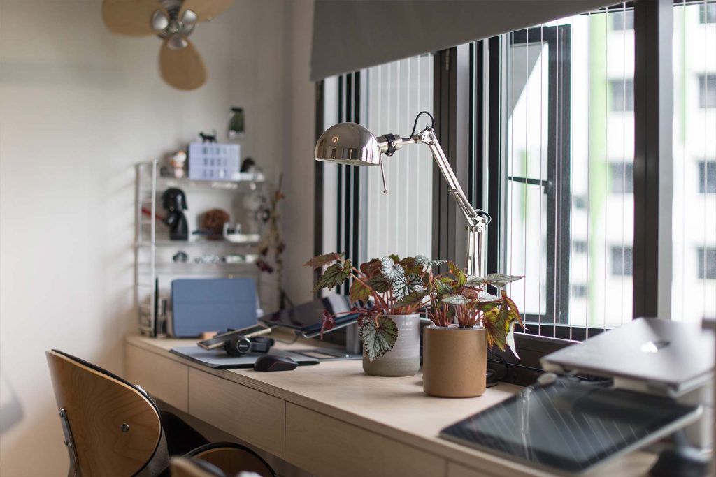
While home offices are usually designed in a room setting, Wenxiang and Yi Ting’s workspace comprise a customised high table by the window, to take advantage of the natural light and green views.

The workspace with a view

Next to the home office is the bedroom, and a built-in wardrobe doubles up as a partition between the bedroom and bathroom.

DIY Projects

As hands-on home owners, the couple had also taken on a handful of DIY projects, including installing the shelving and master bathroom vanity cabinet.

Fittings in the form of shelves are some of the many DIY projects

Their biggest project, Wenxiang shares, was the kitchen cabinets. “We measured the dimensions and sourced for a carpenter to provide us with the wood laminates. We then put together  the kitchen cabinets ourselves. It took us quite some time, but it was worth it,” he beams.

The TV console and extended bench in the living room were built in a similar fashion, where the couple assembled  them using customised wooden planks, before adding storage beneath.

The space under the extended bench is used as storage (left), while the TV console doubles as a hutch for the home owner’s pet bunny (right)

While designing their flat from scratch has allowed Yi Ting and Wenxiang to enjoy cost-savings and the ability to fully utilise the space, they said the task may not be suitable for all home owners.

“We spent a considerable amount of time trying different layouts and were also very involved during the renovation process. Not all home owners have the luxury of time to do so, so engaging an interior designer and/ or contractor might be a better alternative for them. However, for us, the fulfilment we got in designing our home is definitely worth the effort.”

For more interior inspiration, check out more Home Tours and Design Ideas!

Source: mynicehome.gov.sg
Home Tours: Bold Colours, Aesthetic Patterns & Retro Vibes

Home Tours: Bold Colours, Aesthetic Patterns & Retro Vibes

While the Scandinavian style had initially appealed to Qing Hong and Vivian, find out why the home owners opted for darker and bolder colours

Prior to their renovation journey, Lee Qing Hong and Vivian Chua had envisioned a Scandinavian-inspired home and its hallmark elements of bright, airy spaces, white walls, and wood accents.

Glancing at the walnut cabinet and Aegean blue feature wall in their living room, Vivian lets out a small laugh and says, “Well, we did manage to include wood elements in the final look.”

Home owners Qing Hong and Vivian
The various elements of the home look harmonious when put together

Bold, Dark Tones

While the muted colour palette and natural elements of the Scandinavian style had initially appealed to Qing Hong and Vivian, they found themselves gravitating to darker and bolder colours. “We wanted a look that is slightly different, a style that is bold yet calming,” they explain.

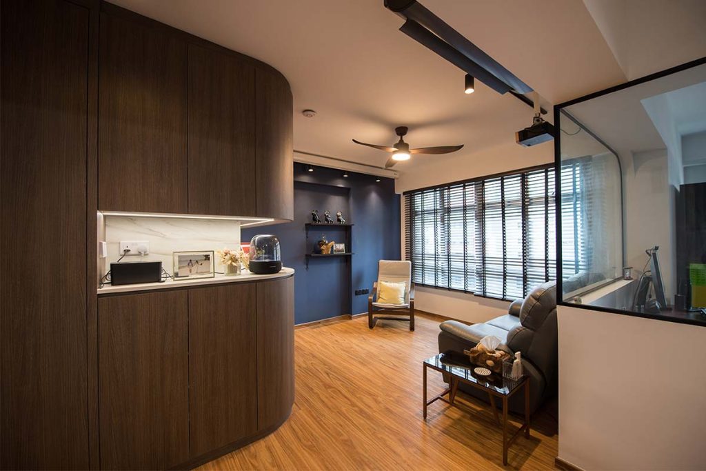
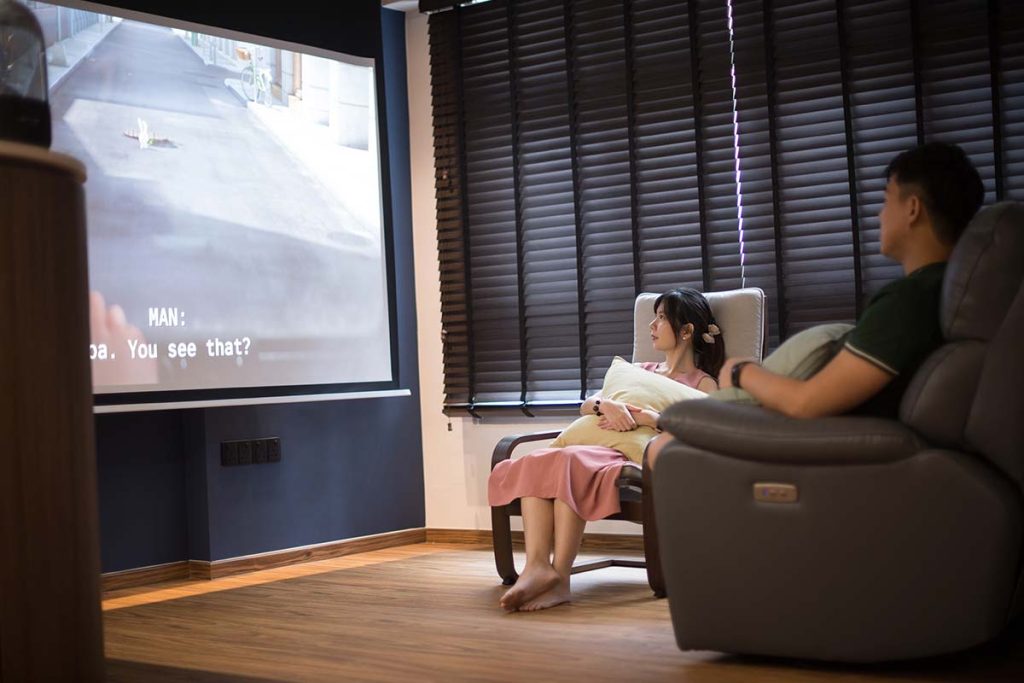
The dark colours create a cosy ambience that is perfect for movie nights
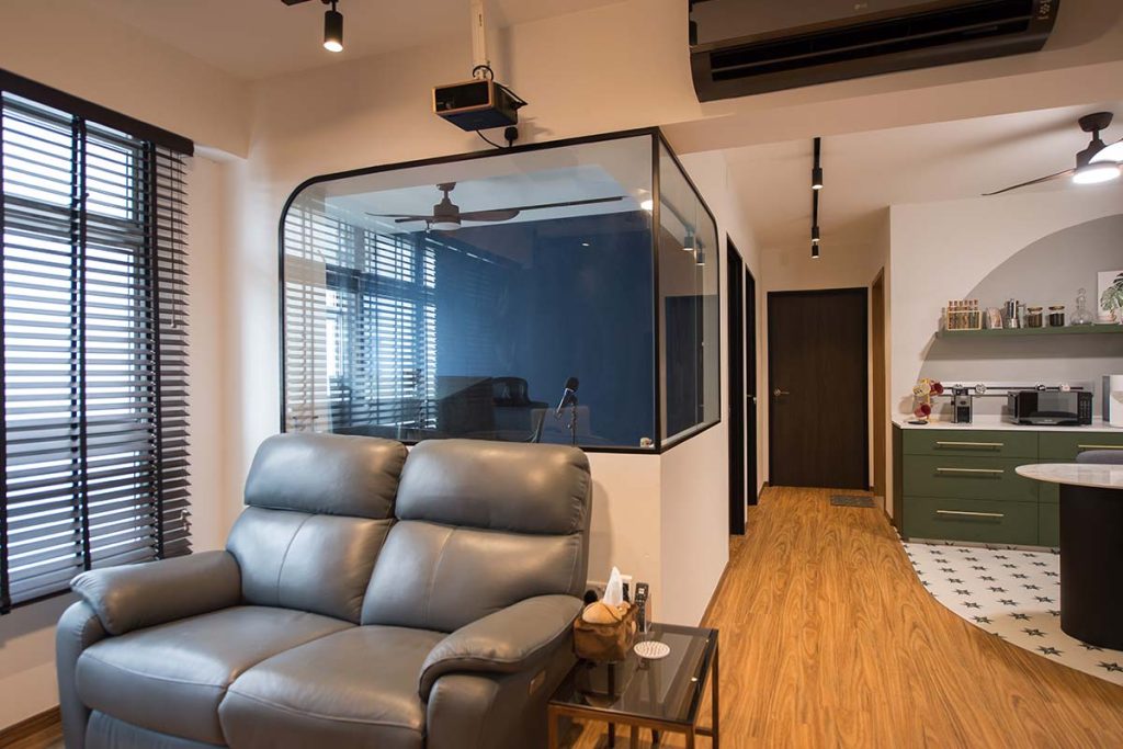
The use of glass balances the dark tones, and creates openness within the home

The couple then decided on blue—Vivian’s favourite colour—as the primary colour for their home. As frequent beachgoers, they liked how blue reminds them of the sea, as well as the calming vibes that the colour evokes. To complement the blue, the couple who are also nature lovers, incorporated a shade of green into the colour palette.

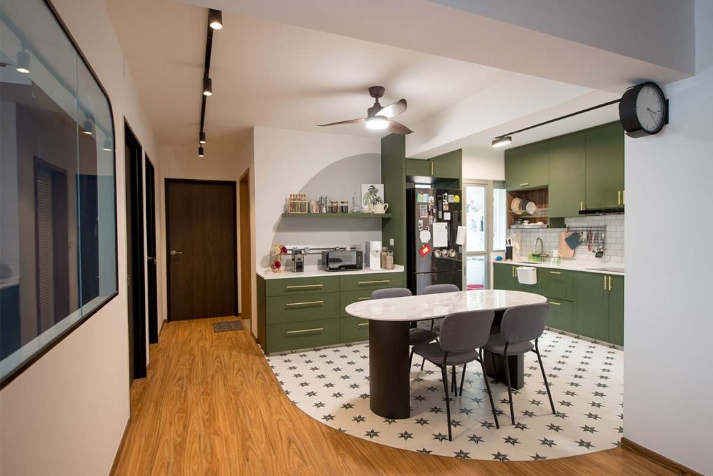
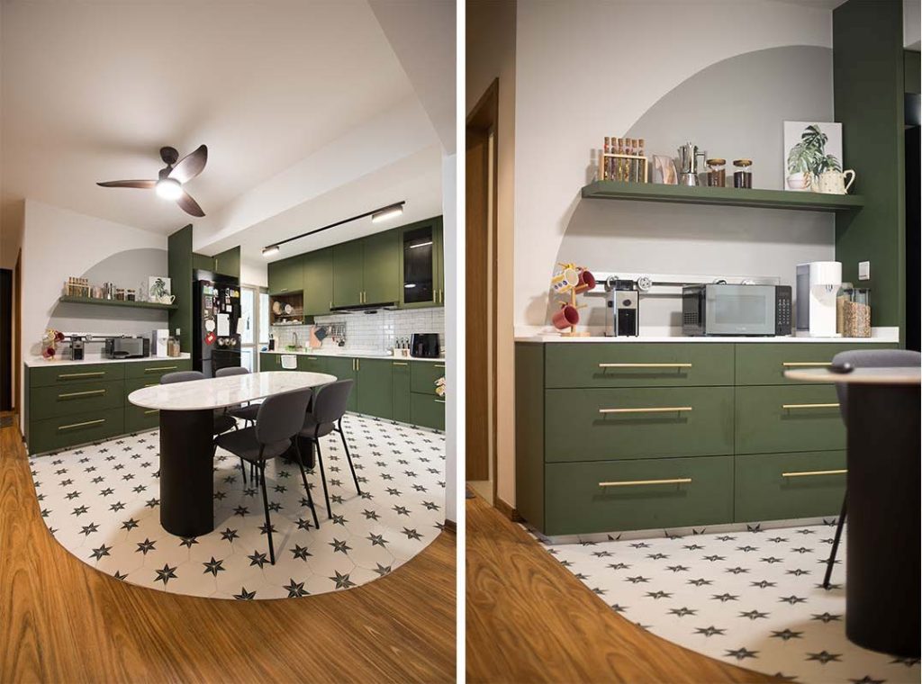
 Green is used on the cabinets in the open kitchen and pantry area
Dark walnut tones around the house tie the overall look together

Demarcating Spaces with Design Elements

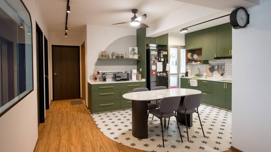
While the olive-green cabinets make a visual statement, what makes the kitchen really stand out is the tiled flooring that extends to the dining room. Striking hexagonal tiles that serve up some serious retro vibes are laid in the shape of an arc – a design element that is cleverly reflected on the pantry wall.

The arc on the floor is also mirrored on the pantry wall

Aesthetics aside, the tile floor serves to demarcate the dining area and kitchen from the rest of the common living space.

“While we appreciate the seamless flow of the open flat layout, we wanted to literally draw the line between the spaces,” Vivian shares. “So instead of vinyl flooring like the rest of our home, we opted for tiles in the dining area and kitchen instead.”

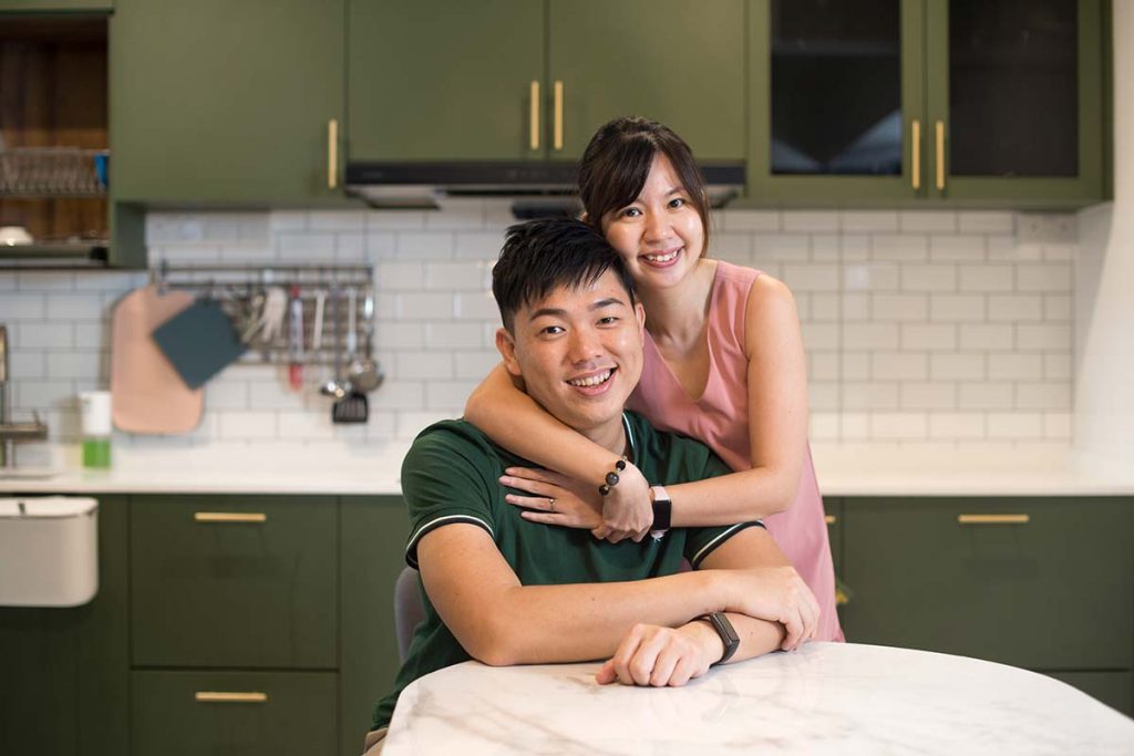
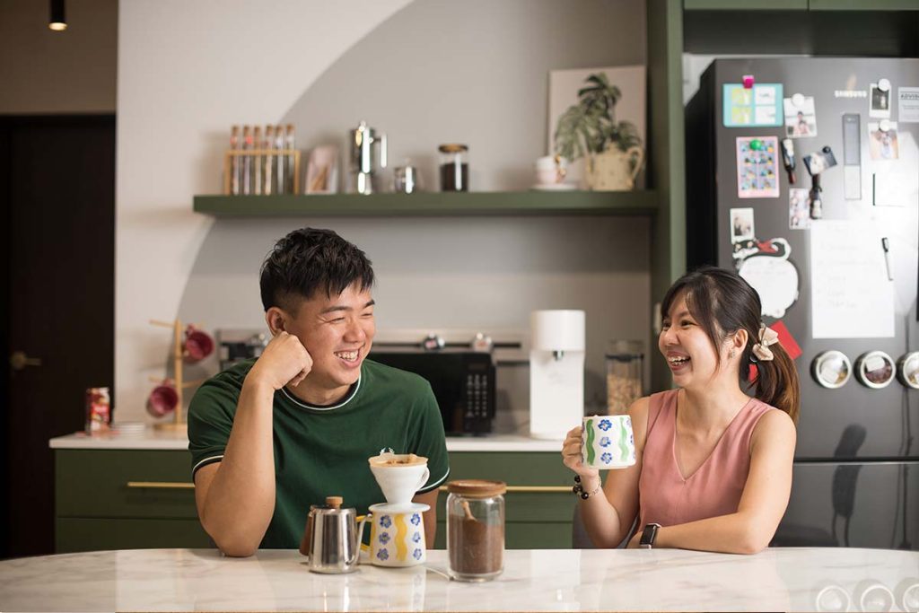
Qing Hong and Vivian enjoying their coffee in the dining area

Qing Hong explains that the dining area is where he spends his me time, relaxing as he reads a book over a cup of coffee.

Without skipping a beat Vivian adds, “The dining and kitchen area is definitely our favourite spot at home. It’s where we host our family and friends, and where memories are made.”

Source: mynicehome.gov.sg
A Touch of Peranakan

A Touch of Peranakan

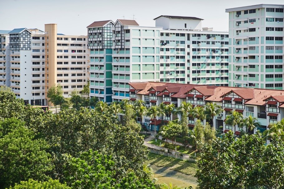
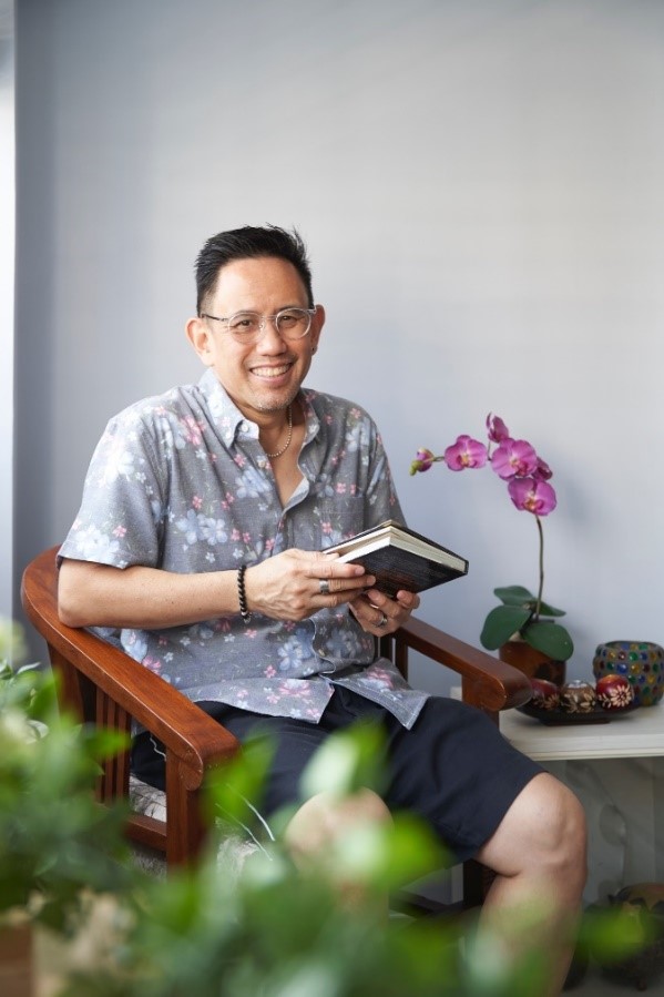
Once an eastie, always an eastie! Christopher brings us around his peranakan-inspired 5-room flat in Pasir Ris.

Christopher knew that the 5-room resale flat in Pasir Ris was The One, the moment he saw it. “My mother and I had viewed 10 properties before falling in love with this unit,” he said.
Having grown up and lived in the east side of Singaporefor allhis life, Pasir Ris was an ideal town for Christopher with its laidback vibes and peaceful surroundings. On top of the lovely view, the flat offered him the chance to design his home the way he wanted.
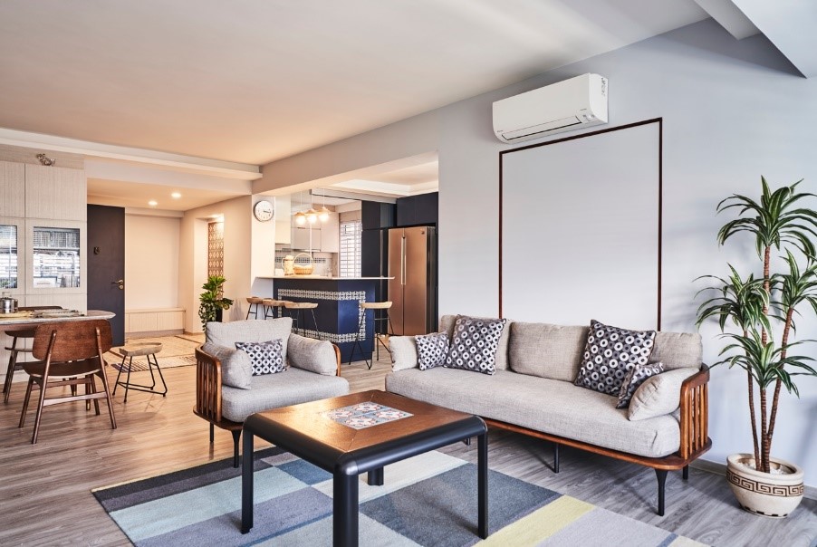
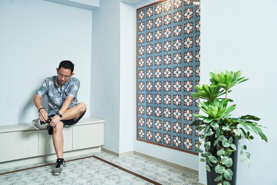
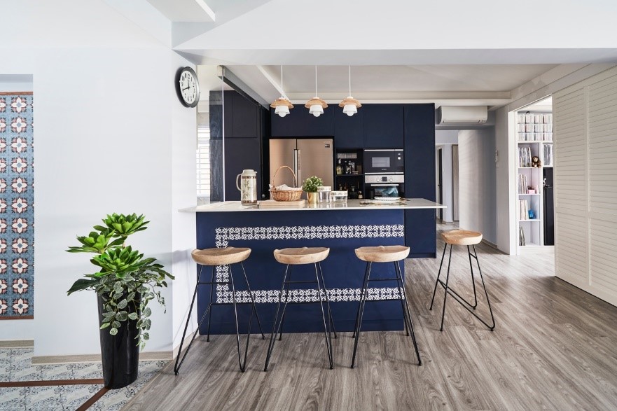
Christopher worked closely with his interior designer, Dan,to develop the design ideas and carry out the renovation works. To complement a soothing palette of greys and blues,subtle patterns were incorporated in the décor for visual interest. One example is thestunning feature wall of Peranakan tiles at the entryway, as a nod to Christopher’s heritage.

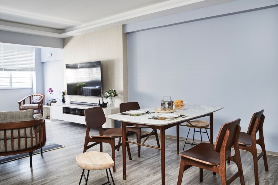
In planning the layout of the flat, Christopher considered how the space could meet his lifestyle needs. “As I had little use for a balcony, I chose to expand the living room instead,” he explained. The change made room for ample seating and dining space, which is especially useful when he has friends over.

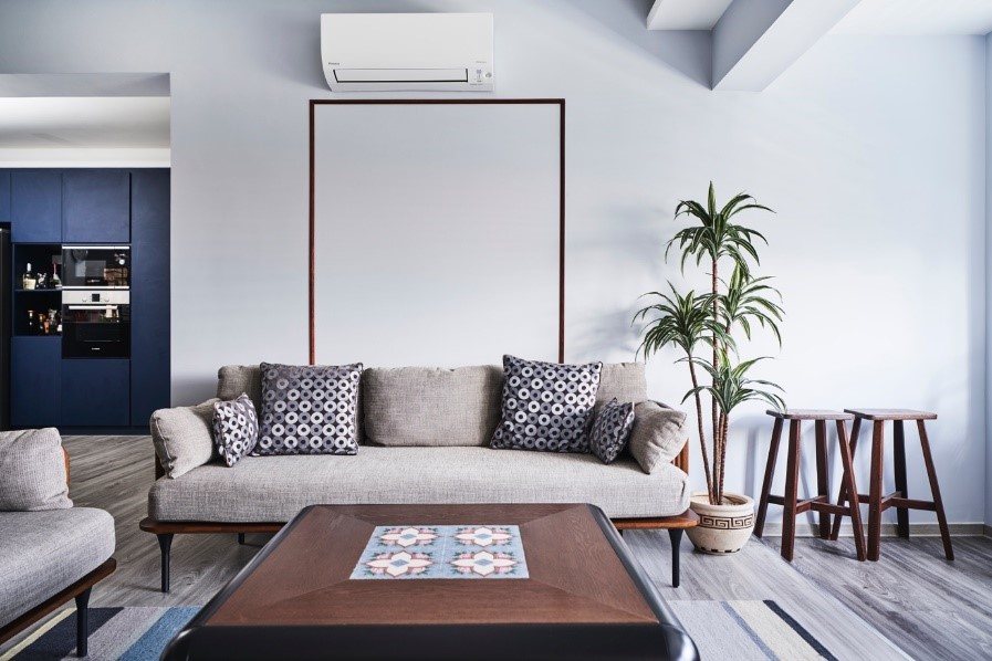
While Christopher purchased most of his furniture from Castlery and IKEA, he also has unusual pieces in his home, such as a customised coffee table with a Peranakan tile pattern that complements the overall interior design concept.

Christopher and his mother do a lot of cooking at home, so he remodelled the kitchen into one with both wet and dry areas that are separated by glass doors to keep the cooking fumes out. The open concept kitchen features a dark blue island with a unique motif, which also doubles up as a casual breakfast bar.

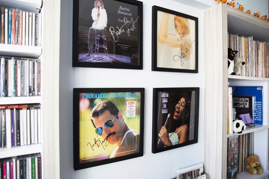
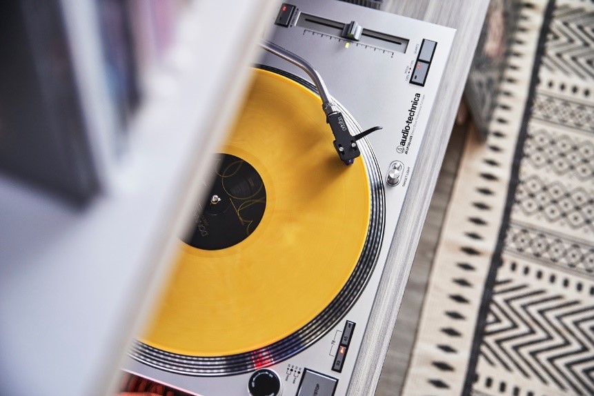
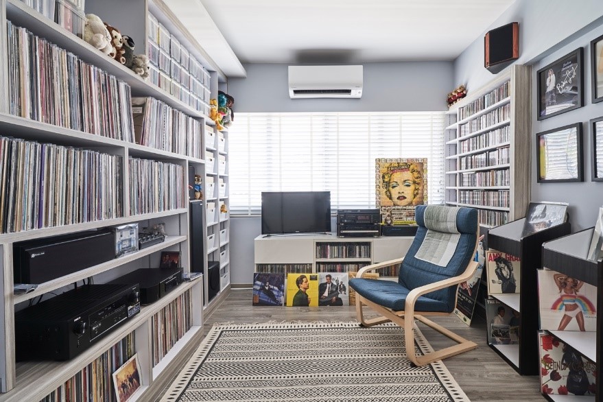
An avid vinyl record collector, Christopher transformed one of the bedrooms into a music room. Besides full-height shelves to display his extensive, prized collection, the room is decked out in framed signed vinyls and other toy memorabilia. “It is a favourite spot for me to sit back and unwind while listening to music,” Christopher said.


Source: mynicehome.gov.sg