Home Tour

Home Tours: A Cosy Tropical Home in Toa Payoh

Home Tours: A Cosy Tropical Home in Toa Payoh
Step inside this tropical glam home!

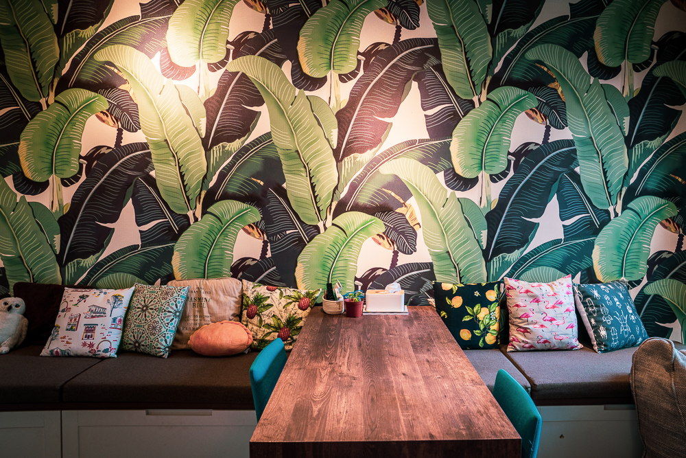
It was love at first sight for Yasmine when she chanced upon a banana leaf-inspired wallpaper. “The jungle vibe of the banana leaves called out to me,” the journalist smiles and continues, “In fact, the colours in the rest of the house are inspired by the wallpaper.”
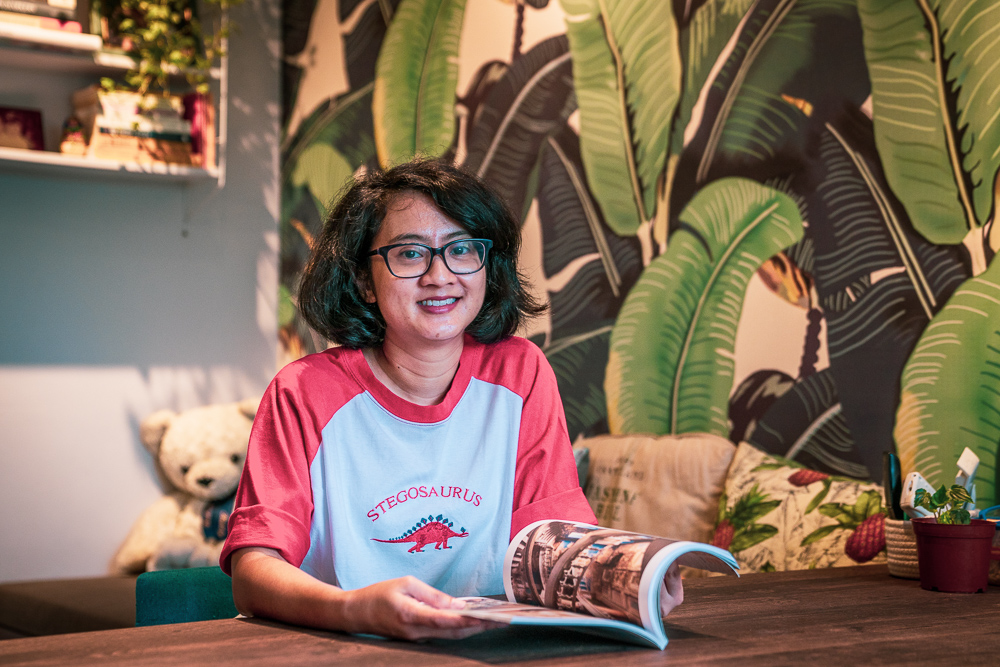
Homeowner Yasmine

The colour green now takes centrestage in Yasmine’s home, which she bought after deciding to move to Toa Payoh to be close to her workplace. “I bought a resale flat here because I love the location – the MRT station is only a few minutes’ walk away and there is a lot of good food in the area. Plus, I can shop for most of my necessities and groceries within the neighbourhood! ”

“It is also convenient for my parents, who occasionally stay over to look after my son,” Yasmine adds.
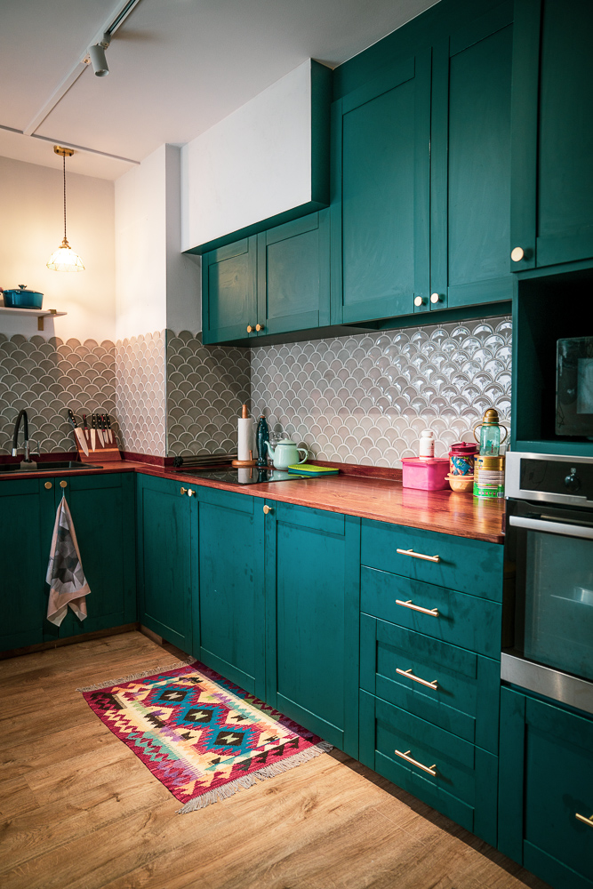
The colours of Yasmine’s home are inspired by the living room’s feature wall
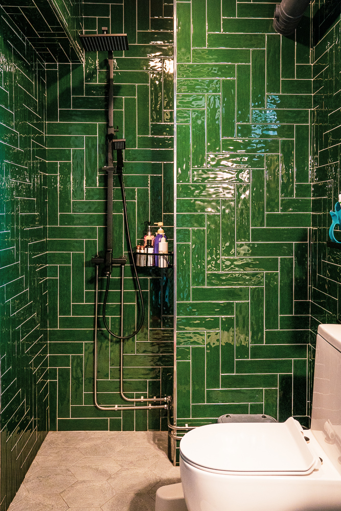
Green takes centrestage in the common bathroom
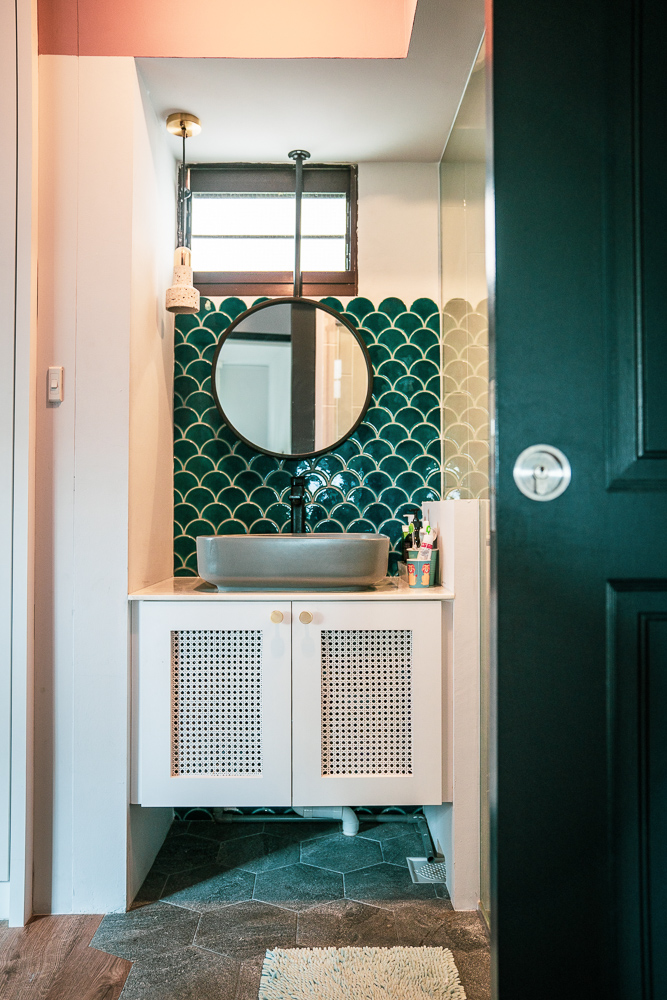
The seashell-inspired backsplash adds a pop of colour and texture

To optimise the space of her flat, Yasmine installed a sliding door for her master bedroom, and customised a sliding dining table. “Initially, I was sceptical about the concept of a sliding table in case some guests might find it uncomfortable. But it turned out fine and I really appreciate being able to shift the placement of the table to suit my needs!”
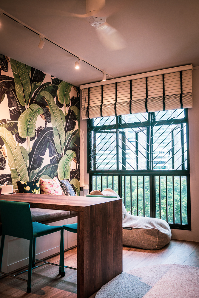
The living area, featuring the custom-made sliding dining table
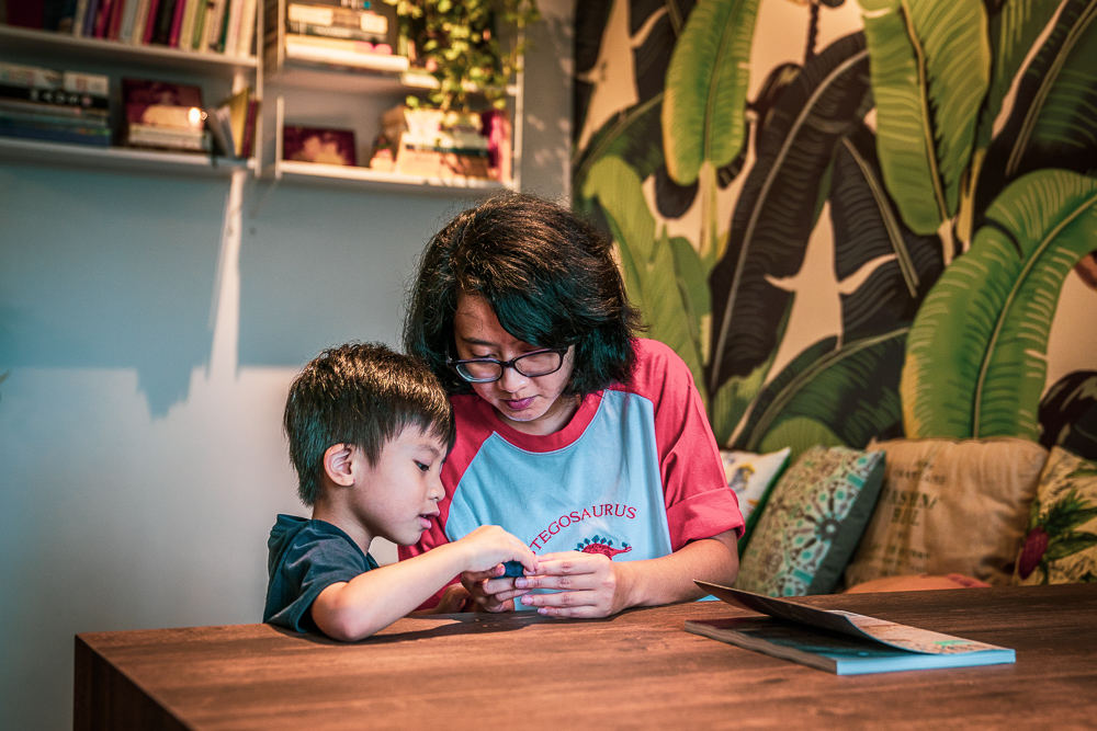
Yasmine spending some quality time with her son

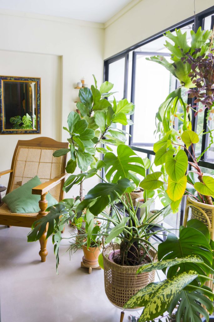
While her home now resembles a tropical forest filled with lush greenery, Yasmine admits she has not always been an avid plant lover. “My passion for plants began only after I received a potted plant as a housewarming gift. Since then, I’ve grown the collection of plants in my home, buying them from the nurseries located around the area.”
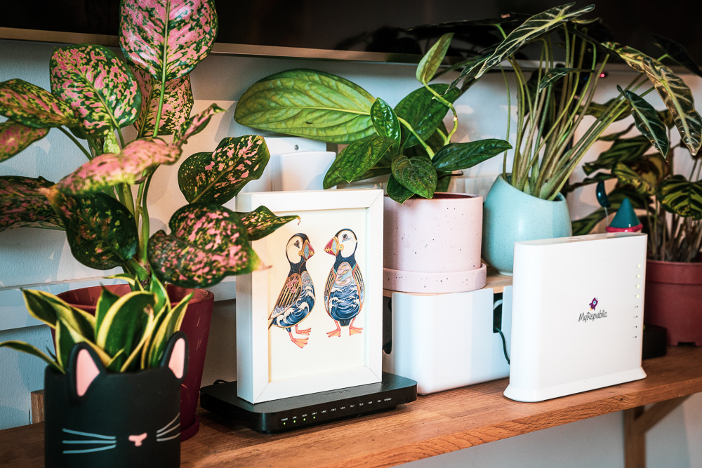
Some of the potted plants in Yasmine’s home

Recounting her renovation process, Yasmine emphasised the importance of close communication with the interior designers. “I discussed at length with my interior designer, Three-D Conceptwerke what I wanted for the house– bright colurs, wooden accents and storage space. Once we agreed on the overall theme and design, the team got to work!”

“The renovation process was really smooth and this really made me realise the importance of engaging interior designers whom you can communicate and work with.”

Source: mynicehome.gov.sg

Home Tours: An Industrial Home With A Splash Of Chic

Home Tours: An Industrial Home With A Splash Of Chic

Step inside this charming eclectic space that reflects its homeowners’ personalities!

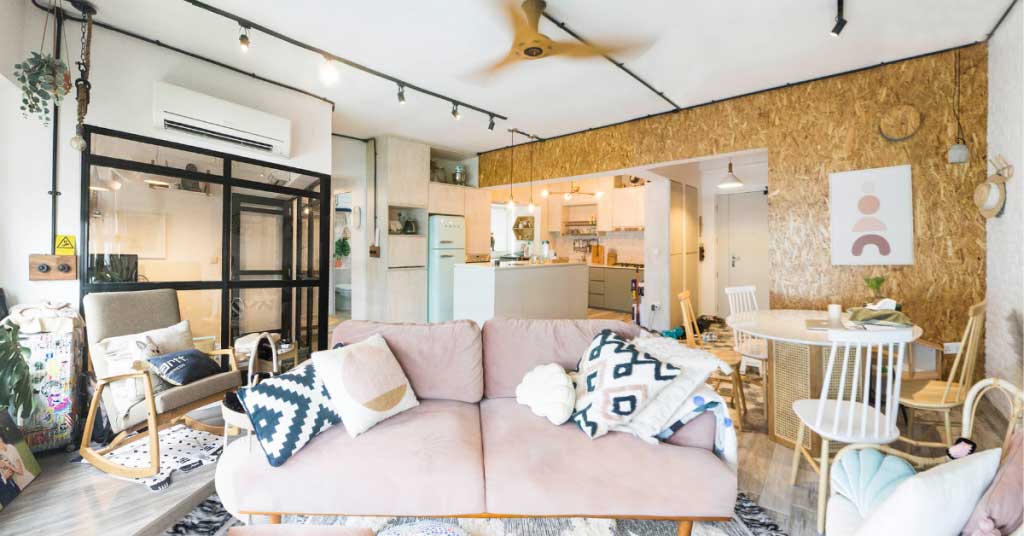
Inspired by Kenny’s preference for industrial interiors and Ruby’s love for pastels and greenery, the couple’s home is a charmingly eclectic space that reflects their personalities.

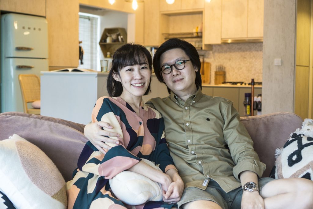
Homeowners Ruby Chong and Kenny Ren in their 5-room home

“I’ve always liked the monochromatic shades, as well as the raw aesthetics of the industrial style,” 38-year-old Kenny says. “Hence, we incorporated elements such as white-washed wooden tiles and black track lights.”

At the same time, one can’t help but notice pops of colours that extend throughout the home, including houseplants and pastel-coloured furnishings.

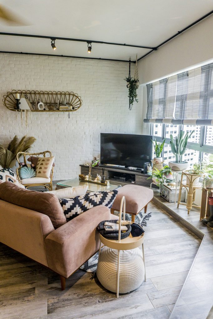
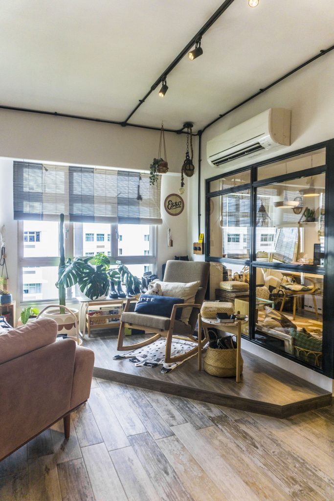
The living room features a raised platform that doubles up as a plant corner

“Plants help to liven up the space,” 32-year-old Ruby smiles. “When I was living overseas, the first décor item I bought for my then-apartment was plants – I really liked how they cosy up the space and wanted the same for our home.”

Designing Their Home

Despite their different aesthetic preferences, Kenny and Ruby managed to combine them to form a charming industrial-eclectic style that carries throughout the 5-room flat – a considerable feat, given how the couple had done most of the design work.

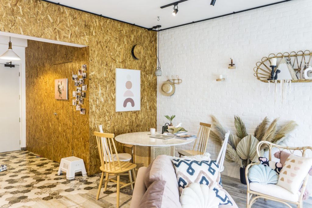
“While we do have a constant look and feel for the house, it’s obvious who had a bigger role in designing certain spots of the house,” Kenny laughs as he refers to the dining area that is finished with rattan pieces and pastel-coloured décor items.

The dining area designed by Ruby emits a mix of Scandinavian and Bohemian vibes

“We were also quite particular about the concept – so even though we engaged an interior designer, we played a bigger role in the designing process,” Ruby says. “For instance, Kenny planned the flat layout while we worked on the aesthetics together.”

The raised platform was designed by Kenny and doubles up as his lounge area

To maximise the space in their living room, the couple incorporated an extended platform that serves as the TV corner, a small balcony and a lounge area.

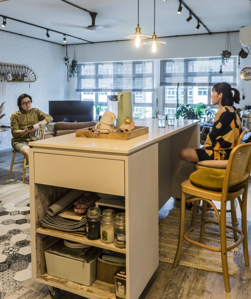
“Our living room layout is relatively uncommon, and I wanted to make the best of the space – especially the corners of the room,” Kenny explains. “Instead of a permanent dining area, we opted for a kitchen island on wheels that allows us more flexible use of the space.”

When hosting visitors, the couple would make more space in the common living area by relocating their mobile kitchen island

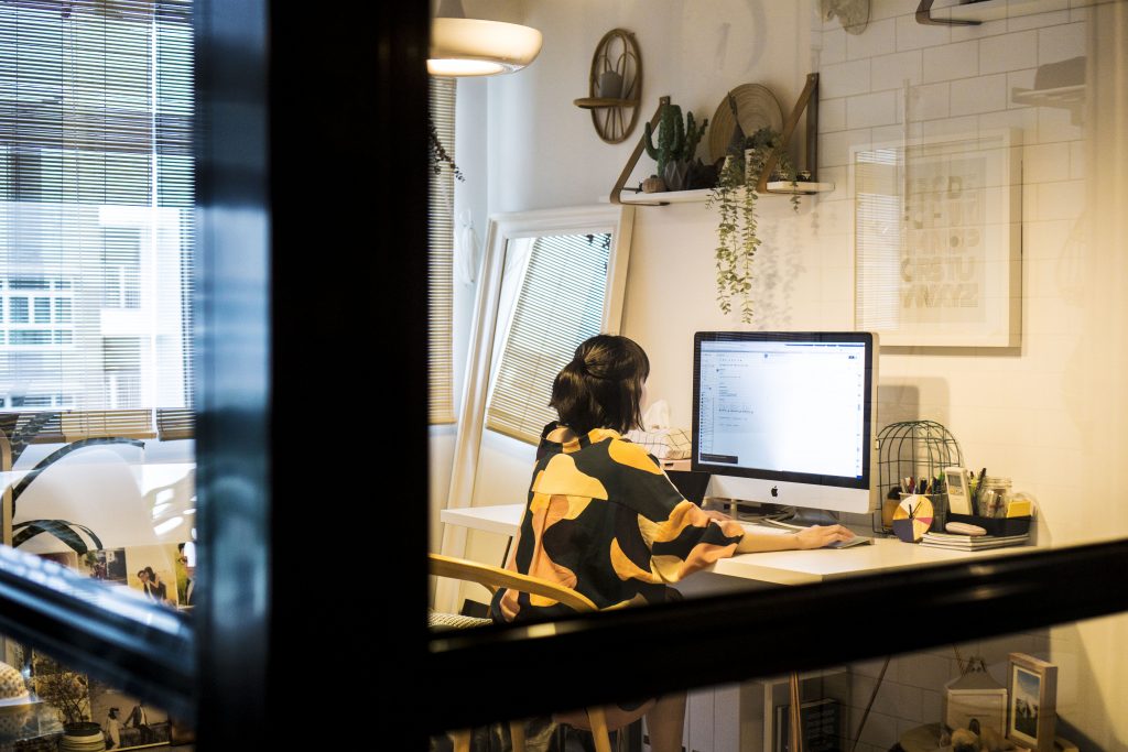
To create the illusion of a bigger space, the couple hacked away the walls of the home office and replaced them with black-framed glass panels. “Not only does the common living area feel bigger, the glass panels also allow more natural light into the home office,” the couple says.

The walls of the home office are replaced by black-framed glass panels

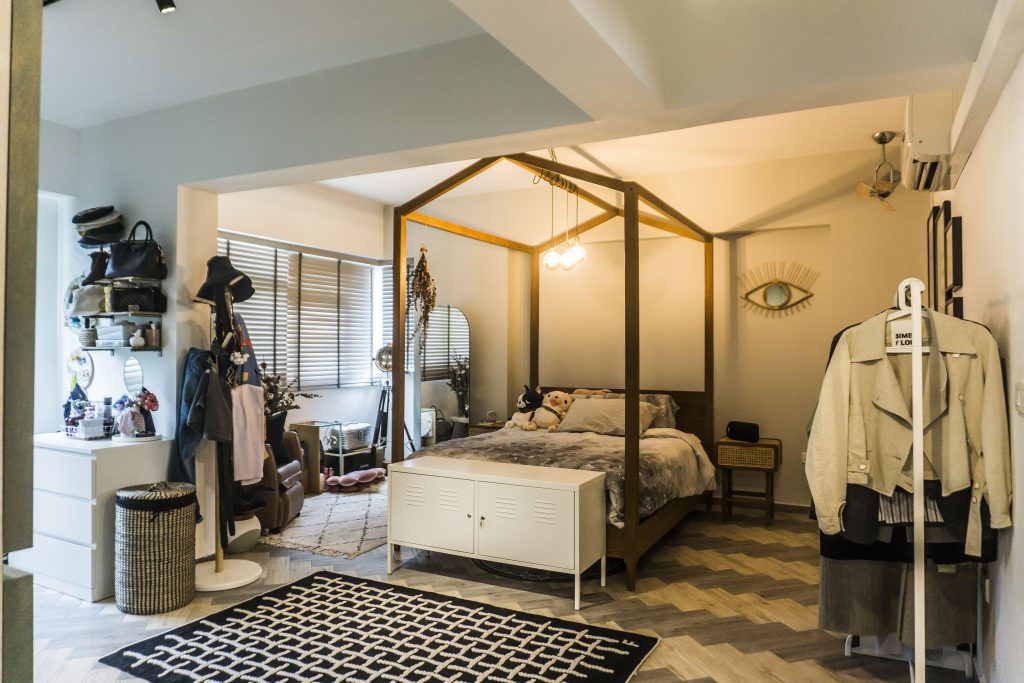
The homeowners’ spatial preference is also reflected in their bedroom. “We opted for the top floor unit as we wanted a higher ceiling,” Ruby says.

This is further accentuated by the couple’s house-shaped canopy bedframe, which also lends the illusion of an attic roof.

DIY Elements

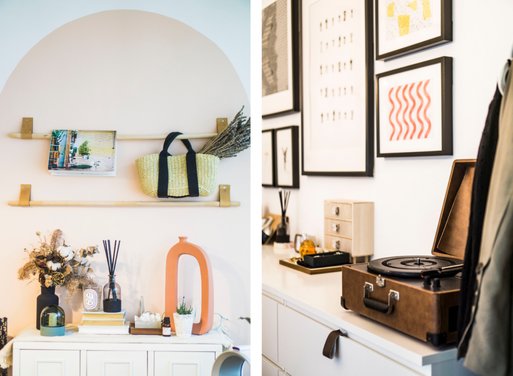
From dabbling in pottery to painting portraits, Ruby shares how her passion for crafts has translated into home projects. “I’ve always wanted to be an art teacher but that didn’t happen,” she laughs. “I like to keep my hands busy, so I would embark on mini DIY projects around the house. For instance, now that I’m spending more time working from home, I decided to spruce up the home office and painted an arc on the wall. I also constructed drawer handles from leather strips, so that it’s easier for us to access them.”

The hand-painted arc in the home office (left) and drawer handles (right) reflect Ruby’s passion for crafts

It has been 5 years since they moved in; the couple decided to refresh the flat and recently renovated the bathrooms.

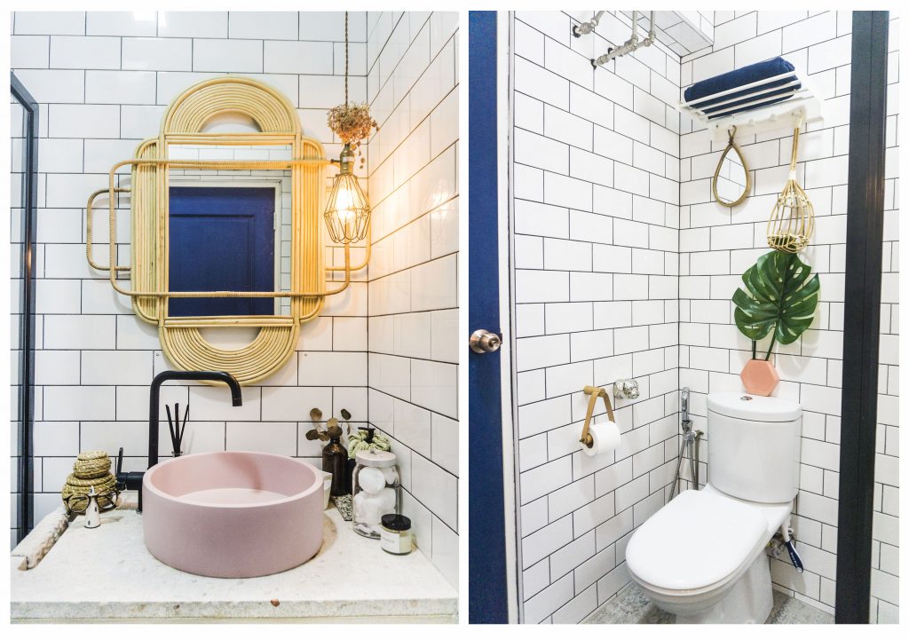
The master bathroom features existing subway tiles, a new tap and sink

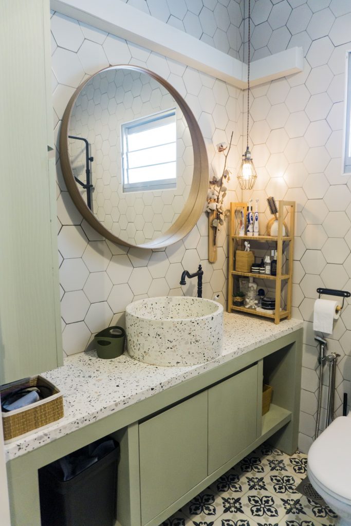
“After choosing and buying the materials, all we had to do was to engage contractors to install the fittings for us,” Ruby shares. “We really enjoyed the process – for instance, we couldn’t decide between powder pink and sage for the bathroom vanity cabinet, so we took to Instagram polls and went with the majority.”

Kenny and Ruby eventually decided on a sage cabinet, terrazzo countertop and sink for the common bathroom

“Renovation never really ends – homeowners will always be on the lookout to improve on or beautify their home!”

Source: mynicehome.gov.sg

Home Tours: An Urban Sanctuary with a Vintage Twist

Home Tours: An Urban Sanctuary with a Vintage Twist

This cosy flat in Telok Blangah is decorated with lots of greenery!

Decorated in splashes of green, with lots of greenery around the home, Lingyi and Marvin’s cosy flat in Telok Blangah is the exact description of their Instagram handle – @ourseaofgreen. More than that, the couple’s 4-room resale flat also overlooks the verdant Telok Blangah Hill Park.

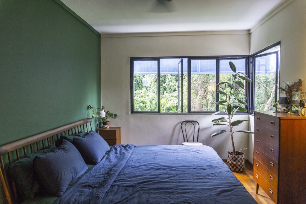
The bedroom overlooks Telok Blangah Hill, as does much of the house

“My previous home used to be in the vicinity of the MacRitchie Reservoir and as we both appreciate greenery, Marvin and I were drawn to the idea of living close to nature,” 32-year-old Lingyi explains. “We quickly fell in love with this current location. We enjoy strolling through Telok Blangah Hill Park and visiting the Gillman Barracks galleries over the weekends.”

Bringing Nature Indoors

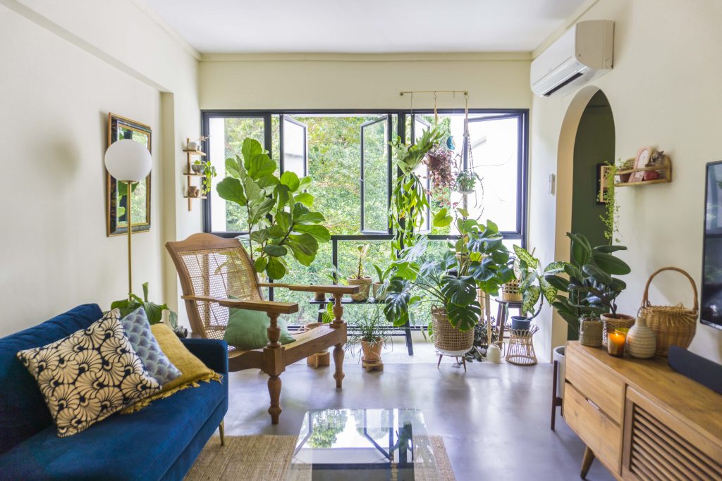
Lingyi and Marvin’s plant collection

Being nature lovers, the couple wanted to include greenery in their home. “Our collection has grown over the past months and we’re loving how our home has become an urban sanctuary that we can relax in,” Lingyi says.

For aspiring plant-parents, the couple recommends picking plants according to the flat’s lighting condition. “As plants such as cacti and monstera don’t require much light, they’re perfect for homes with low-light. All plants will have to adjust to their new environment, so don’t be deterred if they aren’t doing too well when you first bring them home. When we brought our monstera home, it had just 3 leaves in the first two weeks. Now, it’s thriving with over 20 leaves!”

Waste Not, Want Not

As advocates of sustainable living, Lingyi and Marvin chose to retain as much as the original interiors of their resale flat as possible, including all wooden doors and the parquet flooring in the bedrooms. In the living room, the couple also opted for concrete screed, a more natural material, as opposed to vinyl flooring.

The study room, featuring wooden parquet flooring from the previous owner

Instead of buying their furniture first-hand, they also managed to source for several well-made and beautiful pre-loved furniture from Carousell, including their vintage-inspired TV console.

Rustic Vintage Vibes

When designing their home, Lingyi and Marvin regularly browsed sites such as Pinterest for vintage-inspired interiors and put their ideas on a shared board for discussion. They also presented a deck of visual references to potential interior designers.

“It’s important that they understand our needs. Portfolio aside, we were looking for an interior designer with whom we can communicate well. We’re really happy to have worked with Monocot Studios as they really brought our rustic vintage concept to life,” the couple says.

Bringing out the vintage vibes with mosaic tiles

“We’re really happy with our home,” the couple smiles. “All the hard work was definitely worth it.”

Source: mynicehome.gov.sg
Home Tours: A Bold, Eclectic Home

Home Tours: A Bold, Eclectic Home

This flat in Bukit Batok is dressed in bold colours and a smorgasbord of patterns.

First-time home owners Kenneth and Xinrong talked to us about buying their BTO flat and the $48,000 housing grant they received. They let us in on their HomeStory and their gorgeous home.


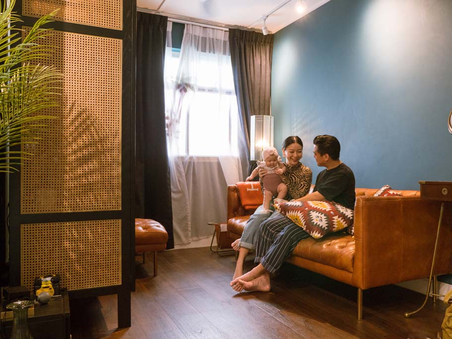
Dressed in bold colours and a smorgasbord of patterns, Kenneth and Xin Rong’s HDB flat in Bukit Batok is exactly what they intended it to be – a cosy, artsy space filled with elements they love.

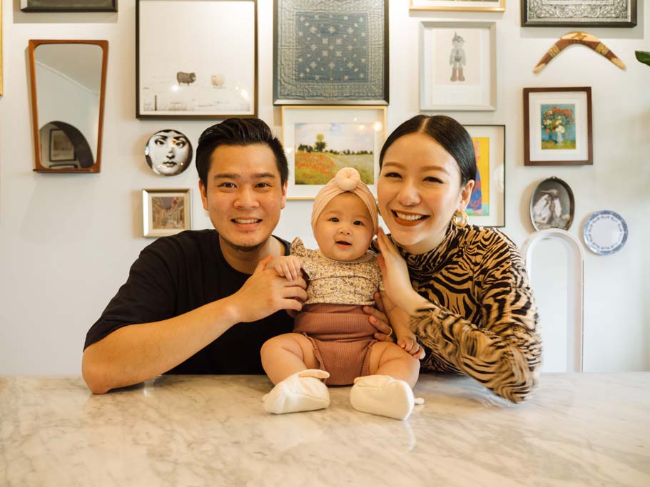
Home owners Kenneth and Xin Rong, with daughter Kaia Rose

Playing with Colours and Textures

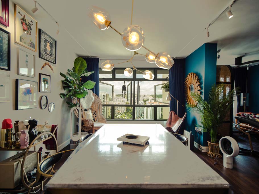
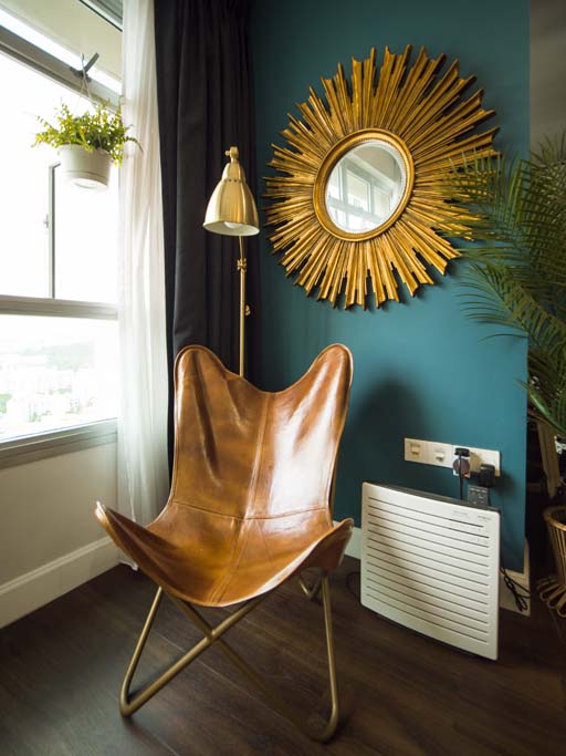
“We really like the colour blue, and have incorporated it where we can,” Xin Rong smiles. “We chose a deep hue as Kenneth prefers darker spaces. I lean towards brighter tones, so that comes through in the gold accents that carry throughout our home,” she adds, gesturing to a sunburst mirror which contrasts brilliantly against the dark blue wall of the dining area.

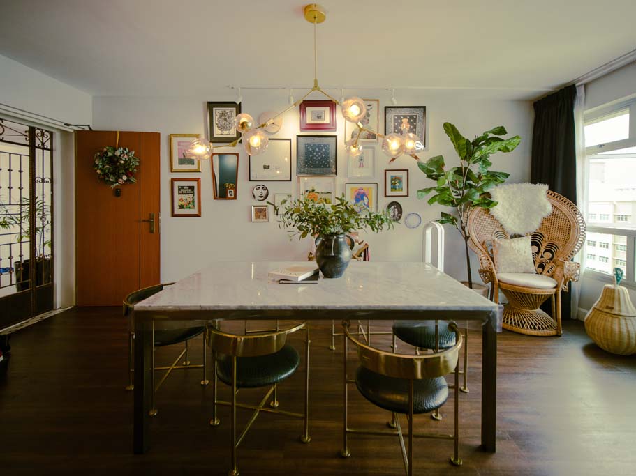
The dining area is also where the couple displays collectibles from their trips. “These souvenirs remind us of the good times we shared and at the same time, add character to our home,” they explain.

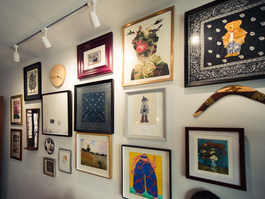
Kenneth and Xin Rong's collection of paintings


Creating a Bright, Spacious Home

In designing their home, the couple shared that they knocked down a wall between the living and dining areas to open up the space. Additionally, since many of the family’s activities— such as eating, hosting, and working— take place at the dining table, they decided to place it in the designated living room which is more spacious.

The living room

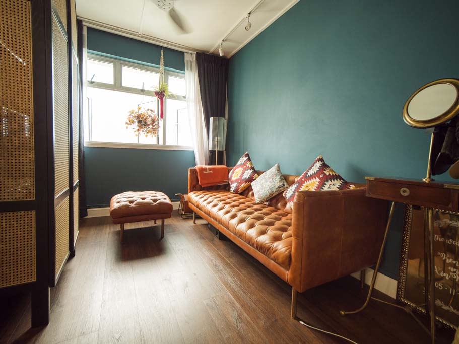
What was meant to be the dining area was then redesigned as a cosy lounge space, where the family often spends quality time together.

Kenneth and Xin Rong's sofa

“We prefer talking to each other over watching television, so we did away with the TV altogether,” Xin Rong laughs.

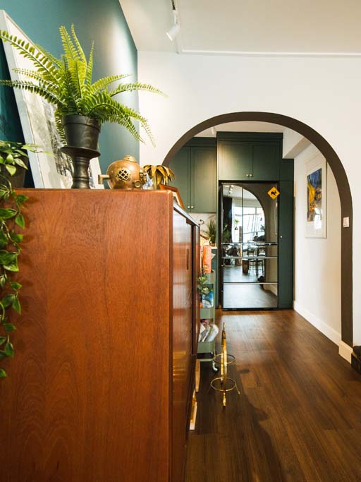
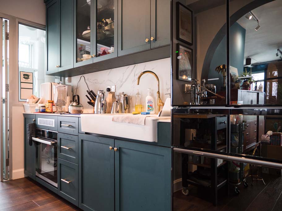
Although much of Kenneth and Xin Rong’s home features its deep signature blue, their flat does not feel gloomy. To maximise the amount of sunlight that filters in, the home owners chose curtains for their home, with the sheer day curtains lending a light, airy feel. Curtains also offer an unblocked view of the estate. In the kitchen, an arc was built into a wall to let even more light in.


Flexibility First

With the exception of the kitchen cabinets and master bedroom wardrobes, the home is furnished with loose items. “We like the versatility that comes with non-built-ins. This way, we can refresh the look whenever we wish!” the couple says.

Majority of the furnishings are non-built ins

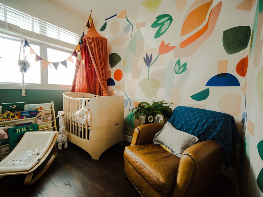
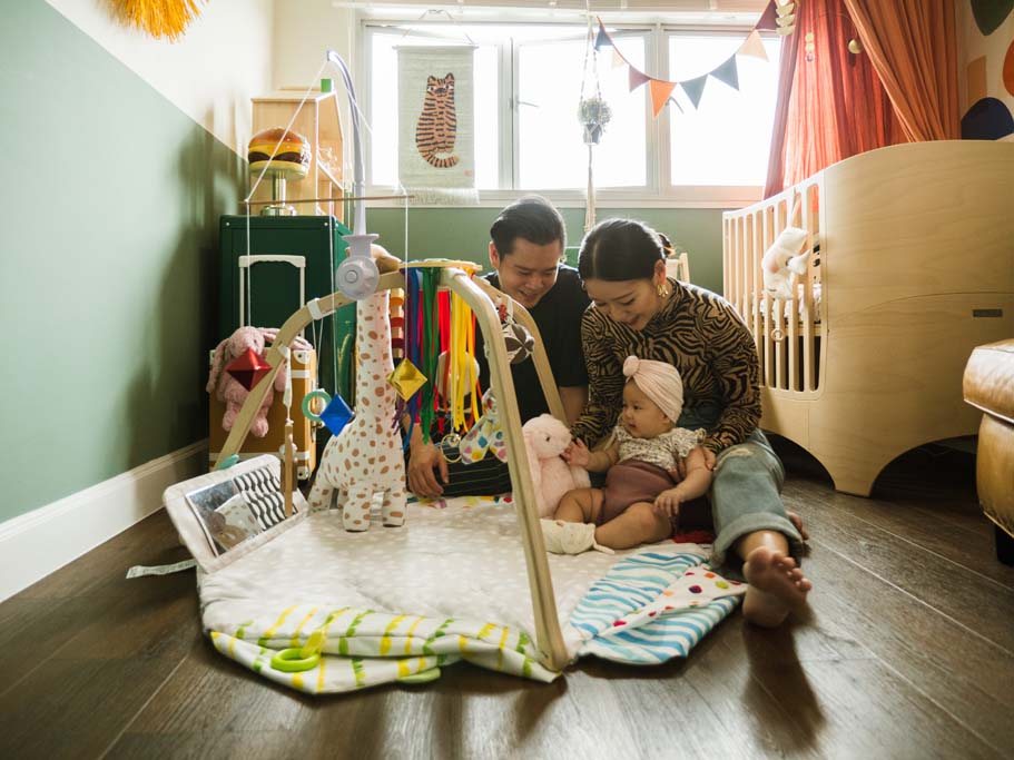
Having such flexibility also means the house can evolve with their family. In the bright and lively nursery, accessories such as a leather armchair, wooden cot and soft toys decorate the room. “Without built-ins, we’re able to rearrange the furnishings so that the room can be transformed into a play area when Kaia Rose grows older,” they say with a smile.


Source: mynicehome.gov.sg