Home Tour

The Ultra Minimalist 3-Room Home

The Ultra Minimalist 3-Room Home
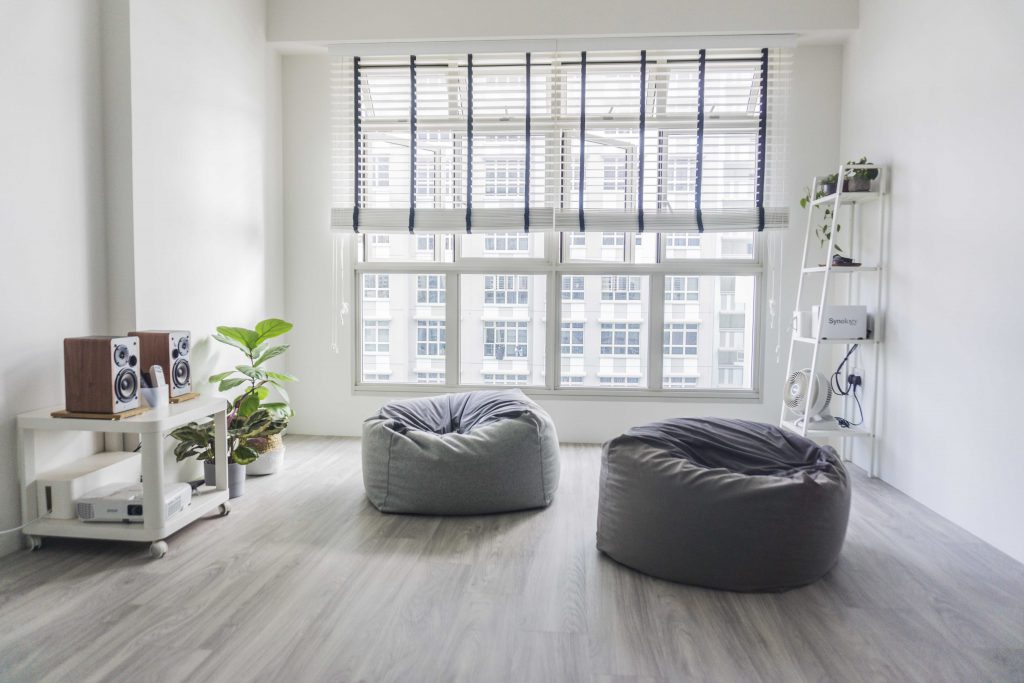
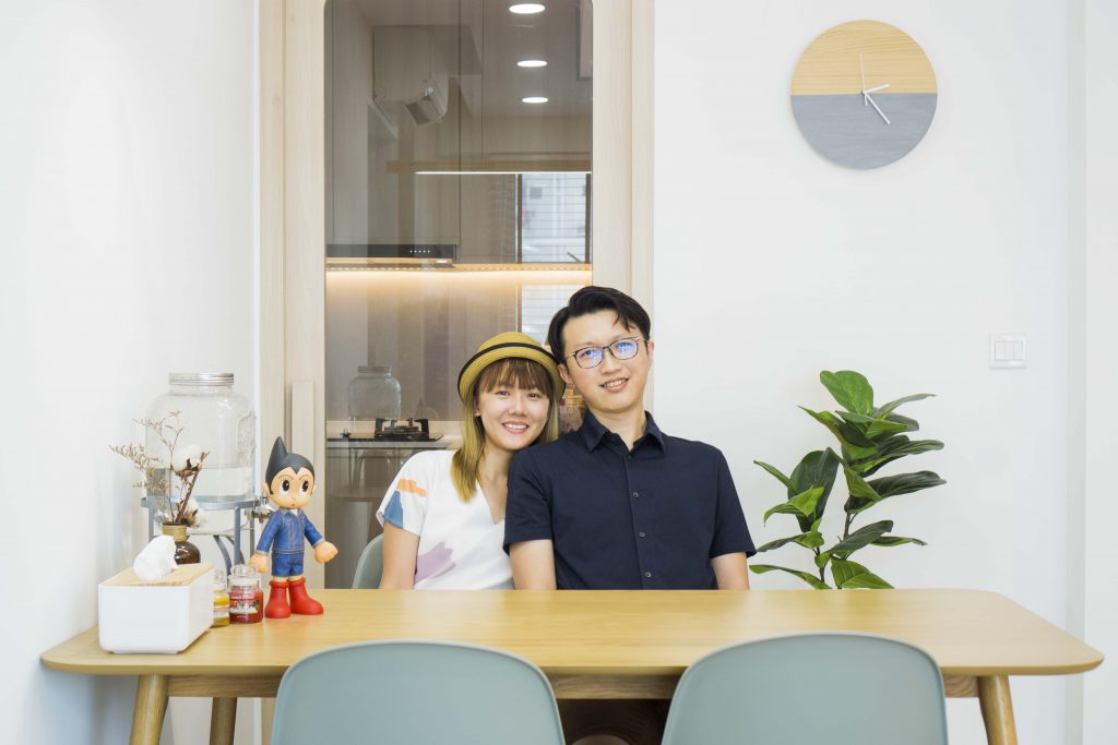
Two bean bags, a utility shelf and a stereo set – that’s the total sum of furniture in the living room of Yong Wei (Glo) and Hiang Ling’s 3-room flat.
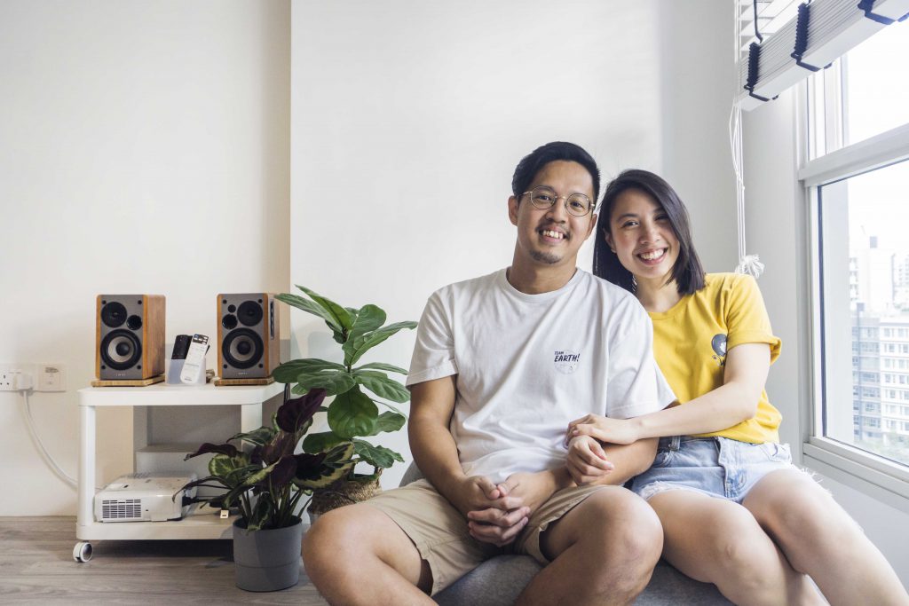
Homeowners Glo and Hiang Liang

The flat is purposefully designed to be ultra-minimalist, Hiang Ling explains. “Glo is big on practicality and sensibility. So we keep only what we need, and discard what we don’t – even if it means going against the social norm of what a home should look like. From the start, our Pinterest board was titled ‘White, Woody, Leafy’, which pretty much sums up the look we were going for,” she laughs. “Our good friends at Komorebi Interior Design helped us bring this concept to life!”
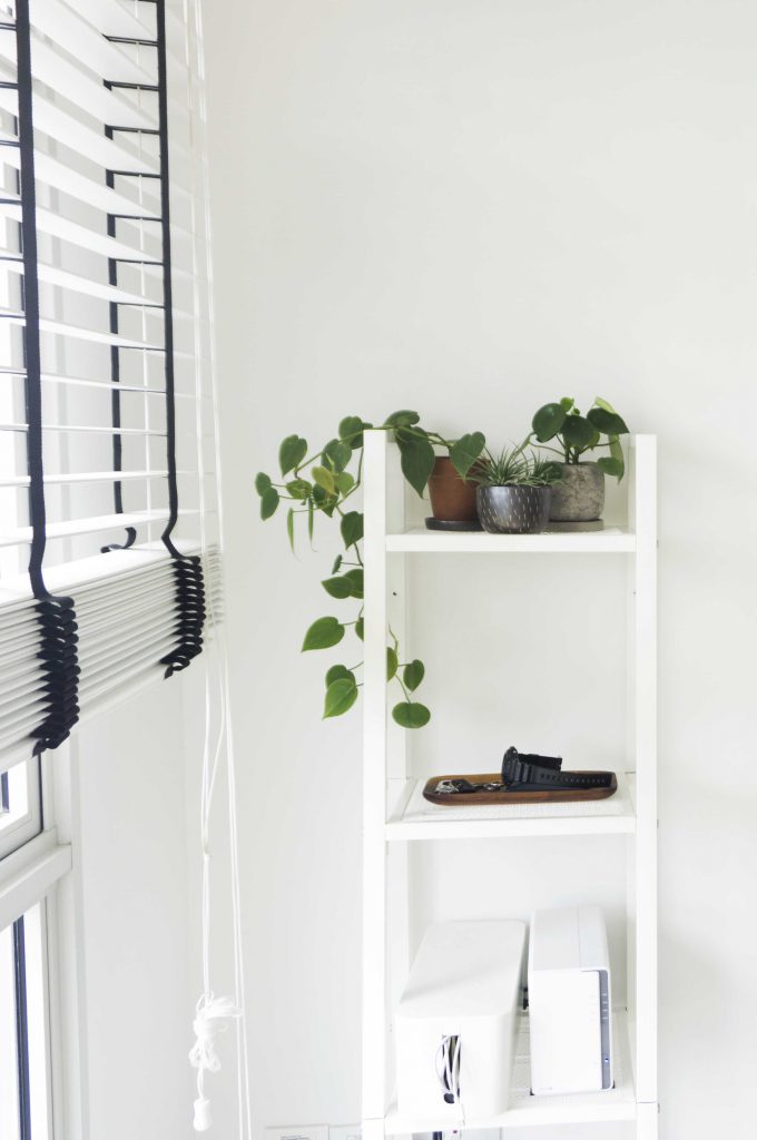
The utility shelf in the living room
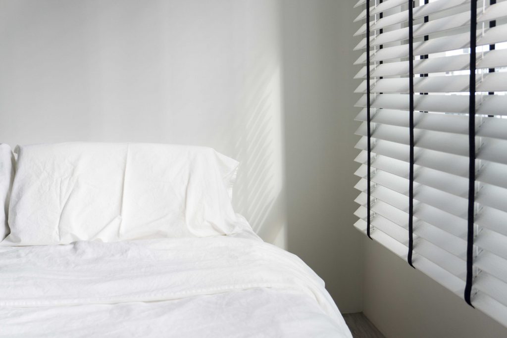
The minimalist bedroom

Active in Punggol

The couple moved into their new home late last year. “When we were applying for a flat four years ago, this Punggol project was our favourite among all the BTO options available then. We like the tranquility and how the neigbourhood is surrounded by nature,” they shared.

Having carefully considered their finances, they decided on a 3-room flat. “To be honest, finances was one of our primary considerations. Our business was just taking off then and we didn’t want to over-stretch ourselves financially,” Glo explained.

Previously a personal fitness trainer, Glo lives an active lifestyle. “Working out and eating well are things that I’ve always believed in,” he says. “When my dad, whom everyone saw as the strong figure in the family, was admitted into the Intensive Care Unit for a heart condition, I realised that taking care of our health is the best thing we can do. Thankfully, he has since recovered.”

In addition to working out at home, the couple exercises outdoors. “Certain exercises such as the sprint workout can only done outdoors. While working out at home gives us privacy, the surrounding parks are great workout spots. Besides jogging together, Hiang Ling also inline skates.”
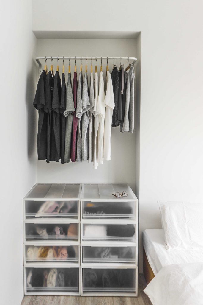
The couple share a minimalist wardrobe

Designed with Function

The theme of functionality runs constant throughout the flat. “We have bean bags instead of a couch and a projector for a TV. We also have a temporary dining table that we take out only on occasion, to maximise space,” laughs Hiang Ling.
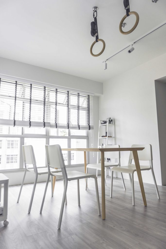
The dining table can be dismantled easily and is usually stored away
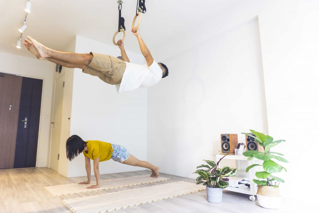
Glo and Hiang Liang working out in their living room

As the “event space”, the living room is the couple’s favourite space in their home. “The spaciousness, sunlit brightness and versatility of it makes us fall in love with it over and over again. When we’re hosting guests, it becomes a warm and welcoming space. When we’re in the mood for a movie, it becomes a cosy cinema. Both of us can even fit comfortably on one bean bag,” she laughs.

At the same time, the living room serves as an exercise ground. “It provides us with an energetic space to work out in, which also means that we’d never have an excuse not to exercise, rain or shine!”
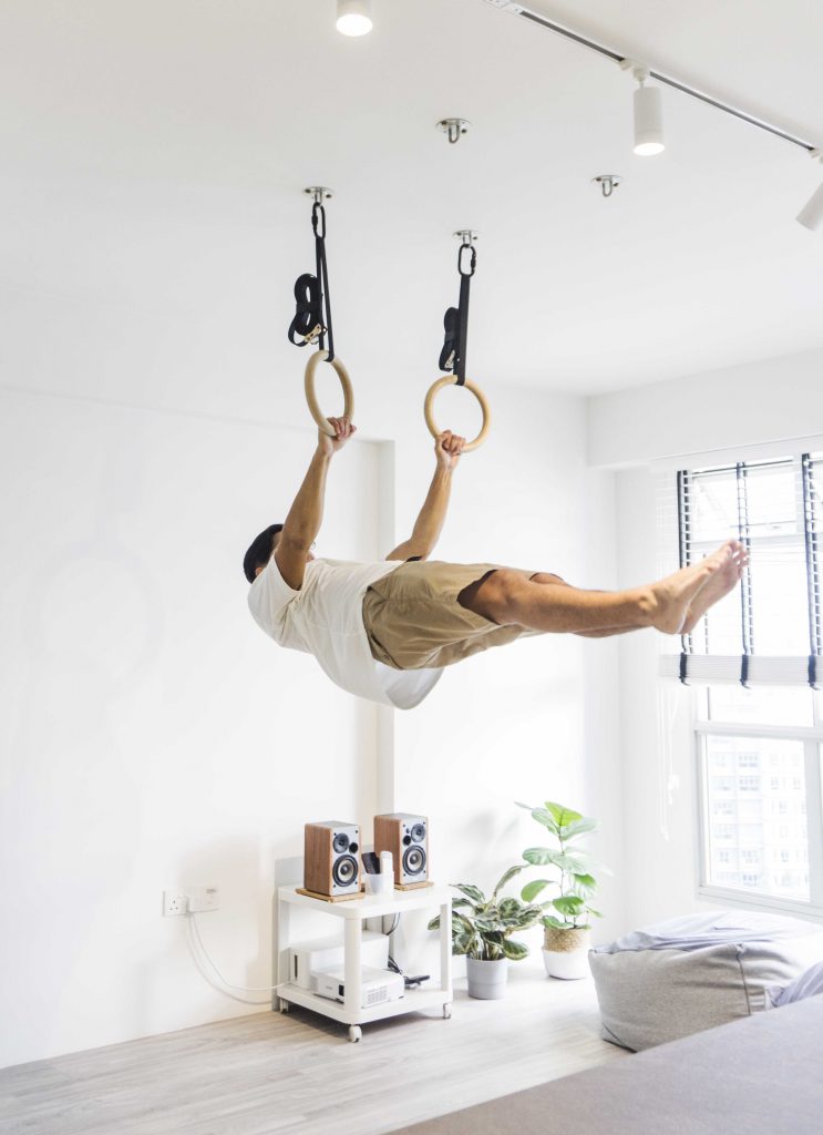
Glo on the gymnastic rings

Complementing the couple’s active lifestyle are two wooden gymnastic rings that are hung from the ceiling. An alternative to a pull-up bar, the pair of rings are utilised for various workouts such as pull-ups and front levers, an exercise that involves keeping one’s body in a horizontal position whilst mid-air.

As for why not a pull-up bar, Hiang Ling laughs, “To be honest, we couldn’t find one that complements the overall aesthetic of the house.” While Glo nods in agreement, he explains the versatility of the rings, “We have four different hooks that allows us to switch the position of the rings, so we can adjust them accordingly for different workouts.”

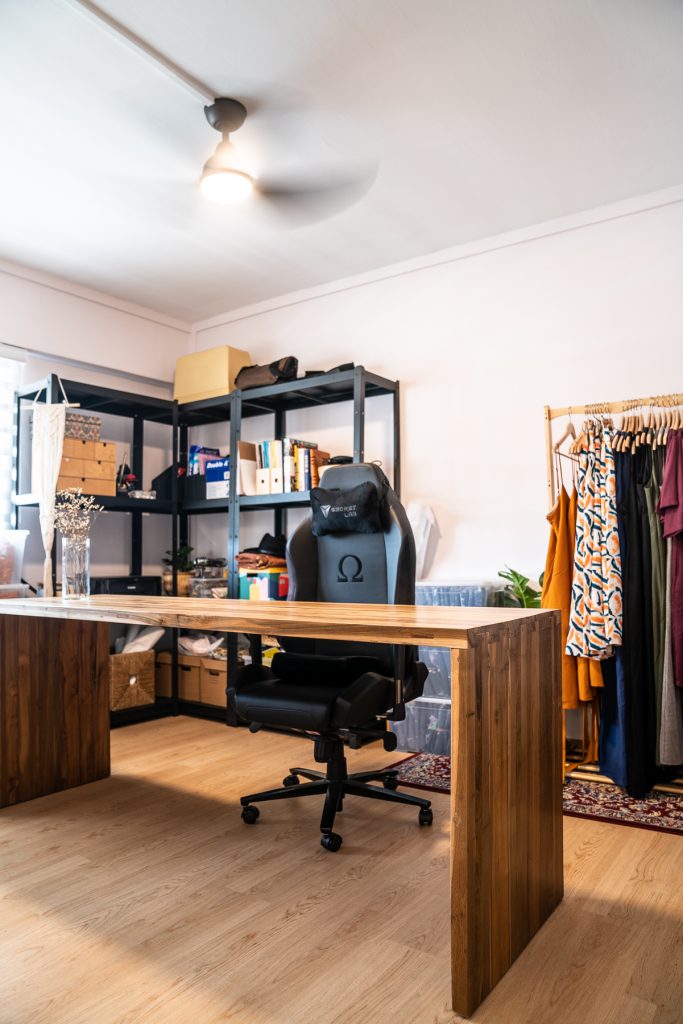
“The rooms are allocated according to their purpose,” explains the couple. “For instance, as we work from home, we require a comfortable working space – hence, we turned the larger bedroom into a home office.”
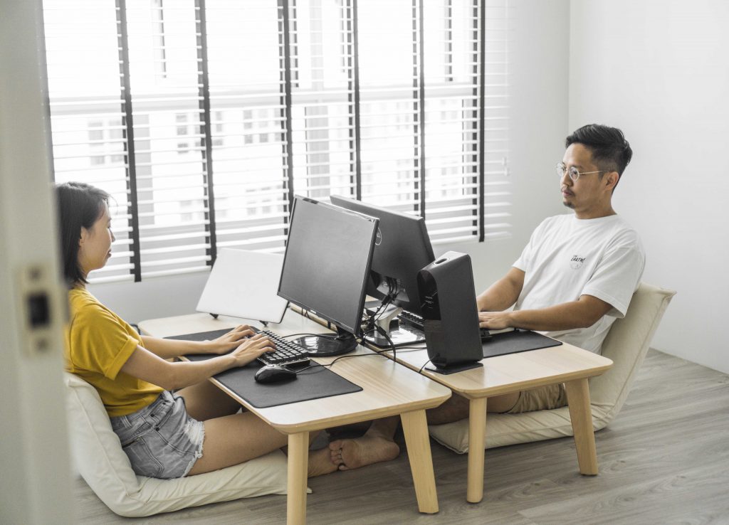
The floor desk and chair setup of the couple’s home office
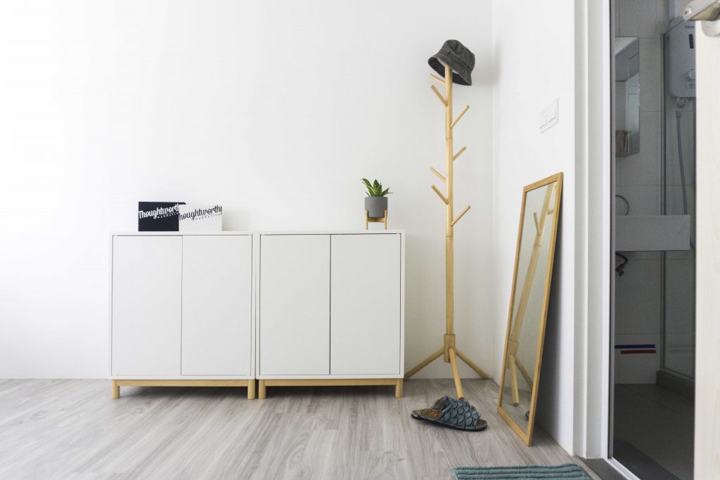
The storage cupboard for work equipment such as cameras

The couple was also careful to design a home that complements their healthy lifestyle. For instance, the home office was designed with health benefits in mind. “The floor desk and chairs make it easy for us to switch between sitting postures as we work,” Hiang Ling explains. “The open space allows us to stretch our legs during breaks.
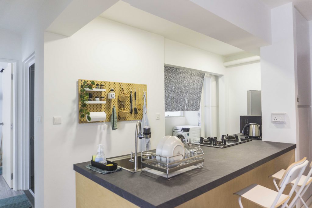
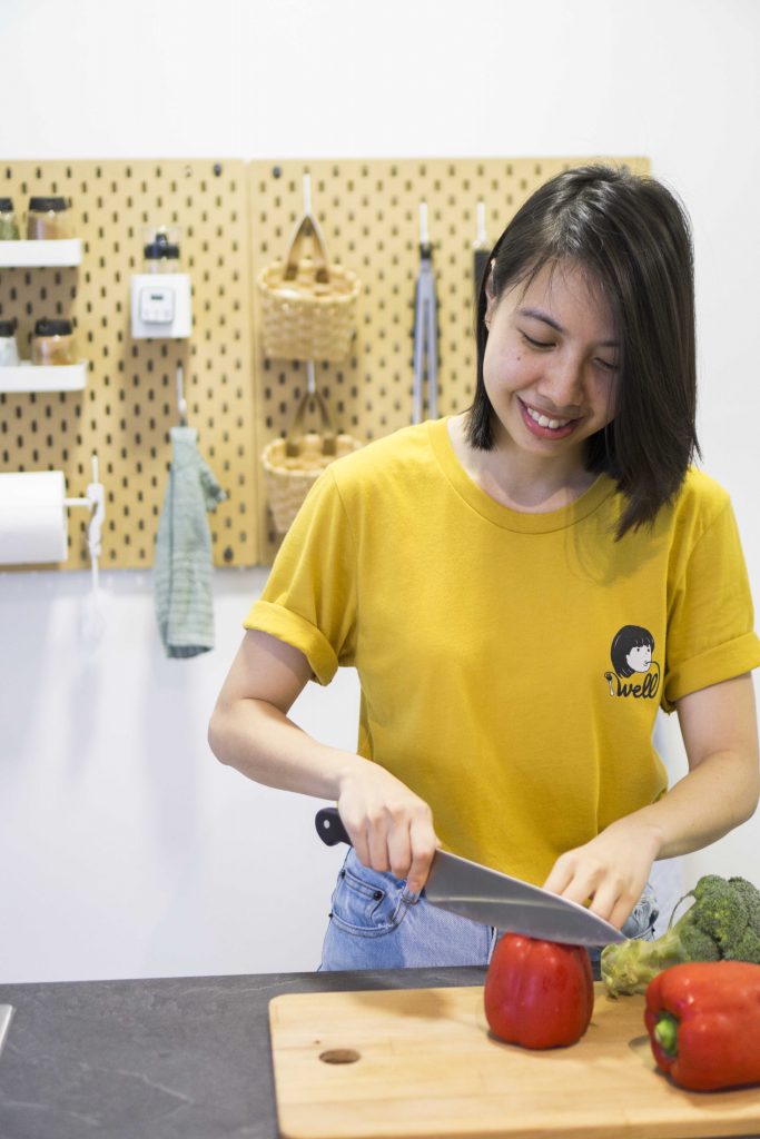
The remodeled kitchen features a custom-made countertop where Hiang Ling prepares most of their meals
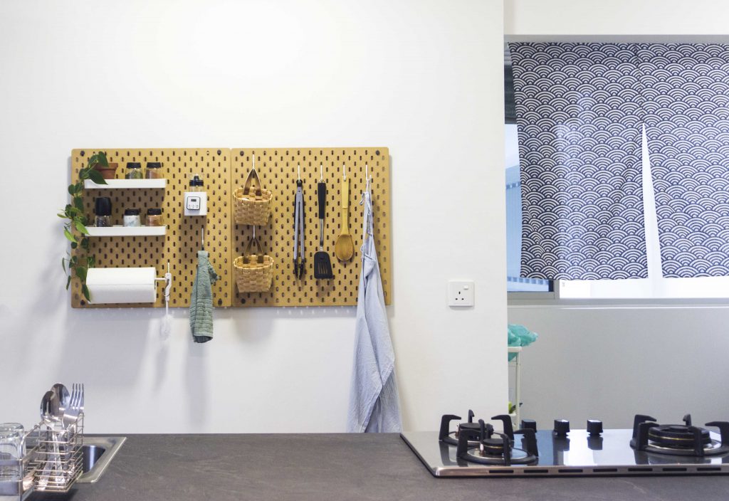
The couple keeps their kitchen organised with a peg wall

Diet plays an equally important role in their healthy lifestyle – as such, the couple prepares most of their meals in their remodeled kitchen. “We extended the countertop and shifted our sink from the corner of the kitchen to its current position – this allows us more space to prep our food,” the couple explains. As for who spends more time in the kitchen, Glo smiles, “Hiang Ling prepares majority of our meals – when I cook, it’s usually for a special occasion.”

While owning a minimalist and sustainable home is challenging, the couple shares what they think is most important when designing one, “It’s important to keep things as simple as possible. Also, engage a trust-worthy interior designer. This is a really good investment, especially if you can afford it.”

Source: mynicehome.gov.sg

Home Tours: The Art of Functionality

Home Tours: The Art of Functionality

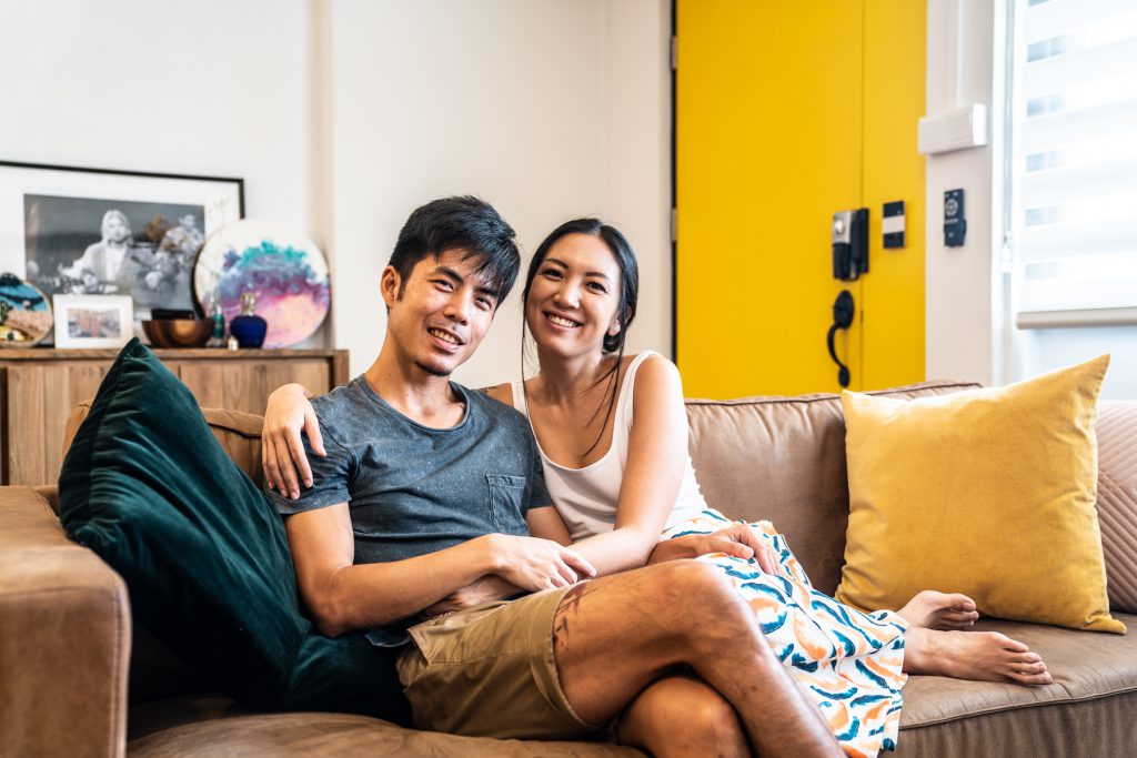
Like the bright yellow door to their home, the exuberance of Grace and Josh is hard to miss.

“I’ve always liked the colour yellow,” Grace smiles. “It makes for a happy welcome whenever we return home.”

Home owners Josh and Grace

The “east side best side” couple always wanted to live in the eastern part of Singapore. “Both of us grew up in Katong and our parents are living in the east. So there’s a sense of familiarity and we wanted to be close to our families,” 33-year-old Josh shares.

After house-hunting for 3 weeks, the couple feel in love with their current 4-room resale flat in Mountbatten. “I think we were really lucky to have found our home in such a short period of time,” Josh laughs.

“This neighbourhood is amazing! It’s quiet and in fact, Josh’s workplace is just a 20-minute bus ride away,” says Grace, founder of LunchMoney, a local fashion label.

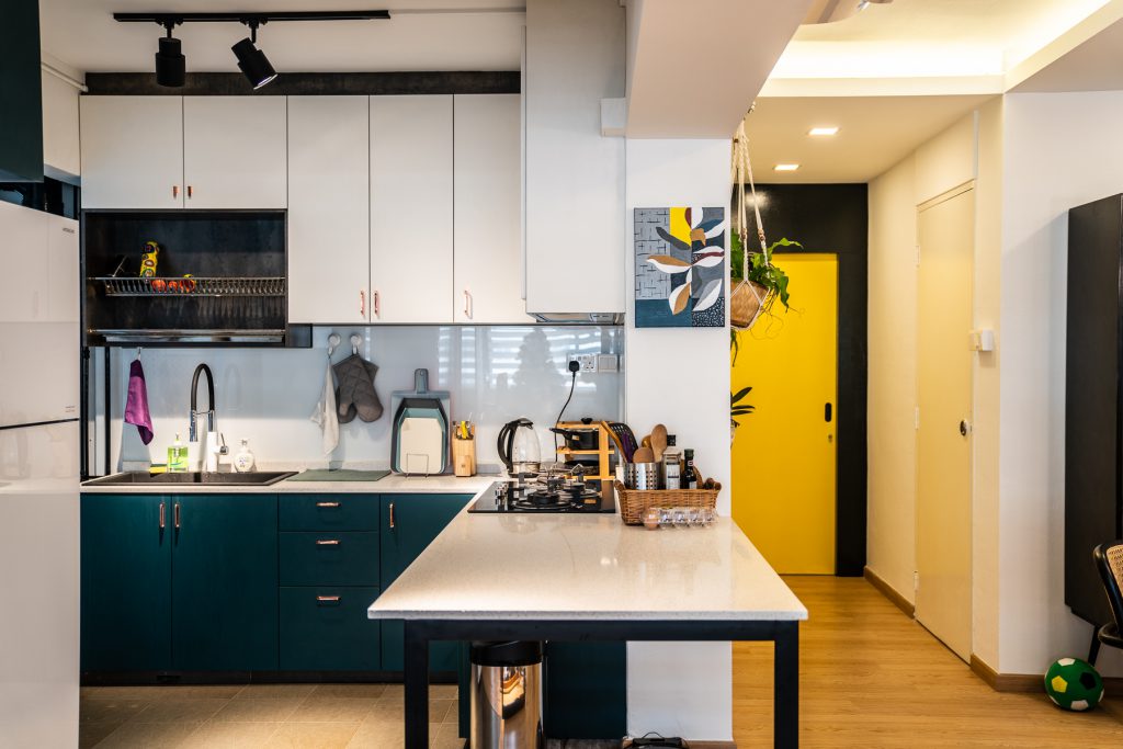
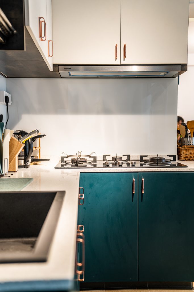
The refurbished open concept kitchen

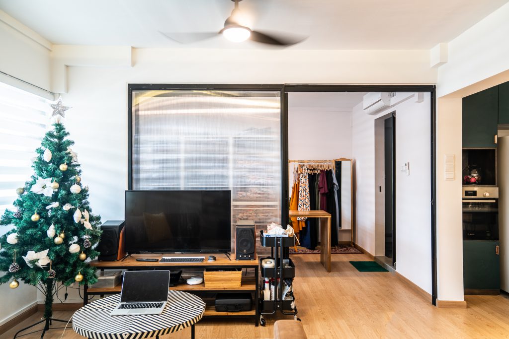
The living room

Grace’s workspace

Mix and Match

Featuring pops of colour and wooden accents, the cosy flat is an eclectic mix with hints of Scandinavian and minimalist influences. “We didn’t have a specific theme,” 28-year-old Grace laughs, “But we took what we liked about the different house themes and put them together.”

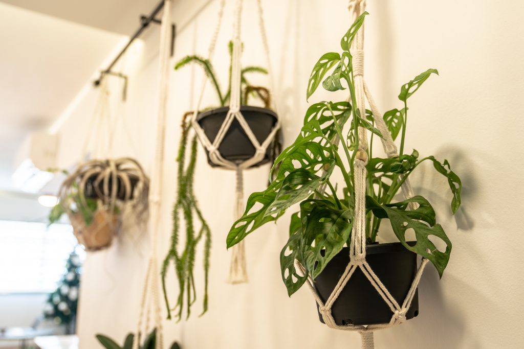
Hanging plants in the living room

From potted herbs to hanging ferns, plant lover Grace shares the importance of having greenery in the house.

“They really liven up the place,” she smiles and continues, “Plus, herbs in supermarkets are almost always sold in large quantities – so growing our own gives us access to fresh ingredients while avoiding food wastage!”

While Josh wasn’t previously a big fan of plants, he has grown to appreciate them.

“Josh actually does most of the watering,” Grace smiles approvingly as Josh nods proudly.

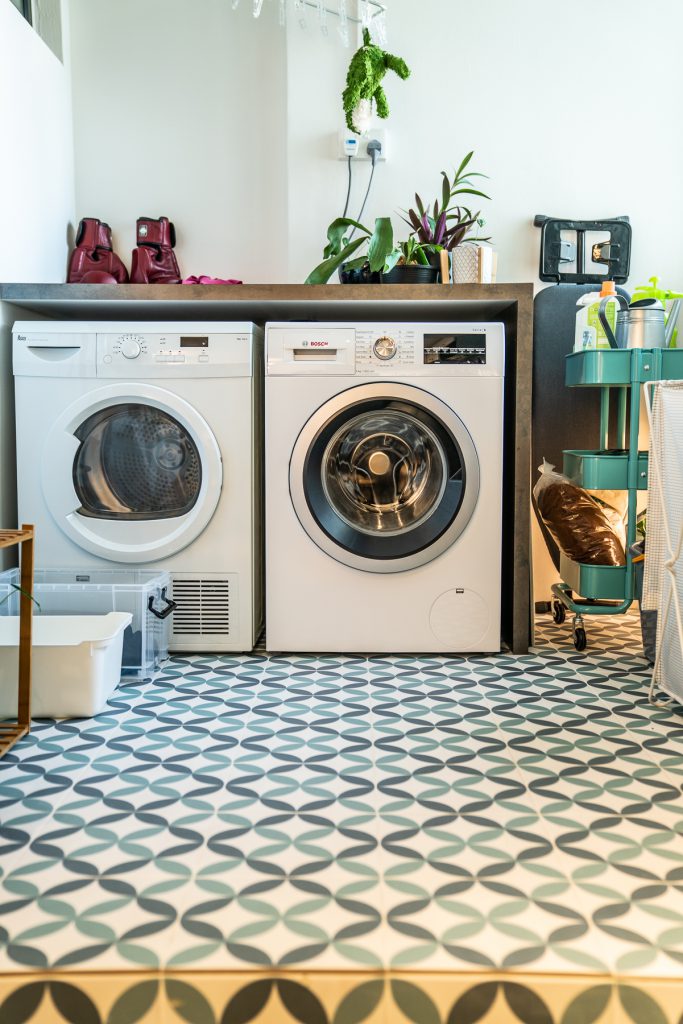
The service yard

To the couple, the functionality of the space was of utmost importance. For instance, in the living room, a large wooden cabinet containing utensils and cutlery is placed next to the dining table. “As we have guests over regularly, storing the cutlery in the living room will save us having to walk back and forth the kitchen,” Grace explains.

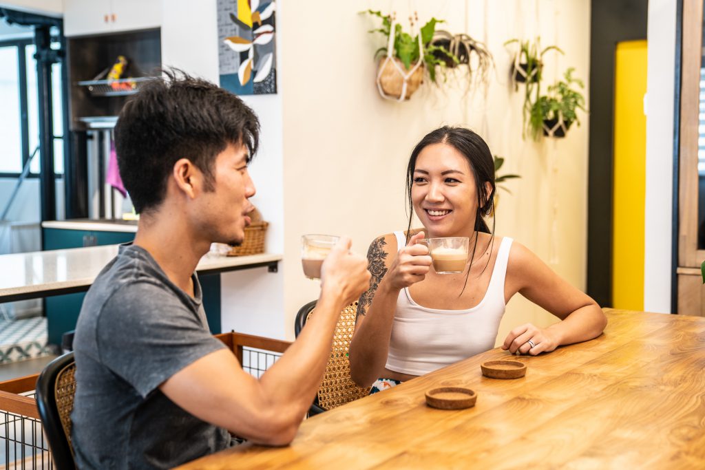
The couple enjoying an afternoon coffee

Upon closer look, one will notice that the lights in the kitchen are intentionally misaligned. “While having the lights evenly spaced out makes aesthetic sense, they wouldn’t be able to fully light our kitchen cabinets – we decided that functionality was more important and went ahead with the light placement that best suits our needs.”

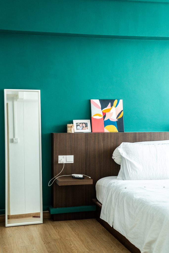
The bedroom

The bathroom

No Place like Home

While their renovation journey was mostly smooth, Grace and Josh share some of the lessons learnt. “Some installations took place after we’d moved the new furniture in and we had to shift and clean them repeatedly. Admittedly, this was a little frustrating.”

When it comes to engaging and communicating with interior designers, the couple advises: “Don’t be afraid to speak candidly! It’s important to hold an open and honest communication with each other about the house, so find an interior designer that you’re comfortable working with.”

When asked if they’ve a favourite spot within the house, the couple laughed and responded, “We love every part of the house. You won’t believe it but when we were on our honeymoon, we couldn’t wait to come back to the comfort of our home! That’s how much we love our new home.”

Source: mynicehome.gov.sg

Home Tours: A Cosy Tropical Home in Toa Payoh

Home Tours: A Cosy Tropical Home in Toa Payoh

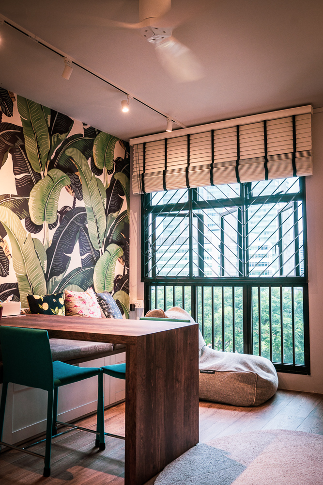
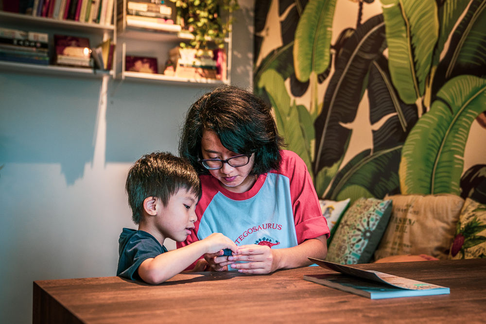
It was love at first sight for Yasmine when she chanced upon a banana leaf-inspired wallpaper. “The jungle vibe of the banana leaves called out to me,” the journalist smiles and continues, “In fact, the colours in the rest of the house are inspired by the wallpaper.”

Homeowner Yasmine

The colour green now takes centrestage in Yasmine’s home, which she bought after deciding to move to Toa Payoh to be close to her workplace. “I bought a resale flat here because I love the location – the MRT station is only a few minutes’ walk away and there is a lot of good food in the area. Plus, I can shop for most of my necessities and groceries within the neighbourhood! ”

“It is also convenient for my parents, who occasionally stay over to look after my son,” Yasmine adds.

The colours of Yasmine’s home are inspired by the living room’s feature wall

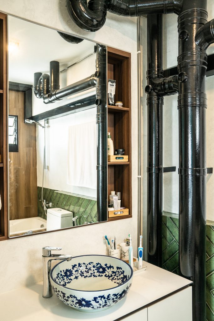
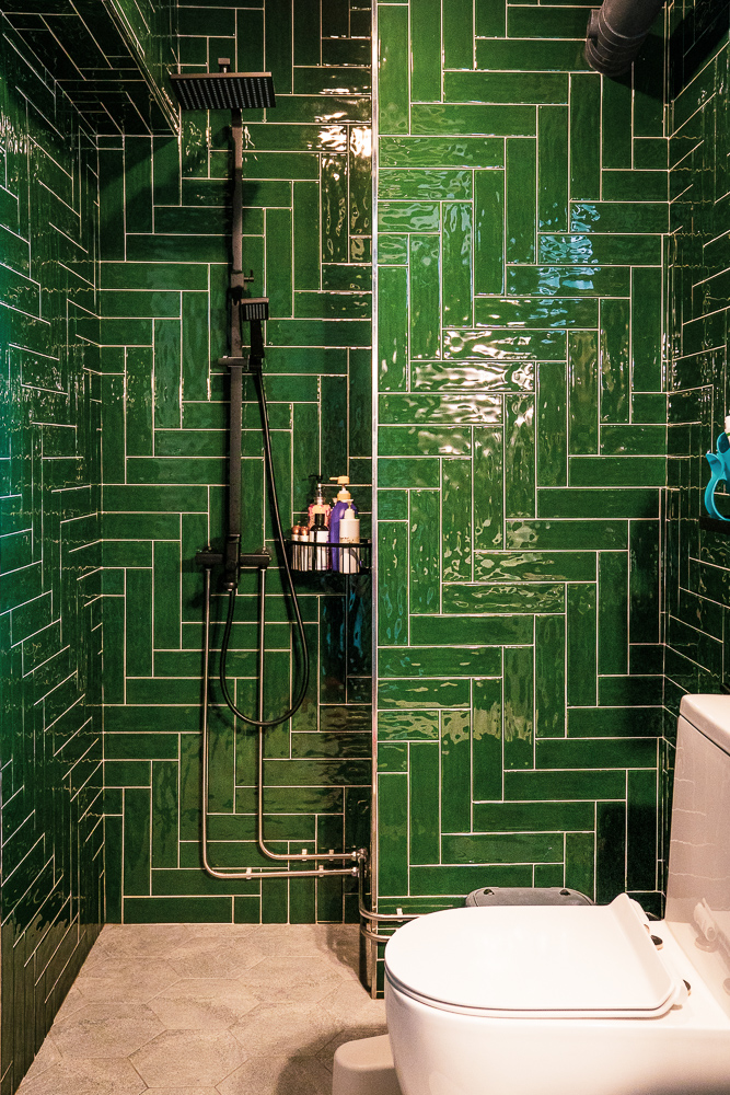
Green takes centrestage in the common bathroom

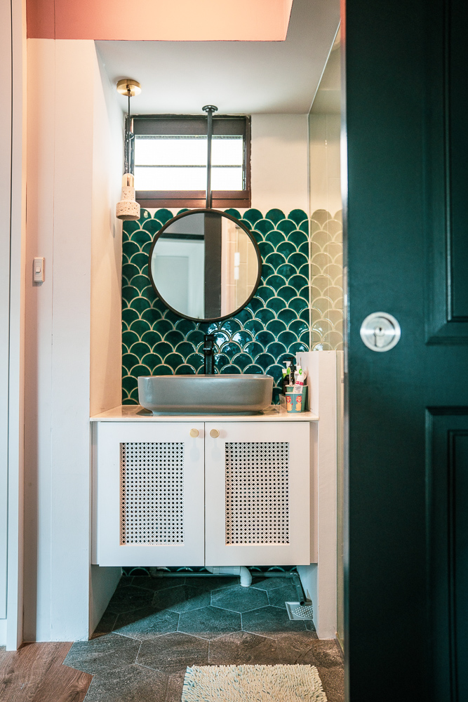
The seashell-inspired backsplash adds a pop of colour and texture

To optimise the space of her flat, Yasmine installed a sliding door for her master bedroom, and customised a sliding dining table. “Initially, I was sceptical about the concept of a sliding table in case some guests might find it uncomfortable. But it turned out fine and I really appreciate being able to shift the placement of the table to suit my needs!”

The living area, featuring the custom-made sliding dining table

Yasmine spending some quality time with her son

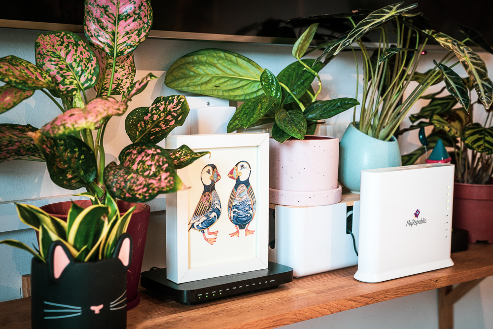
While her home now resembles a tropical forest filled with lush greenery, Yasmine admits she has not always been an avid plant lover. “My passion for plants began only after I received a potted plant as a housewarming gift. Since then, I’ve grown the collection of plants in my home, buying them from the nurseries located around the area.”

Some of the potted plants in Yasmine’s home

Recounting her renovation process, Yasmine emphasised the importance of close communication with the interior designers. “I discussed at length with my intrior designer, Three-D Conceptwerke what I wanted for the house– bright colurs, wooden accents and storage space. Once we agreed on the overall theme and design, the team got to work!”

“The renovation process was really smooth and this really made me realise the importance of engaging interior designers whom you can communicate and work with.”

Source: mynicehome.gov.sg

Home Tours: A Glamorous 4-Room Flat in Tampines

Home Tours: A Glamorous 4-Room Flat in Tampines

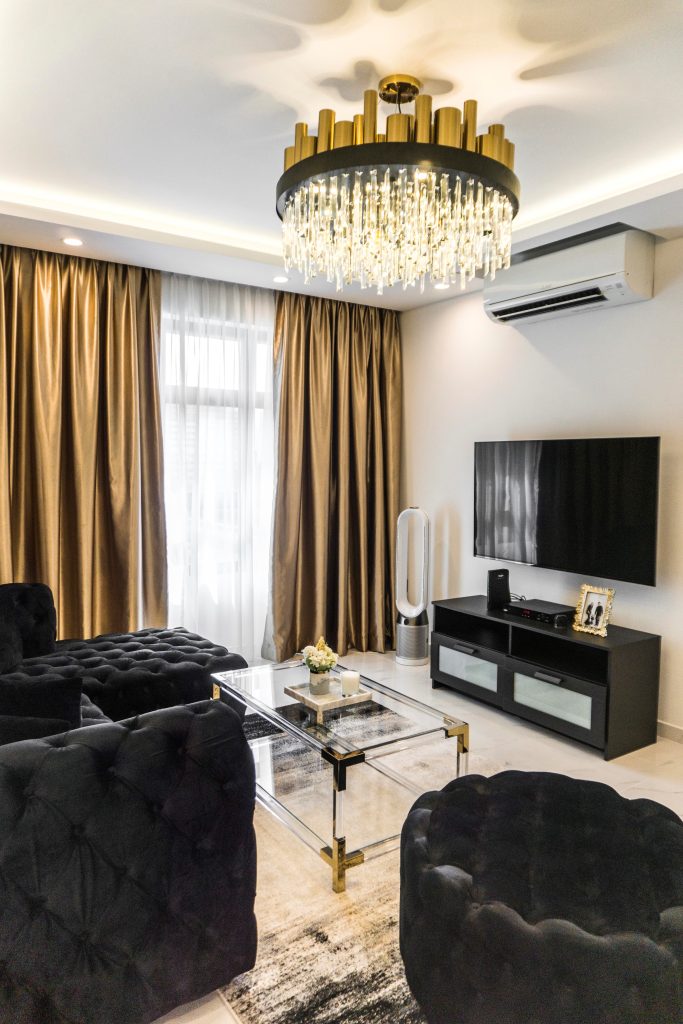
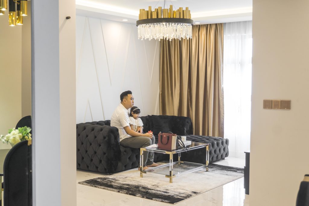
With its sleek, textured velvet couch and a golden-accented coffee table on a luxurious rug, we wondered if we had accidentally stepped into the home of Jay Gatsby. Did we also mention the sparkling crystal chandelier hanging from the ceiling?

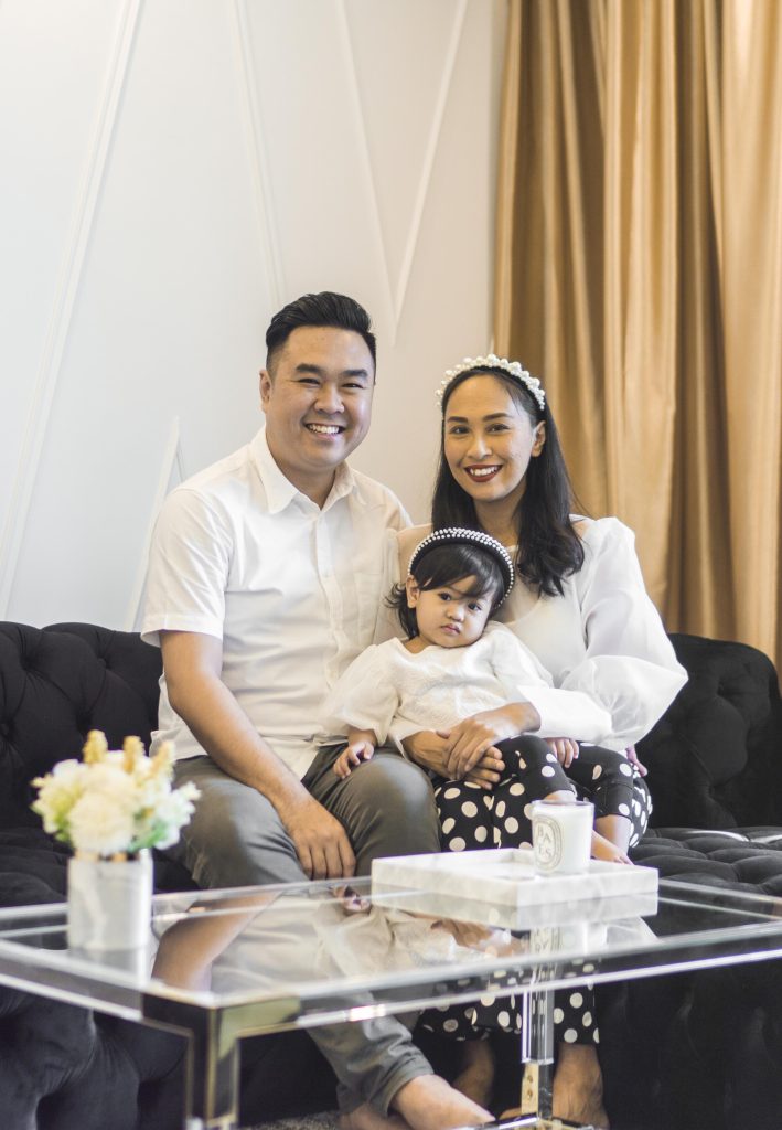
From left: Farhan, Fayona, and Yati

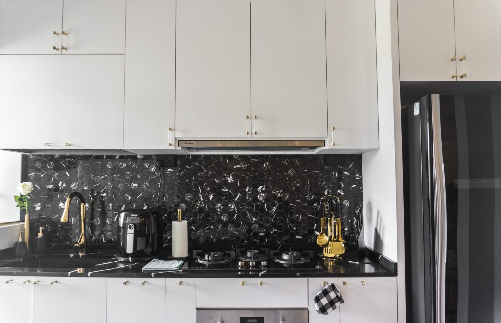
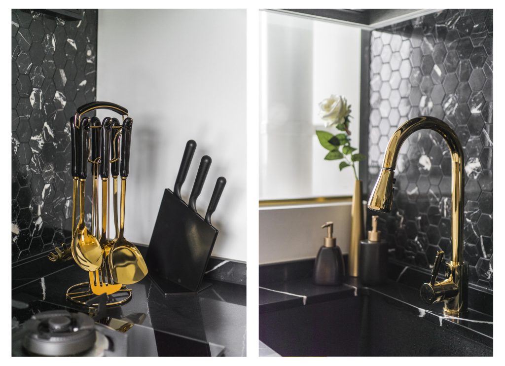
Yati and Farhan, owners of the 4-room flat in Tampines, explained that they were going for a modern luxe look with shades of white, black, and gold as the predominant colours. The dining table for instance, is made of pure marble, while the kitchen features a marble-mosaic backsplash and rose gold accents.

The kitchen, featuring a marble-mosaic backsplash

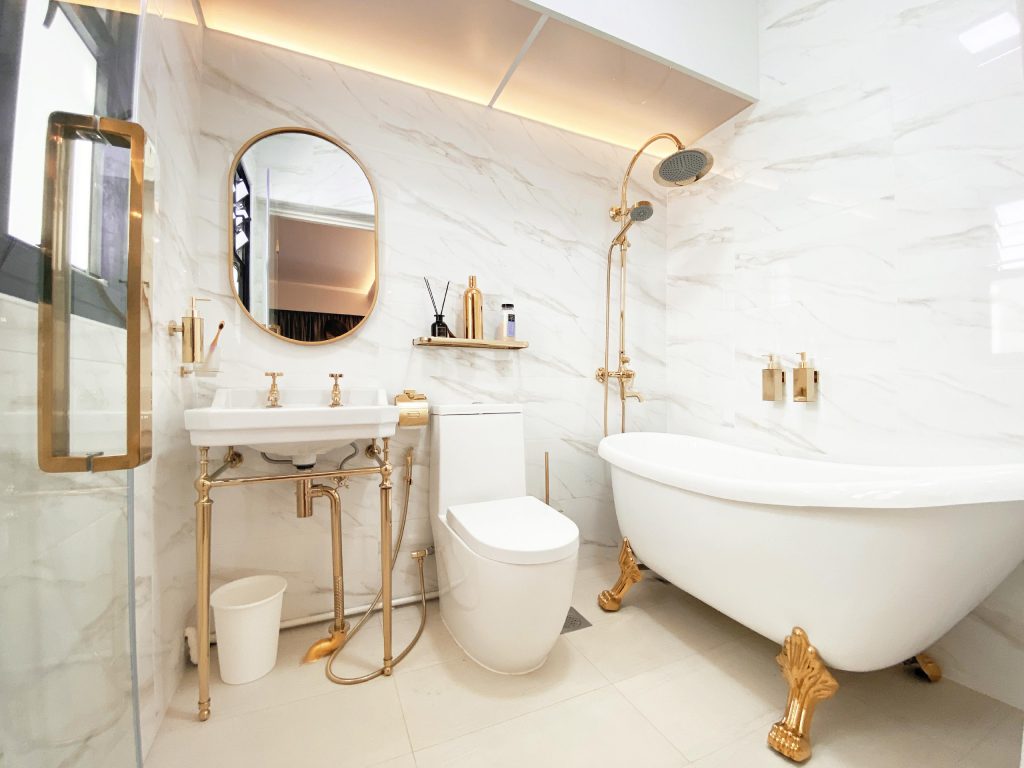
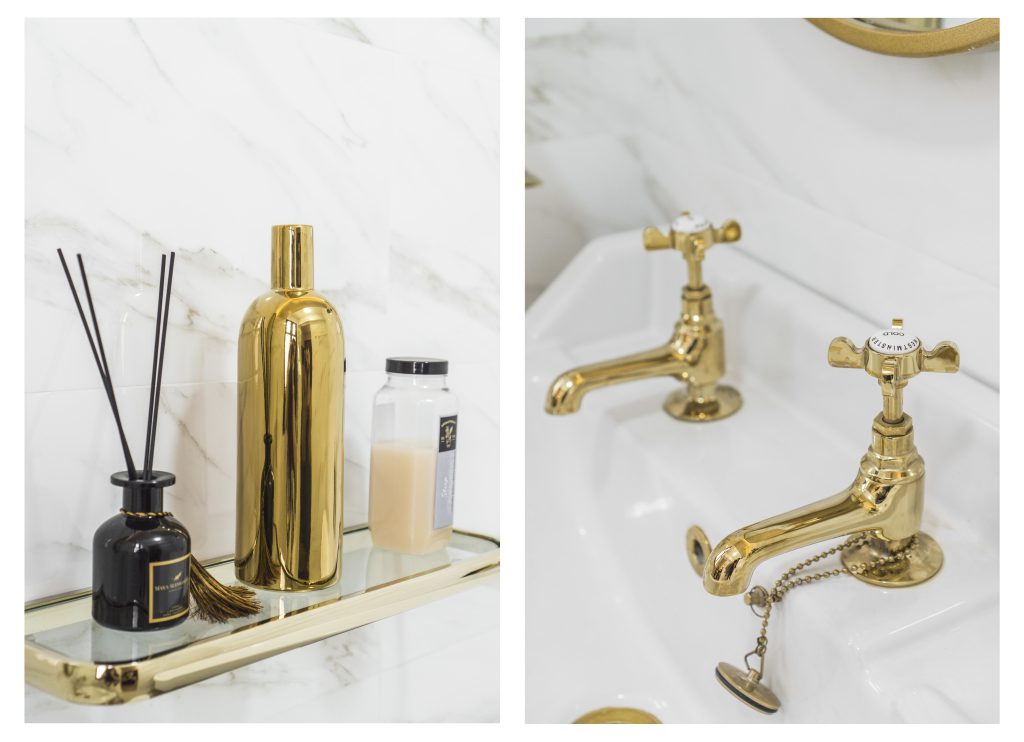
Adding to the glamorous vibe of the flat is the golden-accented bathtub in the master bedroom toilet. “It’s very good for relaxing in,” Yati laughs. “I really look forward to a nice soak – especially after a long day.”

The master bedroom toilet features a luxurious bathtub

Pops of gold that lend glamour

Yati meticulously picked out every piece of furniture and accessory, her keen eye for detail honed by her extensive experience in the fashion industry.

“We bought most of our furniture and accessories online,” Yati laughs. “I was determined to keep the theme consistent and would scour the Internet for the perfect piece.” Farhan agrees and says, “It took us a lot of effort, but it’s important to not settle.”

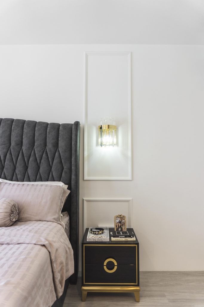
The modern luxe theme extends into Farhan and Yati’s rooms too. The master bedroom is plush and cosy, with an upholstered headboard and decorative wall panelling that would not feel out of place in an upscale hotel.

The master bedroom in shades of black, white and gold

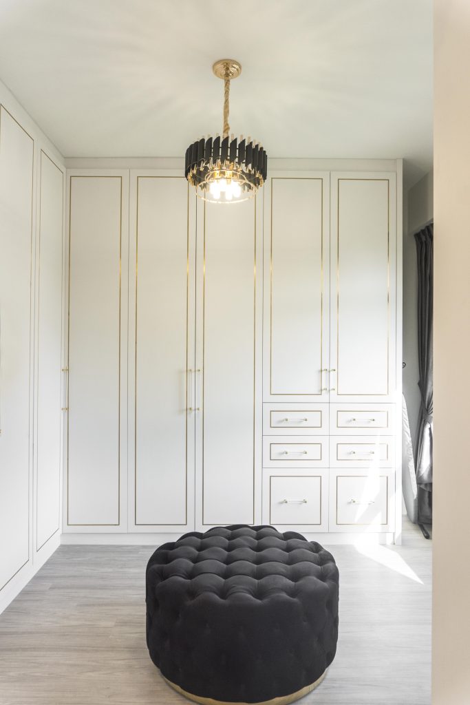
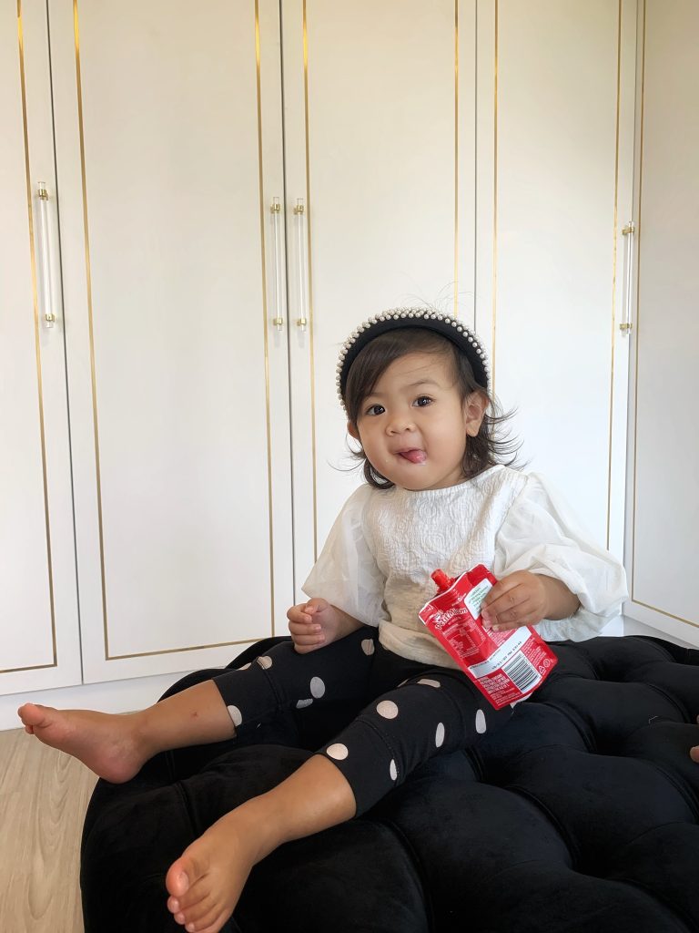
The couple combined the master bedroom with the adjoining common bedroom, converting the latter into a walk-in wardrobe. This sun-drenched space features floor-to-ceiling white, gold-trimmed cupboards and drawers, complete with a textured seat that matches the sofa outside.

“The walk-in wardrobe offers us more space. It helps to keep our clothes organised and makes it easier to pick out our outfits,” Yati shares. “It’s something we’ve always wanted.”

The couple’s walk-in wardrobe

Daughter Fayona having her mid-day snack in the walk-in wardrobe

“Our interior designer was PSD Studio. It’s important to engage interior designers that can work independently – for instance, our designers oversaw most of the renovation process and there were no major issues,” Farhan says.

The couple’s renovation took a little over 2 months before they moved in on 11 August 2019. “We remember the exact date as we had combined the Hari Raya Haji celebration with our housewarming party,” the couple smiles. “It was definitely a day to remember.”

Source: mynicehome.gov.sg

Home Tours: An Urban Sanctuary with a Vintage Twist

Home Tours: An Urban Sanctuary with a Vintage Twist

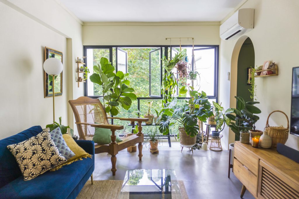
Decorated in splashes of green, with lots of greenery around the home, Lingyi and Marvin’s cosy flat in Telok Blangah is the exact description of their Instagram handle – @ourseaofgreen. More than that, the couple’s 4-room resale flat also overlooks the verdant Telok Blangah Hill Park.

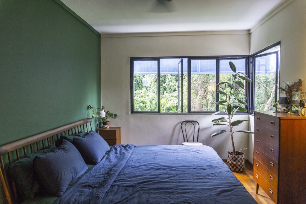
The bedroom overlooks Telok Blangah Hill, as does much of the house

“My previous home used to be in the vicinity of the MacRitchie Reservoir and as we both appreciate greenery, Marvin and I were drawn to the idea of living close to nature,” 32-year-old Lingyi explains. “We quickly fell in love with this current location. We enjoy strolling through Telok Blangah Hill Park and visiting the Gillman Barracks galleries over the weekends.”

Bringing Nature Indoors

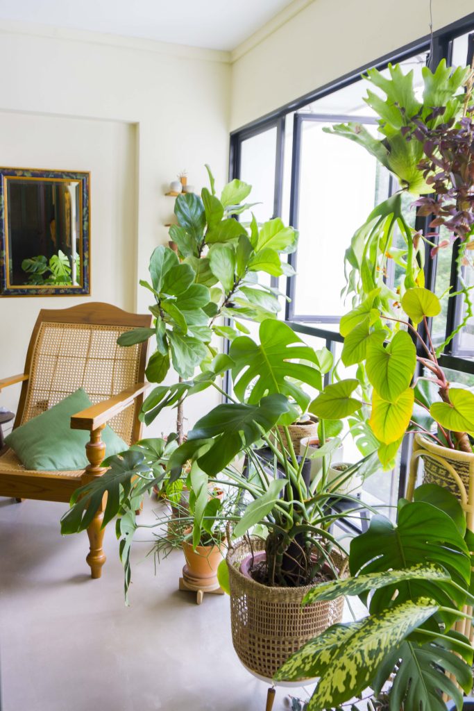
Lingyi and Marvin’s plant collection

Being nature lovers, the couple wanted to include greenery in their home. “Our collection has grown over the past months and we’re loving how our home has become an urban sanctuary that we can relax in,” Lingyi says.

For aspiring plant-parents, the couple recommends picking plants according to the flat’s lighting condition. “As plants such as cacti and monstera don’t require much light, they’re perfect for homes with low-light. All plants will have to adjust to their new environment, so don’t be deterred if they aren’t doing too well when you first bring them home. When we brought our monstera home, it had just 3 leaves in the first two weeks. Now, it’s thriving with over 20 leaves!”

Waste Not, Want Not

As advocates of sustainable living, Lingyi and Marvin chose to retain as much as the original interiors of their resale flat as possible, including all wooden doors and the parquet flooring in the bedrooms. In the living room, the couple also opted for concrete screed, a more natural material, as opposed to vinyl flooring.

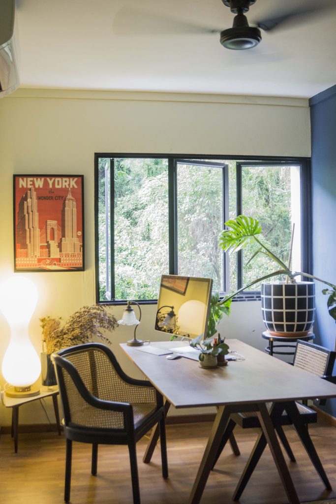
The study room, featuring wooden parquet flooring from the previous owner

Instead of buying their furniture first-hand, they also managed to source for several well-made and beautiful pre-loved furniture from Carousell, including their vintage-inspired TV console.

Rustic Vintage Vibes

When designing their home, Lingyi and Marvin regularly browsed sites such as Pinterest for vintage-inspired interiors and put their ideas on a shared board for discussion. They also presented a deck of visual references to potential interior designers.

“It’s important that they understand our needs. Portfolio aside, we were looking for an interior designer with whom we can communicate well. We’re really happy to have worked with Monocot Studios as they really brought our rustic vintage concept to life,” the couple says.

Bringing out the vintage vibes with mosaic tiles

“We’re really happy with our home,” the couple smiles. “All the hard work was definitely worth it.”

Source: mynicehome.gov.sg
Home Tours: The Cosy Japandi Home

Home Tours: The Cosy Japandi Home

Rachel and Zhuang Yu’s 4-room flat in Commonwealth is minimalist, bright, and filled with trinkets from their travels to Japan—a home that perfectly encapsulates their love for the land of the rising sun.

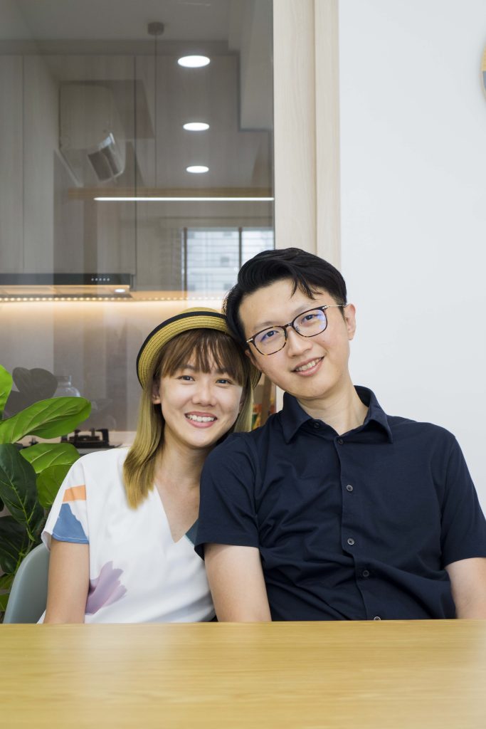
Home owners Rachel and Zhuang Yu

Designing the Home

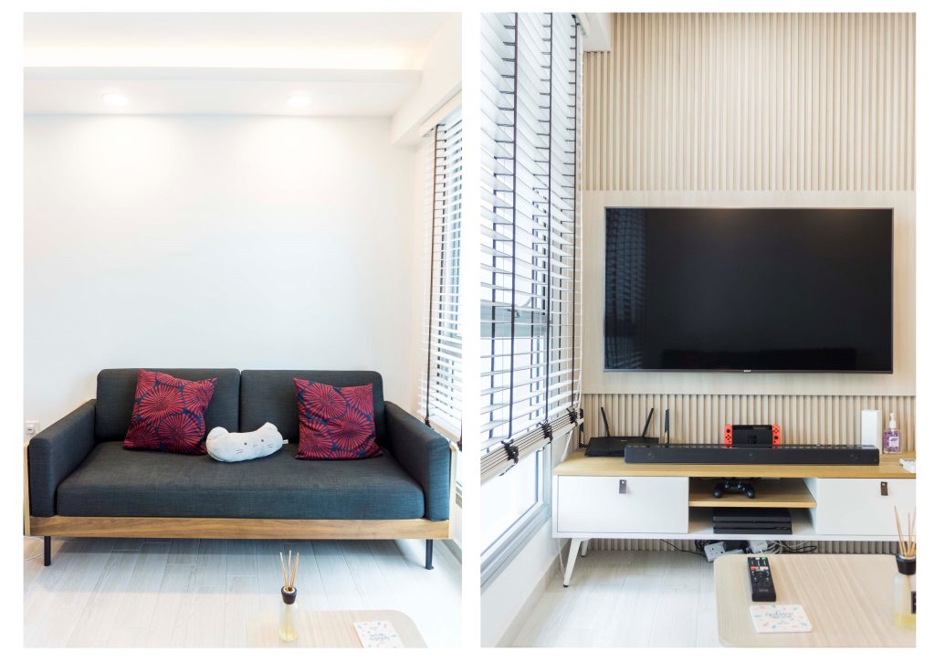
When it came to designing their home, Zhuang Yu and Rachel wanted to replicate the cosy simplicity of Japanese interior design, as they are huge fans of Japan and its culture. For example, the living room feature wall, with its clean linear pattern, is reminiscent of bamboo walls.

The living room

“To add a different dimension to the overall interior aesthetic, we also borrowed some minimalist Scandinavian influences,” Rachel adds.

The result is a beautifully-executed Japandi theme, featuring white walls, wooden accents, and a complementary colour palette of muted colours such as light grey and pastels for an added touch of cosiness. Wooden flooring, common in Japanese and Scandinavian homes, round up the look. However, instead of the relatively popular vinyl flooring, Rachel and Zhuang Yu splurged a little on wood-look tiles. “We prefer the texture of tiles,” Zhuang Yu explains. “Also, we thought that tiles would be more durable than vinyl!”

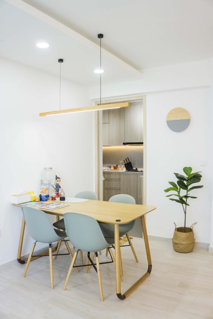
Rachel’s favourite spot at home is the light-drenched dining area, a harmonious showcase of Japandi elements. “Sitting here makes us feel relaxed – it’s as if we are at a cafe in Japan,” she laughs.

The dining area

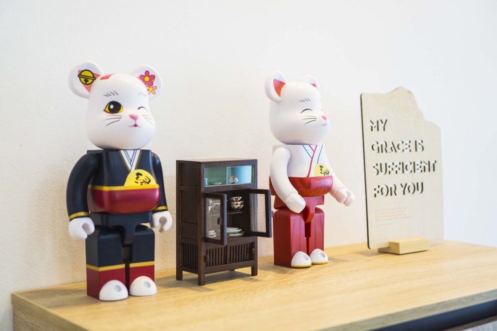
Japanese figurine displays on their wooden shoe rack

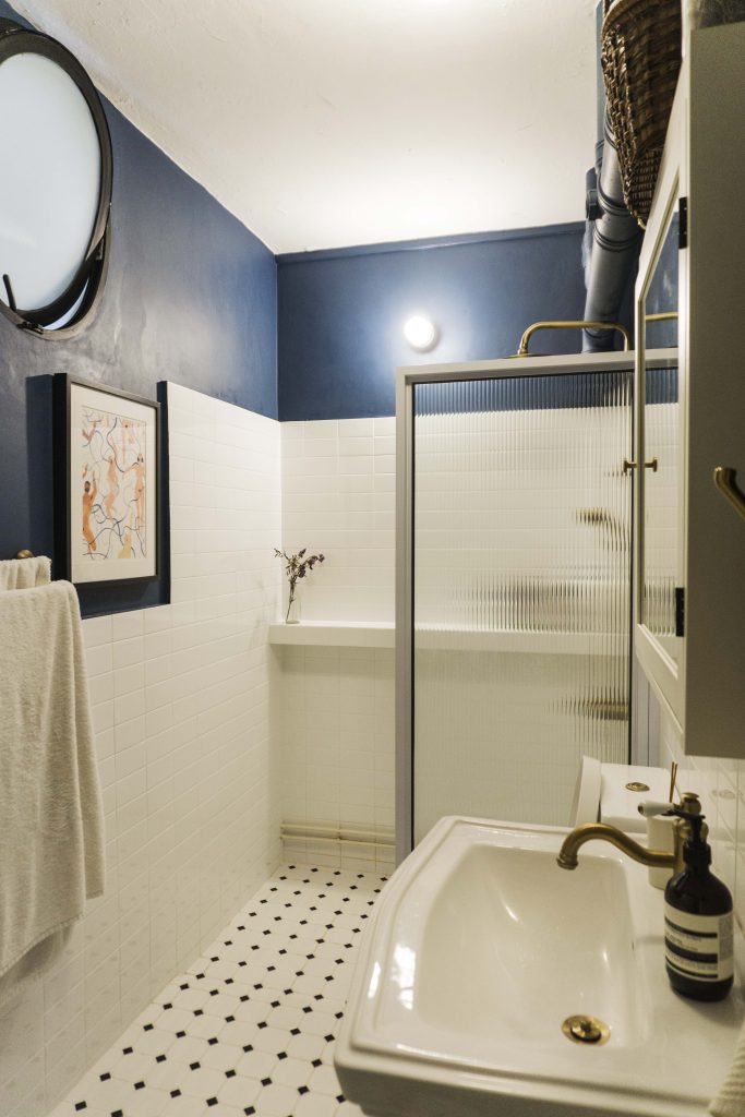
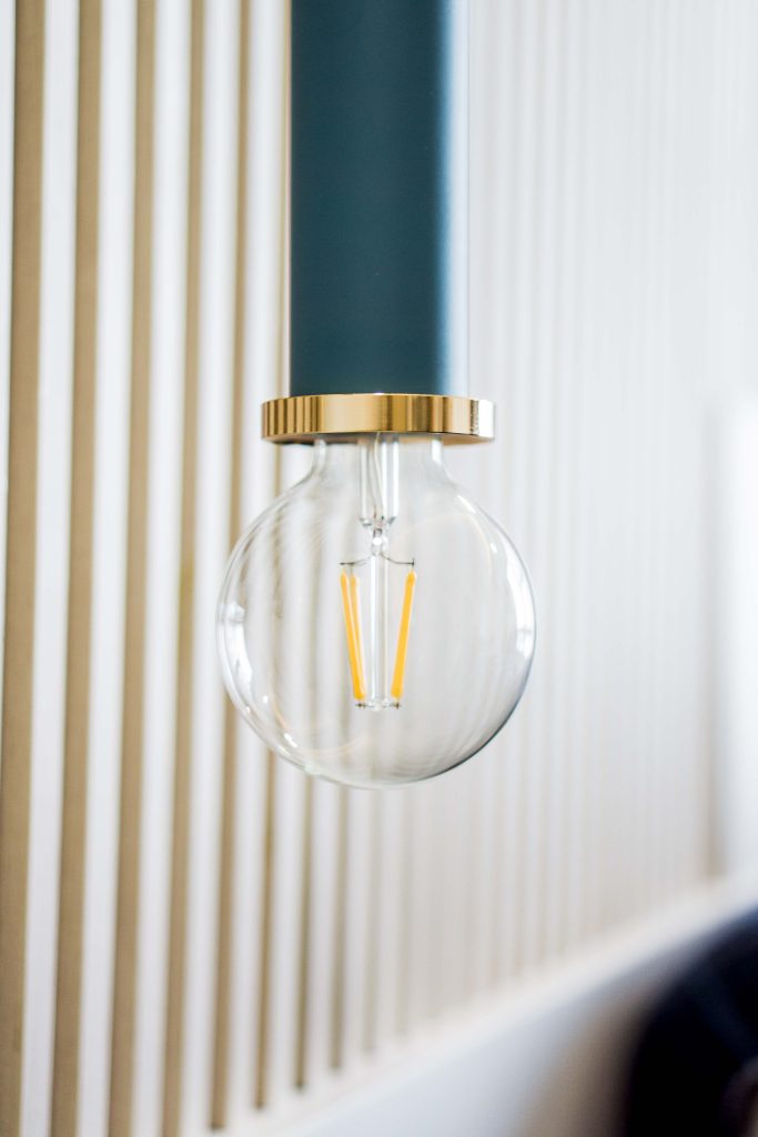
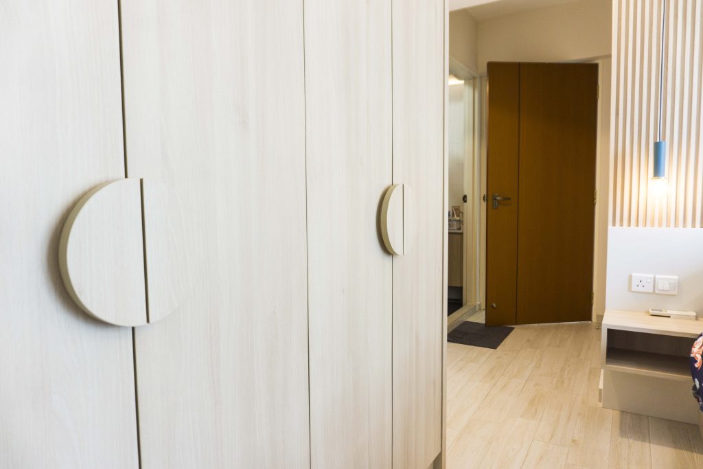
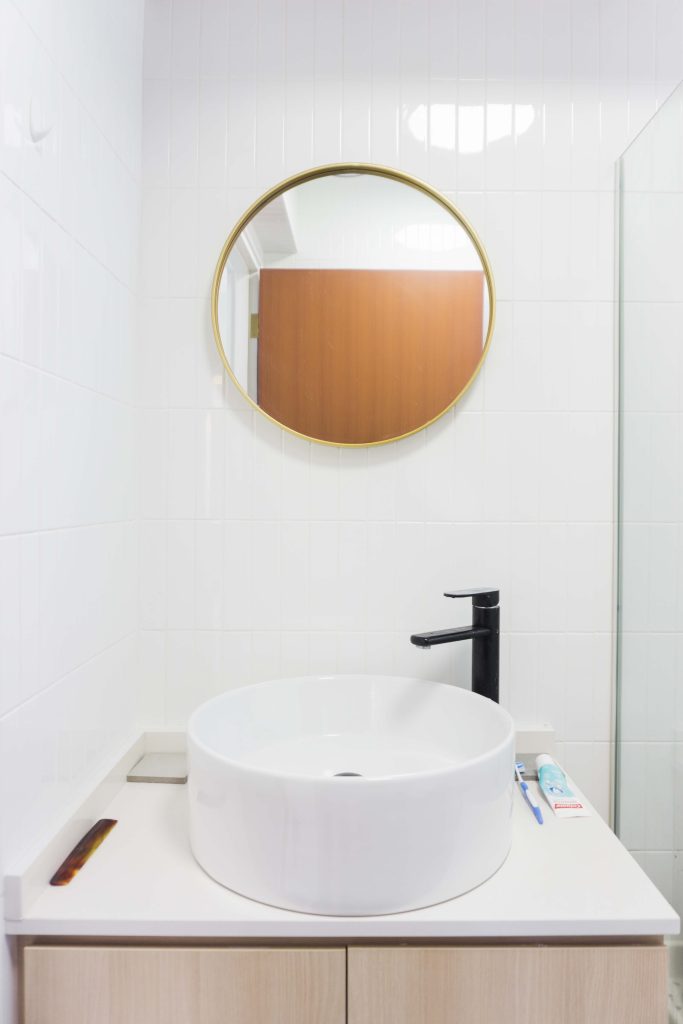
“We also included circular elements and soft corners for our house as too much white and wood can make a house feel impersonal,” Rachel explains. This includes statement lightbulbs in the master bedroom, customised semi-circular wardrobe handles, as well as a round mirror and sink in the bathroom.

It is a design element fitting of a Japanese-inspired home, as circles hold heavy symbolism in the culture—signifying continuity, balance, and completeness.

Rachel and Zhuang Yu’s master bedroom features a series of round elements, including a statement lightbulb

The customised semi-circular handles of their wardrobe fit with the theme

Their toilets also feature a round mirror and sink

A Home for Hobbies

Rachel’s ceramic works

The couple has also carved out dedicated spaces in their home for their hobbies. “I have been practising ceramic arts and recently bought a ceramic wheel to improve my craft. Compared to a workshop, a home studio gives me the comfort and freedom to practise at my own pace,” Rachel says.

“I currently make decorative pieces, and hope to create crockery such as cups and plates to use in our home in future,” she adds.

Rachel’s pigeonhole shelves

“I am a graphic designer and have lot of design books where I draw inspiration from. I place these in my pigeonhole shelves,” Rachel says.

Zhuang Yu’s man-cave

Zhuang Yu’s ‘man-cave’ is a gamer’s paradise, featuring a high-functioning LED-lit CPU that supports graphic-intensive games, an ergonomic chair for maximum comfort, and a pair of wireless headphones with Bluetooth microphone for the best gaming experience.

Zhuang Yu is also an avid anime fan, and his room features his favourite figurines that he had collected from the couple’s trips to Japan, on shelving that is similar to Rachel’s.

Zhuang Yu’s collection from Japan

Renovation Tips

When it comes to renovation tips, Rachel iterates the importance of good financial planning. “In addition to having an overall budget, Zhuang Yu and I further apportioned budgets for each living space such as the living room, kitchen and master bedroom. Having a more detailed budget helped us to better manage the overall costs,” Rachel advises.

They also suggested purchasing bathroom accessories, décor and lighting online as it may be cheaper. “I bought most of my stuff on Taobao. However, do check out the sellers’ reviews and ratings before purchasing from them,” Rachel recommends.

Source: mynicehome.gov.sg
Home Tours: How a Couple Designed Their Elegant Abode

Home Tours: How a Couple Designed Their Elegant Abode

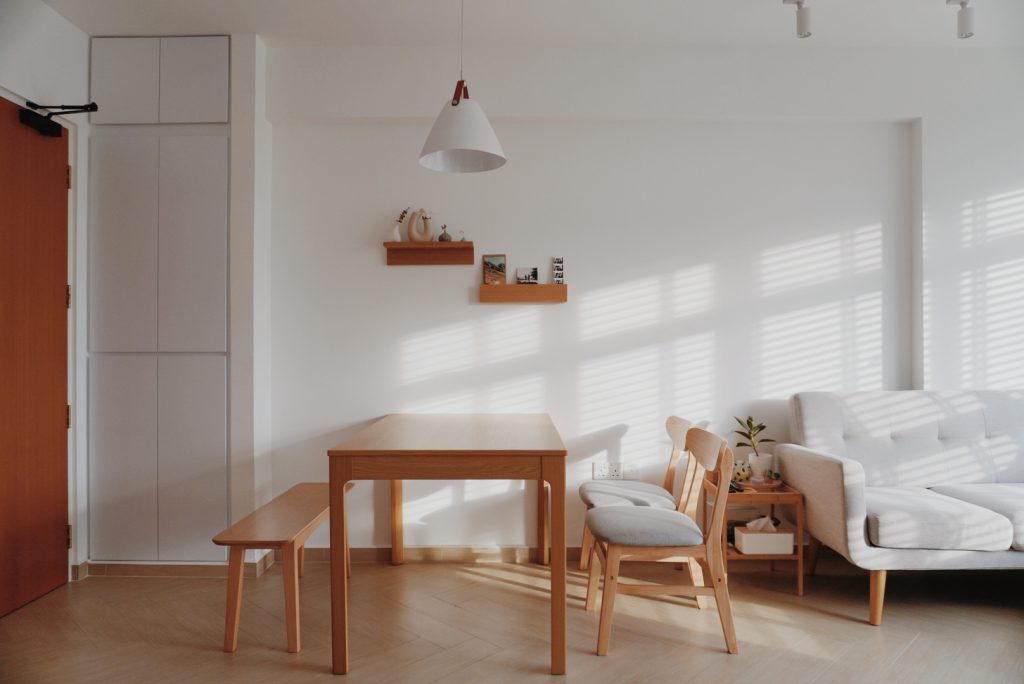
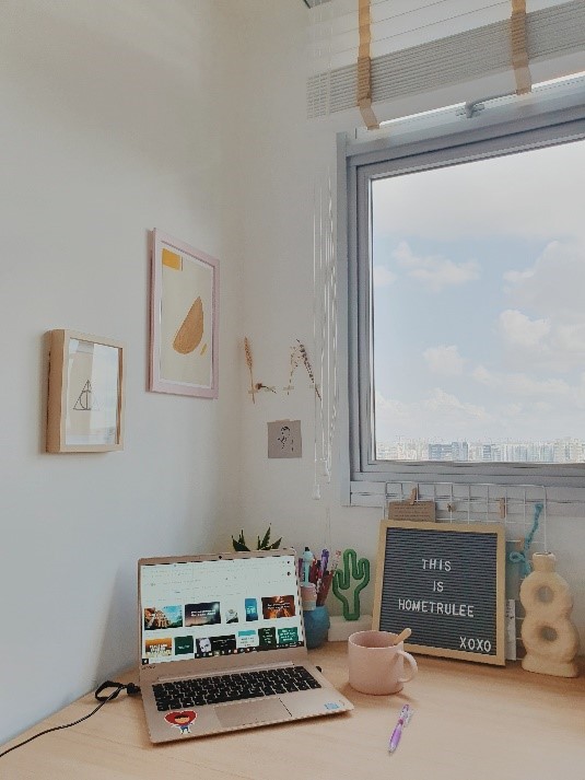
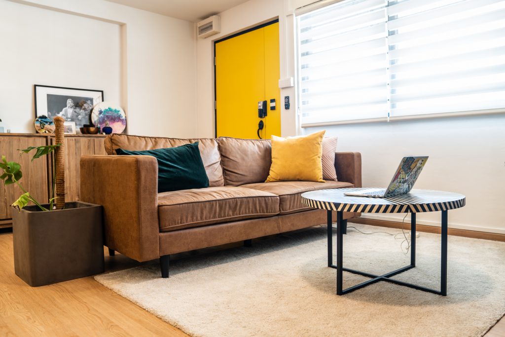
Nestled in the heart of Boon Keng is a cosy 3-room flat which stands out for its understated elegance and style. The light-filled home incorporates simple lines, pale wood, and plenty of white to achieve the zen vibes that would make it @hometrulee – a play on the homeowners’ Instagram handle.

Taking On the Role of Interior Designers

While many other home owners would have engaged the services of interior designers to bring their vision to life, Mr and Mrs Lee, who are both working in the education industry, took a more unconventional approach. “We decided to not engage an interior designer as we wanted to take on the challenge of designing our own home,” the couple laughs.

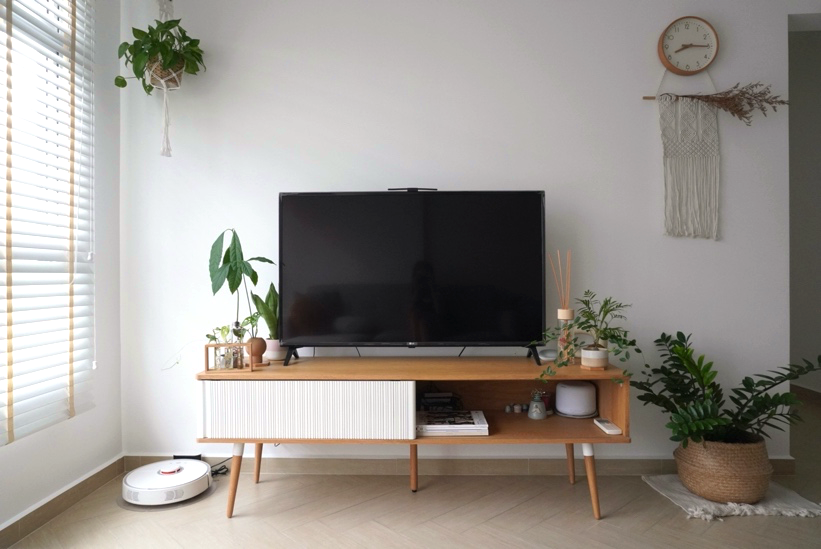
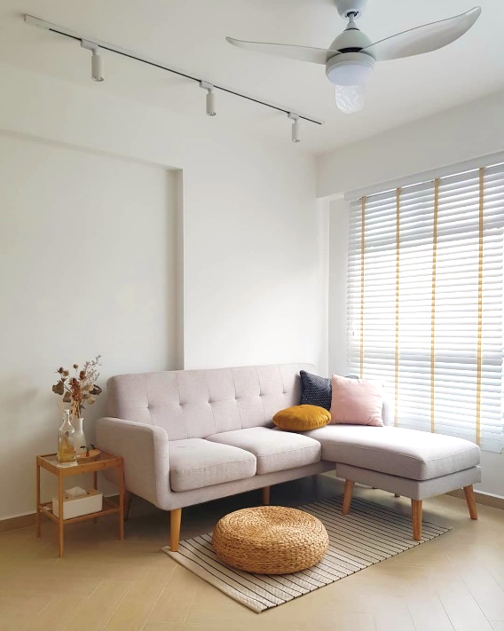
The flat features wooden and white accents

They kickstarted the project by deciding on the overall theme months ahead of their key collection date. This stage involved a lot of research, creating mood boards and referencing different sources, including fellow home owners, for tips and inspiration.

With neither background in design nor 3D renders of their home, visualisation played a big part during the designing process. “We had to mentally picture the entire design and hoped that the elements will go hand-in-hand,” the couple recalls.

Upon receiving the keys to their flat, the couple then took measurements of their new home with their contractor. “Only some minor layout changes were made to the master bedroom,” Mr Lee says. “We were really excited and started renovations the day after!”

Without an interior designer to oversee and coordinate the various aspects of their home renovation, the couple had to step up to fulfil this role despite their work commitments. “We had to personally visit the site to ensure that the works are in order. We also visited many different tilers as we couldn’t decide on our flooring,” they say.

“We’re really glad that everything worked out in the end!”

A view of the cosy living room

Bringing Out the Cosy Vibes

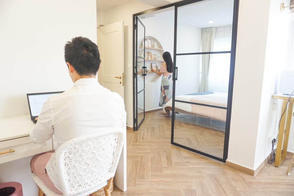
The home owners eventually selected Herringbone floor tiles, in a wooden shade that would complement the furniture which they mainly sourced from Ikea and Taobao. “We tried to have furnishings of the same wooden tone,” Mrs Lee says. “It was challenging but the result is very satisfying.”

The couple chose furnishings and décor pieces in complementary, muted colours

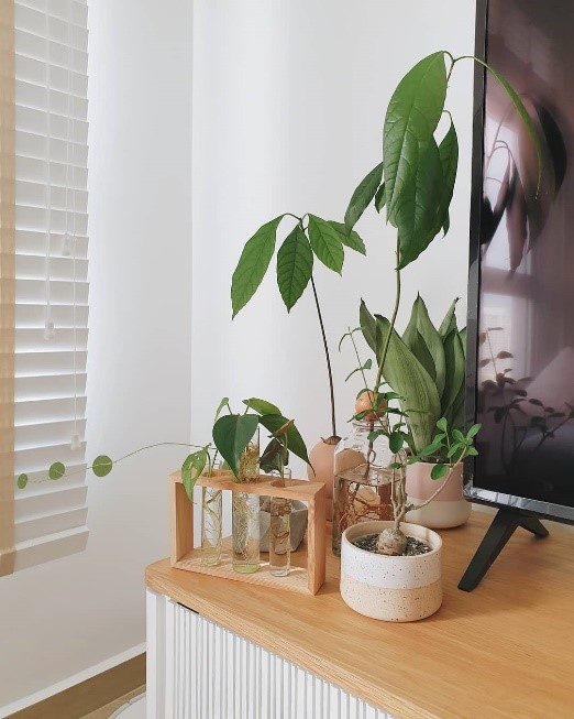
Coming from a family of home gardeners, the couple also naturally took an interest in plant keeping. “Adding a dash of greenery is a simple way of injecting life and calming vibe to the house,” the Lees say.

Pontos, or money plants, are a good option for those just starting out as they are affordable and easy to care for. The couple also suggest the Zamioculcas Zamiifolia (ZZ) plant as it is hardy and grows well, but cautions that it is unsuitable for pet owners as the plant is toxic to animals.

One of the plant corners within the flat

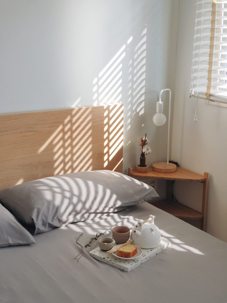
Processed with VSCO with a6 preset

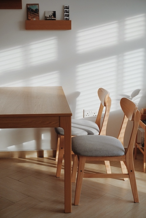
The morning light peeking through the blinds

The Lees took advantage of the natural light that floods their home by opting for blinds. “We love the effect of natural light peeking through the blinds, especially in the mornings. We also thought blinds were more complementary to our theme,” Mrs Lee says.

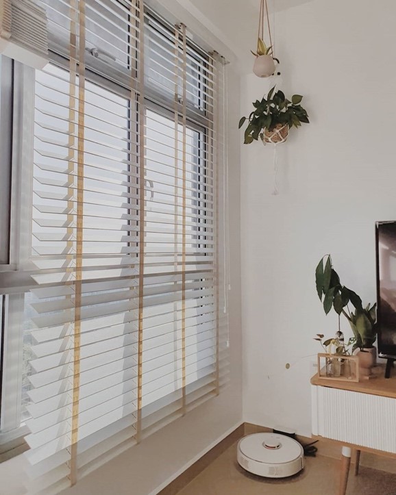
Instead of curtains, Venetian blinds are used to elevate the theme

For homeowners considering the same, Mrs Lee advises, “As Venetian blinds don’t block out the light, blackout blinds or curtains may be better options for individuals who prefer to sleep in complete darkness.

Combining Form and Functionality

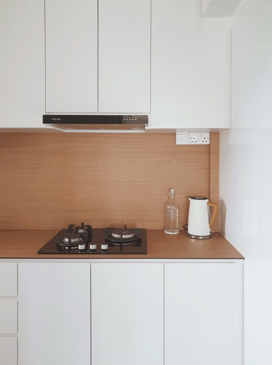
The kitchen countertop and backsplash are made of KompacPlus, a low-maintenance material popular amongst homeowners

Beyond aesthetics, the couple highlighted the importance of functionality in a home. “Ease of maintenance is key,” Mr Lee emphasises. “For instance, we made sure to purchase furniture pieces with ‘legs’ as we wanted to clean the house with a robot vacuum. We also chose KompacPlus for our kitchen countertop and backsplash as the material is easy to clean.

Home in the Heartland

“We were initially a little apprehensive about purchasing a 3-room flat because of the size, but the flat turned out to be spacious enough for us! Plus, a smaller flat is also easier to maintain,” the couple laughs.

“Boon Keng is a great location and many of our friends live in the neighbourhood. We couldn’t be happier with our home!”

Photos courtesy of Mr and Mrs Lee (@hometrulee)

Source: mynicehome.gov.sg
Home Tours: A Modern Bohemian Flat

Home Tours: A Modern Bohemian Flat

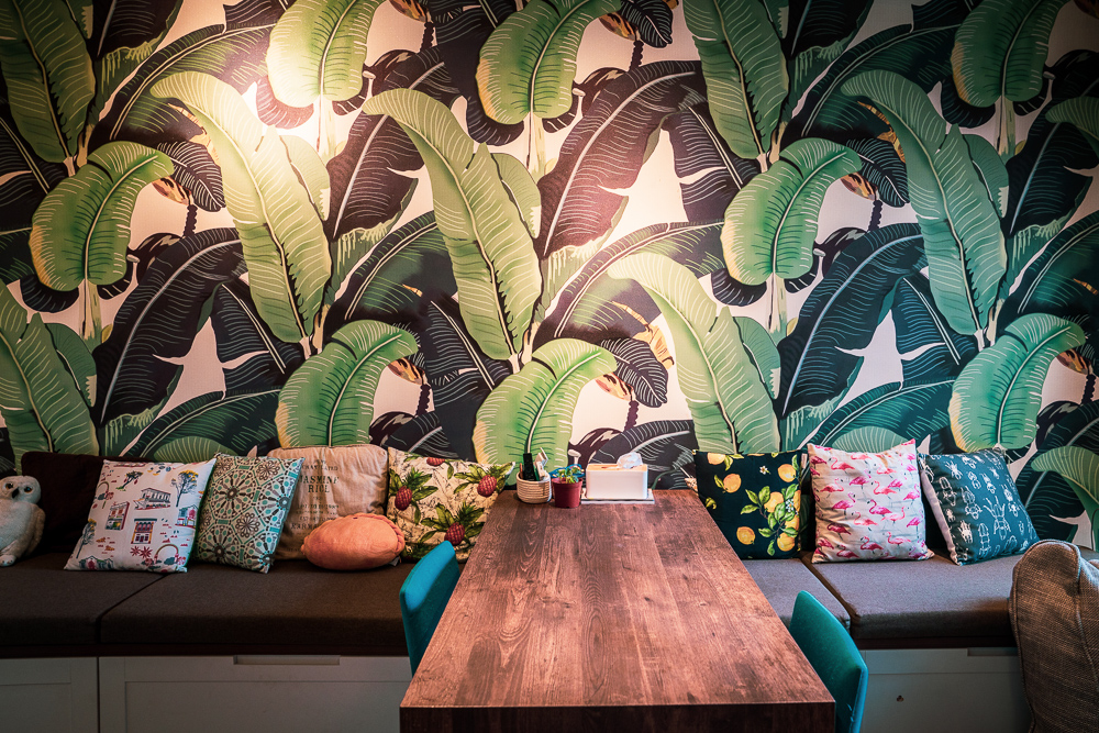
The relaxed vibe of Jolene and Yi Peng’s Sengkang flat brings to mind exotic locales, where rich patterns and colours meld effortlessly to create a cosy ambience. The couple describes their interior design as bohemian-meets-minimalism, a unique combination that reflects their preferred decor styles.

“I love warm spaces with textures and splashes of colours, while Yi Peng prefers sleek lines and a cleaner look. So we ended up mixing and matching the different elements for our home,” Jolene explains.

Winning Combination

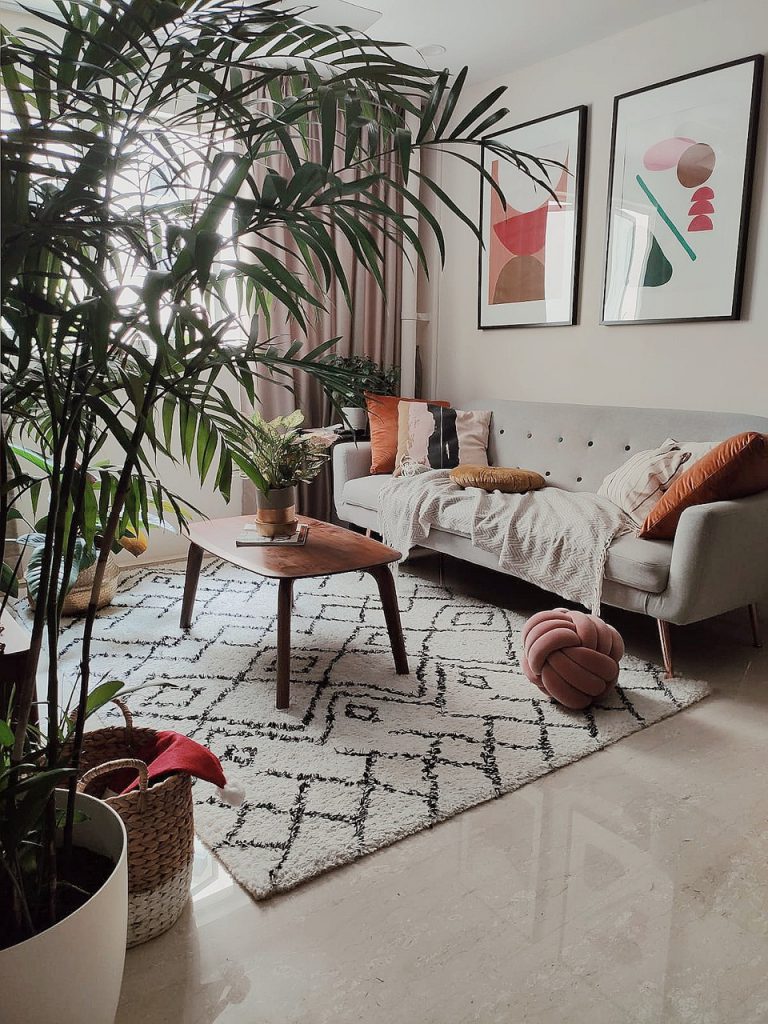
This modern bohemian combination carries throughout the couple’s 5-room flat. For instance, a clean-lined, minimalist sofa in the living room is livened up by a smattering of jewel-toned cushions and a cosy throw. A patterned rug lies underfoot, its look anchored by black-framed art pieces which take pride of place on the wall behind.

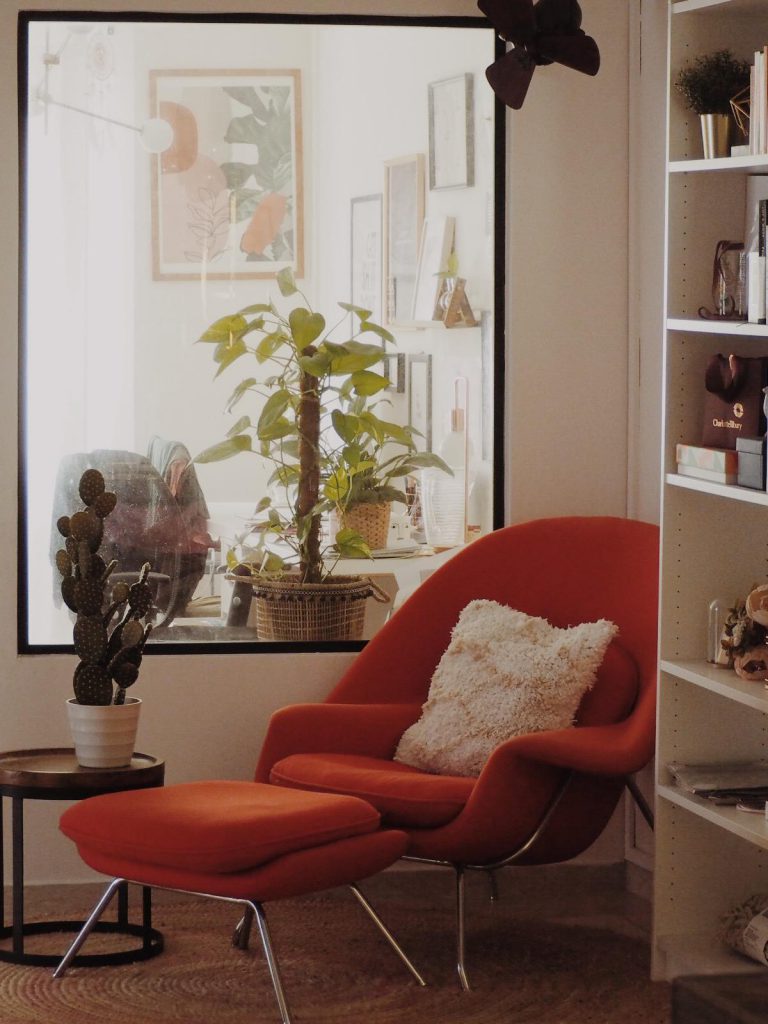
In the mini library, a black-framed window, which is in line with Yi Peng’s preference, complements an orange lounge chair which adds a warm and cosy touch to the space.

The mini library features a black framed glass window that was installed to brighten up the space

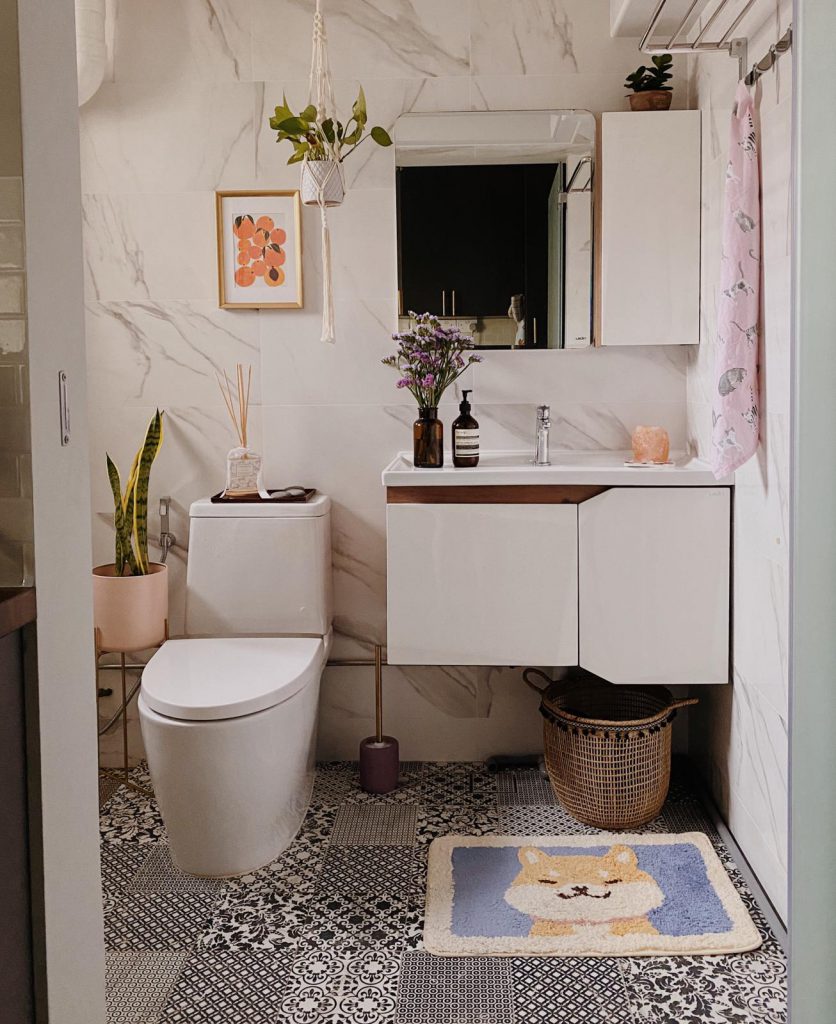
And while the kitchen adopts a minimalist aesthetic with a black fridge and dark grey cabinets, the common bathroom nearby features Peranakan-inspired floor tiles that add playfulness and visual interest.

The Peranakan-inspired tiles in the common bathroom add playfulness to the kitchen area

Glamour, Customised

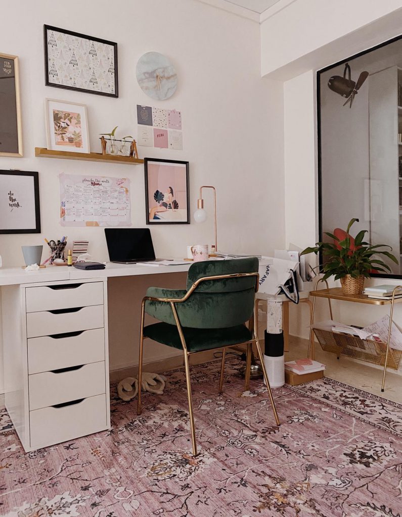
One room however, stands out in luxe contrast against the others. With plush forest green chairs, a teal daybed and prominent gold accents, the home office emits a glamourous vibe without straying from the flat’s overall boho-meets-minimalist theme.

With the couple currently working from home, they find themselves spending a lot more time in their home office. “The space is comfortable to work in and the daybed is perfect for short breaks,” they say.

Unlike the rest of the rooms, the home office spots a contemporary luxe look

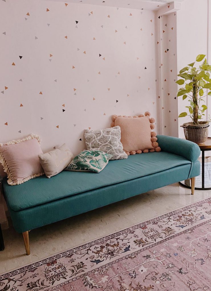
The home office features a whimsical, DIY, confetti wall

“In designing this space, we were going for a cleaner and brighter aesthetic,” Jolene explains. To achieve the contemporary luxe look, the couple chose gold-accented furniture, and even spray-painted the desk legs gold. The home office also features a confetti wall, a project which the couple completed with handmade cut-outs.

DIY Home Projects

Apart from the home office, Jolene and Yi Peng’s creativity also extends to other parts of their flat in the form of DIY home projects.

“We prefer a hands-on approach as we get to customise our home décor,” Yi Peng explains, “For instance, painting the art in our living room allows us to use specific colours that complement the rest of our home. Sourcing for home décor items that fit perfectly can be challenging, so we would rather embark on home projects instead!”

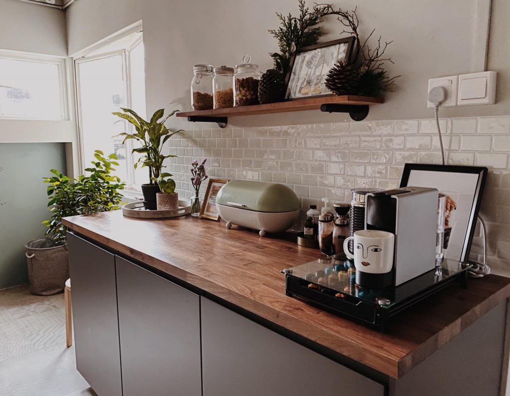
The subway tile-inspired kitchen backsplash is also a result of the couple’s handiwork.

The coffee corner in the kitchen, featuring the white subway tile-inspired backsplash stickers

“We had initially opted for a champagne gold backsplash as we thought it would complement the gold accents in our home, but didn’t really like the result,” the couple says. “So we bought some white subway tile-inspired stickers from Amazon and installed them instead!”

“Whenever we spot something in the home that can be tweaked to better complement the overall aesthetic of our home, we can’t help but do so. Instead of buying a new item, we prefer to get it done ourselves – I guess this is why they say home renovation never ends!” they laugh.

Photos are courtesy of Jolene and Yi Peng of @februarynest

Source: mynicehome.gov.sg
Home Tours: Dressed in Dreamy Pastels

Home Tours: Dressed in Dreamy Pastels

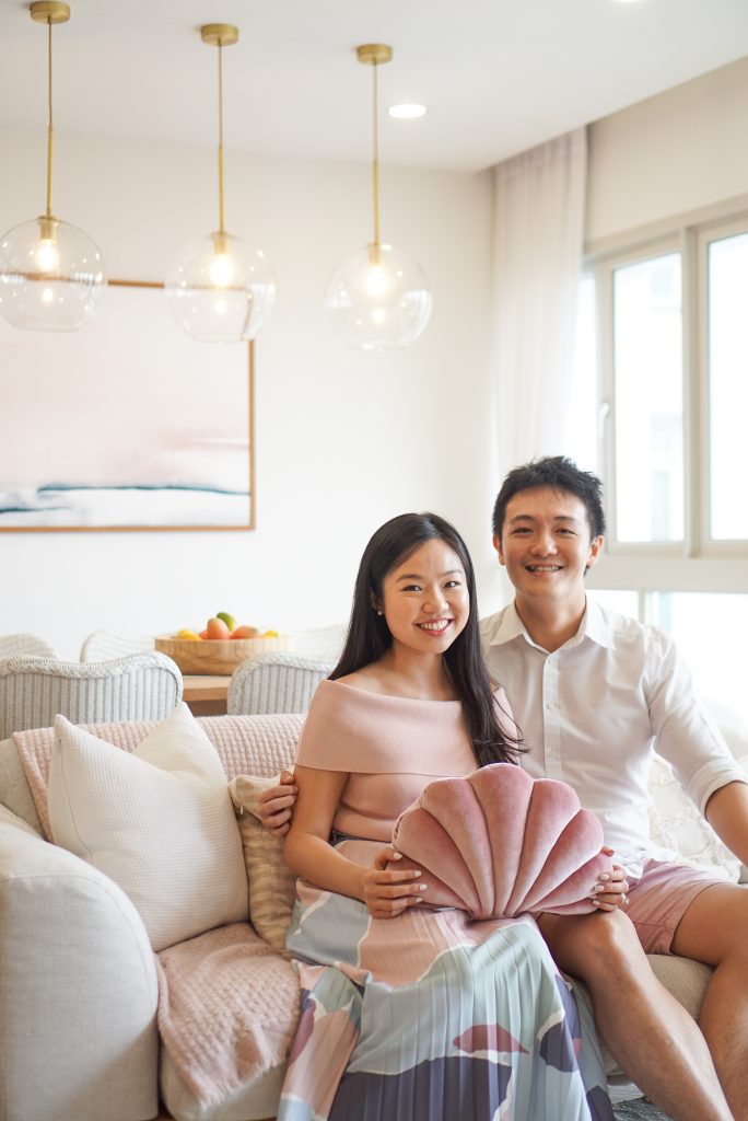
It was love at first sight for Samantha and Jovin Loh, when they viewed a 5-room resale flat in Queenstown. “We loved it so much we made an offer for the unit on the day of the viewing!” they recall. “The spaciousness of the flat and panoramic view from the living room were really attractive to us.”

While they were excited to kickstart renovation works after collecting the keys to their new home, they decided to do so only after their wedding, a decision which worked out unexpectedly well. Prior to their big day, Samantha and Jovin had been searching for a studio to practise their first dance when they thought of their new home. “The walls of the living room were previously lined with full-length mirrors and we thought, ‘Where better to rehearse our dance than in our future home?’”

The living room
Home owners Samantha and Jovin

Wooden Accents and Muted Colours

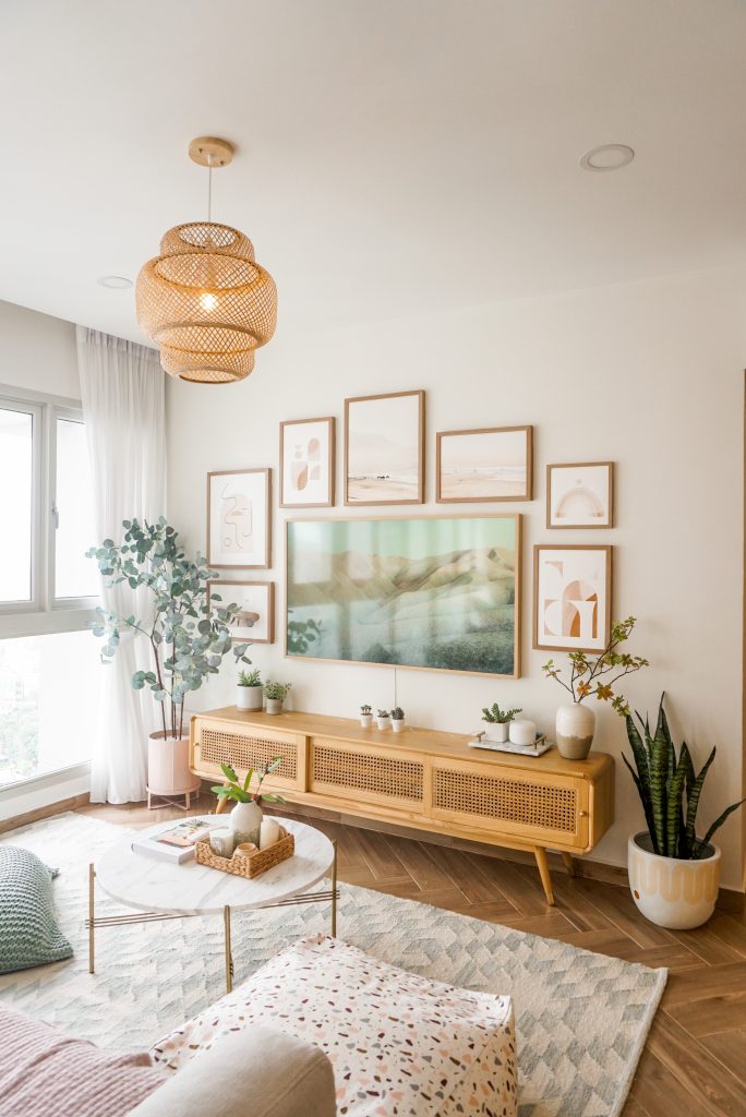
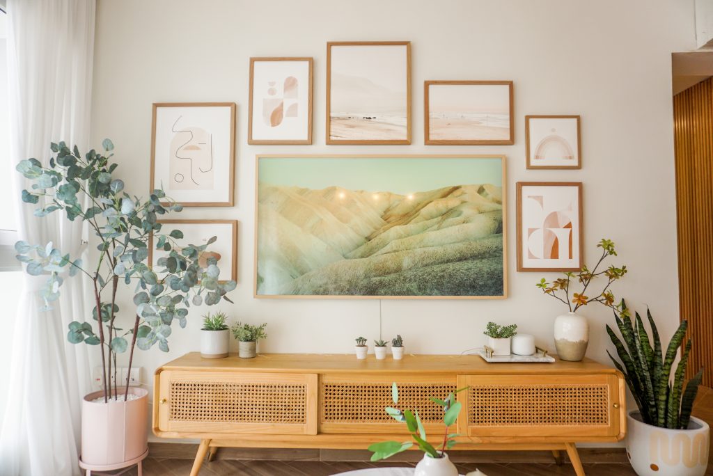
Rattan furnishings and wooden wall frames add warmth

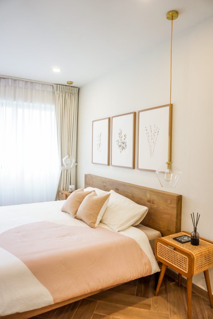
Post-wedding, Samantha and Jovin gave their flat a complete overhaul, transforming its stark monochrome interior into a cosy, calming space which featured plenty of wood. “We wanted to create a homely vibe, so we opted for wood-like tiles throughout the flat. We also use wood and rattan furnishings for an added dose of warmth,” Samantha explains.

Complementing the wooden accents is a pastel colour palette, in which one unique shade stands out. “I’ve always loved the colour frost. It reminds me of summer and adds a pop of colour to the overall look,” Samantha says, referring to the blue shade with grey undertones.

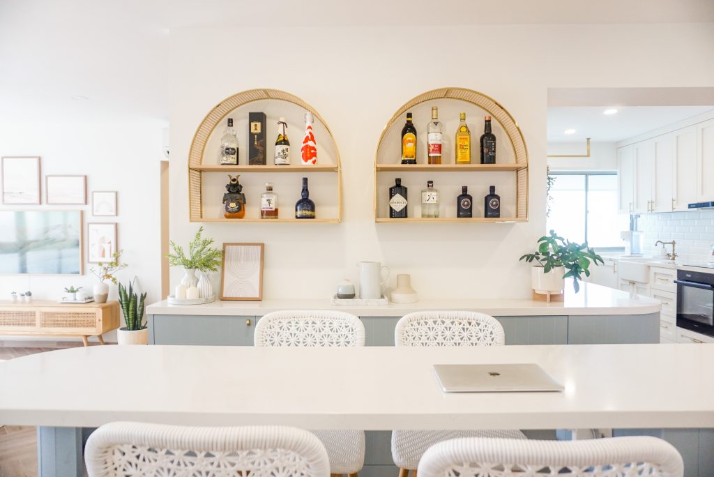
View from the bar table
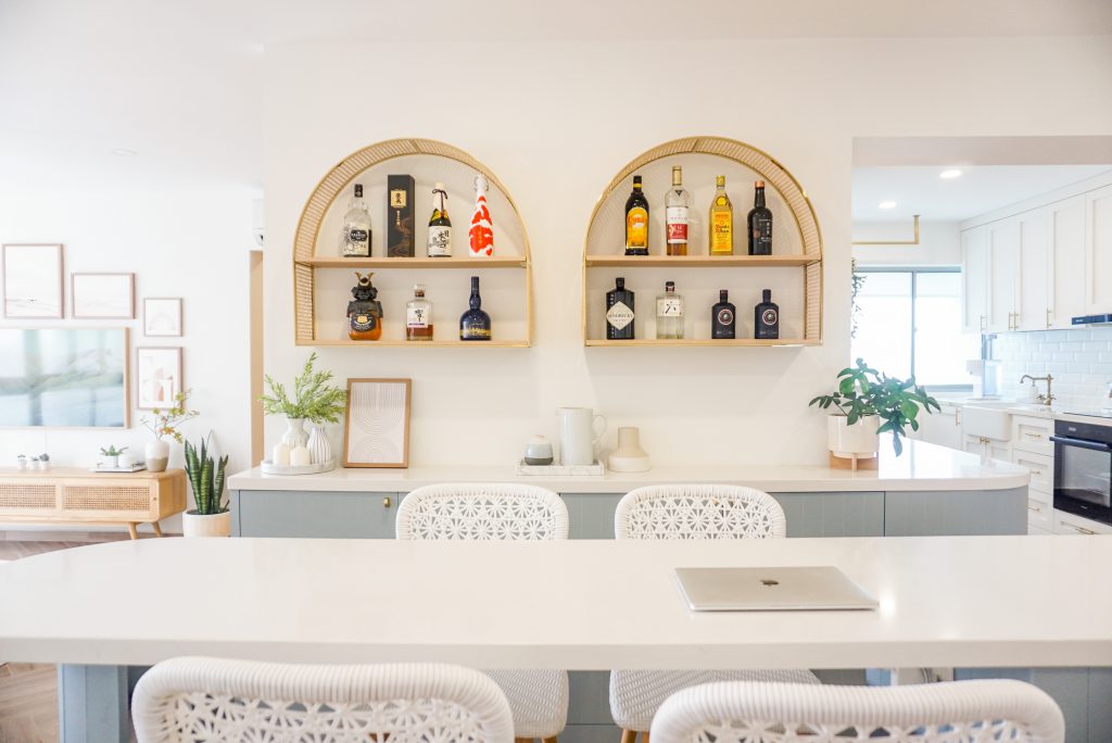
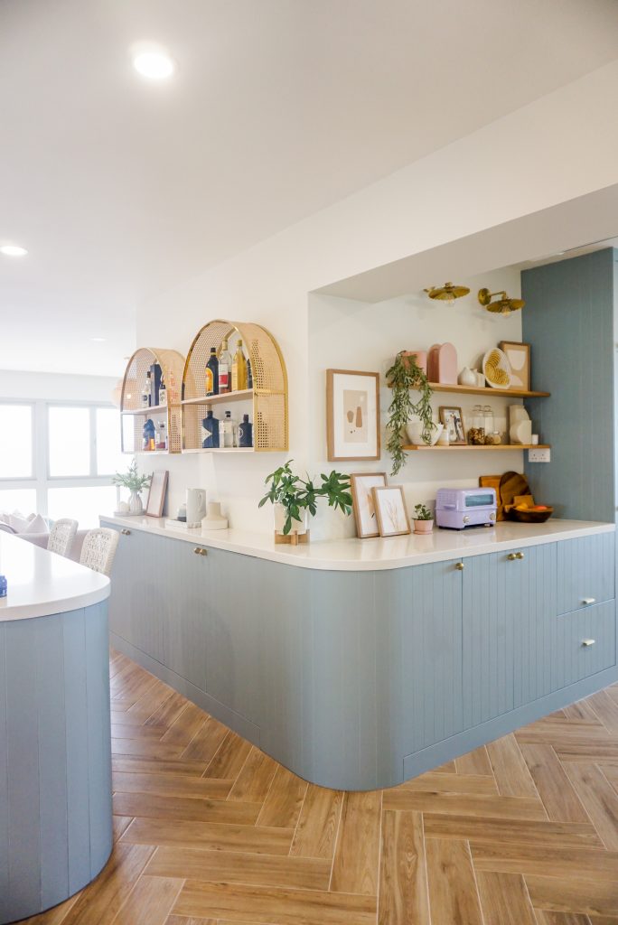
The frost-coloured kitchen cabinets and bar table feature unique rounded countertops

Made for Entertaining

In the Lohs’ flat, the colour is especially eye-catching as it is used in the open kitchen—the cabinets and bar— which is close to the flat’s entranceway.

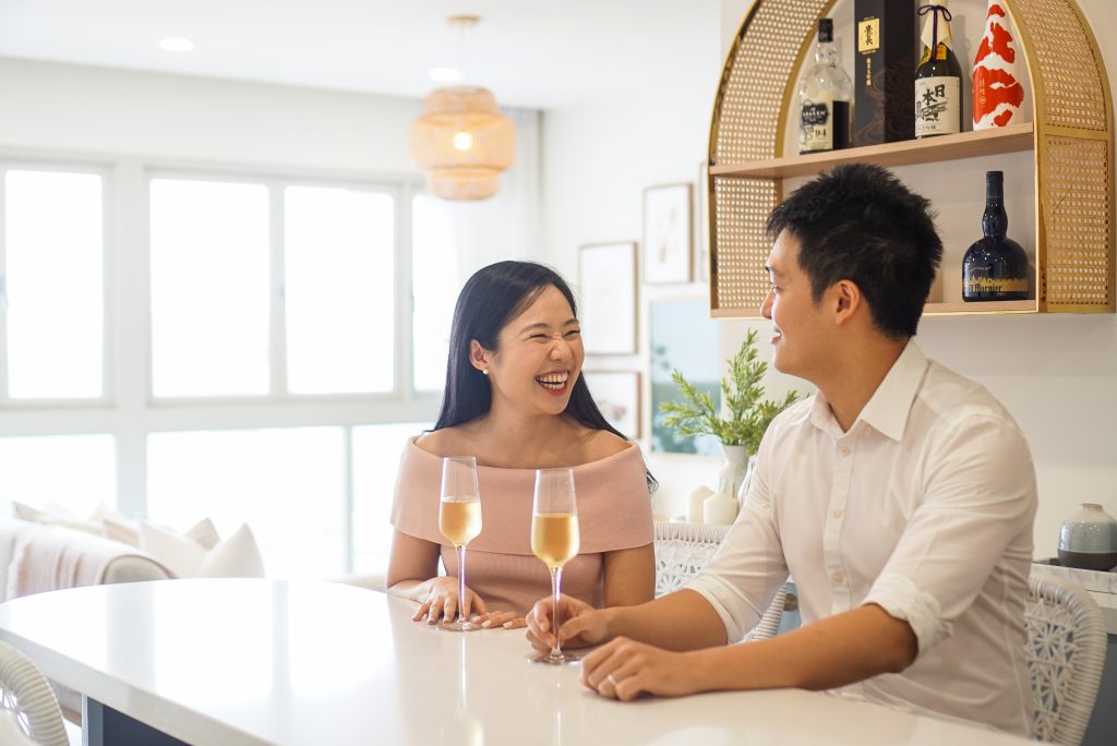
In designing their new home, the couple prioritised a spacious living and dining area. “We often have family and friends over and we want to be able to house everyone comfortably, hence the open kitchen concept,” they explain. “To accommodate larger gatherings, the bar sometimes transforms into a dining area. It provides a good view of the house and we installed electrical points there so that we can host hotpot and fondue parties!” the couple says.

Samantha and Jovin enjoying a chat at the dining area
The couple enjoying a drink at the bar

Unique Design Elements

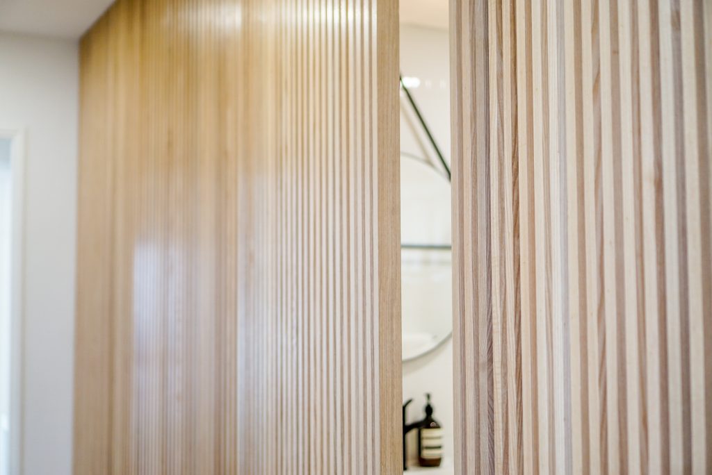
Guests to the flat might find it difficult to locate thae common bathroom at first, and that’s because its entrance blends into the living room, concealed by Japanese-inspired wooden slats. The bomb shelter received the same design treatment, with the two hidden entrances demarcated with two alphabets – ‘T’ for toilet and ‘B’ for bomb shelter. “We thought the idea was really unique, so we built a feature wall to conceal the rooms, as well as to give the living room a more seamless look.”

The concealed door leads to the common bathroom

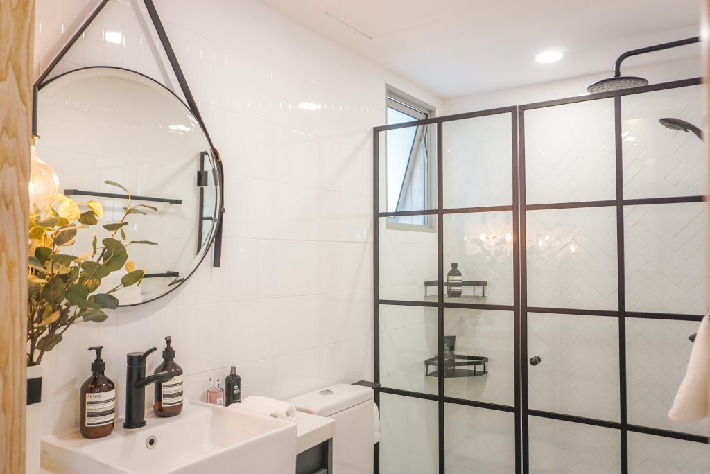
Unlike the living areas, the bathroom features a monochrome colour scheme. The black-framed glass partition and door repeats itself in the master bedroom, where the couple decided to do away with an entire wall because they wanted more light in the room.

Jovin works in the home office, which has been combined with the master bedroom
A closer look at the master bedroom

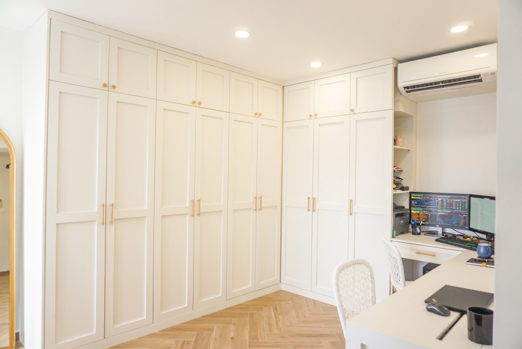
The master bedroom and common bedroom were also combined to form a dressing/ home office area with more wardrobe space, a decision that the Lohs are very happy with.

The dressing area and home office

The couple are happily settled into their new tranquil neighbourhood, despite being initially unfamiliar with the area—Jovin used to live in Choa Chu Kang and Samantha grew up in Bedok.

“I always thought we would live in the east. Out of the 18 houses we viewed, this was the only one that wasn’t located in the east. I guess east side might not be the best side after all!” Samantha quips.

Photos by Briana Tan

Source: mynicehome.gov.sg
Home Tours: Bringing Back Old School Vibes
Home Tours: Bringing Back Old School Vibes

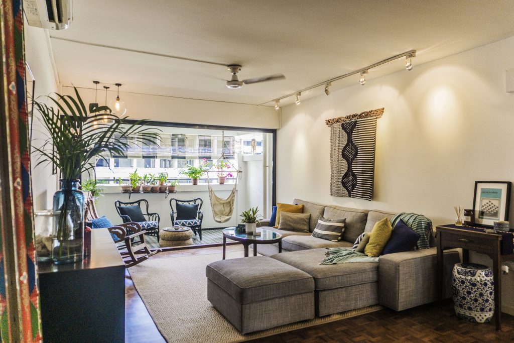
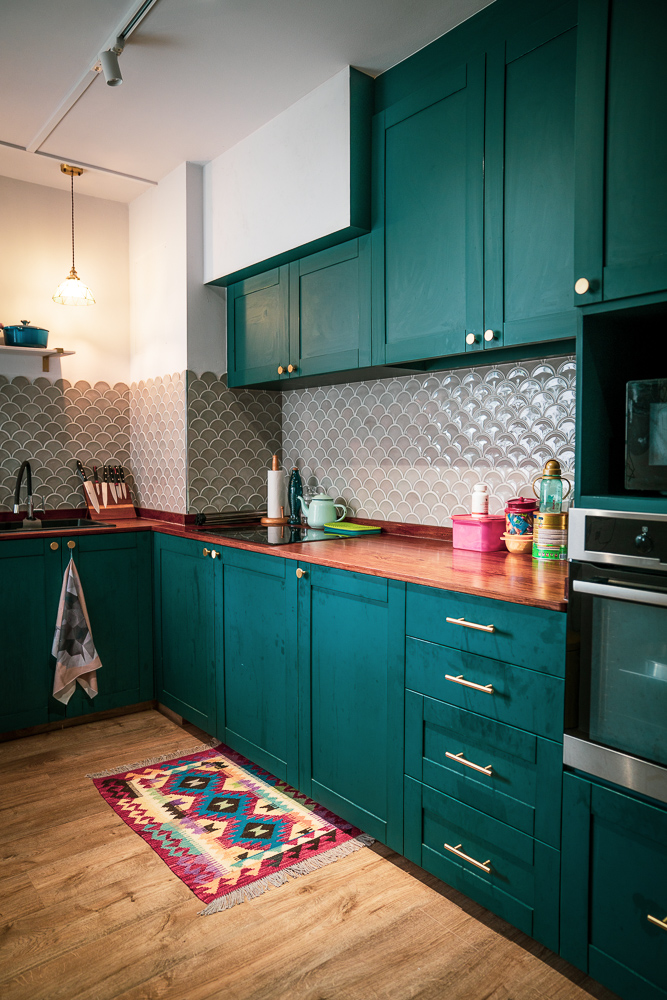
Adorned with antique furnishings and Peranakan-inspired prints, Daria and Faizal’s home will take visitors a step (or two) back in time.

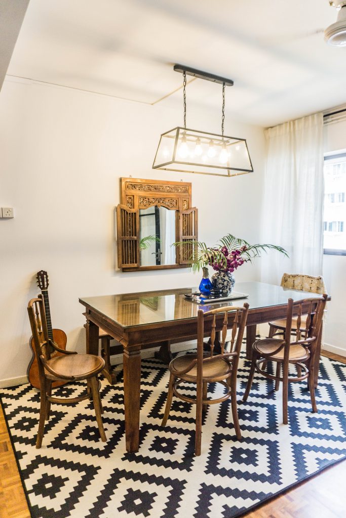
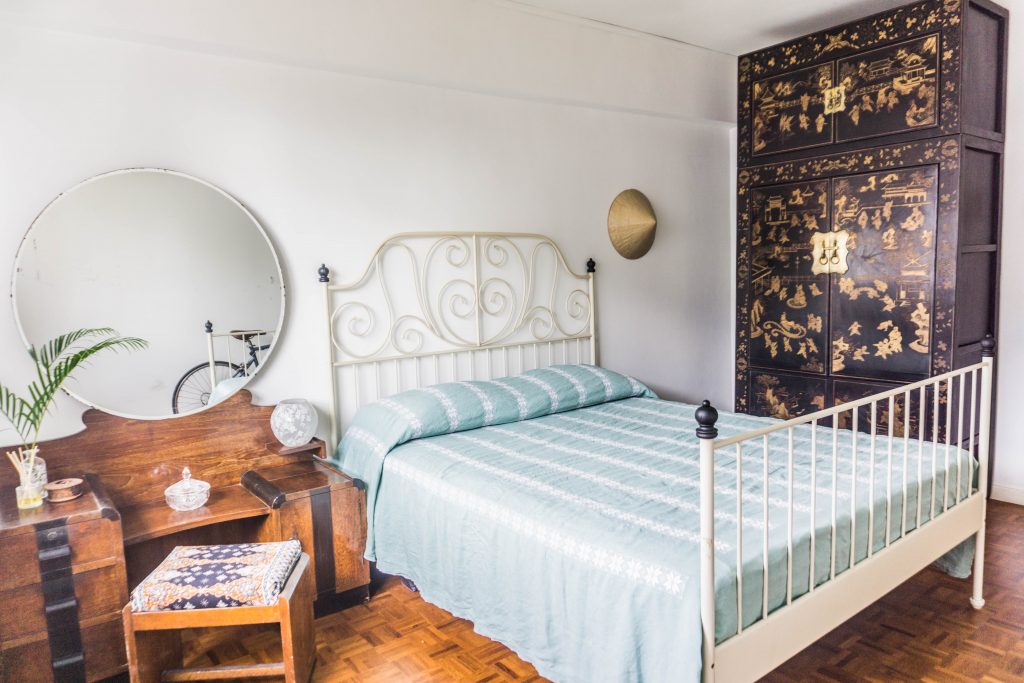
Wooden furnishings make up most of Daria and Faizal’s home

“We love the look of old school, colonial homes,” Daria smiles. “Instead of adopting the minimalist look, we decided to go the other way and incorporated darker-coloured wood furnishings!”

Going Old-School

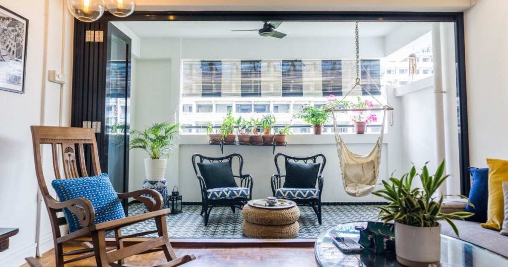
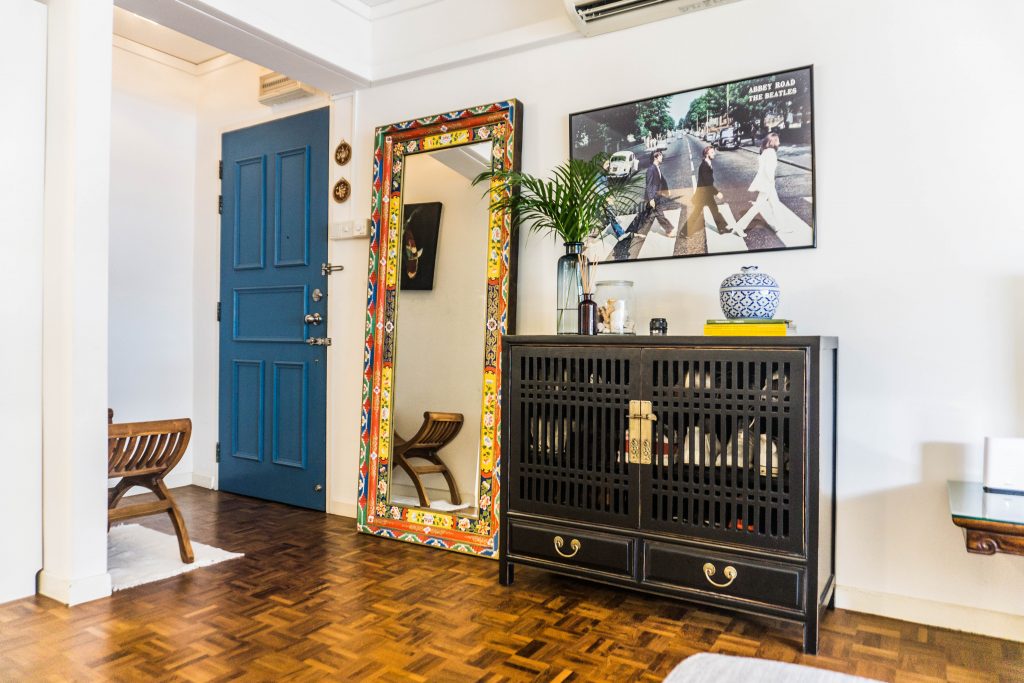
Step into the 5-room resale flat, and you will be greeted by a full-length mirror framed with colourful Tibetan prints, followed by an antique shoe cabinet. The vintage vibes continue with the living room and the balcony which has been repurposed to a lounge area.

In addition to the white and blue bamboo blinds and black rattan chairs, the balcony also features Peranakan tiles – a nod to Faizal’s roots. “The concept is partially influenced by motifs commonly seen in my childhood home, such as Peranakan and Batik prints,” Faizal smiles.

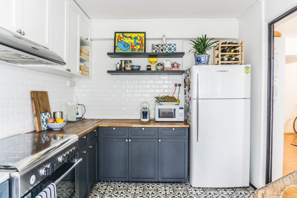
The tiles in the kitchen add a local flavour in the otherwise European-looking kitchen
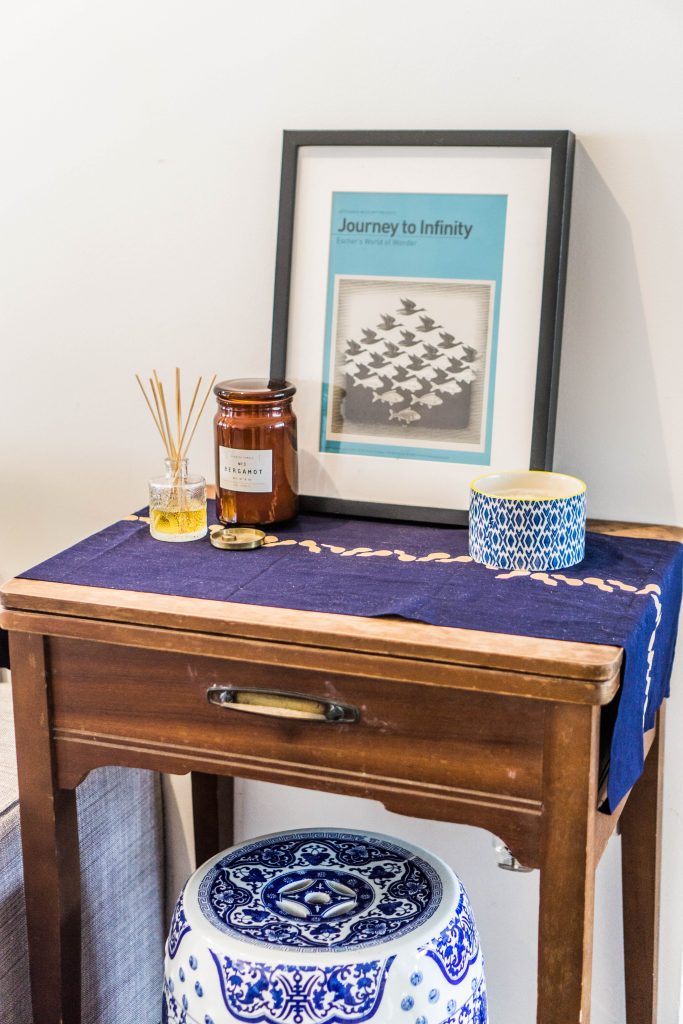
Decorative Batik prints are also found throughout the rooms

Incorporating Italian Influences

While the vibrant home features splashes of colours, the flat is consistently decorated in a white and blue colour palette.

Décor items in Daria’s favourite colour

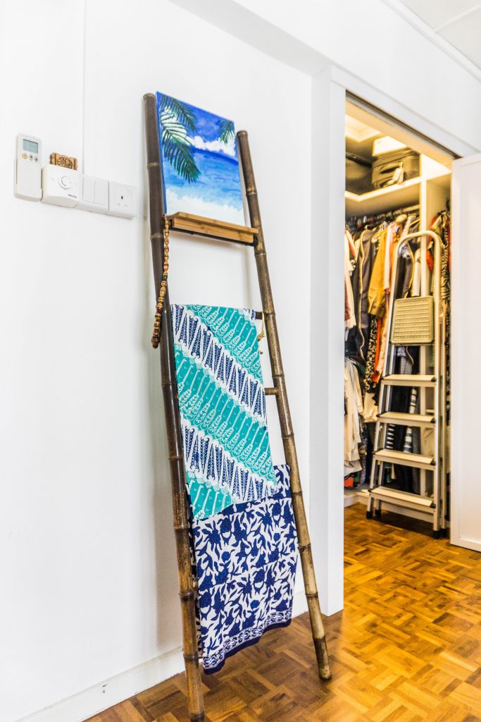
Daria, who is born in Italy, explains that blue reminds her of her country and it is also her favourite colour.  Italian elements are incorporated into the flat through items such as art pieces, bed covers and shawls.

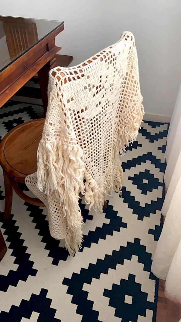
The bedcover and woolen shawl are both from Daria’s hometown in Italy

Repurposing Furnishings

To furnish their home, the couple opted for pre-loved antique furniture, to go with the vintage concept.

“Wood is lasting in nature, so we had no hesitation about buying secondhand furniture, as long as they are often in good condition. Even our fridge is pre-loved. It’s good for the environment (and our wallets!)” Daria laughs.

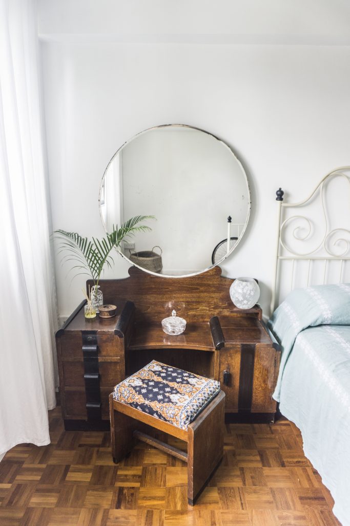
The vanity table in the guestroom is a repurposed gift from the couple’s friends

While pre-owned pieces like the coffee table, TV console, and the guestroom wardrobe were bought from local furniture shops, the couple also actively repurposes furniture previously owned by family and friends. “We think it’s a waste to throw them out, so we often adopt their furniture! For example, our rocking chair and vanity table were hand-me-downs from our friends.”

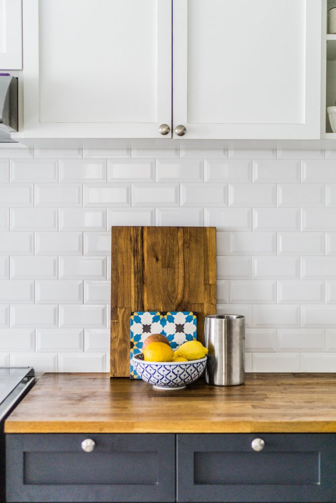
The chopping block is made of leftover material from the kitchen countertop

Daria and Faizal have also found a way to give new life to leftover materials from their renovation works. “There was some extra wood from the kitchen countertop, so we repurposed it into chopping blocks. We also turned the extra tiles into coasters,” the couple says.

“Waste not, want not – we hope other homeowners will consider repurposed furniture as they furnish their homes!”

Source: mynicehome.gov.sg