Home Tour

Scandinavian Simplicity

Scandinavian Simplicity

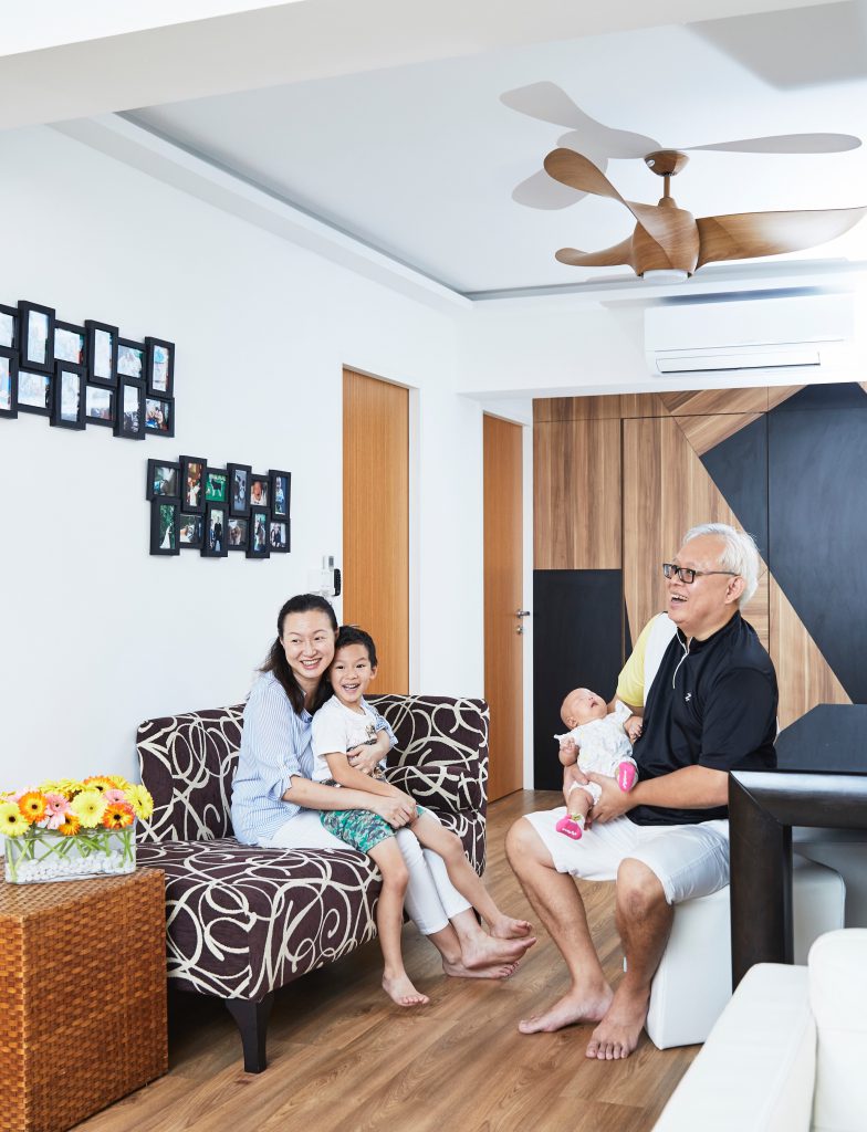
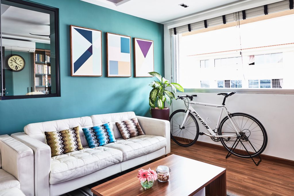
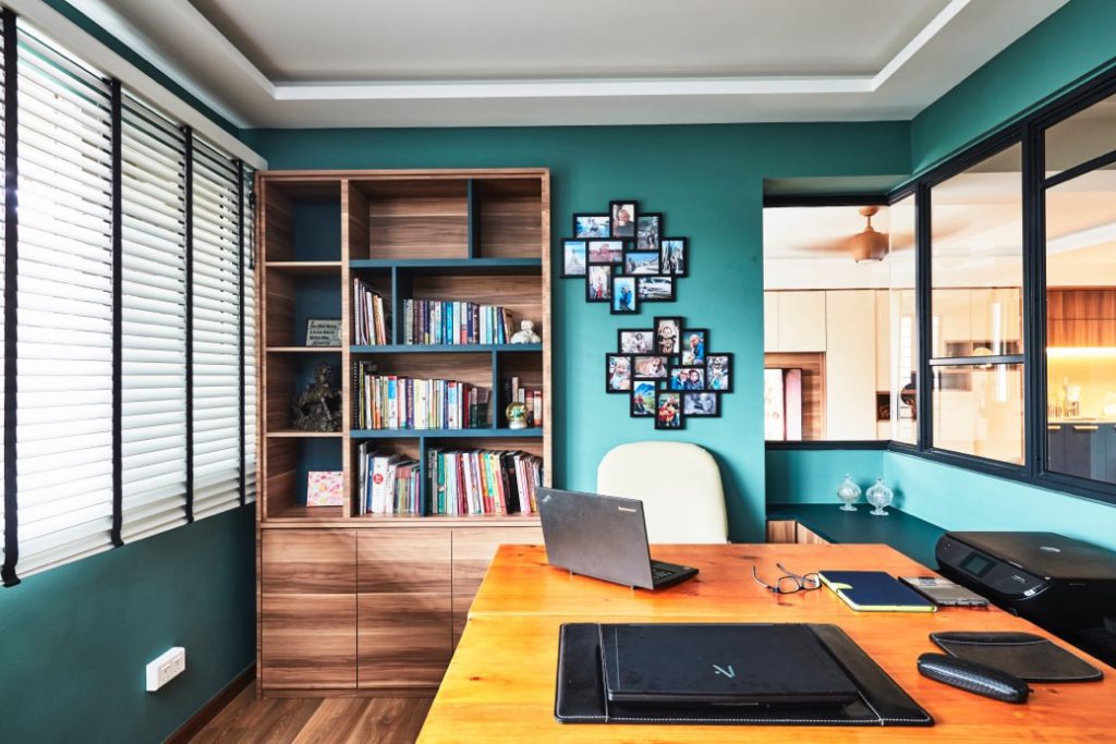
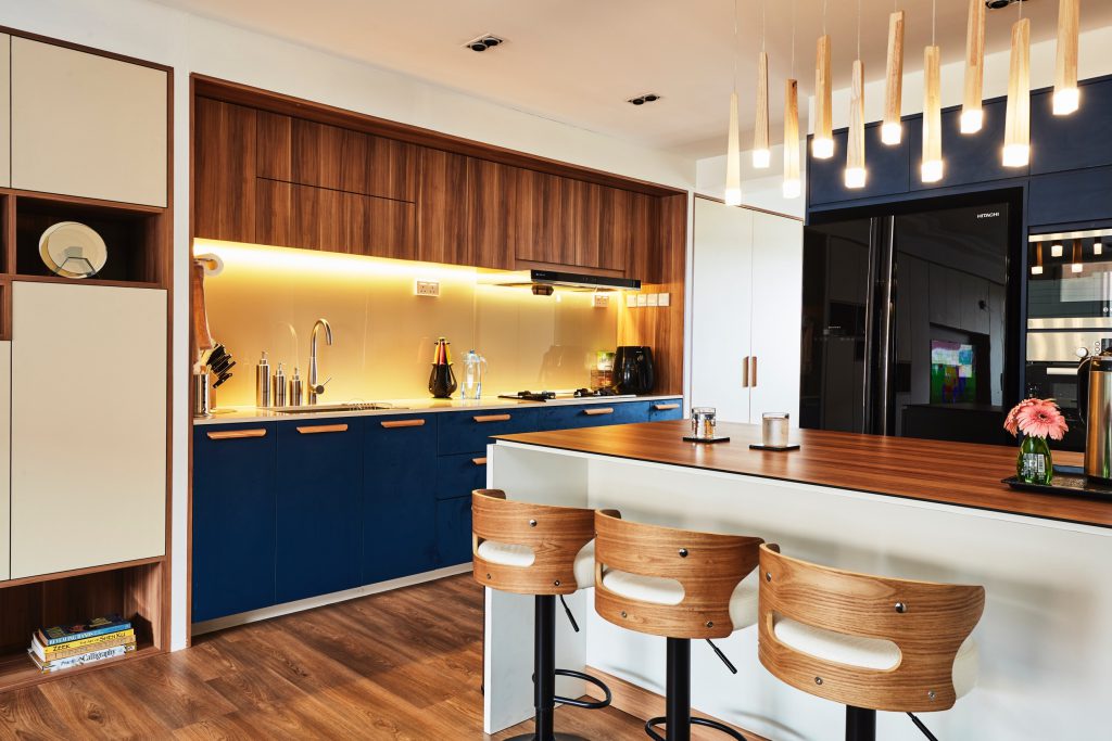
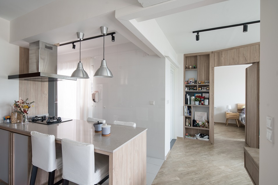
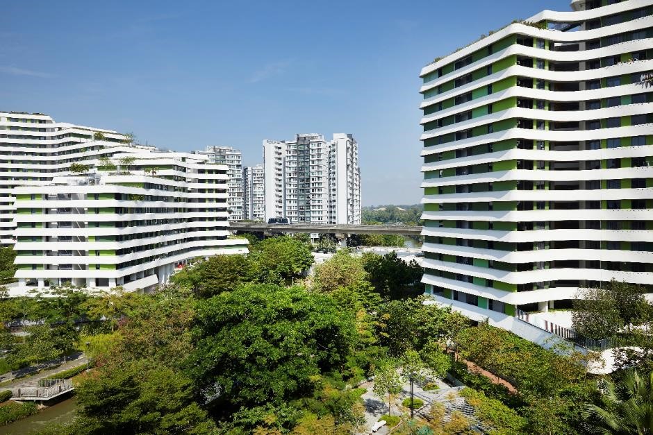
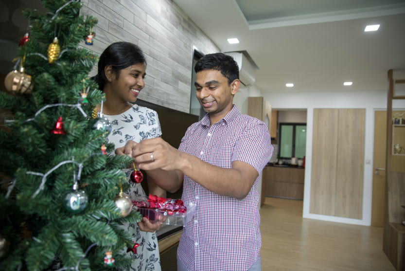
This 4-room flat at SkyVille @ Dawson checks all the right boxes when it comes to having an awesome, fuss-free home. And it was all done within a mere 2.5 months, making it possible for the happy couple to move in in December 2017, just in time for Christmas!

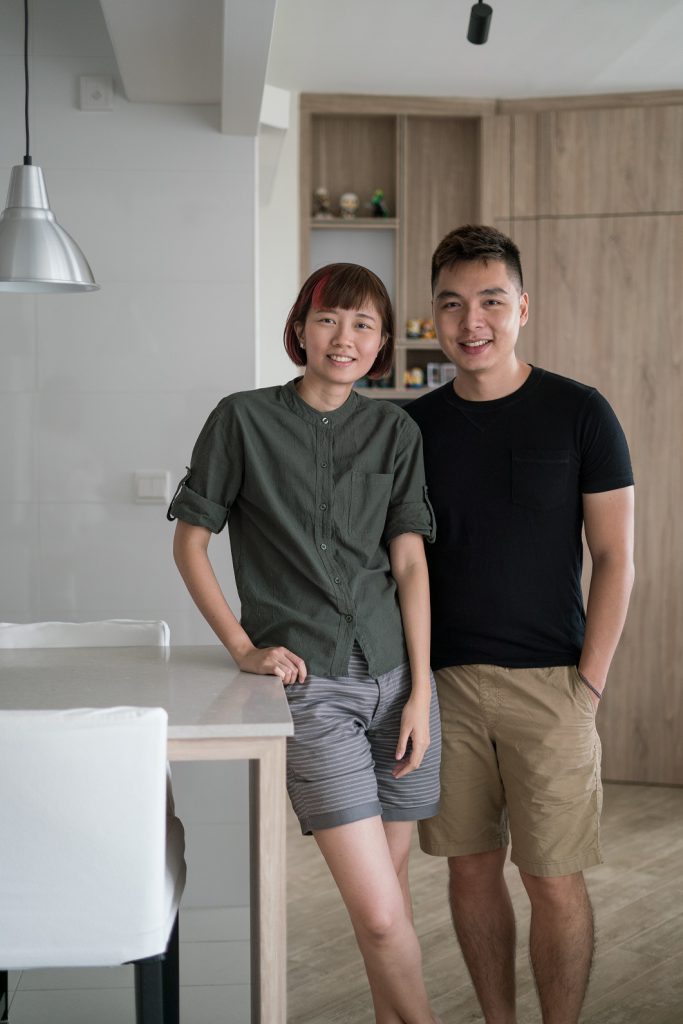
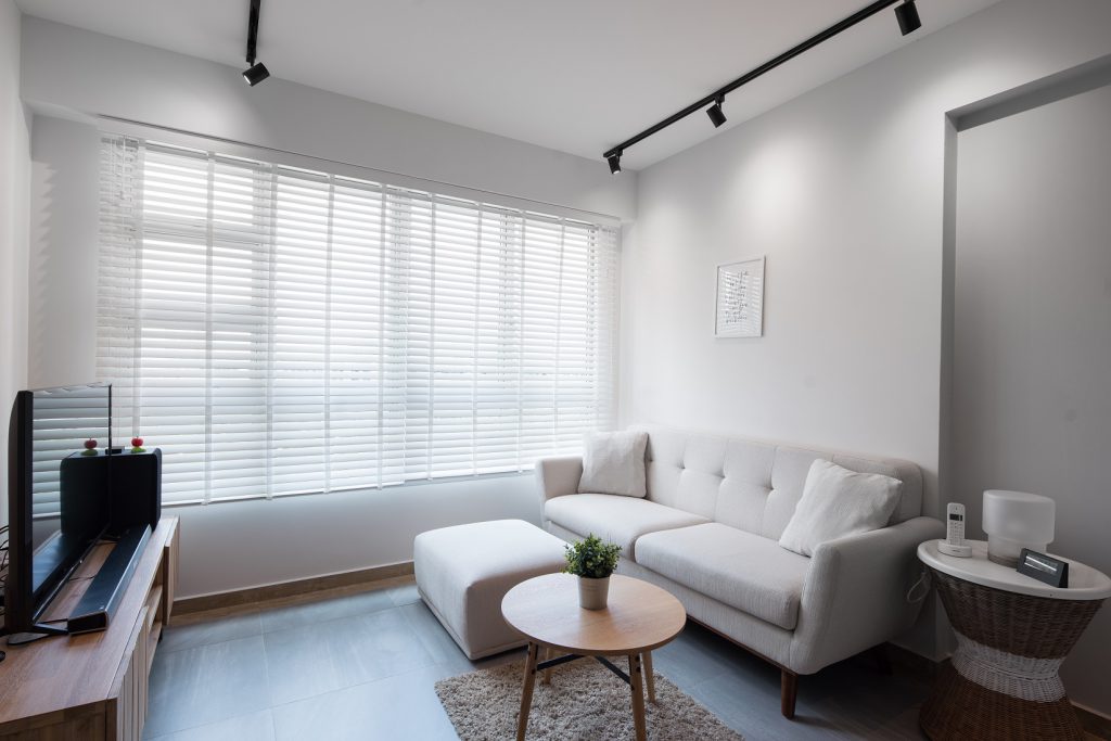
Physiotherapists with a busy schedule, they had the help of an Interior Designer (ID) to renovate their home. Knowing what they wanted made the work easier. “We both knew that we were going for a Scandinavian, natural, wood-elements-kind-of-look for the home – so that made things a lot easier,” said Rethinam.
Ingenious storage ideas

Since the couple wanted to ensure that they maximise the space as much as possible, their ID helped to point out which of their ideas might work better.

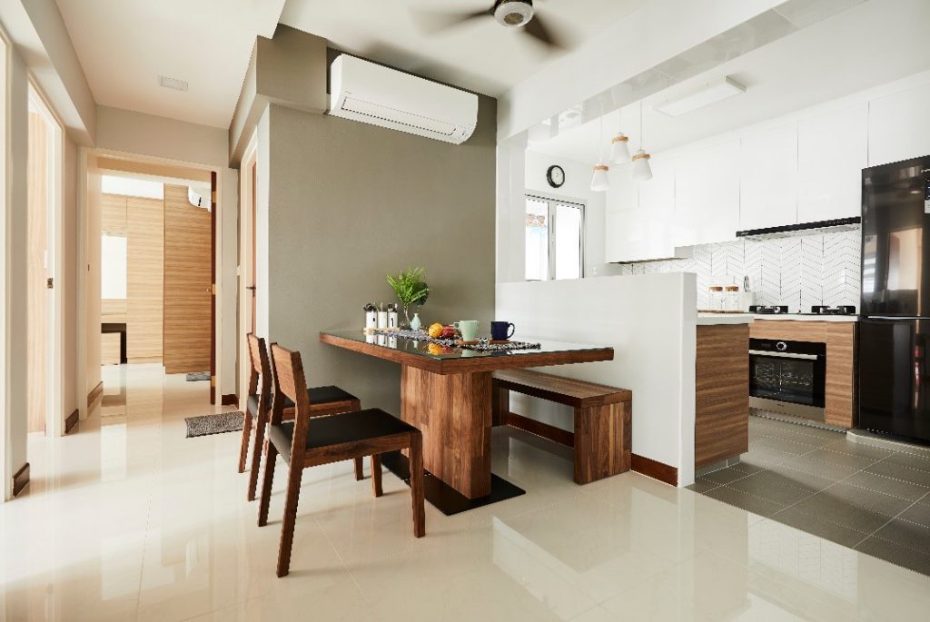
Putting their heads together, they succeeded in creating ingenious storage spaces, such as building shelves behind cupboard doors to store shoes, having the TV console share common wall space between 2 rooms, and replacing dining chairs with bench seats that double up as storage solutions.
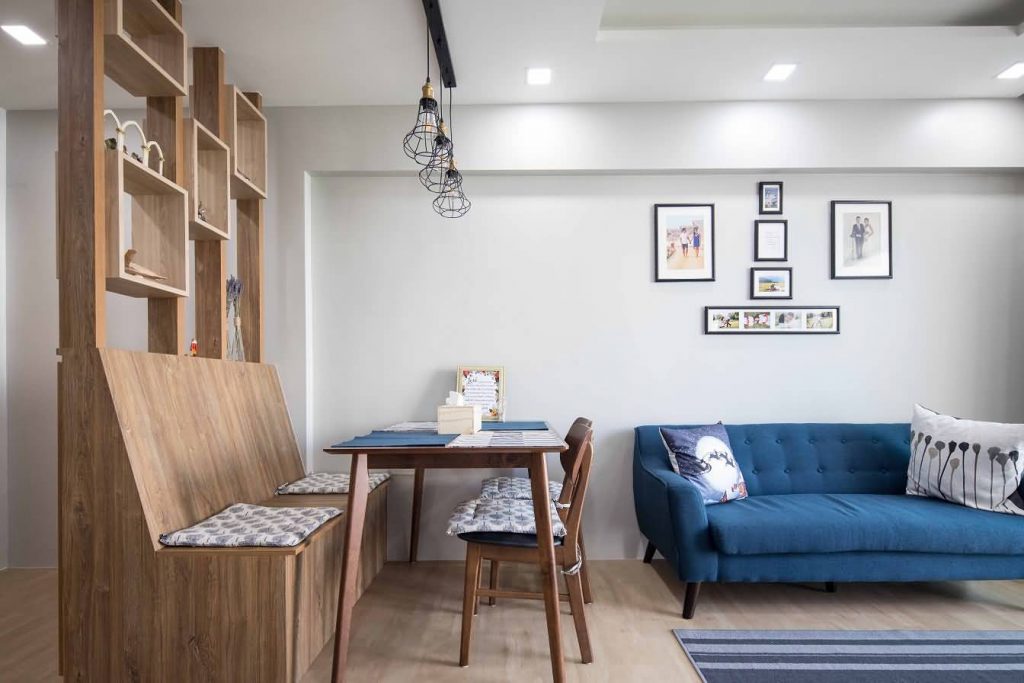
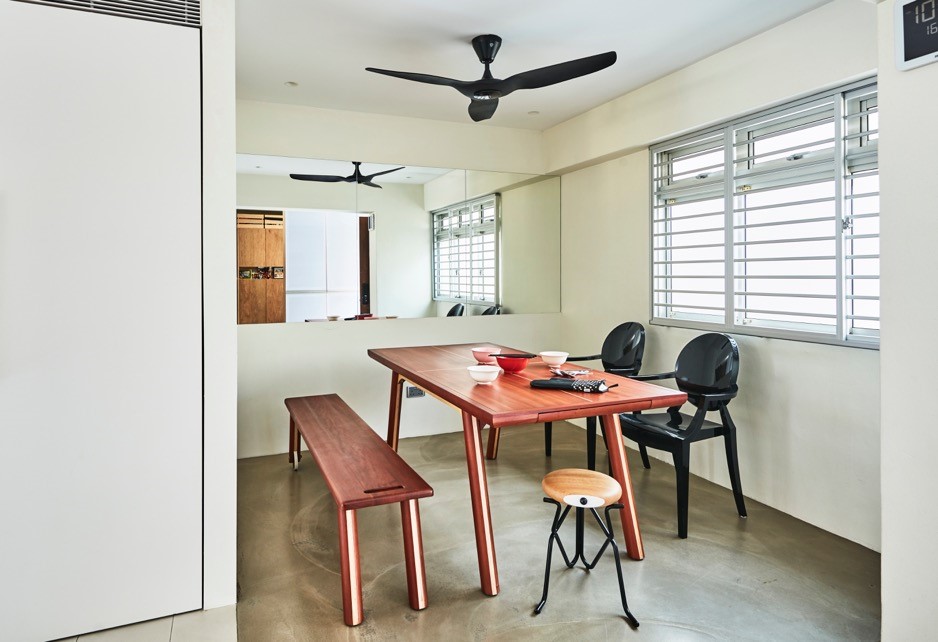
Dining seats with storage to keep clutter away
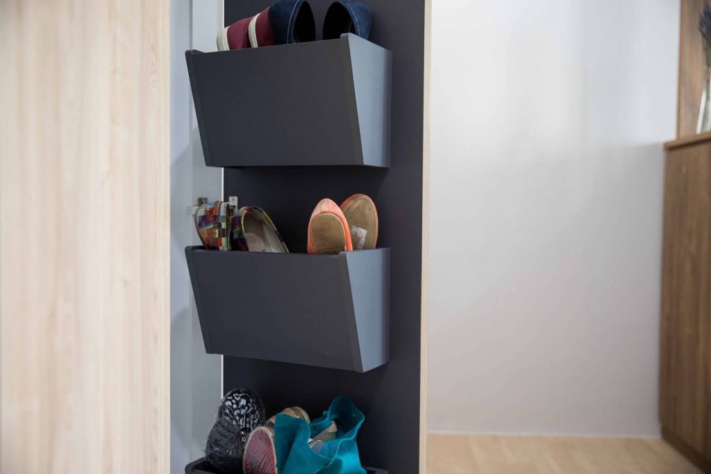
Stow away the shoes neatly in shelves behind cupboard doors
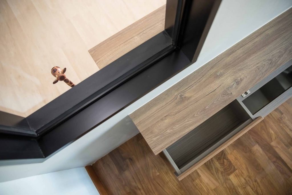
Hiding the TV console by cutting it over to the next room is ingenious!
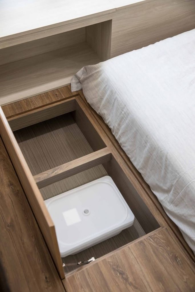
Storage solutions under the platform bed
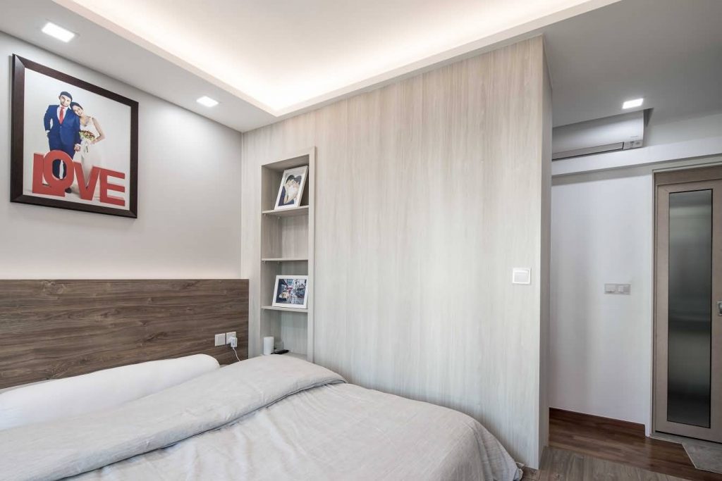
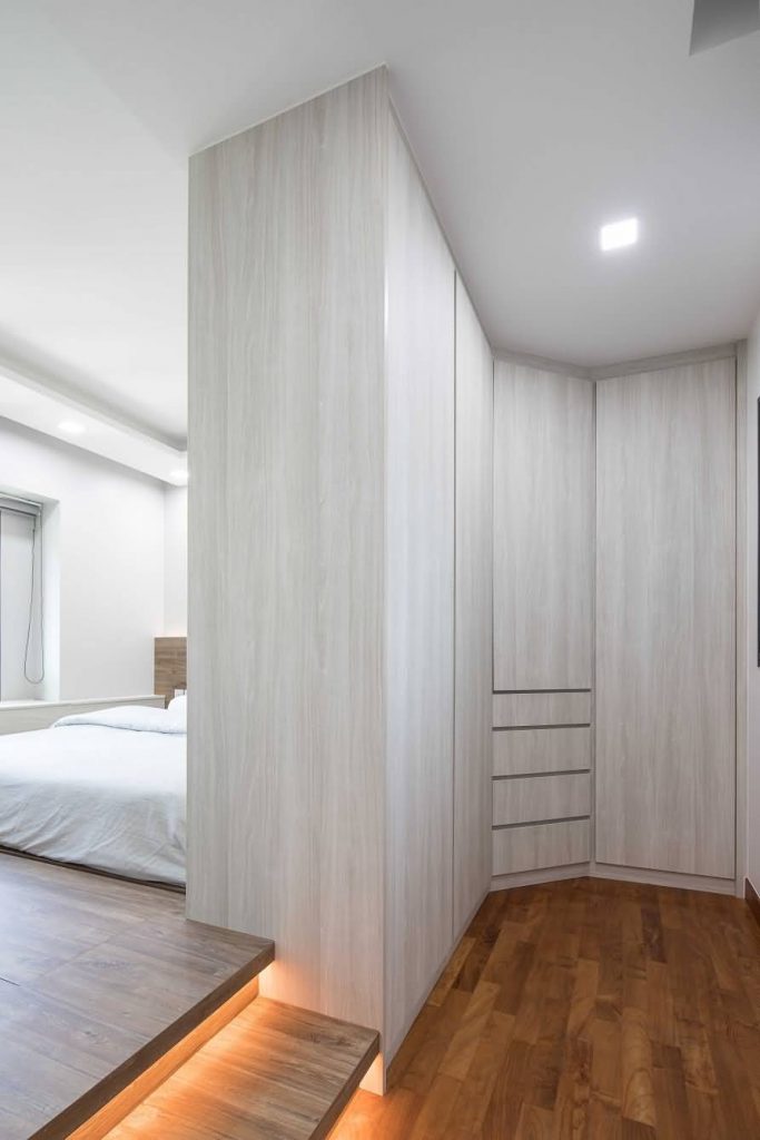
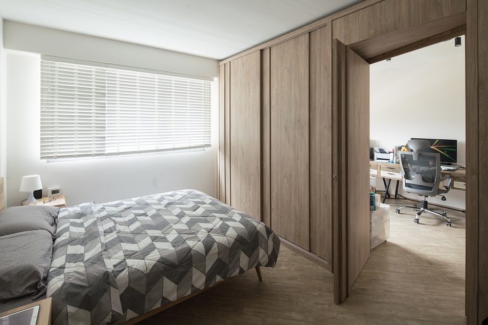
Walk-in wardrobe that acts as a partition to the bedroom

Personal touch

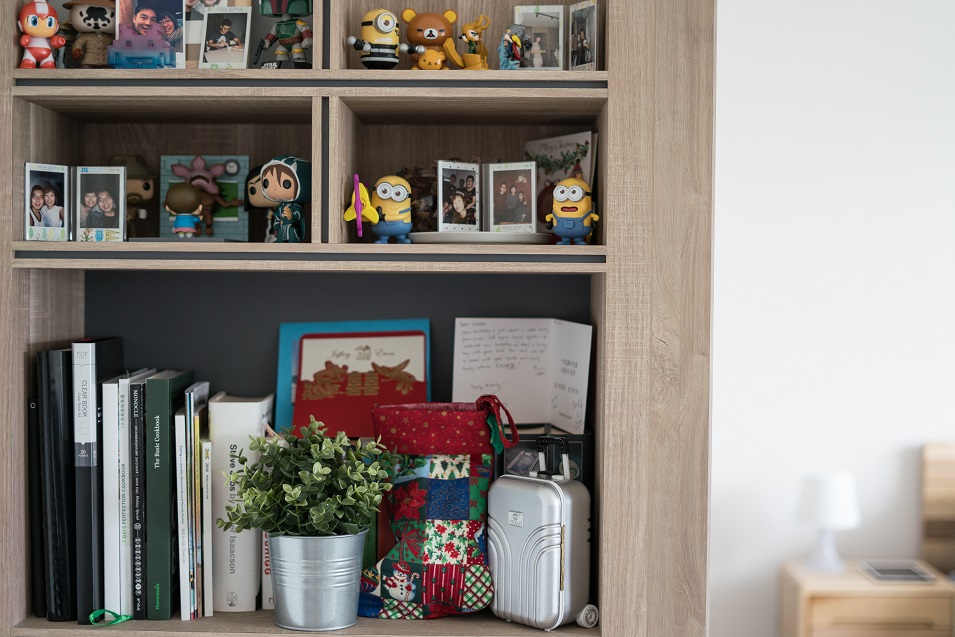
While Scandinavian is a preferred interior design theme these days, each home can look quite different with the personalised touch of their owners. For Rethinam and Alyssa, they have chosen to accessorise their home with keepsakes and photos of their holidays and their wedding too.

Cute keepsakes lending their personal touch to the decor
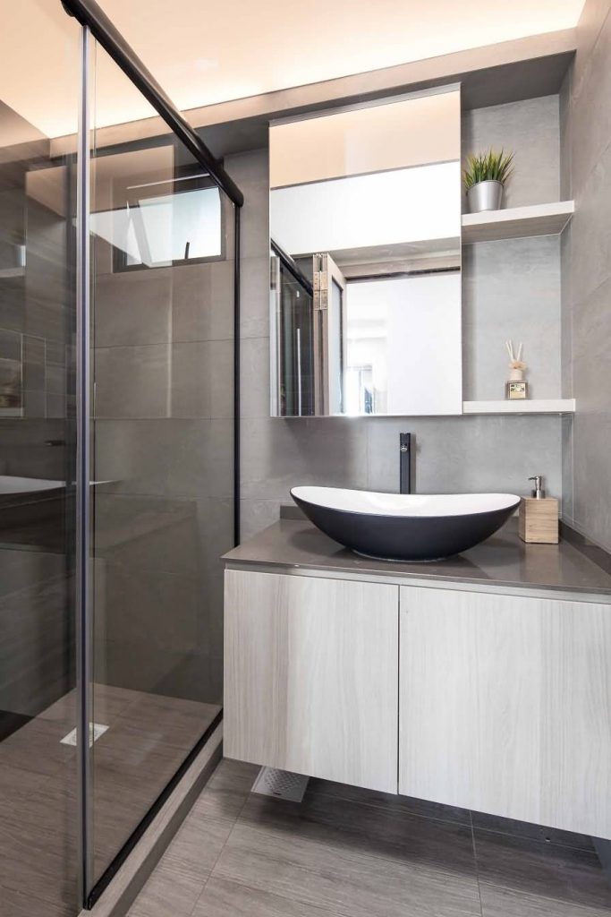
Neutrals in the bathroom to complement the rest of the home decor

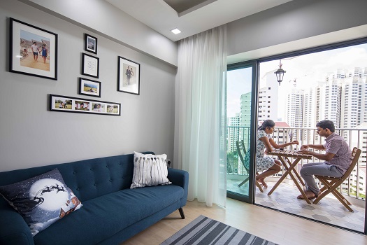
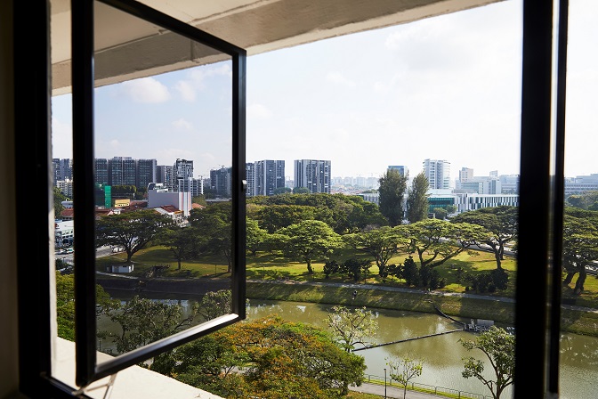
The balcony is a lovely place too, overlooking the rooftop of the car park and the precinct greenery below their block. “We love how we are surrounded by greenery in this neighbourhood,” said Alyssa.

Reno tips

The couple spent about $40,000 on the home renovations but their flat looks like a million bucks!

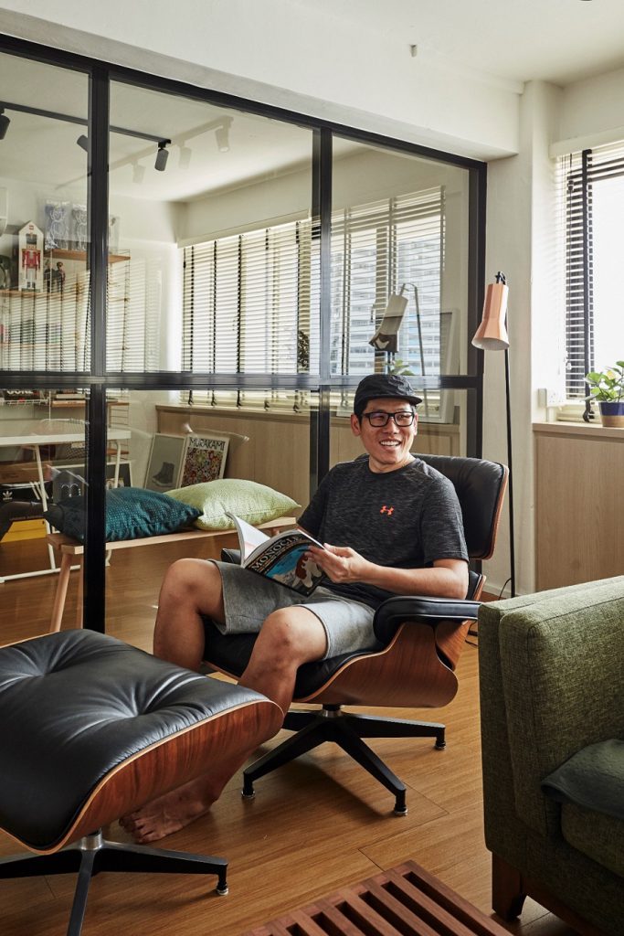
Unwinding and checking out the lush green views from their quaint balcony

If you are a new home owner planning on your renovations, why not check out these tips shared by Rethinam and Alyssa:

  1. Go through a few IDs’ portfolio and see whose style best meets your vision for your home.
  2. Take the time to meet some IDs and talk to them to see if you get along well.
  3. Let them know your requirements but discuss to see what is feasible.
  4. Have a budget for your renovations (which you can let your ID know) plus some buffer amount, as you might require the latter for some unplanned renovation works later.

Source: mynicehome.gov.sg

Stylish in Monochrome

Stylish in Monochrome

Five years after moving in, choosing a monochromatic interior decor theme has helped Jean keep her 4-room flat at The Pinnacle @ Duxton looking sleek and stylish.

Jean co-owns the flat with her brother, and fortunately both prefer minimal aesthetics. “We knew we wanted something that would be easy to maintain,” Jean said. Their interior designer, a good friend of Jean’s, recommended unique materials and design elements to make the home one of a kind.

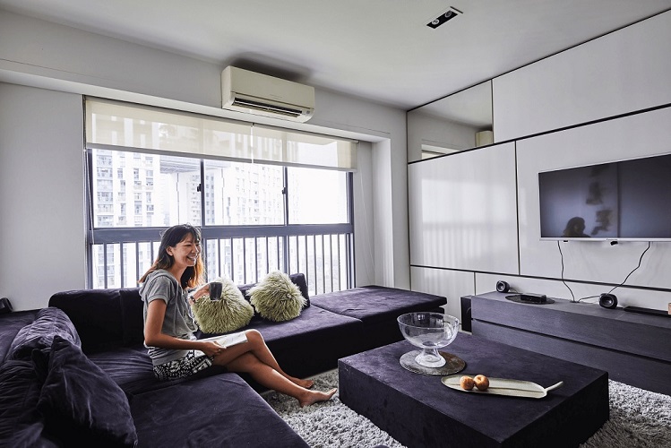
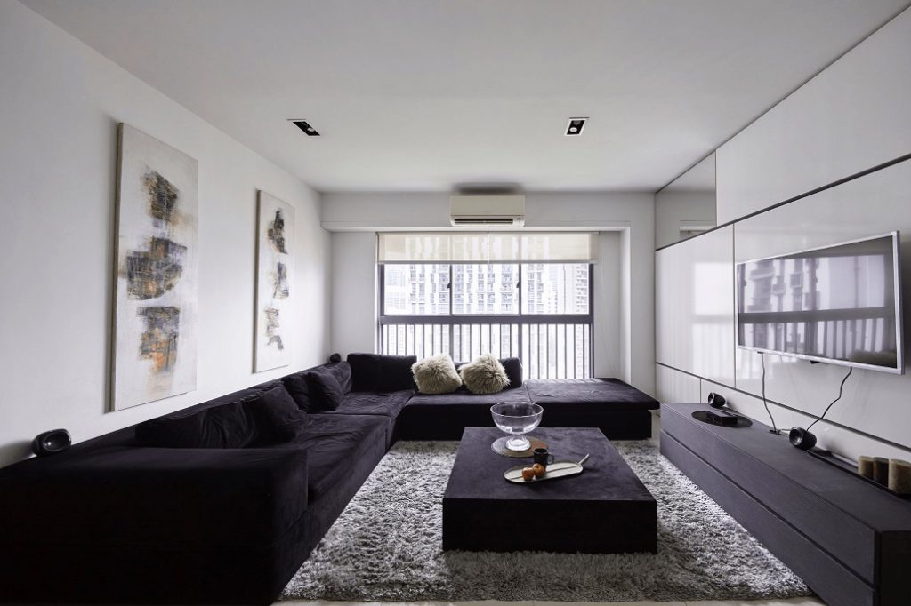
The living room features a cushy custom-made sofa and coffee table set that offers plenty of seating for guests. “Some of them have even slept over on the sofa,” she quipped. The art pieces hanging on the wall are from Jean’s travels to Bali.

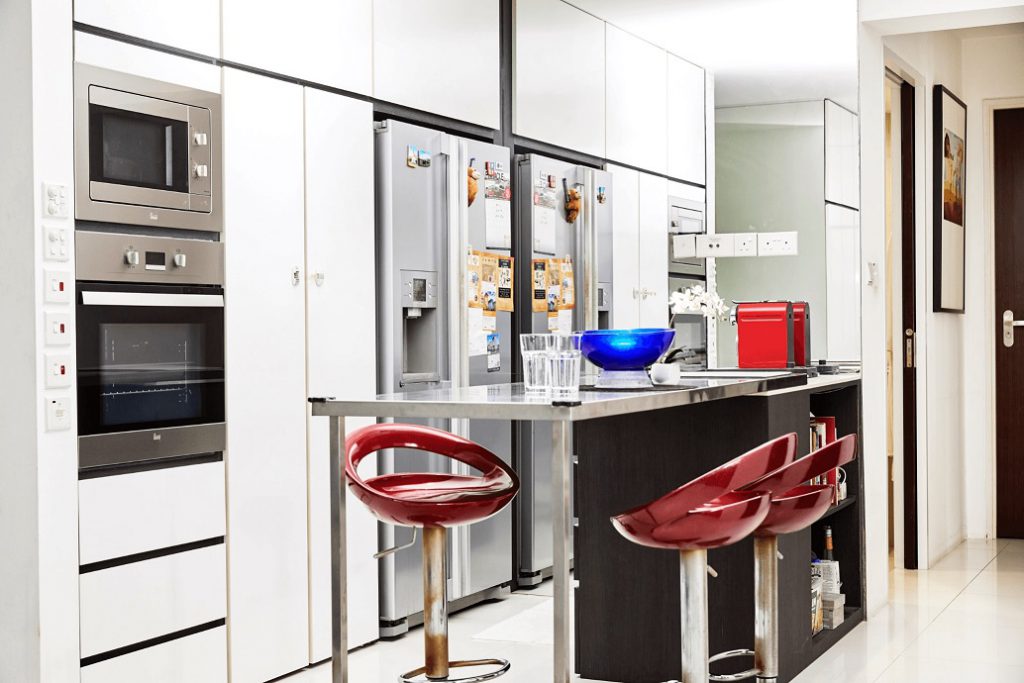
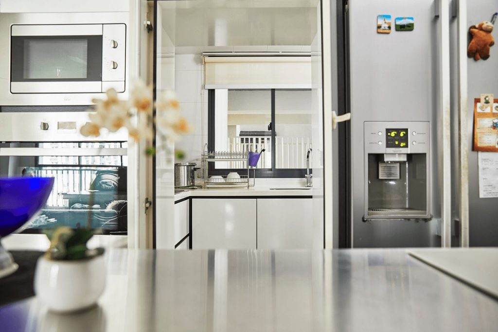
The flat features a kitchen island with an induction cooker, perfect for entertaining friends over light meals.

There is also an ingenious concealed wet kitchen area, which leads to the service yard. While there are plenty of metal surfaces throughout the flat, Jean finds them easy to wipe down and keep clean.

The siblings spent around $60,000 on the renovations, which included hacking works to change the room sizes, and carpentry to create storage space.

“I made my bedroom bigger, and converted one of the rooms into a smaller music room for my equipment,” Jean explained. A creative freelancer, Jean also works as a DJ and a music producer.

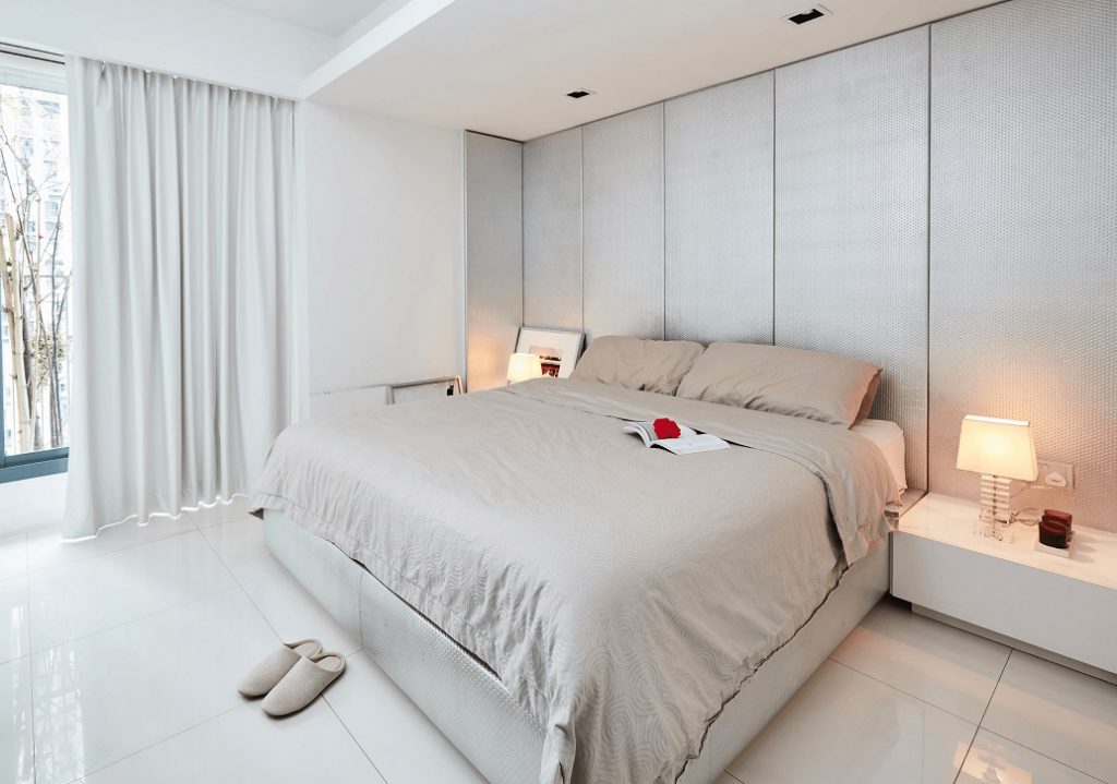
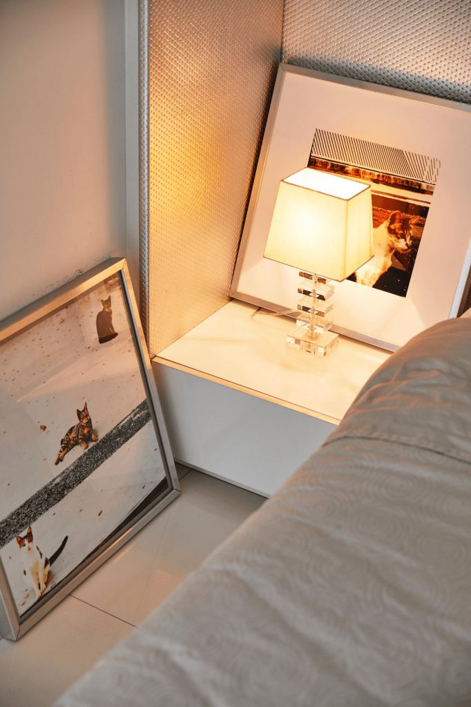
A focal point of Jean’s bedroom is the textured silver panelled wall. While Jean chose the colour, the material had been suggested by her interior designer. Even with minimalism as the goal, Jean chose to add a personal touch by displaying prints of cats she had photographed herself.

Source: mynicehome.gov.sg
Living the Zen Life

Living the Zen Life

Karen and Jian Zhan’s home at Skyline II @ Bukit Batok feels like a detox for the soul. It is also a marriage and meeting of minds, as the couple share many similar likes and tastes.

Their Zen journey was a process to make the best of their 4-room flat layout, light and wind conditions to create a design that allows for simple and cosy living.

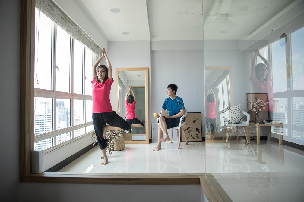
No sofa means ample space to do yoga in the living room, while admiring the view

True to their style, their living room is devoid of clutter – no sofa, no TV set. Not avid TV viewers themselves, they prefer space that welcomes conversations and meaningful activities.

Nature lovers too, they have infused their home with a careful selection of plants (including prints of plants) to enhance the décor. For the living room, they chose the eucalyptus (which is a natural insect repellent) and cotton plants. In the gaming room, Karen has placed a pot of lavender for a calming contrast to the action-packed games that Jian Zhan plays on the computer.

A hangout room for Karen and Jian Zhan to kick back and relax

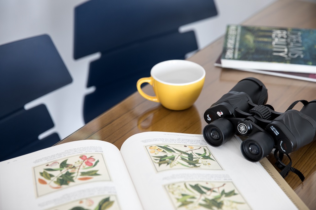
Being near Bukit Timah means being able to keep a lookout for native bird species

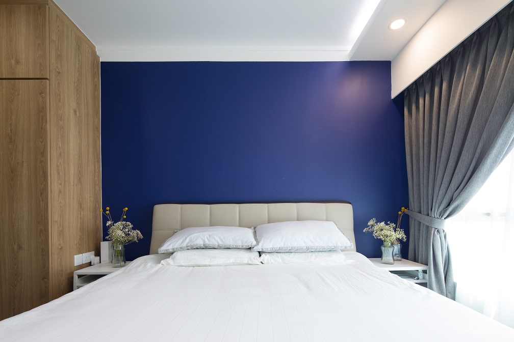
In the bedroom, the deep blue feature wall complements the wood floor finishes and the wardrobe. The choice of plants – billy balls and baby’s breath, pops out against the blue wall and softens the room’s rectilinear lines.

Blue, grey and brown in the master bedroom create a soothing ambience

Using cove lights means less shadows cast which is great for reading

The couple is also big on recycling and keep to a ‘one-in-one-out’ lifestyle. So for every item that they buy they would need to give away or discard an old item, so that they maintain a clutter-free home.

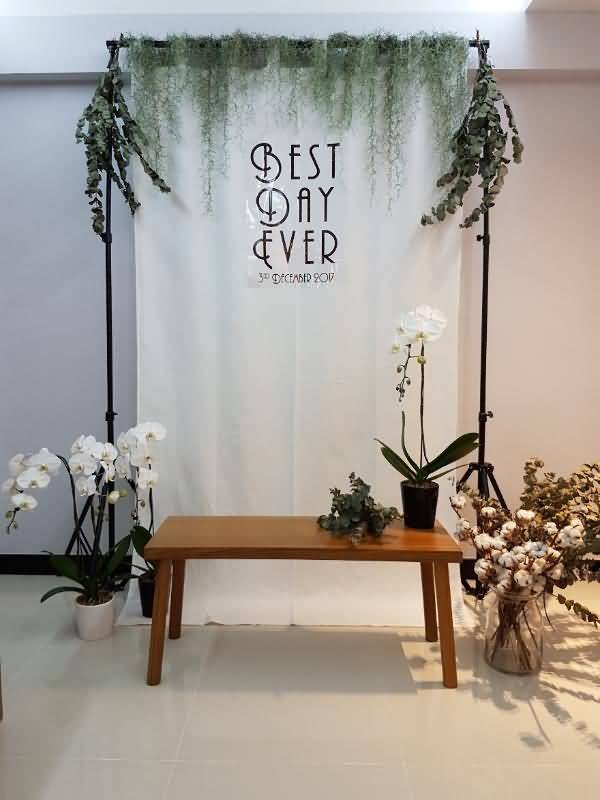
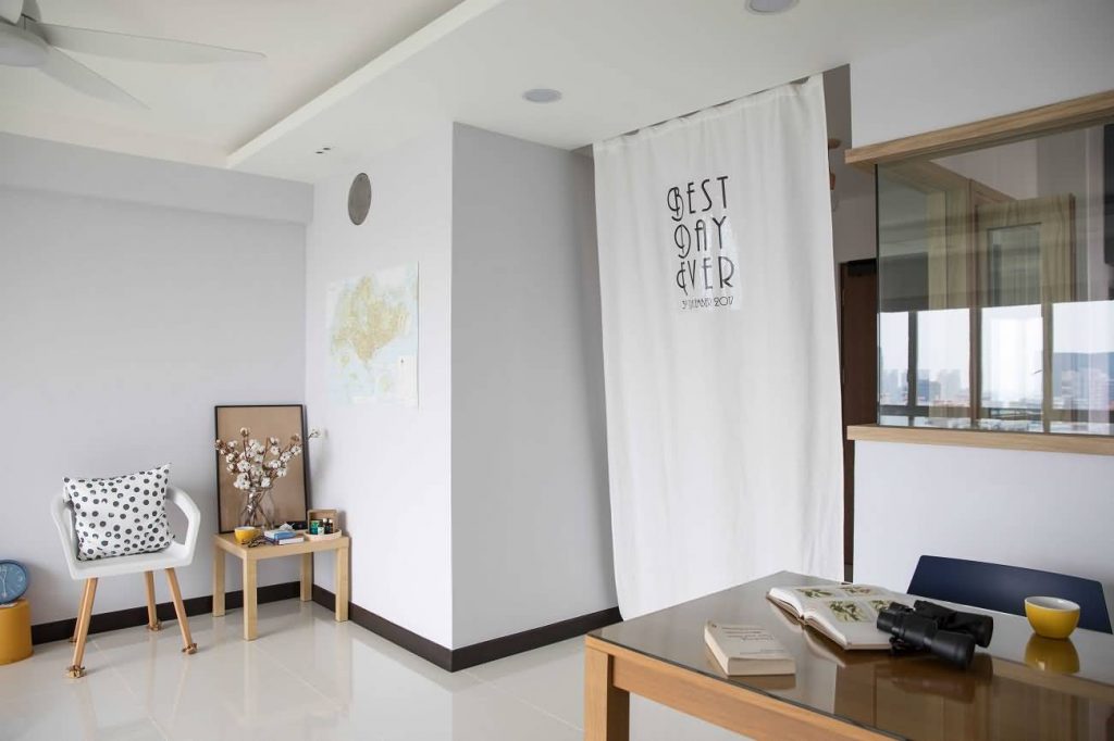
Though they moved in in January 2018, the couple had already given their friends and family a preview of their new home in December 2017, when they solemnised their marriage in their flat. J They wanted a simple and intimate affair and could not think of a better venue then their first home. The backdrop that they used for the photo wall has been transformed into a curtain at the entrance to their flat.

Photo booth in their flat on their ROM day (Photo courtesy of Karen and Jian Zhan)

The photo booth ‘wall’ now serves as a curtain to create a private living room area

Source: mynicehome.gov.sg
Designed with Love

Designed with Love

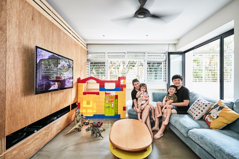
From chalkboard paint walls to kids’ playroom, Kai and Jillian clearly designed their maisonette in Choa Chu Kang with their 2 young children in mind, when they moved into their home about a year ago.

The couple had chosen the resale flat due to its proximity to schools and nature. Yew Tee Park is right on their doorstep, while Sungei Buloh Wetland Reserve, their favourite weekend hangout, is only a short drive away.

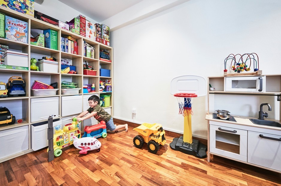
Kai and Jillian entrusted the renovation of their flat to a friend, with only a few requests. “We wanted our home to feel warm and welcoming, and have plenty of storage space, especially for the kids’ toys,” Kai said.

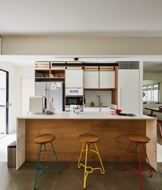
Colourful bar stools transform the kitchen island into a perfect spot for entertaining guests

While the renovation took about 4 months to complete, the results are definitely worth it.

A combination of light wood and monochromatic decor accents gives the home a cosy feel, even as there is ample room for the children to play and move about.

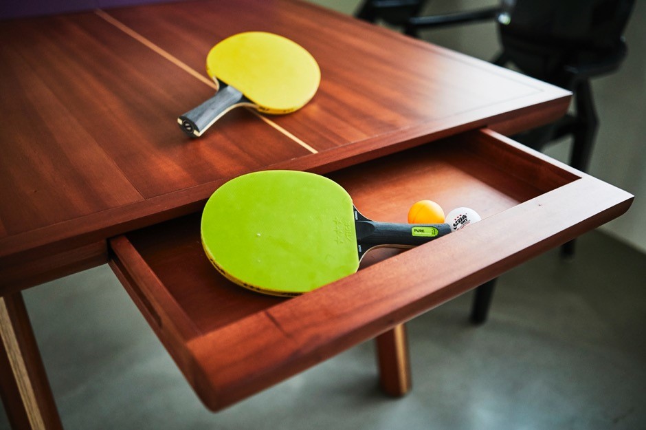
The kitchen island is where the family spends quality time, from cooking and baking, to entertaining guests. A dining table that doubles as a table tennis table add delight to the space!

The couple also grows plants, and irrigates them with condensate water from their air-conditioner. “We hope to inculcate good recycling habits in our children from young, by showing them how to do it,” Kai explained.

Twice a week, Kai will whip up delicious meals in their wet kitchen

Jillian shares her passion for baking with her children

The long bench ensures enough seating when the couple’s parents visit

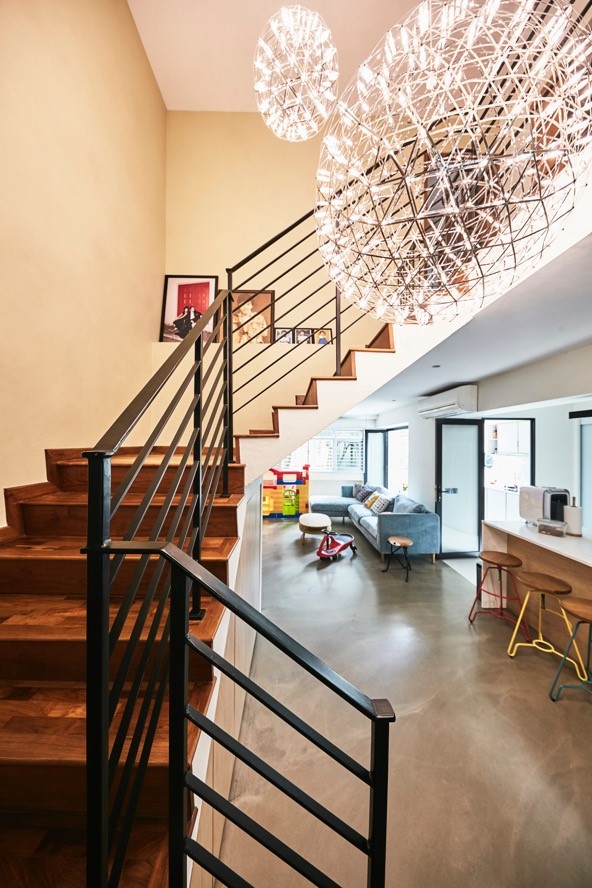
A unique and artsy light fixture adorns the stairway

A custom-made two-in-one dining/ table tennis table

The kids’ playroom is bright and breezy

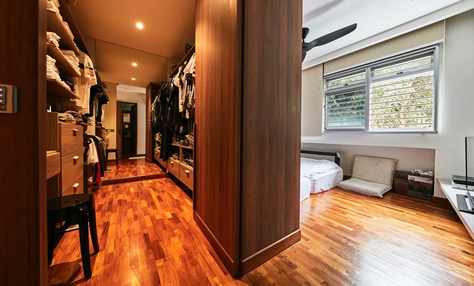
The master bedroom also houses the couple’s walk-in wardrobe

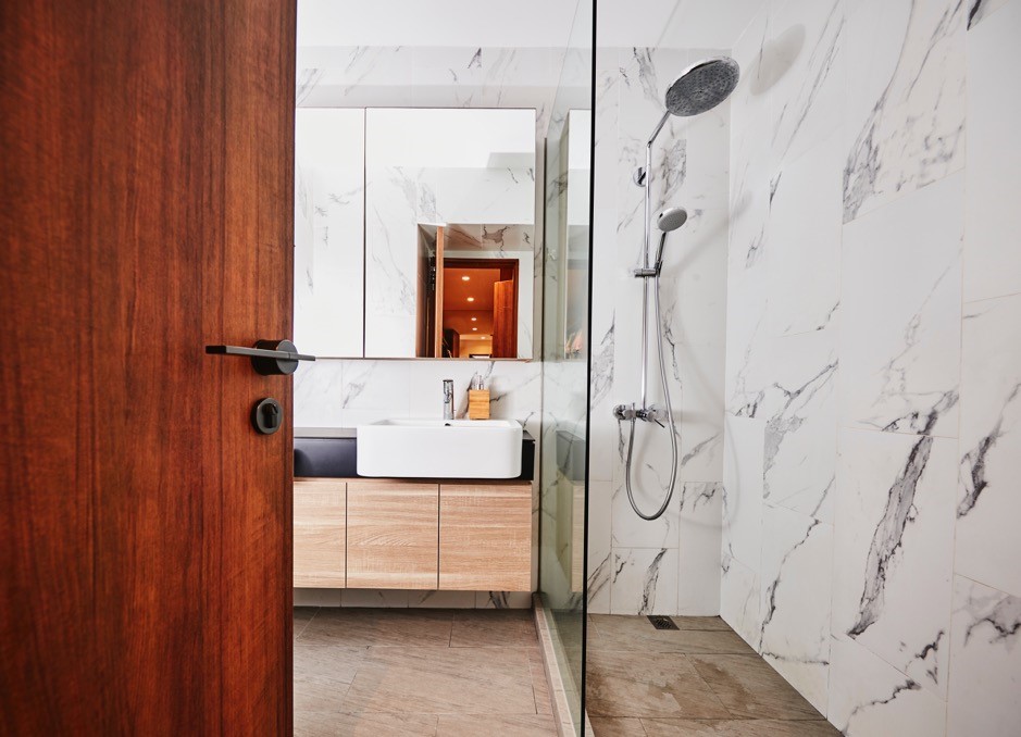
Marble walls give the spacious bathroom a classy vibe

Source: mynicehome.gov.sg
The Joys of A New Home Again

The Joys of A New Home Again

For Jo and Angie, their new home in Bishan checked all the boxes for their family. It was close to the Bishan Town Centre, a stone’s throw from their preferred school (Catholic High), and had a beautiful park right at their doorstep.

As soon as they found the flat of their dreams, the couple was determined to make it their new home. Juggling their hectic work schedules as university lecturers, they saw through the sale of their previous flat in Bukit Batok, and the renovation of their new home – all in two months.

Thankfully, their interior designer was able to make it all happen, and the final design was exactly the way they envisioned their home to be.

“We met our interior designer through an online renovation portal. She was prompt in responding to all our queries, and made sure that everything was ready by the agreed deadlines,” said Angie.

The design process was also a breeze: They picked their favourite colours, and their interior designer ran with it. “While we initially toyed with the idea of a Scandinavian theme, we eventually settled on a more colourful palette, which turned out to be a great choice,” said Jo.

Beige and white form the base palette of this home, while each room adopts a different colour. The floor finishing, which is a new type of vinyl imported from Belgium, extends seamlessly throughout the flat, complementing the rooms’ wall colours and giving the home a spacious feel. Other plus points: it’s very comfortable to walk on, easy to clean, and durable!

The couple also loves their open kitchen: “Having lived abroad for a while, we prefer to have an island kitchen. The counter in the open kitchen is useful when we bake!”

Angie shared a renovation tip: “Always think through the appliances that you will need to use, and where you want to place the switches and power outlets. If they’re not well-placed, it will be very inconvenient later, and you’ll have ugly cords running all around!”

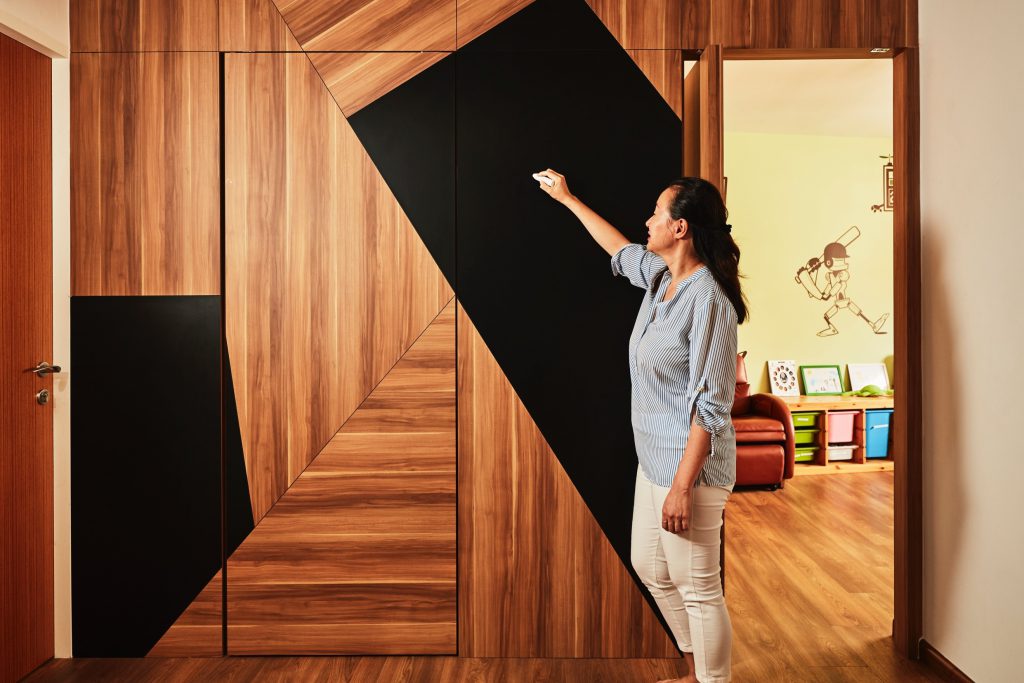
Blending in well – the storeroom is hidden behind this feature wall, which doubles up as a chalkboard.

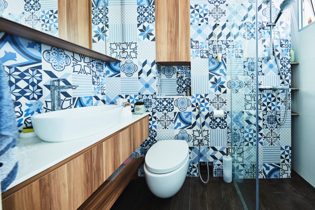
Add a touch of class and colour to the bathroom, with modern geometry in a single colour family.

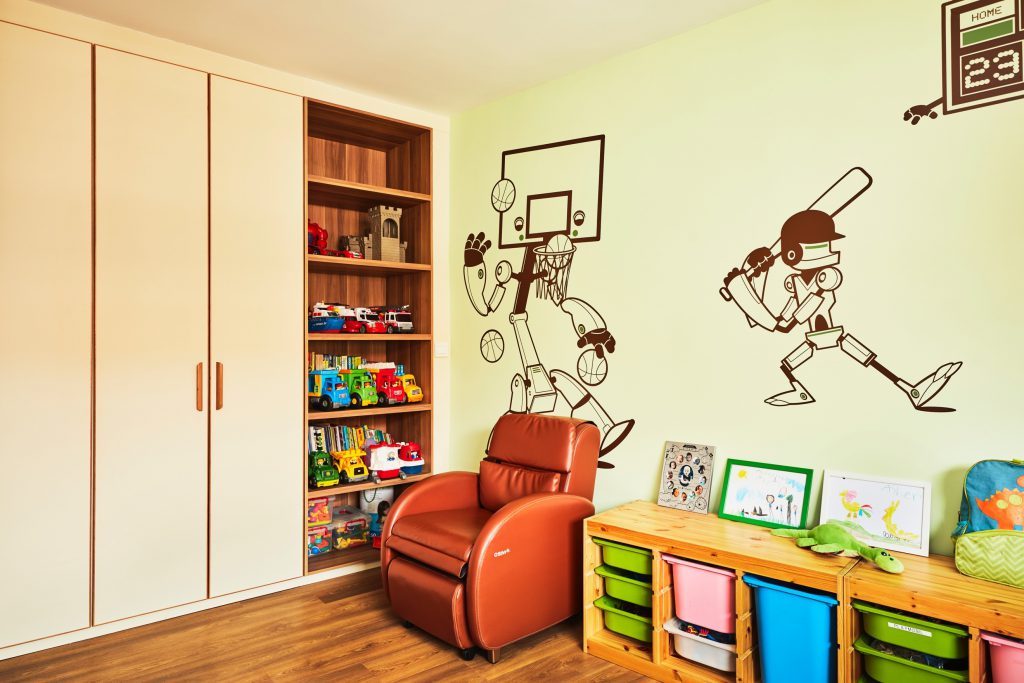
Wall decaling is a simple way to inject fun into the kids’ room; they can be replaced or removed as they grow up.

Source: mynicehome.gov.sg
An Artsy, Urban Hideaway

An Artsy, Urban Hideaway

Hygge vibes are strong in Zi Kai’s and Deborah’s 5-room Clementi flat. For the uninitiated, hygge is a Danish concept that encompasses a feeling of coziness and well-being through enjoying the simple things in life.

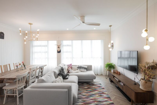
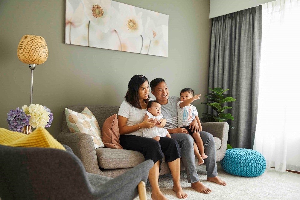
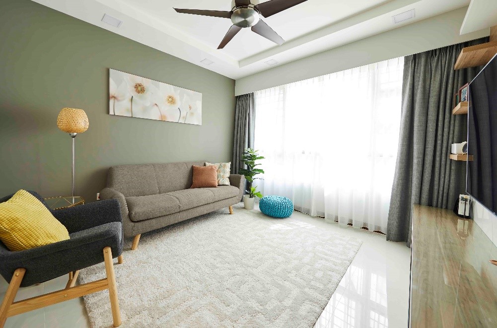
In the day, sunlight floods into their home through large windows framed by gauzy curtains. By night, the large wooden dining table serves as the focal point for family gatherings, as does the cosy cushion sofa.

“A bright home makes us instantly happy,” the couple says.

Organic Chic

The flat’s mash-up of Scandinavian, cottage, and country is a departure from the distinctly Nordic look the couple had initially envisioned. But the current iteration turned out even better, offering a perfect balance of bright and minimalistic, yet homely and warm.

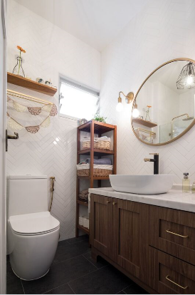
The wall panelling, cornices, and brass accents look surprisingly modern, luxurious even, when paired with large wooden furniture pieces and the herringbone floor. Built-in fittings were kept to a minimum for layout flexibility and to rein in the costs.

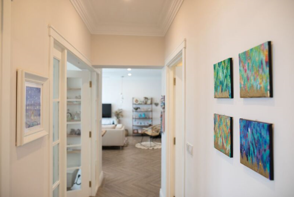
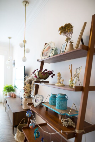
A growing collection of handmade weavings adorn the walls, each handpicked by the handicraft-loving Deborah from places as far off as the United States and Australia. Equally talented herself, Deborah’s water colour paintings and crochet pieces take pride of place in the home.

Beauty is found all around the home

From Home Office to Nursery

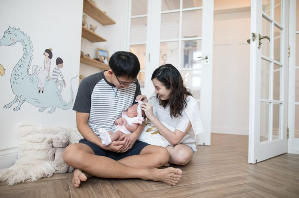
A set of French doors at the start of the hallway lends an unexpected touch, opening up to a nursery that matches the home’s elegant aesthetic appeal. While originally intended as a study, the couple said that the room’s regular layout made it easy to convert it into a cosy, calming space that meets the needs of their littlest family member.

“We stuck on this whimsical wall decal about a week before our daughter was born. Even now, looking at it reminds of us of the anticipation and excitement we felt, as we awaited her arrival,” the couple said.

A space to dream, love, and laugh

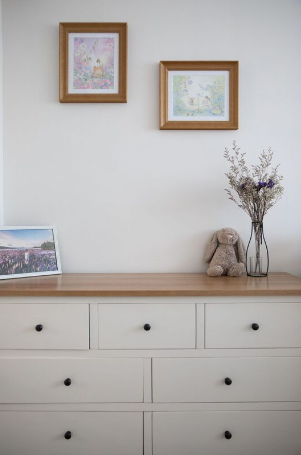
Soft, neutral tones for a soothing ambience

A Home to Love

“We bought this flat when I was still in school, and were initially worried about how to finance it,” Zi Kai said. “However, the housing grants that we received helped, and as we waited for our flat to be completed, our financial situation also improved.”

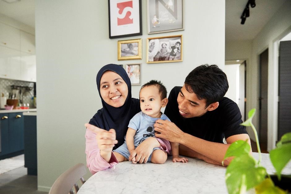
The proud home owners love the amenities in the area, and their neighbours have become friends— they attend one another’s housewarming parties and their babies’ first month celebrations.

“We know we found a great place to live and for that I feel lucky every day,” Deborah added.

Blissful and contented at home

Source: mynicehome.gov.sg
Beauty in Simplicity

Beauty in Simplicity

‘Simple and neat’ is how Muhammad Izzat describes his family abode at Woodlands Rise. Now, do not mistake simple for boring, because this 4-room flat is far from it.

Izzat and his wife knew exactly how they wanted their new home to look – soft, inviting, and neat. They had spent approximately $28,000 on their renovation, a sum that they both agreed was very reasonable given the scope of work.

“We went into Qanvast and 3 interior design companies contacted us,” Izzat explained. “We decided to go with Space Factor, because they offered us a simple design that we really­ liked”. Their renovation journey was a relatively smooth one, except for a few last minute changes to the furniture laminates.

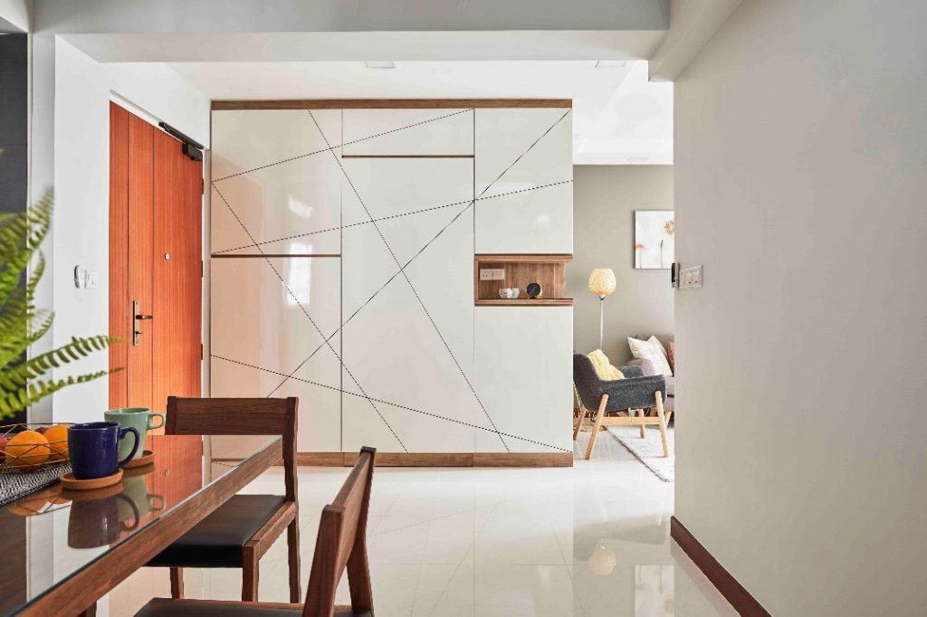
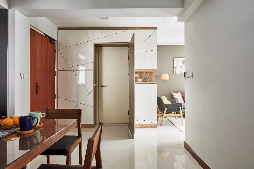
The shoe cabinet spans an entire wall, and conceals the bomb shelter door

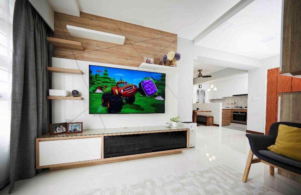
The geometric motif makes a subtle appearance on the feature wall too

Their interior designer was tasked to design the cabinets, wardrobe, TV console and feature wall. It took about 3 rounds of changes before the couple finally decided on the geometric design for the laminate finishing.

“It was hard for us to visualise the design. Most of the design changes were last-minute, because that was when we could see the final product in the actual space.”

The floor tiles offered under HDB’s Optional Component Scheme matched Izzat’s design concept perfectly

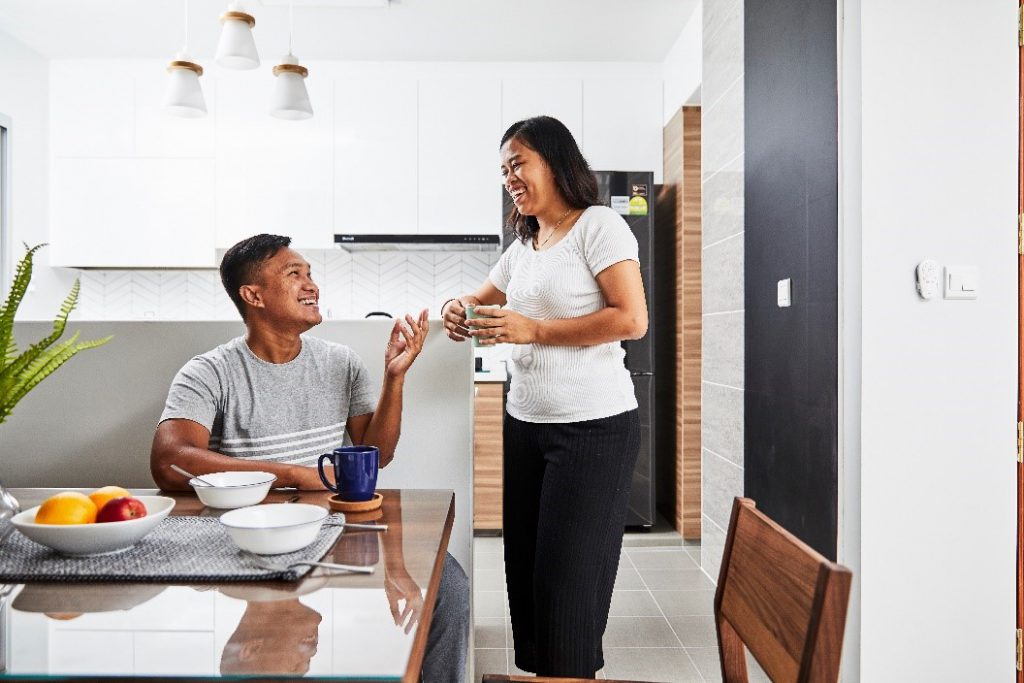
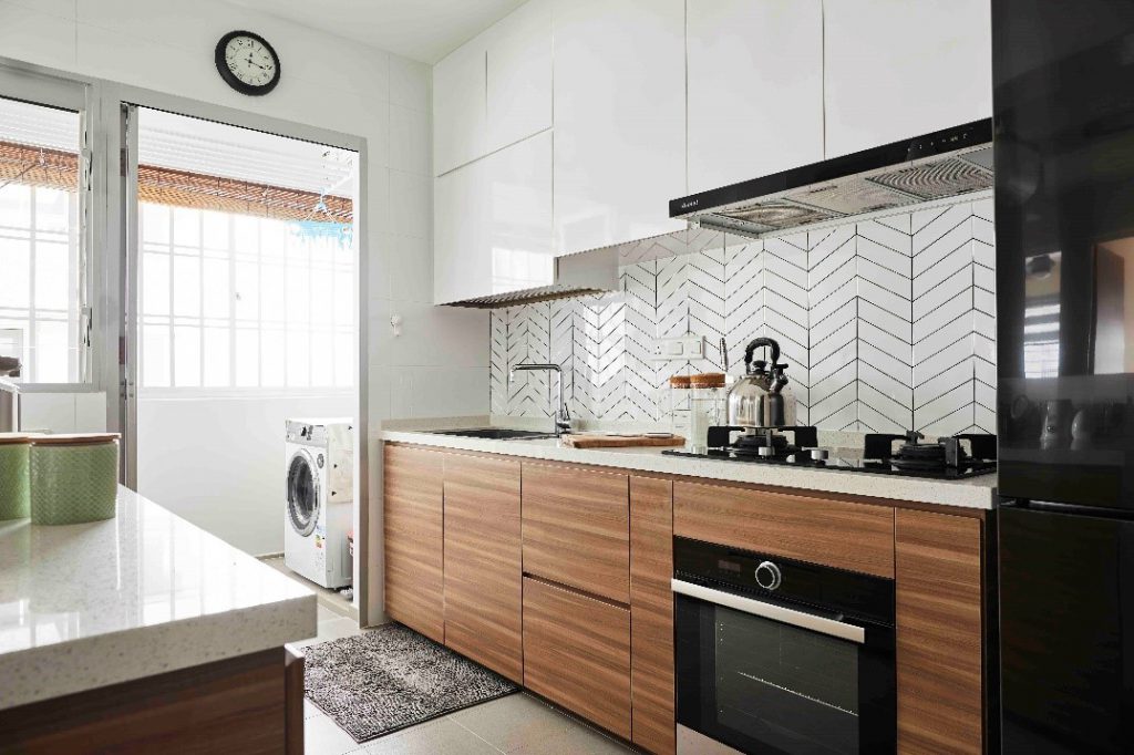
The couple went for an open kitchen concept, and hacked half of the wall to create visual continuity. They kept the kitchen clean and uncluttered – much like the other parts of their home.

The herringbone-patterned backsplash in the kitchen added a unique twist to their otherwise minimalistic kitchen, while the wooden-textured cabinets lent a cosy feel to the space.

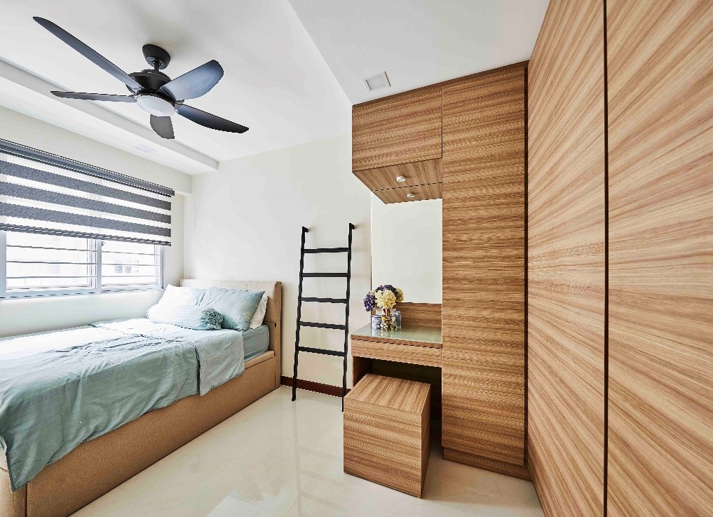
Wood textures were also used for the wardrobe laminate in their bedroom

Adding the finishing touches to their flat took up much time, as the couple were not big on online shopping. They visited a range of shops, from Castlery and Prestige Affair, to IKEA, to find the perfect décor items that would complement their immaculate home. And the end results were certainly worth it!

Source: mynicehome.gov.sg
A Cosy Nest for Two

A Cosy Nest for Two

Eugene and Vanessa are content and settled into their new flat in Ang Mo Kio. “I knew I wanted to stay in Ang Mo Kio if possible, as I have lived here all my life,” Vanessa explained.

The couple had selected the 3-room unit at Teck Ghee Parkview during the Sale of Balance Flats exercise, as the flat suited their budget and needs. “A smaller flat also means less housework,” Eugene joked.

Having moved in a year ago, Eugene and Vanessa had the chance to meet Prime Minister Lee Hsien Loong during a recent welcome party for Teck Ghee Parkview residents. “He visited the homes of several residents, including ours,” Eugene recounted.

The couple wanted their flat to feel spacious and airy, and had looked around for an interior designer with good space solutions. They eventually went with Authors Interior & Styling, as they felt an instant connection with the interior designer. “It was like working with a friend, and the constant communication made the 3-month renovation process a breeze,” said Vanessa. They spent $33,000 on their flat’s renovation.

Design marries function in this wardrobe integrated with the door to the adjoining study

The flat has classic Scandinavian touches, from the light-toned wood to black fixtures. Clutter is kept to a minimum, as Eugene and Vanessa embrace a minimalist lifestyle. Both own capsule wardrobes comprising staple pieces, and cited the Japanese 5S philosophy as their inspiration when organising their home.

An open kitchen makes the flat feel more spacious

Photos and personal mementos are neatly arranged in a display corner

Vanessa described their shopping for tiles and lighting as a hassle-free experience. “We are both decisive people, and we selected all the items in one day at Lucky Khoon,” she shared.

Track lighting with an ergonomic design enables lighting heads to be adjusted easily

They had converted one of the bedrooms into a study with individual workspaces. “We generally avoid bringing work home, but we enjoy gaming during our free time,” Vanessa said.

Eugene and Vanessa stay close while working or playing games

The couple with their affectionate pet cockatiel

The happy home owners are satisfied with the amenities around their area, especially the food options such as the nearby Chong Boon Food Centre. Their flat also has a great view of the rooftop gardens atop the multi-storey carpark, where residents often gather for their morning exercise.

Source: mynicehome.gov.sg
The ‘Hypebeast’ Home

The ‘Hypebeast’ Home

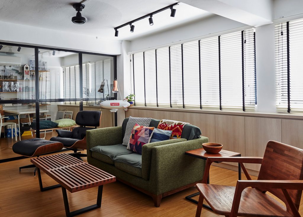
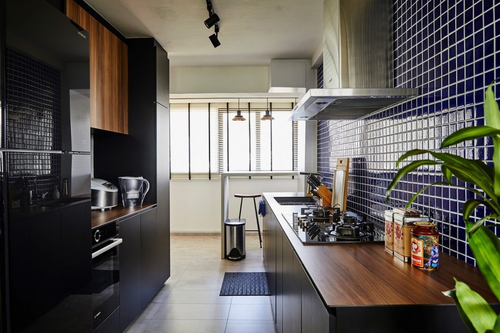
This view was definitely a pull factor when Wilfred and his wife were debating whether to purchase the 4-room resale flat at Whampoa. “We decided to go ahead with it. I mean, where else can you get a such a view?” he shared.

Renovation took a long time, but the result was worth it. The couple did not engage an interior designer, and were adamant about being very hands-on in the process. Thus, they felt that hiring a contractor would suffice to translate their vision into a reality.

“During the process, I consulted my friend who does interior design for commercial spaces, and that helped a lot. I shared with her my ideas, and got her professional opinion on whether they would work,” Wilfred explained. Trained in architecture, it is no wonder that he had a knack for design and an eye for detail.

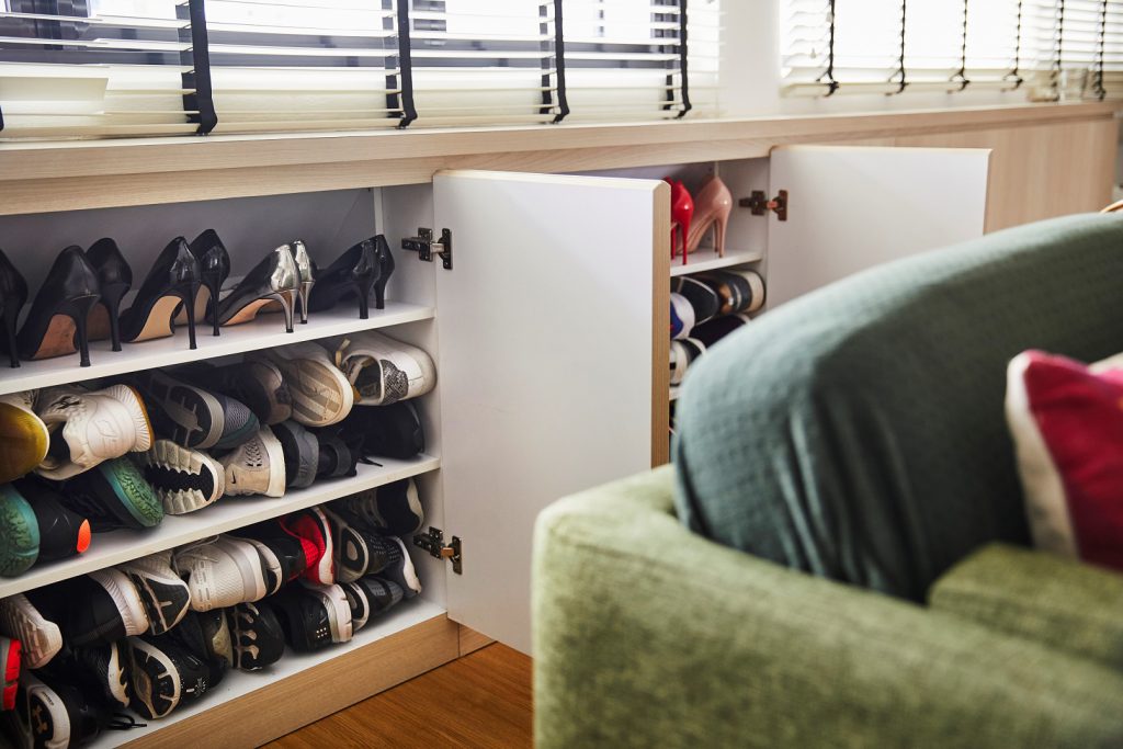
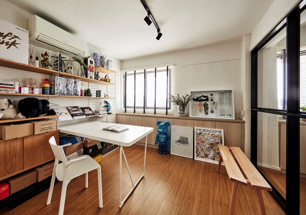
The built-in cabinets under the windows contain the couple’s massive shoe collection

Both Wilfred and his wife share a love for shoes, and to store their impressive shoe collection. they built cabinets along an entire stretch of the wall.

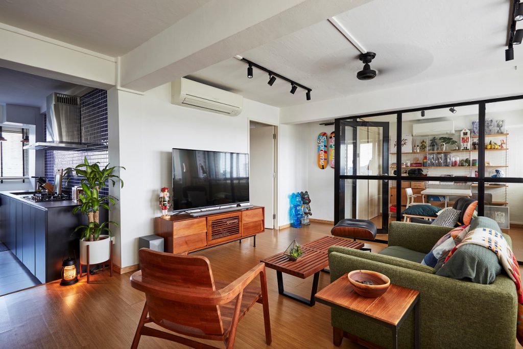
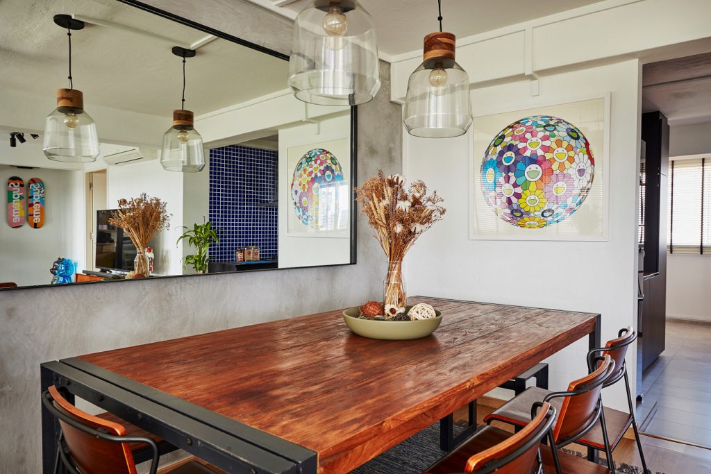
The furniture in the living room were sourced from various online and offline sources – namely, Crate and Barrel and Castlery. The couple enjoy having friends over, so they invested in a large dining table from Picket and Rail, that fitted right in with the industrial-themed décor of their home.

“My favourite part of the home? Definitely the kitchen. We don’t cook often enough though!” Wilfred explained with a laugh.

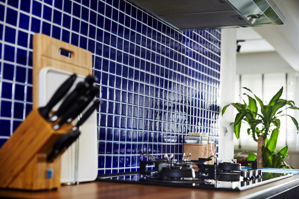
Blue mosaic tiles on the kitchen wall create a stunning backdrop for the dark-panelled cabinetry

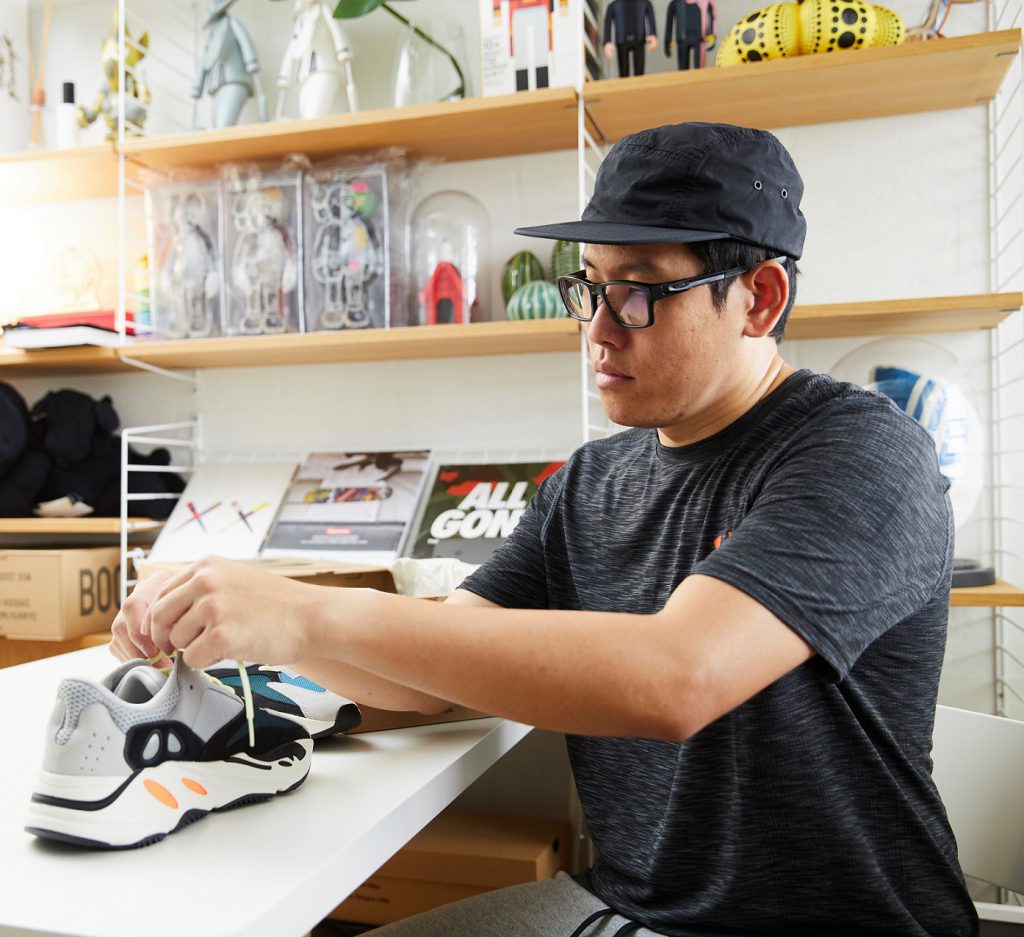
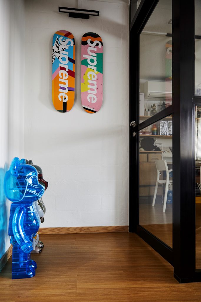
They also replaced the concrete wall of one of the rooms with full glass panels to demarcate their working space. A highlight of this room is the impressive display of limited edition sneakers and Medicom Toys collected from the couple’s travels around the world.

Wilfred shows us some of his limited edition sneakers that he keeps in neat boxes in the study room.

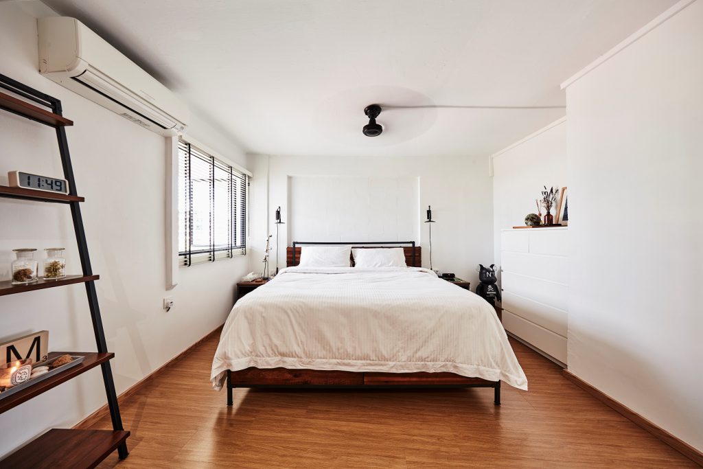
Much like the rest of the house, the bedroom is also tastefully designed to fit the industrial theme. Furniture items have been kept to a minimum so that the bedroom remains clutter-free and neat.

Source: mynicehome.gov.sg
A Colourful Scandi Abode

A Colourful Scandi Abode

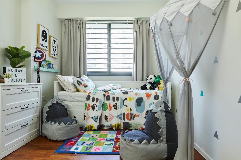
Faqih and Lydia designed their 4-room flat in Punggol with their growing family in mind. Though they loosely define their interior décor style as modern Scandinavian, the couple shared that keeping to the theme was not their top priority when renovating their home.
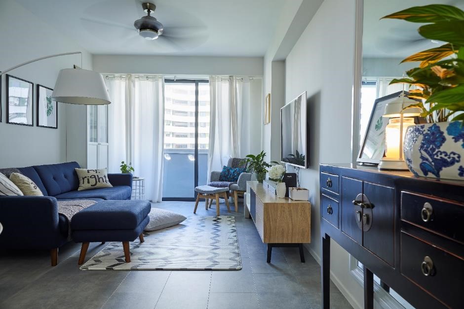
A harmonious palette of blues and greys is quintessentially Scandinavian

“We wanted our home to be kids-friendly, clean, and homely.” Lydia said. “Having a design theme may not necessarily help us achieve that,” Faqih added.

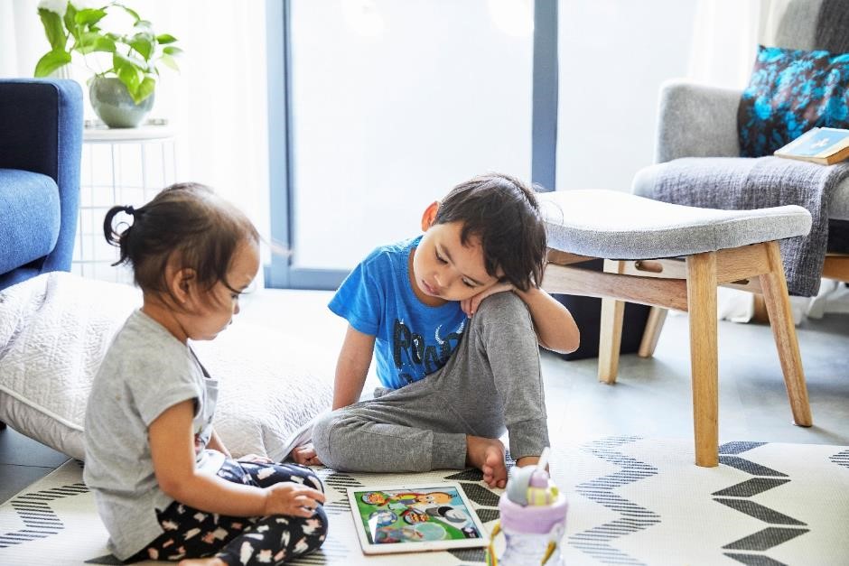
Faqih and Lydia thought of their kids first when designing their home

Interesting pieces such as a carpet with a zig-zag pattern add personality to a room

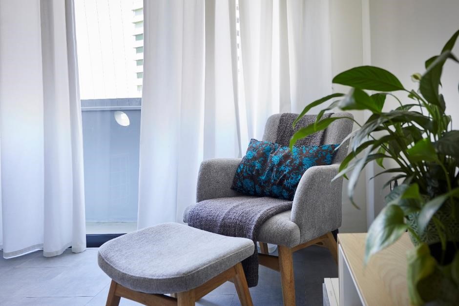
A cosy reading corner

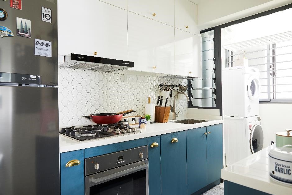
The couple had a pleasant renovation process with their interior designer from Facelift Design. “As we cook on a regular basis, we told our interior designer that we could compromise on everything except the kitchen,” Lydia quipped.

The couple opted for unique teal cabinets with gold handles

Nevertheless, Faqih and Lydia’s home is still a reflection of their personal tastes and preferences, such as in their choice of furniture. The couple had purchased the major furniture pieces from various stores, including Star Living, Prestige Affairs, Lush Furniture, and Nook and Cranny.

Their total renovation cost was about $30,000, as they did not require much carpentry works done for their home.

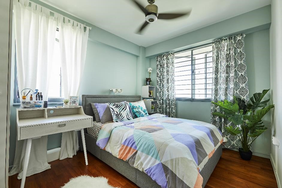
Mixing and matching patterns spice up a pastel-toned room

The children’s bedroom is decorated with fun furnishings and colourful prints

An expansive view of Waterway Terraces from the balcony

The couple shared that they had chosen the Punggol unit because of its convenient location, reasonable price, and attractive flat layout. “The best part is that we are within walking distance to most of the amenities we need,” Faqih said.

Source: mynicehome.gov.sg