Month: October 2022

The Nature-Inspired Home

The Nature-Inspired Home

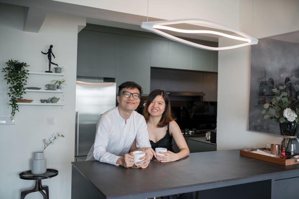
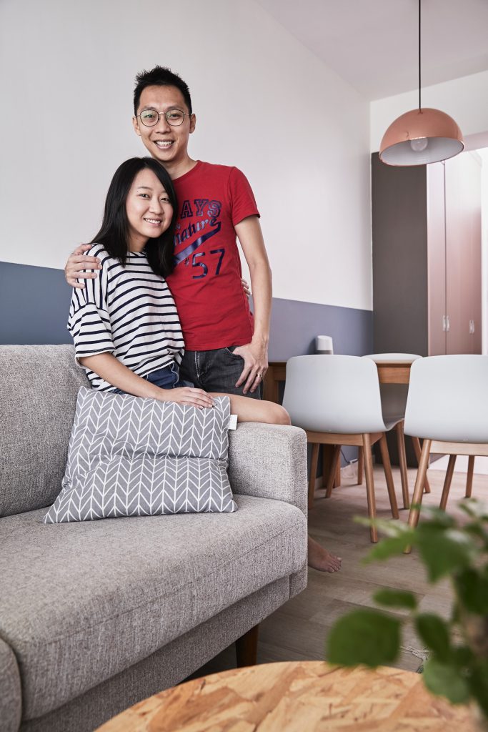
Check out how Kai Jie and Jiching brought the outside in to their flat at Telok Blangah!

The one thing that struck Kai Jie and Jiching when they first entered their 4-room flat at Telok Blangah was the view of the sea and lush greenery from the living room window. The delicate blues and calming greens of the landscape gave them the idea to go for an interior design concept that could ‘bring the outside in’ to their home.
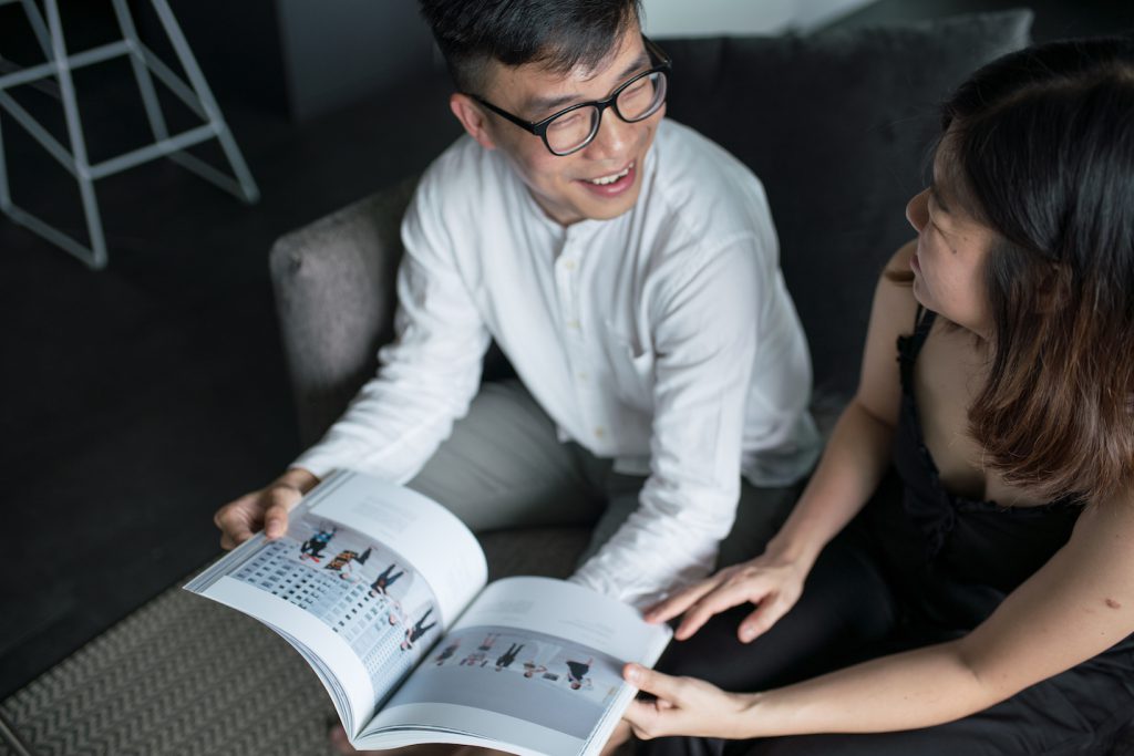
Their love for design and art helped them actualise their dream of creating a nature-inspired home. They enjoyed the process immensely, as it was an outlet for them to express their creativity.

“We drafted several moodboards, but everything was fundamentally Scandinavian with a muted palette,” Jiching explained. Just like how the couple were inspired to bring the elements of the surrounding landscape into their flat, Scandinavian design is also about paying homage to nature by including natural materials like wood, and adopting subdued tones like grey and green.
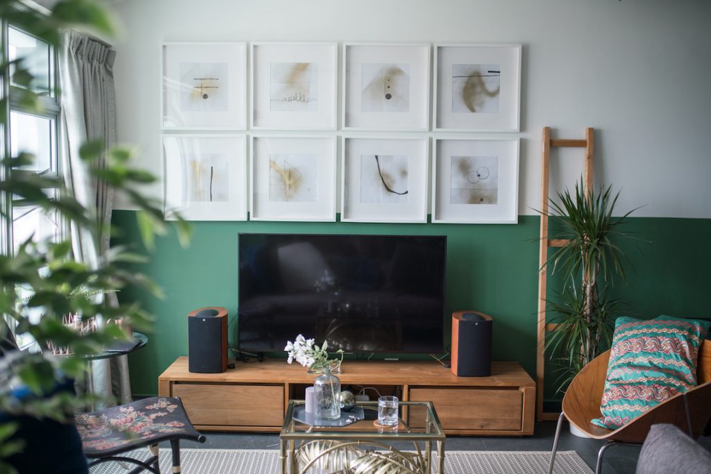
The artworks created by Jiching are displayed in the living room

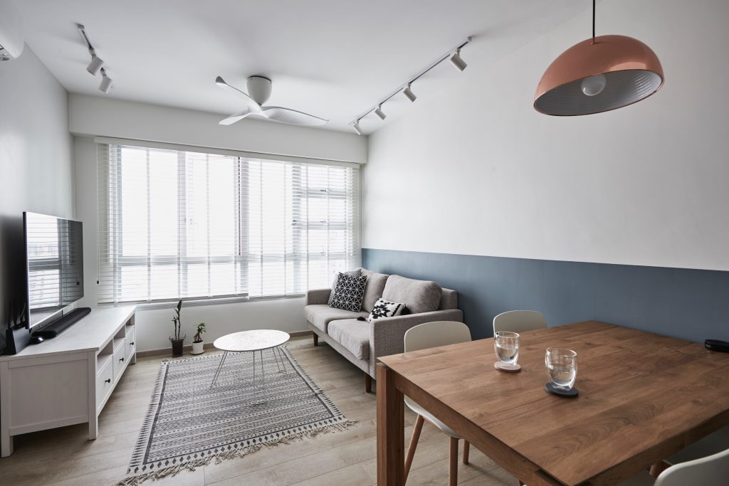
Wooden furniture, plants, and cosy textiles are interspersed throughout their home to create an atmosphere of being one with nature.

While they hired an interior designer to create the permanent fixtures in their home, like kitchen cabinets, wardrobe and bed frame, everything else was the couple’s own effort; from sourcing for décor items, to even painting the feature wall in their living room!

They picked the shade of forest green for the feature wall to complement the wooden TV console that they bought from Ethnicraft. Jiching also created a series of minimalist-themed artworks using only 4 materials – gold spray paint, marker, white paper and a photo frame. With just a few strokes and sprays, she created an art collection that now adorns their living room wall.
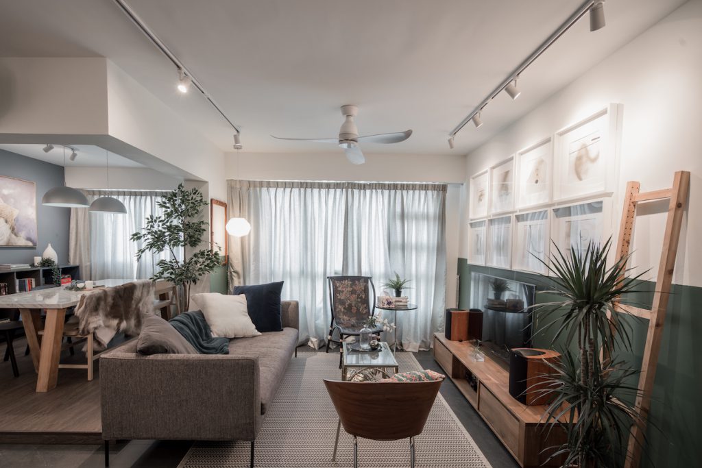
A mixture of simple wooden and eclectic Asian-influenced furniture
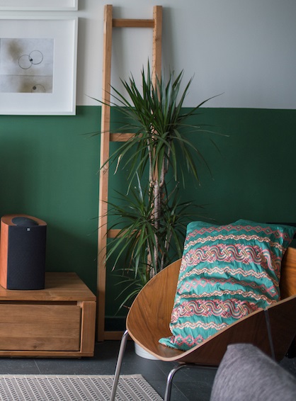
Jiching liked the embroidery on a traditional Burmese costume, so she turned it into a cushion cover

Kai Jie and Jiching also share an inclination for décor items that hold a cultural significance. Some of the notable pieces in their home include a batik-patterned chair, and a cushion that was repurposed from a traditional Burmese costume. While it is atypical for a Scandi-themed home to have such elaborate motifs, it is also what makes their home truly unique.
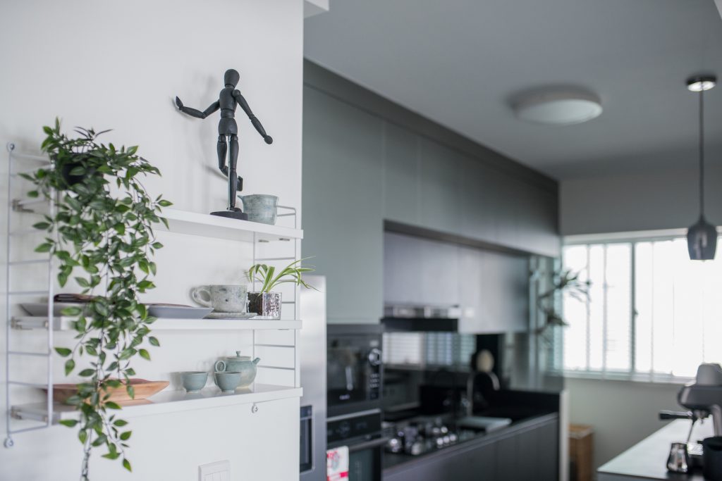
The couple commissioned the famous pottery artist Kim Whye Kee to create this teapot set that was used during their wedding tea ceremony
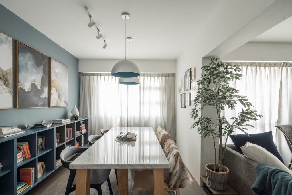
The dining room shares a similar muted palette that evokes a cosy atmosphere for the couple to gather with family and friends over dinner
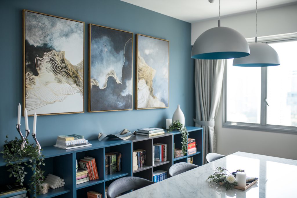
These dome-shaped pendant lights are staples in Scandi-themed homes
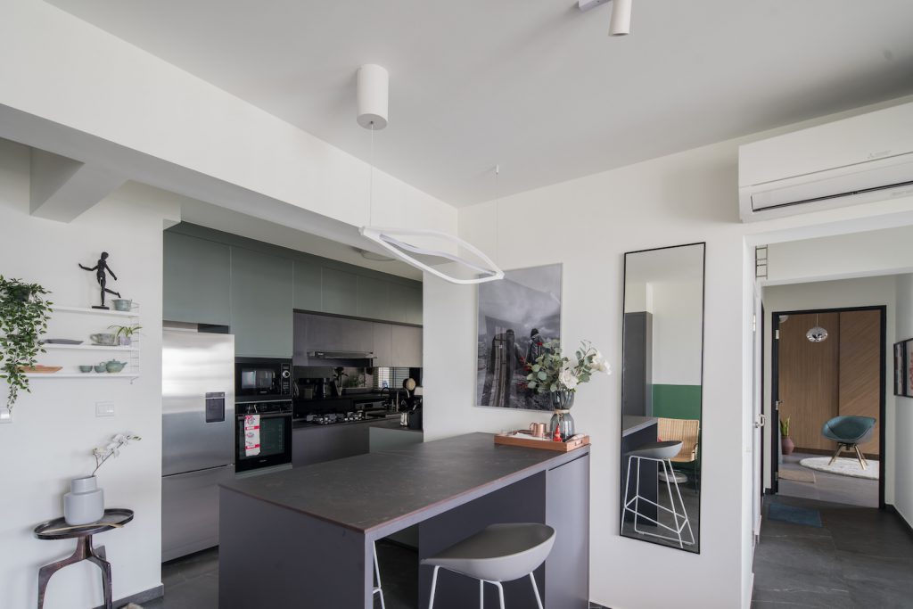
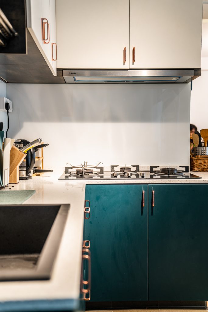
Greenish-grey cabinet finishing in the kitchen fit in nicely with the overall minimalistic look of the home
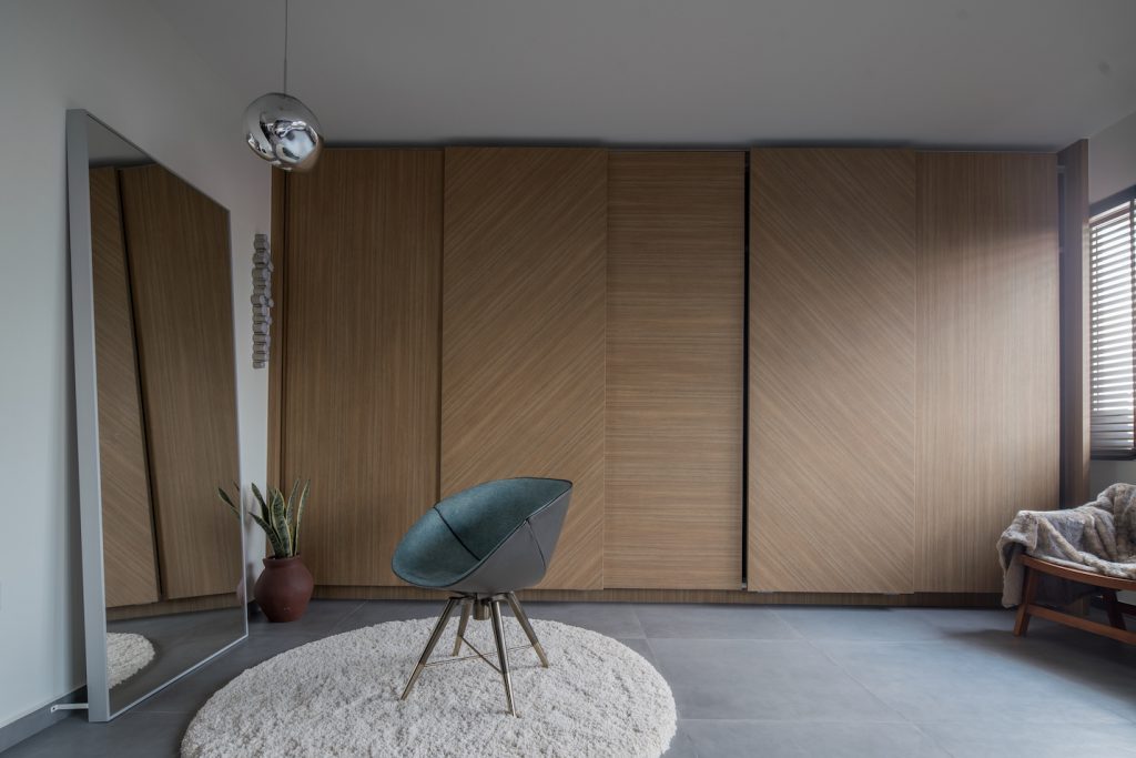
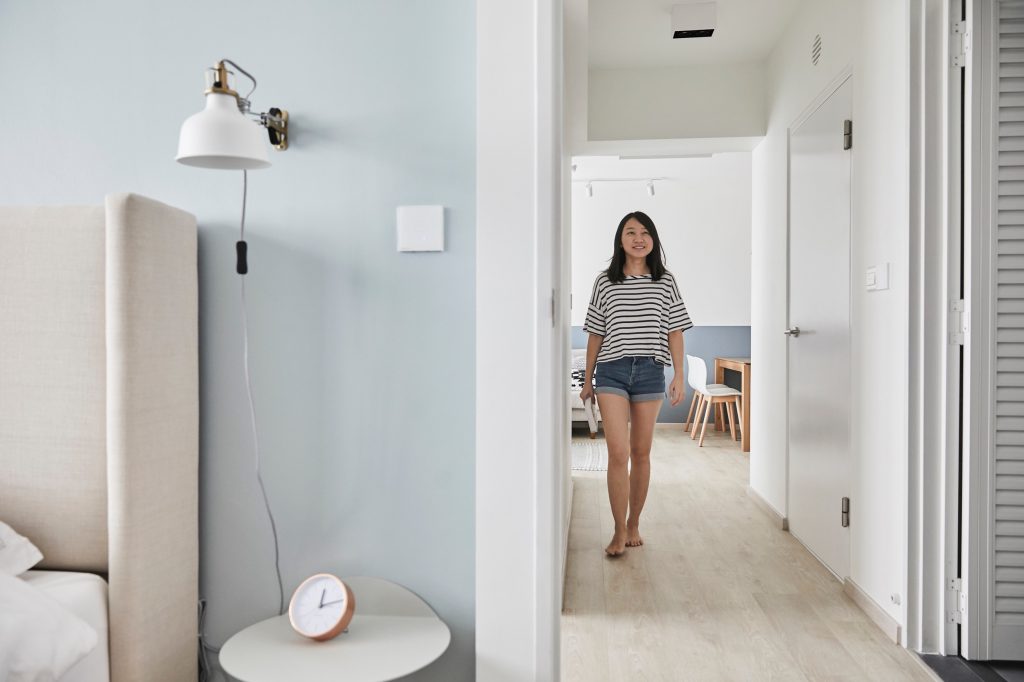
Their bedroom, in particular, epitomises the concept of ‘less is more’. Despite the spaciousness of their bedroom, as they had hacked the wall separating it from the adjacent room, the décor is kept to a minimum. “Our interior designer advised us not to add too many things in the room,” Jiching shared.
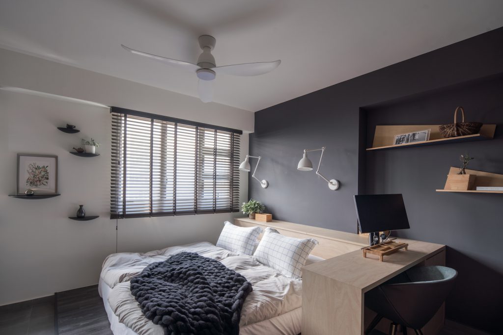
The couple wanted a simple, yet functional bed that allows them to do work on their laptops at the side

Again, we see form following function in the design of their bedframe. There are no fancy headboards or fixtures, just a sleek table extension that allows them to do work on their laptops.
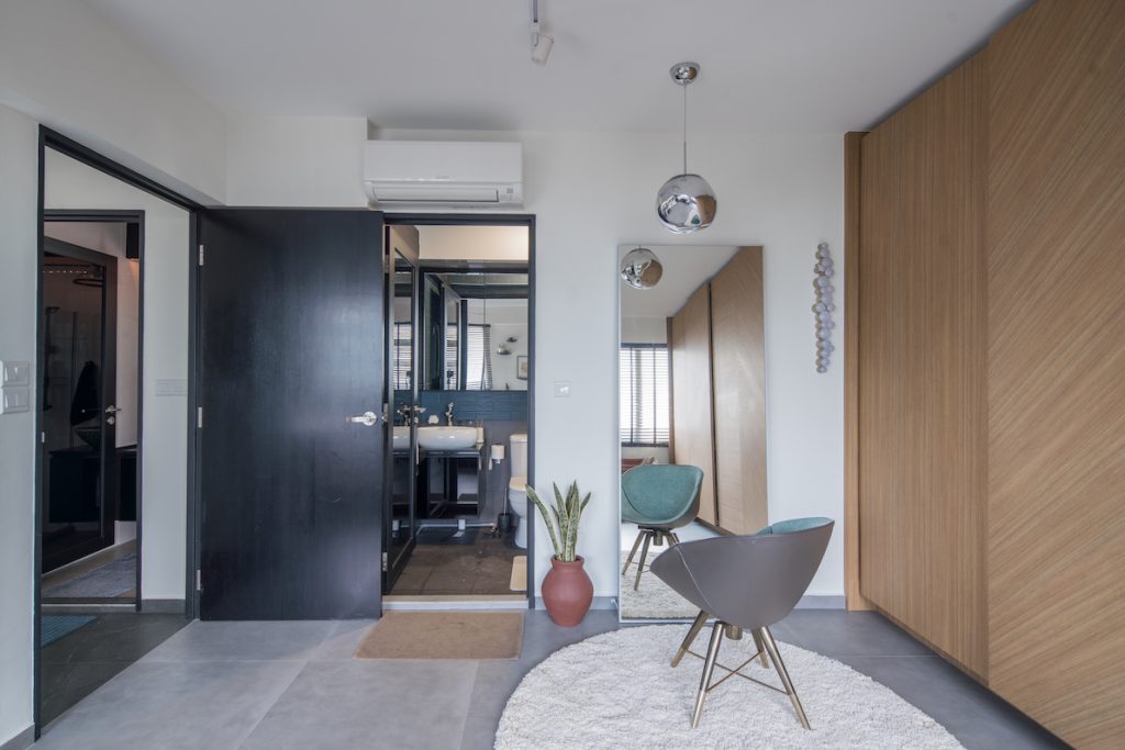
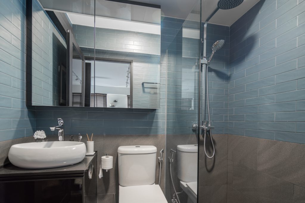
Their master bedroom toilet shares the same colour scheme as the rest of the home

Kai Jie and Jiching shared that the advantage of sourcing furniture on their own was that it gave them a tighter control over their budget. They offered a great tip, which is to attend the last few days of the annual International Furniture Fair (IFFS), because the vendors who exhibit furniture during the fair would start slashing prices to clear out their stock. In fact, most of the items in their home, like the gold-coloured coffee table, and paintings in the dining room, were bought on sale from the fair.

They also suggest measuring the furniture you are interested in before buying them, and ensuring that it can fit into the lift at your block. Especially since Kai Jie and Jiching live on a high floor, carrying large furniture items up the stairs is not really an option.

To the couple, designing their flat and transforming it into a cosy home was one of the most exciting things about being first-time home owners. “We wanted to create a home that is uniquely ours, and we are proud of how it turned out,” Kai Jie shared.

Source: mynicehome.gov.sg

Smart and Clean

Smart and Clean

This simple flat is fitted with the coolest tech devices to make living more convenient for this couple!

At first glance, it seemed like a chic flat with simple, minimalist aesthetics. Then, the phrase “Alexa, turn on the lights” was spoken aloud.

The lights in the living room brightened, and I felt like I walked into a real-life episode of The Jetsons. Except this all happened in an HDB flat. (Imagine the possibilities in our smart-enabled flats coming up in Punggol Northshore!)

Smart-enabled homes are getting increasingly accessible, with more solutions becoming available in the market to make our lives more convenient. The variety makes it easier to get started, and tailor the smart lifestyle to fit your home and budget—just like Yueyu and Jinru did.

The young homeowners made their home ‘smart’ – with most of the gadgetry and technical magic discreetly designed and positioned. But perhaps the most amazing thing is that they did most of it on their own. Strategically placed on their dining table are both voice assistants from Amazon and Google, which are both used to activate different lights and speakers around the flat.

It started off as a personal project to make the house more convenient to live in. “We wanted fewer keys, so we replaced the locksets with digital locks,” said Yueyu. “I trialled some of the products at my parent’s home before implementing them here.”

The couple’s DIY approach to installing smart home products brought much savings to their home project. They searched for their locks on online marketplaces, and even found a professional installer online. To complete the clean and modern look, each room is also fitted with touch-sensitive light switches that glow with a touch. Apart from the technological wizardry, what stood out in the home was its timeless look and ease of living. “I guess it is comfortable and easy to tidy up. No bulky furniture, and we can move things around easily when we have guests,” said Jinru.

Having storage space under the bed means that they can keep their room clutter-free

Cleaning is a breeze, with a robot cleaner doing much of the daily sweeping. “We specifically found furniture that would work with the robot. Our wardrobe is built in, and storage is below our bed,” Jinru explains. With less surfaces, there’ll be a lot less cleaning to do!


Source: mynicehome.gov.sg

An Oasis of Calm

An Oasis of Calm

Take a tour around Ching Kai’s spacious 3-room resale flat in Hougang!


Step into Ching Kai’s 3-room flat in Hougang, and you almost feel like you are in an oasis. A creative director and artist, Ching Kai knew right from the start how he would design his own home. “As soon as I set eyes on the flat, I immediately saw its potential, and envisioned how I wanted it to look,” he said. “The flat also gave me a sense of familiarity, as it has the same layout as the one I grew up in.”

Drawing inspiration from Japanese minimalism, Ching Kai focused on transforming the resale flat with an open concept layout. He hired a renovation contractor and personally supervised the home makeover process. His budget? $40,000, including carpentry.

Referencing a book titled “Goodbye, Things” by Fumio Sasaki, Ching Kai shared that the philosophy of doing away with excess resonates with him. “I did my best to reduce my possessions to the items I really needed,” he said.

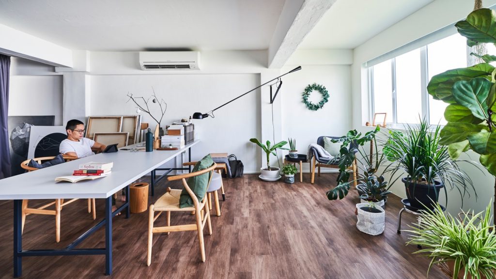
This meant furnishing his flat with only key pieces he loved, and opting for multifunctional furniture where possible. For instance, a large table in the middle of the living area serves as Ching Kai’s workspace, which can be converted into a dining table when he has guests over.

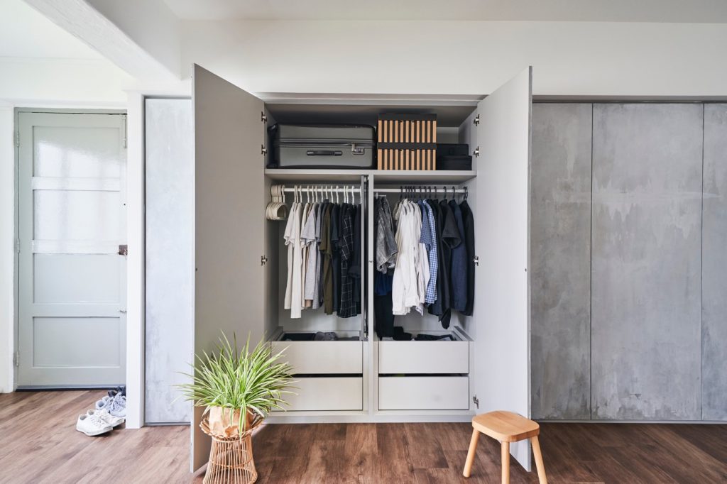
A large custom-made cupboard offers plenty of storage to keep the flat clutter-free. Ching Kai’s passion for his craft also saw him painting the wardrobe with varying shades of grey for a unique finish.

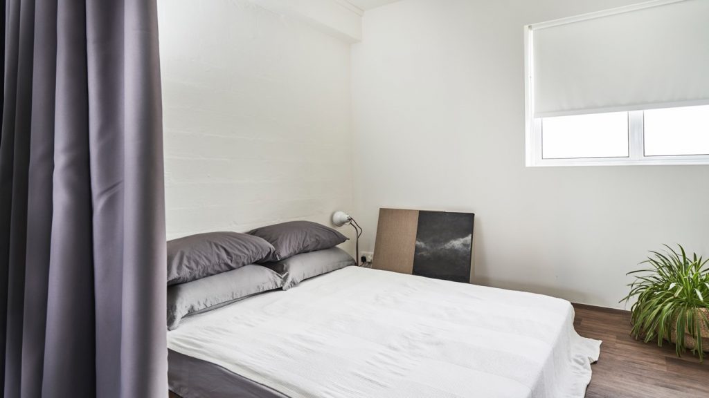
Ching Kai’s sleeping nook similarly reflects a minimalist aesthetic. He kept the furnishings simple, and opted not to use a bedframe. “As I had removed the bedroom walls, I used drapes to demarcate the bedroom space. It allows me privacy when I needed it, while adhering to the open plan,” he explained.

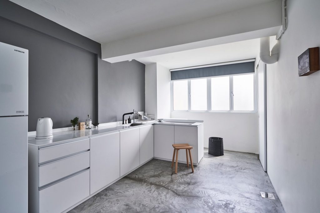
For the kitchen, Ching Kai chose to use cement flooring as he deems its raw look to be aesthetically pleasing. Plus, it was economical as well. “My principal concern was cost, and using cement helped me save some money on tiles,” he said.

A lack of overhead cabinets complements both the openness of the flat, as well as Ching Kai’s minimalist lifestyle. “It encourages me to keep less things around,” he joked.


Source: mynicehome.gov.sg
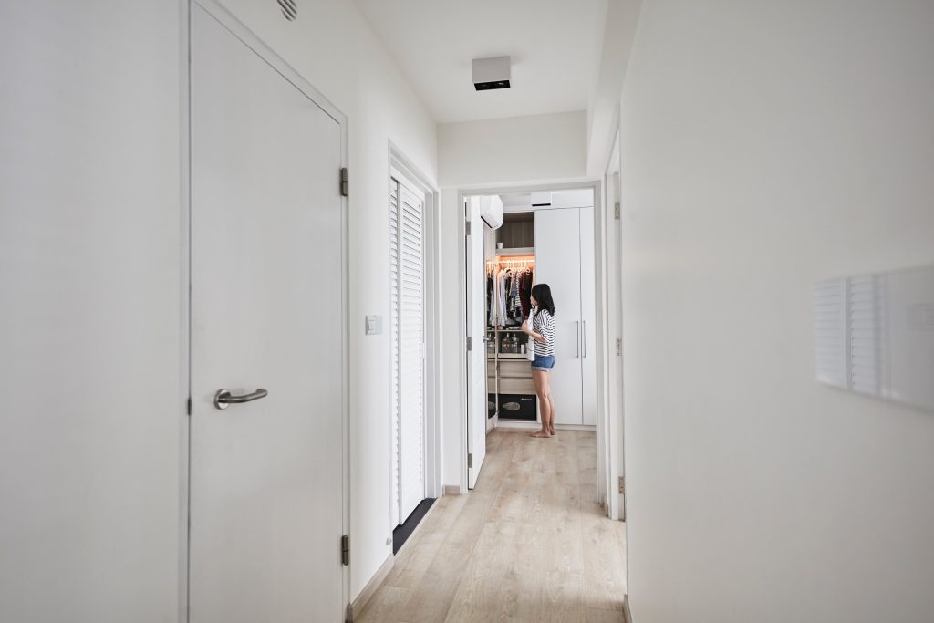
A Flat with Flexible Layout

A Flat with Flexible Layout

Betty and Marcus used mobile storage units so that they can reconfigure their 3-room flat layout easily!

Art directors Betty and Marcus purchased their 3-room resale flat after house-hunting for over a year. The couple wanted a location that offered a shorter commute to their workplaces, and were patient until they found the ideal flat that met their budget and needs.

Flexible Spaces

Betty was inspired by the design of retail spaces, where layout is often dynamic. “I wanted our home to have flexible space, which we can reconfigure as needed,” she shared.

The creative couple had many ideas for their home, and chose to engage an interior design studio to refine the concept for their home. “We wanted a neutral party who could mediate between us, if and when we had different design ideas!” Betty recalled with a laugh. Three-D Conceptwerke was their eventual choice, as they found the studio’s portfolio to be original and unconventional.

Having expected the interior designer to propose partitions and sliding doors, which will offer some degree of layout flexibility, Betty and Marcus were pleasantly surprised when he suggested customised mobile storage units instead.

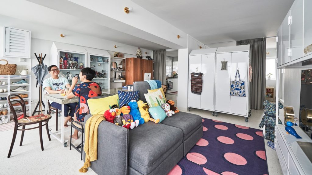
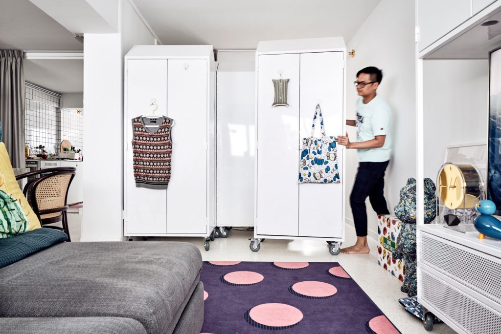
These storage units took the place of all walls which were hacked. Made of lightweight steel, they are easily movable and enable the home owners to move and alter the layout at whim. “It’s effortless to switch them around when we feel like transforming our flat occasionally. It’s also convenient when we wish to make room for visiting friends who want to stay over for a couple of nights,” Betty said.

Customisation of the storage units, however, was an intricate process, involving detailed calculations to ensure that the units fit under the beams and even the block’s elevators when moving in.

Putting a Personal Touch

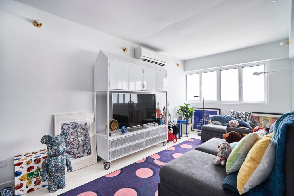
Another unique feature of Betty and Marcus’ flat is the extensive use of terrazzo tiles, which were sourced from Vietnam. They chose to use terrazzo for their flooring as it is a timeless material, while its subtle pattern of speckled colours add visual interest to the home.

“We spent around $80,000 on the renovation, but saved where we can, such as by buying our lighting fixtures online,” they shared.

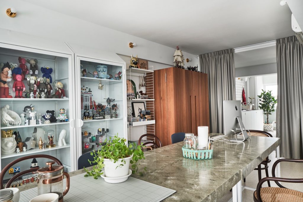
The couple also took time to furnish their home with pieces they love, and were not afraid to mix and match different materials and colours. The marble-look dining table doubles up as a workspace, and is complemented by Made & Make rattan chairs and a metal dining bench from JotterGoods.

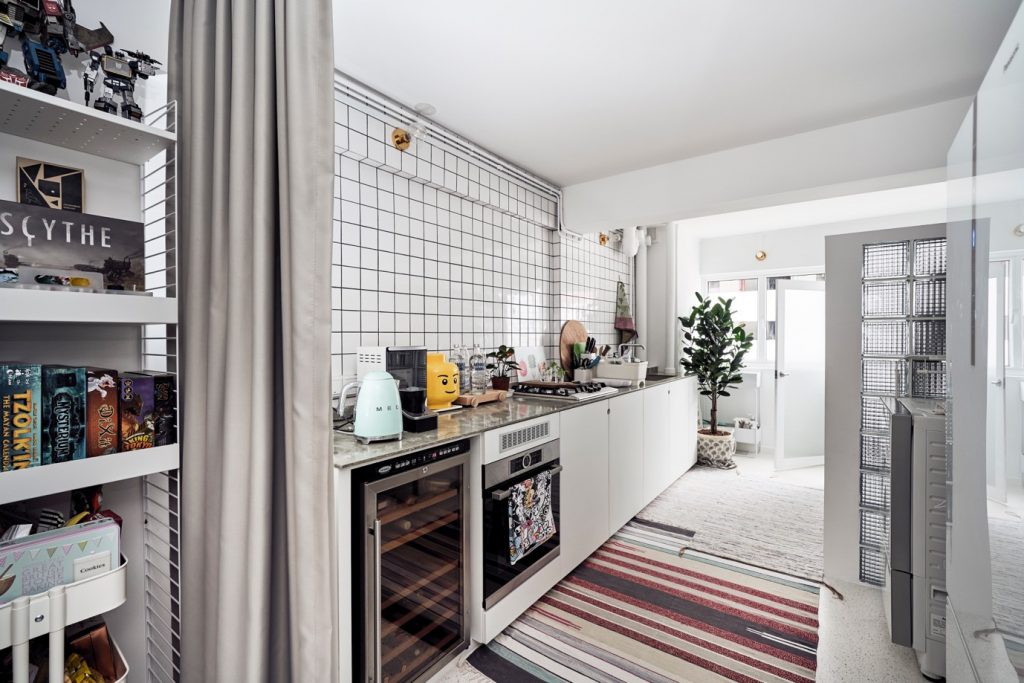
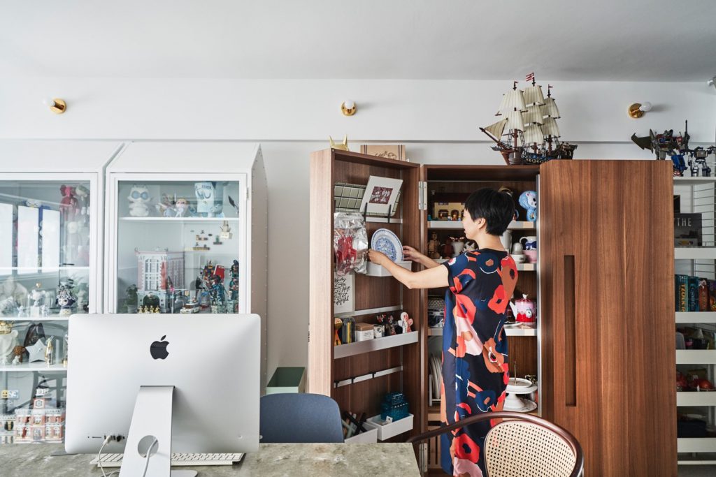
Leading into the kitchen is Betty’s prized possession, a Bulthaup cabinet crafted from wood. With doors that can fully open up to show all the contents in clear view, the well-designed piece offers maximum storage capacity while taking up minimal space. The rich colour of the wood also goes well with the white painted frames of the steel storage units.

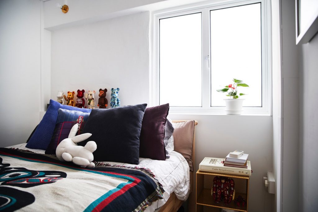
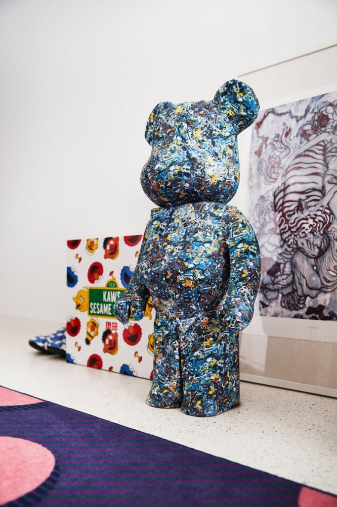
Completing the personal touch are displays of Betty’s homeware collection, Marcus’ KAWS toys, and souvenirs from their travels.


Source: mynicehome.gov.sg

A Touch of Peranakan

A Touch of Peranakan

Christopher knew that the 5-room resale flat in Pasir Ris was The One, the moment he saw it. “My mother and I had viewed 10 properties before falling in love with this unit,” he said.

Having grown up and lived in the east side of Singaporefor allhis life, Pasir Ris was an ideal town for Christopher with its laidback vibes and peaceful surroundings. On top of the lovely view, the flat offered him the chance to design his home the way he wanted.

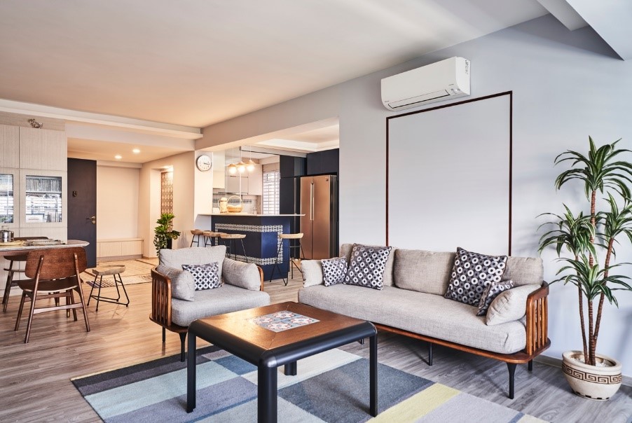
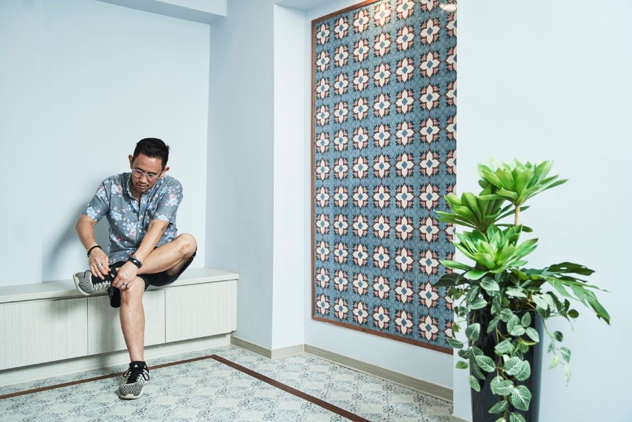
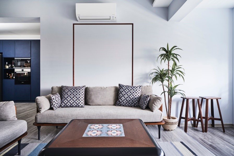
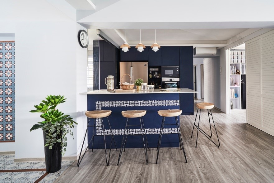
Christopher worked closely with his interior designer, Dan,to develop the design ideas and carry out the renovation works. To complement a soothing palette of greys and blues,subtle patterns were incorporatedin the décor for visual interest. One example is thestunning feature wall of Peranakan tiles at the entryway, as a nod to Christopher’sheritage.

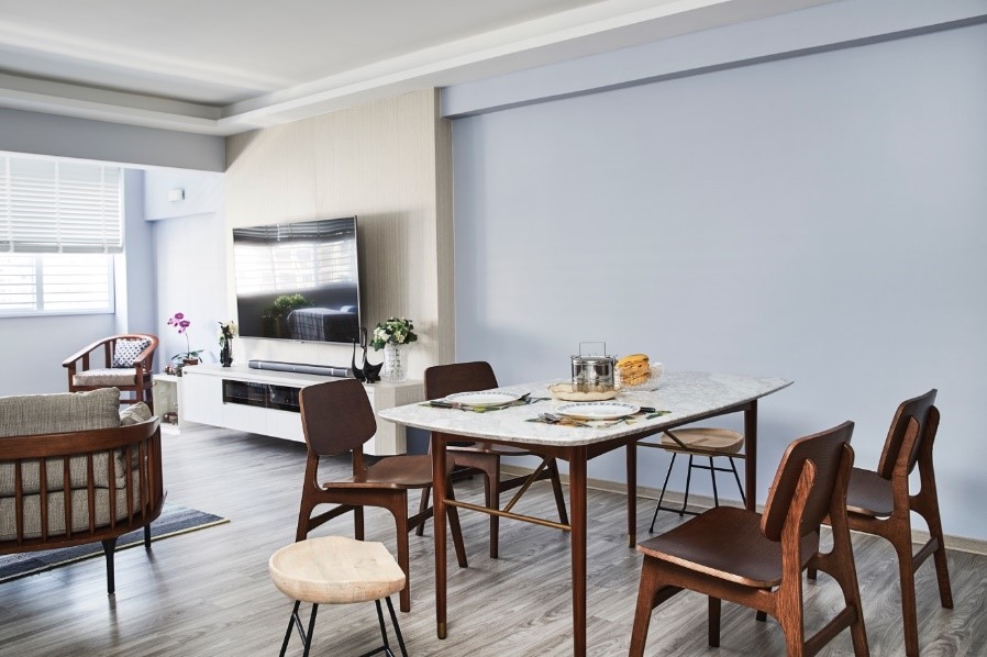
In planning the layout of the flat, Christopher considered how the space could meet his lifestyle needs. “As I had little use for a balcony, I chose to expand the living room instead,” he explained. The change made room for ample seating and dining space, which is especially useful when he has friends over.

While Christopher purchased most of his furniture from Castlery and IKEA, he also has unusual pieces in his home, such as a customised coffee table with a Peranakan tile pattern that complements the overall interior design concept.

Christopher and his mother do a lot of cooking at home, so he remodelled the kitchen into one with both wet and dry areas that are separated by glass doors to keep the cooking fumes out. The open concept kitchen features a dark blue island with a unique motif, which also doubles up as a casual breakfast bar.

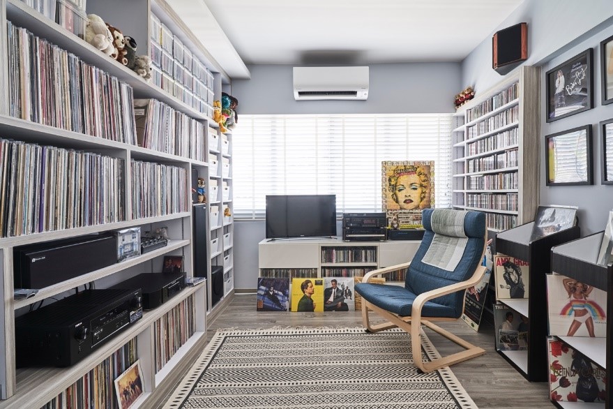
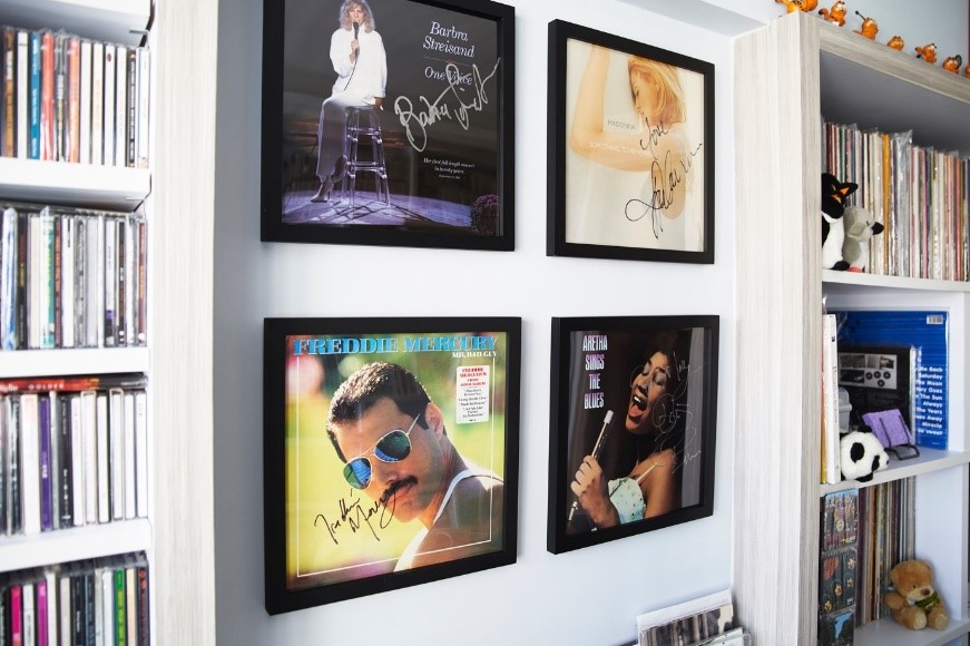
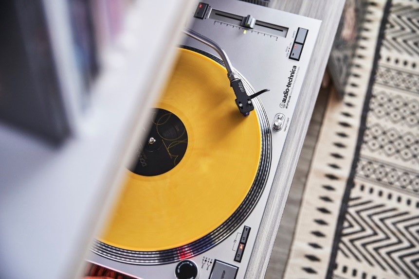
An avid vinyl record collector, Christopher transformed one of the bedrooms into a music room. Besides full-height shelves to display his extensive, prized collection, the room is decked out in framed signed vinyls and other toy memorabilia. “It is a favourite spot for me to sit back and unwind while listening to music,” Christopher said.


Source: mynicehome.gov.sg
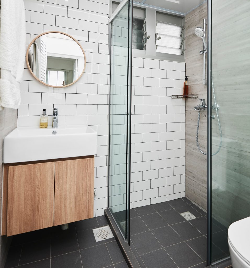
Living the Artist’s Dream

Living the Artist’s Dream

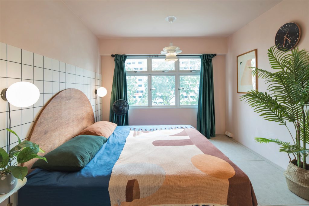
Stepping inside the five-room flat, one can’t help but marvel at the amalgamation of colours and textures. “I didn’t have a specific theme when I was designing the house because I couldn’t choose between them,” Grace laughed. “But I do know that I love to be stimulated by visual elements, so my home is really colourful.”

From deciding on the colour palette to picking out the furniture to painting the walls, Grace had put the house together from scratch. “My husband is really easy-going, so he leaves the décor to me,” she grinned.

Located in Bukit Batok, the flat is a stone throw’s away from the MRT station and amenities such as hawker centres and polyclinics –  one of the primary reasons why she fell in love with the neighbourhood. “We got pretty lucky when purchasing our flat,” Grace shared and continued, “We opted for the Sale of Balance flats in Bukit Batok and had only two units in our block to choose from – one unit was booked on the flat selection day but we’re still very pleased with our unit.”

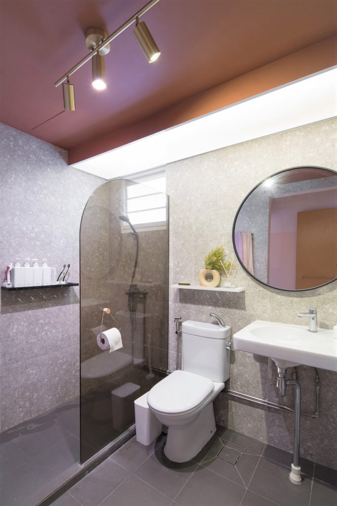
In addition to using more than 10 colours on the walls of her home, a variety of textures are found throughout the flat. “When browsing for home decor ideas, my main goal was to have an aesthetic space. This resulted in a carefully curated party of colours and textures that include glass, coarse stones, leather, metal and more!”

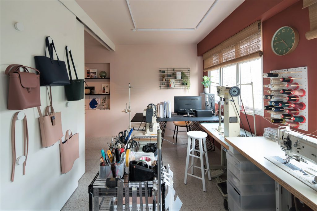
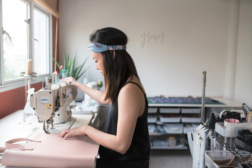
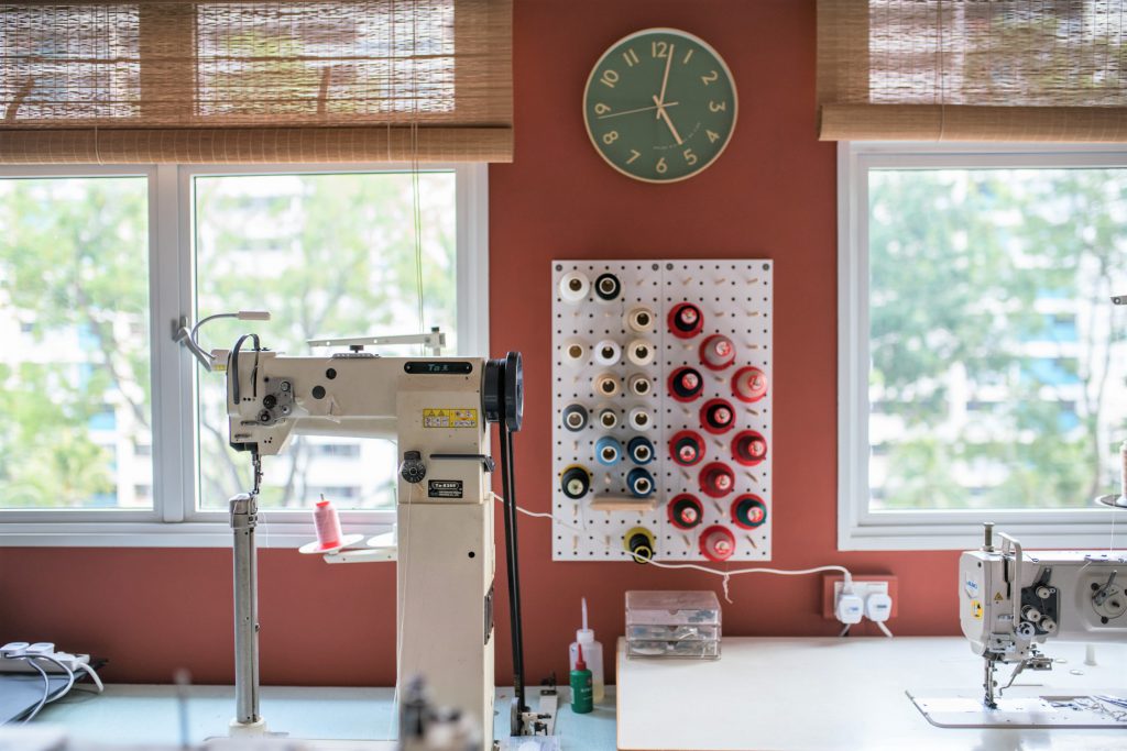
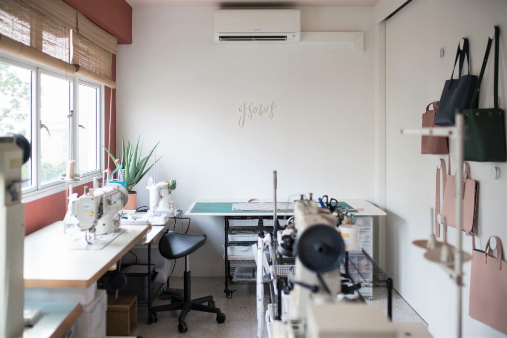
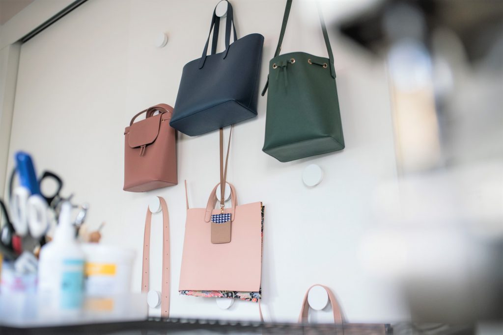
With sewing machines, materials and bags hanging off nearby racks, one can easily guess Grace’s line of work. The founder of GSEWS, a venture that specialises in customised bags, Grace was an architecture student at the National University of Singapore (NUS) when she uncovered her passion for sewing and in particular, bag making. 2 ½ years into the course, she made the life-changing decision of dropping her degree to pursue her passion.

“Honestly, the further I was into the course, the more I thought I was not suited to be an architect,” Grace said. “I was making and selling bags while in school, and it dawned on me that I am more of a craft maker than building designer. That was when I decided to make the switch.”

Considering the importance of her home workstation, Grace was extra meticulous when designing the space. “Having the option to hack the partition walls was very helpful as it resulted in a wide rectangular area that gave us ample layout possibilities,” Grace smiles.

“The workspace also features the only white walls in the house as I use them as the backdrop for product photoshoots.”

Putting the Pinterest-worthy home together however, did come with its fair share of challenges. Every piece of furniture complemented the overall aesthetic, something Grace was particularly mindful of. “Our renovation budget was tight and my design ideas such as the fluted glass sliding toilet door and marble kitchen wall were not easy to execute.”

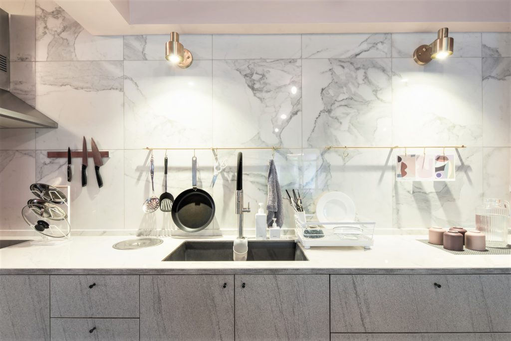
“I had to look for cost-friendly alternatives like marble-printed tiles for the kitchen countertop that was more affordable than the regular quartz material, but with the same durability,” Grace explains.

“But I have to say that this made the renovation process more fulfilling. Take the glass sliding door for example – we had to source for the different components of the door (hinges, sliding track, rollers, glass, door handle, door lock) before assembling it ourselves. The process was rewarding as it helped widen my knowledge of materials and construction methods tremendously.” From the customised high table in the living room to the doorknobs, Grace’s home is a careful curation of both overseas and local furniture.

So what are some renovation tips Grace has for homeowners? “I find visualisation aids very useful, especially for those not intending to engage their interior designers or consultants. Personally, I recommend Home Design, an interior design mobile app that allowed me to visualise the furniture layout, wall colours and more to see what works and what doesn’t”, quips the homeowner.

She also shared that how, even after one and a half years, she’s still making tweaks to her home workspace. “The main objective is to keep it simple, neat and efficient for work,” Grace says. “I’d put a lot of thought into the placement of the sewing machines, tables and tools but I’m still constantly making changes in order to improve the workflow. For instance, in order to save on space, I’ve replaced a stand-alone clothes rack with knobs to hang my bags on.”

For aspiring home business owners looking to design their workspace, Grace highlights the importance of workflow visualisation. “Think about the space utilisation (especially if you’re working with many tools or constantly need to move around) before planning permanent fixtures such as storage spaces and doors. It’s helpful to keep your layout flexible with mobile shelves and tables as you’ll tend to move them around as you make adjustments to your workspace.”

Know of a gorgeous HDB home we should feature? Drop us an email at mynicehome@mailbox.hdb.gov.sg!

By Adeline Ang

Source: mynicehome.gov.sg
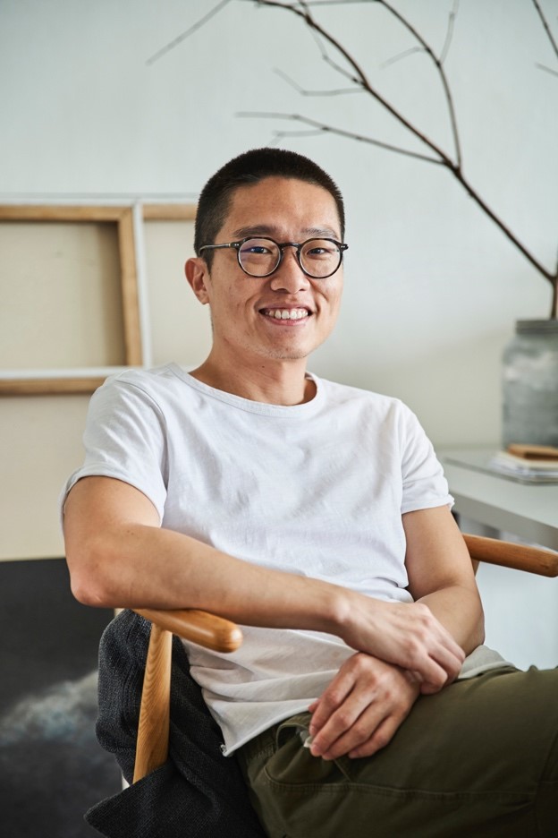
The Ultra Minimalist 3-Room Home

The Ultra Minimalist 3-Room Home

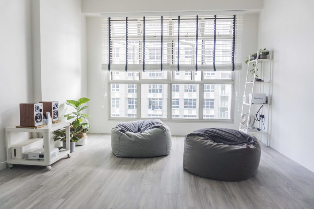
Two bean bags, a utility shelf and a stereo set – that’s the total sum of furniture in the living room of Yong Wei (Glo) and Hiang Ling’s 3-room flat.

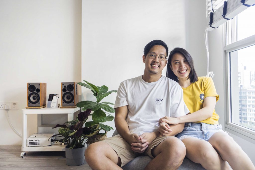
Homeowners Glo and Hiang Liang

The flat is purposefully designed to be ultra-minimalist, Hiang Ling explains. “Glo is big on practicality and sensibility. So we keep only what we need, and discard what we don’t – even if it means going against the social norm of what a home should look like. From the start, our Pinterest board was titled ‘White, Woody, Leafy’, which pretty much sums up the look we were going for,” she laughs. “Our good friends at Komorebi Interior Design helped us bring this concept to life!”

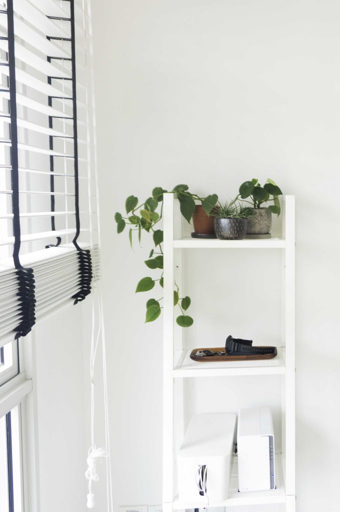
The utility shelf in the living room

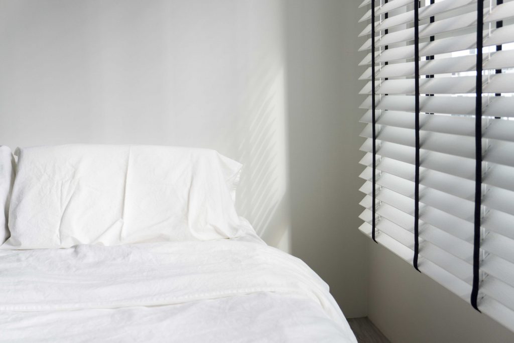
The minimalist bedroom

Active in Punggol

The couple moved into their new home late last year. “When we were applying for a flat four years ago, this Punggol project was our favourite among all the BTO options available then. We like the tranquility and how the neigbourhood is surrounded by nature,” they shared.

Having carefully considered their finances, they decided on a 3-room flat. “To be honest, finances was one of our primary considerations. Our business was just taking off then and we didn’t want to over-stretch ourselves financially,” Glo explained.

Previously a personal fitness trainer, Glo lives an active lifestyle. “Working out and eating well are things that I’ve always believed in,” he says. “When my dad, whom everyone saw as the strong figure in the family, was admitted into the Intensive Care Unit for a heart condition, I realised that taking care of our health is the best thing we can do. Thankfully, he has since recovered.”

In addition to working out at home, the couple exercises outdoors. “Certain exercises such as the sprint workout can only done outdoors. While working out at home gives us privacy, the surrounding parks are great workout spots. Besides jogging together, Hiang Ling also inline skates.”

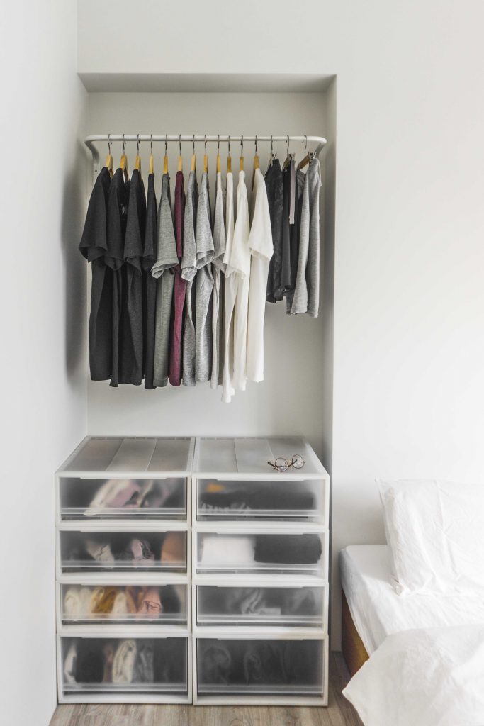
The couple share a minimalist wardrobe

Designed with Function

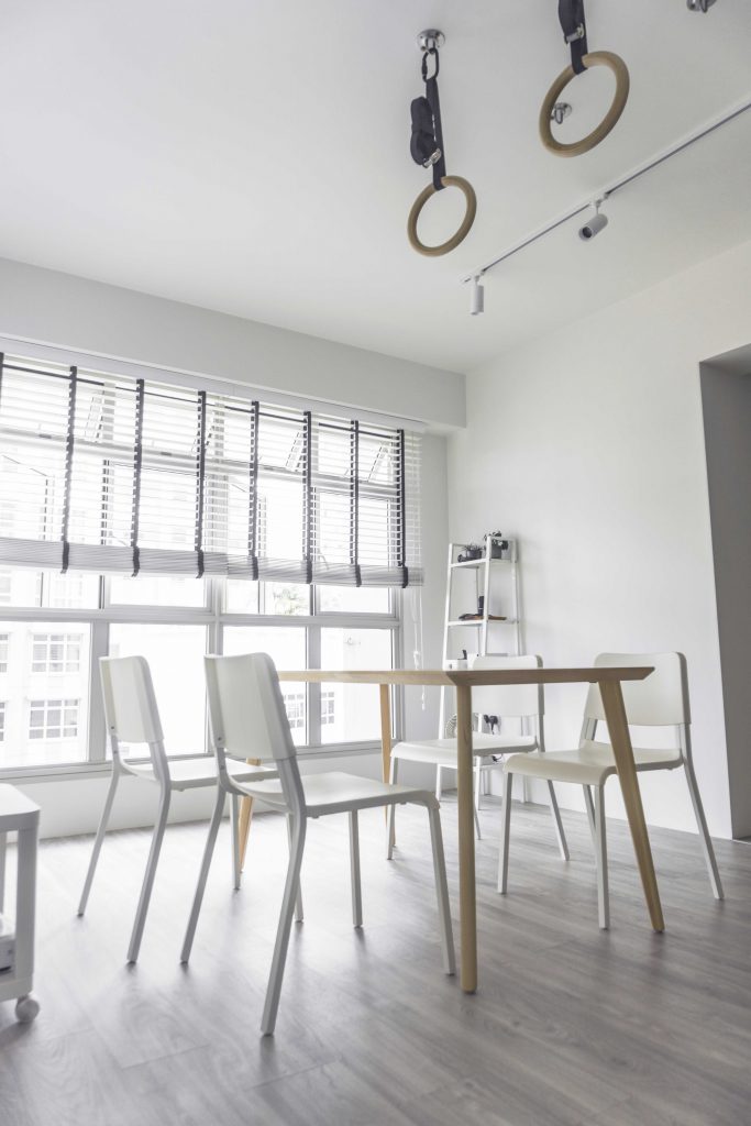
The theme of functionality runs constant throughout the flat. “We have bean bags instead of a couch and a projector for a TV. We also have a temporary dining table that we take out only on occasion, to maximise space,” laughs Hiang Ling.

The dining table can be dismantled easily and is usually stored away

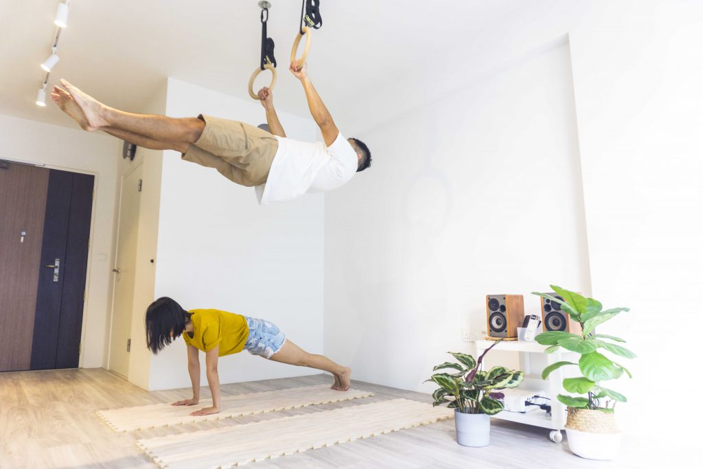
Glo and Hiang Liang working out in their living room

As the “event space”, the living room is the couple’s favourite space in their home. “The spaciousness, sunlit brightness and versatility of it makes us fall in love with it over and over again. When we’re hosting guests, it becomes a warm and welcoming space. When we’re in the mood for a movie, it becomes a cosy cinema. Both of us can even fit comfortably on one bean bag,” she laughs.

At the same time, the living room serves as an exercise ground. “It provides us with an energetic space to work out in, which also means that we’d never have an excuse not to exercise, rain or shine!”

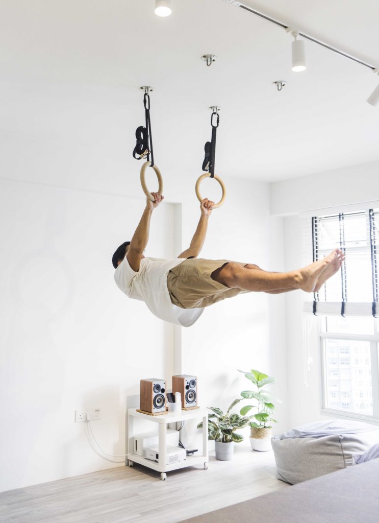
Glo on the gymnastic rings

Complementing the couple’s active lifestyle are two wooden gymnastic rings that are hung from the ceiling. An alternative to a pull-up bar, the pair of rings are utilised for various workouts such as pull-ups and front levers, an exercise that involves keeping one’s body in a horizontal position whilst mid-air.

As for why not a pull-up bar, Hiang Ling laughs, “To be honest, we couldn’t find one that complements the overall aesthetic of the house.” While Glo nods in agreement, he explains the versatility of the rings, “We have four different hooks that allows us to switch the position of the rings, so we can adjust them accordingly for different workouts.”

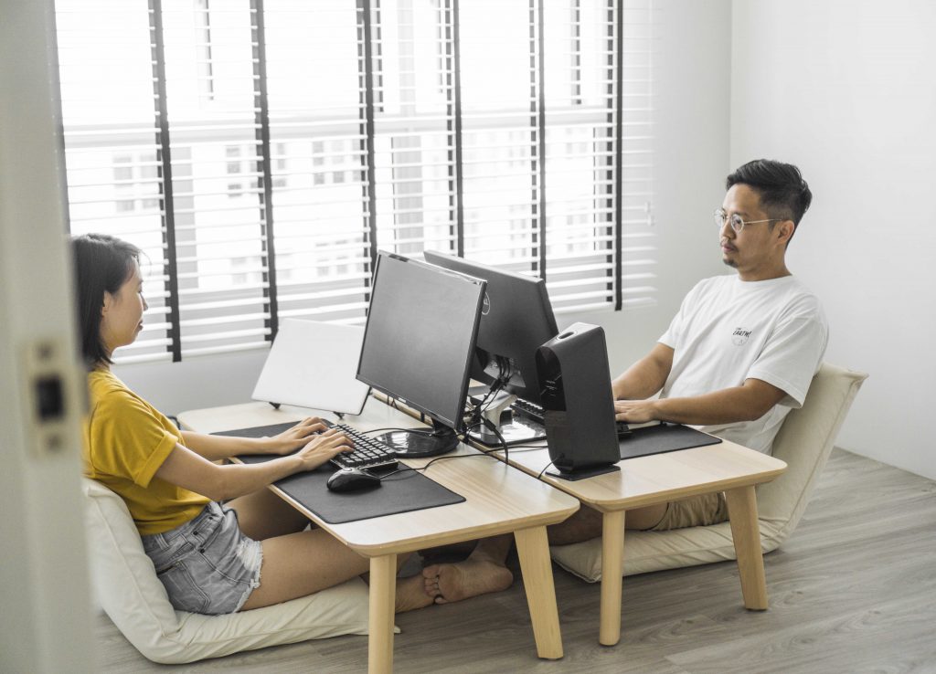
“The rooms are allocated according to their purpose,” explains the couple. “For instance, as we work from home, we require a comfortable working space – hence, we turned the larger bedroom into a home office.”

The floor desk and chair setup of the couple’s home office

The storage cupboard for work equipment such as cameras

The couple was also careful to design a home that complements their healthy lifestyle. For instance, the home office was designed with health benefits in mind. “The floor desk and chairs make it easy for us to switch between sitting postures as we work,” Hiang Ling explains. “The open space allows us to stretch our legs during breaks.

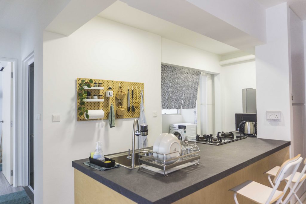
The remodeled kitchen features a custom-made countertop where Hiang Ling prepares most of their meals

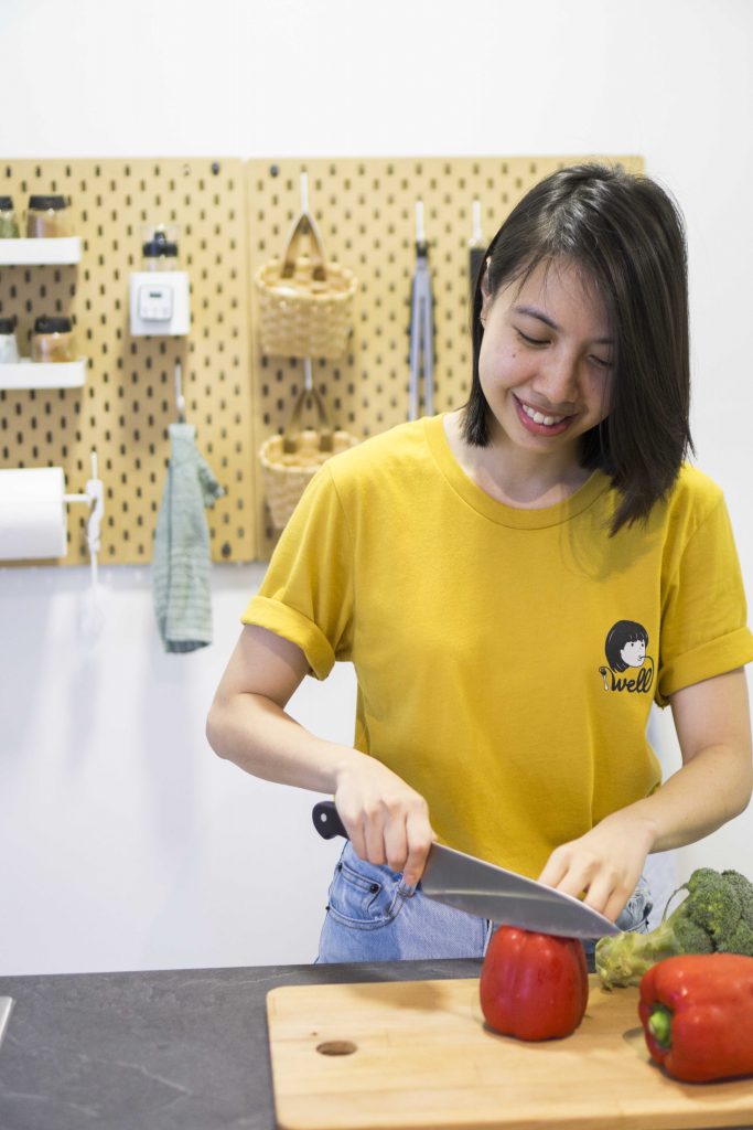
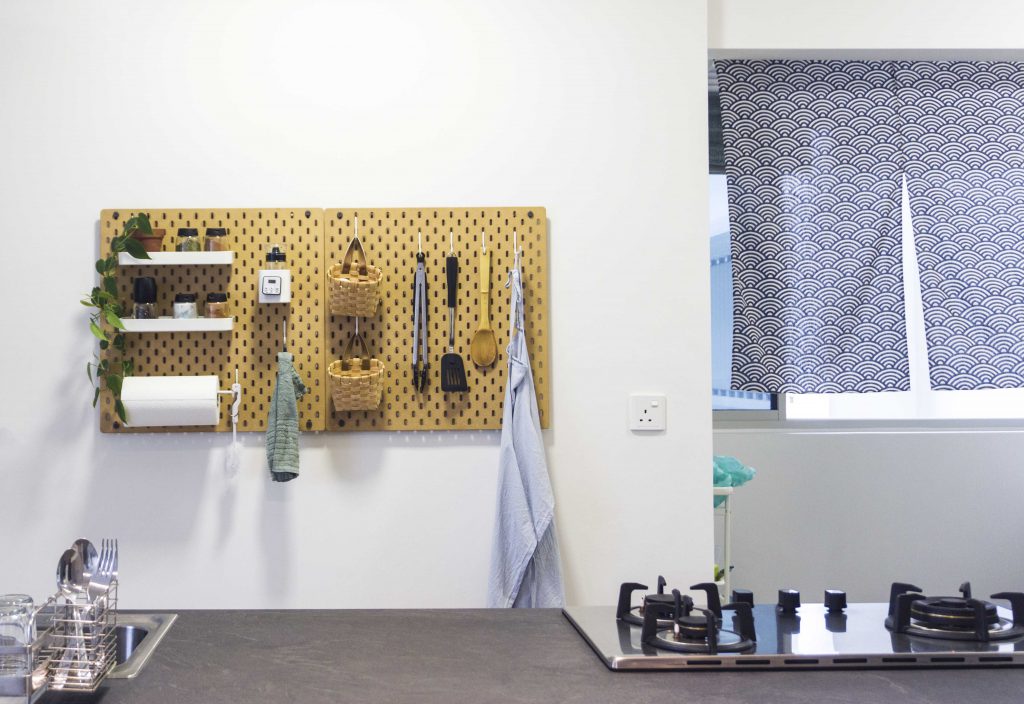
The couple keeps their kitchen organised with a peg wall

Diet plays an equally important role in their healthy lifestyle – as such, the couple prepares most of their meals in their remodeled kitchen. “We extended the countertop and shifted our sink from the corner of the kitchen to its current position – this allows us more space to prep our food,” the couple explains. As for who spends more time in the kitchen, Glo smiles, “Hiang Ling prepares majority of our meals – when I cook, it’s usually for a special occasion.”

While owning a minimalist and sustainable home is challenging, the couple shares what they think is most important when designing one, “It’s important to keep things as simple as possible. Also, engage a trust-worthy interior designer. This is a really good investment, especially if you can afford it.”

Source: mynicehome.gov.sg
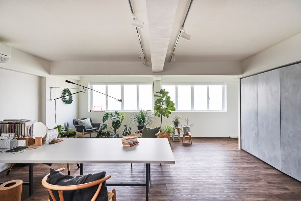
Home Tours: The Art of Functionality

Home Tours: The Art of Functionality

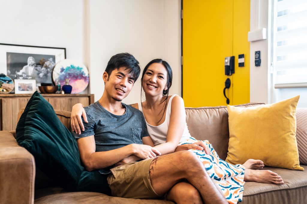
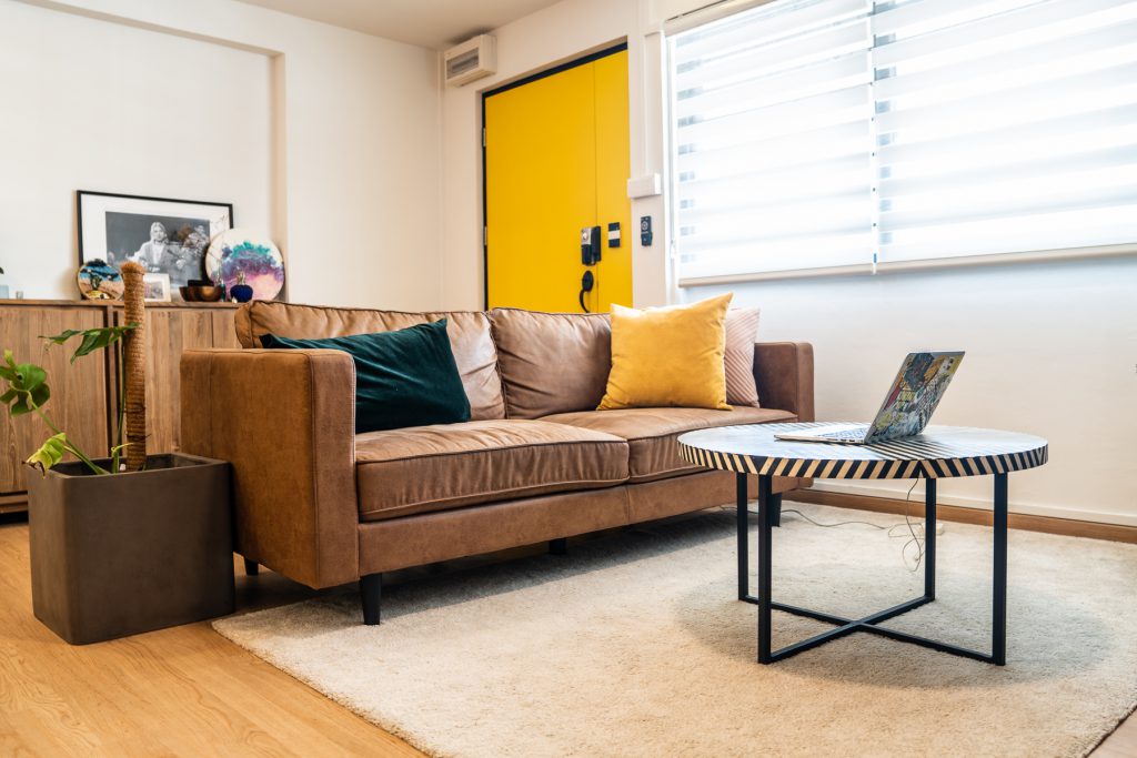
Like the bright yellow door to their home, the exuberance of Grace and Josh is hard to miss.

“I’ve always liked the colour yellow,” Grace smiles. “It makes for a happy welcome whenever we return home.”

Home owners Josh and Grace

The “east side best side” couple always wanted to live in the eastern part of Singapore. “Both of us grew up in Katong and our parents are living in the east. So there’s a sense of familiarity and we wanted to be close to our families,” 33-year-old Josh shares.

After house-hunting for 3 weeks, the couple feel in love with their current 4-room resale flat in Mountbatten. “I think we were really lucky to have found our home in such a short period of time,” Josh laughs.

“This neighbourhood is amazing! It’s quiet and in fact, Josh’s workplace is just a 20-minute bus ride away,” says Grace, founder of LunchMoney, a local fashion label.

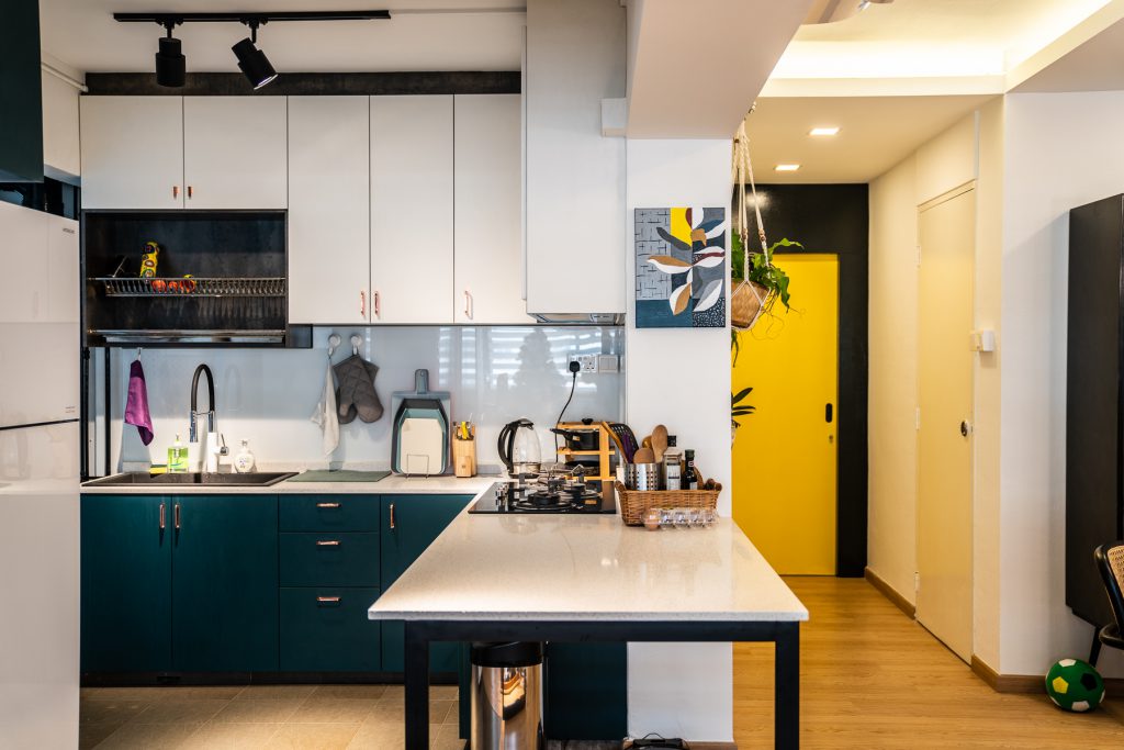
The refurbished open concept kitchen

The living room

Grace’s workspace

Mix and Match

Featuring pops of colour and wooden accents, the cosy flat is an eclectic mix with hints of Scandinavian and minimalist influences. “We didn’t have a specific theme,” 28-year-old Grace laughs, “But we took what we liked about the different house themes and put them together.”

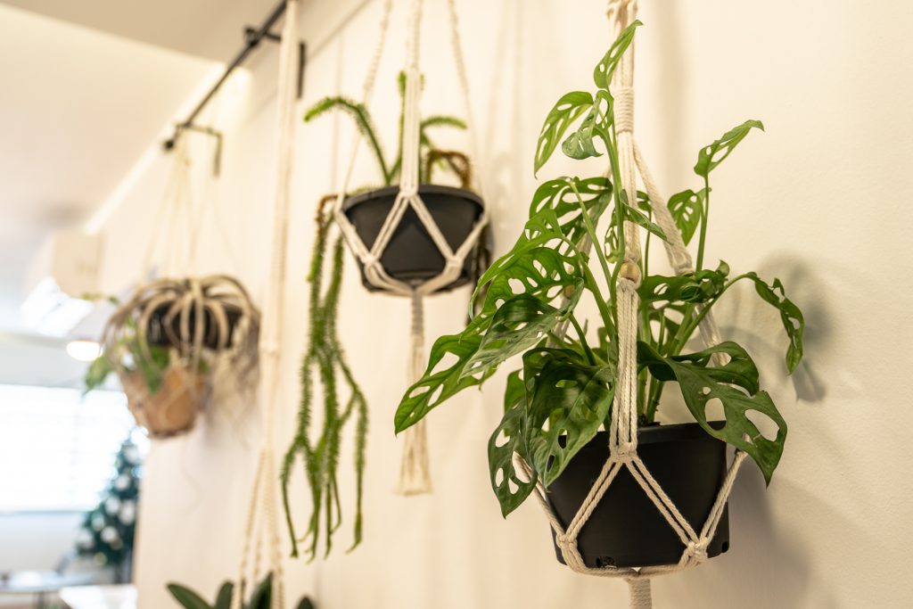
Hanging plants in the living room

From potted herbs to hanging ferns, plant lover Grace shares the importance of having greenery in the house.

“They really liven up the place,” she smiles and continues, “Plus, herbs in supermarkets are almost always sold in large quantities – so growing our own gives us access to fresh ingredients while avoiding food wastage!”

While Josh wasn’t previously a big fan of plants, he has grown to appreciate them.

“Josh actually does most of the watering,” Grace smiles approvingly as Josh nods proudly.

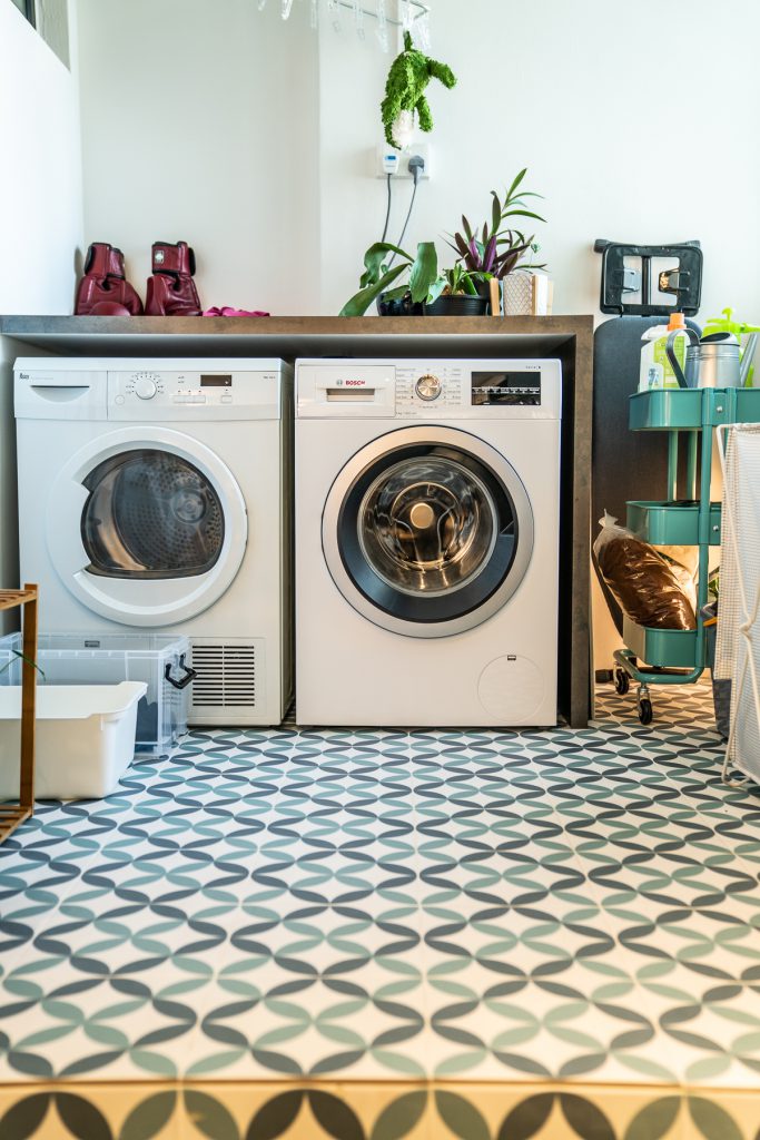
The service yard

To the couple, the functionality of the space was of utmost importance. For instance, in the living room, a large wooden cabinet containing utensils and cutlery is placed next to the dining table. “As we have guests over regularly, storing the cutlery in the living room will save us having to walk back and forth the kitchen,” Grace explains.

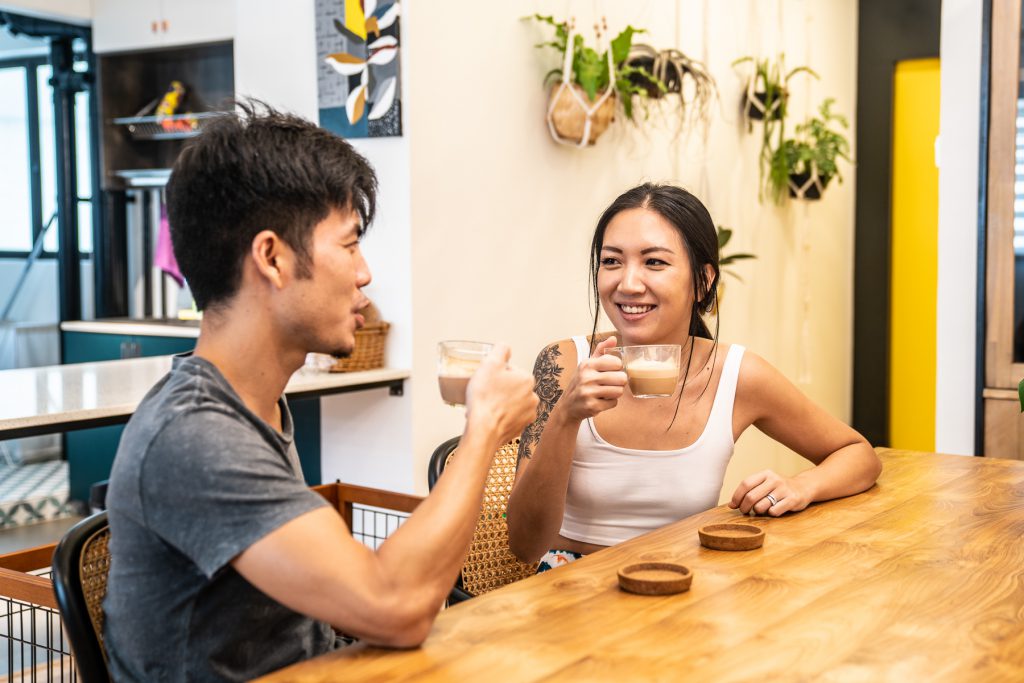
The couple enjoying an afternoon coffee

Upon closer look, one will notice that the lights in the kitchen are intentionally misaligned. “While having the lights evenly spaced out makes aesthetic sense, they wouldn’t be able to fully light our kitchen cabinets – we decided that functionality was more important and went ahead with the light placement that best suits our needs.”

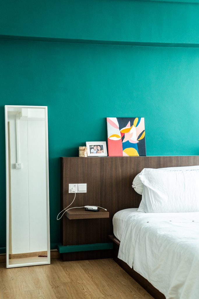
The bedroom

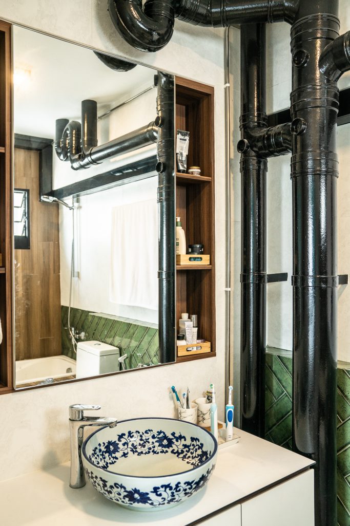
The bathroom

No Place like Home

While their renovation journey was mostly smooth, Grace and Josh share some of the lessons learnt. “Some installations took place after we’d moved the new furniture in and we had to shift and clean them repeatedly. Admittedly, this was a little frustrating.”

When it comes to engaging and communicating with interior designers, the couple advises: “Don’t be afraid to speak candidly! It’s important to hold an open and honest communication with each other about the house, so find an interior designer that you’re comfortable working with.”

When asked if they’ve a favourite spot within the house, the couple laughed and responded, “We love every part of the house. You won’t believe it but when we were on our honeymoon, we couldn’t wait to come back to the comfort of our home! That’s how much we love our new home.”

Source: mynicehome.gov.sg
Home Tours: A Cosy Tropical Home in Toa Payoh

Home Tours: A Cosy Tropical Home in Toa Payoh

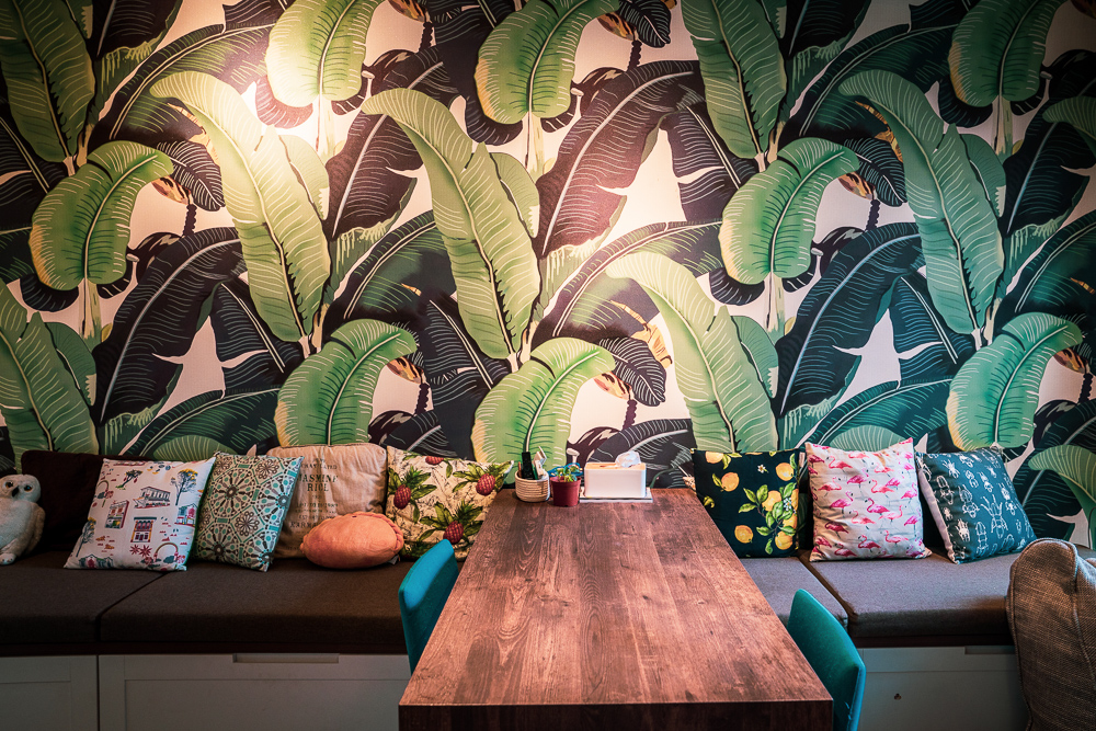
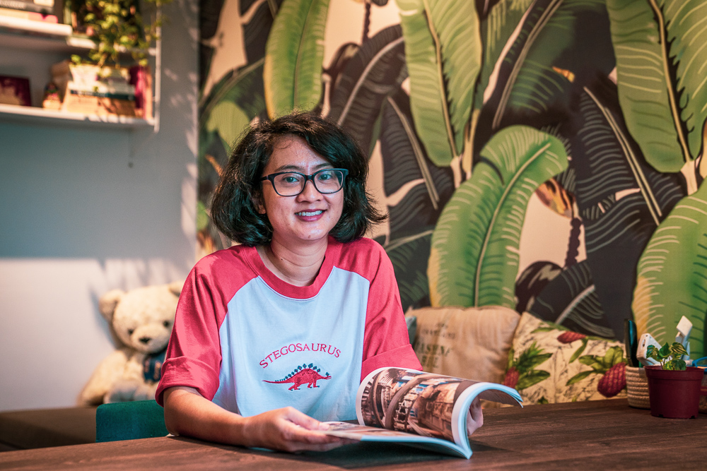
It was love at first sight for Yasmine when she chanced upon a banana leaf-inspired wallpaper. “The jungle vibe of the banana leaves called out to me,” the journalist smiles and continues, “In fact, the colours in the rest of the house are inspired by the wallpaper.”

Homeowner Yasmine

The colour green now takes centrestage in Yasmine’s home, which she bought after deciding to move to Toa Payoh to be close to her workplace. “I bought a resale flat here because I love the location – the MRT station is only a few minutes’ walk away and there is a lot of good food in the area. Plus, I can shop for most of my necessities and groceries within the neighbourhood! ”

“It is also convenient for my parents, who occasionally stay over to look after my son,” Yasmine adds.

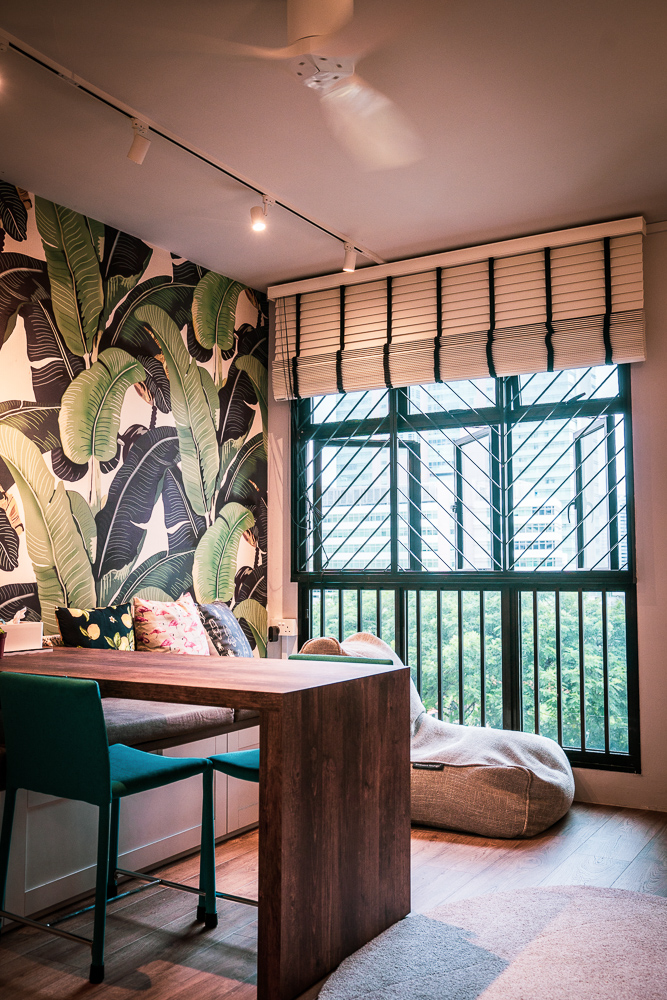
The colours of Yasmine’s home are inspired by the living room’s feature wall

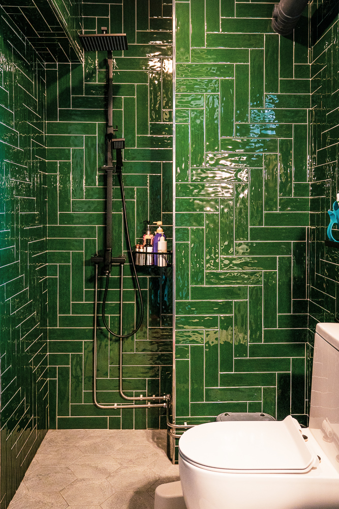
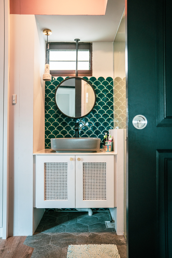
Green takes centrestage in the common bathroom

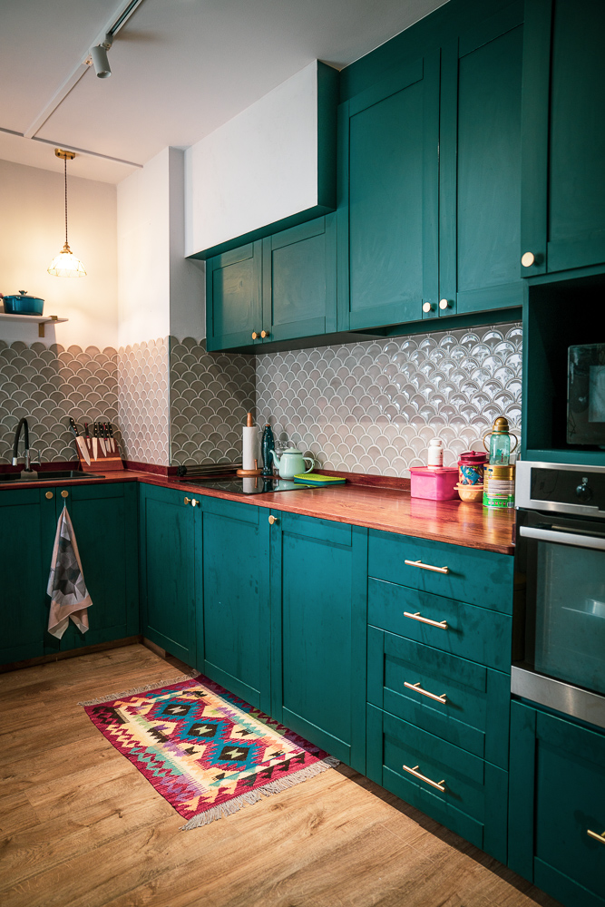
The seashell-inspired backsplash adds a pop of colour and texture

To optimise the space of her flat, Yasmine installed a sliding door for her master bedroom, and customised a sliding dining table. “Initially, I was sceptical about the concept of a sliding table in case some guests might find it uncomfortable. But it turned out fine and I really appreciate being able to shift the placement of the table to suit my needs!”

The living area, featuring the custom-made sliding dining table

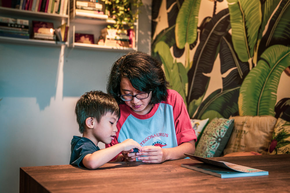
Yasmine spending some quality time with her son

While her home now resembles a tropical forest filled with lush greenery, Yasmine admits she has not always been an avid plant lover. “My passion for plants began only after I received a potted plant as a housewarming gift. Since then, I’ve grown the collection of plants in my home, buying them from the nurseries located around the area.”

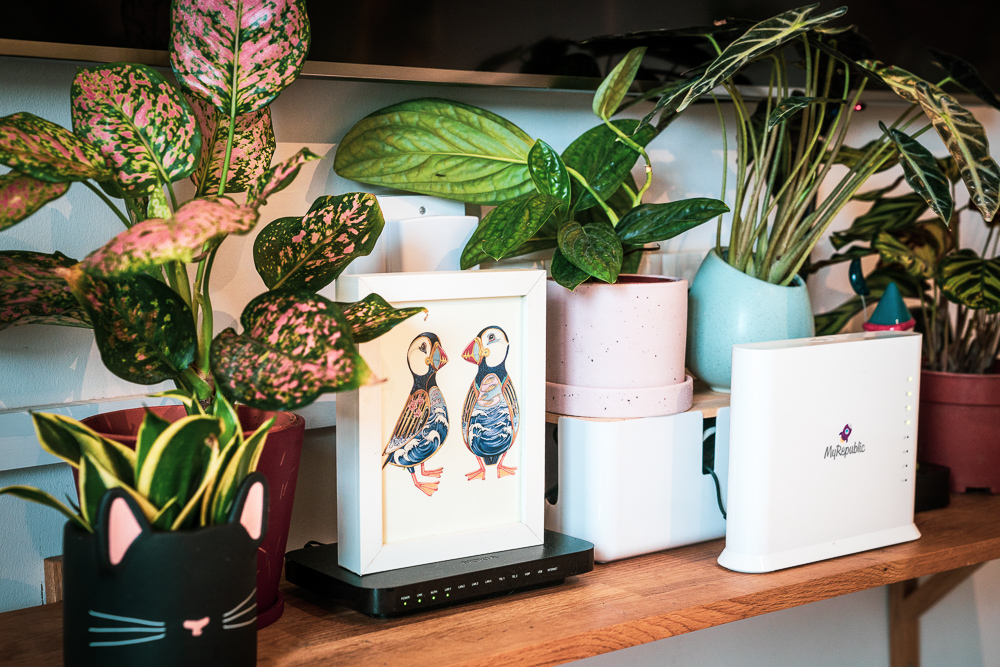
Some of the potted plants in Yasmine’s home

Recounting her renovation process, Yasmine emphasised the importance of close communication with the interior designers. “I discussed at length with my intrior designer, Three-D Conceptwerke what I wanted for the house– bright colurs, wooden accents and storage space. Once we agreed on the overall theme and design, the team got to work!”

“The renovation process was really smooth and this really made me realise the importance of engaging interior designers whom you can communicate and work with.”

Source: mynicehome.gov.sg
Home Tours: A Glamorous 4-Room Flat in Tampines

Home Tours: A Glamorous 4-Room Flat in Tampines

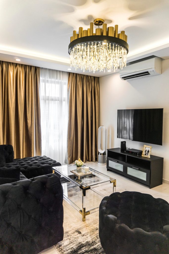
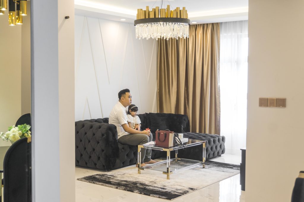
With its sleek, textured velvet couch and a golden-accented coffee table on a luxurious rug, we wondered if we had accidentally stepped into the home of Jay Gatsby. Did we also mention the sparkling crystal chandelier hanging from the ceiling?
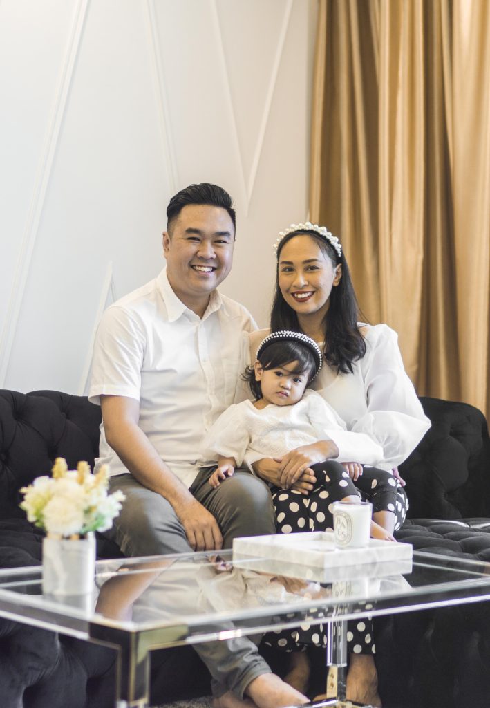
From left: Farhan, Fayona, and Yati

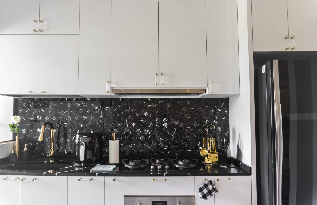
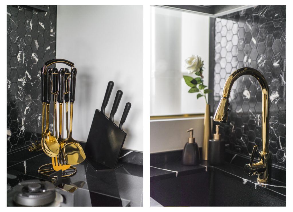
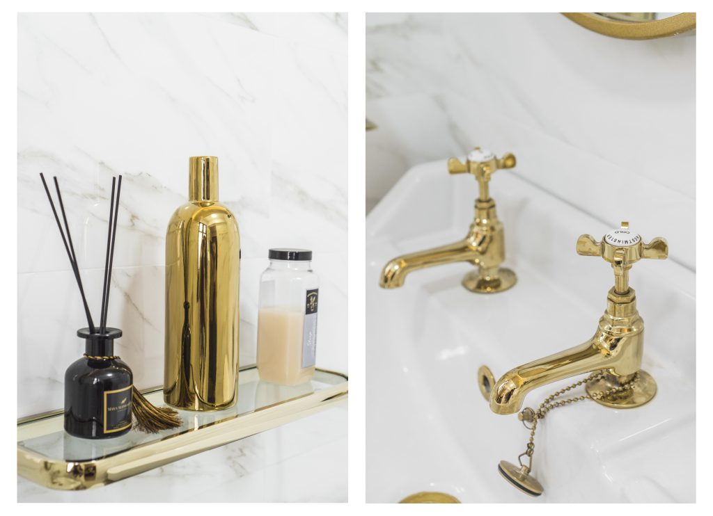
Yati and Farhan, owners of the 4-room flat in Tampines, explained that they were going for a modern luxe look with shades of white, black, and gold as the predominant colours. The dining table for instance, is made of pure marble, while the kitchen features a marble-mosaic backsplash and rose gold accents.

The kitchen, featuring a marble-mosaic backsplash

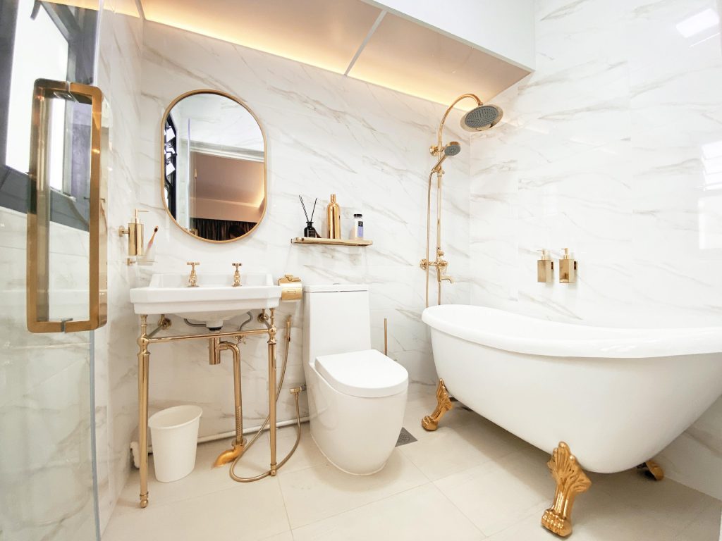
Adding to the glamorous vibe of the flat is the golden-accented bathtub in the master bedroom toilet. “It’s very good for relaxing in,” Yati laughs. “I really look forward to a nice soak – especially after a long day.”

The master bedroom toilet features a luxurious bathtub

Pops of gold that lend glamour

Yati meticulously picked out every piece of furniture and accessory, her keen eye for detail honed by her extensive experience in the fashion industry.

“We bought most of our furniture and accessories online,” Yati laughs. “I was determined to keep the theme consistent and would scour the Internet for the perfect piece.” Farhan agrees and says, “It took us a lot of effort, but it’s important to not settle.”

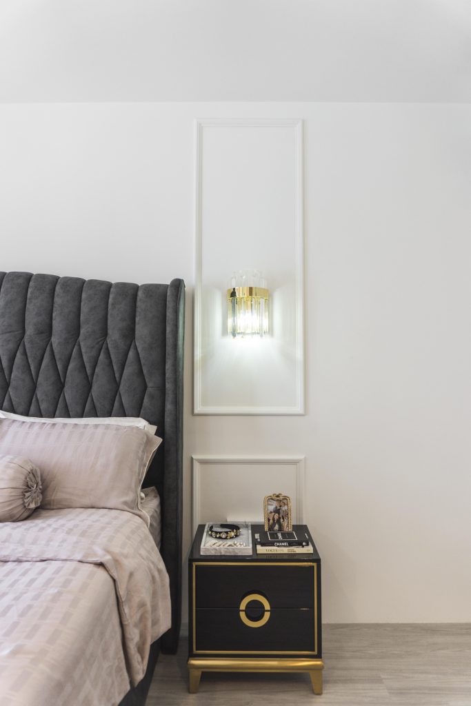
The modern luxe theme extends into Farhan and Yati’s rooms too. The master bedroom is plush and cosy, with an upholstered headboard and decorative wall panelling that would not feel out of place in an upscale hotel.

The master bedroom in shades of black, white and gold

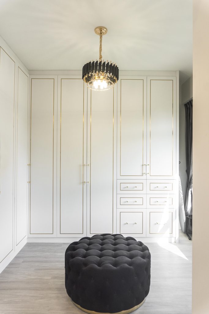
The couple combined the master bedroom with the adjoining common bedroom, converting the latter into a walk-in wardrobe. This sun-drenched space features floor-to-ceiling white, gold-trimmed cupboards and drawers, complete with a textured seat that matches the sofa outside.

“The walk-in wardrobe offers us more space. It helps to keep our clothes organised and makes it easier to pick out our outfits,” Yati shares. “It’s something we’ve always wanted.”

The couple’s walk-in wardrobe

Daughter Fayona having her mid-day snack in the walk-in wardrobe

“Our interior designer was PSD Studio. It’s important to engage interior designers that can work independently – for instance, our designers oversaw most of the renovation process and there were no major issues,” Farhan says.

The couple’s renovation took a little over 2 months before they moved in on 11 August 2019. “We remember the exact date as we had combined the Hari Raya Haji celebration with our housewarming party,” the couple smiles. “It was definitely a day to remember.”

Source: mynicehome.gov.sg