Month: October 2022

The White House

The White House

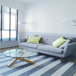
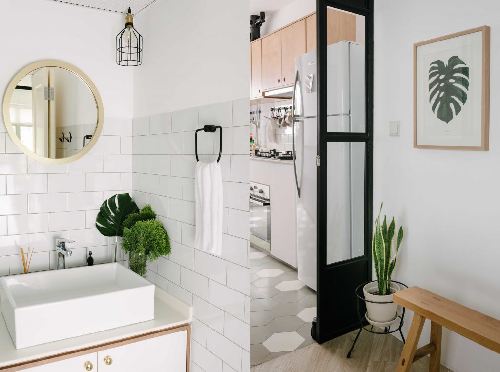
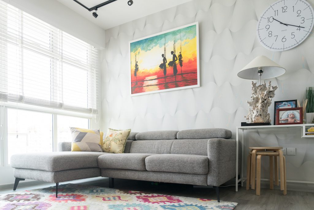
If there is one thing you would not find in Fiszuanie and Ashik’s 4-room flat in Tampines GreenTerrace, it is anything dark or woody.

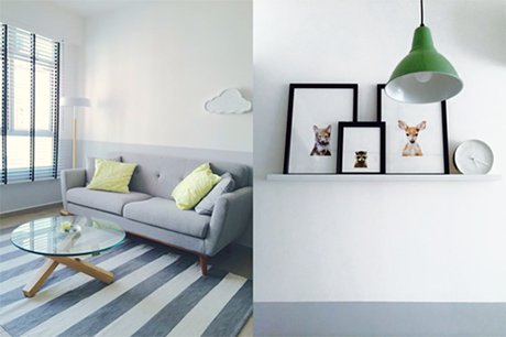
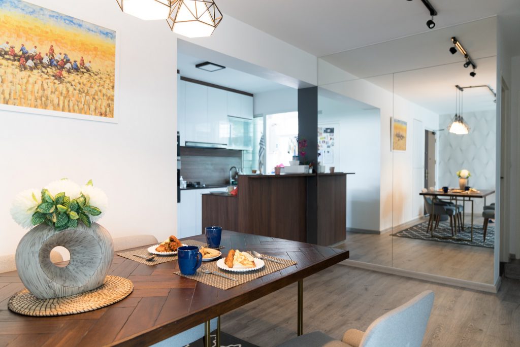
The couple designed their house with the idea of it being bright and spacious, which meant having lots of whites, with pops of colour to inject character.
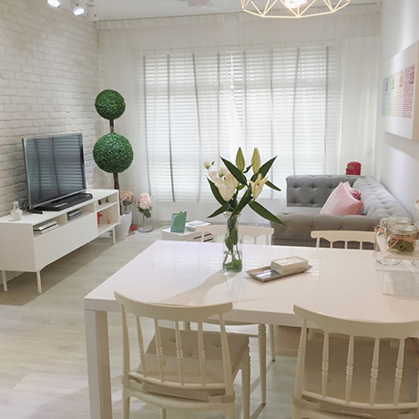
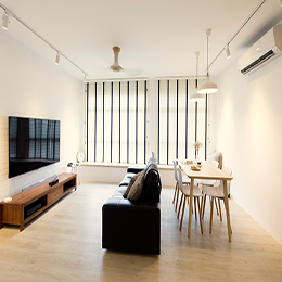
A clean, white space which greets the couple after a long day at work
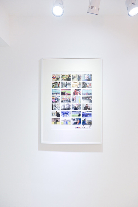
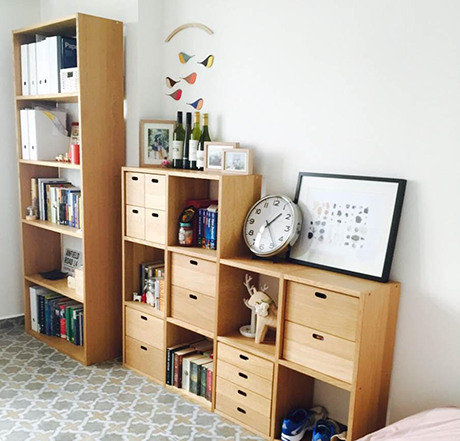
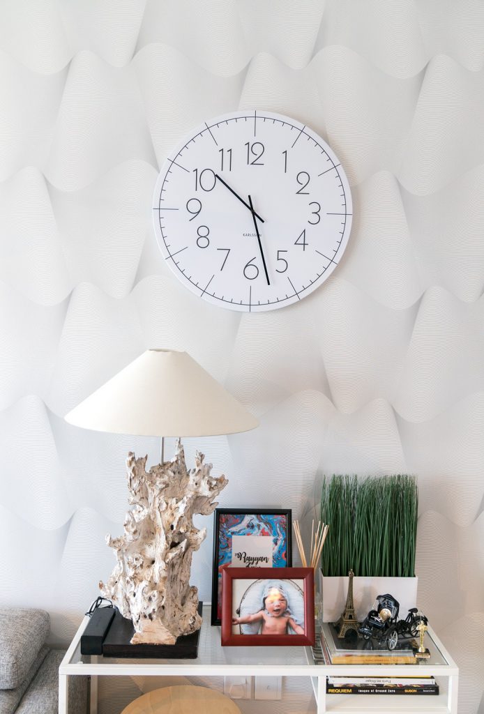
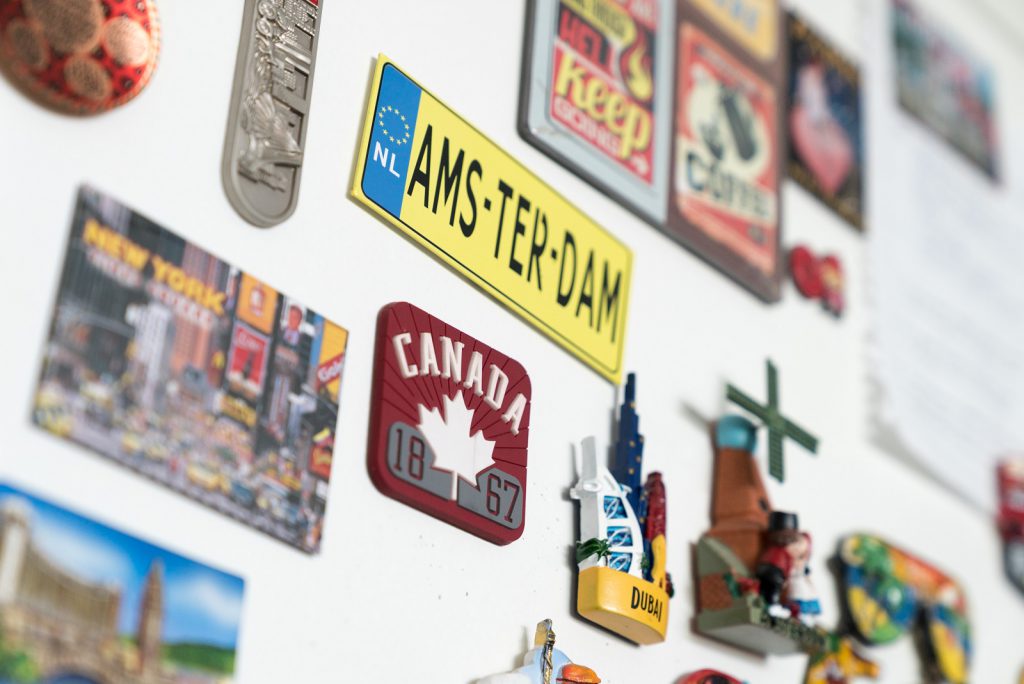
Framed up memories from the couple’s travels

Planning way ahead, the couple took the DIY route – from sketching out designs to sourcing materials and contractors to create their dream home. Doing so also meant overcoming obstacles and saving money
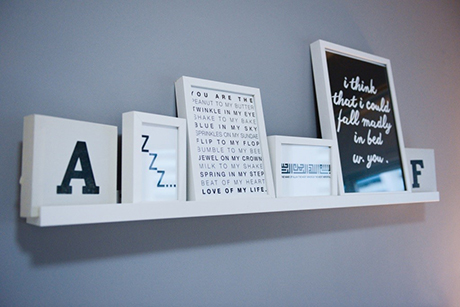
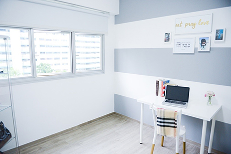
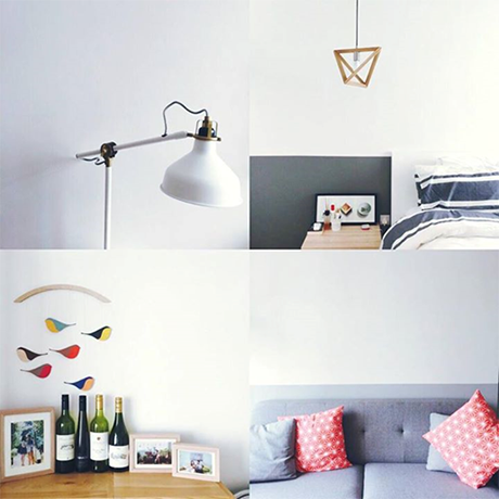
Varying shades of white are in every room

For example…

Fitting in a bathtub might seem difficult unless one resizes the bathroom. But this was not an issue for the couple as they found a portable, standalone bathtub which looks as good as a built-in one. “We saved more than half of what it would have cost to install a built-in bathtub, and don’t have to worry about having to hack any tiles if there’s any choke!” said Fiszuanie. But of course, the couple checked that fitting in the bathtub would be in line with HDB’s guidelines for bathroom renovation before making their purchase.

Perfect for a bubble bath

From the start, the couple wanted their walls to be white all around. But as their kitchen came with beige tiles, replacing them with white tiles would cost a lot. So they got specialists to paint over the tiles with four coats of paint.
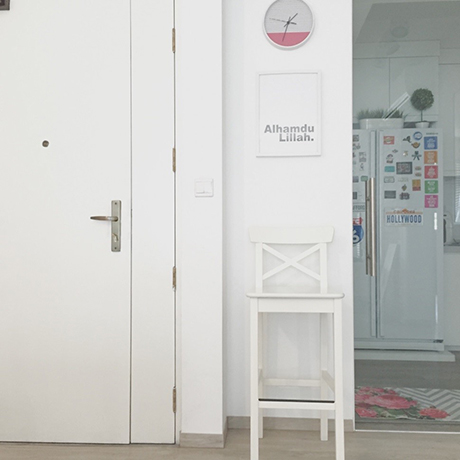
Out, brown spot – white paint took care of the original brown door!

The main door to their flat was painted over too – with six coats of paint. “We did this ourselves. It was tedious, but we couldn’t change the door, and didn’t want any browns at home!”
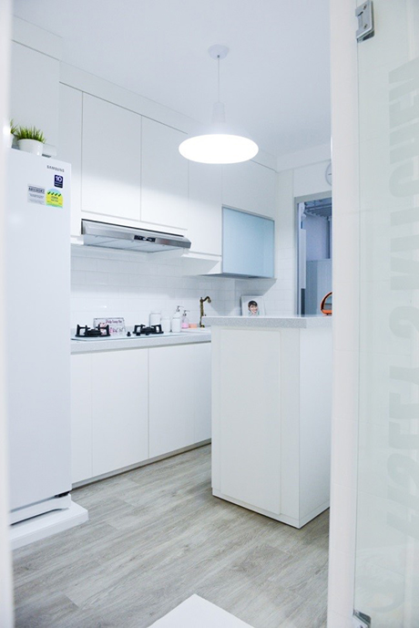
Realising the dream of having an island in the kitchen
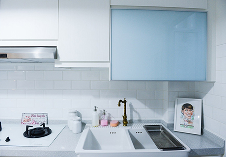
Planning in advance gave the couple much time to source for their dream fittings – like this vintage-inspired tap and farmhouse sink

But what is most impressive is the moveable island the couple designed especially for their kitchen.
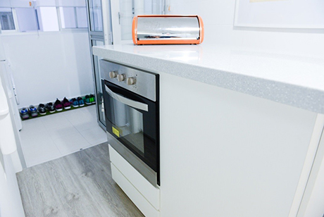
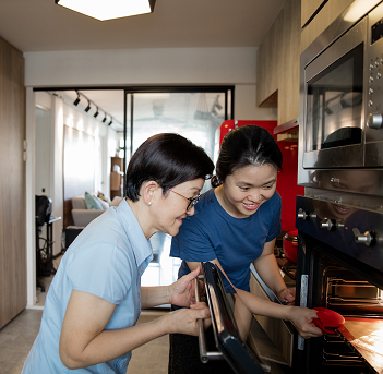
Built-in oven in a moveable kitchen island
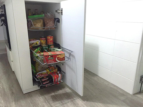
“I’ve always dreamt of having a kitchen island, but that would require me to have lots of space in the kitchen. I didn’t have that much space, but I was determined to realise my dream. So I designed one to fit in a dry cabinet and an oven, and found a carpenter to construct it!” said Fiszuanie. She shared how Ashik was sceptical of the idea at first, but then he chipped in with what she called the best idea ever – to make it moveable. “Now if I ever feel like having a change, I could always push it up against the wall.”
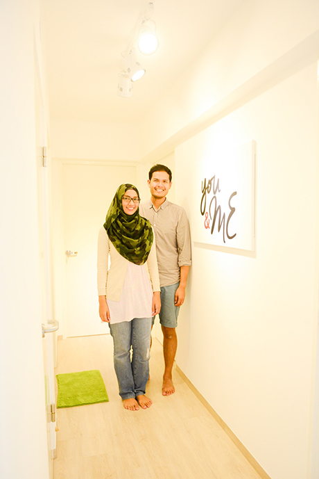
The ‘D.I.White duo’, Fiszuanie and Ashik

Looking back on their experience of designing their home and managing the different contractors they hired to execute their plans, they felt it was well worth the effort: “It was tiring. But at the end of the day, the satisfaction of seeing your dream home come to life is indescribable!”

Source: mynicehome.gov.sg

A Slice of Australia in Queenstown

A Slice of Australia in Queenstown

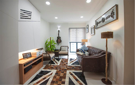
Lester and Lydia live in a 4-room flat at SkyTerrace@Dawson with their 2-year-old son. Their cosy space is an eco-lover’s dream, inspired by the homes and cafes in Australia where the couple lived during their university years.

They embraced organic materials in a big way, from the oak table in the dining area to the vintage leather sofa, rattan seats, and driftwood lamps in the living room. Old mirrors were given a new lease of life, lining the living room wall to reflect light into the area.

The family’s television is tucked away in a specially designed cabinet, safely out of their son’s reach – like most of the other electronic appliances such as tablets and mobile phones.

The living room oozes casual charm

A Home for Family

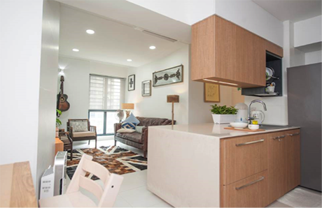
A family that eats together, stays together. This explains why Lester and Lydia love their kitchen and dining area the most. They opted for an island counter top in the open concept kitchen, deep enough to prepare dough for pastries and bread. Twice a month, it doubles up as a buffet table when family and friends come over for dinner parties and get-togethers.

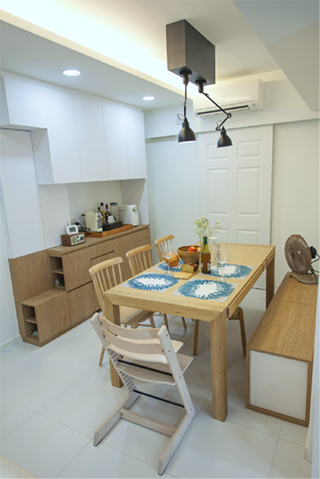
To recreate the experience of dining at communal tables which are commonplace in Melbournian cafes, the couple paired a large 8-seater oak table with wooden chairs and a custom-designed storage bench.

“We do lots of things around this table, besides having meals together. We play the guitar, draw, do jigsaw puzzles, and host imaginary tea parties with our son. The subtle scent of natural oak from the table also lifts our mood”, Lester and Lydia said.

A view of the kitchen and living room from the dining area

Inspired by Australian cafes

Luxe for Less

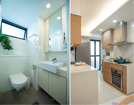
For a touch of luxury at home, the couple cleverly used materials which looked far more expensive than they actually were, like the solid surface kitchen counter top which easily passes off as stone.

To mimic the appearance of marble for their kitchen backsplash, they opted for large slabs of homogenous tiles with a vein finish similar to the real deal. Not only was it more affordable, it is also easier to maintain – two thumbs up in my book!

In the master bedroom bath/ toilet, a ‘mother of pearl’ mosaic on the vanity countertop completes the look, a space which will not look out of place in an upscale hotel.

Small but impactful touches which add to the overall look

Organic Home, Organic Process

The couple, who designed the flat themselves, said that the entire design process was fairly organic. They started out with the intention of making the kitchen and dining area the heart of their home, and with good ideas and planning, the other aspects fell into place

.“Our completed flat turned out 90% of the way we envisioned. But what mattered more was that we designed a home which could promote family unity”, they said.

Know of other well-designed HDB homes that we can feature?

Source: mynicehome.gov.sg
Soothing Shades of Grey

Soothing Shades of Grey

At Home with Julian and Dawn

You can often tell a couple’s personality by the way their home looks. And for Julian and Dawn, their tastefully-decorated space speaks volumes about their chic and minimalist style.

Soothing grey tones dominate the 4-room Costa Ris flat, accentuated by pops of colours from their accessories. The home is cosy, comfortable, and functional – just as the couple had envisioned it to be.

Cool grey tones that soothe and relax

A Home Takes Shape

After hours of poring through Pinterest and online resources, Julian and Dawn found themselves gravitating towards a Scandinavian decor style for their home. With some ideas in mind, they engaged an interior designer whom they credited for bringing their concept to life.

Julian and Dawn stressed on the importance of chemistry when choosing an interior designer to partner as that may just be the key to making a potentially stressful experience, enjoyable. They said their designer was invaluable throughout the whole process – from crystallising their vision through mood boards, to picking out paint swatches and navigating the extensive tile warehouse with them.

It was about four months before the couple moved into their home, but not before having to clean up the onslaught of dust that inevitably comes with renovations.

“We rounded up some friends to help us clean up, and hosted a pizza party on the newly-cleaned floors to thank them afterwards”, they said. “But the dust was everywhere, and it took many rounds of cleaning over several weekends before it finally went away.”

Pretty details for a cohesive look

Scandinavian with a Twist

Although Julian and Dawn’s home was predominantly inspired by the clean Scandinavian style, they avoided it looking clinical by incorporating different patterns and textures. A look around the flat revealed hexagonal toilet floor tiles, cement screed walls in the kitchen and toilets, and retro-patterned flooring in the rooms.

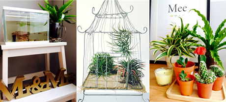
They consciously infused their living space with personal touches like favourite artworks, books, photographs, and memorabilia. Indoor plants, the couple’s new hobby, also dot the flat for added colour to rooms and counter tops.

To ensure a cohesive look for their home, Julian and Dawn were very disciplined when it came to selecting furniture. Anything that did not match the overall theme was a no-go, even if it looked great.

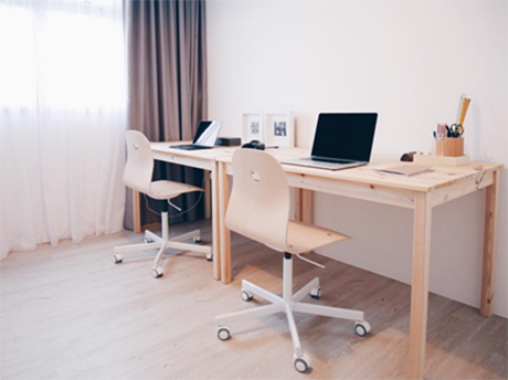
The use of wood and patterned tiles lend warmth to the study

New home, new hobby – indoor plants!

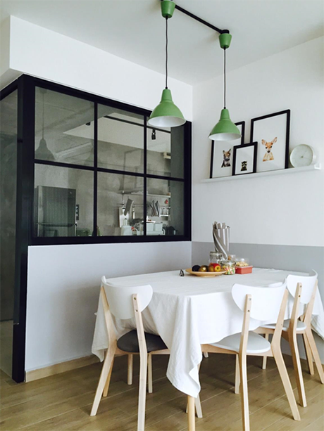
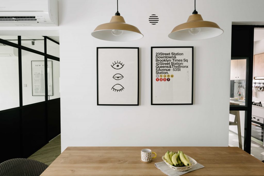
Since moving in in April 2015, the dining nook remains the couple’s favourite part of the home. With its hanging lights, photo frames, and light wood table set against black-framed kitchen doors, they have had friends and family remark that the area looks like part of a hipster café. They also let on that they have invested in a coffee machine, with the aroma of a freshly brewed cup adding to the café-like setting. Good food, good coffee, and good company – what is there not to love?

Hipster café right at home

Home Sweet Home

Julian and Dawn said that the journey from bare flat to home sweet home had been a challenging but fulfilling one. Besides sticking to a clear décor theme and choosing the right interior designer, they said a sense of humour is essential to keep the stress of home-building at bay.

Source: mynicehome.gov.sg

Back to Basics

Back to Basics

At Home with Jane and Davier

Stepping into this 5-room flat located in Tampines, gives you a sense of calmness – maybe it’s the white walls, or the earthy tones. This Scandinavian and minimalistic decor makes Jane and Davier’s home a cosy haven tucked away in the eastern part of the island.

Love for All Things Simple

“We were quite clear from the start on how our dream home should look like,” said Jane. “It definitely helped that both of us had similar tastes in furnishing our new flat,” added Davier. Having collected their keys in 2015, the couple shared their quick and interesting transformation of their BTO flat. “We started renovations in October last year and we were quitekiasu– checking the progress of our renovations almost daily. It was rather cool to witness the bare flat morph into our ideal home in just a few months!”

Making plaster look like a brick wall feature can save some money

Neutral tones never go out of fashion

Bomb shelter door cum photo wall

Getting Into the Design

Even before getting their keys, the design-savvy couple started planning the look of their new home by Pinterest-ing minimalistic interior design ideas. They also used Google SketchUp (it’s free!) to make their dream home come to live in 3D format so that they could play around with the space and plan the furniture.

Jane added that they did not want to have too many decor elements in their house, just simple evergreen ones that can be shifted around to instantly refresh the design.

Shelves with fuss-free and easily changeable decor pieces

The duo, who confess to being TV addicts, also put in a lot of time and effort to ensure that their living room turned out to be exactly as they envisioned it to be.So their dining table is just behind the sofa, and they hacked a wall off their kitchen so that they can interact or catch up on their favourite drama series while whipping up a meal.

Window seats let more guests lounge around the living room while multi-tasking as a storage option too

Open-kitchen concept – breakfast bar also doubles up as additional cooking or baking space

No Renovation Blues

Though the couple enjoyed shopping for the furniture (from picking out a wooden ceiling fan to complement theirau naturelhome, to finding the right dining table), they were happy to pass the bulk of the renovation planning to their trusted Interior Designer (ID).

Davier said that amidst their busy work schedules, they were thankful to have someone coordinate all the renovation works. The key is to do a lot of research and speak to IDs and contractors so that you can engage someone whom you are comfortable with, he shared.

Here are more shots for you to feast on Jane and Davier’s design ideas ?

Creative use for a coat stand

Small white side tables paired with a mirror stand for that minimalistic vibe

Wood, and more wood everywhere!

Adding a pop of colour and a local flavour to the home decor

Source: mynicehome.gov.sg
Industrial Love

Industrial Love

At Home with Jenny

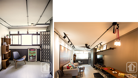
Jenny’s 3-room flat in the Havelock area stands out from the units next to hers. From the vintage-looking door to the Andy Warhol-inspired Campbell Soup poster that peeked from behind it, we knew we were stepping into a rather chic home!

Exposed pipes and pendant lights are the signature elements of this style

“I wanted a modern industrial look but something that is easy to maintain, so that was the direction for my interior designer,” said Jenny.

Soft elements like cushions break the hard industrial look and lend a cosy finish

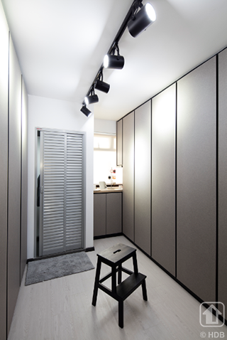
There was another constant in her home besides the theme – cupboards and more cupboards! With a laugh, Jenny explained that storage was another aspect that she emphasised to her interior designer. She chose a complementary shade of grey for her carpentry works so that they would blend right into her home decor.

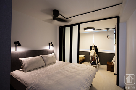
To make space for the additional storage space, she hacked a wall from the rooms so that she had just one large space to plan her bedroom area and walk-in wardrobe.

Walk-in wardrobe area next to the bedroom provides ample storage

Sleek lines and a simple silhouette for the bedroom with a foldable partition door that separates the guest room

Jenny made sure that every item of furniture and home furnishing, no matter how small, would fall right in place within her bigger home canvas. She found what she wanted either in online marketplaces or by browsing through items in local stores. By hunting down bargain deals on her furniture and fixtures, she managed to save quite a tidy sum, spending just about $40,000 on all her renovation.

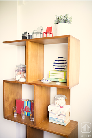
A mishmash of collectibles and books

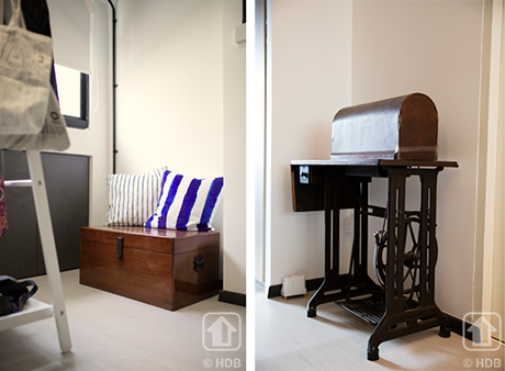
Having lived with her parents and late grandma all her life, Jenny made sure to bring along a little bit of the familiar and fondness. Two items – a re-varnished chest, and a Singer sewing machine – that used to belong to her grandma now take pride of place in her cosy abode. Jenny said, “I grew up under my grandma’s care and was really close to her, so nothing spells home more warmly than having these memories of her in my flat.”

An avid cook, Jenny also paid special attention to her dining area and kitchen. Her fully functional kitchen is where she de-stresses by cooking or baking whenever she has time.

Metal surfaces and wood finishes give an edgy vibe

A drop-leaf table gives Jenny the flexibility to maximise space when she is not having guests over

Now that she has her own space, Jenny is looking forward to inviting her friends and family over for mini gatherings and showing off her bachelorette-pad.

Source: mynicehome.gov.sg
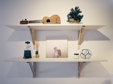
Dare to Be Different

Dare to Be Different

Daring to be different, a fusion of styles was the look that Nizam and Fazlin were going for. In less assured hands, it can turn out very wrong. In their case, the mix of Scandi, vintage and industrial styles flows effortlessly from one room to the other, making their 4-room flat quite the charming abode.

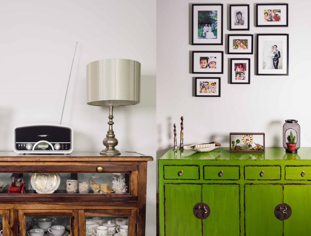
Keeping customised cabinetry to the barest minimum allows them to mix and match and be creative – and also rein in renovation costs. “We didn’t want to have a lot of built-in cabinets around the house so we have interesting cupboards like these for the living room,” says Nizam.

(Left) An antique wood and glass cabinet to store mum’s and grandma’s chinaware (Right) The moss green ‘vintagey’ chest sets off the family’s framed shots perfectly

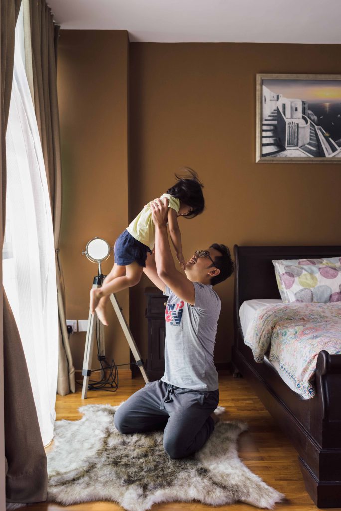
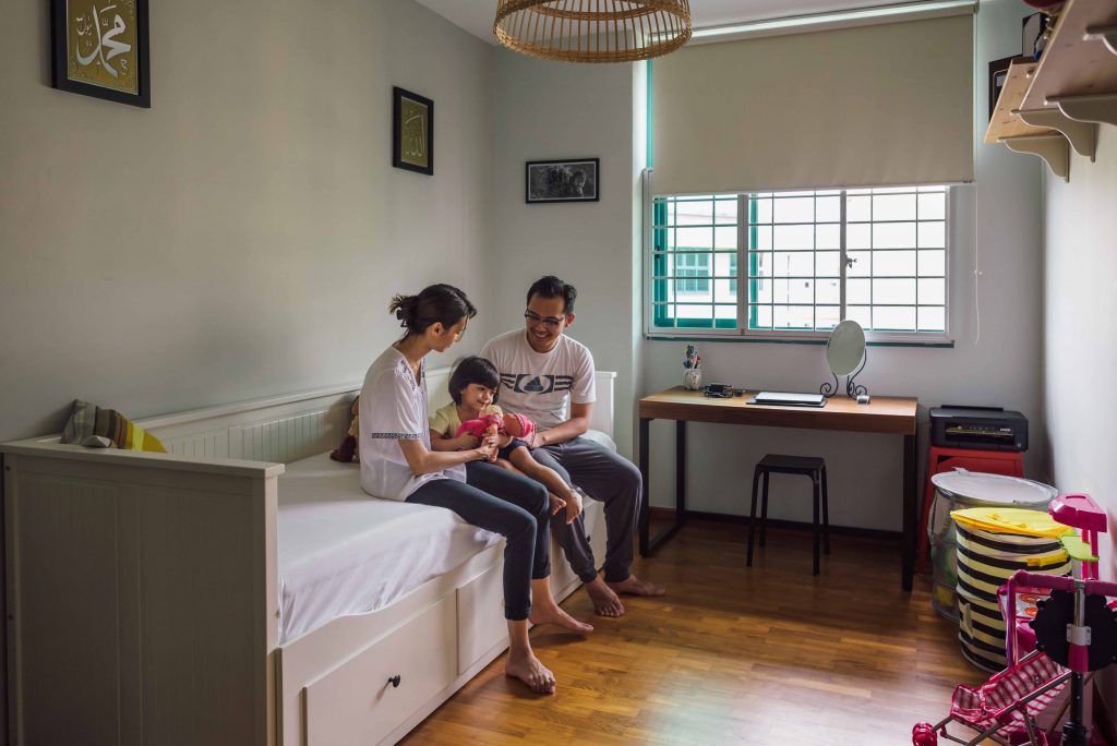
The couple have a 2-year-old daughter Maya, who was born when they just moved in. Hence they made a conscious effort to have lots of free space for her to run around and play as she grows up.

Daddy’s girl! A rug adds to the cosy space

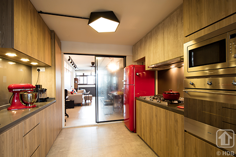
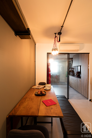
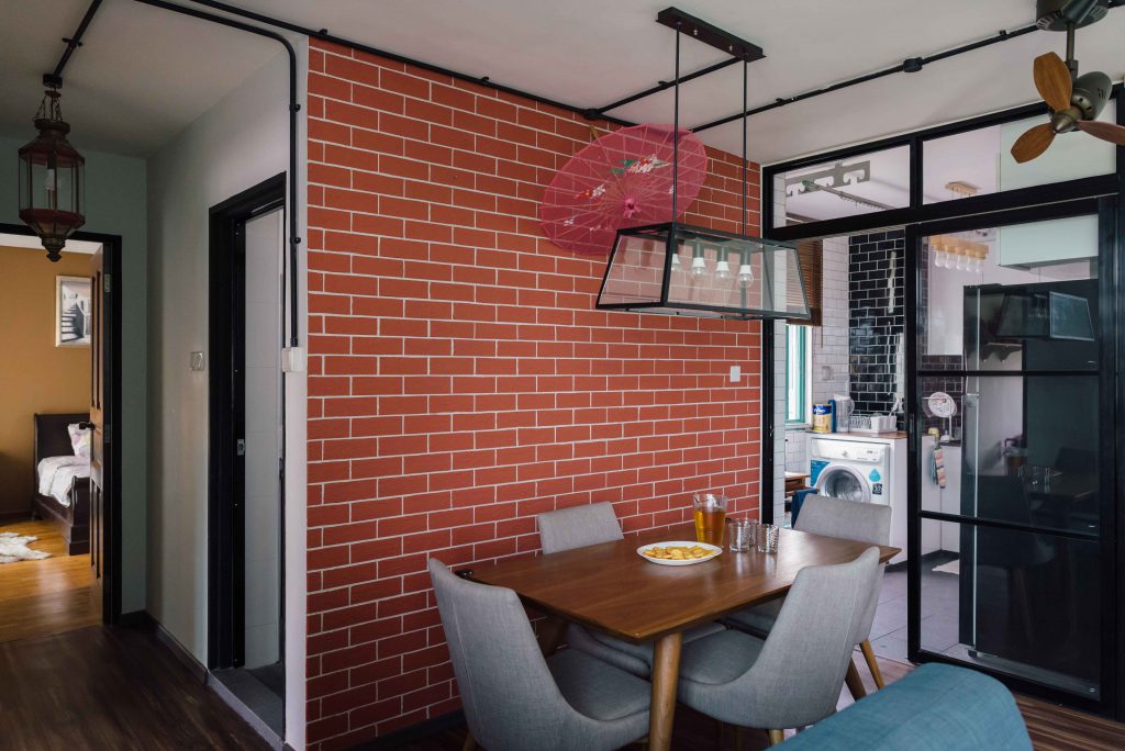
The dining area is Fazlin’s favourite. With its fire-engine red brick wall and unusual pendant lighting, it is the industrial chic corner of their home.

Bringing the cafe concept right to their dining space

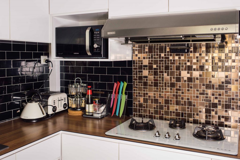
The brick-wall design also continues in their kitchen but is given a twist with monochrome, glossy tiles. Coupled with a gold and bronze backsplash, the kitchen looks fabulous!

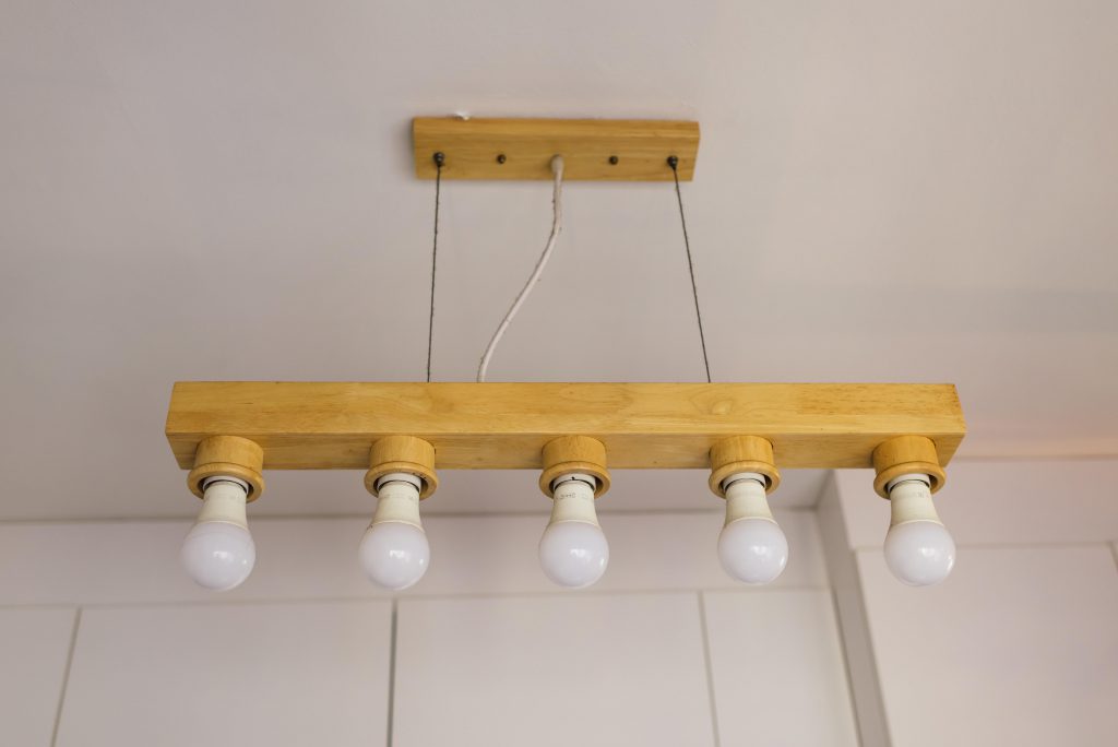
The kitchen spots a modern industrial look complete with hanging pendant lights

The couple has also displayed their travel mementos around their house, including some art pieces from their honeymoon in Greece. Some Scandinavian touches to their bedroom like the earthy browns and a furry rug, remind us of the ‘Hygge’ style (the art of creating intimacy).

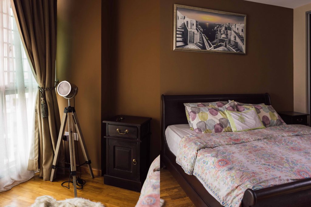
Spotlight, furry rug and a painting of Santorini in the master bedroom

One of the rooms has been converted into a guest room for their relatives and doubles up as a play room for Maya

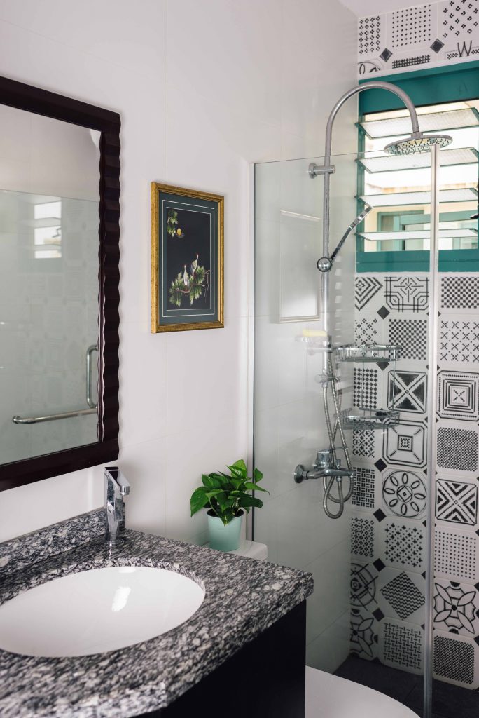
The patterned wall tiles complement the mottled granite vanity top

“Our relatives were the first to visit and they did not quite know what to say initially to our fusion style! But they all thought that the decor was nicely done up, and that our home had interesting and quirky furniture,” says Fazlin.

“Our cosy home is perfect for us, reflects our personalities and what we both love! Though it doesn’t look right out of a showroom, we like it this way,” adds Nizam.

Source: mynicehome.gov.sg

Sanctuary in Simplicity

Sanctuary in Simplicity

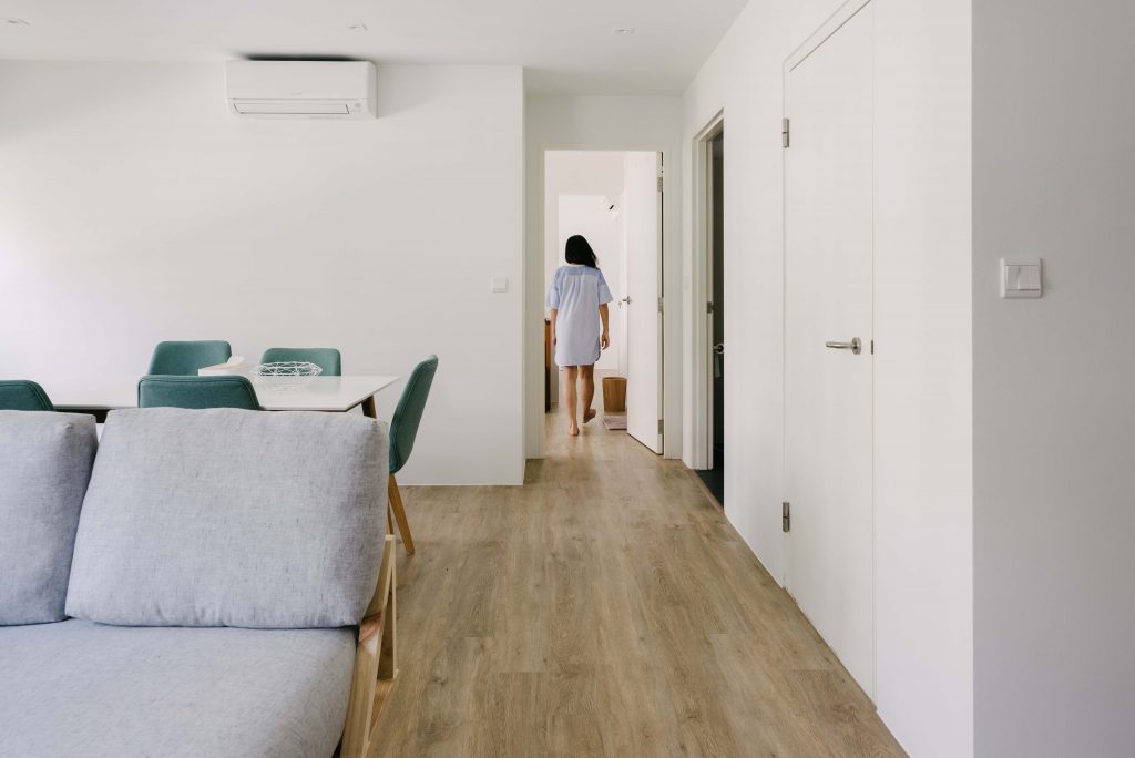
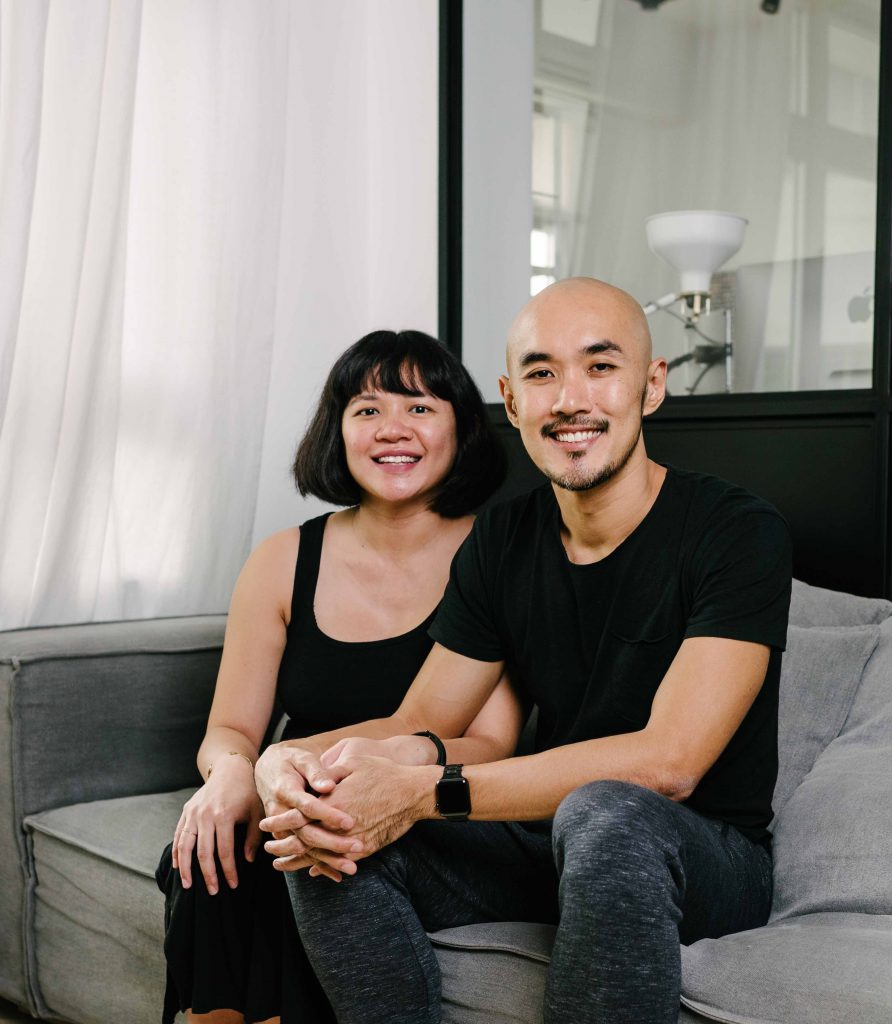
Alicia and Gabriel’s 4-room flat in Bedok is a modern minimalist haven. From the clever crafting of space to the mindful choice of statement furniture, their home perfectly exemplifies the concept of “less is more”.

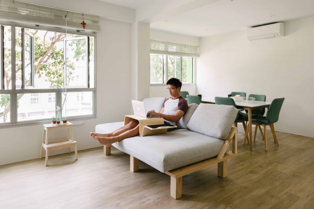
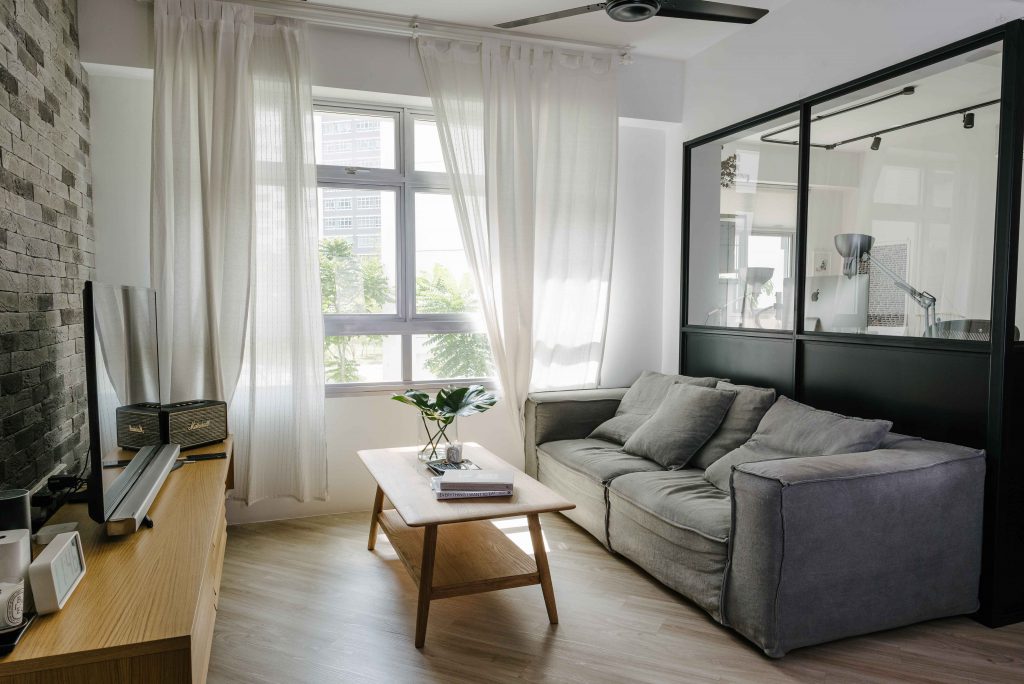
Stepping into the bright and airy flat makes one feel at ease instantly. The peaceful atmosphere is enhanced by the vibrant green of the tree canopy outside the windows, echoed by the pleasing hints of green woven throughout the interiors.

Marrying their love for different design styles, the couple achieved a clutter-free and clean look for their home. “I like the Scandinavian style, while Gabriel is fond of the Japanese look, so we tried to mirror both of them in our overall concept,” Alicia said.

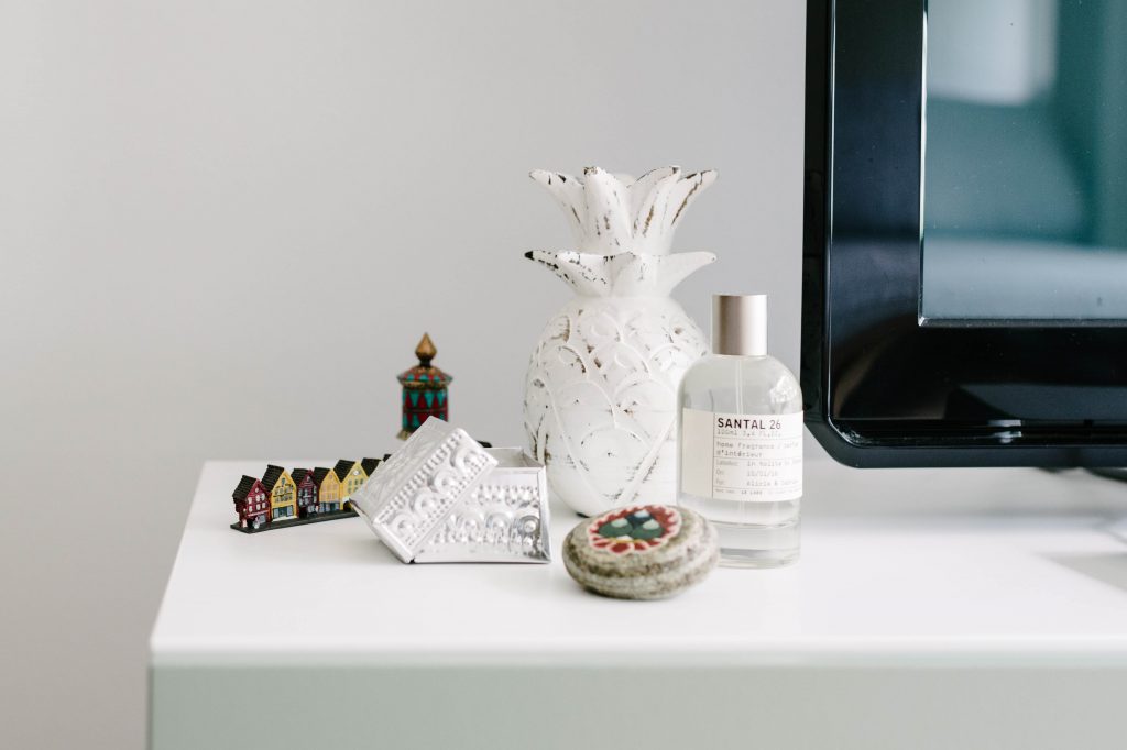
They also selected or customised furniture made of natural materials, including wood, to complete the appeal. Their sofa, for instance, is custom-made by a friend, as Gabriel wanted a sofa with a deeper seat. Gifts from friends and travel mementos decorate small corners of their home, breathing life and personality into their minimalist home.

As the co-founder of an e-commerce business and a freelance writer, Alicia works from home most of the time. “We wanted our flat to be functional and spacious, and also a comfortable working space,” they explained.

The couple roped in another friend who works as an architect to come up with the plans for their home. By hacking a wall from the rooms, they divided their flat into two key spaces – the living and dining areas, and the couple’s bedroom and walk-in wardrobe.

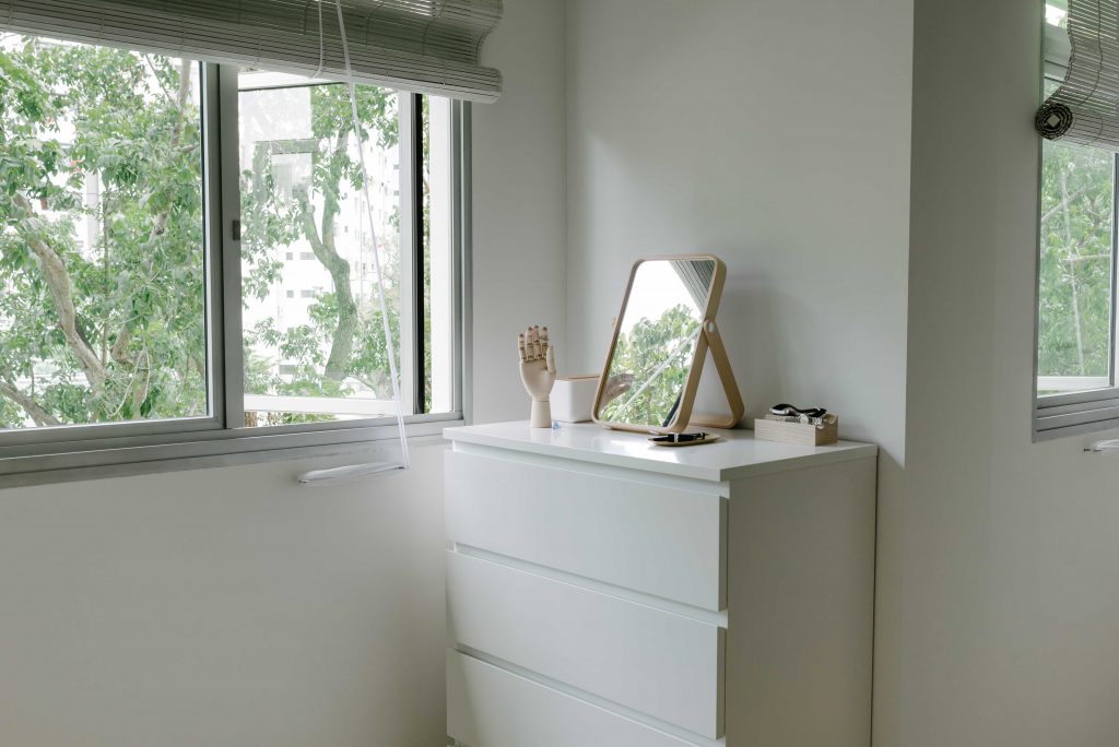
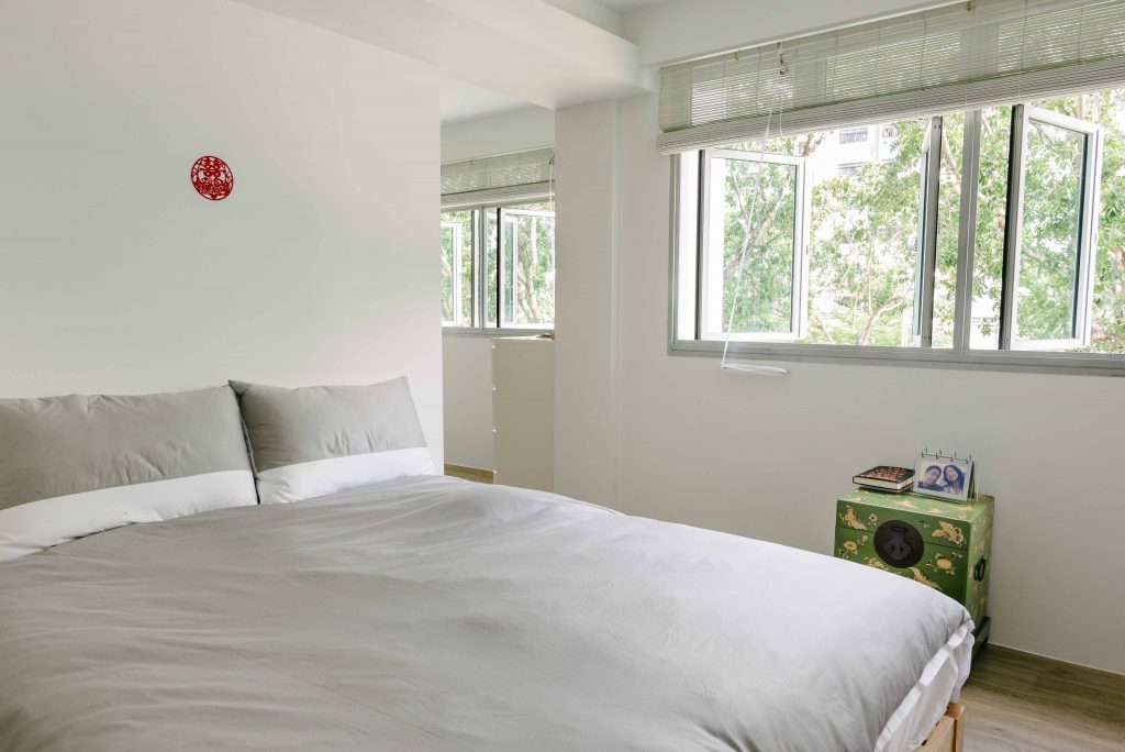
The couple’s bedroom reflects the same pared down aesthetic. A seamless combination of simple lines and neutral colours evokes a sense of balance. The antique green chest which is used as a bedside table adds a fun pop of colour that goes well with the quiet colour palette of whites and greys.

Having moved into their flat only a few months ago, Alicia and Gabriel will be spending their first Chinese New Year in their new home. We wish them all the festive best!

Source: mynicehome.gov.sg
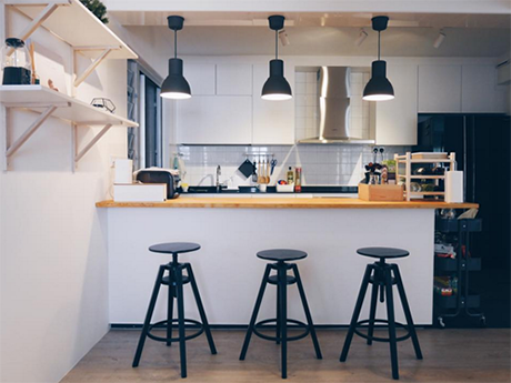
A Nordic Haven in Anchorvale

A Nordic Haven in Anchorvale

As creative professionals, Ben and Melly had a clear vision of their ideal home. Luckily, both share the same sense of aesthetics. Looking at their flat, decorated in a monochromatic colour palette, it is clear what that style is.

Late morning light filtering through the curtains paints the flat in a soft glow

“I originally wanted a flat that was all white,” Melly said. “Both of us do not really like colours, which is why black, white and grey feature strongly within the design,” Ben added.

Art prints that reveal Melly’s love for New York

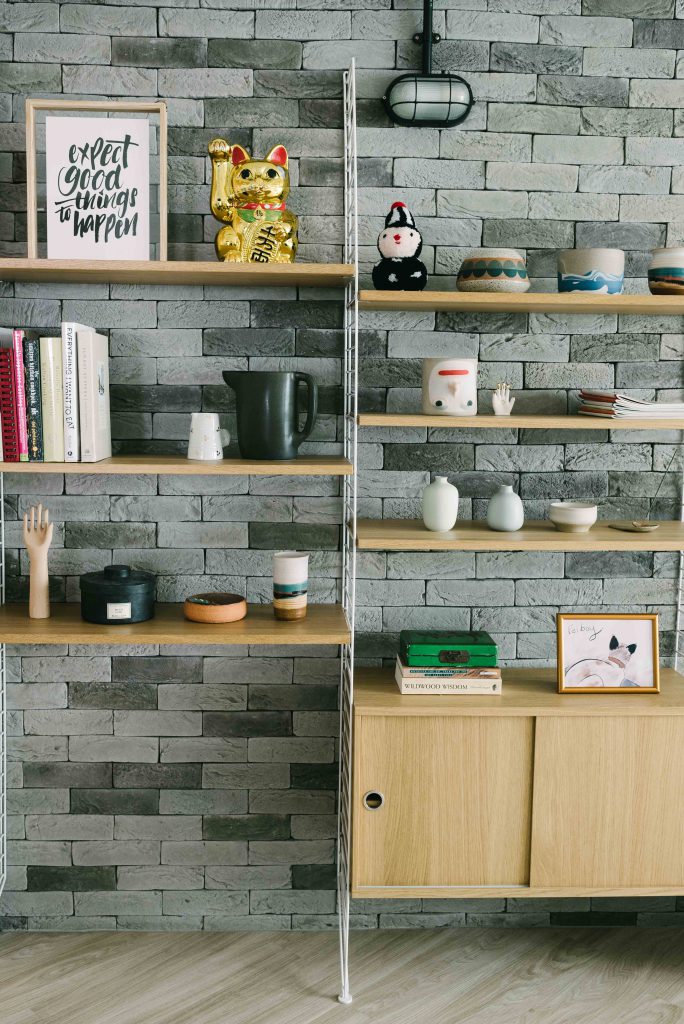
Open shelving showcases the couple’s favourite ornaments and travel souvenirs

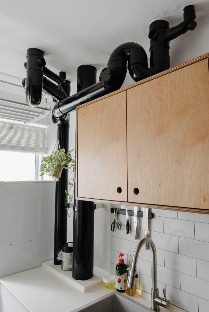
A pleasing ensemble of grey and wood elements evokes warmth and consistency in the design. From light fixtures to floor finishes and tiles, the couple were heavily involved throughout the design process. The exposed wiring and pipes in their flat are a nod to the industrial theme, adding a chic and edgy touch to their Scandinavian interiors.

Exposed black painted pipes in the kitchen are a unique focal point

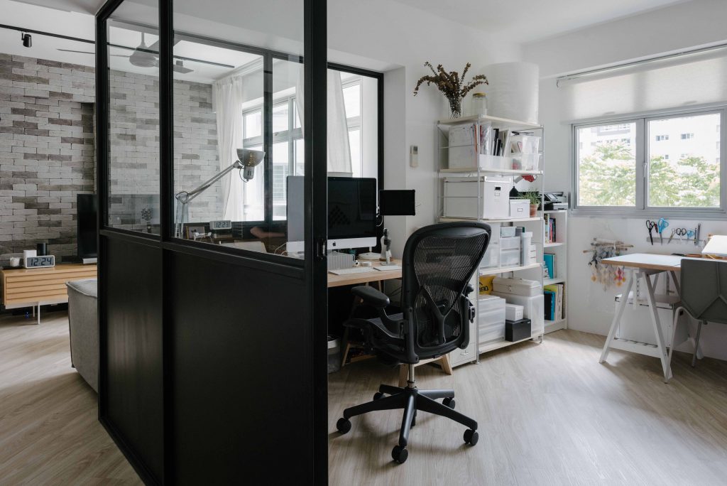
Being an app developer and artist respectively, Ben and Melly work primarily from home. A comfortable work space was definitely on the top of their priorities – their glass panelled office embodies the balance of functionality and style that Nordic design is famous for.

In carving out a specific spot to work, they also wanted the space to be open. “We had to knock down some walls, but it is great to see what is happening outside of the room instead of just staring at walls,” said Ben.

The use of glass panels makes Ben and Melly’s workspace feel airy and open

By choosing a flat in a non-mature estate, the couple was able to buy their flat at a relatively lower price. This allowed them to spend more on their flat renovation, which came up to about $60,000.

Houseplants and leaf cuttings bring nature into the home

Since moving into their new home in 2014, Ben and Melly have caught up with old friends and found new friends in their neighbours living in the same estate. “The car park is a great place to meet new people,” Melly joked. They are also fond of the Sengkang Riverside Park near their home, where they often head to for exercise.

Ben and Melly shared that they are currently expecting a baby and will be transforming one of the rooms into a nursery. We wish the lovely couple and the newest addition to their family every happiness!

Source: mynicehome.gov.sg
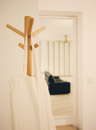
Industrial Loft Chic

Industrial Loft Chic

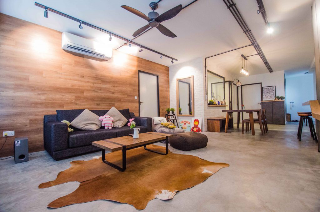
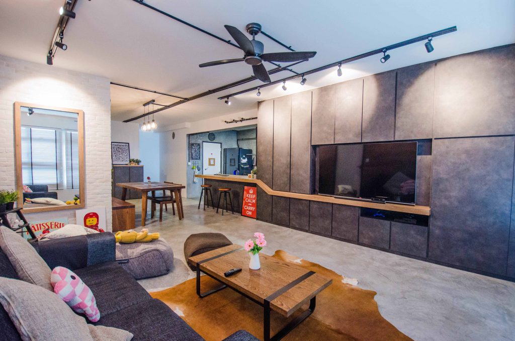
If you thought industrial is all about dull greys and blacks, here is a home that might get you to fall in love with the style. Hong Yang and Shu Yan’s 5-room flat at Fernvale Riverbow is designed around the industrial loft concept. They have taken it to a new level of chic with injections of their personality and art.

Straight out of a home decor magazine!

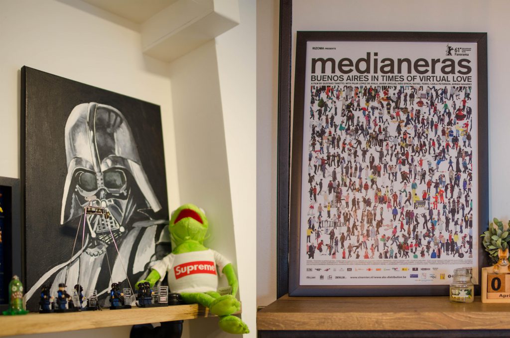
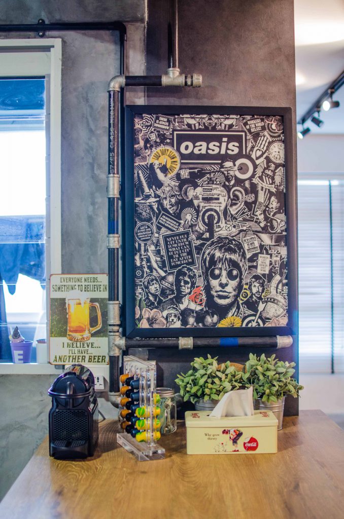
Curated art pieces and decor make for interesting details around the home

Both of them graduated with a degree in visual communications so they put their artistic skills to good use and painted some cool artworks for their home. “That was before we moved in, not much time now,” laughed Hong Yang.

Removing some walls let the couple design their dream home and install a breakfast counte rtop. “The open-kitchen concept is great for us as we often have friends over for drinks.”

Could pass off as a cafe wall!

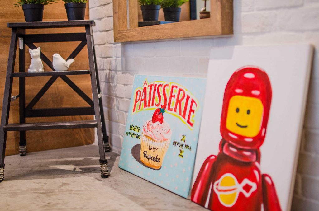
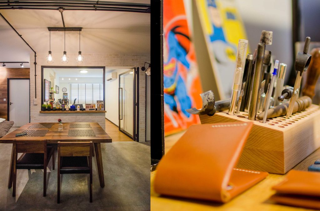
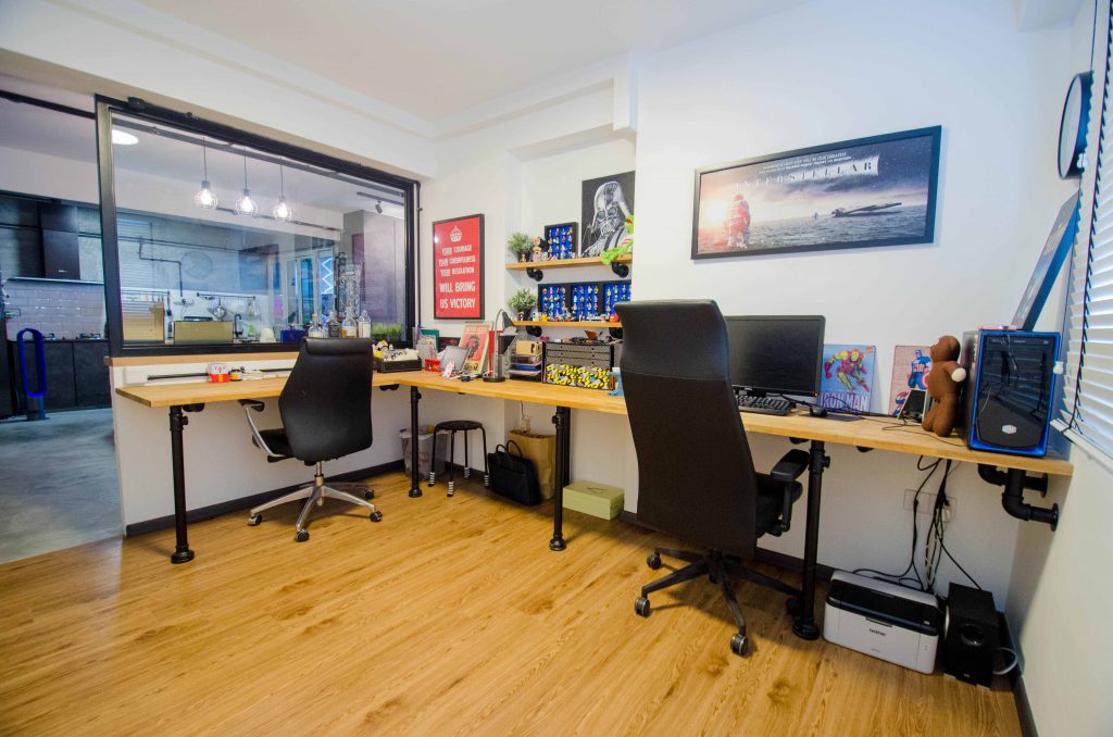
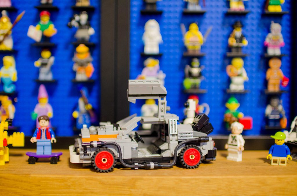
By using a glass wall and door for their study, they have also cleverly managed to make the space look airier. The study houses their Lego mini figurine collection and is where Hong Yang pursues his other hobby of leather crafting.

(From left) Dining area has a clear view of the study, and Hong Yang’s leather crafting tools

Trading the usual table legs for pipe stands to stay true to the industrial theme

Pops of colour and fun!

Even with wide open spaces, they have managed to conceal the storage spaces – plenty of them in fact! The entire TV console is a cabinet that spots the concrete screed finishing. We also like how the breakfast counter top extends all the way to the TV console – elongating the space and uniting the different areas of the home.

Shades of greys and browns get an uplift with clever use of textures, materials and finishes

For their feature wall, they opted to use vinyl floor finishes to achieve a totally different look, which also matches the rest of their wood decor elements and furniture for seamless continuity.

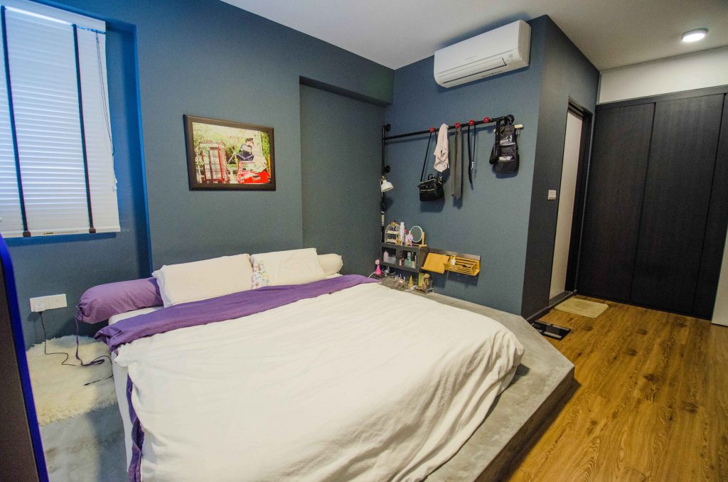
Industrial pipes make a functional appearance in the bedroom as well

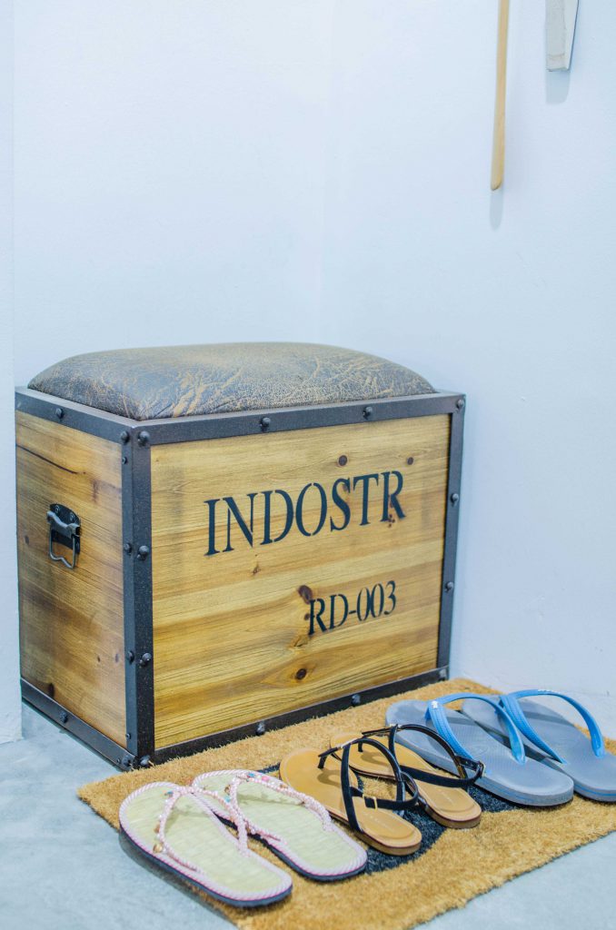
A low wood storage box seat near the entrance fits right in with the raw and edgy theme

With careful research and a clear vision of their design, the couple spent about $48,000 on renovations back in 2015 when they did up their home. The results speak for themselves.

Source: mynicehome.gov.sg
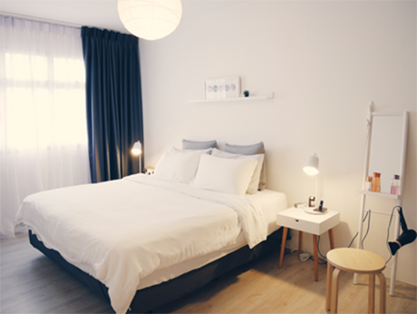
Going Gaga over Zakka
Going Gaga over Zakka

When it comes to interior decor, sometimes it is good to keep things simple and free. No, we do not mean going minimalist.

Zakka, meaning ‘many things’ in Japanese, is a design trend where you place attractive and meaningful items together to improve the appearance of your home and life. Just like any design trend, there are various ‘schools’ of the Zakka style – some purists would only gather handmade items and group them with neutral-tone, usually wooden, accessories for that cosy, homely feel. Others mix and match an assortment of everyday objects to bring about a sense of calm in their homes.

We stepped into Raihana and Shafiqs’ 4-room crib in Punggol for a taste of a simple Zakka experience that is easily achievable.

Going basic with major surfaces, such as walls and large furniture, will never go wrong. You can always add some colour with decorative objects

“We did not specially buy these items for our home. When we see something we really like, we would likely buy it without thinking too much about how they go together with a theme,” said Raihana.

Rooms can be kept relatively simple, with just a few memorable items that spark joy as Kondo Marie had famously put it

“I have always believed that if you love it enough, it will all work out with everything in the end,” Raihana quipped.

The well-travelled couple had their share of exciting adventures, and their home brims with items that reflect the journeys they covered. Now, they are in a brave new chapter in life: being young parents!

Let that metal bomb shelter door become a home for your souvenirs and magnets

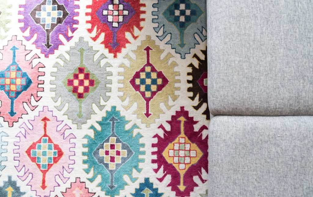
The couple lugged this rug with a rare design, all the way from a vacation in Australia

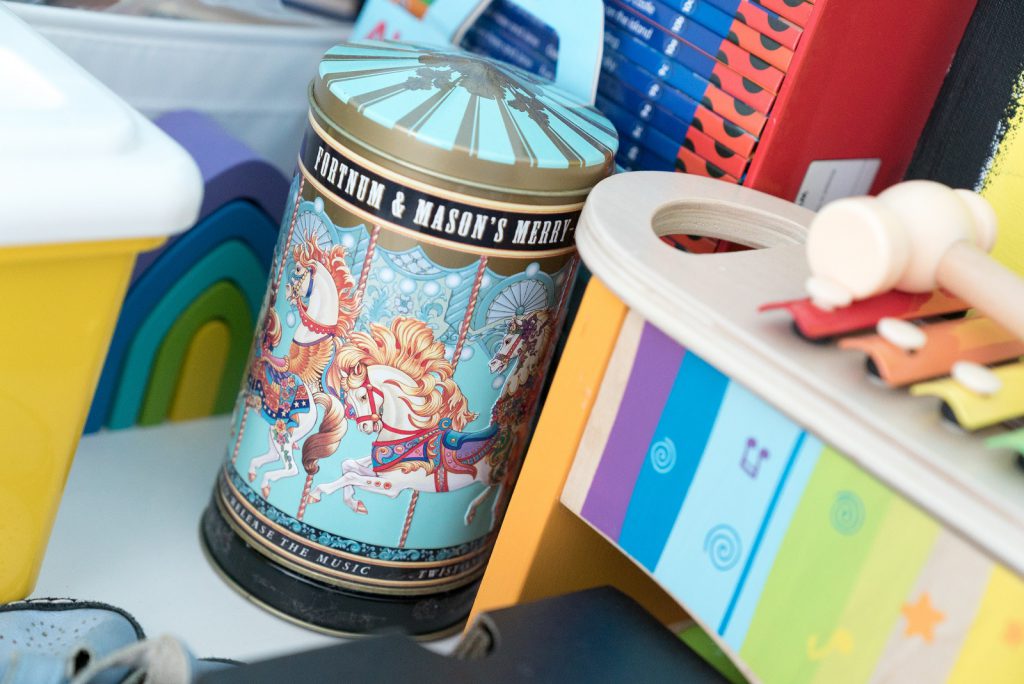
Not just pretty: This biscuit tin from London also plays a soothing melody to keep young kids happy

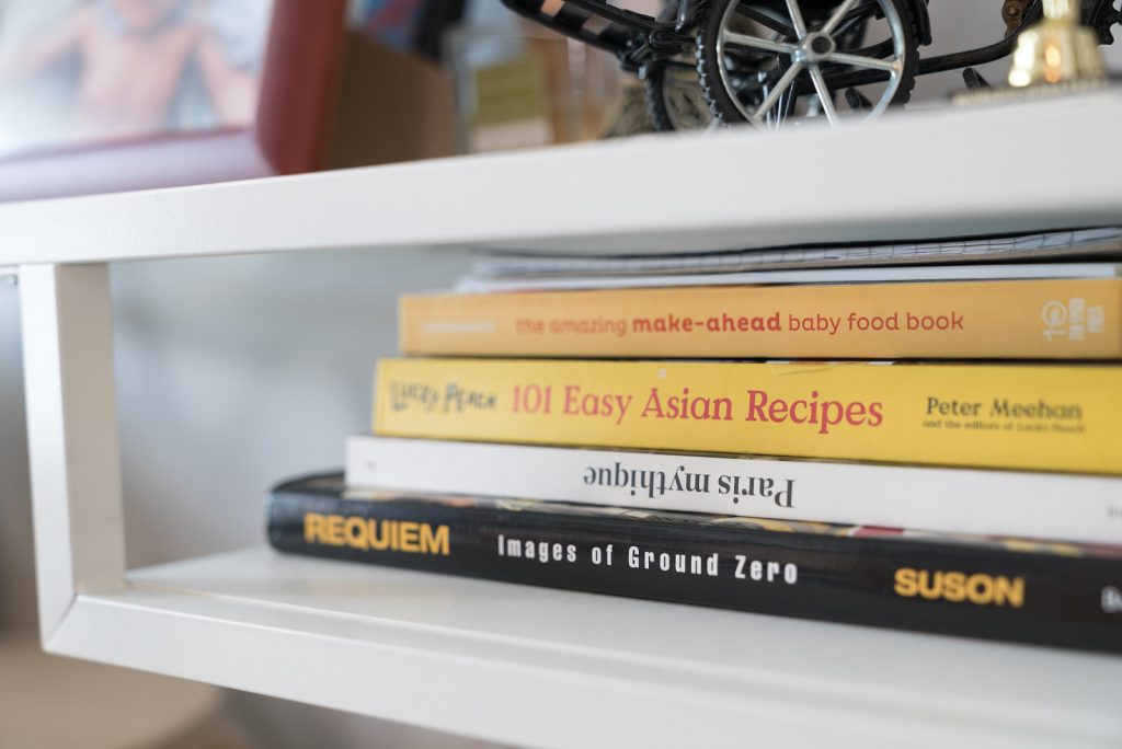
Books can be placed (in stacks, and not shelved) around the house

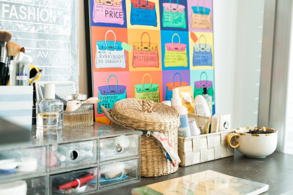
Check out local or overseas art markets to find gems to decorate your home

Source: mynicehome.gov.sg