Art directors Betty and Marcus purchased their 3-room resale flat after house-hunting for over a year. The couple wanted a location that offered a shorter commute to their workplaces, and were patient until they found the ideal flat that met their budget and needs.
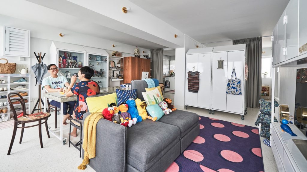
Flexible Spaces
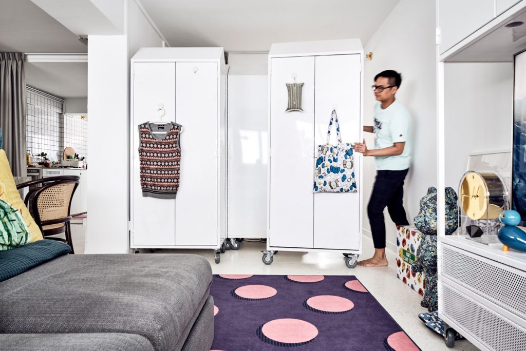
Betty was inspired by the design of retail spaces, where layout is often dynamic. “I wanted our home to have flexible space, which we can reconfigure as needed,” she shared.
The creative couple had many ideas for their home, and chose to engage an interior design studio to refine the concept for their home. “We wanted a neutral party who could mediate between us, if and when we had different design ideas!” Betty recalled with a laugh. Three-D Conceptwerke was their eventual choice, as they found the studio’s portfolio to be original and unconventional.
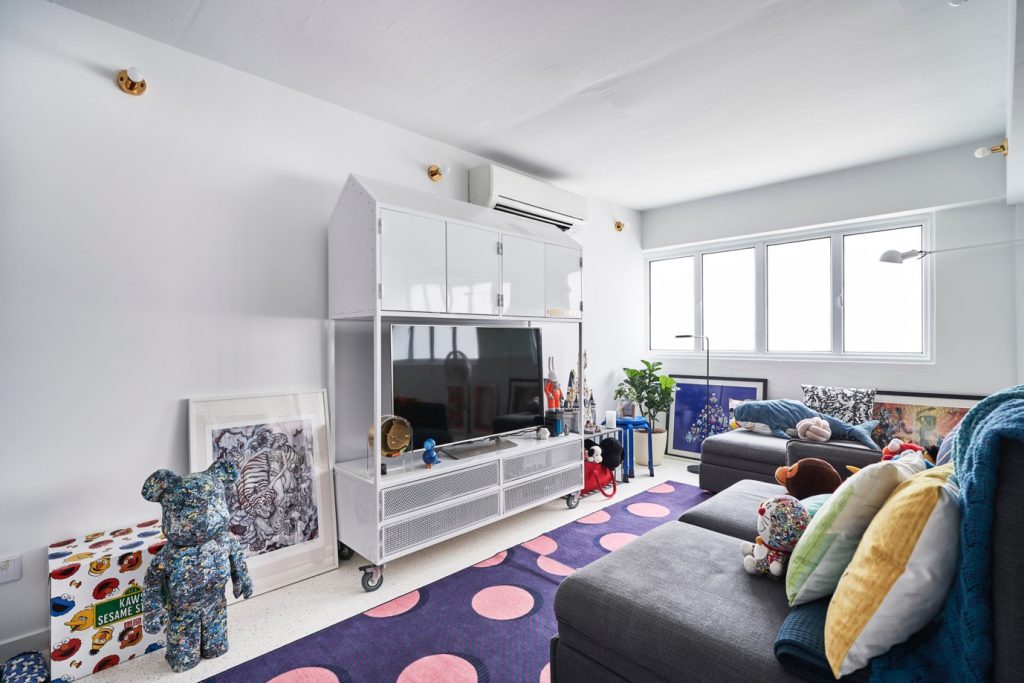
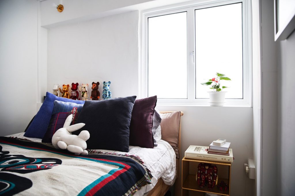
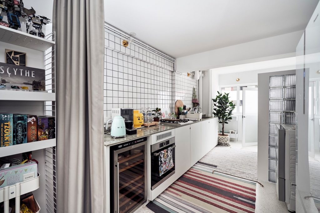
Having expected the interior designer to propose partitions and sliding doors, which will offer some degree of layout flexibility, Betty and Marcus were pleasantly surprised when he suggested customised mobile storage units instead.
These storage units took the place of all walls which were hacked. Made of lightweight steel, they are easily movable and enable the home owners to move and alter the layout at whim. “It’s effortless to switch them around when we feel like transforming our flat occasionally. It’s also convenient when we wish to make room for visiting friends who want to stay over for a couple of nights,” Betty said.
Customisation of the storage units, however, was an intricate process, involving detailed calculations to ensure that the units fit under the beams and even the block’s elevators when moving in.
Putting a Personal Touch
Another unique feature of Betty and Marcus’ flat is the extensive use of terrazzo tiles, which were sourced from Vietnam. They chose to use terrazzo for their flooring as it is a timeless material, while its subtle pattern of speckled colours add visual interest to the home.
“We spent around $80,000 on the renovation, but saved where we can, such as by buying our lighting fixtures online,” they shared.
The couple also took time to furnish their home with pieces they love, and were not afraid to mix and match different materials and colours. The marble-look dining table doubles up as a workspace, and is complemented by Made & Make rattan chairs and a metal dining bench from JotterGoods.
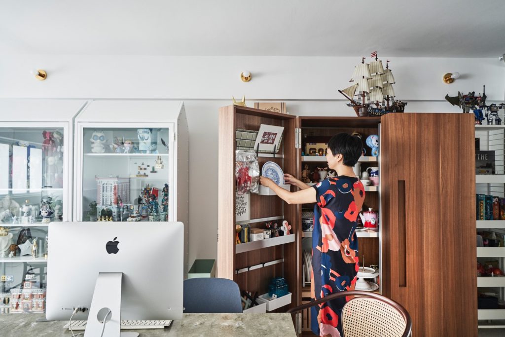
Leading into the kitchen is Betty’s prized possession, a Bulthaup cabinet crafted from wood. With doors that can fully open up to show all the contents in clear view, the well-designed piece offers maximum storage capacity while taking up minimal space. The rich colour of the wood also goes well with the white painted frames of the steel storage units.
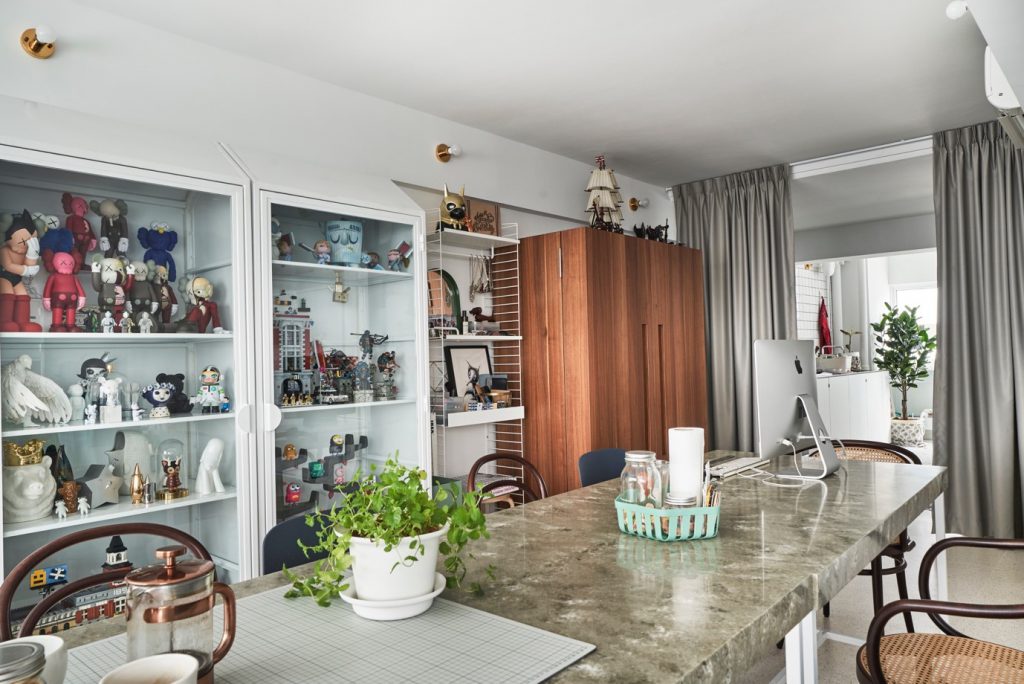
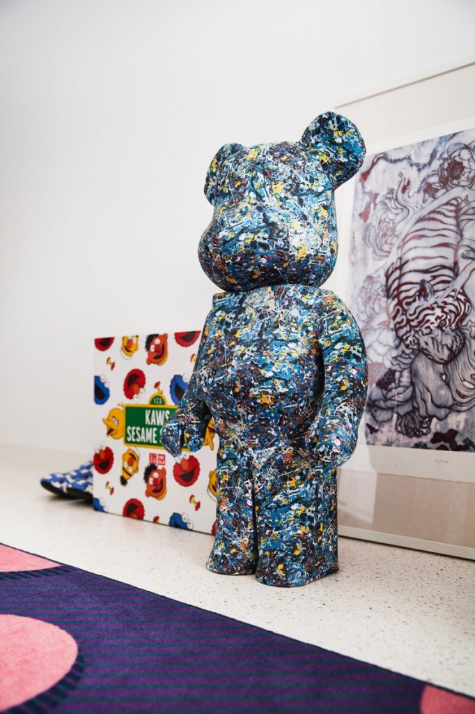
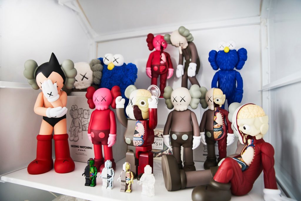
Completing the personal touch are displays of Betty’s homeware collection, Marcus’ KAWS toys, and souvenirs from their travels.
Source: mynicehome.gov.sg

