Day: October 14, 2022

Home Tours: Wood Vibes Only

Home Tours: Wood Vibes Only

Levon and Jasper’s abode exudes calm and soothing vibes reminiscent of a Ryokan – a traditional Japanese inn

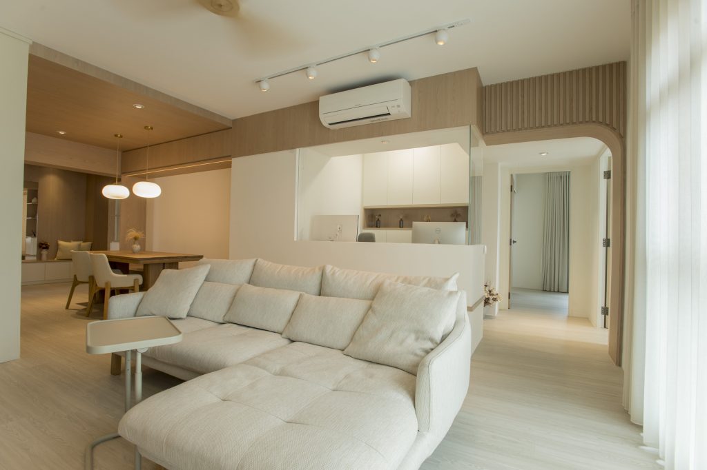
There’s a lot to love about Levon and Jasper’s flat in Bukit Merah, particularly the wood-splashed interior and wooden walkway arches. There, the interplay of light and honey-toned wood exudes calm and soothing vibes reminiscent of a Ryokan – a traditional Japanese inn.

“We like the warm and cosy vibe of wood,” the home owners explain. “We took inspiration from the Japandi (Japanese and Scandinavian) style, as its fusion of simplicity and nature is closest to what we envisioned for our home.”
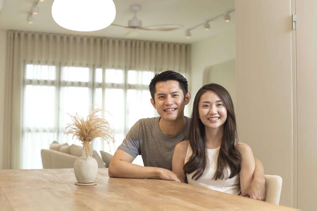
First-time home owners Jasper and Levon

Warm, Wood Vibes

Just like one would expect in a Ryokan, hospitality plays a big part in the couple’s home. “One of our key considerations when flat-hunting was that our home needed to have a large common area to host our friends and family,” Jasper explains.

They found what they were looking for in their current home and worked to turn their ideas to reality. Instead of consulting with an interior designer, Levon and Jasper took on the task of planning for the space themselves.

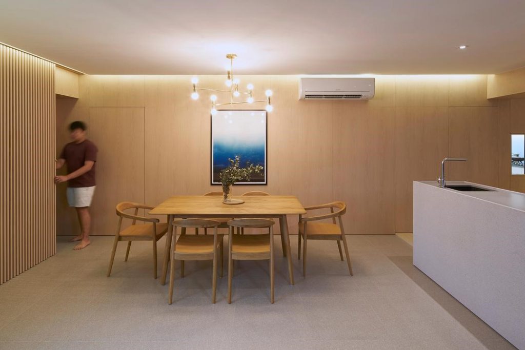
On one side, they placed a large, plush sofa that seats many; and on the other side, a dining nook where friends and family would gather. In the nook, wood laminates stretch from the floor to across the ceiling, making the spot feel extra cosy. The wood on the ceiling also visually demarcates the dining nook from the rest of the communal area. Strip lighting along the top frame of the nook gives it a modern touch, while a customised wooden bench replaces conventional dining chairs on one side of the table.
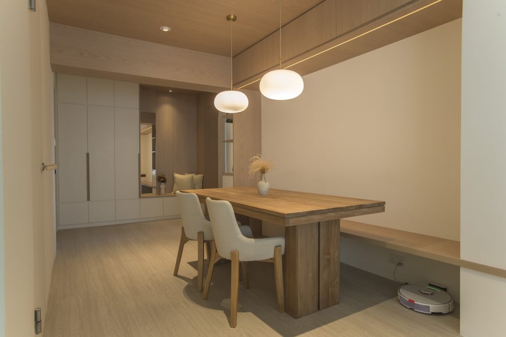
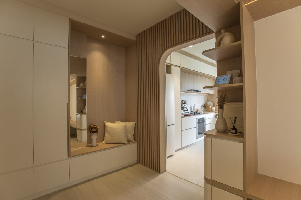
Wood-paneled walls, floor, and even ceiling, lend warmth to the space 
Wooden arches, such as the one above, softens the interior 

Wooden touches extend to the bedroom as well. Like those in traditional Japanese inns, a wooden sliding screen door with vertical rectangular panels is used to define and separate the bedroom from the adjoining space.
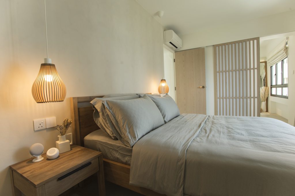
Warm lighting is used to create a restful ambience in the bedroom

Balancing the Look

While the colour palette of the home comprises mostly neutral shades, gold accents are used consistently throughout to liven up the space. In the kitchen, with most of the cabinets decked out in wooden laminates, a gold tap injects modernity to the look. Similarly, the gold tap stands out—in a good way—against the wood-tiled bathroom wall.
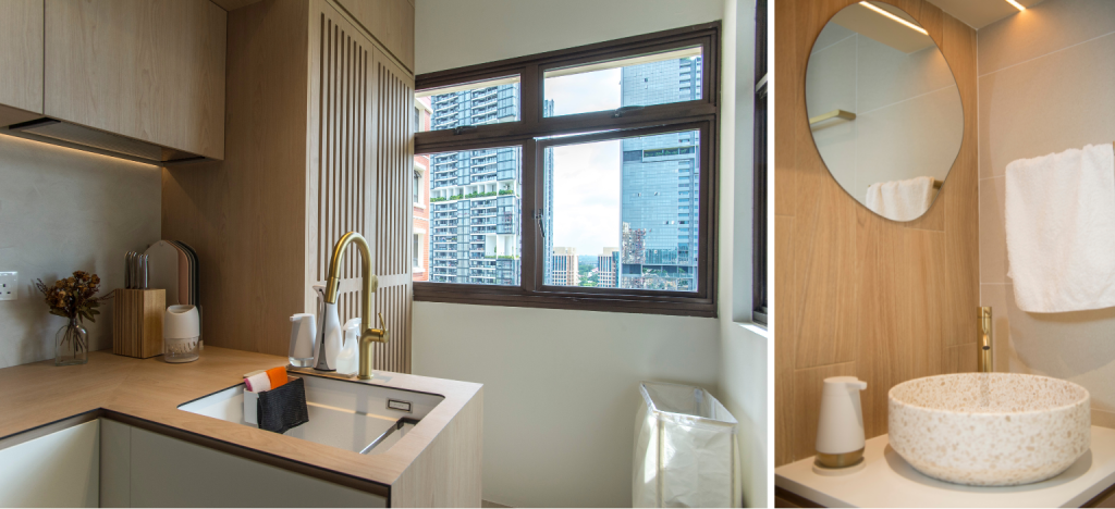
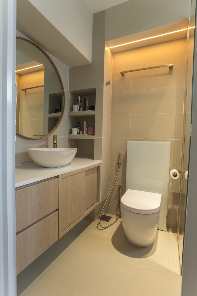
Gold accents liven up the space
No onsen here, though wooden tiles and ambient lighting create a relaxing space

Glass was also cleverly used in the home design to break up the use of all that wood, in the form of a half wall partition between the workspace and living room.
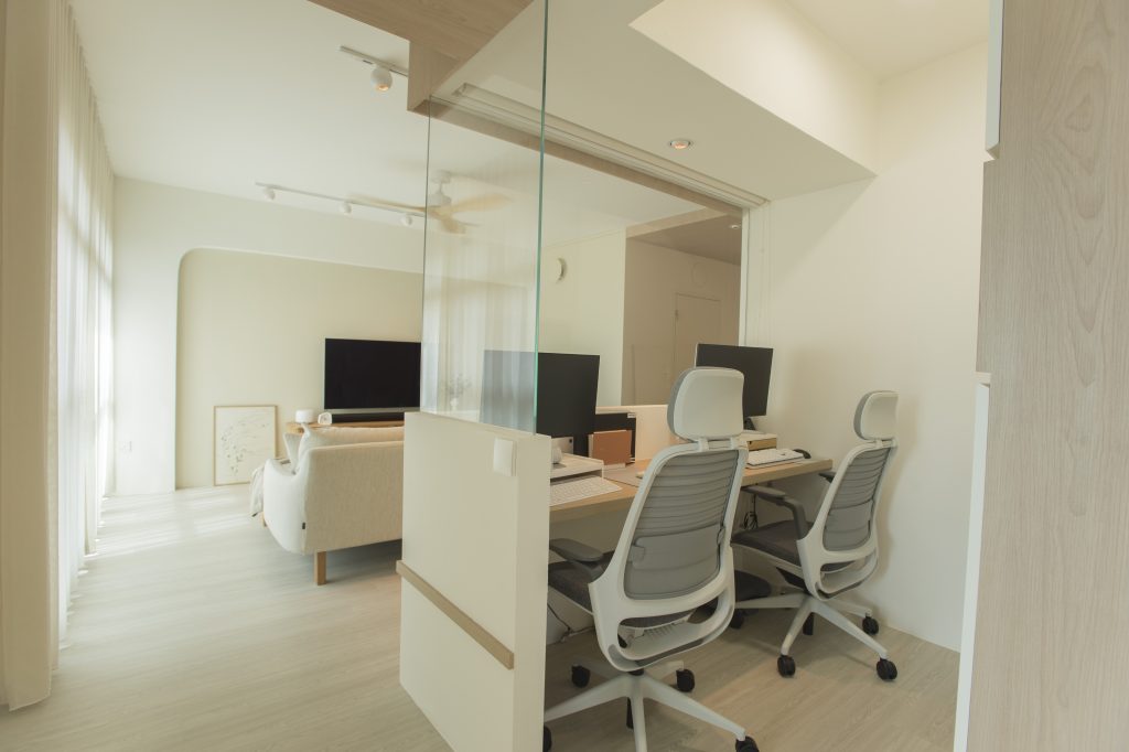
A section of the master bedroom was carved out for a workspace

“We like how the glass wall lets in more natural light into our home,” Levon explains. “It also lets us feel like we’re in the same space, even if we are not.”

Jasper adds: “For instance, when I’m working and Levon is watching TV, I’d pop my head up for a break and watch whatever she’s watching – sometimes, she’d even catch me up on the plot!”
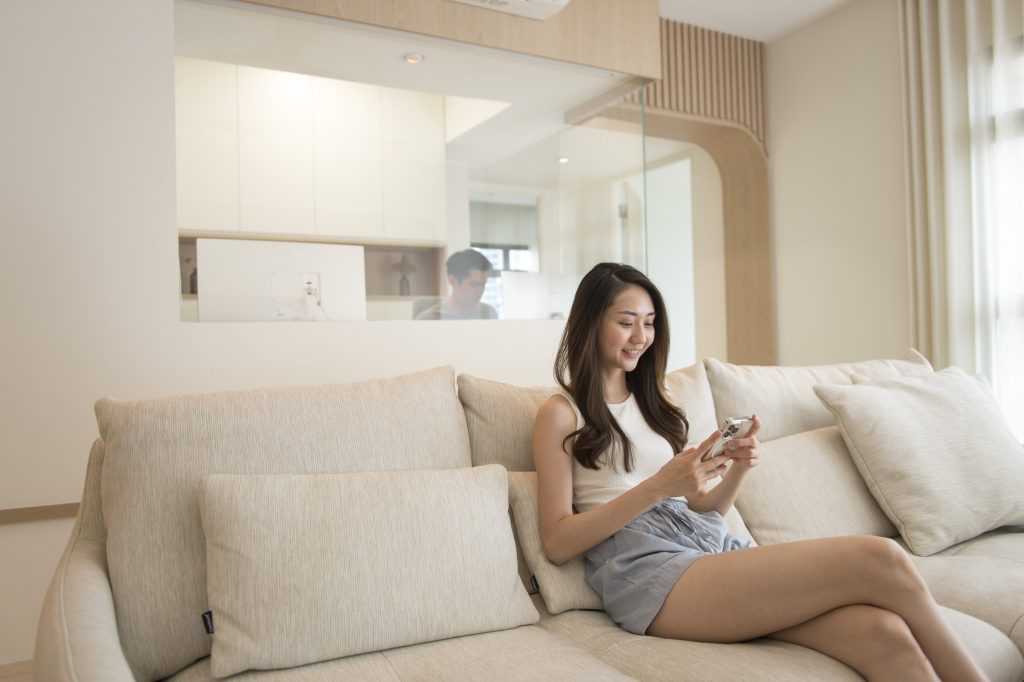
The half glass wall partition between the workspace and living room lets the couple feel like they are in the same space

A Home Designed for Individual Needs

While aesthetics played a big role in the design of their home, the couple emphasises the importance of functionality.

“It’s helpful to think about how the design can cater to your way of living, and not the other way round,” they say. “We knew we wanted a walk-in wardrobe and a workspace, so we prioritised those and designed the space accordingly.”

The result is a gorgeous home that caters to their lifestyle and individual needs.


Source: mynicehome.gov.sg

Home Tours: A Boho-Chic Home Full of Thrifted Treasures

Home Tours: A Boho-Chic Home Full of Thrifted Treasures

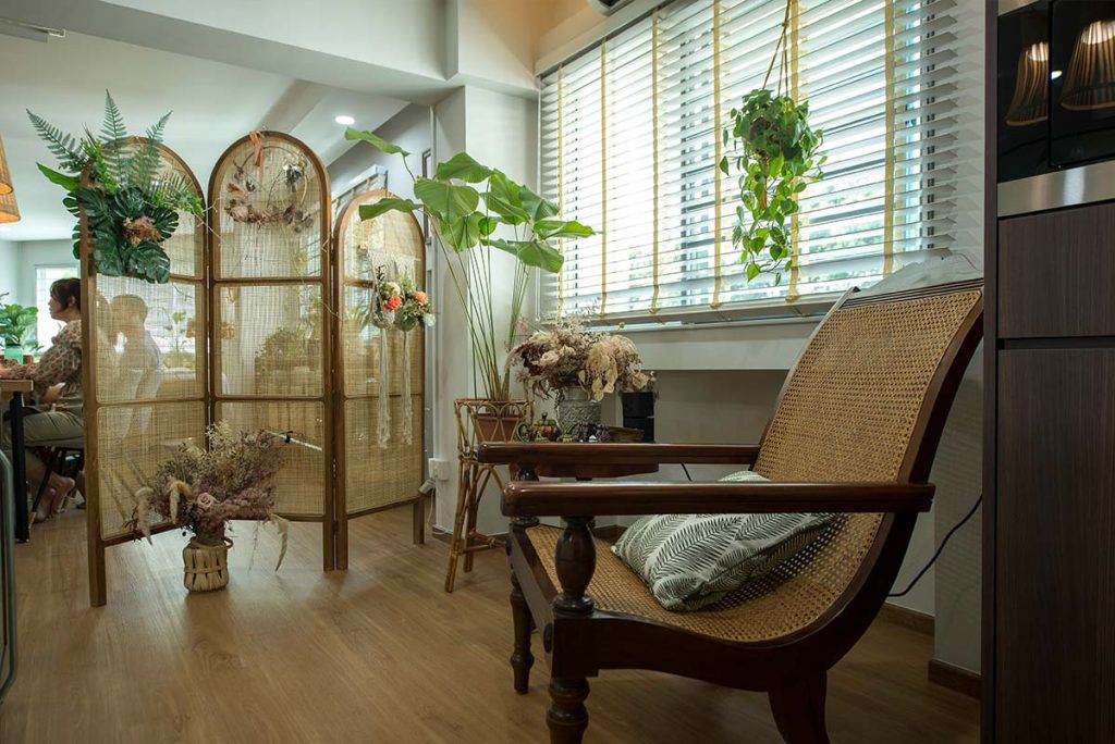
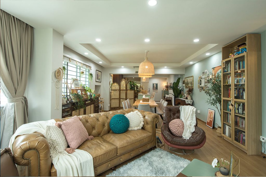
As avid antique lovers, most of the furnishing and home décor pieces in Jocelyn and Samuel’s flat have vintage origins

For vintage hunters Jocelyn Lim and Samuel Ng, their 5-room flat in Pasir Ris is a proud display of their thrifted treasures collection.

Home owners and vintage lovers, Samuel and Jocelyn

“Every piece tells a story,” Jocelyn explains. “The 19th century lampshade in the living room was passed down for generations in an Australian family. It looks so unique because of the way it’s crafted. It was the first item that we picked out for our new home,” she adds.

The 19th century lampshade in the living room was the first item Jocelyn and Samuel purchased for their home

Pre-loved Furniture with Character

As avid antique lovers, most of the furnishing and home décor pieces in the flat have vintage origins. For Samuel, the appeal of those thrifted pieces lies in their craftsmanship, uniqueness, and intricate detailing. “I love the different colours and textures that they add to our home.”

One of his favourite pieces is the sideboard with distinctively curved legs (also known as Queen Anne legs or cabriole legs) and padded feet. Another vintage statement piece is the planter’s chair, which comprises long teakwood planks with a rounded end. The planter’s chair was commonly used during the colonial era, where the extended planks were used as leg rests.

“I like that we’re able to learn about the art and design from a particular period through the furniture and items that we have collected over time,” Samuel says.

The Queen Anne style furniture comprises distinctively curved legs and padded feet
The planter’s chair, picked up from Carousell, was a great find for the couple

While Jocelyn and Samuel look out for good deals in retail shops and on online platforms, the items don’t always come in optimal condition. That’s when the couple would dabble in some DIY works, such as painting over pottery and fixing the frame of a leather side chair.

Repairing a leather side chair (right) was one of the couple’s DIY projects

Laidback Boho-Chic Vibes

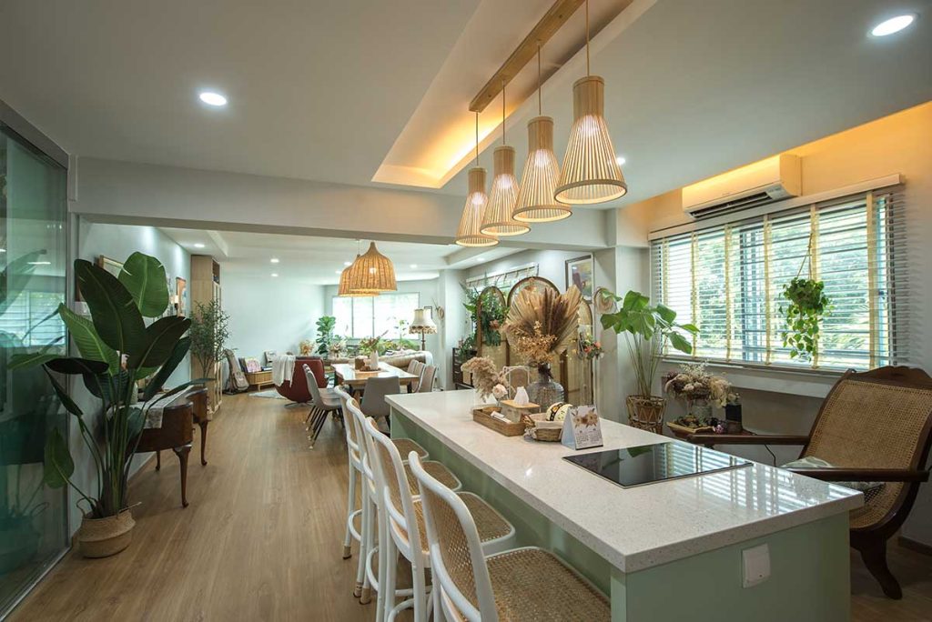
The pre-loved furniture which they have chosen, complement the flat’s earthy tones, rattan accents and greenery that reflect the couple’s love for nature. Together with the tapestry and paintings on the walls, the flat exudes casual boho-chic vibes.

The open living concept provides the illusion of a larger space, and the natural light filtering in through the windows lends the flat its soft, natural look. The windows also offer ample views of the surrounding greenery, something the couple was drawn to right from the start.

“This flat checked all the right boxes for us. We even got to enjoy proximity grants, on top of CPF housing grants, because we live near our parents. That helped us save quite a bit on the cost of the flat,” they say.

The open layout of the communal area is another feature that the home owners love, especially since they frequently host family and friends.

A kitchen island is incorporated into the common living area as an additional gathering space for the couple’s family and friends.

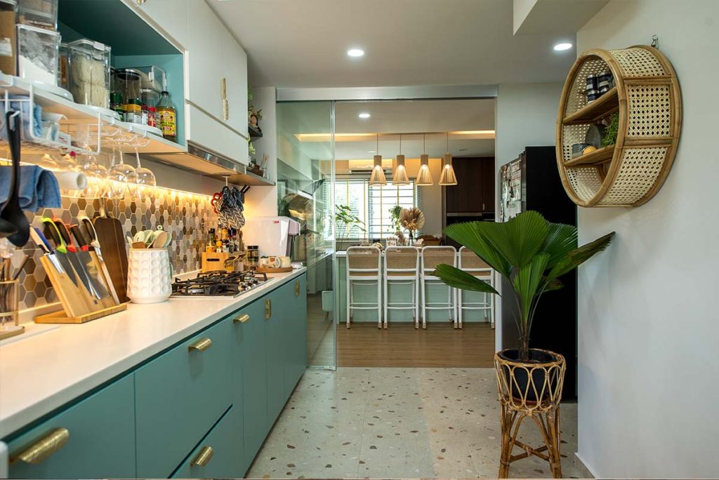
Different floor treatments help to demarcate the different spaces while also serving a functional purpose. “As we spend a considerable amount of time (or money?) in the kitchen, we decided on terrazzo tiles for the space as they are relatively easy to upkeep. They also complement the boho aesthetic,” Jocelyn explains. A glass sliding glass door keeps fumes and smells contained in the kitchen, whenever the couple whips up a meal.

Rattan accents in the form of a shelf and plant pot tie the look together in the kitchen.

The green and white kitchen complements the earthy tones of the house

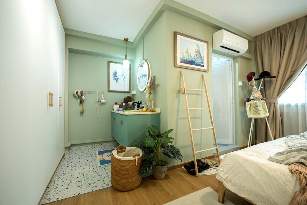
In a house full of unique finds, another unexpected touch is the creation of a sink and bathroom vanity in the bedroom instead of having it within the ensuite itself. The couple did so as they wanted a bigger sink and vanity area.

The terrazzo-tiled vanity area is a unique feature of the master bedroom

As with the rest of the flat, the bedroom is designed in a neutral palette that adds to the room’s relaxing environment

When asked about their favourite thing to do at home, Jocelyn laughs. “We love lounging! When designing our home, we made sure to include a variety of side chairs and settees.”

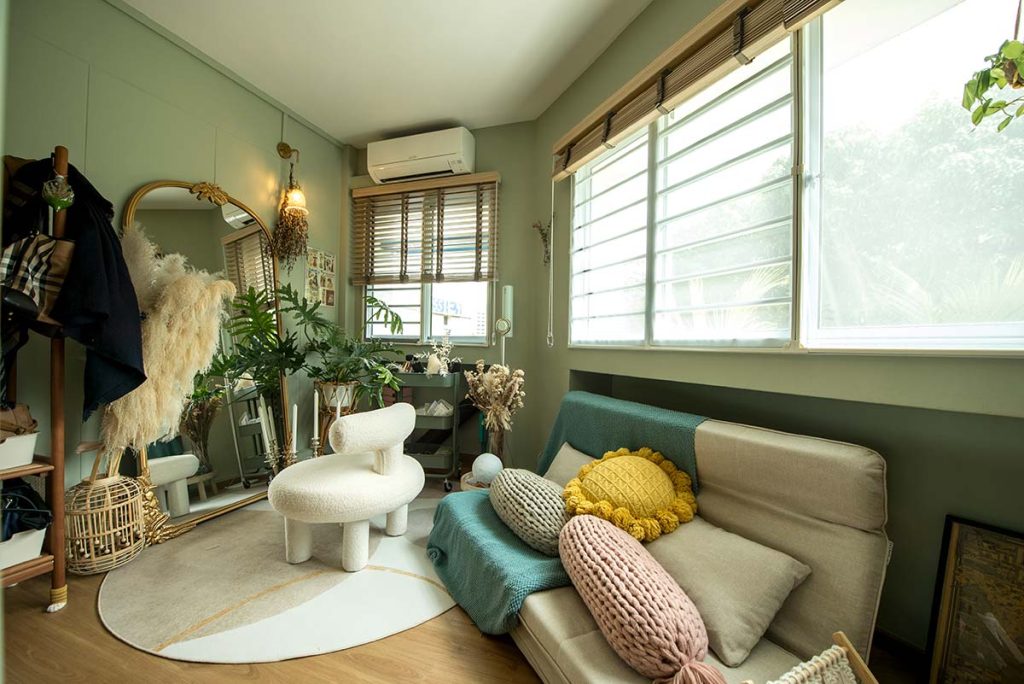
The home owners take their love for lounging so seriously that they carved out a space for that very purpose. Leading up to the master bedroom is a cosy corner furnished with a daybed and soft cushions.

The lounge corner

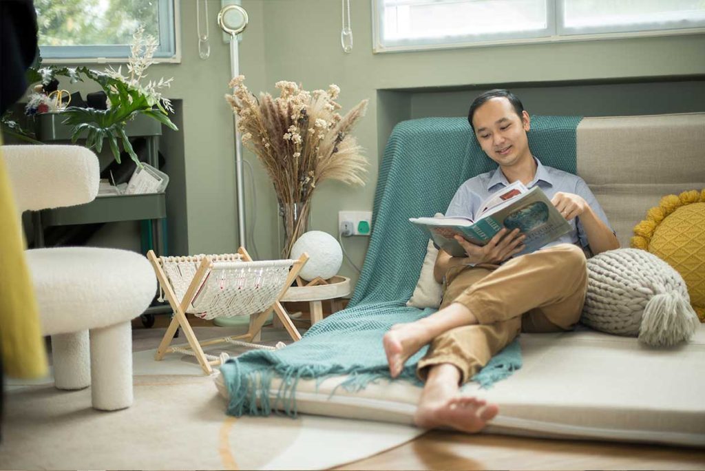
For Samuel, the lounge corner is his favourite space because the cosy and relaxing vibes make it perfect for reading and spending some me-time.

Samuel often spends his free time reading in the lounge corner

When asked about her favourite space within their abode, Jocelyn, without missing a beat, quips, “The living room, because it offers me the best views of our home.”

“I love the planter’s chair in the living room too!” Samuel adds. “I can just sit there and admire the greenery surrounding our home, which is a definite plus.”

From finding a flat that ticked all their boxes, to designing a home that meets their exact tastes and lifestyle needs, Samuel and Jocelyn created a home that was perfect for themselves.

Source: mynicehome.gov.sg
Home Tours: A Self-Designed, Studio-Inspired Home

Home Tours: A Self-Designed, Studio-Inspired Home

A fan of open layouts? Find out how Yi Ting and Wenxiang turned their flat into a bright and airy studio-like space.

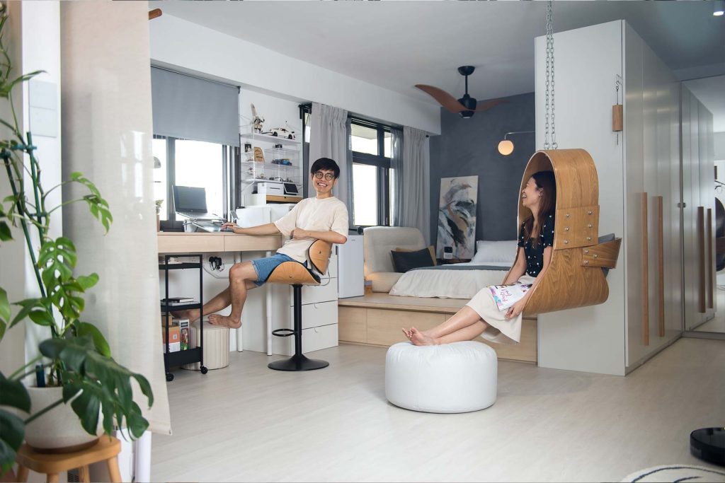
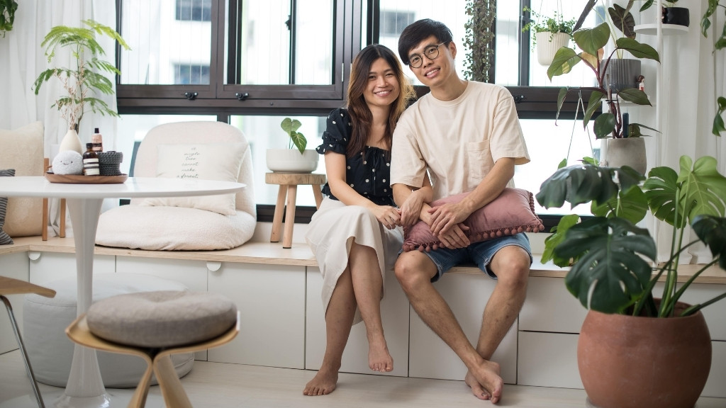
Seated by the bay window that overlooks the rest of their home, couple Ong Yi Ting and Poh Wenxiang laugh when naming their favourite space at home. “Since our flat is one connected space, can our answer be ‘our home’?” they say cheekily.

Home owners Yi Ting and Wenxiang

A Completely Open Layout

While the concept of open layout is relatively common, what makes Wenxiang and Yi Ting’s 3-room BTO flat stand out is their decision to completely do away with bedrooms. The result is a bright and airy studio-like space designed to suit the couple’s lifestyle needs.

“We started brainstorming for layout ideas as soon as we selected our flat,” Yi Ting recalls. “Our priority was to have maximum space with minimal maintenance, so that helped guide our design process.” With a background in design, the couple experimented with a variety of layouts—with and without bedrooms— before deciding on the current iteration.

On why they did not opt for a bigger flat type, Yi Ting laughs and says, “The bigger the space, the higher the level of maintenance required. We didn’t see the need for a bigger flat, plus, with the current open layout, the space is more than sufficient for our needs.”

From the From the living room, one can get an overall view of Yi Ting and Wenxiang’s 3-room flat.

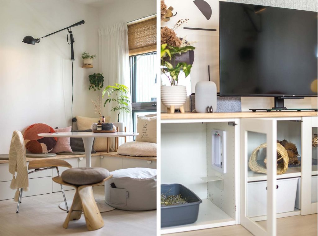
The couple considered each other’s living habits and needs, to help them better plan the flow of their home whilst still fully utilising the space. For instance, they wanted to combine the living and dining area, so having a sofa in the room wasn’t ideal. Instead, they designed an L-shaped seat that extends to the window for this purpose.

An L-shaped seat that borders the room is one of the couple’s many designs that integrates form and function.

Creating Different Spaces

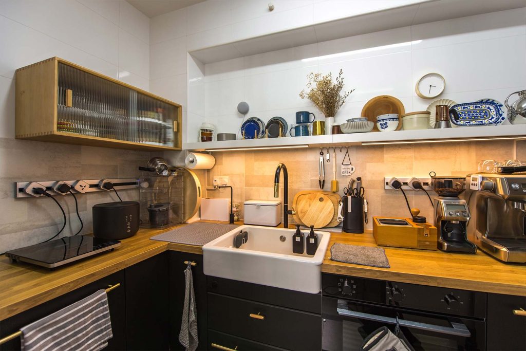
Wenxiang and Yi Ting were careful to remove only the non-structural walls in their flat to facilitate a seamless flow within the flat. They then used design elements to differentiate the various spaces. The kitchen for instance, is set apart by its tiled flooring as opposed to the vinyl overlay in the rest of the flat.

To further differentiate the kitchen from the rest of the flat, darker tones such as black and grey are used.

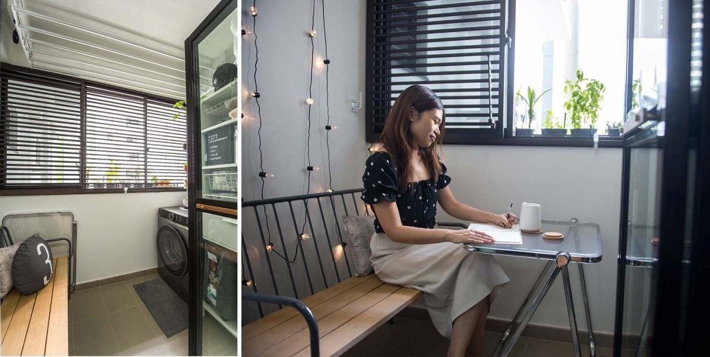
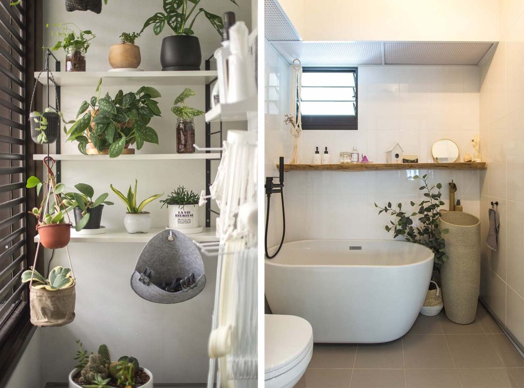
The home owners also made full use of the service yard, transforming it into a dual-use space comprising a laundry area and lounge corner.

The service yard also has a cosy breakfast nook

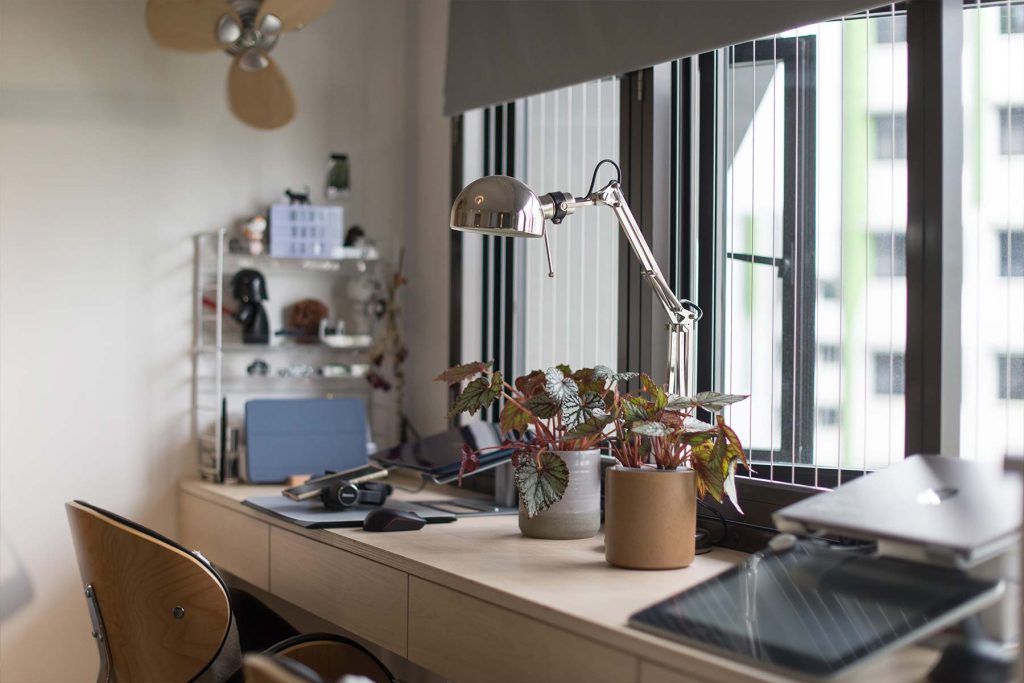
While home offices are usually designed in a room setting, Wenxiang and Yi Ting’s workspace comprise a customised high table by the window, to take advantage of the natural light and green views.

The workspace with a view

Next to the home office is the bedroom, and a built-in wardrobe doubles up as a partition between the bedroom and bathroom.

DIY Projects

As hands-on home owners, the couple had also taken on a handful of DIY projects, including installing the shelving and master bathroom vanity cabinet.

Fittings in the form of shelves are some of the many DIY projects

Their biggest project, Wenxiang shares, was the kitchen cabinets. “We measured the dimensions and sourced for a carpenter to provide us with the wood laminates. We then put together  the kitchen cabinets ourselves. It took us quite some time, but it was worth it,” he beams.

The TV console and extended bench in the living room were built in a similar fashion, where the couple assembled  them using customised wooden planks, before adding storage beneath.

The space under the extended bench is used as storage (left), while the TV console doubles as a hutch for the home owner’s pet bunny (right)

While designing their flat from scratch has allowed Yi Ting and Wenxiang to enjoy cost-savings and the ability to fully utilise the space, they said the task may not be suitable for all home owners.

“We spent a considerable amount of time trying different layouts and were also very involved during the renovation process. Not all home owners have the luxury of time to do so, so engaging an interior designer and/ or contractor might be a better alternative for them. However, for us, the fulfilment we got in designing our home is definitely worth the effort.”

For more interior inspiration, check out more Home Tours and Design Ideas!

Source: mynicehome.gov.sg
Home Tours: Bold Colours, Aesthetic Patterns & Retro Vibes

Home Tours: Bold Colours, Aesthetic Patterns & Retro Vibes

While the Scandinavian style had initially appealed to Qing Hong and Vivian, find out why the home owners opted for darker and bolder colours

Prior to their renovation journey, Lee Qing Hong and Vivian Chua had envisioned a Scandinavian-inspired home and its hallmark elements of bright, airy spaces, white walls, and wood accents.

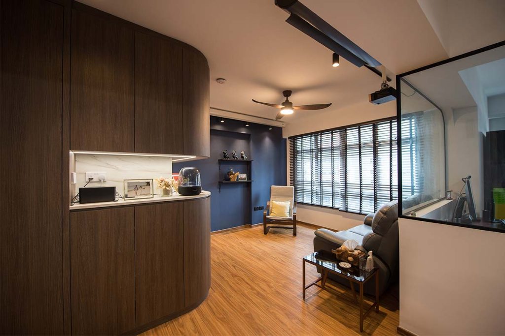
Glancing at the walnut cabinet and Aegean blue feature wall in their living room, Vivian lets out a small laugh and says, “Well, we did manage to include wood elements in the final look.”

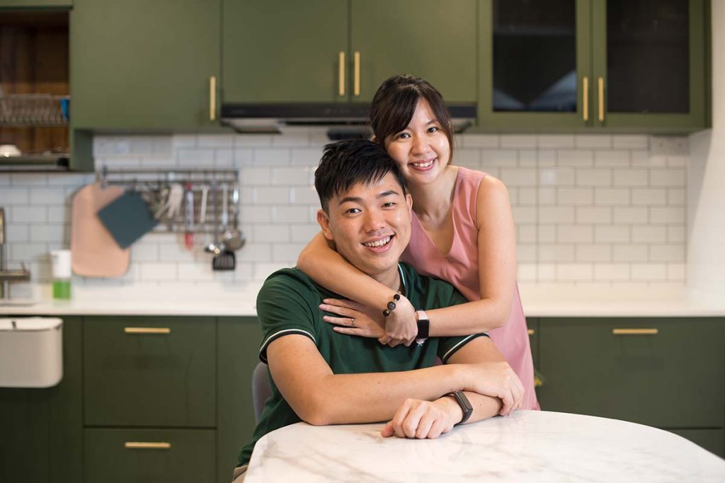
Home owners Qing Hong and Vivian
The various elements of the home look harmonious when put together

Bold, Dark Tones

While the muted colour palette and natural elements of the Scandinavian style had initially appealed to Qing Hong and Vivian, they found themselves gravitating to darker and bolder colours. “We wanted a look that is slightly different, a style that is bold yet calming,” they explain.

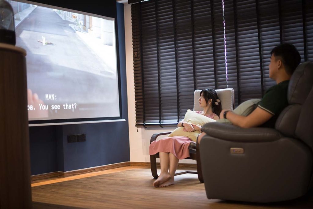
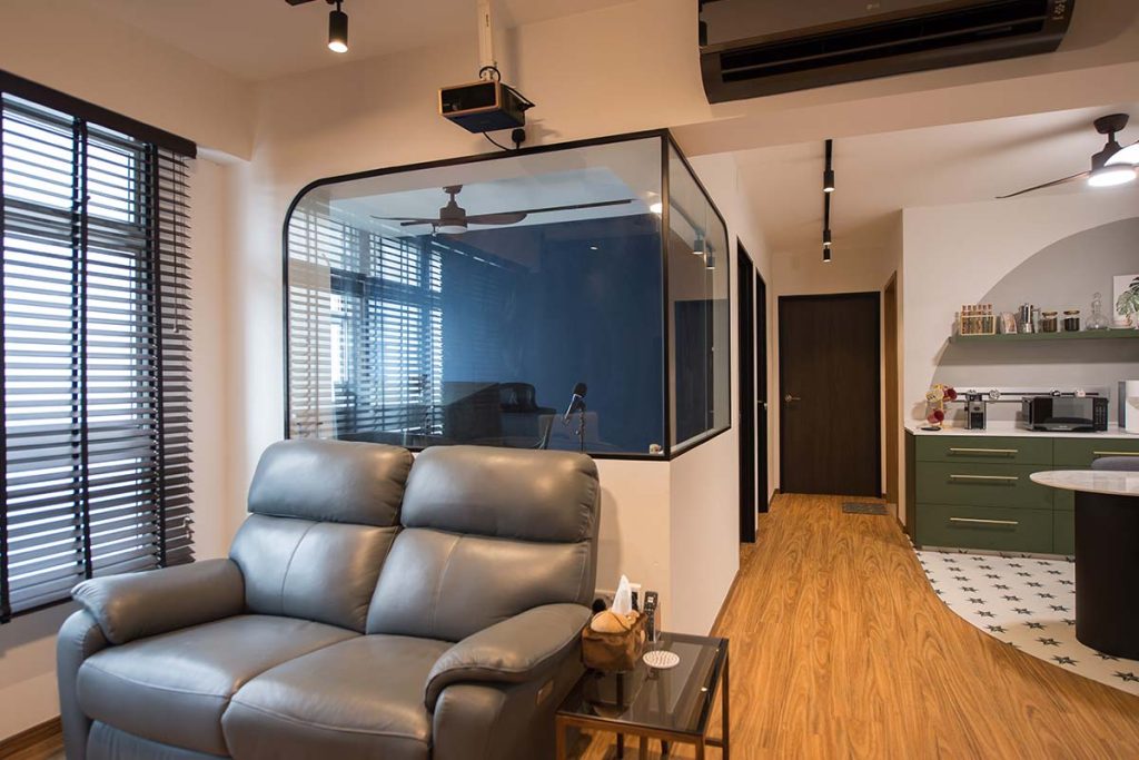
The dark colours create a cosy ambience that is perfect for movie nights
The use of glass balances the dark tones, and creates openness within the home

The couple then decided on blue—Vivian’s favourite colour—as the primary colour for their home. As frequent beachgoers, they liked how blue reminds them of the sea, as well as the calming vibes that the colour evokes. To complement the blue, the couple who are also nature lovers, incorporated a shade of green into the colour palette.

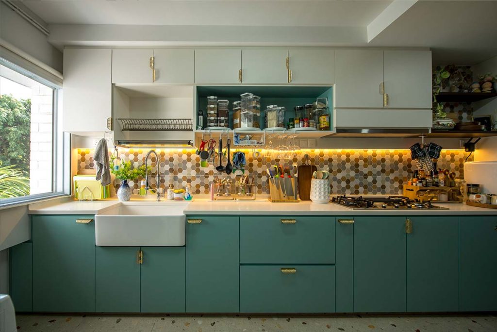
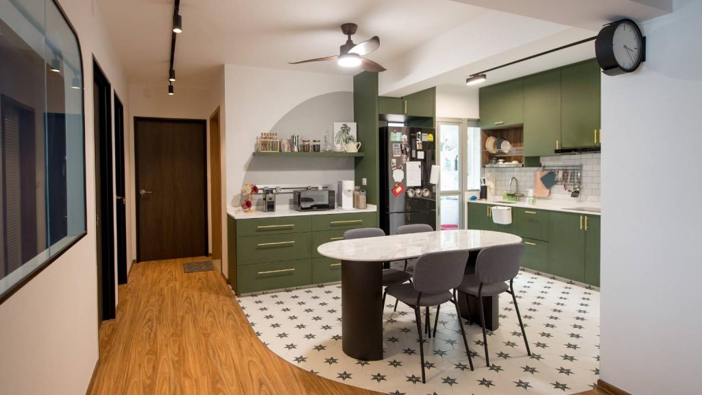
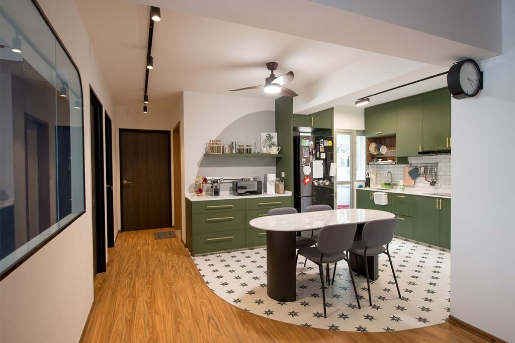
 Green is used on the cabinets in the open kitchen and pantry area
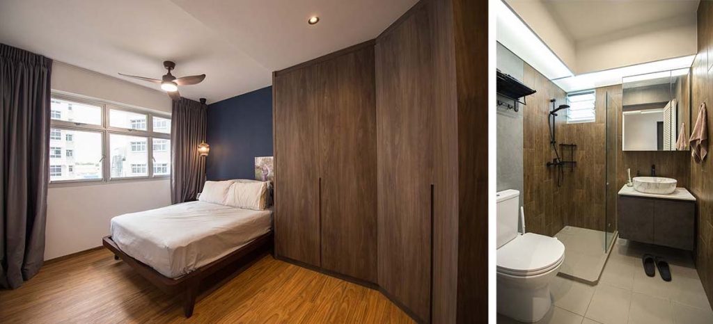
Dark walnut tones around the house tie the overall look together

Demarcating Spaces with Design Elements

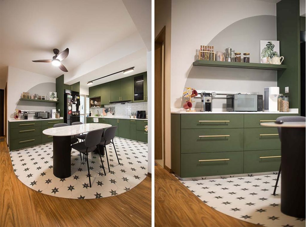
While the olive-green cabinets make a visual statement, what makes the kitchen really stand out is the tiled flooring that extends to the dining room. Striking hexagonal tiles that serve up some serious retro vibes are laid in the shape of an arc – a design element that is cleverly reflected on the pantry wall.

The arc on the floor is also mirrored on the pantry wall

Aesthetics aside, the tile floor serves to demarcate the dining area and kitchen from the rest of the common living space.

“While we appreciate the seamless flow of the open flat layout, we wanted to literally draw the line between the spaces,” Vivian shares. “So instead of vinyl flooring like the rest of our home, we opted for tiles in the dining area and kitchen instead.”

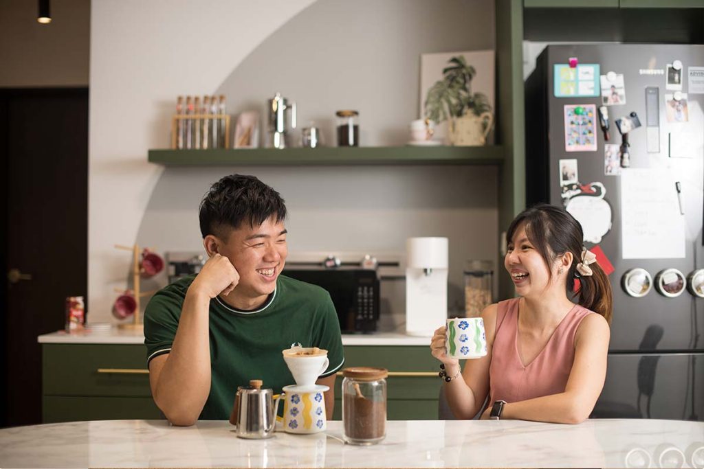
Qing Hong and Vivian enjoying their coffee in the dining area

Qing Hong explains that the dining area is where he spends his me time, relaxing as he reads a book over a cup of coffee.

Without skipping a beat Vivian adds, “The dining and kitchen area is definitely our favourite spot at home. It’s where we host our family and friends, and where memories are made.”

Source: mynicehome.gov.sg
Tips for Designing a Japanese-Style Home.

Tips for Designing a Japanese-Style Home.

Here’s to owning your very own Muji-inspired home

Simplicity. Zen. Serenity. These are some words that come to mind when we think about Japanese-inspired interiors. How can we include these design elements within our HDB flats without breaking the bank, you ask?

Read on for five simple tips to designing a Japanese-style home:

Interior Designer: Weiken

Photo Credit: @renonation

Wooden Elements

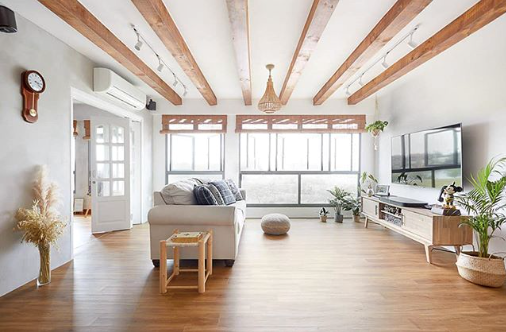
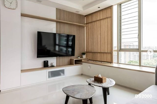
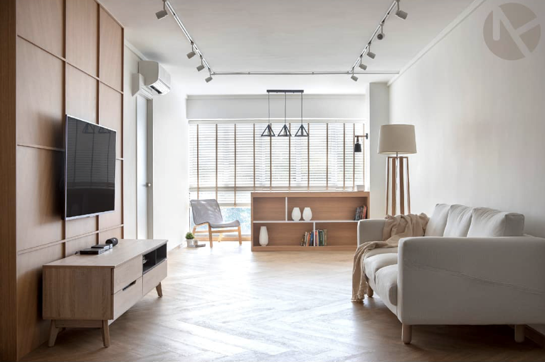
Wooden materials, such as oak or bamboo, take centerstage in Japanese homes. For a quintessential Japanese-style home, bring clean-lined wooden elements into your home in the form of carpentry or even the furniture!

Interior Designer: Fifth Avenue Interior

Photo Credit: @obliviondezign

Neutral Colour Palette

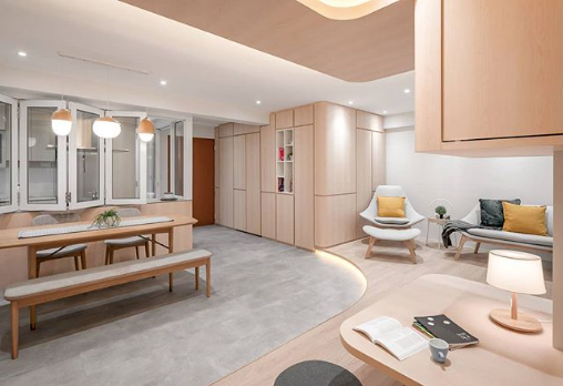
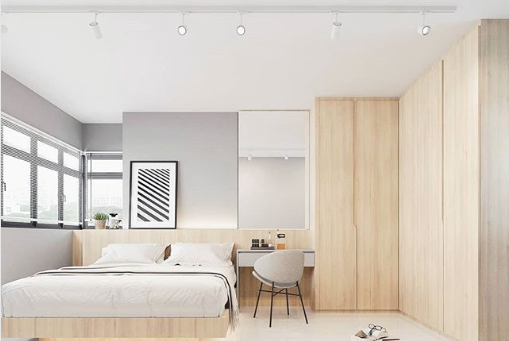
While the Japanese may embrace bright colours in fashion, a calmer and more neutral colour palette is often the choice for their homes. To achieve that clean look, opt for oak, grey and white shades for the walls. Hot tip: Pick these wall colours to create the illusion of a brighter and more spacious home!

Interior Designer: Fifth Avenue Interior

Photo Credit: @renonation

Natural Light Is Key

Japanese apartments tend to appear bright and breezy – probably due to the natural light that floods the house. Having large, expansive windows is the easiest way for natural light to enter your home, especially if you skip the curtains!

Interior Designer: DS2000 Interior & Design

Photo Credit: @ds2000interior

Save Space With Sliding Doors

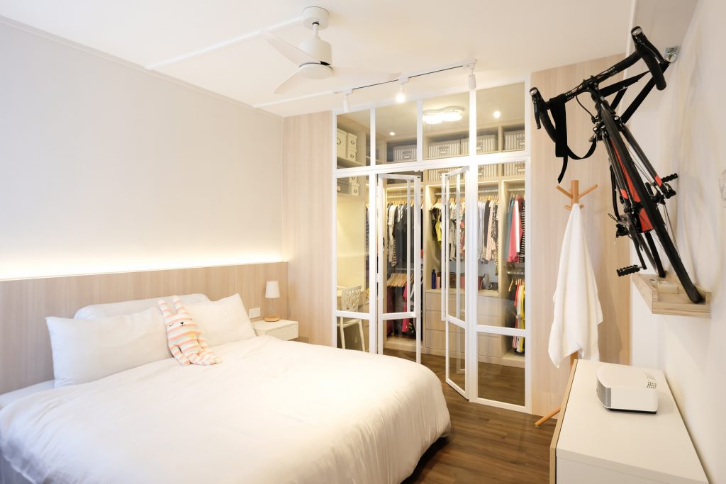
Did you know that traditional Japanese houses come equipped with sliding frames instead of swinging ones, to help conserve space? An easy way to adopt this idea is to incorporate sliding frames to your cupboard doors for a sleek, space-saving touch.

Interior Designer: Neu Konceptz

Photo credit: @neukonceptz

Minimalist Design

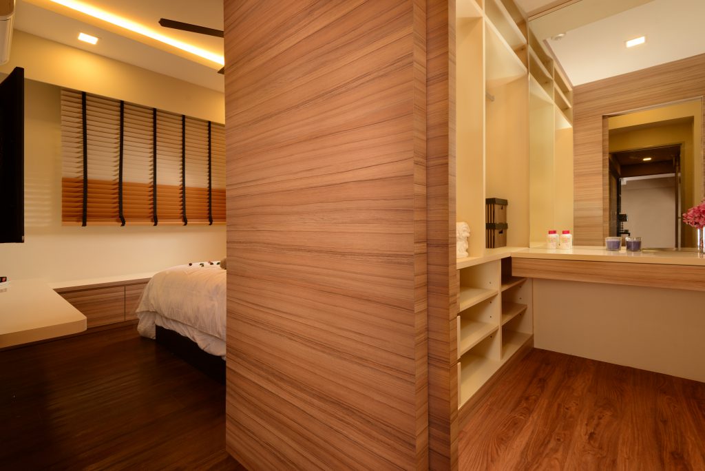
You might have realised by now that Japanese homes are mostly simple and uncluttered – the epitome of minimalism. The trick to a simple style? Only purchase essential furniture pieces in designs that never go out of style!

Got any other tips to achieve that quintessential Japanese aesthetic for your home?

Source: mynicehome.gov.sg
A Guide to Having a Walk-In Wardrobe

A Guide to Having a Walk-In Wardrobe

You don’t have to have a million to dress like a million!

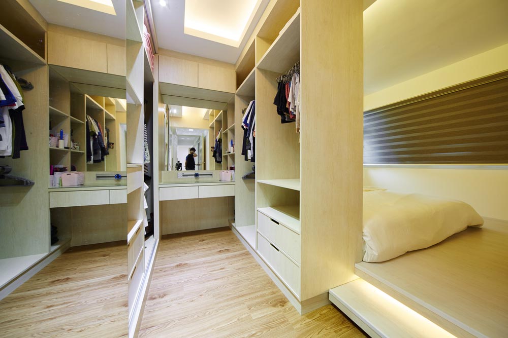
They say size matters and for walk-in wardrobes, it is definitely the case of the bigger, the better! While turning an entire bedroom space into a walk-in wardrobe is very, very tempting, it is important to consider whether it is worthwhile to do so – especially if you’re thinking of welcoming a little one soon!

However, it is still possible to achieve your dream wardrobe. The best part? You don’t have to sacrifice an entire room or carry out major hacking works!

Credit: Nitty Gritty Interior

Check out these 3 design ideas on how you can transform your bedroom space to fit a walk-in wardrobe:

Lay It Out

Photo Credit: CAD Associates ID

Before you go wild with designing your walk-in wardrobe, think about how much space you wish to dedicate to the space. This helps you decide on the layout of your walk-in wardrobe. Some ideas include a galley style with an aisle in between two closets, an L-shape configuration with ample (standing) space, or even a little boxed-up enclave for that exclusive feel.

All About That Space

Photo Credit: Design 4 Space

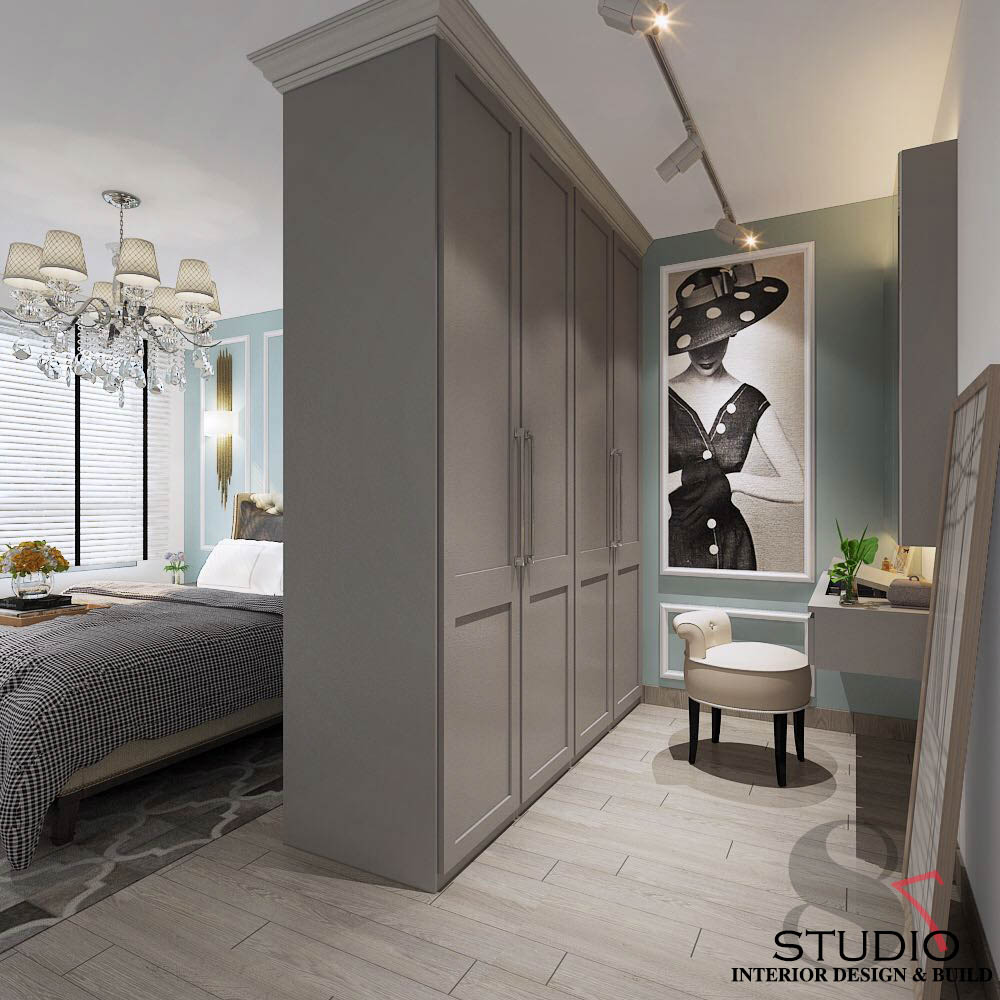
Fitting a walk-in wardrobe in your bedroom means having to maximise space with the help of an efficient design. Regardless of the layout you’re going for, it’s helpful to swap out the hinged doors for sliding frames or even ceiling-to-ground curtains – not only do they help to save space, but they also create an illusion of a wider aisle.

Accessorise

Photo Credit: Eighty Seven

Yes, it’s possible to accessorise your walk-in wardrobe! A full-length mirror is a must-have; be it on the wall, the wardrobe door, or sliding frame. Spruce it up with statement lighting that brightens up the space, and then add pops of colour such as a feature wall, painting, or plant.

Excited about these ideas and can’t wait to start on your renovation journey? Read up and be familiar with the HDB renovation guidelines first, and check out some of our handy renovation tips!

Source: mynicehome.gov.sg
6 Creative Shoe Storage Ideas

6 Creative Shoe Storage Ideas

There is more to shoe storage solutions than just cabinets!

Looking for a better way to organise and display your shoes? Here are some shoe storage ideas that are not only practical but can double up as a design feature too.

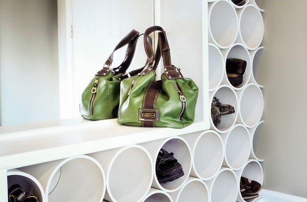
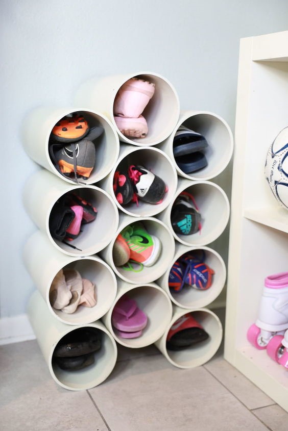
1. Pipe-Inspired Shoe Rack

Plastic pipes are a fun, unique and space-saving shoe storage solution that also work well for corners. While white pipes are perfect for minimalist homes, don’t be afraid to add a dash of colour by painting them in your favourite shade.

Photo Credit: Homedit

Photo Credit: Pinterest

2. Tension Rods

Photo Credit: Aloyalove

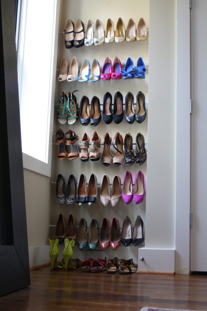
Tension rods are a fuss-free and creative way of organising your high-heeled shoes! Install these rods between two walls and hook the heels of your shoes on them.

3. Under-The-Bed Storage

Photo Credit: Pinterest

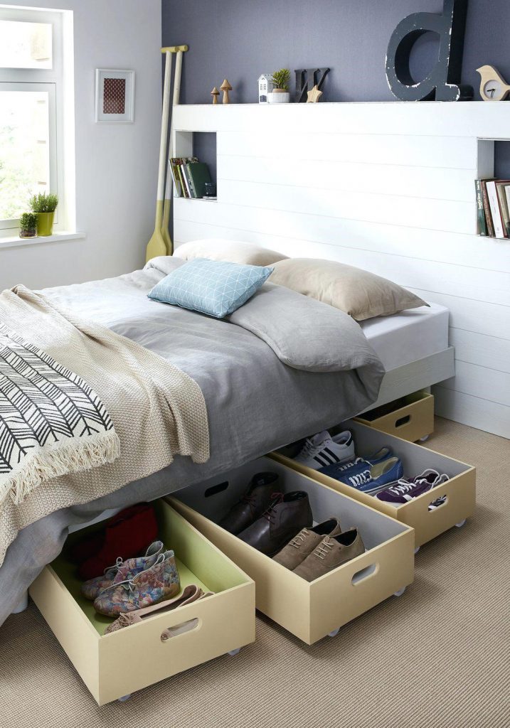
Another nifty way of storing shoes, especially those that you use only on occasion, is in under-the-bed boxes or drawers. Do remember to measure the space you have under your bed, before you go shopping for storage solutions!

4. Ladder Shelf

Photo Credit: A Beautiful Mess

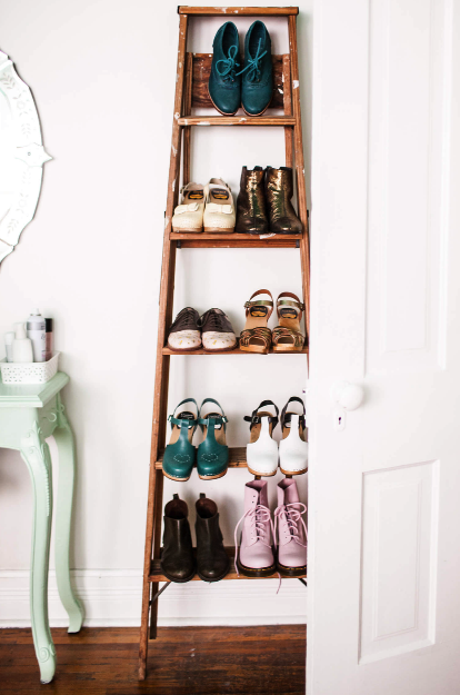
A shoe shelf fashioned from a ladder is a great option for footwear that look too nice to hide away. Also, you no longer have to rummage through the cabinet looking for shoes to go with your outfit.

5Metal Grid Panels

Photo Credit: Burkatron

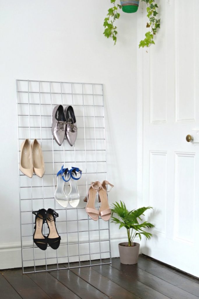
Metal grid panels are an affordable yet creative way of organising footwear. These metal grid panels are easily available too – they can be purchased from IKEA or the neighbourhood hardware store. They come in a variety of sizes to suit your needs. Hang your shoes or lay them on top of the grid – you decide!

6. Wooden Crates

Photo Credit: The Merry Thought

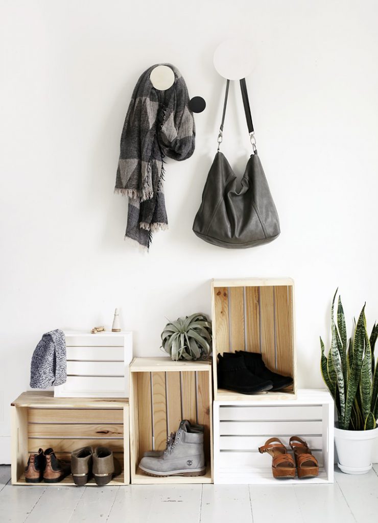
Wooden crates are an unconventional way to organise your footwear while adding a touch of Scandinavian to your home. Paint the crates to fit the colour scheme of your home or have it as-is for a rustic vibe. Stack them up in any way and decorate them with your favourite succulents!

Depending on your home and needs, there are many ways of storing and organising your footwear. Have your very own unique shoe storage ideas

Source: mynicehome.gov.sg
7 Moodboard-Worthy HDB Homes

7 Moodboard-Worthy HDB Homes

Ready for some serious reno inspo?
With a new HDB flat comes the perfect opportunity to create that unique moodboard-worthy space you’ve always dreamt of. All you need is a creative vision, and expert advice from interior designers. Here are some homes you need to check out!

Interior Firm: EHKA Studio

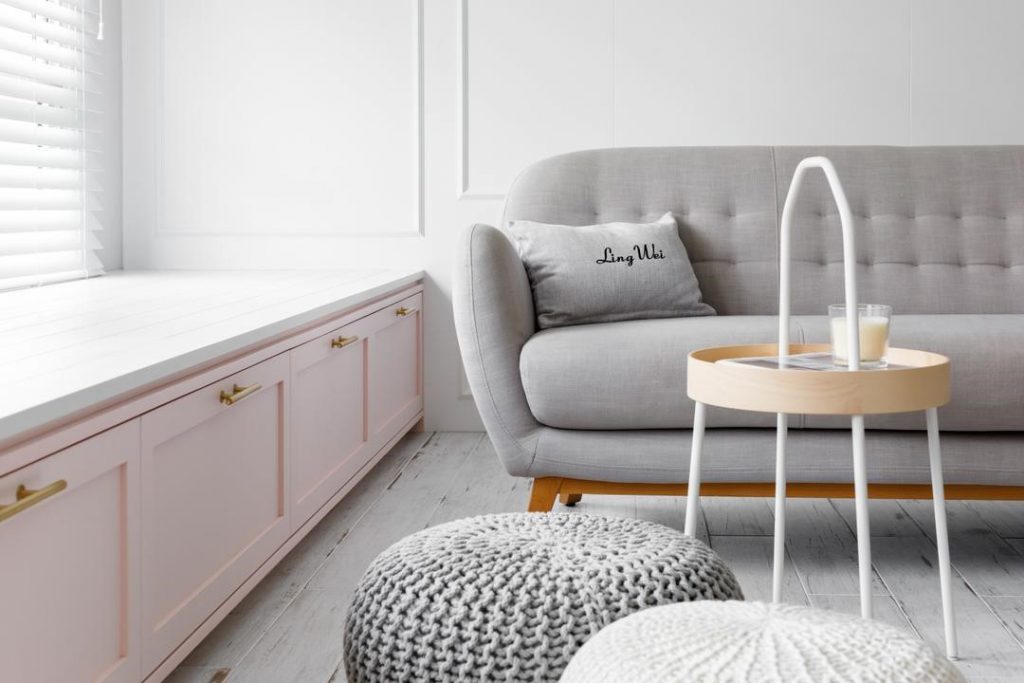
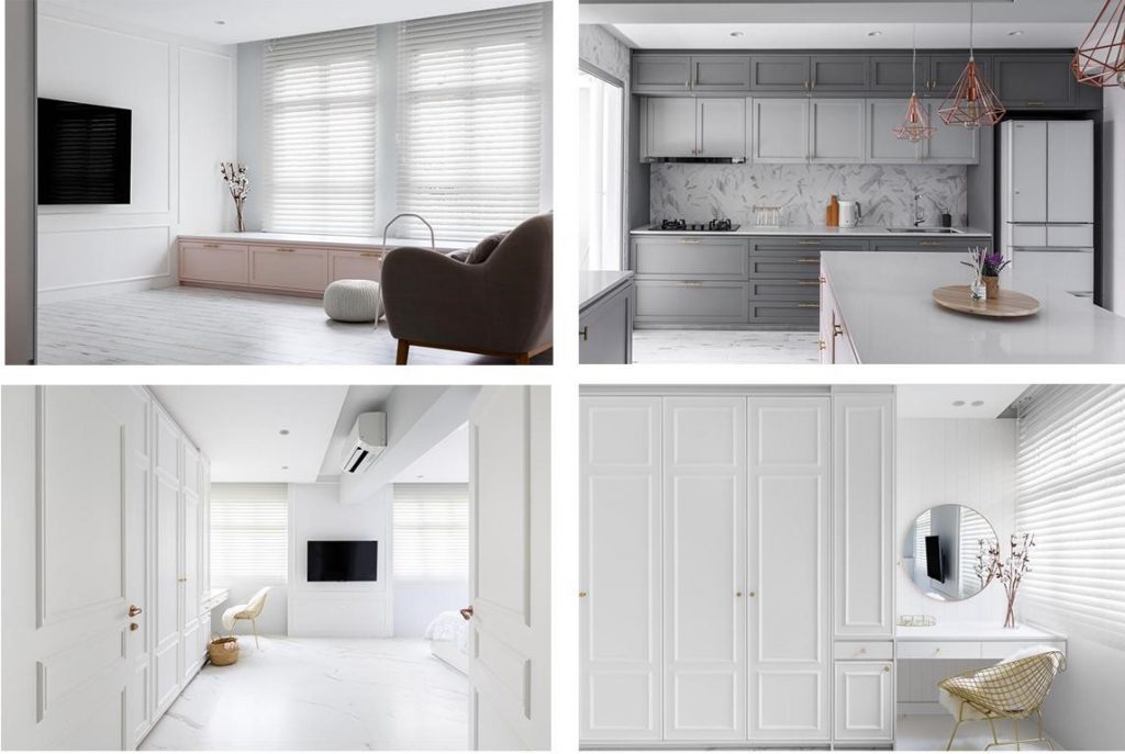
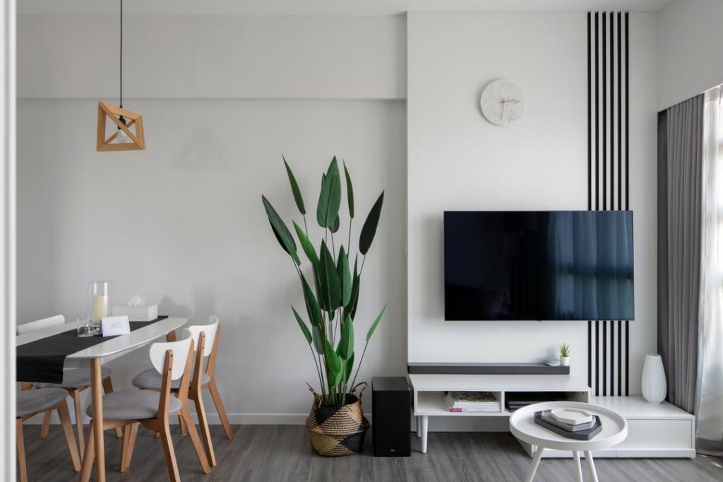
1. This home looks like it came straight out of a modern fairytale, with its dreamy white and pastel palette. Gold furniture details, herringbone backsplash, and combination of wood and marble flooring were specially picked to complement the look.

Interior Firm: The Scientist

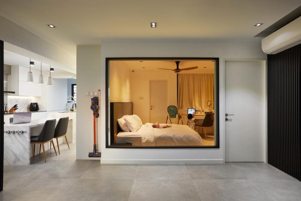
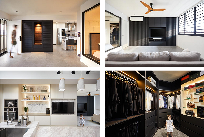
2. The black and white palette in this home is reminiscent of an upscale apartment in downtown New York. To play up the modern look, the homeowners added minimalistic yet functional fixtures: a huge walk-in wardrobe, and a glass panel to separate the bedroom and living room.

Interior Firm:The Local INN.terior

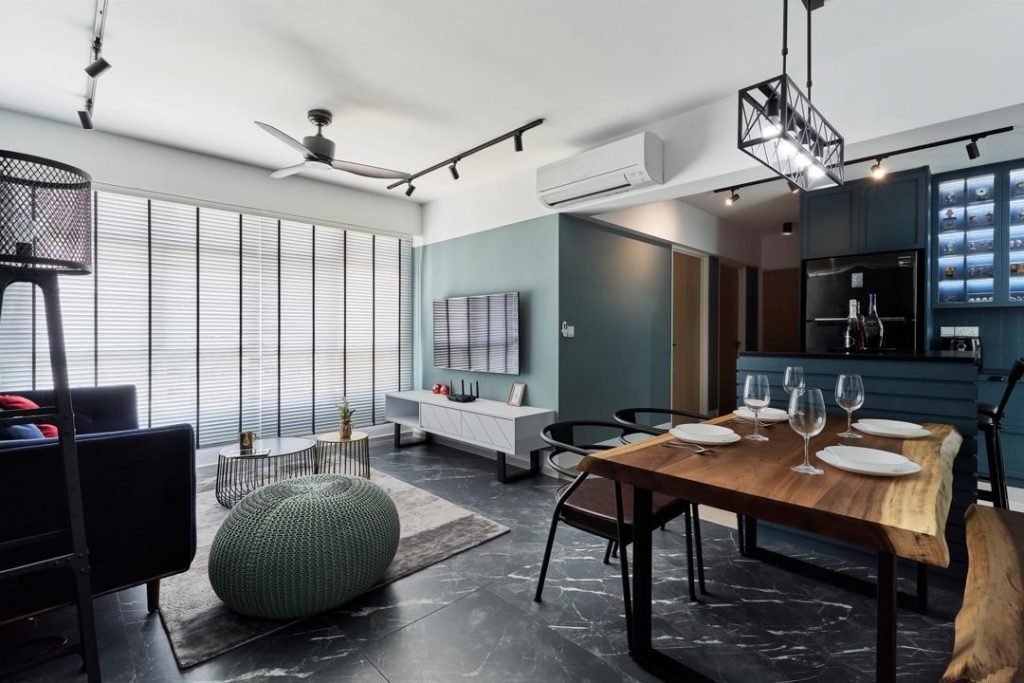
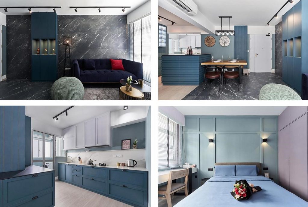
3.This home features dark-veined marble tiles on the living room floor and walls, and furniture in varying shades of blue. Meanwhile, the bedroom and kitchen sport lighter hues, which help create a soothing effect.

Interior Firm:Charlotte’s Carpentry

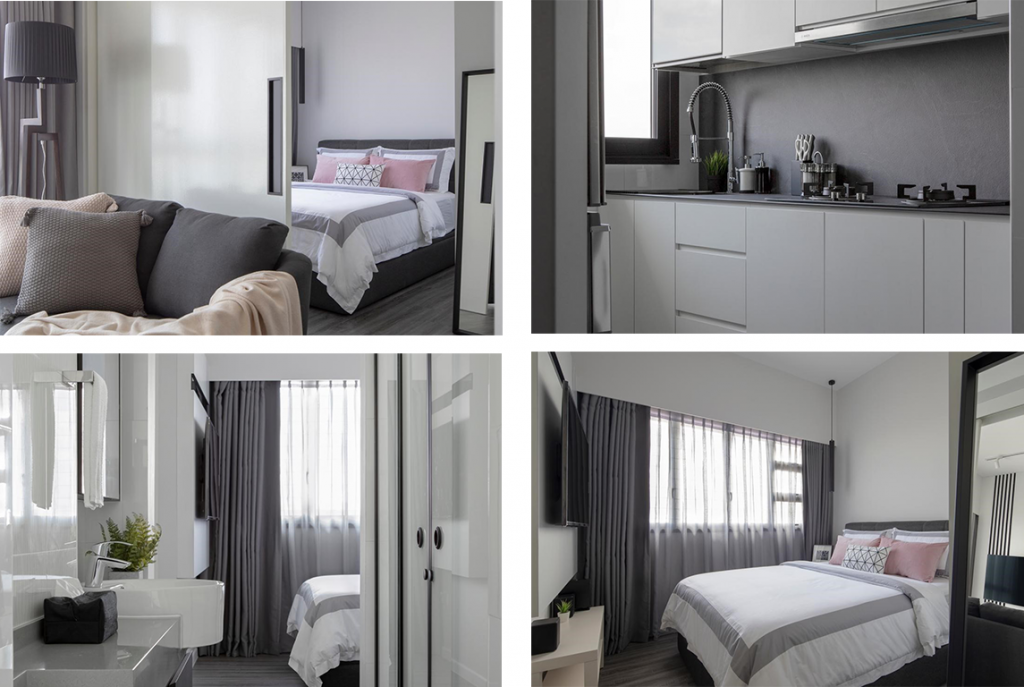
4. The sliding door in this 2-room flat separates the bedroom from the living room, offering greater privacy. The extensive use of grey also gives the home a modern, minimalistic look.

Interior Firm: Neu Konceptz

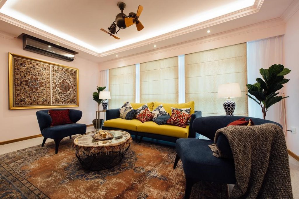
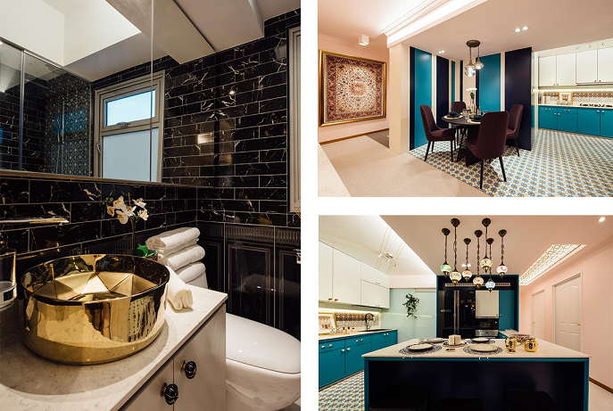
5. The owners of this flat went all out, by picking bold colours and patterns! Unconventional décor choices, like the statement Persian rug, gold sink, and Turkish lighting fixtures, making this home truly unique.

Interior Firm: Fatema Design Studio

6. From the wooden slats that function as a feature wall, to the dark-coloured furniture, this home is definitely a Scandinavian haven. Fur rugs and plush furnishings were added to soften the entire look.

Interior Firm: erstudio

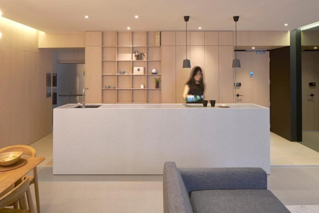
7. This home has fashionable full-height shelving units and concealed doors that help to keep the living room clutter-free and sleek. The owners also opted for a white minimalistic kitchen island to match that Nordic aesthetic.

Interior Firm: EHKA Studio

This article was contributed by Qanvast

Source: mynicehome.gov.sg
Reno Inspo: Pantone Colour Of The Year

Reno Inspo: Pantone Colour Of The Year

Classic Blue is the new black

Move over ‘Living Coral’, ‘Classic Blue’ is here to stay – at least in 2020! So what makes this elegant and timeless shade of blue so special, that Pantone decided to crown it colour of the year?

Pantone explained that ‘Classic Blue’ represents stability, calmness, and connection. Well, sounds like everything we’d love in a home! Here’s how you can incorporate this on-trend shade in your interior décor.

1) Just a Hint of Blue

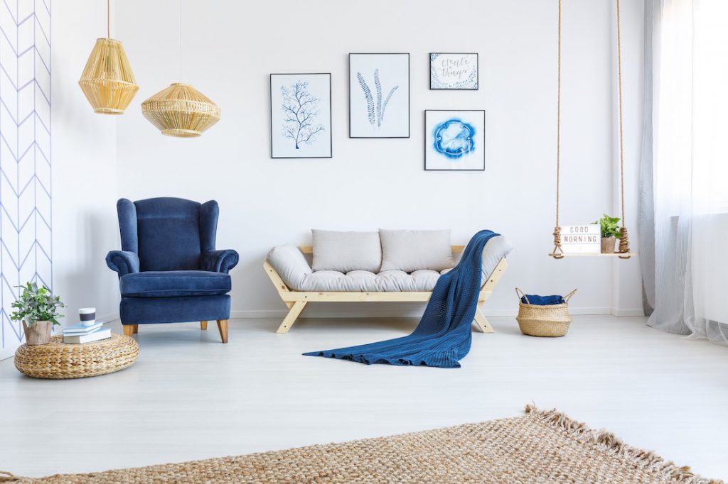
The easiest way is to add art pieces and soft furnishings, such as cushion covers, curtains, throws, and rugs, in the shade of ‘Classic Blue’. This would be most impactful in spaces with a neutral-toned decor to contrast with the unexpected pop of colour.

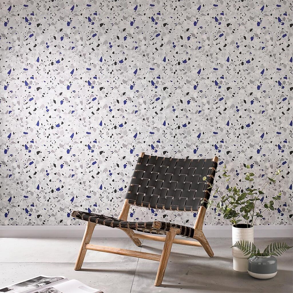
For something more permanent, consider this blue-speckled terrazzo wallpaper, especially if you are going for a vintage vibe.

Photo Credit: Graham & Brown

2) Bold Blue Statement Pieces

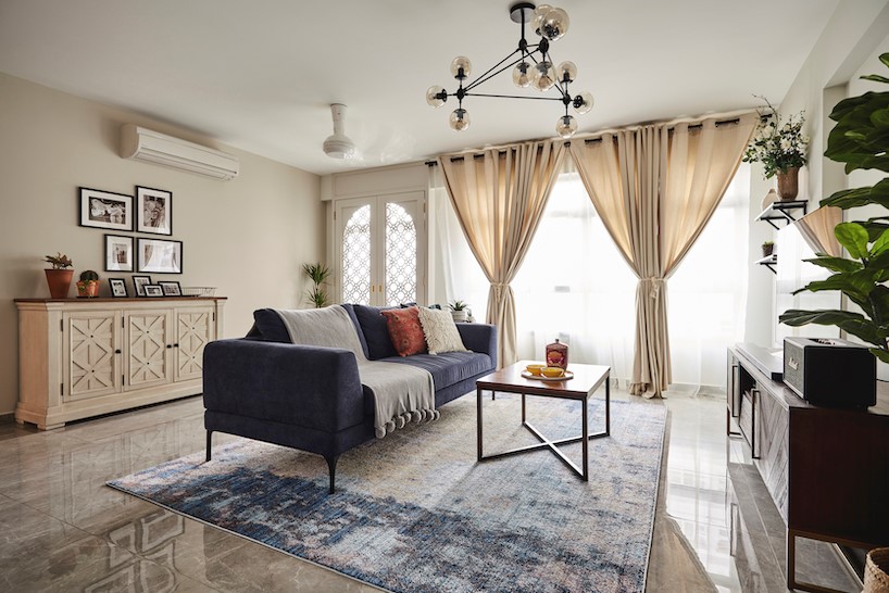
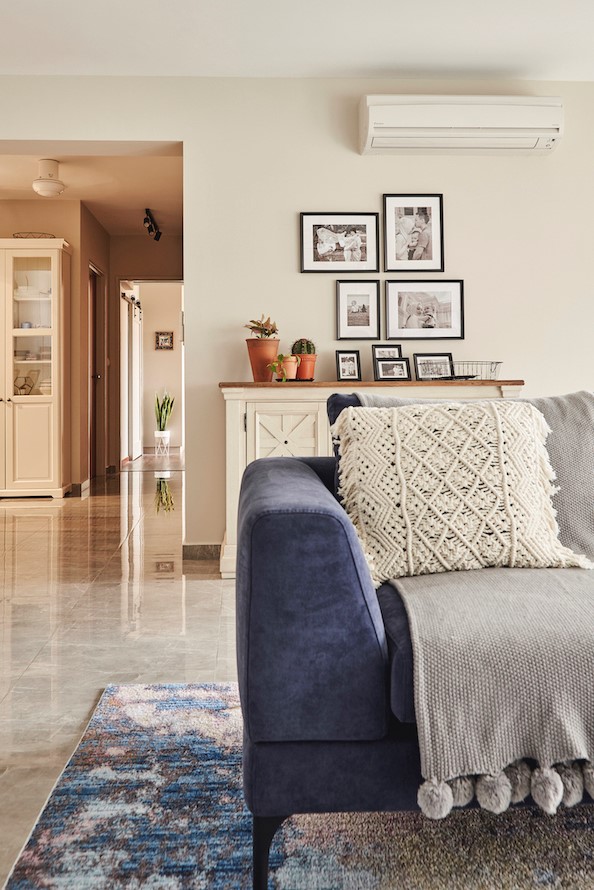
A sofa is one of the most important pieces of furniture in your living room, so pick well! After all, that’s where most of your guests will spend their time, and maybe you too (think netflix and really just chilling). Here, homeowner Fizah picked a large velvet blue sofa to be the highlight of her living room, with a matching rug to complete the look.

Fizah picked a rug with hints of blue to match her sofa

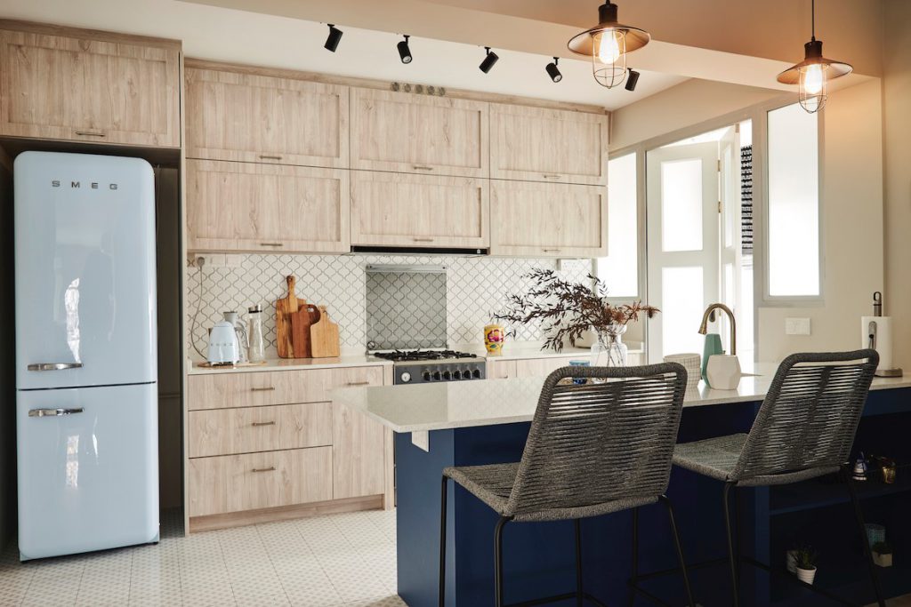
If the idea of full blue kitchen cabinets sounds a bit overwhelming, why not choose a blue laminate for your kitchen island instead. It adds the right amount of pizazz – see how Fizah has done it below!

3) Full on Blue

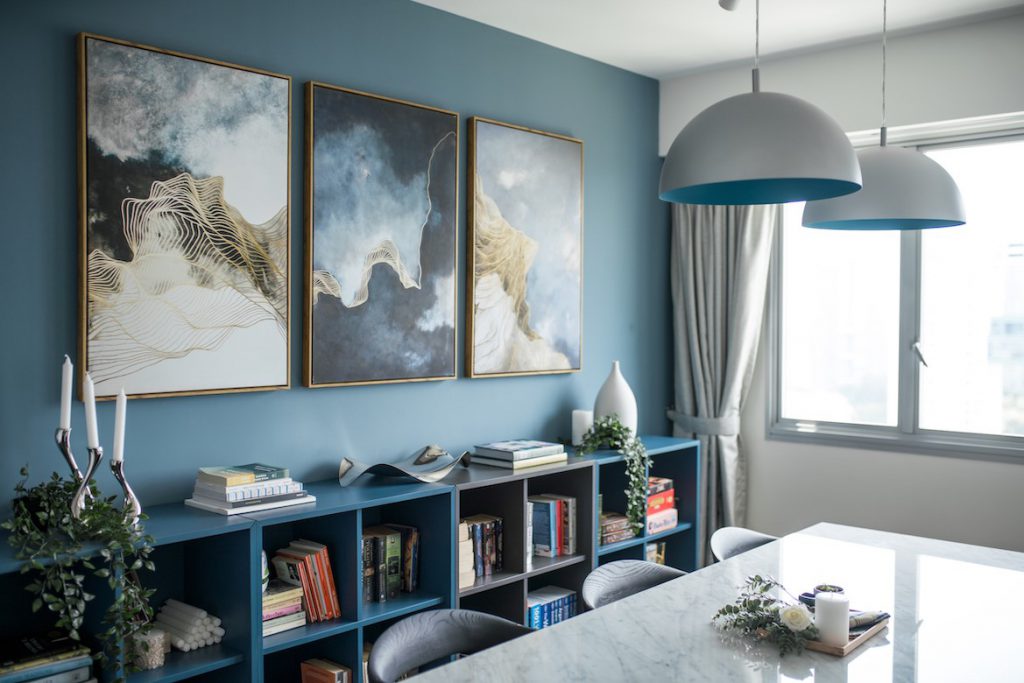
Yes, you can go big on blue! Don’t be afraid to go all out, because it is such an easy colour to match. Take reference from Kai Jie and Jiching’s flat; from the feature wall, to the artwork and cabinets, everything features ‘Classic Blue’. They balanced the colour with white, to achieve a nature-inspired theme.

Kai Jie and Jiching’s home features a lot of blue.

The surest way to make a statement with ‘Classic Blue’, is to simply paint it on your walls. Some common colour pairings are gold, brown, white, and yellow.

Know of other ways to work ‘Classic Blue’ into your home decor? Let us know in the comments below

Source: mynicehome.gov.sg
Trendy Wall Decor Ideas That’ll Refresh Your Space

Trendy Wall Decor Ideas That’ll Refresh Your Space

Renovating your home? Don’t worry, we’ve got you covered. Literally.

Looking to refresh your space? We’ve got your walls covered (literally)! From houseplants to statement lights, read on for our favourite wall décor inspirations.

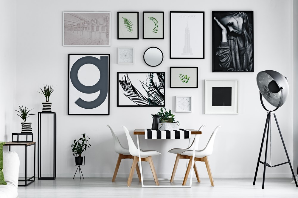
Gorgeous Galleries

Pictures of you, pictures of me, all upon your wall for your visitors to see.

Beyond showcasing your favourite photos/artwork, a gallery wall also adds a personal touch to the space. Opt for rectangular frames for a more polished look or mix things up with a variety of ornate ones. Alternatively, choose a large painting to liven up the room.

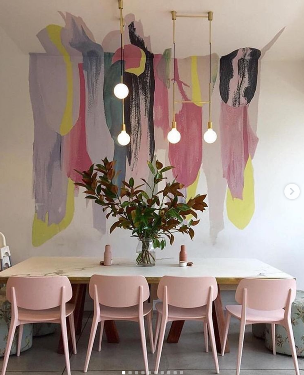
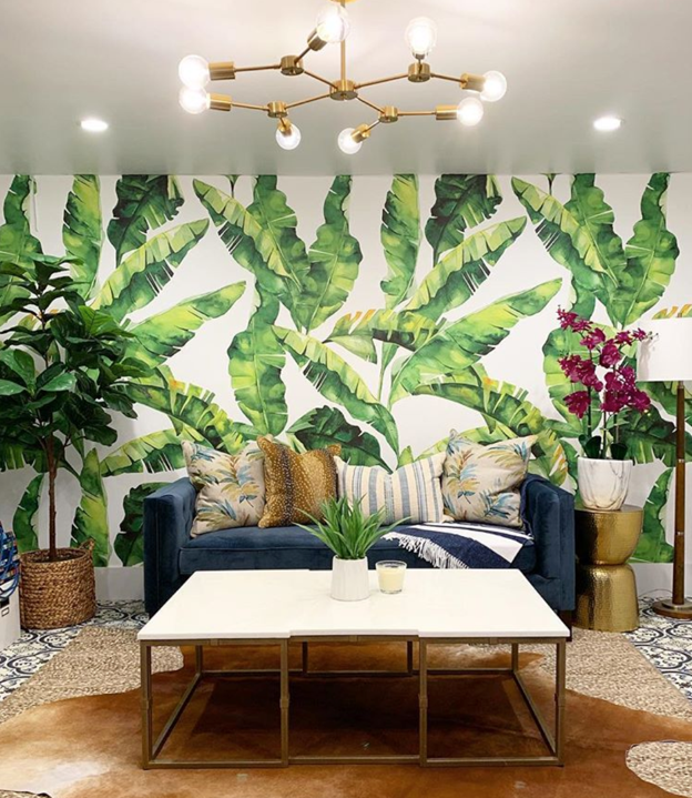
Mural Magic

Photo Credit: @echinteriors

Photo Credit: @houseofbrazier

Make a bold statement with a wall mural! Let your creativity flow and turn your walls into works of art. Not ready to whip out the paint brush? Removable wall stickers will do the trick. Whether it’s tropical-inspired paintings or abstract art, there’s a wide range of designs to choose from.

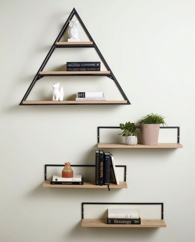
A Little Shelf Care

Photo Credit: @u.loft

Small shelves are a perfect way to display art pieces, potted plants and even books. Instead of the usual rectangular planks, opt for geometric shelves for a more striking contrast. If you have a dark-coloured wall, go for white shelving for a pop of colour.

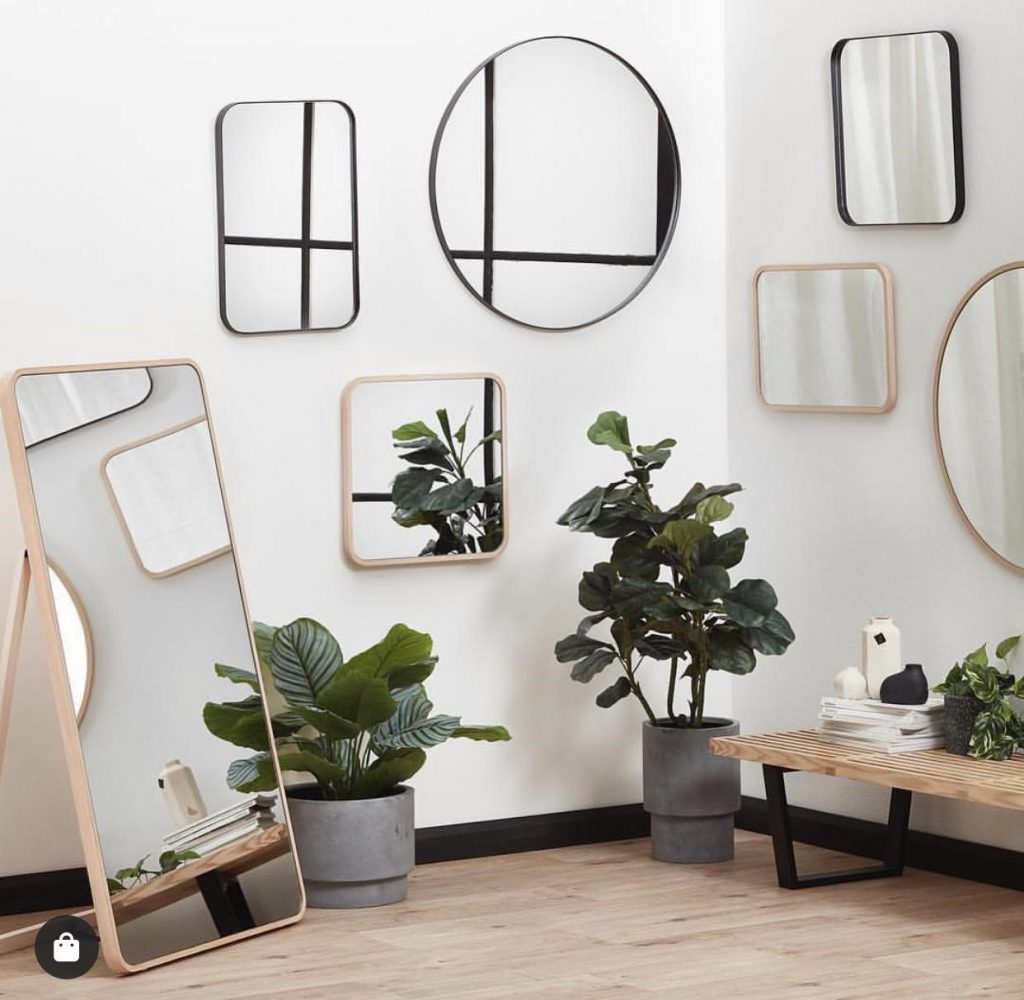
Mirror, Mirror on the Wall

Which is the most decorative of them all?

Not only are mirrors great for adding depth to a space, they reflect light instead of absorbing it and thus, will make any room appear bigger than it actually is. Choose from big, oversized mirror or go salon-style with a variety of small mirrors.

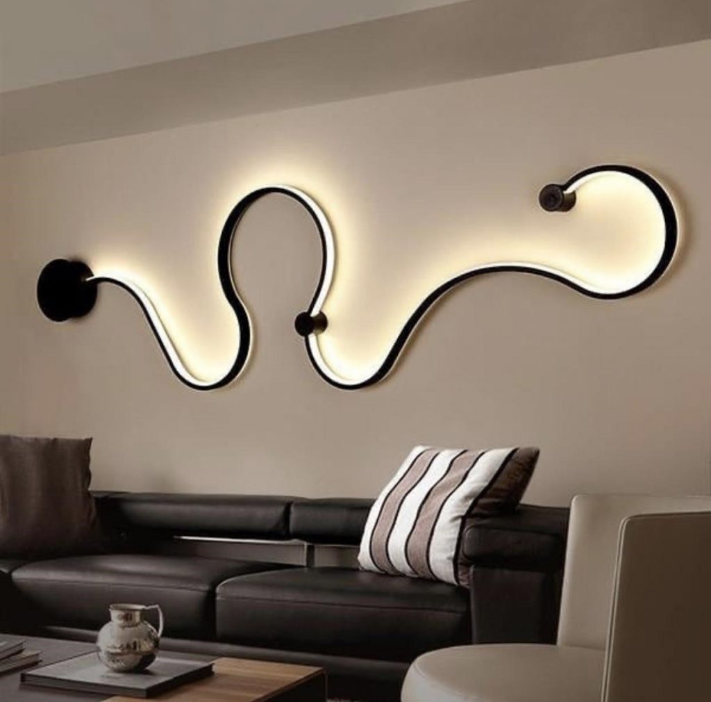
Getting Lit

Lights don’t only belong on the ceiling and on tables — add some decorative LED lights on your walls to liven the space! For a more artsy vibe, consider wall light sculptures! These wall luminaries come in a variety of shapes and styles that will make you want to flick the switch.

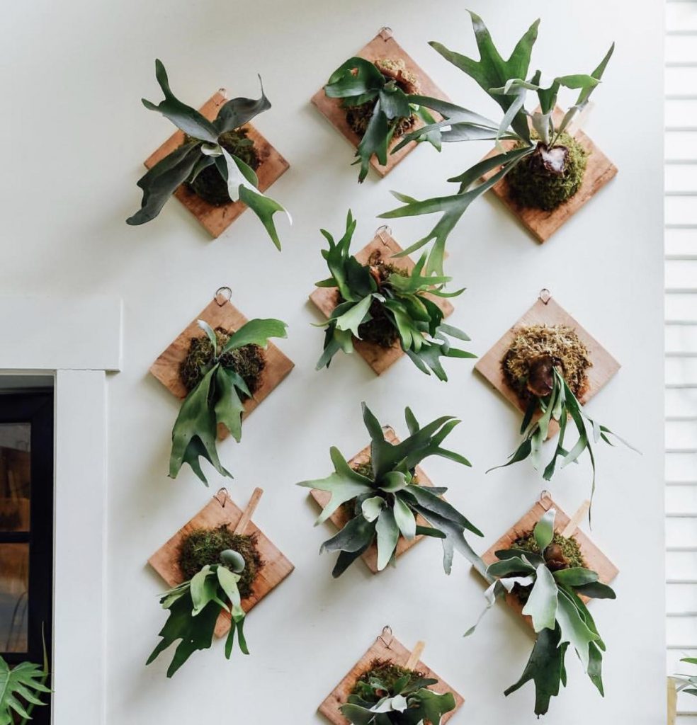
Planting Plants

Photo Credit: @pistilnursery

Are you a nature lover? With wall-mounted plants, you can be surrounded by lush greenery in the comfort of your home! Not only do they give life and personality to your living space, plants purify the surrounding air too! PS: Look out for these plants that are perfect for the indoors.

There are many different ways homeowners can accentuate their walls. From living rooms to bedrooms, you can imbue your living space with decor ideas to add personality and style. Have wall design idea(s) to share?

Source: mynicehome.gov.sg