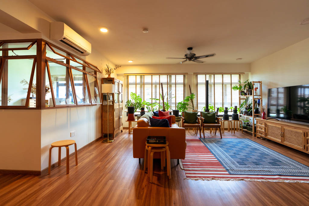
The home of Matthew Lee and Alee Wee is exactly what their Instagram handle, @thewoodyhome, describes – a cosy space dressed in warm, woody elements.
“We love teak wood as it is hardy and looks so raw,” the couple said. “Interestingly, both of us grew up surrounded by teak furniture – so this is also our way of bringing a piece of our childhood into our new home!”
Japanese Influences
When designing their 5-room HDB flat, Matthew and Alee took inspiration from Japanese architecture. “During our trips to Japan, we noticed that glass and wood are frequently used as the main interior design elements. The result is a rustic yet contemporary look – something we wanted to replicate for our home.”
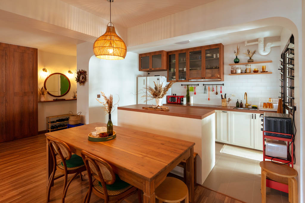
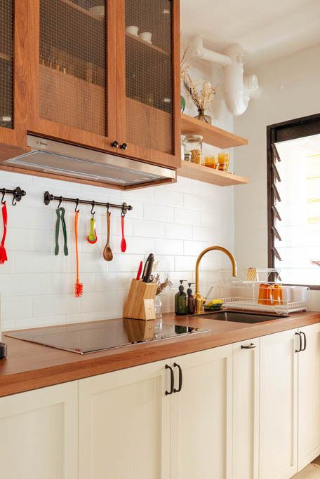
The kitchen and home office carry the strongest Japanese-inspired influences. In the kitchen for example, the couple opted for wooden shelves to mimic the minimalism of Japanese home kitchens.
Across the room, the wood-framed glass windows of the home office recreate the look of Japanese cafés. “We hacked the top half of the wall to incorporate windows. Beyond aesthetics, the windows also brighten up the space by letting in more natural light—it’s a win-win,” Matthew explained.
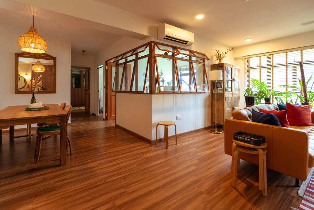
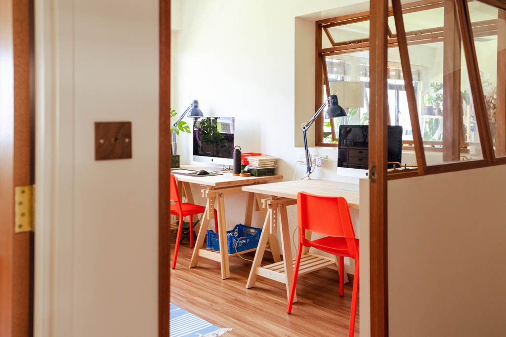
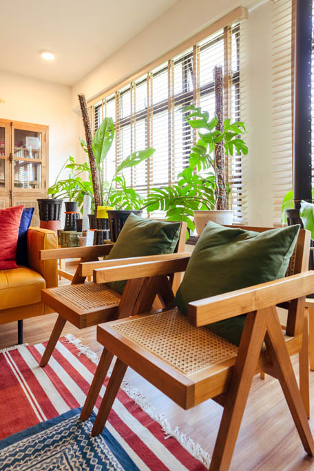
The couple mainly opted for loose pieces in their home to highlight the spaciousness of the flat. Besides the teak furnishings that they love, they also added rattan pieces to the mix. “Rattan is a common element in Japanese homes. Plus, the varying texture of rattan furniture also helps with creating dimension within the space,” Alee says.
Mix and All Match
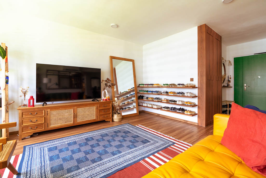
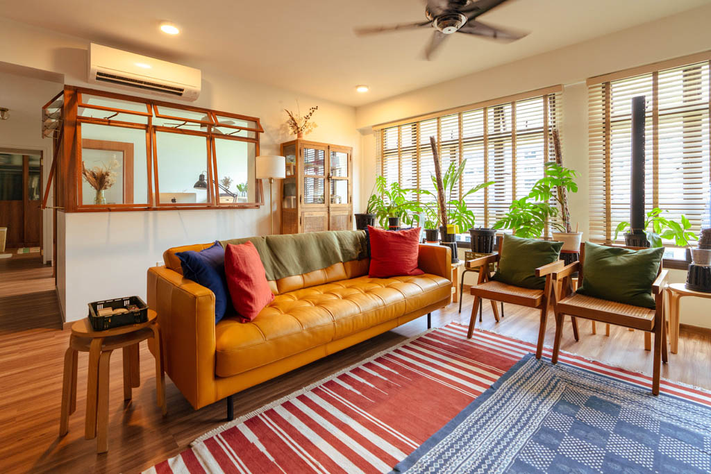
With shades of brown and white making up the primary colour palette of the flat, pops of colour are used to liven up the space. The living room for instance, is decorated with rugs and cushions of different textures and tones.
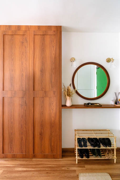
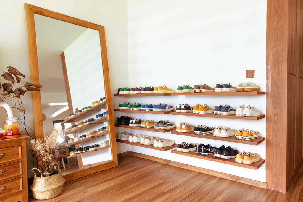
Colour is also added in the form of a shoe display that features the home owners’ sneaker collection. “The sneakers add a dash of personality to the space and frankly, serve as reminders of what we already own,” laughs Alee.
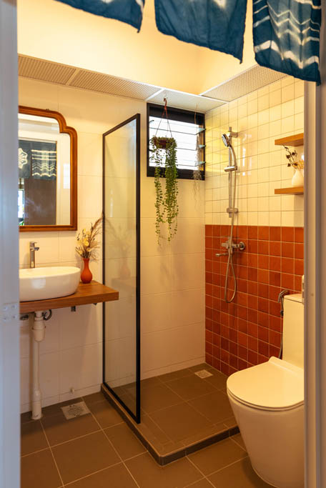
The mix and match design also extends to the bathrooms. While the walls of the common bathroom feature a mixture of terracotta and white tiles, the couple took a different design approach in the master bath by combining different wall finishes.
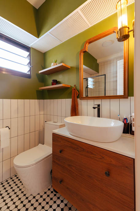
“We were planning for a combination of green and white tiles for our ensuite bathroom,” Matthew explains. “However, we were unable to find the exact shade of green we wanted, so we decided to paint the upper half of the wall instead!”
Maximise Space, Minimise Built-Ins
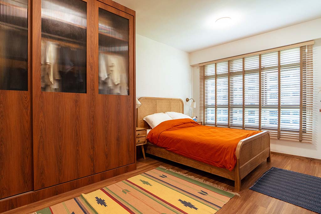
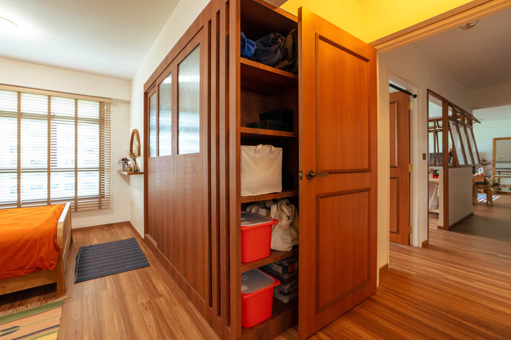
While built-ins in the home were kept to a minimum, the key ones that Matthew and Alee opted for—the kitchen island and wardrobe—were meant to add storage space.
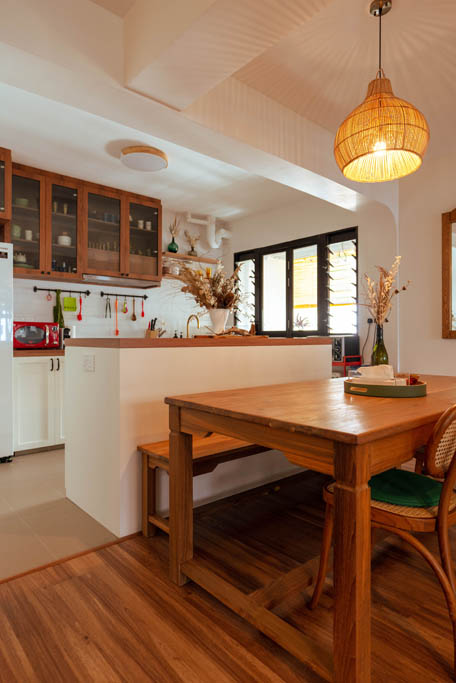
“The kitchen island provides more countertop space for cooking prep, and acts as an extended dining table for when we have guests over. It also triples up as a storage space where we keep our tableware,” the couple says.
In the master bedroom, the couple pushed back a wall into the adjoining room, to enlarge the wardrobe space.
On her favourite spot in the flat, Alee says, “I love the dining area. Now that we’re working from home, I spend even more time here. This spot is spacious and allows me a panoramic view of the house.”
While Matthew’s go-to spot is also in the communal area, he shares why the living room is his favourite. “I like hanging out in the living room – especially on the sofa,” he grins. “Since I grew up with a teak couch, I really appreciate having a cushioned resting spot.”
Source: mynicehome.gov.sg

