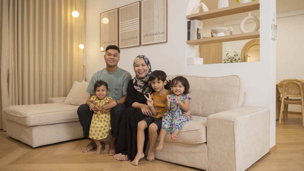
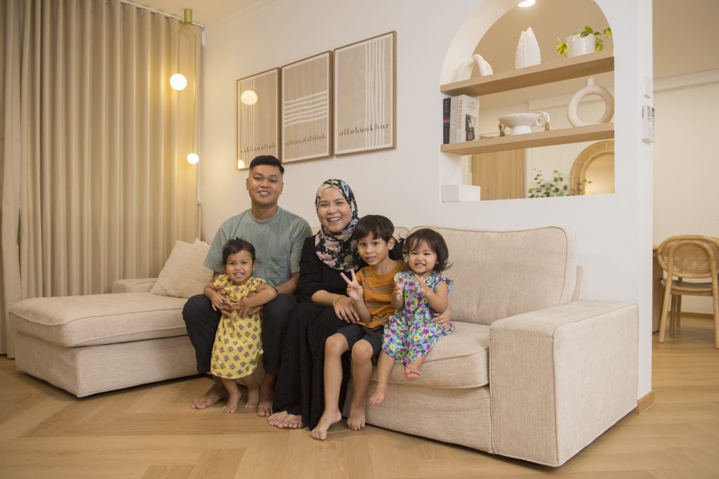
Full of colour, but with a hint of minimalism, Rina Raihana and Muhammed Fauzan’s home in Bukit Panjang is a representation of their individual styles.
“I wanted a colourful, playful space while Fauzan leans towards the Scandinavian aesthetic. So, we decided on a mainly white-and-wood theme that’s decorated with splashes of colours and playful elements,” Rina smiles. The 5-room flat is also adorned with wall paintings and rattan décor that add to its Bohemian charm.
Mixing Shapes and Patterns
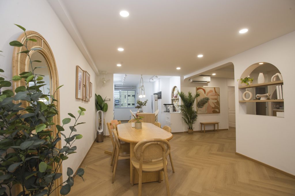
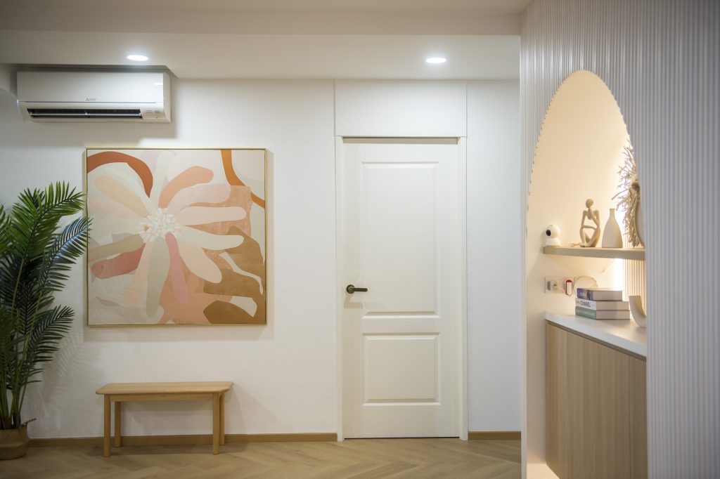
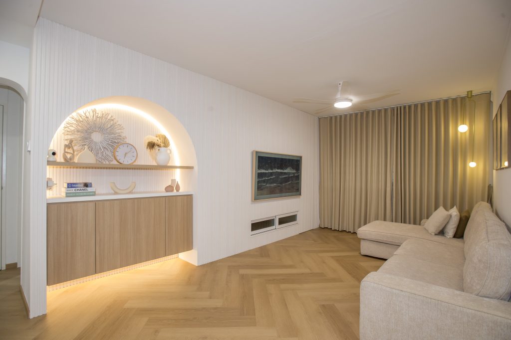
Rina and Fauzan, who are second-time home owners, worked together to achieve the shared vision for their home. In the open plan communal area, the walls and most of the décor items, are primarily white. The herringbone pattern is weaved into the flooring, creating a seamless flow between the living, dining and kitchen areas. These aspects of the design are attributed to Fauzan, who explains, “I’m a minimalist who prefers consistency and continuity.”
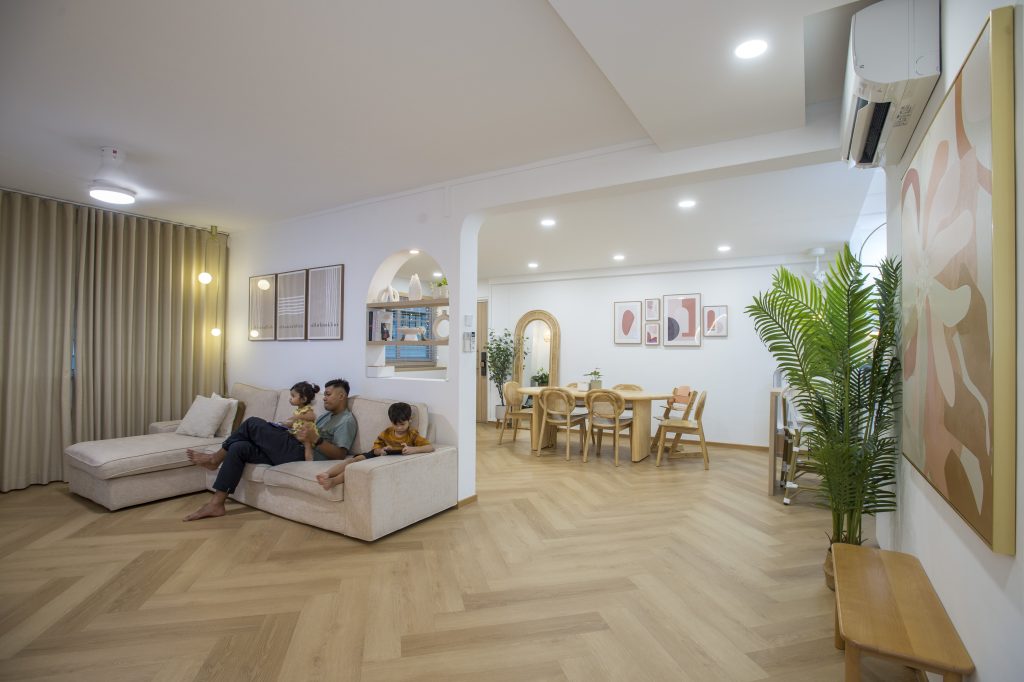
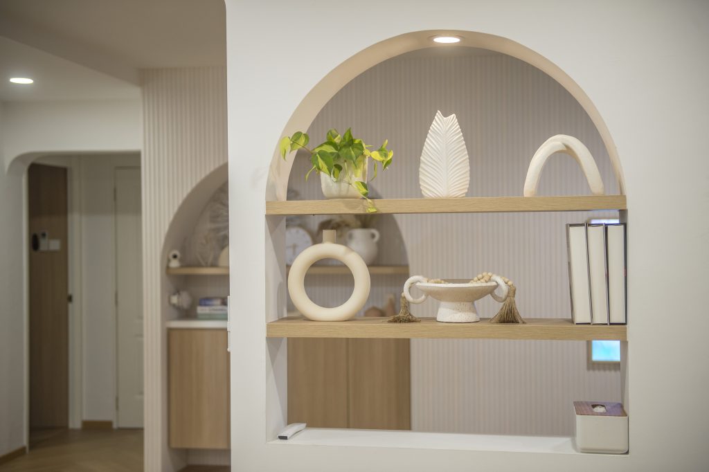
The home is far from monotonous, however, as the couple incorporated arches and colourful wall paintings for a playful touch – a result of Rina’s bubbly personality. “With their round edges, the arches also help to soften the overall look,” she says.
The arch is also present in the kitchen pantry, albeit in a different style. A vintage-inspired wallpaper is used as the backdrop, to add a pop of colour in the area. This complements the white rattan chairs at the kitchen island, where Rina does most of her cooking preparations.
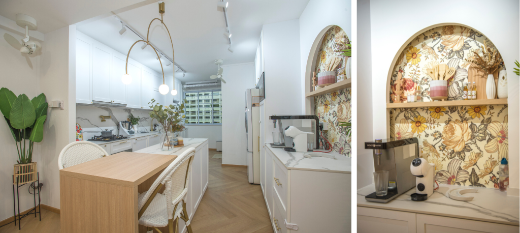
“The extra countertop space comes in handy, especially because I cook often. The kitchen island is also perfect for us, as it doubles up as a hosting area whenever we have friends and family over,” Rina shares.
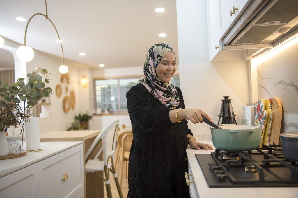
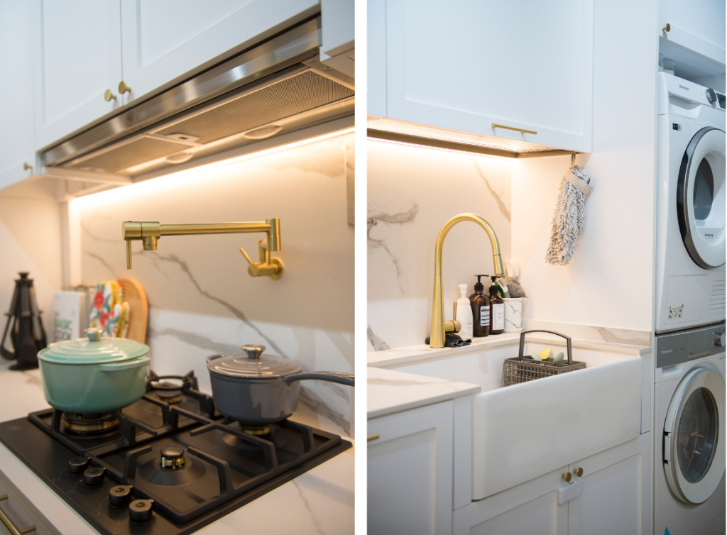
The kitchen sports a minimalist look with its matching marble backsplash and countertop. The rustic look of the shaker-style cabinets and farmhouse sink further ties the kitchen’s aesthetic back the rest of the communal area.
Playing with Colours
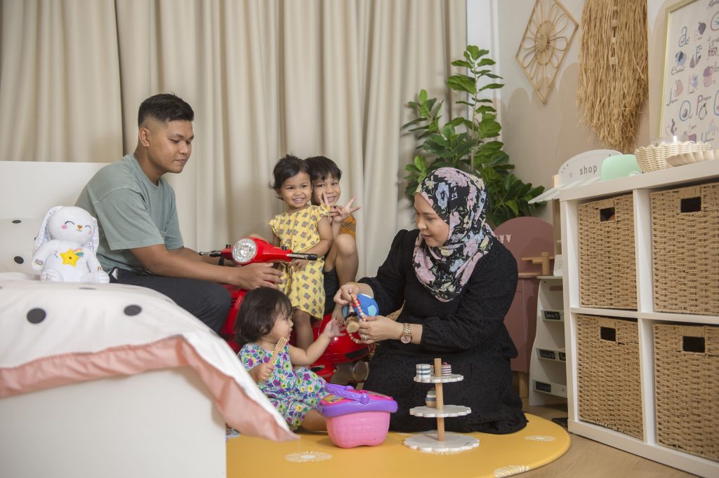
In the children’s bedrooms, colours are used to liven up the space. “We didn’t plan to use vibrant colours in the bedrooms initially. However, after receiving a yellow playmat as a gift, we thought the décor for the children’s bedrooms could be brighter, especially since the rooms are also their play area,” Rina says.
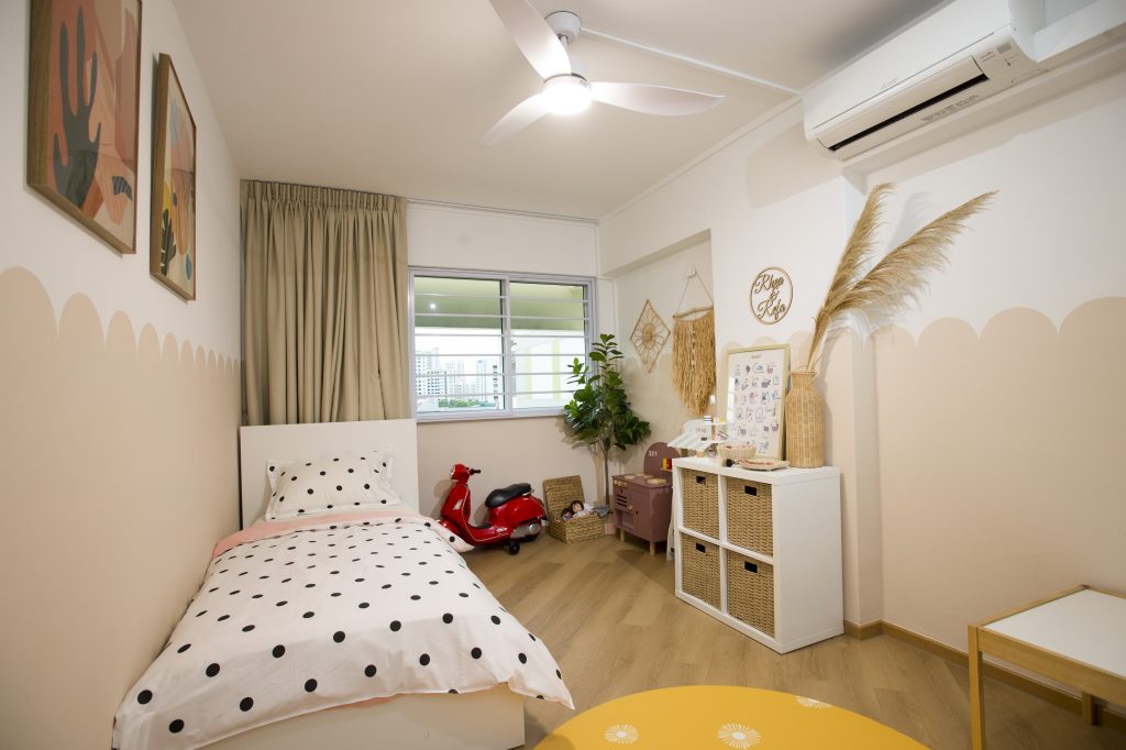
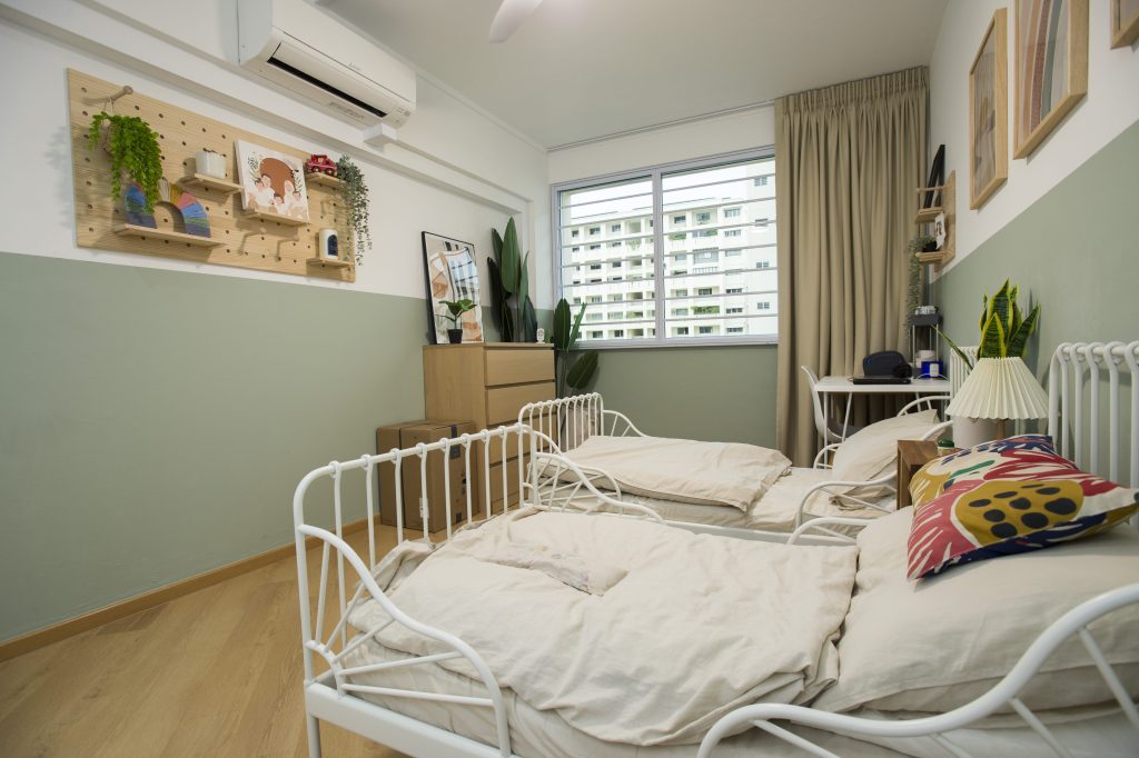
In the adjacent bedroom, the couple chose a refreshing sage colour for the walls. White, rustic-inspired bedframes add a cosy vibe to the bedroom.
It is however, in the bathrooms where Rina’s vision for colourful spaces truly come to life. The common bathroom features a half-wall designed with green subway tiles paired with a mosaic-tile floor, while the ensuite bathroom stands out with a terrazzo wall and wood-inspired floor tiles. Both bathrooms are also adorned with gold fittings that further brighten up and add luxe to the intimate spaces.
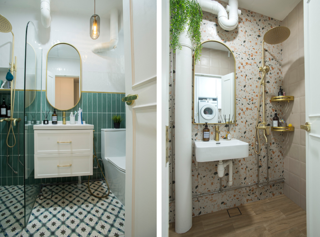
“I really unleashed my creativity in the bathrooms,” Rina laughs. “Since the bathrooms are more ‘hidden’, I could add more colours without them looking too contrasting to the rest of the flat.”
Source: mynicehome.gov.sg

