Day: October 5, 2022

Home Tours: Designing a Modern Minimalistic HDB Flat

Home Tours: Designing a Modern Minimalistic HDB Flat

Looking for interior design inspiration for a minimalist home? Find out more in this edition of home tours!

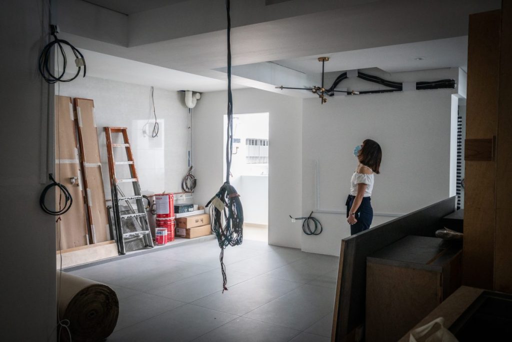
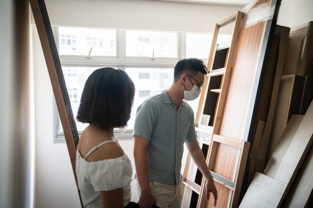
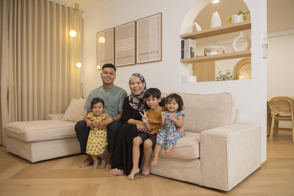
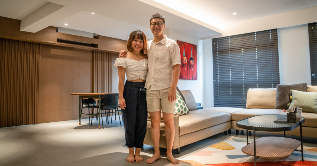
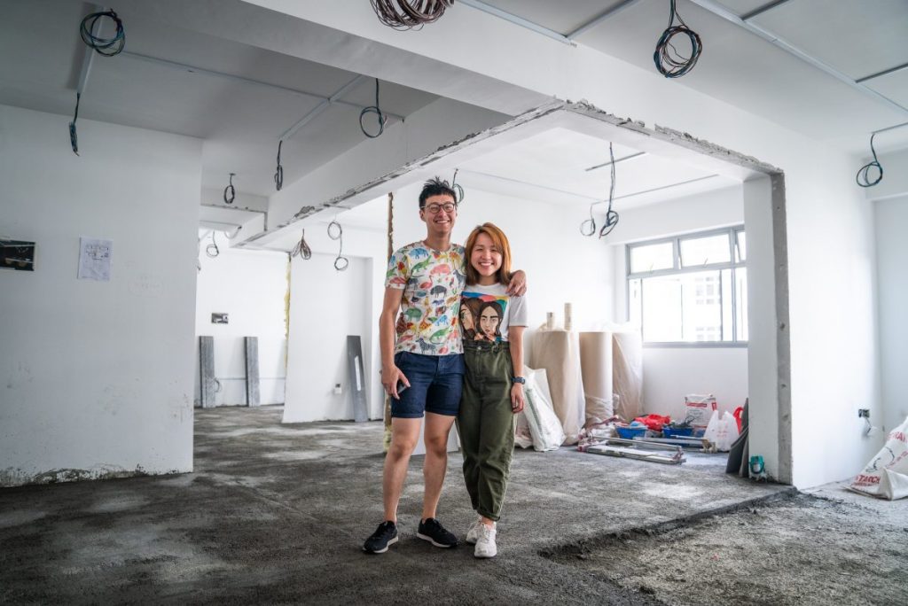
Within two months of collecting the keys to their new home, Adora Liang, Francisco Loi and their two sons were settled in their new 4-room HDB flat at Alkaff Court – making them one of the first few residents to move into the new Bidadari estate.
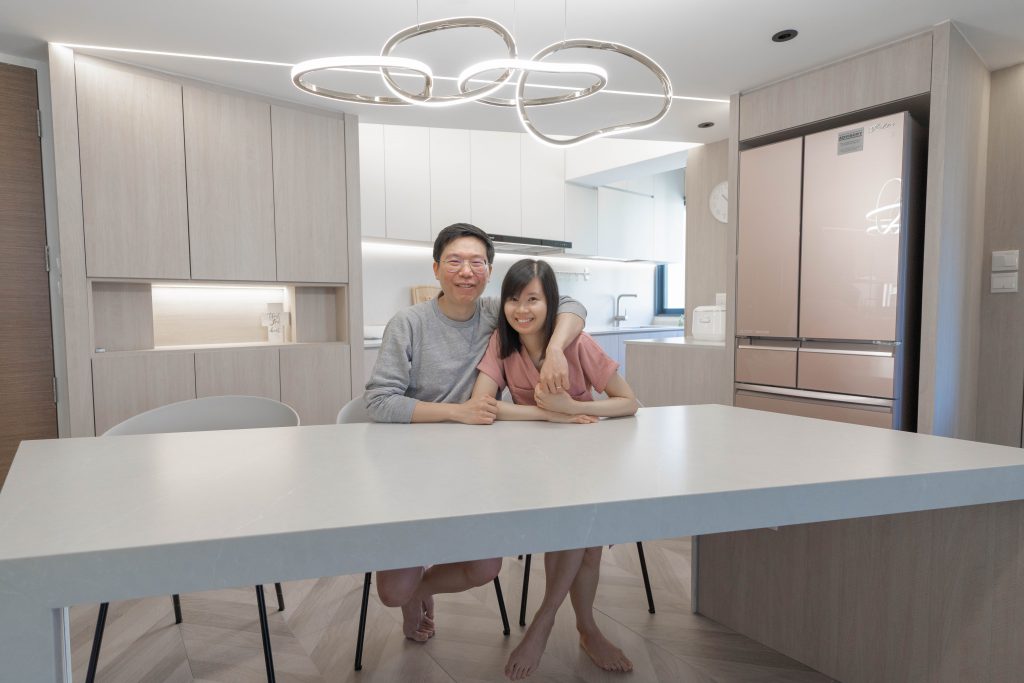
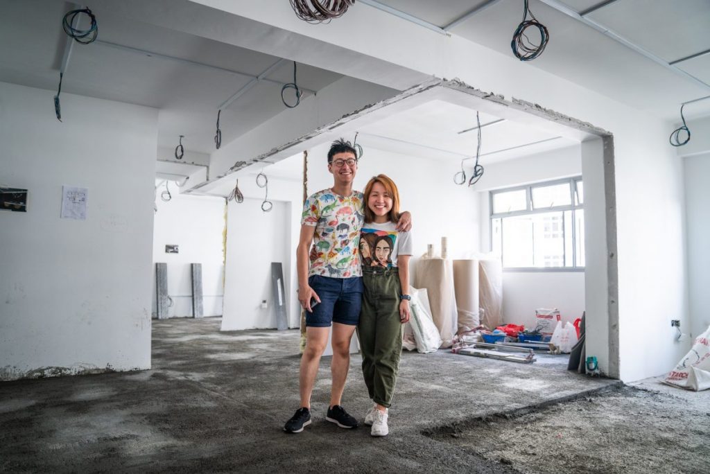
Home owners Francisco and Adora in their brand new flat

Francisco has a background in interior design, which helped with the speedy move-in process. From space planning to colour-matching, he and his wife went through most of the renovation journey on their own and only engaged contractors for carpentry works.

Contemporary Vibes

The home owners went to great lengths to ensure thematic consistency, incorporating light tones, marble accents and geometrical shapes throughout the space.

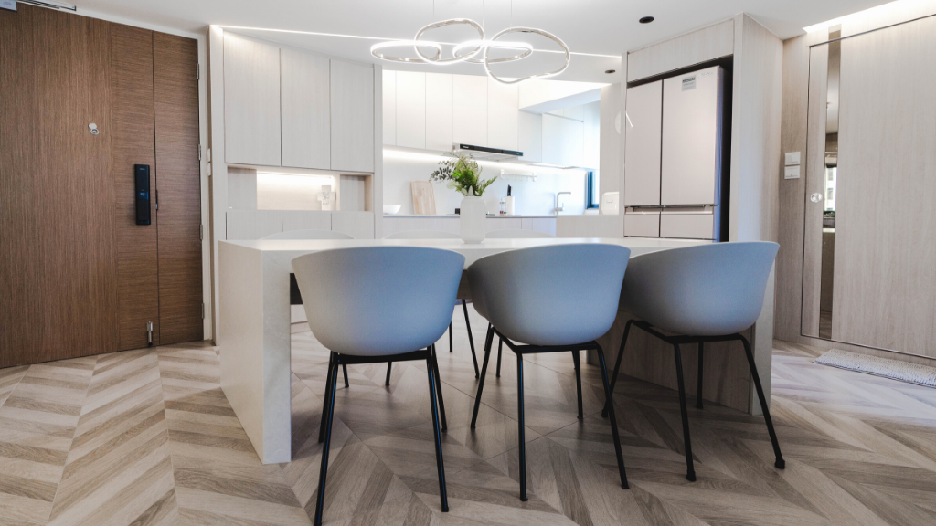
Upon stepping into the flat, the statement pendant light hanging above the dining table is difficult to miss. Strip lights that are carefully concealed by a false ceiling complement the light fixture lending a polished look to the dining area.
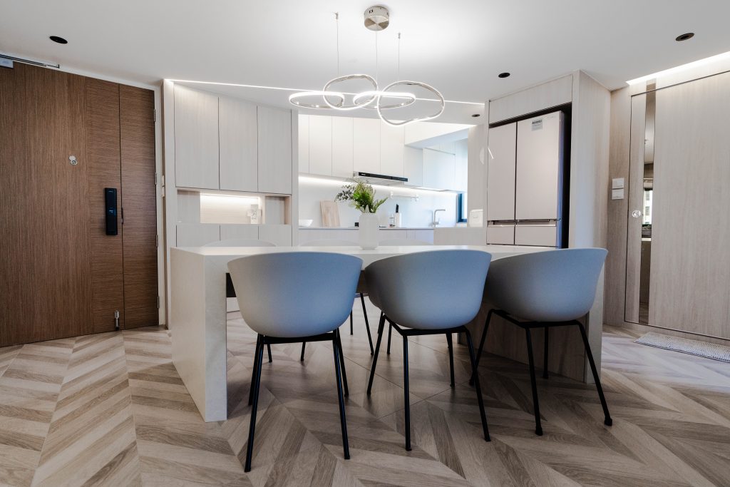
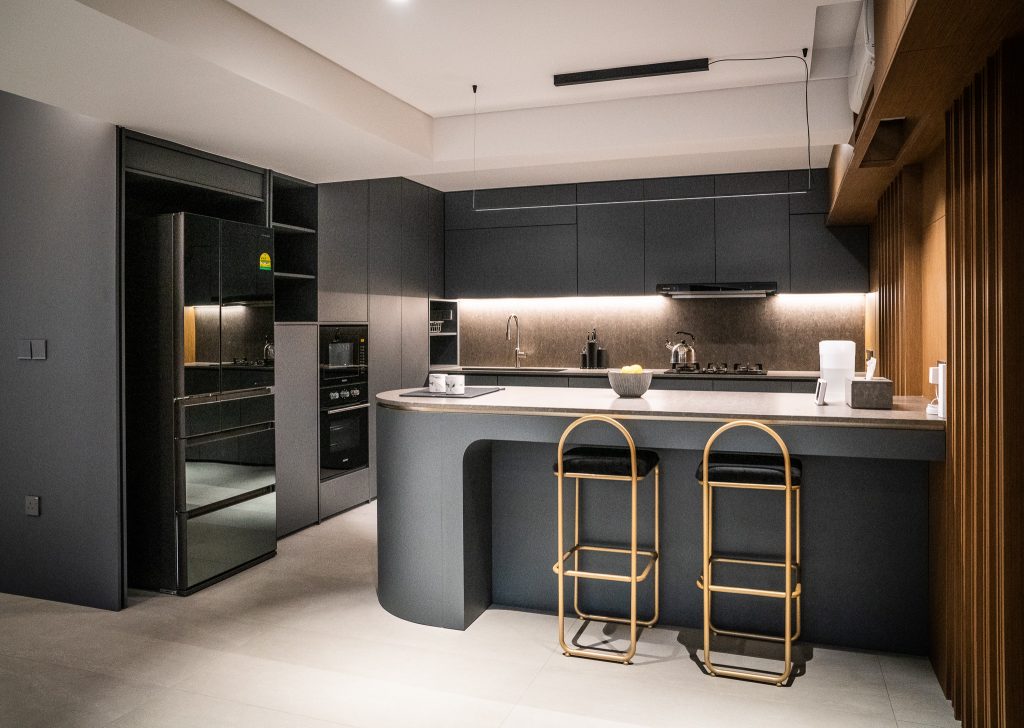
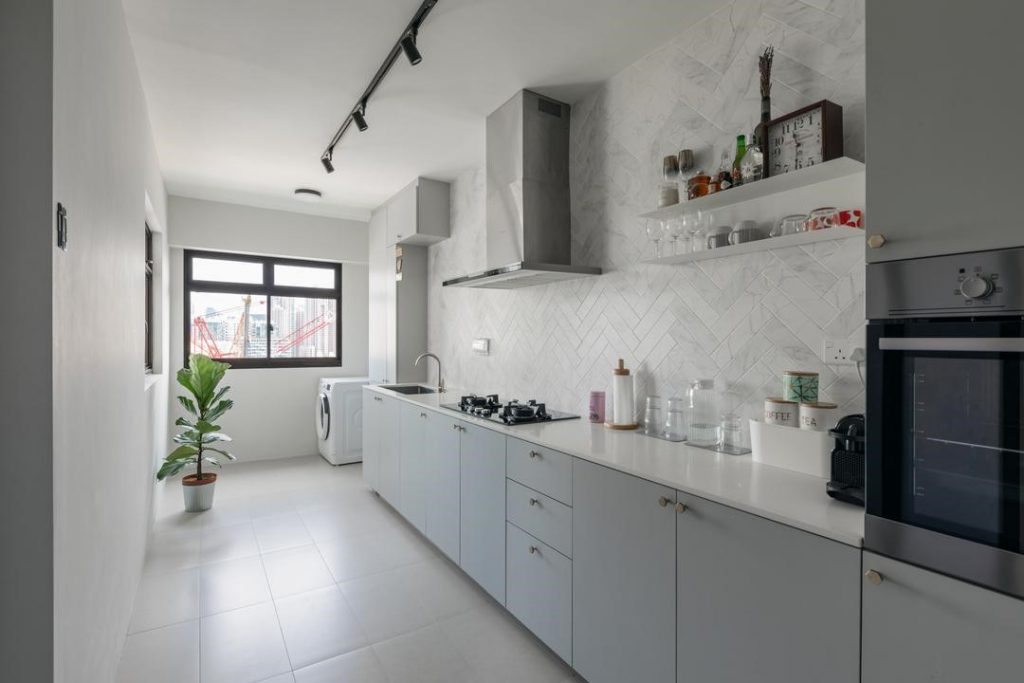
The classy kitchen and dining area

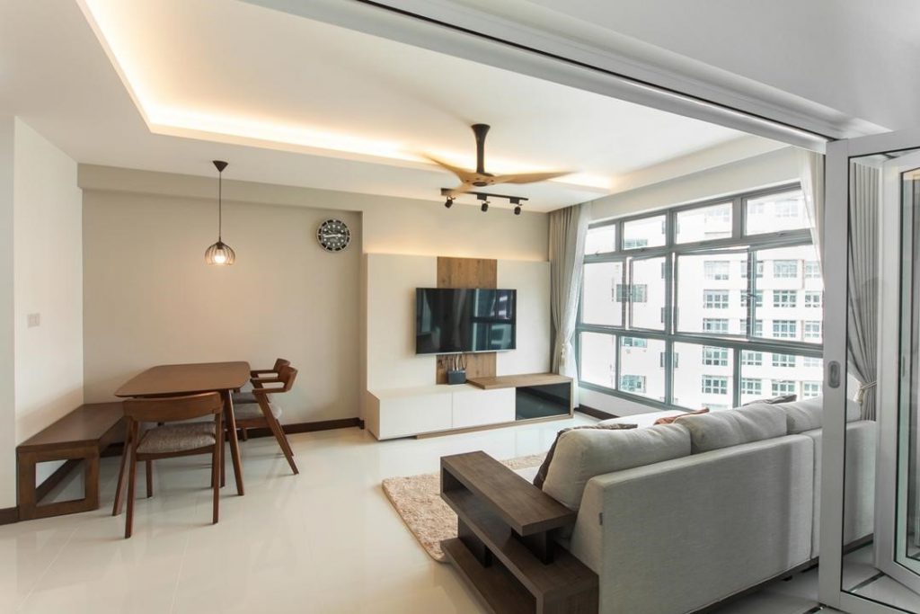
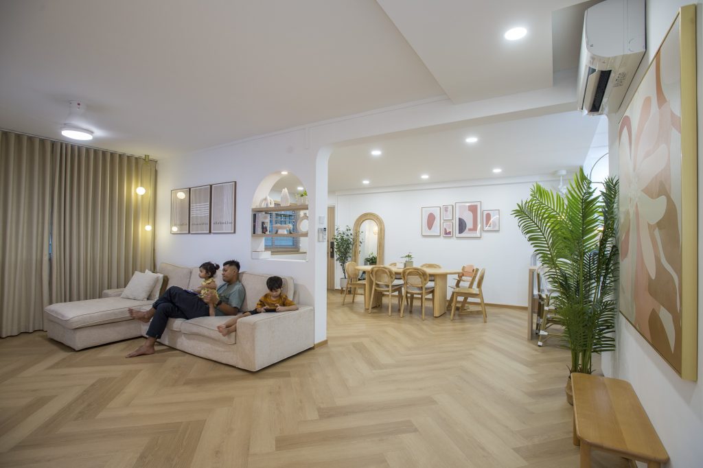
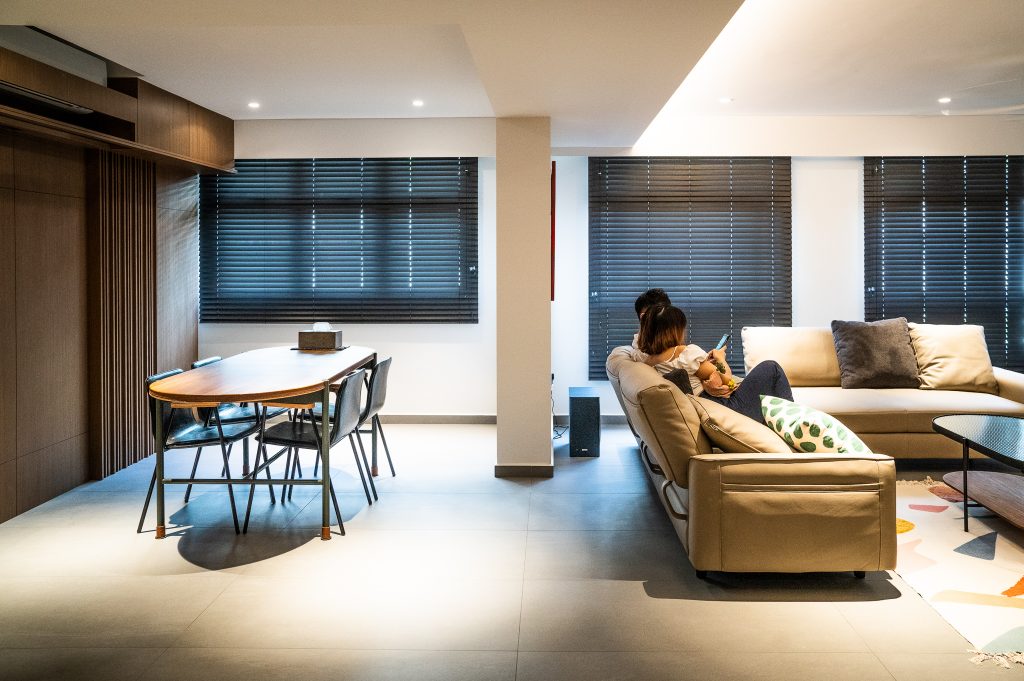
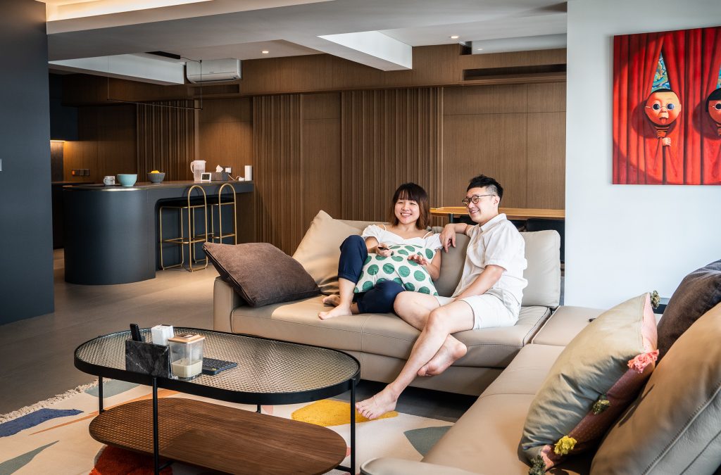
The classy, contemporary vibe continues to the living area, which features marble accents and herringbone tiles as the primary design elements. To create a seamless flow between spaces, herringbone tiles are used for the flooring of the entire flat, including the bedrooms.
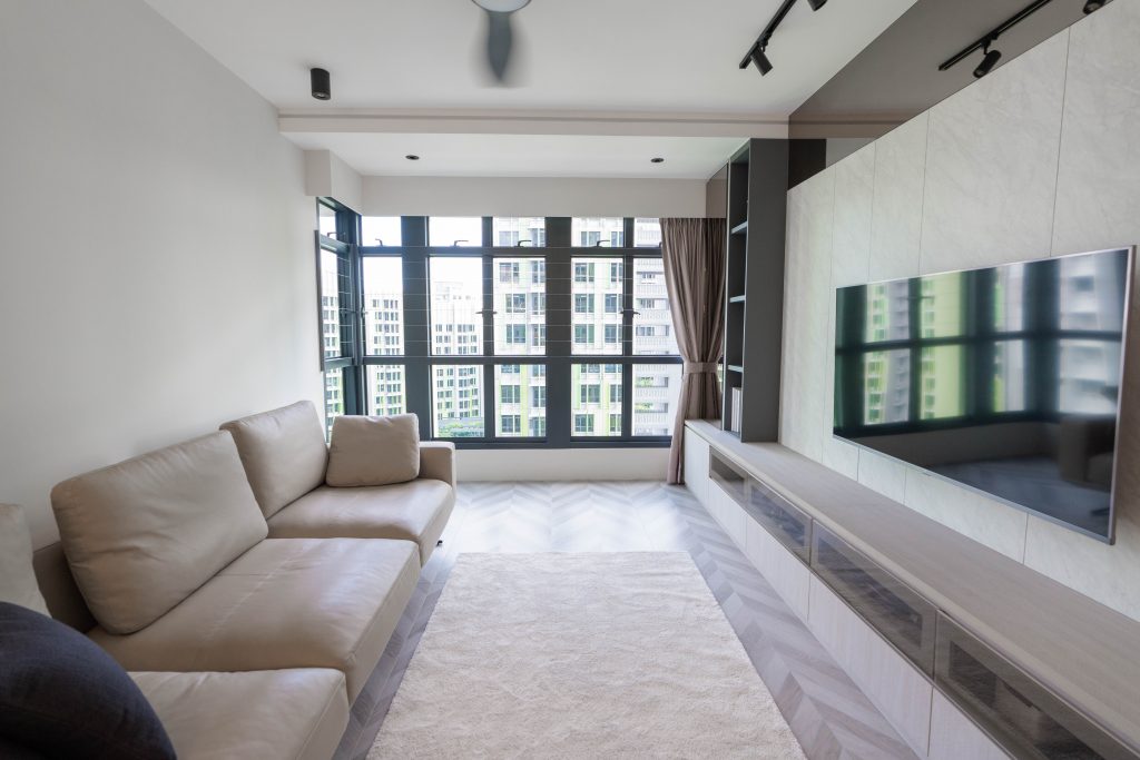
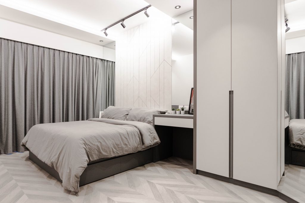
Like the rest of the home, the living room features neutral shades such as ivory, brown and grey
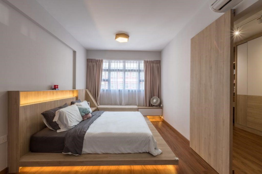
The master bedroom

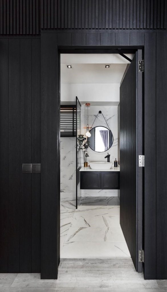
While their home is dressed predominantly in lighter colours, the common bathroom stands in stark contrast to the rest of the space.

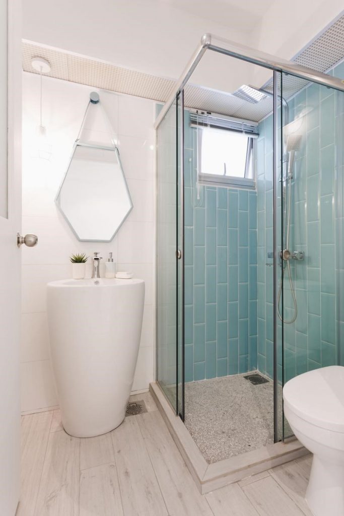
The bathroom’s grey, washed-out tiles emit an industrial vibe – a look that Francisco wanted to achieve. “I wanted a darker aesthetic for our home but Adora preferred a brighter living environment. We compromised, and the bathroom became a space for my artistic expression,” he laughs.
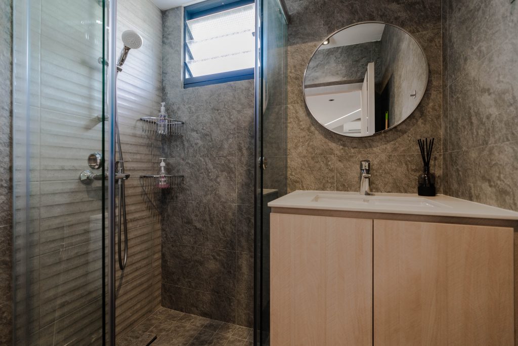
Francisco shares how additional features were incorporated to create a more luxurious bathroom. “We love the look and feel of hotel bathrooms and wanted the same for our own. So, we opted for a false wall to conceal the exposed pipes and created a niche for our shower essentials. We also incorporated a rain shower to amp up the luxe factor.”

Reconfiguring the Space

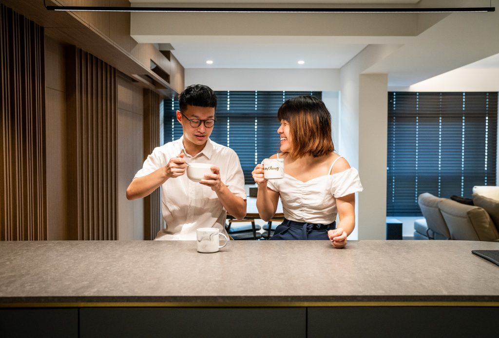
The couple’s home renovation was also meant to reconfigure the space to cater to their lifestyle needs. As a family who enjoys cooking, Adora and Francisco decided to not only expand their kitchen area, but also make layout adjustments.
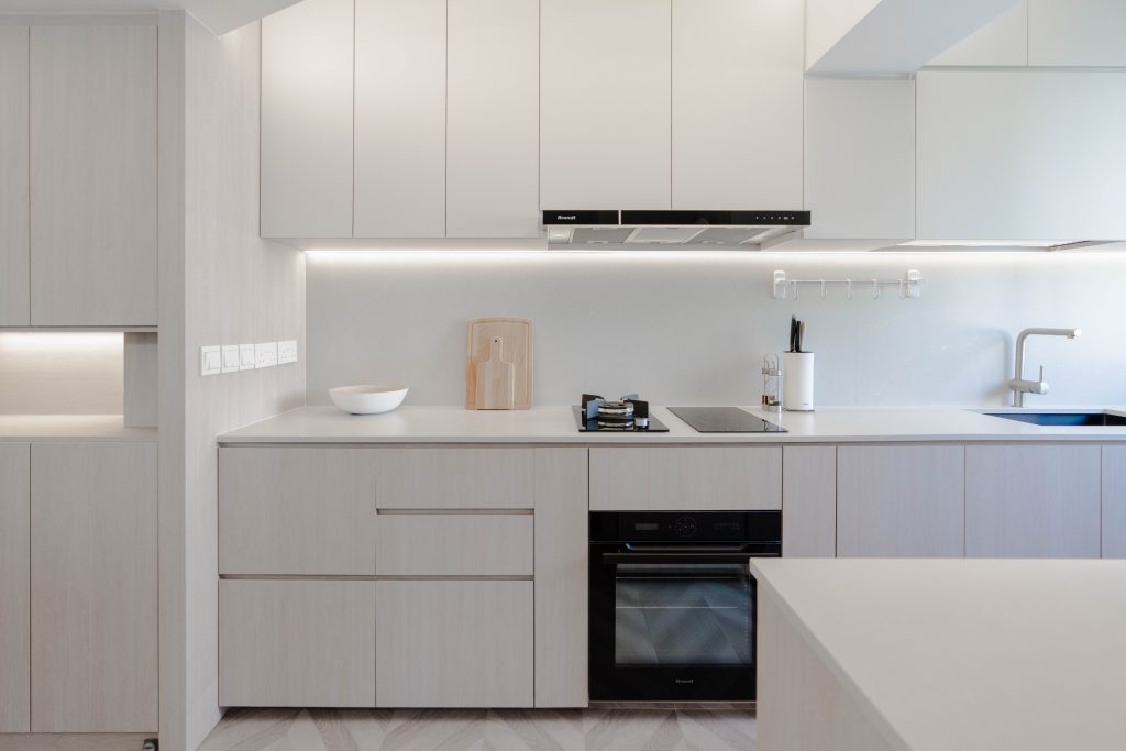
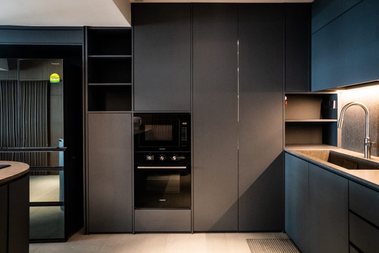
The kitchen is fitted with full top and bottom row cabinets to maximise storage

For instance, the stovetop and sink were repositioned to the extended countertop for more preparation space, while built-in storage house appliances such as the dishwasher and water filter system.
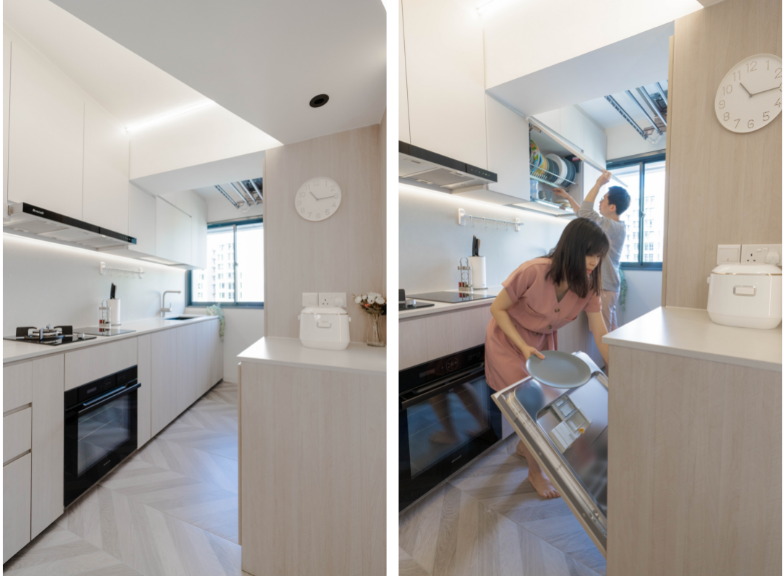
Customised carpentry works house appliances such as the dishwasher, for a clean look

The kitchen is also designed to flow seamlessly into the dining area. Beyond a space for meals, the dining table also serves as a demarcation between the kitchen/dining area and the living room.

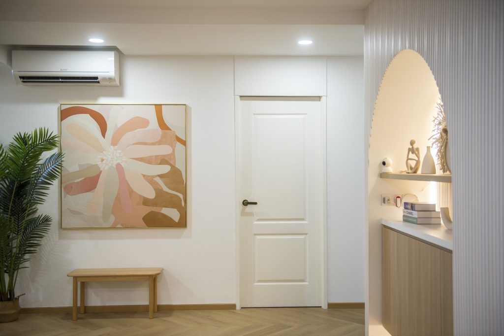
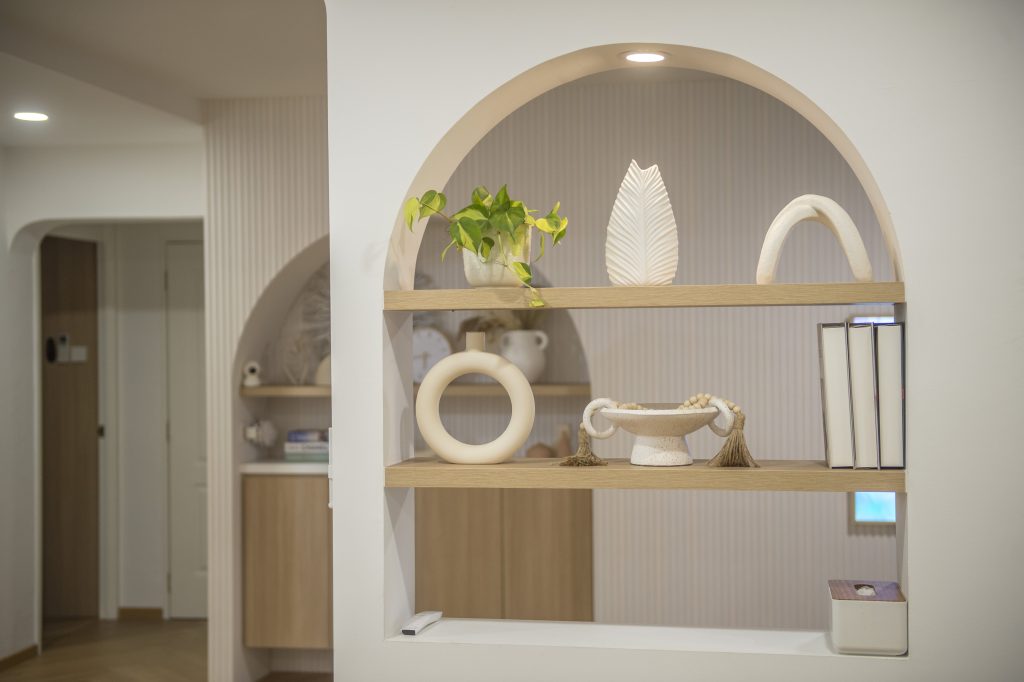
Similar to the kitchen, the home owners incorporated customised carpentry works in the living room, such as TV console and shelves to maximise storage space. The glossy feature wall there also serves dual purpose—it has a hidden door to separate the communal area from the bedrooms.
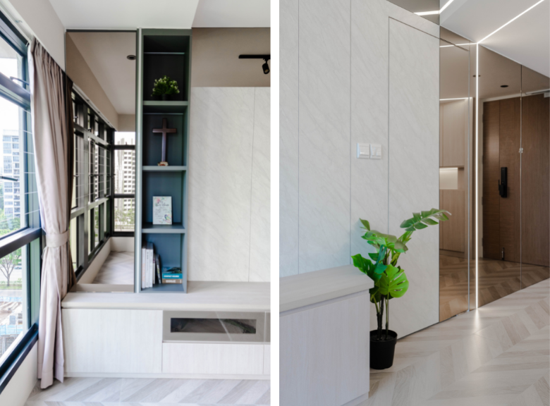
Built-ins such as the TV console and shelves were adopted to maximise storage (left). The extended feature wall comprises a hidden door that leads to the bedrooms (right)

While the design and renovation process wasn’t easy, Francisco and Adora enjoyed every step of the way. For home owners looking to embark on their renovation journey without engaging the help of interior designers, the couple’s advice is to focus on space planning., “Before diving into the design, it’s important to first have an idea of what the space is to be utilised for. This will then determine the level of carpentry works that needs to be done,” they say.

Source: mynicehome.gov.sg

Reno Journey: An Architect’s Home – Planning (Pt. 1)

Reno Journey: An Architect’s Home – Planning (Pt. 1)

Journey with us into the homes of HDB residents in this 3-part series, and witness the transformation of their flats into beautiful homes!

Journey with us into the homes of HDB residents in this 3-part series and witness the transformation of their flats into beautiful homes.

Homeowners: Geoffrey and Sian Ching
Town: Tampines
Flat type: 5-room BTO

As an architect, Geoffrey is no stranger to designing homes. When it came to his own flat, the decision to manage the entire renovation process himself was thus a no-brainer, and it was a personal project that he had been looking forward to.

The flat looks really airy and bright! What is the plan for this space?

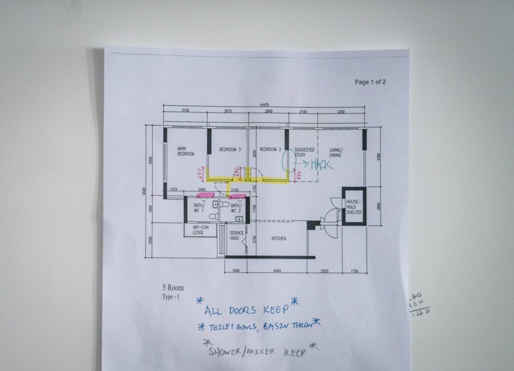
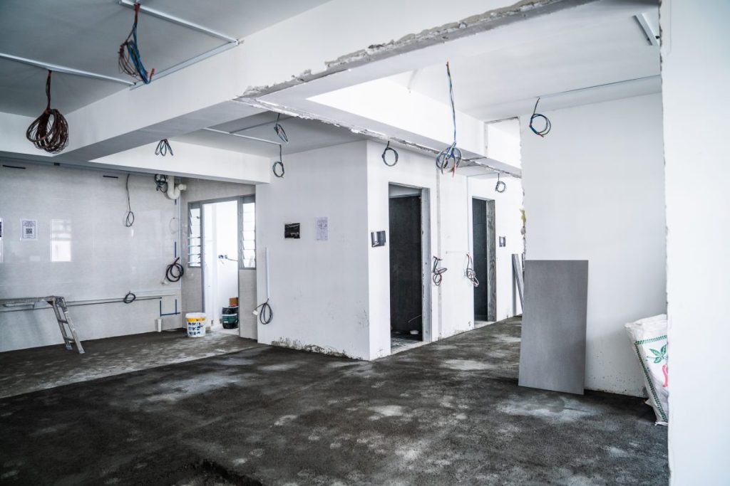
Sian Ching: We wanted a big communal area because I love hosting. We are planning for an open kitchen and also hacked the walls of the first bedroom to create a larger living area. For privacy, we will add a feature wall with a concealed door to separate the bedrooms from the rest of the house.

How did you start planning your home?

Geoff: As we intend for this flat to be our forever home, we plannedfor our future needs right from the start. The layout and design must be versatile enough to suit us at different life stages, without the need for major rework in future. We went ahead with the hacking works after we were confident that we could rebuild the walls if needed. For the bedroom in particular, we ensured that the placement of the air-con unit and lighting, for example, would still be ideal even after sealing the space.

Sian Ching: Layout aside, Geoff and I browsed Pinterest and Instagram for design and décor inspiration.

What advice would you give home owners who intend to take the DIY route?

Geoff: If you plan to engage contractors without the help of interior designers, it’s important to understand the contractor’s working style. Source for a contractor who understands your needs and is willing to communicate.

After doing so, set a timeline and agree on the milestones and responsibilities, such as whose role it is to source for supplies. In our case, we conducted extensive research on materials that best suit our needs. While this may help reduce costs, these tasks are time-consuming and there might be hiccups, such as things you have overlooked, y as your renovation journey progresses.

Homeowners looking to design their flats can consider using SketchUp, a complimentary software that can draw up 3D renders.

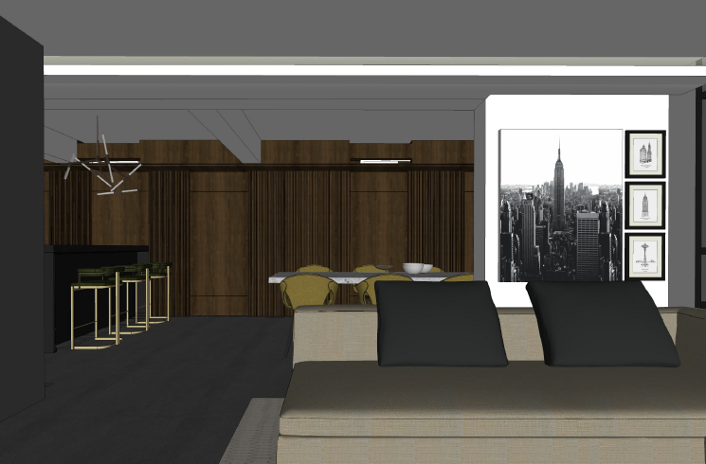
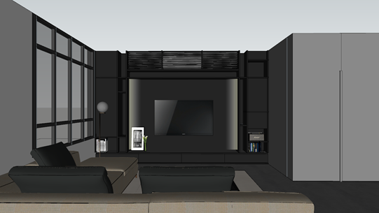
Geoffrey’s 3D renders of the living room, and feature wall that separates it from the private areas
Full height cupboards that help to maximise storage space. Sketch by Geoffrey

Let’s talk about renovation expenses—how does one stay on track?

Sian Ching: We started with a budget in mind and listed what we wanted before shortlisting the essentials. That said, we were willing to spend more on our renovation as we consider it a long-term investment. We also tracked our expenses using an excel sheet.

Geoff: When renovating, it’s easy to neglect the cost of furniture. It’s important to factor the furnishing cost into the total renovation budget to avoid settling for furniture you don’t fancy. This is especially so for theme-heavy houses, where furniture can play a big role in tying the entire look together.

In part 2 of the series, find out more about Sian Ching and Geoffrey’s renovation works and how they, like many homeowners, had to take on the challenges brought about by the pandemic.

Source: mynicehome.gov.sg
Reno Journey: An Architect’s Home – Transforming (Pt. 2)

Reno Journey: An Architect’s Home – Transforming (Pt. 2)

Journey with us into the homes of HDB residents in this 3-part series, and witness the transformation of their flats into beautiful homes.

Come journey with us into the homes of HDB residents in this 3-part series, and witness the transformation of their flats into beautiful homes.

Homeowners: Geoffrey and Sian Ching
Town: Tampines
Flat type: 5-room BTO

In the second part of this series, we continue with Sian Ching and Geoffrey’s renovation journey and how they are slowly turning their plans into reality. Get acquainted with the couple in part 1 here.

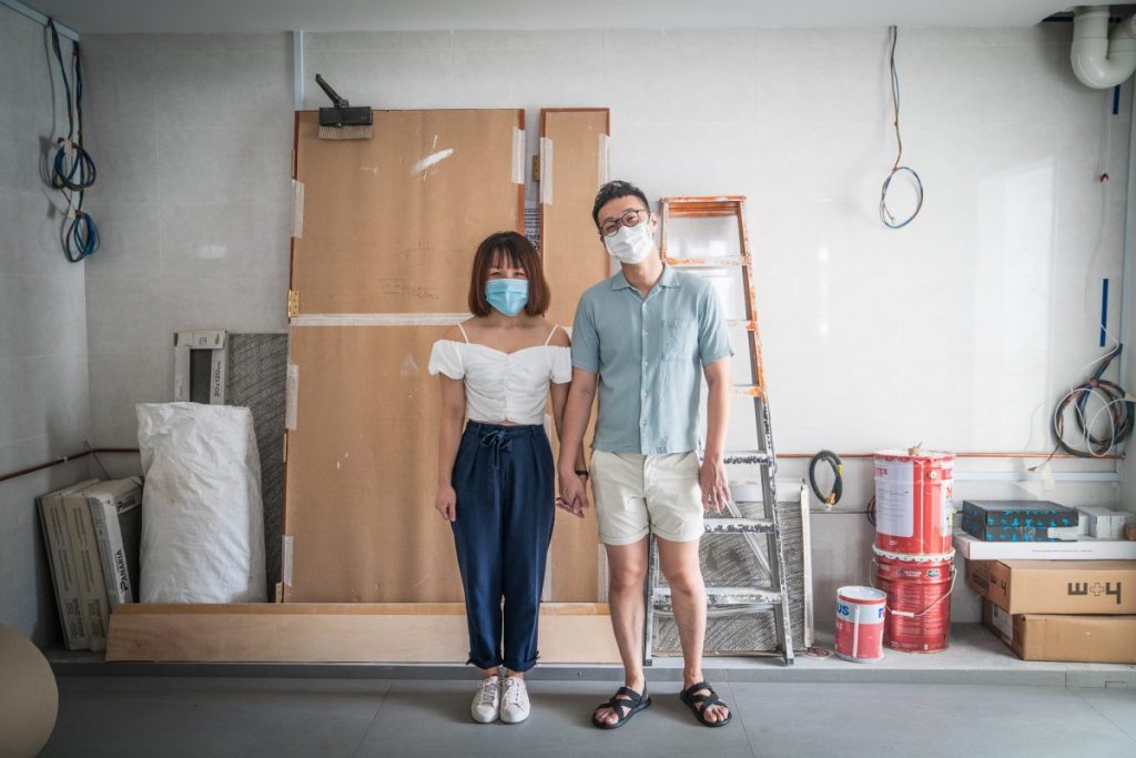
Home owners Sian Ching and Geoffrey

We heard that you faced an unexpected challenge soon after renovations began?

SianChing: Our renovations began in January 2020, but everything ground to a halt during the circuit breaker period. We could only resume works in July – 5 months after we first started renovating!

Geoff: Our Malaysia-based carpenter also had difficulties entering the country. As such, we couldn’t proceed with the furniture installation even though our furniture was ready. Customised  furnishings and fittings are a main feature of the flat, so our renovation completion date was highly dependent on when we could get our carpentry installed.

Sian ChingAs we both work in the construction industry, we are familiar with the process and know that there’s little we can do to hasten it. We also preferred not to engage another worker to assist with the installation, so we just had to wait it out.

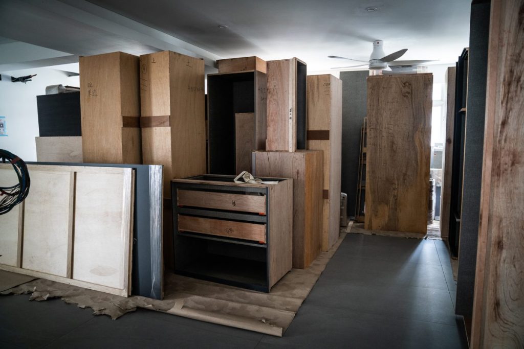
Customised furniture designed and built for the couple’s house
Due to the challenges brought about by the pandemic, renovations ground to a halt

Did you have to tweak your original plans and designs?

Sian Ching: As we progressed,we ended up choosing different materials – such as the laminate for the carpentry. Geoff originally wanted the cabinets in the living room to be black, but I thought the colour was too overwhelming for the space. Instead, we opted for a dark brown laminate which complemented the colour of our sofa.

GeoffSourcing for materials and samples was quite a feat. We needed to examine and feel the sample physically before making the final decision. Home owners should research the materials and not limit themselves to those presented by the interior designer. Don’t be afraid to engage your interior designer in a discussion!

Were there other design changes?

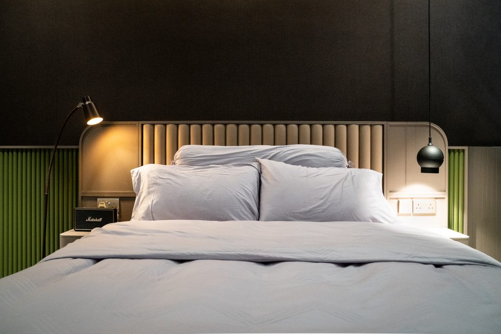
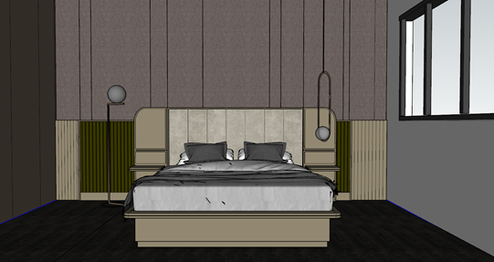
Sian Ching: We were looking for a unique bed frame design that would complement the overall interior theme. We couldn’t find it in any store, so we decided to design it ourselves and have it built!

Geoff: We chose a mixture of leather and wood paneling for the headboard, and had it seamlessly integrated with the switches to avoid visual clutter.

A draft render of the bedroom, designed by Geoffrey

Next in this series, we’ll bring you on a tour of Sian Ching and Geoffrey’s fully renovated flat!

Source: mynicehome.gov.sg
Reno Journey: An Architect’s Home – Big Reveal (Pt. 3)

Reno Journey: An Architect’s Home – Big Reveal (Pt. 3)

Journey with us into the homes of HDB residents in this 3-part series, and witness the transformation of their flats into beautiful homes!

Come journey with us into the homes of HDB residents in this 3-part series, and witness the transformation of their flats into beautiful homes!

Homeowners: Geoffrey and Sian Ching
Town: Tampines
Flat type: 5-room BTO

In the final part of this series, Sian Ching and Geoffrey bring us on a tour of their recently-completed home.Get acquainted with the couple and their design process  in part 1, and find out more about their renovations in part 2.

Before and after: Homeowners Sian Ching and Geoffrey unveil their cosy abode

“We don’t have a specific interior theme – it’s a modern and timeless look that comprises black and wood accents,” Geoffrey and Sian Ching explains the look and feel they were aiming for in their new home.

Your house looks great! How did you achieve such a spacious living area?

Sian Ching: We hacked the wall of the first bedroom to create a bigger communal space. As we like having friends over, we made this design decision from the get-go.

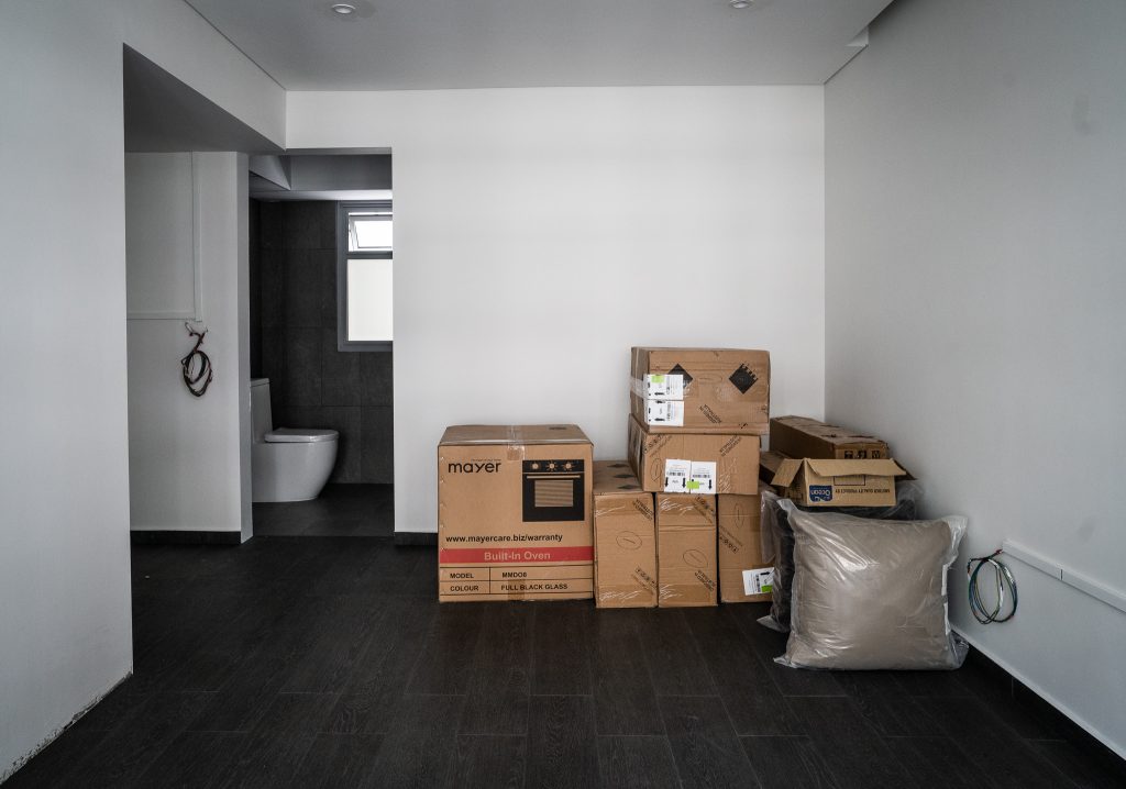
The wall of the first bedroom was hacked to create a larger living area

Sian ChingWe have different hangout spots to cater to different groups of guests and it’s interesting to see them gathering at the sofa, the dining area, and of course, the bar counter. The dynamic communal area enables guests to move around the house, which is what we had in mind.

It sounds like your house is the perfect place for a gathering (within the allowed group size, of course).

Geoff: Sian Ching enjoys hosting so we decided to extend the bar counter for more dining space. In the kitchen, the sink is also designed to be a little wider, to accommodate more dishes for washing-up sessions after playing host.

Before (top) and after (bottom): The open kitchen concept in the couple’s home
The bar counter is deliberately positioned further away from kitchen cabinets so that the cooking area is larger
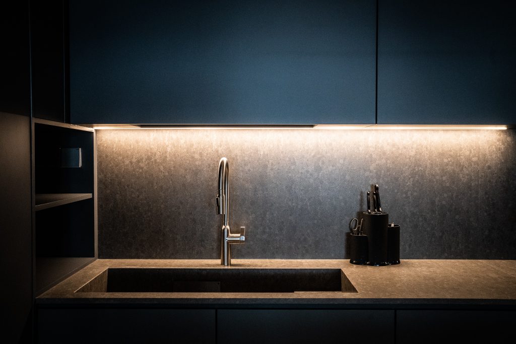
Quartz is used for the kitchen and bar counter tops, backsplash and sink, as the material is known to be hardy

Can you tell us more about your customised carpentry works?

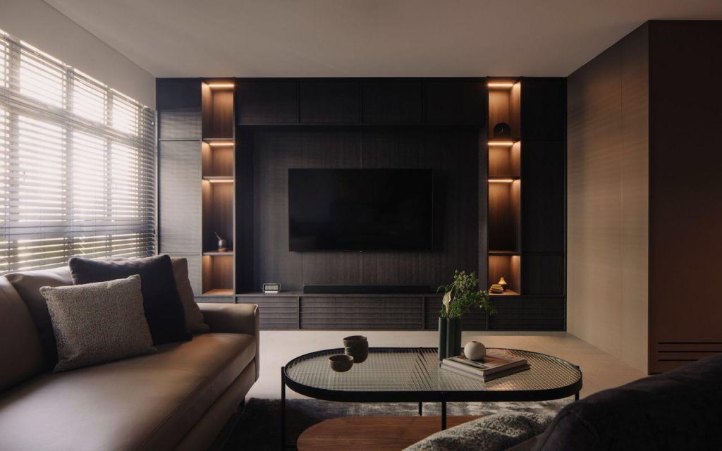
Sian ChingTo maximise the space, we opted for lots of full-height features – including the TV area. Instead of just a console, we created more storage space via nooks built into the wall.

Photo: @khoogj_

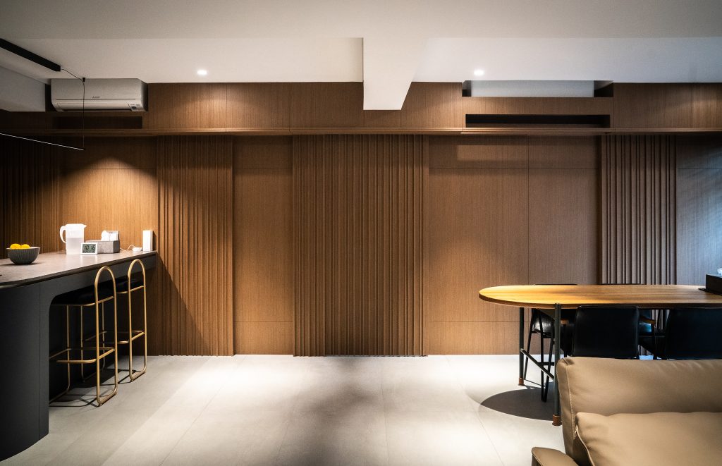
Geoff: Another key feature of our home is the wooden wall that leads to the bedrooms. We concealed a door in the design, which separates the communal and private spaces while enabling a seamless transition between the two.

A feature wall with hidden doors separate the communal space from the bedrooms

How did you achieve such a stylish look for your bedroom?

Before (top) and after (bottom): The master bedroom before and after renovation

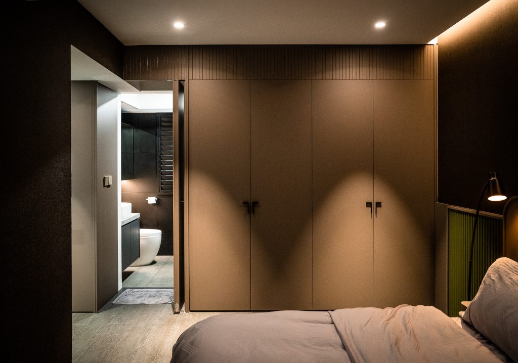
Sian ChingWe chose a darker colour palette for the bedroom as it provides a more relaxing environment. We used a combination of pendant lights, floor lamp and cove lights to keep the space cosy.

GeoffYou will notice that our toilet door and wardrobe are hardly distinguishable. We wanted everything to look flat, so the toilet door is on the same plane as the wardrobe. Both are also fabricated with the same material, to achieve a seamless look. We also shifted the position of our bedroom door to align it with the wardrobe.

Source: mynicehome.gov.sg
Living the Artist’s Dream

Living the Artist’s Dream

Grace is a pro at pairing colours and textures. Check out how she designed her 5-room flat!

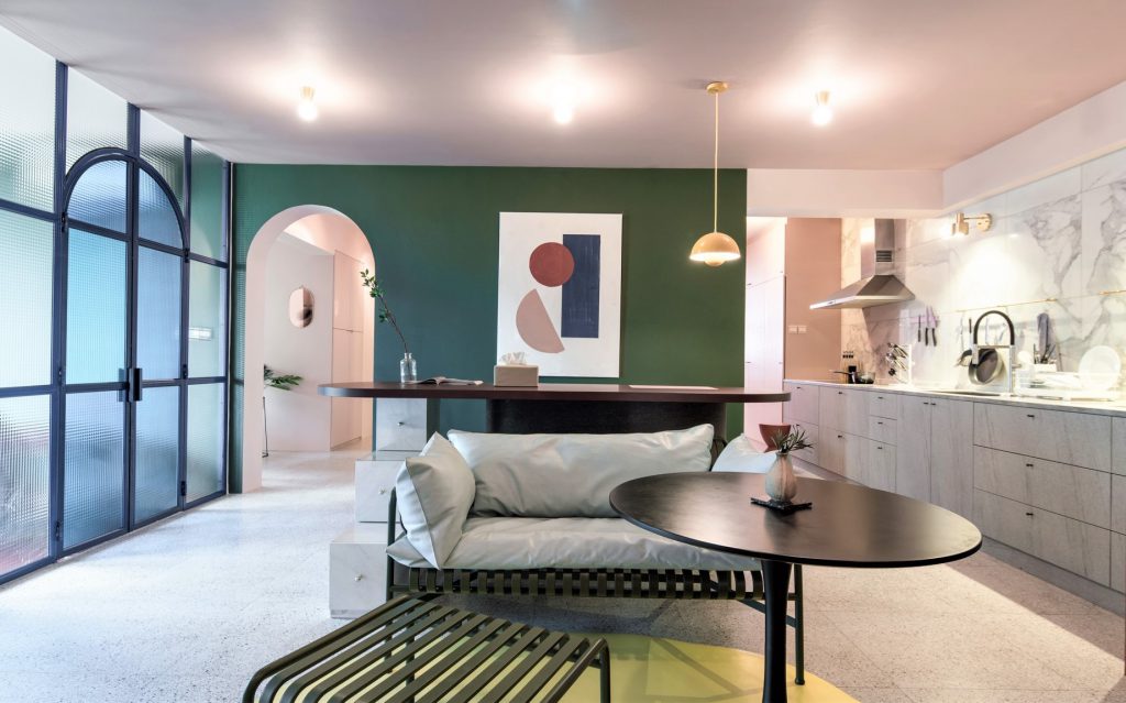
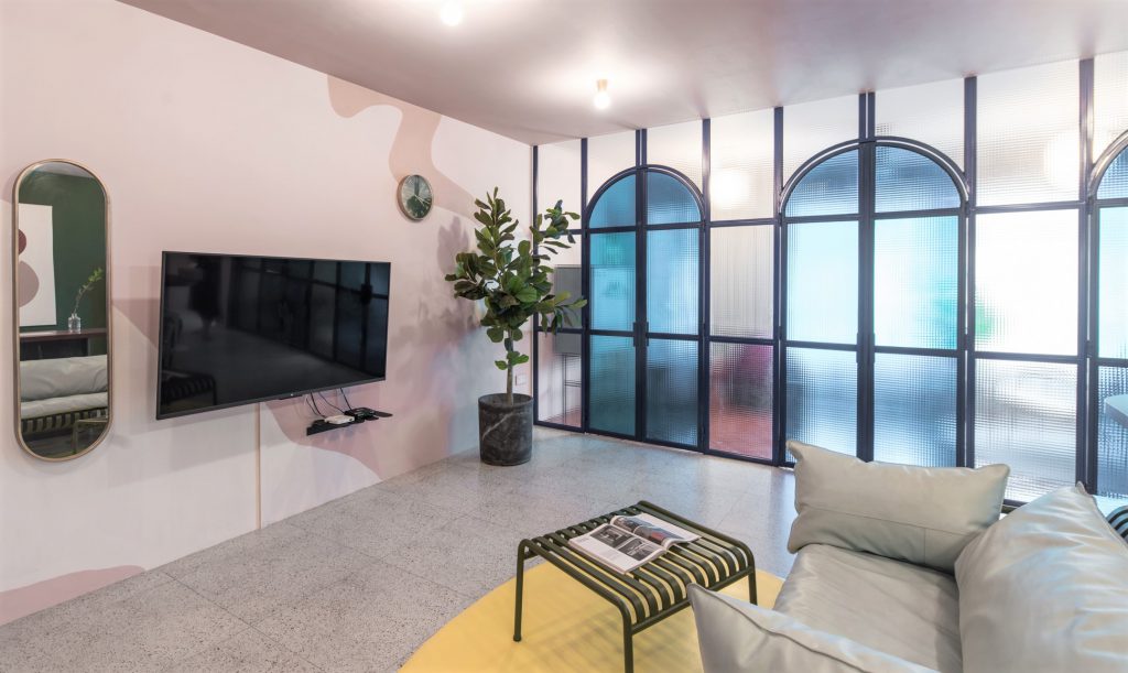
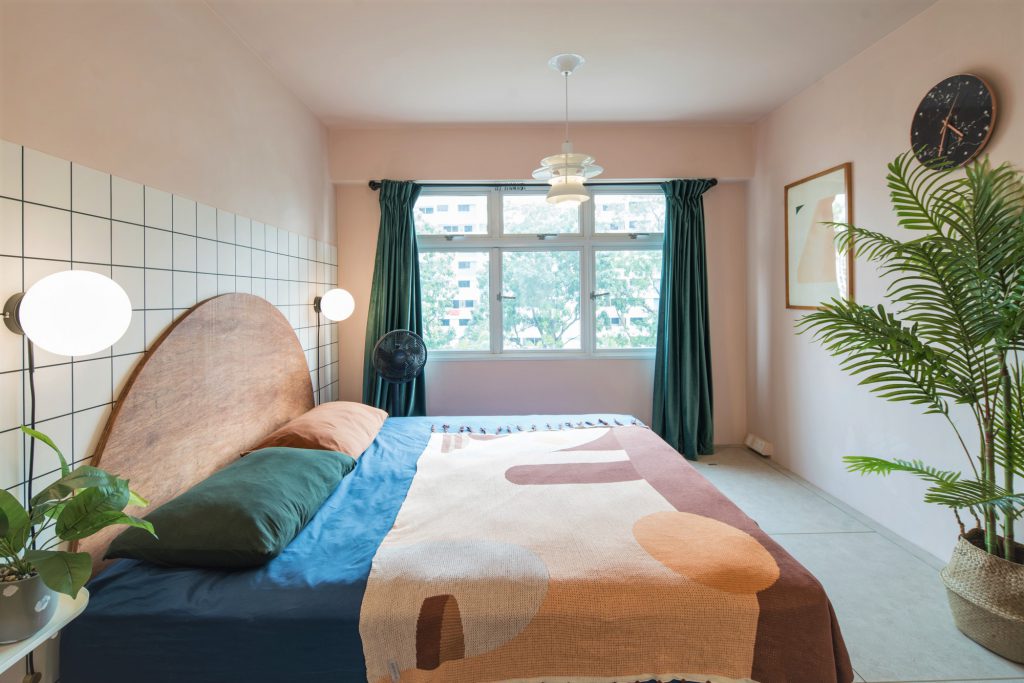
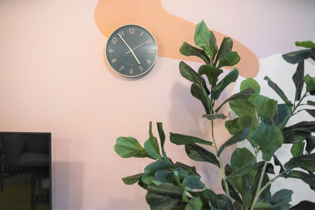
Stepping inside the five-room flat, one can’t help but marvel at the amalgamation of colours and textures. “I didn’t have a specific theme when I was designing the house because I couldn’t choose between them,” Grace laughed. “But I do know that I love to be stimulated by visual elements, so my home is really colourful.”

From deciding on the colour palette to picking out the furniture to painting the walls, Grace had put the house together from scratch. “My husband is really easy-going, so he leaves the décor to me,” she grinned.

Located in Bukit Batok, the flat is a stone throw’s away from the MRT station and amenities such as hawker centres and polyclinics –  one of the primary reasons why she fell in love with the neighbourhood. “We got pretty lucky when purchasing our flat,” Grace shared and continued, “We opted for the Sale of Balance flats in Bukit Batok and had only two units in our block to choose from – one unit was booked on the flat selection day but we’re still very pleased with our unit.”

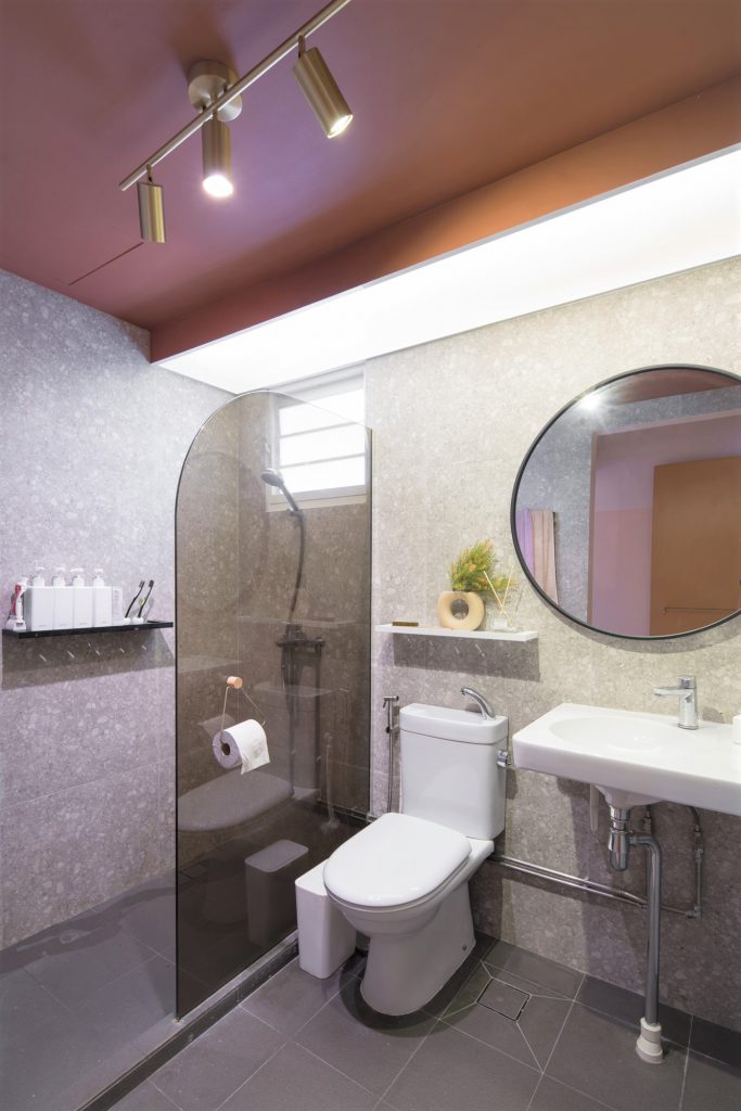
In addition to using more than 10 colours on the walls of her home, a variety of textures are found throughout the flat. “When browsing for home decor ideas, my main goal was to have an aesthetic space. This resulted in a carefully curated party of colours and textures that include glass, coarse stones, leather, metal and more!”

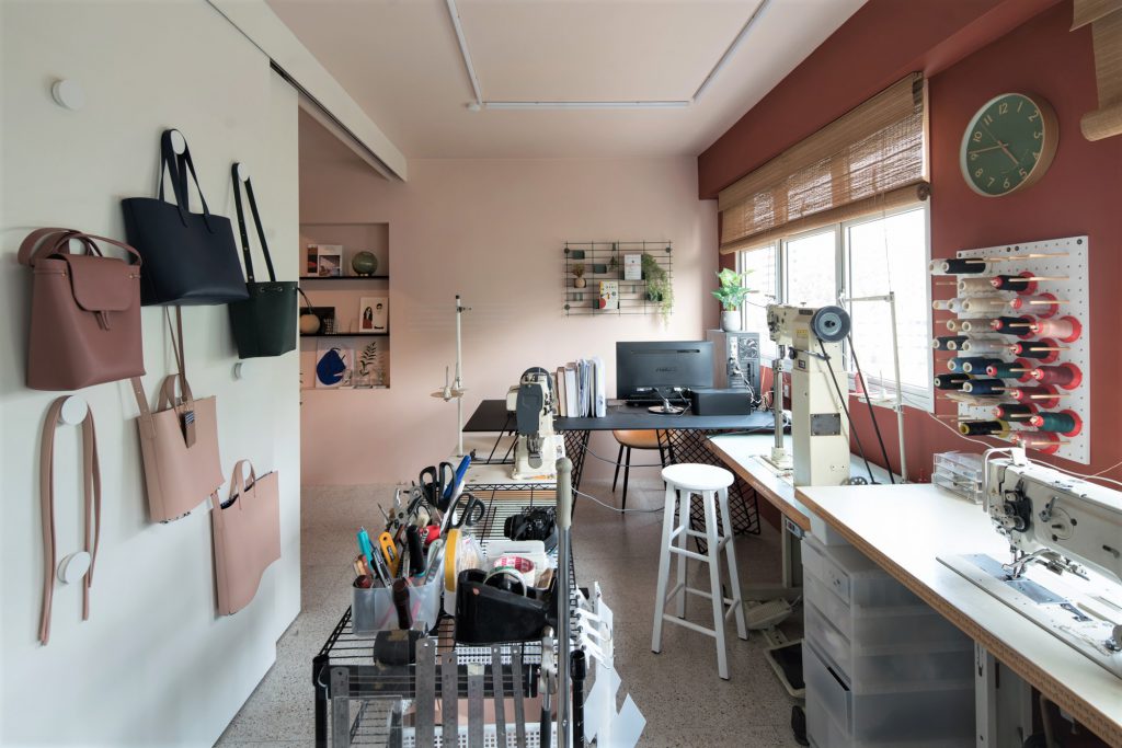
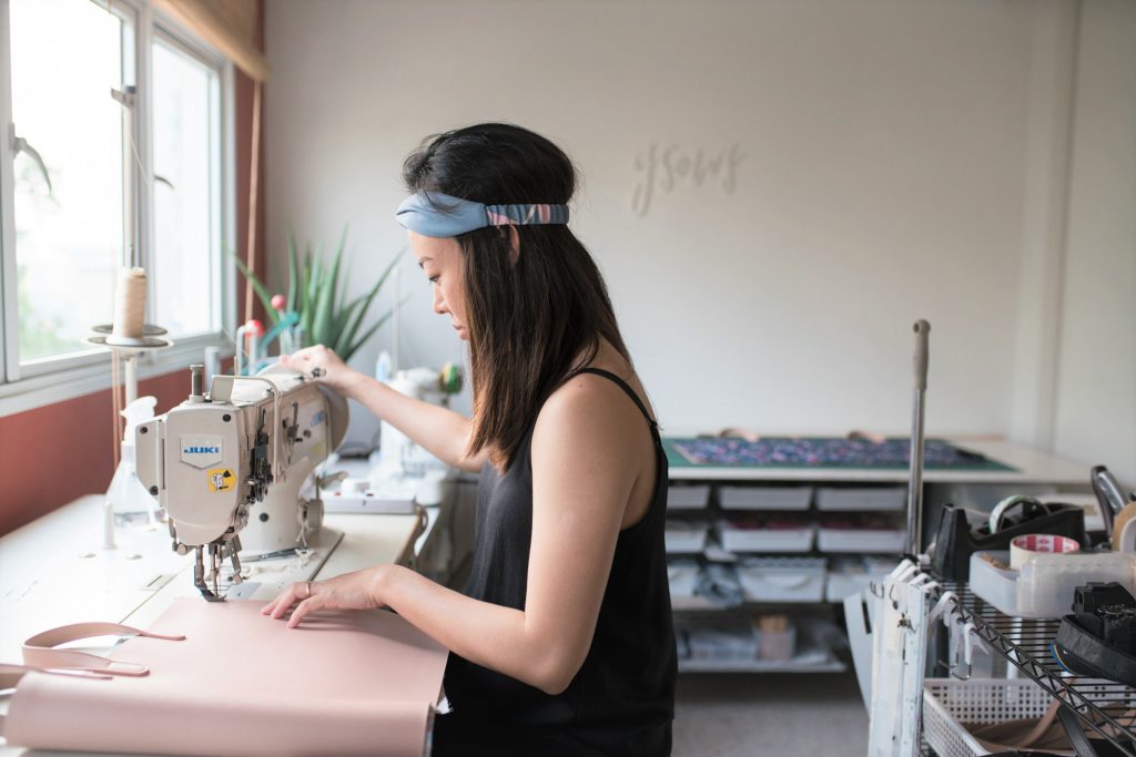
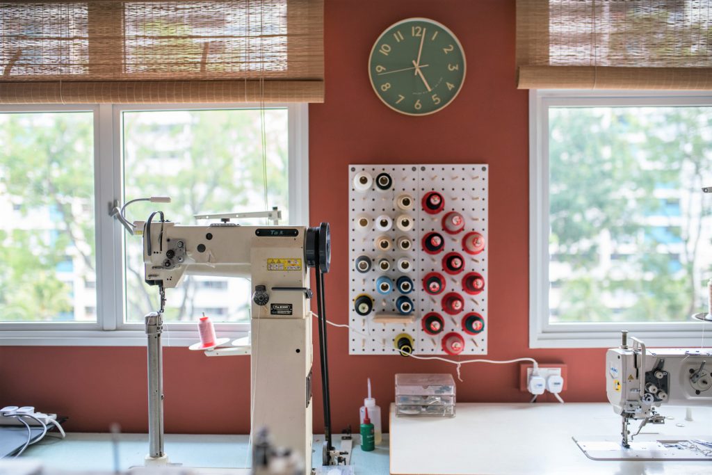
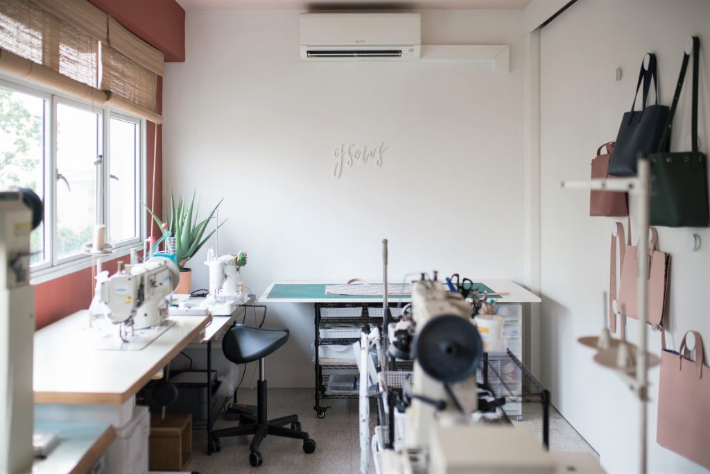
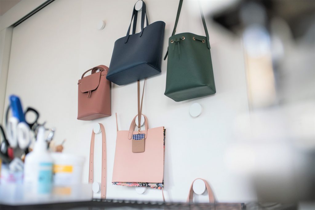
With sewing machines, materials and bags hanging off nearby racks, one can easily guess Grace’s line of work. The founder of GSEWS, a venture that specialises in customised bags, Grace was an architecture student at the National University of Singapore (NUS) when she uncovered her passion for sewing and in particular, bag making. 2 ½ years into the course, she made the life-changing decision of dropping her degree to pursue her passion.

“Honestly, the further I was into the course, the more I thought I was not suited to be an architect,” Grace said. “I was making and selling bags while in school, and it dawned on me that I am more of a craft maker than building designer. That was when I decided to make the switch.”

Considering the importance of her home workstation, Grace was extra meticulous when designing the space. “Having the option to hack the partition walls was very helpful as it resulted in a wide rectangular area that gave us ample layout possibilities,” Grace smiles.

“The workspace also features the only white walls in the house as I use them as the backdrop for product photoshoots.”

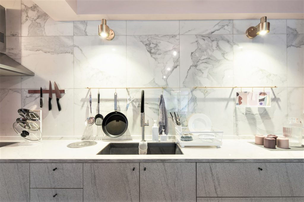
Putting the Pinterest-worthy home together however, did come with its fair share of challenges. Every piece of furniture complemented the overall aesthetic, something Grace was particularly mindful of. “Our renovation budget was tight and my design ideas such as the fluted glass sliding toilet door and marble kitchen wall were not easy to execute.”

“I had to look for cost-friendly alternatives like marble-printed tiles for the kitchen countertop that was more affordable than the regular quartz material, but with the same durability,” Grace explains.

“But I have to say that this made the renovation process more fulfilling. Take the glass sliding door for example – we had to source for the different components of the door (hinges, sliding track, rollers, glass, door handle, door lock) before assembling it ourselves. The process was rewarding as it helped widen my knowledge of materials and construction methods tremendously.” From the customised high table in the living room to the doorknobs, Grace’s home is a careful curation of both overseas and local furniture.

So what are some renovation tips Grace has for homeowners? “I find visualisation aids very useful, especially for those not intending to engage their interior designers or consultants. Personally, I recommend Home Design, an interior design mobile app that allowed me to visualise the furniture layout, wall colours and more to see what works and what doesn’t”, quips the homeowner.

She also shared that how, even after one and a half years, she’s still making tweaks to her home workspace. “The main objective is to keep it simple, neat and efficient for work,” Grace says. “I’d put a lot of thought into the placement of the sewing machines, tables and tools but I’m still constantly making changes in order to improve the workflow. For instance, in order to save on space, I’ve replaced a stand-alone clothes rack with knobs to hang my bags on.”

For aspiring home business owners looking to design their workspace, Grace highlights the importance of workflow visualisation. “Think about the space utilisation (especially if you’re working with many tools or constantly need to move around) before planning permanent fixtures such as storage spaces and doors. It’s helpful to keep your layout flexible with mobile shelves and tables as you’ll tend to move them around as you make adjustments to your workspace.”

Source: mynicehome.gov.sg
Choosing Lighting Fixtures for Your HDB Home

Choosing Lighting Fixtures for Your HDB Home

From pendant lights to desk lamps, here are some tips to finding the best lights for your home!

Gone are the days where fluorescent tubes were the default choice of lighting for homes. Today, you will find a blinding (pun intended) range of lights of different designs and functions. Good lighting fixtures not only provide the appropriate illumination to achieve your desired ambience; they can also serve as statement pieces.

Here are some tips to help you choose the lighting fixtures that best suit your home!

Consider the Theme

Keep in mind your interior design style when shopping for lights. If you are going for a more simple and clean look such as the popular Scandinavian, Japandi or minimalist styles, consider sleek lights, such as pendant or track lights. These lighting fixtures are usually more subtle in design, which will complement the mentioned themes. If your  style is a little bolder, a glamourous chandelier may just be the thing for you!

Statement pieces should be placed at prominent places to complement the overall theme and add to the ambience. Some popular spots are above the dining table, in the living room or beside the bed.

Area to Illuminate

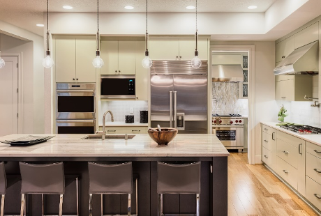
Photo: Passion Home

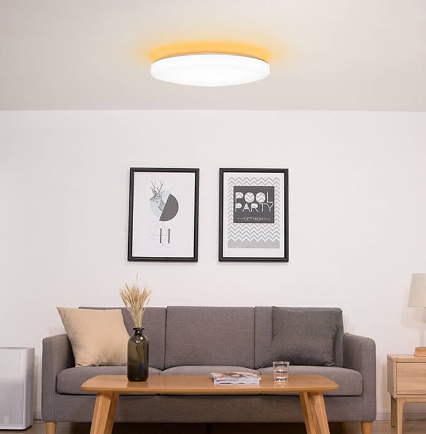
When choosing lighting fixtures, consider the size and shape of the area that you wish to illuminate. For large spaces , good ol’ ceiling lights are your best bet. These are generally placed in the centre of a room to help evenly distribute light throughout the space.

Otherwise, consider downlights – a smaller and generally inexpensive alternative that can be installed in multiples to provide sufficient lighting. Due to their small size, downlights can also be installed in tight spaces that are unable to accommodate ceiling lights. Think in-between areas such as the corridor between rooms as well as the wardrobe area.

Purpose of the Space

Photo: Home Designing

Will you be spending hours working or reading in the room? Or will it be a space for some winding down after a long day?

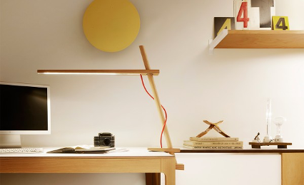
Reading for long hours can be straining on the eyes. To reduce discomfort, use a good desktop lamp with adjustable brightness to help reduce glare. Also, remember to complement it with a ceiling light to help balance the contrast between the ambience lighting and your desktop to further reduce the strain.

Photo: The Wedding Vow

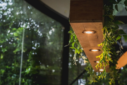
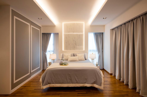
When designing a room that is meant for relaxation, consider the use of cove lights, which are indirect source of lights often built into ledges and recesses. The light source is either directed towards the ceiling or the floor. Hidden from sight, soft, diffused cove light exudes a luxurious vibe.

Don’t overlook the importance of lighting when it comes to designing your dream home!

Source: mynicehome.gov.sg
How to Read Your HDB Floor Plan in 10 Seconds

How to Read Your HDB Floor Plan in 10 Seconds

Check out this handy guide on how to read your HDB floor plan like a pro!

So, you’ve just gotten your hands on the layout of your new home and are all set to start planning for your renovation, except for a little hitch: you can’t make any sense of the floor plans. But don’t panic! Simply read our guide below on how common home structures are represented in floor plans, and you’ll be able to figure out everything on your own in no time.

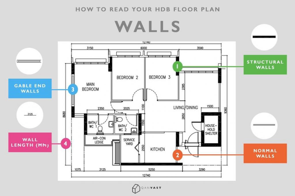
Walls

It’s pretty obvious that lines in a floor plan represent walls, but did you know that each wall type (structural, normal, gable end) is represented differently on a floor plan? Here’s how they are shown:


1. Structural Walls

Represented by bold lines, structural walls are foundations or pillars that hold your flat together and they can’t be hacked away.

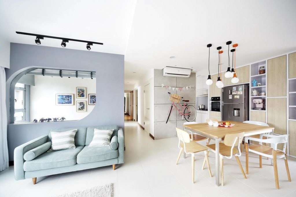
Interior Firm: Free Space Intent

Can’t hack a bomb shelter? Make it a highlight feature wall and space breaker. This fun, concrete-finished wall acts as a separator between the kitchen and bedrooms.

2. Regular Walls

These walls are the partitions that separate the rooms in your home from each other, and they’re shown as a pair of lines with a thin gap between them.

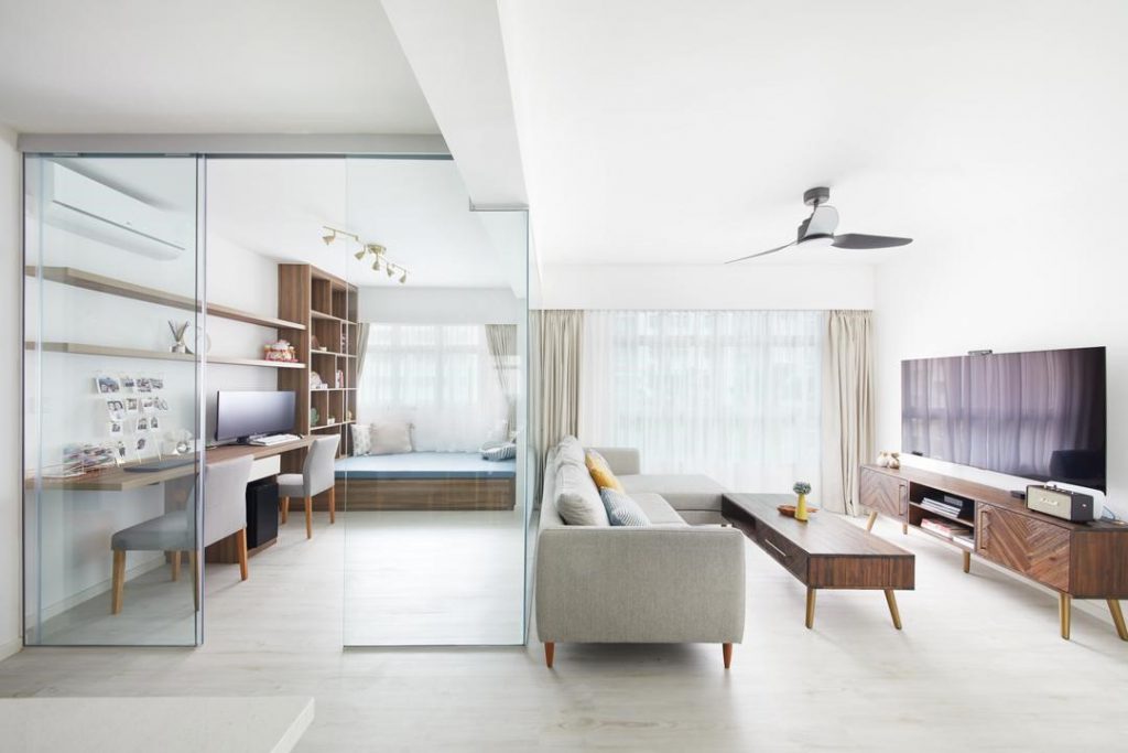
Interior Firm:Design 4 Space

Here’s an idea for your extra study room. Remove the walls and replace them with a glass-box style partition for a clear, unbroken look.

3. Gable-end Walls

Found in corner units, these walls come with short awnings that protect your home from sun and heat.

Interior Firm:D5 Studio Image

4. Wall Length (in mm)

The numbers that surround your floor plan indicate wall dimensions.


Doors

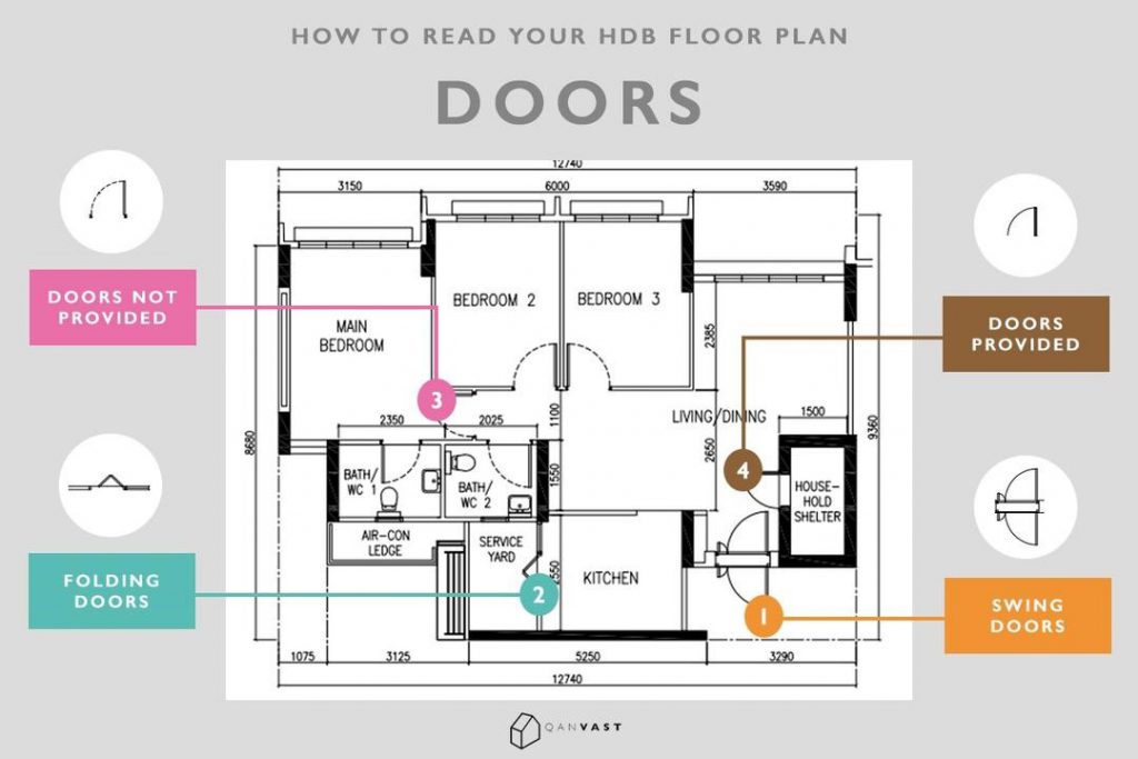
Similar to walls, there are a couple of symbols that represent different types of doors:

1. Swing Doors

Swing doors are represented by ‘wedge’-like symbols that also indicate their opening radius and direction.

Most doors in HDB homes open inwards (with the only exception being household shelter doors), so avoid adding any furniture or build-ins within their swing radius.

Interior Firm: Earth Interior Design Pte Ltd

Whether you’re living in an HDB home or not, always be sure to install build-ins and storage fixtures in places that don’t interfere with door movement.

2. Folding Doors

More commonly found in service yards and bathrooms, foldable doors are represented by V-shaped symbols.

Interior Firm:Mr Shopper Studio

You are free to choose any type of door that you want for a room, as long as it doesn’t require hacking a structural wall. Also, be sure to leave sufficient walkway space!

Interior Firm:Space Atelier

Lacking in walkway space? A sliding door will solve your woes because it doesn’t require an opening radius to work.

Interior Firm:Rockin Spaces

For a seamless look, camouflage your doors into a feature wall, so that it looks concealed at first glance.

Are your doors provided for?

Knock knock, who’s there? Oh wait, you might not even have a door to knock on. You can find out which doorways have pre-built doors provided by HDB based on the strokes in your floor plan.

  • Dotted/ Dashed: Doorways that HDB doesn’t provide doors for
  • Solid Line: Doorways that HDB provides doors for


Windows

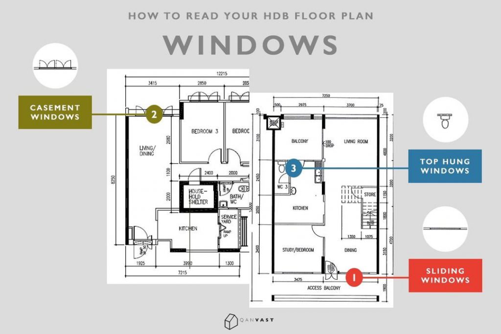
There are three different types of windows that you will find in HDB flats – sliding windows, casement windows and top hung windows.

1. Sliding Windows

On a floor plan, a sliding window is shown as a thin, hollow line by the walls, which can be hard to notice.

Interior Firm:Crescendo Interior & Lifestyle

Window frames aren’t just functional fixtures – they can also serve as subtle accents in a monochrome space.

2. Casement Windows

Casement windows are those that you can swing open, much like a door. Represented by a pair of thin lines with a thicker one between them (or a ‘closed wedge’) with their opening radius indicated.

Interior Firm:Space Atelier

Kept simple, the walls surrounding the wide casement windows of this living room serve as a sleek, minimalist ‘frame’.

3. Top Hung Windows

Small top-hung windows that provide ventilation for bathrooms.

Interior Firm:Mr Shopper Studio

Install a mini blind on your top-hung window if you are worried about privacy. Some window types are better suited for specific uses than others. For example, louvred or top-hung windows are usually installed in bathrooms because they are easier to use from a greater height. On the other hand,casement windows are great for living areas as they provide more efficient ventilation.

Keep in mind that HDB also has some regulations for installing certain types of windows:

  • For safety reasons,casement windows cannot be installed along a common corridor
  • To maintain a consistent exterior, HDB homeowners aren’t allowed to change the look oftheir 3/4 or full-length windows


Other Symbols

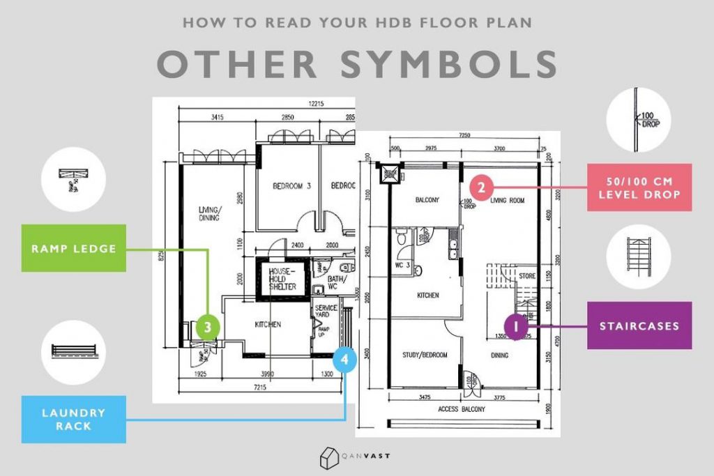
1. Stairs

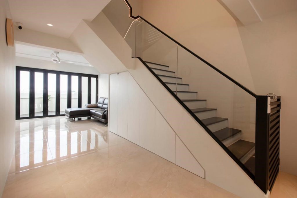
For those living in a maisonette, you’ll find your home’s stairway indicated as a series of lined rectangles in the floor plan.

Interior Firm:Dyel Design

If you want a simple way to maximise the space under your stairway, minimalist storage is the way to go.

2. 50/ 100mm Drop

This label indicates a drop of 50mm or 100mm in floor level. These drops are found in wet areas (kitchen, balcony, bathrooms), and they prevent the rest of your home from being flooded by ensuring better drainage.

Don’t like having a ledge between your living space and balcony? Create a seamless transition between two spaces by leveling your floors with cement screed.

3. Ramp Up

The ‘Ramp Up’ label indicates home areas with ramps that make it easier to negotiate differences in floor level (such as the 100mm drop).

4. Laundry Rack Area

Service yards in newer HDBs come installed with a laundry rack, which are represented by 3 black lines in floor plans.

This article was contributed by Qanvast, Singapore’s go-to renovation platform. Whether you’re embarking on a major overhaul or a simple refresh, Qanvast can connect you to the right professionals for the job.

Source: mynicehome.gov.sg
Home Tours: How a Couple Designed Their Elegant Abode

Home Tours: How a Couple Designed Their Elegant Abode

Step inside the warm and cosy home of Mr and Mrs Lee!

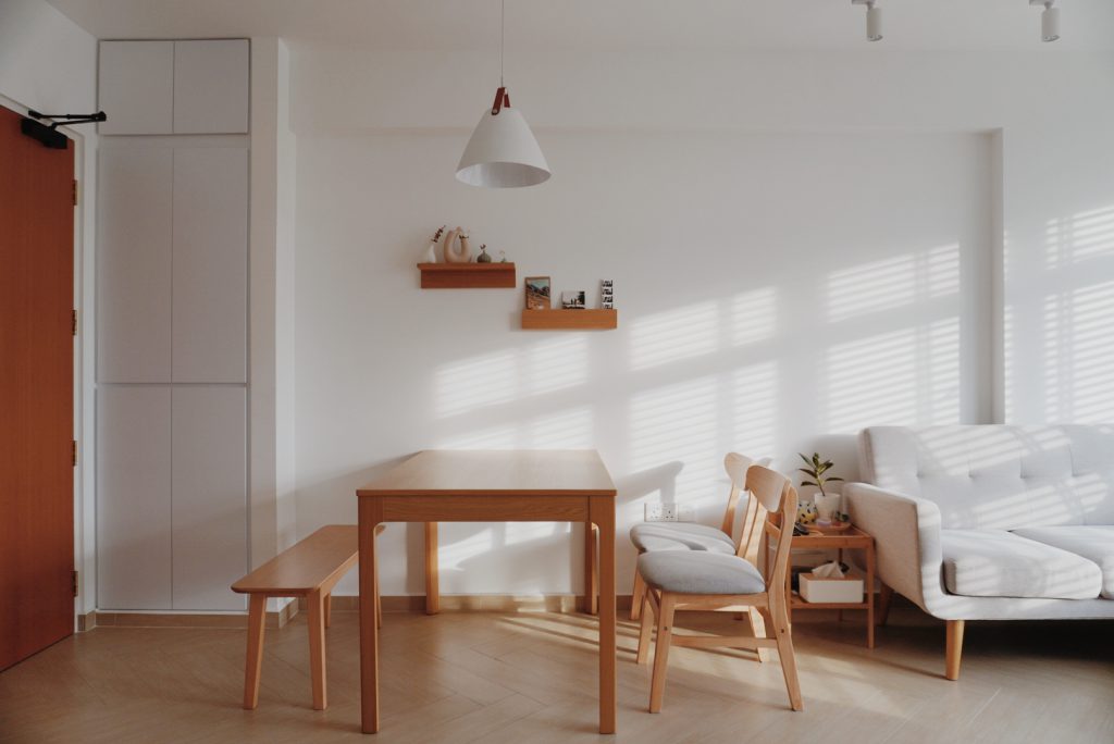
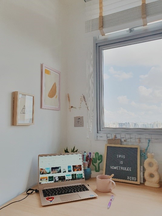
Nestled in the heart of Boon Keng is a cosy 3-room flat which stands out for its understated elegance and style. The light-filled home incorporates simple lines, pale wood, and plenty of white to achieve the zen vibes that would make it @hometrulee – a play on the homeowners’ Instagram handle.

Taking On the Role of Interior Designers

While many other home owners would have engaged the services of interior designers to bring their vision to life, Mr and Mrs Lee, who are both working in the education industry, took a more unconventional approach. “We decided to not engage an interior designer as we wanted to take on the challenge of designing our own home,” the couple laughs.

The flat features wooden and white accents

They kickstarted the project by deciding on the overall theme months ahead of their key collection date. This stage involved a lot of research, creating mood boards and referencing different sources, including fellow home owners, for tips and inspiration.

With neither background in design nor 3D renders of their home, visualisation played a big part during the designing process. “We had to mentally picture the entire design and hoped that the elements will go hand-in-hand,” the couple recalls.

Upon receiving the keys to their flat, the couple then took measurements of their new home with their contractor. “Only some minor layout changes were made to the master bedroom,” Mr Lee says. “We were really excited and started renovations the day after!”

Without an interior designer to oversee and coordinate the various aspects of their home renovation, the couple had to step up to fulfil this role despite their work commitments. “We had to personally visit the site to ensure that the works are in order. We also visited many different tilers as we couldn’t decide on our flooring,” they say.

“We’re really glad that everything worked out in the end!”

A view of the cosy living room

Bringing Out the Cosy Vibes

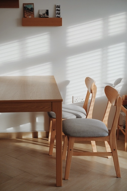
The home owners eventually selected Herringbone floor tiles, in a wooden shade that would complement the furniture which they mainly sourced from Ikea and Taobao. “We tried to have furnishings of the same wooden tone,” Mrs Lee says. “It was challenging but the result is very satisfying.”

\

The couple chose furnishings and décor pieces in complementary, muted colours

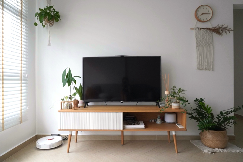
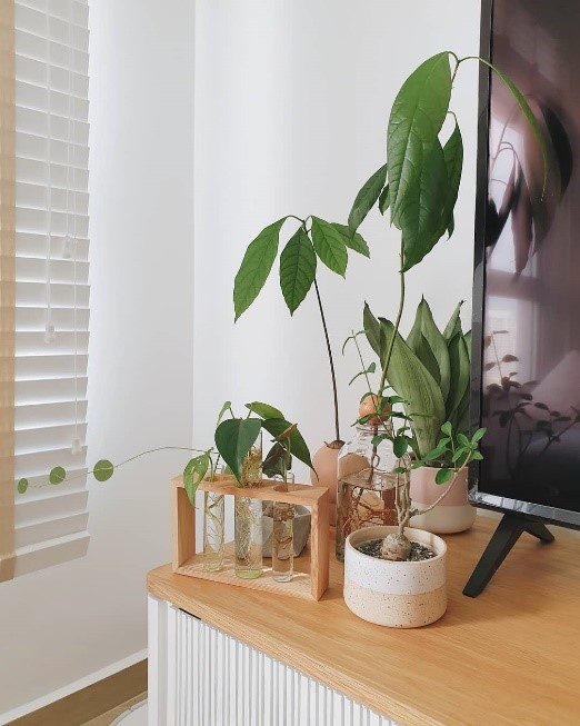
Coming from a family of home gardeners, the couple also naturally took an interest in plant keeping. “Adding a dash of greenery is a simple way of injecting life and calming vibe to the house,” the Lees say.

Pontos, or money plants, are a good option for those just starting out as they are affordable and easy to care for. The couple also suggest the Zamioculcas Zamiifolia (ZZ) plant as it is hardy and grows well, but cautions that it is unsuitable for pet owners as the plant is toxic to animals.

One of the plant corners within the flat

Processed with VSCO with a6 preset

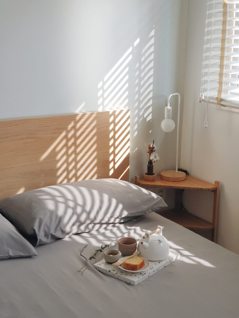
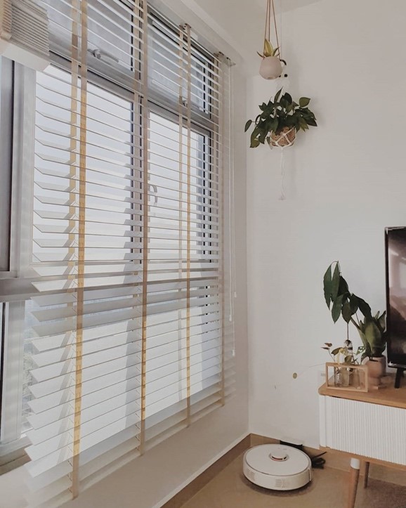
The morning light peeking through the blinds

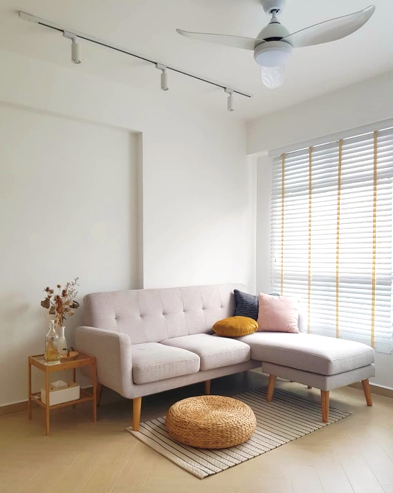
The Lees took advantage of the natural light that floods their home by opting for blinds. “We love the effect of natural light peeking through the blinds, especially in the mornings. We also thought blinds were more complementary to our theme,” Mrs Lee says.

Instead of curtains, Venetian blinds are used to elevate the theme

For homeowners considering the same, Mrs Lee advises, “As Venetian blinds don’t block out the light, blackout blinds or curtains may be better options for individuals who prefer to sleep in complete darkness.

Combining Form and Functionality

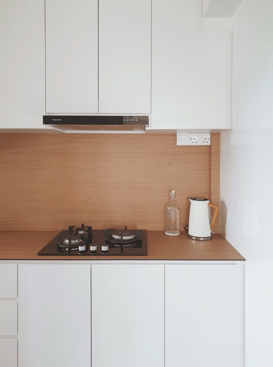
The kitchen countertop and backsplash are made of KompacPlus, a low-maintenance material popular amongst homeowners

Beyond aesthetics, the couple highlighted the importance of functionality in a home. “Ease of maintenance is key,” Mr Lee emphasises. “For instance, we made sure to purchase furniture pieces with ‘legs’ as we wanted to clean the house with a robot vacuum. We also chose KompacPlus for our kitchen countertop and backsplash as the material is easy to clean.

Home in the Heartland

“We were initially a little apprehensive about purchasing a 3-room flat because of the size, but the flat turned out to be spacious enough for us! Plus, a smaller flat is also easier to maintain,” the couple laughs.

“Boon Keng is a great location and many of our friends live in the neighbourhood. We couldn’t be happier with our home!”

Photos courtesy of Mr and Mrs Lee (@hometrulee)

Home Tours: A Playful, Bohemian Home

Home Tours: A Playful, Bohemian Home

Minimalist but with a playful touch, Rina and Fauzan’s home comprise a white-and-wood theme decorated with splashes of colours.

Full of colour, but with a hint of minimalism, Rina Raihana and Muhammed Fauzan’s home in Bukit Panjang is a representation of their individual styles.

“I wanted a colourful, playful space while Fauzan leans towards the Scandinavian aesthetic. So, we decided on a mainly white-and-wood theme that’s decorated with splashes of colours and playful elements,” Rina smiles. The 5-room flat is also adorned with wall paintings and rattan décor that add to its Bohemian charm.

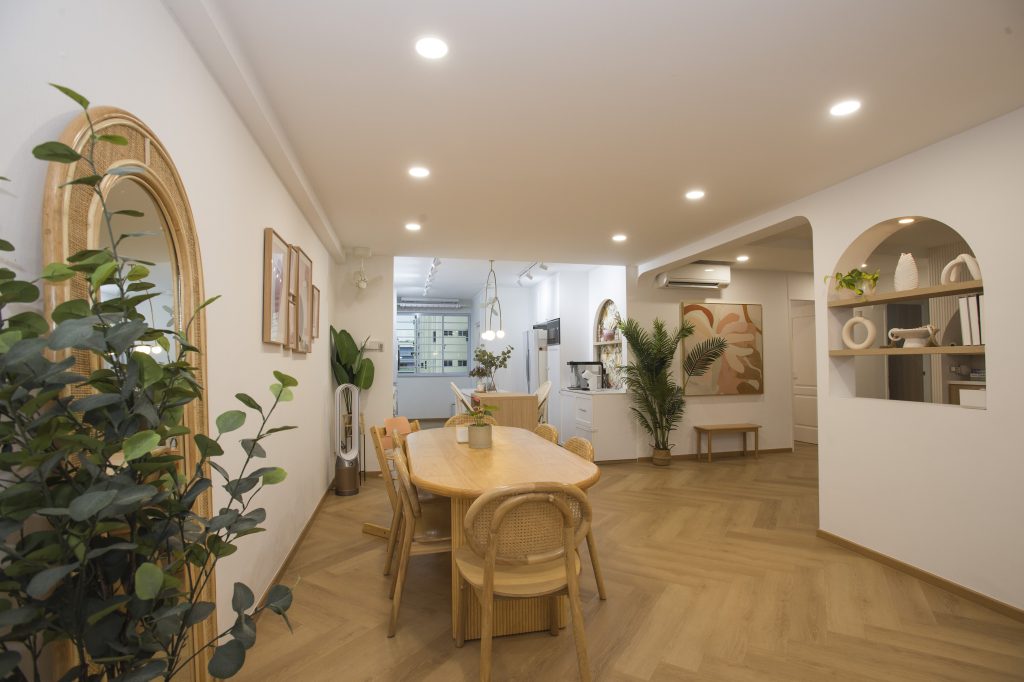
The dining room overlooks the kitchen in the open concept communal area
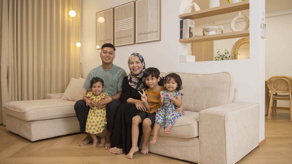
Fauzan, Rina and their three children

Mixing Shapes and Patterns

Rina and Fauzan, who are second-time home owners, worked together to achieve the shared vision for their home. In the open plan communal area, the walls and most of the décor items, are primarily white. The herringbone pattern is weaved into the flooring, creating a seamless flow between the living, dining and kitchen areas. These aspects of the design are attributed to Fauzan, who explains, “I’m a minimalist who prefers consistency and continuity.”

The herringbone floor that carries throughout the space ensures continuity and flow

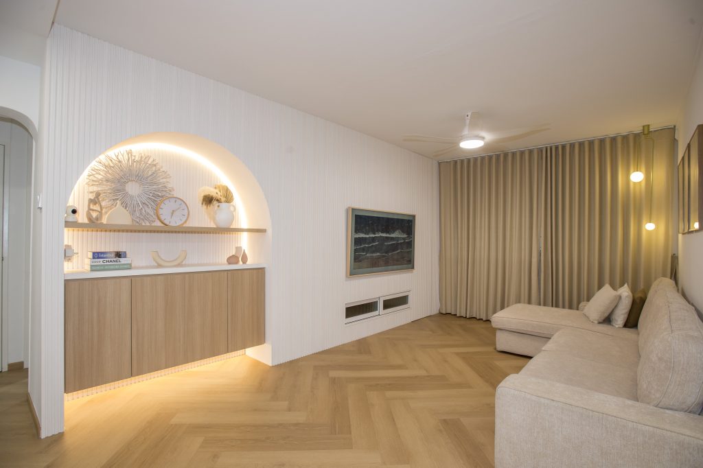
The home is far from monotonous, however, as the couple incorporated arches and colourful wall paintings for a playful touch – a result of Rina’s bubbly personality. “With their round edges, the arches also help to soften the overall look,” she says.

Colourful wall paintings and elements such as arches add a touch of playfulness
The decorative arch-in-the-wall located near the entryway is designed to make an impression


The main arch, designed as part of the feature wall, doubles up as a décor corner. Built-in cabinets maximise storage space.

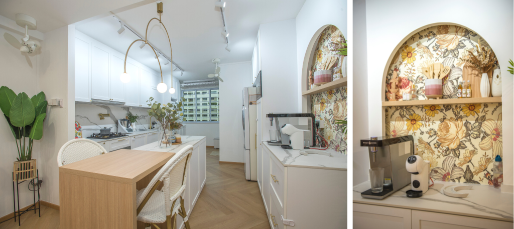
The arch is also present in the kitchen pantry, albeit in a different style. A vintage-inspired wallpaper is used as the backdrop, to add a pop of colour in the area. This complements the white rattan chairs at the kitchen island, where Rina does most of her cooking preparations.

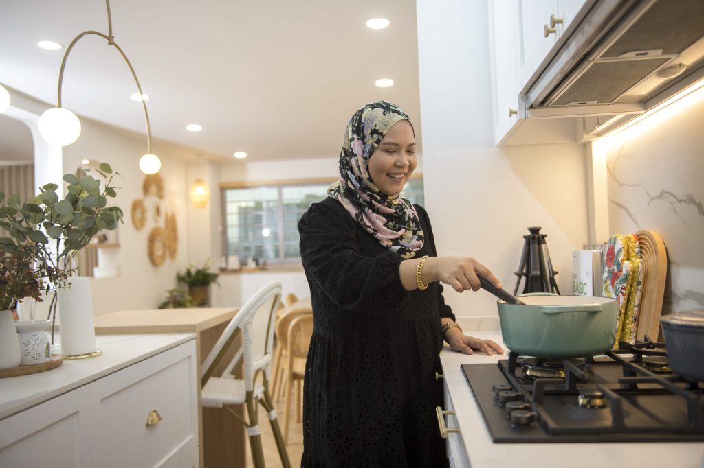
“The extra countertop space comes in handy, especially because I cook often. The kitchen island is also perfect for us, as it doubles up as a hosting area whenever we have friends and family over,” Rina shares.

Rina’s favourite space in the house is the kitchen, where she spends time refining her culinary skills

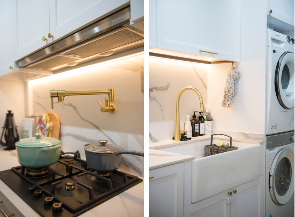
The kitchen sports a minimalist look with its matching marble backsplash and countertop. The rustic look of the shaker-style cabinets and farmhouse sink further ties the kitchen’s aesthetic back the rest of the communal area.

Bohemian with a touch of luxe: the kitchen features a marble backsplash, shaker-style cabinets and a farmhouse sink

Playing with Colours

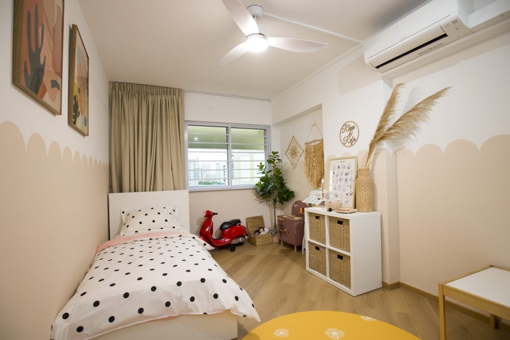
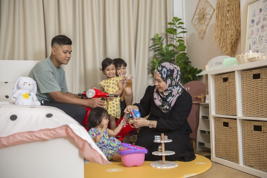
In the children’s bedrooms, colours are used to liven up the space. “We didn’t plan to use vibrant colours in the bedrooms initially. However, after receiving a yellow playmat as a gift, we thought the décor for the children’s bedrooms could be brighter, especially since the rooms are also their play area,” Rina says.

The scalloped walls, an alternative to conventional half walls, were hand-painted by Rina and Fauzan
The bedroom is also where the family spends quality time together

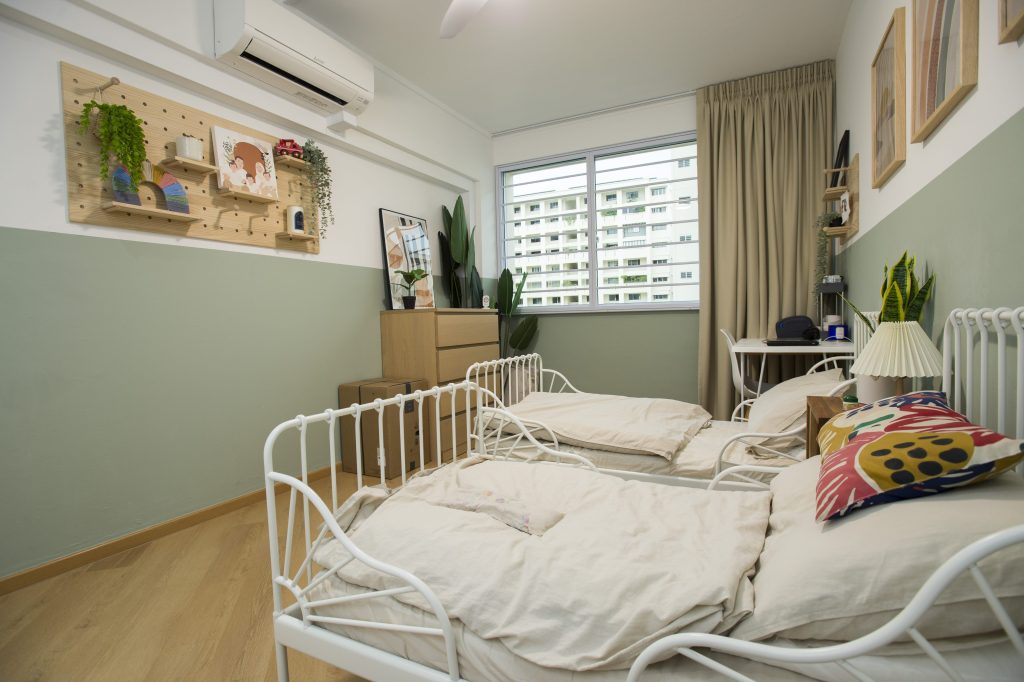
In the adjacent bedroom, the couple chose a refreshing sage colour for the walls. White, rustic-inspired bedframes add a cosy vibe to the bedroom.

The second  bedroom also sports a half-wall feature

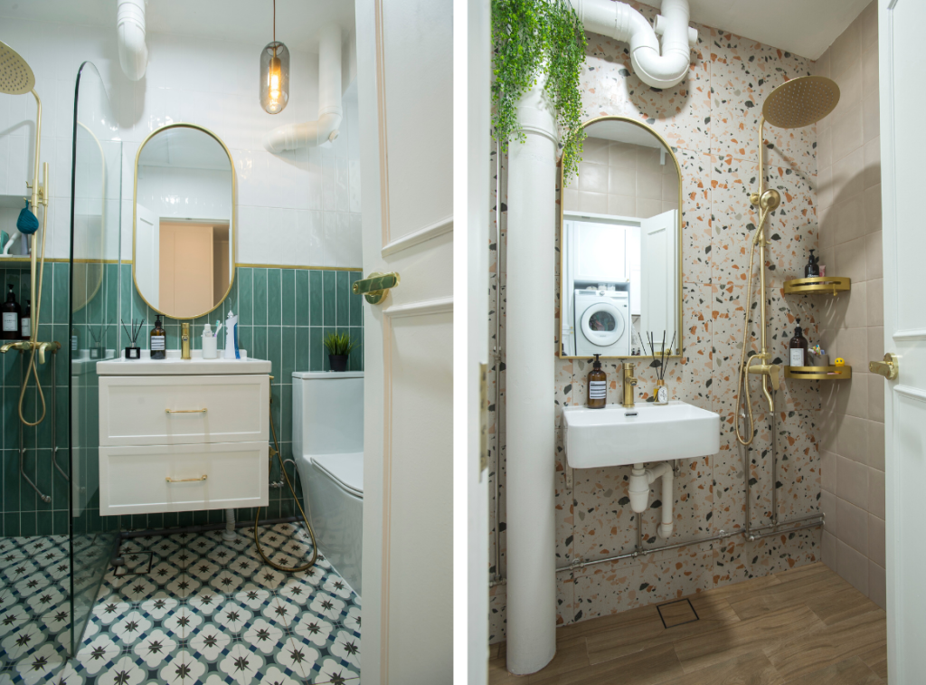
It is however, in the bathrooms where Rina’s vision for colourful spaces truly come to life. The common bathroom features a half-wall designed with green subway tiles paired with a mosaic-tile floor, while the ensuite bathroom stands out with a terrazzo wall and wood-inspired floor tiles. Both bathrooms are also adorned with gold fittings that further brighten up and add luxe to the intimate spaces.

It’s colours and patterns galore in both the common bathroom and ensuite

“I really unleashed my creativity in the bathrooms,” Rina laughs. “Since the bathrooms are more ‘hidden’, I could add more colours without them looking too contrasting to the rest of the flat.”

Source: mynicehome.gov.sg
Home Tours: A Monochrome Greenhouse with Retro Influences

Home Tours: A Monochrome Greenhouse with Retro Influences

Inspired by the industrialist look, this flat is dressed in shades of white, black and grey.

Drawn to the minimal and consistent look of a monochrome palette, Joanne Teo and Samuel Tan did up their home in shades of white, black and grey. The aesthetic is also inspired by the industrialist look, as seen from the concrete flooring and metal black accents that carry throughout the 3-room flat.
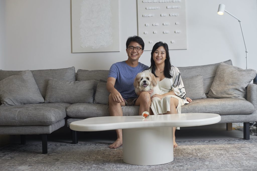
Home owners Samuel and Joanne, and their furkid Bam Bam

“We thought a monochromatic approach is the best way to achieve the modernist look we wanted,” the couple shares. “We also chose the colours for their versatility, as they can be complemented by most furnishings.”

Green and Sustainable Home Décor

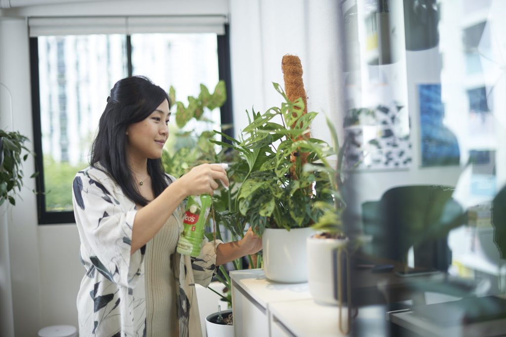
Amidst the sea of grey, pops of colours are incorporated through decor such as plants and paintings, to liven up the space. What stands out most is the balcony garden, a result of Joanne’s passion for plants.

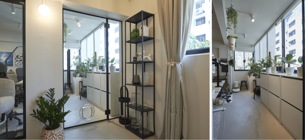
The balcony has been transformed into a gardening space

Housing a variety of decorative potted and hanging plants, the balcony has been turned into a mini greenhouse. “The natural light makes the space very conducive for gardening,” Joanne smiles as she shares more on the transformation of the balcony. “It started with a few plants and before we knew it, our balcony is filled with greenery.”

Joanne finds gardening a therapeutic activity

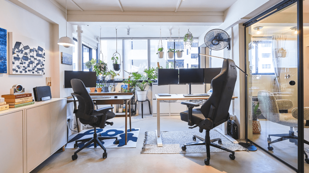
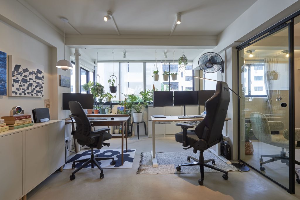
To facilitate the flow of natural light, the wall partition between the balcony and the adjoining home office, was removed. “Our workspace is now brighter. And with the balcony garden, we get to enjoy the sight of greenery, along with fresh air, whilst working.”

The home office opens up to greenery

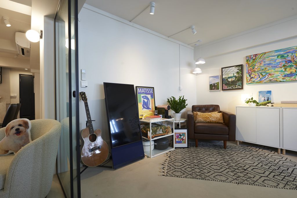
The home office also doubles up as a recreation room, where Samuel spends most of his time in the reading corner. “I love lounging in the leather armchair – whether it’s taking a break or reading my favourite book. It’s where I spend my me time,” he explains.

The lounge corner is also Samuel’s favourite space

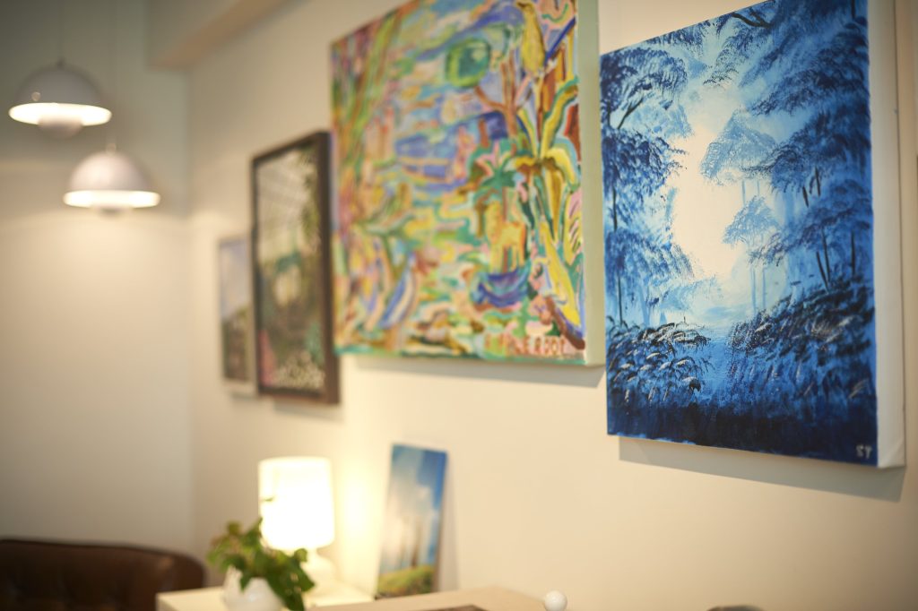
Beyond spots of greenery, the room is also decorated with paintings that span across the wall – some of which are painted by Joanne and Samuel, who love experimenting with art. This room, with its colours, is a departure from the rest of the house.

Paintings add colour to the space

In one of their creations, the home owners had upcycled leftover packing foam peanuts. “We thought it was a waste to throw them out, so we tried to incorporate them into our décor. It turned out surprisingly well and adds some personality to the overall aesthetic,” Joanne chuckles.

The DIY art in the living room (right) is created from upcycled packing peanuts


Minimalist Design with Retro Influences

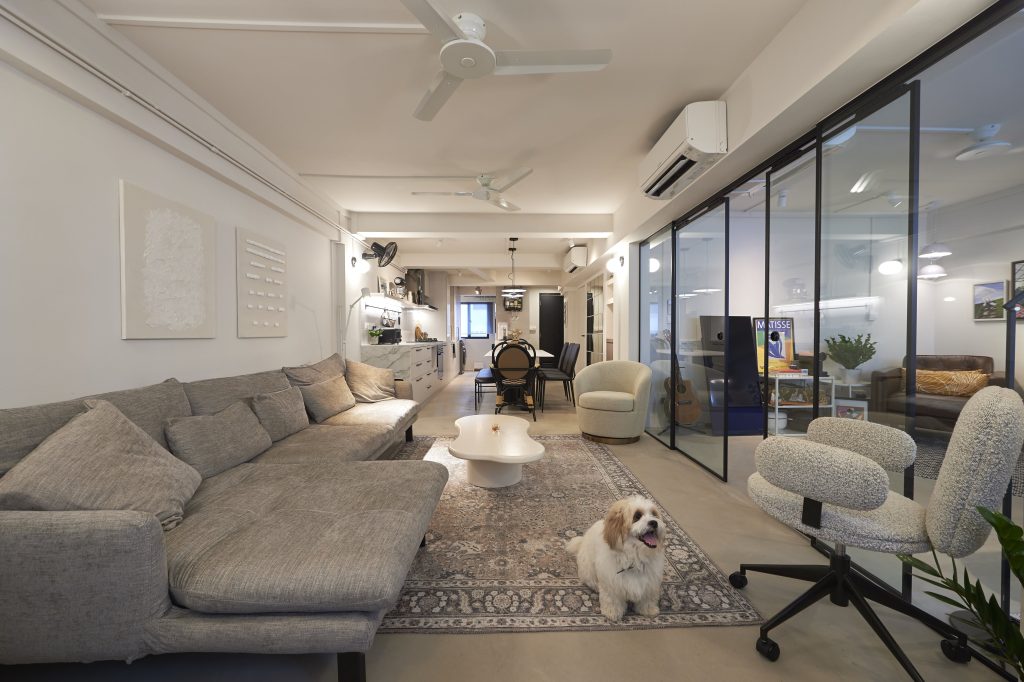
Separated by a sliding glass door, the home office flows into the open concept communal area that comprise the living room, dining room and kitchen.

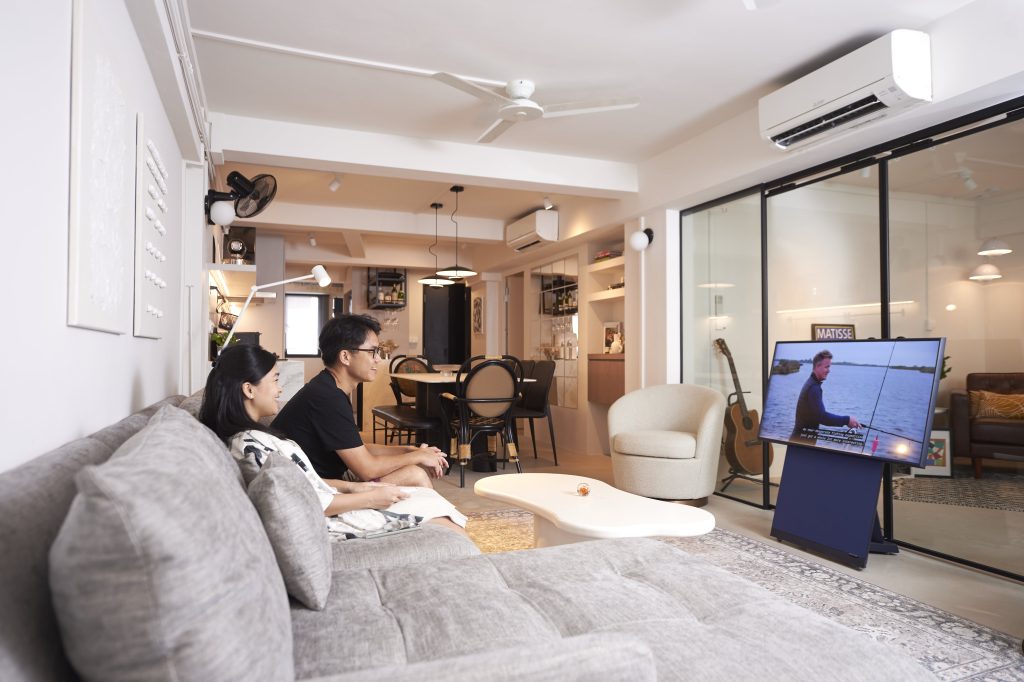
Instead of designating a space for a television, the home owners took the unconventional route of having a mobile screen that can be conveniently stowed away when not in use

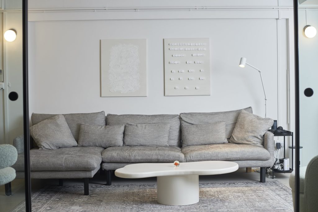
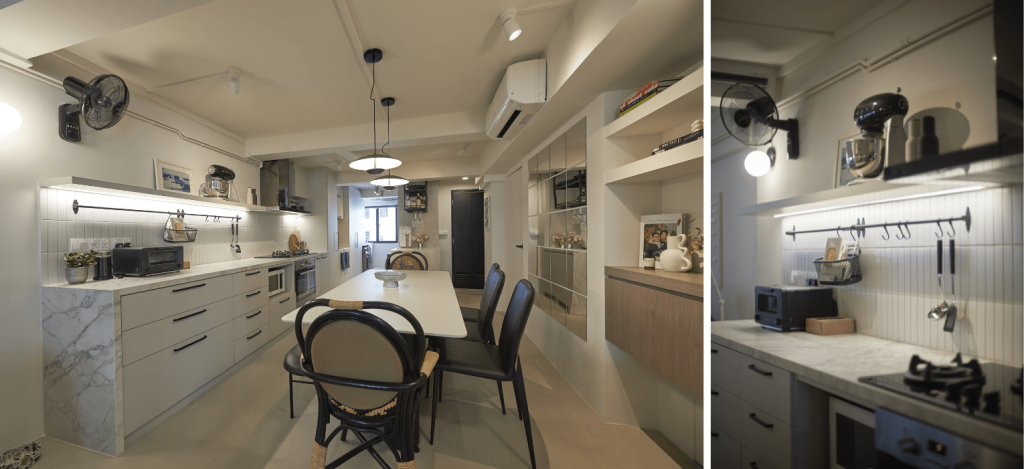
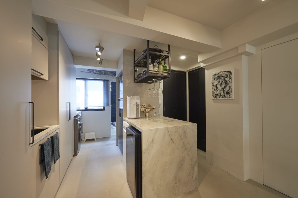
In keeping to the monochromatic theme, the open kitchen is also dressed in white and grey tones, including the marble countertop.

A minimalist kitchen: Top shelves, instead of cabinets, are used to create openness in the space
The kitchen island/ bar serves as additional countertop space for cooking preparation and hosting

Retro influences are used to give the space its unique look. Take for instance, the old-school wall fans and nostalgic rattan dining chairs.

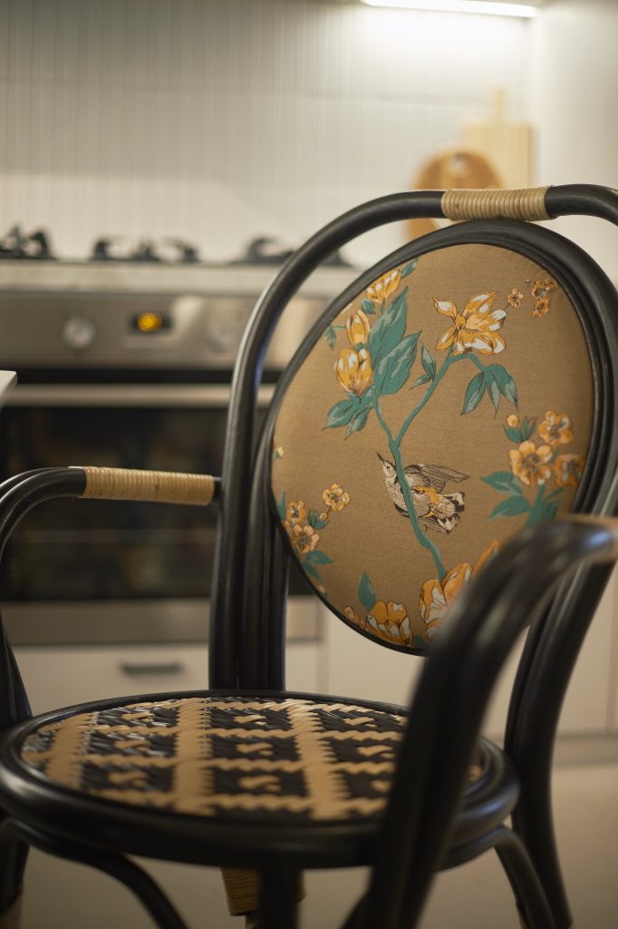
The floral embroidery adds a nostalgic charm to the rattan dining chairs

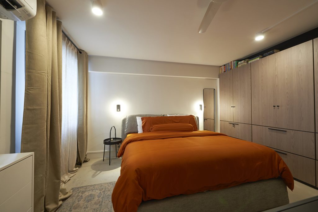
In the bedroom, the orange hue of the sheets gives off cosy retro vibes. Like the rest of the flat, the design is also kept to the minimum, with a wardrobe being the only carpentry item.

The intended space between the wardrobe and ceiling serves as a book storage

When asked about their favourite spaces in their home, Joanne laughs and says, “It’s a no-brainer for Samuel, it’s definitely the home office. For me, I prefer the living room as it’s my lounge spot and it provides the best view of the greenery at the balcony.”

Source: mynicehome.gov.sg